
Table of Contents
Imagine driving two hours down a winding mountain road to reach a renowned forest preserve. When you arrive, the wooden entrance sign is rotting, weeds choke the trailhead, and the map kiosk is blank. Even if the waterfall three miles ahead is breathtaking, your excitement drops before your boots ever touch the dirt. Your website creates that exact same gut reaction online.
Studies in human-computer interaction show that visitors judge a website’s beauty, safety, and trustworthiness in just 50 milliseconds. That blink-of-an-eye impression is your digital curb appeal, and it decides whether a traveler stays to explore your tours or hits the back button forever.
Modern eco-travelers live inside a fascinating paradox. When they step onto your trails, board your kayaks, or check into your eco-lodge, they want to unplug from screens and immerse themselves in unspoiled nature. Yet when those same guests plan their trip from home, they expect instant speed, effortless navigation, and crystal-clear booking tools. They want low-tech wilderness in the field, paired with high-performing digital clarity on their phones and laptops.
True digital curb appeal is never just surface decoration or trendy colors. Instead, it is the intentional alignment of biophilic visual calm, honest ecological proof, and fast technical architecture. When these three elements work together, your website feels like an extension of the landscape itself, guiding hesitant browsers smoothly from initial curiosity straight to buying a ticket.
Diagnosing the Ecotourism Conversion Leak: Main Industry Pain Points
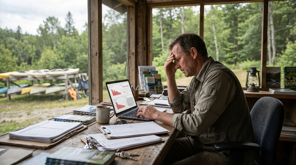
Most ecotourism operators pour their hearts and budgets into trail maintenance, naturalist training, habitat restoration, and guest safety. Meanwhile, their websites sit untouched for five or seven years, quietly leaking thousands of dollars in lost ticket sales every season. Recognizing how weak digital curb appeal hurts your bottom line is the first step toward fixing it.
The OTA Commission Trap
When a traveler lands on an outdated, confusing, or slow website, they rarely abandon their vacation plans altogether. Instead, they open a new browser tab and search for your tour on an Online Travel Agency (OTA) such as Viator, GetYourGuide, or Expedia. Those giant platforms win the booking because their checkout buttons work smoothly on mobile phones.
Unfortunately, that convenience costs you 15% to 30% of every single ticket sold. Worse still, the OTA keeps the guest’s contact information, cutting off your ability to send pre-trip education, gather direct reviews, or invite them back next season. Strong digital curb appeal reverses this leak by making your own website the easiest, most trustworthy place to book.
Sensory Dissonance
Travelers choose ecotourism because they crave peace, authenticity, and a deeper connection with the living world. When they visit a wildlife sanctuary’s website only to be greeted by clashing neon buttons, spinning discount wheels, cluttered templates, and loud pop-up ads, they experience sensory dissonance. The digital front porch contradicts the calm, restorative promise of the physical destination. If your online space feels chaotic and transactional, guests subconsciously wonder whether your guided tours will feel rushed and overcrowded too.
Seasonal Cash-Flow Volatility
Ecotourism businesses naturally rise and fall with weather patterns, wildlife migrations, and school calendars. However, sites that lack thoughtful digital curb appeal suffer far deeper off-peak slumps than necessary. Without clear seasonal storytelling, fast landing pages, and targeted search visibility, operators fail to capture planners who book trips six months in advance. Left without a steady pipeline of early online reservations, businesses become overly dependent on unpredictable, last-minute walk-in traffic during a narrow peak window.
The Science of Digital Curb Appeal: Attention Restoration Theory Meets UX
Great nature-based web design is rooted in biology and environmental psychology, not guesswork. As a studio grounded in biophilic architecture, Silphium Design builds digital spaces around how the human brain actually processes natural environments. Understanding this science reveals why strong digital curb appeal lowers stress and raises conversion rates.
Biophilic Interface Principles
Biologist E.O. Wilson popularized the Biophilia Hypothesis, which shows that humans carry an innate biological affinity for living systems and natural patterns. Building on that foundation, environmental psychologists Rachel and Stephen Kaplan developed Attention Restoration Theory (ART). Their research proves that crowded urban environments and noisy digital screens exhaust our directed attention, causing mental fatigue and frustration. Natural settings, by contrast, trigger what the Kaplans called “soft fascination,” allowing the brain to rest and focus effortlessly.
We translate these findings directly into digital curb appeal through biophilic interface principles:
- Earth-Sampled Color Palettes: Instead of harsh, artificial primary colors, we sample tones directly from your local geology, lichens, river stones, canopy shadows, and native wildflowers.
- Organic Proportions and Whitespace: Generous breathing room around text and images mimics open meadows and forest clearings, preventing cognitive overload.
- Subtle Natural Textures: Gentle paper grains, topographic contour lines, and botanical dividers create tactile warmth without cluttering the screen.
Prospect and Refuge in Web Layout
Architects have long used a spatial concept called “prospect and refuge” to design buildings that feel both inspiring and deeply safe. Humans evolved on the savanna, where survival depended on having an unobstructed view across open land to spot opportunities (prospect) while sitting sheltered behind rock or foliage where predators could not see us (refuge).
Applying prospect and refuge transforms your website’s digital curb appeal and user experience (UX):
- Prospect on the Screen: Wide, open hero photography and clean horizon lines give visitors an immediate, sweeping view of your river valley, coral reef, or mountain ridge. This satisfies their desire for adventure and scale.
- Refuge in Navigation: Calm, predictable menus, clear pricing tables, and a steady, uncluttered booking sidebar give visitors a secure home base. When browsers feel oriented and protected from hidden fees or confusing links, they willingly commit to purchasing tickets.
Above-the-Fold Architecture: Engineering the First Five Seconds
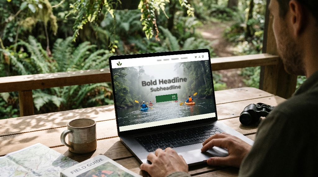
“Above the fold” refers to everything a visitor sees on their screen before they scroll down. In those crucial first five seconds, your digital curb appeal must answer three unspoken questions: Is this place real and breathtaking? Is this trip right for me? How do I take the next step?
Place-Based Visual Hierarchy
Modern travelers spot generic stock photography in half a second, and nothing erodes trust faster than seeing a stock photo of a rainforest that clearly belongs to another continent. Authentic digital curb appeal relies on high-dynamic-range field photography captured on your actual trails, boats, or grounds. Feature real guides interacting with real guests, native plants in seasonal bloom, and genuine weather conditions. Frame your primary hero image so the eye naturally travels from the landscape straight toward your headline and booking button.
Three-Second Value Proposition Clarity
Poetic slogans may look pretty on a brochure, but vague headlines kill online ticket sales. Within three seconds of landing on your page, a browser needs to know what you offer, where you are located, and why the experience matters. Compare “Reconnect with the Spirit of the Wild” against “Guided Old-Growth Canopy Walks and Wildlife Tracking in the Great Smoky Mountains.” The second headline delivers immediate clarity, builds instant confidence, and supports strong digital curb appeal by respecting the visitor’s time.
Non-Coercive Booking Triggers
Aggressive red buttons screaming “BUY NOW BEFORE IT’S GONE!” trigger banner blindness and push thoughtful eco-travelers away. Instead, design primary call-to-action buttons using high-contrast, nature-harmonized tones, such as deep forest moss or warm terracotta, paired with inviting, low-pressure language. Phrases like “Explore Departure Dates,” “Check Trail Availability,” or “View Seasonal Tours” invite curiosity without demanding an immediate wallet pull. Once the visitor clicks and sees live calendar openings, momentum naturally carries them toward checkout.
Eliminating Booking Friction: Technical Performance at Home and in the Field
Even the most gorgeous visual layout fails if the page takes six seconds to load or crashes on a smartphone. Technical speed is the invisible backbone of digital curb appeal. If your engineering lags behind your photography, browsers abandon your site before your story ever appears.
Core Web Vitals for Media-Heavy Sites
Ecotourism websites naturally rely on rich photography and video, yet oversized media files are the top cause of slow load times. Search engines measure page speed using Core Web Vitals, focusing heavily on Largest Contentful Paint (LCP), which tracks how fast your main hero image renders. To keep LCP under 2.5 seconds and protect your digital curb appeal, every image should be converted into next-generation formats like WebP or AVIF. Pair those formats with responsive srcset scaling so mobile phones download compact files rather than massive desktop banners, and apply lazy loading so off-screen photos wait until the user scrolls down.
Mobile-First Spotty-Signal Resilience
Think about where your guests actually make booking decisions. Many travelers search for local eco-tours while riding in a passenger seat along a rural highway, waiting at a small regional airport, or sitting in a mountain gateway town with two bars of cell service. If your site requires five megabytes of heavy scripts just to display tour times, those travelers will give up and book elsewhere. Designing for mobile-first resilience means stripping out bloated plugins, streamlining code, and ensuring your tour schedules and pricing load cleanly even on weak cellular connections.
Unified Checkout Flow
Many tour operators unknowingly destroy their digital curb appeal right at the finish line. A guest clicks “Book Now” on a beautifully branded nature website, only to be yanked onto an ugly, unbranded third-party booking URL or trapped inside a clunky embedded frame that cuts off on mobile screens. Sudden visual shifts make buyers worry that their credit card data is unsafe. A unified checkout flow keeps your typography, colors, header, and reassuring security badges consistent from the first trail photo all the way to the confirmation receipt.
Designing for Ecological Trust: Overcoming Greenwashing Skepticism
Today’s eco-travelers are savvy, educated, and deeply skeptical of empty environmental claims. After years of seeing hotels slap a green leaf icon on standard operations, guests look closely for proof that your business truly protects the places it explores. Building verifiable ecological proof directly into your digital curb appeal turns skeptical researchers into loyal supporters.
Evidence Over Adjectives
Words like “sustainable,” “eco-friendly,” and “green” have lost much of their persuasive power because almost every travel company uses them. Instead of relying on broad adjectives, replace vague promises with concrete operational facts. Explain how your boats use quiet electric motors to protect manatee habitats, how your kitchen sources ingredients from watershed farms within thirty miles, or how your trail crew restricts group sizes to prevent soil erosion. Specific details communicate integrity far better than marketing buzzwords ever could.
Scannable Conservation Telemetry
Many outstanding ecotourism organizations publish detailed annual conservation reports, yet bury them inside twenty-page PDF files that almost nobody downloads. Bring those achievements straight onto your main tour pages as clean, scannable visual data cards. Highlight exact numbers, such as:
- Total acres of native habitat restored or protected through ticket sales.
- The exact percentage of every booking fee donated directly to local watershed or wildlife research.
- Your strict naturalist-to-guest ratio (for example, one certified biologist for every six guests).
Turning raw conservation data into clear visual badges elevates your digital curb appeal and justifies premium ticket pricing.
Contextual Social Proof
Most websites dump all their testimonials onto a single forgotten “Reviews” page. Smart conversion design places proof right next to the decision point. Position verified guest field reviews, naturalist field credentials, and respected third-party certifications like Global Sustainable Tourism Council (GSTC) recognition or Leave No Trace partnerships directly beside your ticket tiers and booking calendar. When a traveler sees a glowing review from a fellow birder or family right next to the “Reserve Spots” button, hesitation melts away.
Sensory Storytelling and Wayfinding: Mapping the Guest Journey Before Arrival
Walking into an unfamiliar wilderness area can feel intimidating, especially for families, older travelers, or first-time outdoor guests. Thoughtful digital curb appeal acts like an experienced trail guide, walking visitors through what the day will feel like before they spend a dime.
Biomorphic Scrollytelling
Rather than presenting a rigid wall of text and boxes, organize your tour pages to mirror the natural emotional arc of an outdoor expedition:
- Anticipation: Open with a sweeping landscape view and a clear summary of the adventure ahead.
- Threshold: Introduce the meeting point, the lead naturalist, and how the journey begins.
- Immersion: Share sensory details of the habitat, from the sound of rushing canyon water to the scent of alpine pines, paired with crisp trail photos.
- Reflection: Close with the lasting takeaway, conservation impact, and a calm invitation to choose a departure date.
Using subtle curved dividers, varied section rhythms, and plenty of whitespace keeps readers scrolling effortlessly from top to bottom.
Pre-Trip Anxiety Reducers
Every time a potential buyer pauses to wonder “Am I fit enough for this hike?” or “What happens if it rains?”, they move one step closer to closing the browser tab. Eliminate silent abandonment by embedding clear, visual wayfinding tools directly into your tour pages:
- Visual Difficulty and Elevation Profiles: Replace vague labels like “Moderate Hike” with clean graphic charts showing total mileage, elevation gain, trail surface type, and resting spots.
- Seasonal Wildlife and Botanical Bloom Calendars: Show month-by-month visual timelines detailing when migratory songbirds arrive, when native orchids bloom, or when river levels peak for paddling.
- Clear Gear Checklists and Accessibility Transparency: Provide straightforward packing lists separating provided equipment from personal items, alongside honest notes about mobility access, restroom availability, and age suitability.
Local and Regenerative SEO: Capturing High-Intent Eco-Travelers
Even extraordinary digital curb appeal cannot convert visitors if search engines never send qualified travelers to your front door. Search Engine Optimization (SEO) for ecotourism works best when your site architecture mirrors the exact habitats, species, and regional experiences travelers actively search for.
Habitat- and Experience-Driven Keyword Architecture
Competing for broad phrases like “adventure tours” or “eco vacations” pits small operators against billion-dollar travel conglomerates. Instead, build dedicated landing pages around specific, high-intent local queries that match what makes your ecosystem unique. Create rich, authoritative guides targeting searches such as “guided spring warbler birding tours in Erie,” “bioluminescent kayak expeditions,” or “private botanist wildflower walks.” When a traveler lands on a page tailored specifically to the exact habitat or wildlife window they researched, conversion rates climb dramatically.
Structured Data and Schema Markup
Behind the visual beauty of your website lies structured code that helps Google and AI search engines understand your offerings with mathematical precision. Implementing specialized schema markup, including TouristAttraction, Trip, Event, FAQPage, and AggregateRating, allows search engines to display rich details right inside search results. Instead of showing a plain blue link, your listing can display live star ratings, tour durations, starting ticket prices, and frequently asked questions before the user even clicks. That early clarity strengthens your digital curb appeal right on the search results page and attracts buyers who are already ready to book.
From Static Brochure Site to Direct-Booking Engine
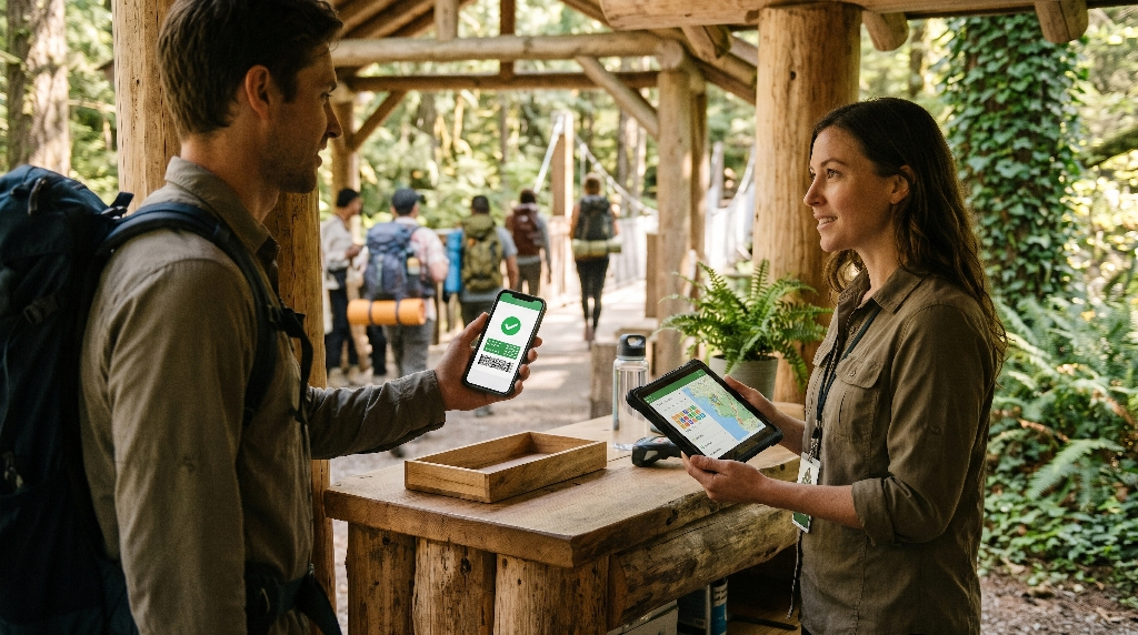
To see how these principles work together in practice, consider what happens when an established river outfitter or wildlife sanctuary transitions from an aging brochure site to a biophilic direct-booking platform.
Before-and-After Blueprint
A typical legacy ecotourism website acts like a digital filing cabinet. It opens with a slow-loading slideshow, buries tour descriptions beneath three layers of dropdown menus, uses tiny text on mobile devices, and pushes buyers out to a clunky external ticketing portal. Visitors feel lost, doubt the operator’s professionalism, and retreat to third-party travel aggregators.
When we re-architect that same platform around strong digital curb appeal, every layer shifts toward clarity and conversion:
- Entry Experience: The slow slideshow is replaced by a fast, razor-sharp hero image of guides on the water, paired with a three-second value proposition and a calm “Check Departure Dates” button.
- Information Flow: Dense paragraphs transform into a scannable journey featuring an elevation and route profile, seasonal wildlife highlights, verified guest quotes, and transparent conservation metrics.
- Seamless Checkout: Clicking a date opens a clean, fast, mobile-friendly booking drawer right on the same domain, offering simple add-ons like binocular rentals or private naturalist upgrades without leaving the site.
Core Conversion Benchmarks to Track
Upgrading your digital curb appeal produces measurable business results you can track inside your analytics dashboard:
- Lower Above-the-Fold Bounce Rate: Visitors immediately feel at home and scroll deeper into your tour itineraries instead of leaving within seconds.
- Stronger Direct-to-OTA Booking Ratio: More guests complete reservations directly on your site, letting you keep the 15% to 30% commission fees previously lost to middlemen.
- Higher Average Order Value (AOV): Clear, non-pushy presentation of multi-day packages, gear rentals, and private guide options encourages guests to customize and upgrade their trips.
- Higher Mobile Checkout Completion Rate: Fast load speeds and unified mobile forms turn on-the-go smartphone browsers into confirmed ticket holders.
Cultivating Your Digital Ecosystem with Silphium Design
Your website is far more than an online flyer. It is the living digital ecosystem where every guest’s journey begins, long before they lace up their hiking boots or step onto your dock. When you unite biophilic visual design, verifiable conservation proof, and fast technical engineering, your digital curb appeal works around the clock as your sharpest, most welcoming trail guide.
At Silphium Design, we specialize exclusively in building nature-inspired, high-converting web architecture for ecotourism outfitters, conservation organizations, botanical gardens, and native landscapes. Led by experts in biophilic design, computer science, and ecological storytelling, our studio bridges the gap between deep environmental integrity and modern conversion engineering. We know how to honor the quiet beauty of your land while eliminating the technical friction that holds back direct ticket sales.
If your current website feels out of step with the extraordinary experiences you deliver in the field, we invite you to take the next step. Reach out to Silphium Design today to schedule a custom Digital Curb Appeal and Conversion Audit. Our team will evaluate your site’s first-impression impact, uncover hidden mobile and checkout leaks, and map out a clear blueprint to transform your website into a direct-booking engine that turns curious browsers into lifelong guests.