The Biological Pull of Earth Tones
Have you ever wondered why taking a walk in a park makes you feel so much better after a long day of staring at a screen? As humans, we have a deep, built-in love for the natural world. Scientists call this biophilia. It is the reason we feel calm when we see a forest or a sunset. When we talk about earth tone color schemes, we are talking about bringing those peaceful feelings into our digital lives.
For a long time, websites looked like cold, white hospital rooms or dark, glowing neon signs. But today, we are changing that. At Silphium Design LLC, we believe that your website should feel like a natural habitat. By using earth tone color schemes, we can make the internet feel less like a machine and more like a home. This article will show you how to use colors from the ground, the trees, and the sky to build a website that people love to visit.
Table of Contents
Deciphering the Palette: What Defines an Earth Tone?
To truly understand earth tone color schemes, we must look beneath the surface of the “brown” label and examine the geological and biological origins of these pigments. As an expert in biophilic design, I view the palette as a collection of colors that exist in a state of entropy—colors that have been weathered, oxidized, or filtered through the natural atmosphere.
The Mineral Foundation: Earth’s Raw Pigments
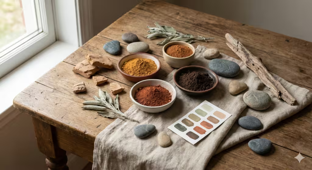
The bedrock of any earth tone color scheme is found in the soil. Historically, artists used “earth pigments,” which are naturally occurring minerals.
- Ochre: This is one of the oldest pigments used by humans. It ranges from a pale yellow to a deep, golden orange. It comes from clay that contains iron oxide. In web design, ochre provides a sense of ancient history and warmth.
- Sienna: Named after the earth in Siena, Italy, this is a yellowish-brown in its raw state. When heated, it becomes “burnt sienna,” a rich, reddish-brown. It is a staple in earth tone color schemes because it feels grounded and “cooked” by the sun.
- Umber: This is a much darker, cooler brown containing manganese. It is the color of wet soil or deep tree shadows. Using umber in your earth tone color schemes provides the necessary “visual weight” to anchor a webpage.
The Atmospheric Filter: Muted Hues
An essential part of deciphering these palettes is understanding that earth tone color schemes are rarely “pure.” In nature, colors are muted by distance, moisture, and light.
- Terracotta and Clay: These represent the transition from mineral to craft. These reds and oranges are softened by the presence of white or gray, making them much easier on the eyes than a primary red.
- Moss and Sage: These are “desaturated” greens. Unlike the bright green of a neon sign, these greens contain a hint of gray or brown. This makes them part of the earth tone color schemes because they mimic the appearance of plants in various stages of life.
- Slate and Stone: Many people forget that cool colors are part of the earth’s palette. The blue-grays of a mountain range or the charcoal of a volcanic rock are vital for creating contrast within earth tone color schemes. They provide a “cooling” effect that balances the warmth of the browns and reds.
Semantic Coverage: Beyond the Visible
When we talk about earth tone color schemes in a technical sense, we are also talking about texture and finish. A color might be “sand,” but on a website, it looks different if it has a matte finish versus a metallic one. In biophilic design, we prefer matte or “satin” finishes because they mimic the non-reflective surfaces found in the wild.
True earth tone color schemes include:
- Hues of Longevity: Colors that remind us of things that last, like stone and hardwood.
- Hues of Vitality: Colors that remind us of things that grow, like leaf mulch and sprout green.
- Hues of Atmosphere: Colors that remind us of the space around us, like mist, fog, and twilight.
By using these varied sources, your earth tone color schemes become a complex language. You aren’t just “painting” a website; you are building a digital environment that feels as deep and layered as the physical world. This depth is what captures a user’s attention and makes them feel a biological sense of belonging on your page.
Seasonal Rhythms: Dynamic Palettes Through the Year
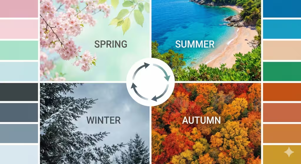
Nature never stays the same color for long. It changes with the seasons, and your website can do the same. By looking at the four seasons, we find endless inspiration for earth tone color schemes.
Spring Renewal
In the spring, the world wakes up. The colors are light and full of hope. Think of sage green, which looks like new leaves, or a soft primrose yellow like the first flowers. Using these earth tone color schemes is great for brands that focus on health, wellness, or new beginnings. It feels fresh and clean without being cold.
Summer Vibrancy
Summer is the time of full growth. The greens get darker and deeper, like a thick forest. The sky is a bright, clear blue, and the beaches are a warm, sandy tan. These earth tone color schemes work well for outdoor brands or travel websites. They feel energetic and full of life, reminding people of long days spent outside.
Autumnal Harvest
Fall is perhaps the most famous time for earth tone color schemes. This is when we see burnt oranges, deep terracotta reds, and golden yellows. These colors feel very warm and cozy. If you want your website to feel friendly and inviting, like a warm blanket or a cup of coffee, the colors of the harvest are the perfect choice.
Winter Stillness
Winter colors are quiet and sophisticated. This season uses charcoal grays, slate blues, and parchment whites. These are still earth tone color schemes because they come from the rocks, the winter sky, and the dried grass. This palette is excellent for high-end technology or luxury brands that want to look professional and calm.
Landscape-Inspired Schemes: Regional Biophilic Profiles
The world is a big place, and different parts of it have different earth tone color schemes. We can look at specific landscapes to find a “mood” for a website.
The High Desert
If you look at a desert, you see amazing earth tone color schemes. There are rusty reds from canyon walls, dusty tans from the sand, and even a pop of turquoise from the desert jewelry or the sky. These colors feel warm and ancient. They are great for creative agencies or handmade goods.
Coastal Serenity
The ocean shore gives us a very different set of earth tone color schemes. Here, we find driftwood brown, seafoam green, and deep navy blue. These colors are very relaxing. They remind us of the sound of waves and the smell of salt air. Many spas and bathroom product websites use these colors to help people feel peaceful.
Woodland Depth
A deep forest offers some of the most complex earth tone color schemes. You have the dark brown of tree bark, the bright green of chlorophyll in the leaves, and the soft gray of shadows. These colors make a website feel sturdy and full of wisdom.
Technical Implementation: From Nature to Hex Codes
Knowing which colors look good is one thing, but putting them on a website is another. In web design, we use “hex codes,” which are six-digit numbers that tell a computer exactly which color to show. To use earth tone color schemes correctly, you need to think about balance.
A good rule of thumb is the 60-30-10 rule.
- 60% should be your main color. This is usually a neutral earth tone, like a very light cream or a soft gray. It goes in the background.
- 30% should be your secondary color. This could be a medium tone, like a sage green or a clay red. Use this for sections and headers.
- 10% should be your accent color. This is your “pop” of color. It might be a brighter gold or a deep forest green. This is what you use for buttons that people need to click.
When using earth tone color schemes, you must also be careful about “contrast.” Contrast is the difference between the color of the text and the color of the background. If you use a light brown text on a tan background, no one will be able to read it. This is bad for users and bad for SEO. Google wants to see that your site is easy for everyone to read, including people who might have trouble seeing. Always make sure your earth tone color schemes have enough contrast so that the words stand out clearly.
Common Questions about Earth Tone Color Schemes
Many people have questions when they start looking into earth tone color schemes. Here are some common things people ask:
What are the best earth tone colors for a professional website?
If you want to look professional, stick to the darker and more neutral earth tone color schemes. Deep charcoal, navy blue, and rich forest green are great. These colors feel serious and “heavy” in a good way. They tell the visitor that you know what you are doing.
How do I choose a color scheme from a photo of a landscape?
This is a fun way to find earth tone color schemes! You can take a photo of a place you love and use a “color picker” tool. Many free tools online let you upload a photo, and then they show you the exact hex codes for the colors in that photo. This ensures that your colors will always look natural together because they already exist together in nature.
Are earth tones trending in 2026 web design?
Yes, they are more popular than ever. As the world becomes more digital and high-tech, people are craving a connection to the physical world. Using earth tone color schemes is a way to bridge that gap. It is part of a movement called “Organic Modern,” which combines clean lines with natural colors and textures.
Why Earth Tones Help Your Business Grow

You might think that picking colors is just about making things look pretty. But as a biophilic design expert, I can tell you it goes much deeper. Using earth tone color schemes can actually help your business grow. When a person feels comfortable on your website, they stay longer. In the world of SEO, this is called “dwell time.” If Google sees that people spend five minutes on your site instead of five seconds, it thinks your site is high quality.
Also, earth tone color schemes reduce “visual fatigue.” Bright, neon colors hurt the eyes after a while. If your website is too bright, people will close the tab just to give their eyes a break. By using soft, natural earth tone color schemes, you make it easy for people to read your blog posts and look at your products for a long time.
Connecting with Different Cultures
Earth tone color schemes are also great because they are “universal.” No matter where someone is from, they understand the colors of the earth. Red means fire or clay, blue means water, and green means life. This makes your website feel welcoming to people all over the world. While some colors have different meanings in different countries, earth tone color schemes usually carry the same feeling of peace and nature everywhere.
Creating a Sensory Experience Online
Even though a website is just on a screen, you can make it feel like a physical place. You can use earth tone color schemes along with images of natural textures. Imagine a background that is the color of sand but also has a slight texture that looks like linen or stone. This makes the user feel like they could reach out and touch the screen. This “tactile” feeling is a big part of biophilic design. It makes the digital world feel less flat and more real.
Using Earth Tones for Different Industries
Not every industry should use the same earth tone color schemes.
- Law Firms and Banks: These should use darker, stony colors like slate and granite.
- Organic Farms and Food: These should use rich greens and soil browns.
- Tech Companies: These can use cool grays and sky blues to look modern but still human.
- Fashion and Beauty: These often use “skin tones,” which are a very important branch of earth tone color schemes. Pinks, tans, and deep browns feel personal and intimate.
The Psychology of Earth and Sky
Every color in your earth tone color schemes has a psychological effect. Blue lowers the heart rate. Green reduces anxiety. Brown creates a sense of order and safety. When you combine these into earth tone color schemes, you are basically writing a “love letter” to the user’s nervous system. You are telling them, “You are safe here. You can relax here.” In a world that is often loud and stressful, providing a quiet digital space is a huge competitive advantage.+1
Maintaining Brand Consistency
Once you pick your earth tone color schemes, you have to use them everywhere. They should be on your website, your social media, and your business cards. This consistency makes your brand look “competent,” which is one of my core values. If your website is green and brown but your Instagram is neon pink, people will get confused. Stick to your chosen earth tone color schemes to build a strong, recognizable identity.
Final Thoughts on Natural Design
Building a website is like building a house. You want it to be functional, but you also want it to be beautiful and comfortable. By using earth tone color schemes from landscapes and seasons, you are using the best designer in the world as your guide: Mother Nature. Nature never picks colors that clash. Nature never makes a mistake with its palette. If you follow the patterns found in the woods, the mountains, and the sea, your website will be a success.
At Silphium Design LLC, we are dedicated to this mission. We believe that the future of the internet is biophilic. We want to see more earth tone color schemes and fewer harsh, artificial lights. When we design with nature in mind, we create a better experience for everyone. Whether you are building a site for a small garden shop or a large corporation, remember that the earth has already given you all the colors you need. Use these earth tone color schemes to ground your brand and connect with your audience on a biological level.
Building Digital Sanctuaries
In conclusion, the use of earth tone color schemes is not just a passing trend. It is a fundamental shift in how we think about the internet. We are moving away from “users” and “consumers” and moving toward seeing people as biological beings who need beauty and calm. By picking earth tone color schemes that reflect the changing seasons and the diverse landscapes of our planet, we can make the web a more beautiful place.
These colors provide the foundation for a website that is not only easy to look at but also easy to use. They help with SEO by keeping people on the page and making the content readable. They help with branding by creating a sense of trust and stability. Most importantly, earth tone color schemes help us remember that even when we are online, we are still part of the natural world.