The human brain is built to respond to the natural world. This is a fact based on our biology. Even though we spend most of our time looking at screens, our eyes still seek the patterns found in the wild. This idea is called the Biophilia Hypothesis, by E.O. Wilson. It suggests that humans have a deep, built-in need to connect with nature.
At Silphium Design LLC, we use this idea to build better websites. We look at the psychology of colors inspired by nature to help people feel more at home online. When we use these colors, we are not just making things look pretty. We are using science to help the brain work better. This reduces the work your brain has to do to understand a page. It also helps people trust what they see.
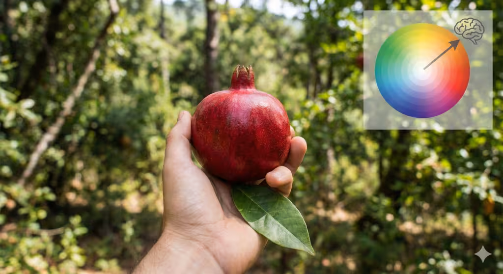
Nature uses colors to tell us things. A bright red berry might be a warning. A soft green leaf suggests life and health. When we bring these colors into the digital world, we tap into those old feelings. My work in biology and web design shows that designs work best when it mimics the real world.
This article will show you how the psychology of colors inspired by nature can change how people use your website. We will look at specific colors and how they change our mood. We will also look at how these colors help your website show up better in search engines.
Table of Contents
The Biological Imperative of Color
Humans evolved in a world of greens, blues, and browns. Our eyes are very good at seeing different shades of these colors. For example, the human eye can see more shades of green than any other color. This helped our ancestors find food and water in the forest. Today, we use this same skill when we browse the web. If a website uses colors that feel natural, our brains feel safe. This is part of the biophilia effect. When a user feels safe, they stay on a website longer. They are more likely to read your content and buy your products.
We call this legible complexity. Nature is complex, but it is also easy to read. A forest has many parts, but it feels like one peaceful place. A website should be the same way. By using natural colors, we create a digital space that feels organized and calm. This is the core of our work at Silphium Design. We want to move away from harsh, neon coloring that tire the eyes. Instead, we use coloring that the brain already knows and likes.
Verdant Growth: The Power of Green
Green is the most common color in nature. It represents growth, health, and new life. In the study of the psychology of colors inspired by nature, green is used to create balance. There is a theory called Attention Restoration Theory. It says that looking at nature helps our brains recover from hard work. Using green colors on a website can help users feel less tired.
When you pick green for a design, think about where they come from. A deep forest green feels solid and strong. A light sage green feels soft and calm. These colors are great for brands that focus on health or the environment. They tell the user that your brand is helpful and alive. At Silphium Design, we often use olive or forest green to help a page feel more grounded. This lowers the stress a user might feel when looking at a lot of data.
Green also helps with navigation. Because our eyes see it so well, it can be used to guide a user through a site. However, it must be the right kind of green. Using greens that are too bright can be distracting. We stick to green shades that you would actually find in a garden or a woods. This keeps the look professional and easy on the eyes.
Celestial and Oceanic Depths: The Role of Blue
Blue is the color of the sky and the sea. It is a color that feels very big and very calm. In the world of colors, blue is often the most popular choice for businesses. This is because it represents trust and stability. When we see a clear blue sky, we feel that the weather is good. When we see clear blue water, we feel that it is safe to drink.
In website design, blue colors help people feel secure. This is why many banks and tech companies use blue. It creates a sense of clarity. If your website provides a lot of information, blue can help the user stay focused. It makes the digital space feel open, like a wide horizon.
We also look at different types of blue. A light sky blue feels airy and fresh. A deep navy blue feels serious and strong. By mixing these blues, we can create a design that feels both modern and natural. Using blue shades found in a coastal mist or a deep ocean can give your brand a high level of authority. Users will feel like they can rely on you.
Terrestrial Foundations: Brown and Ochre
Brown and ochre are colors of the earth. They represent the soil, rocks, and wood. In the psychology of colors inspired by nature, these are called grounding colors. They make a website feel real and solid. In a digital world that can feel fake, earth tones provide a sense of touch and history.
Many people think brown is a boring color, but it is very useful. It provides a warm background that makes other colors stand out. Using browns like tan, terracotta, or dark wood can make a website feel cozy. It is like being in a well-built house. This creates a sense of comfort for the user.
Earth colors also suggest that a brand is honest and hardworking. They are not flashy. They are reliable. At Silphium Design, we use these colors to build a foundation for our designs. When you use browns from the desert or the forest floor, you tell the user that your business is here to stay. It creates a tactile feel that is often missing from the internet.
Questions about How Nature Colors Affect Mood
One common question is how nature colors change the way we feel. Science shows that these colors can actually change our body. When we look at soft blue or green colors, our heart rate can go down.23 Our stress levels drop. This is a physiological response. It happens because our brain thinks we are in a safe, natural place.
On a website, this means the user is more patient. They are willing to spend more time looking at your pages. If a site uses harsh, artificial colors, the user might feel a “fight or flight” response. They will want to leave the site quickly. By using the psychology of colors inspired by nature, we keep them around. We make the experience of using the internet more like a walk in a park.
Another question is what the best palettes are for websites. There is no single answer, but we often look at specific places for ideas. A “Forest Floor” palette might use deep greens, browns, and soft yellows. A “Coastal” palette might use blues, sands, and grays. These groups of colors work well together because they work well in nature. They have a natural harmony that the human eye likes.
Can these colors help with SEO? The answer is yes. Search engines like Google track how long people stay on your site. This is called dwell time. If people like your colors and stay longer, Google thinks your site is high quality. This can help you rank higher. Good design and good SEO go hand in hand. Using natural colors makes your site more usable, and usability is a big part of search rankings.
The Technical Layer: Saturation, Value, and Accessibility
When choosing colors, we have to think about more than just how they look. We have to think about how they work for everyone. This includes people who might have trouble seeing. There are rules called the Web Content Accessibility Guidelines, or WCAG. These rules tell us how much contrast we need between different colors.
For example, if you have dark green text on a light green background, it might be hard to read. We use math to make sure the luminance contrast is high enough. This ensures that everyone can read the content, no matter what their vision is like. We can still use natural colors and meet these rules. It just takes a bit of planning.
We also think about the “value” of the colors. Value is how light or dark a color is. A good design uses a mix of light and dark colors to create a clear path for the eye. We call this visual hierarchy. By using a dark forest green for headers and a light cream for the background, we make the page easy to scan. This helps the user find what they need quickly.
At Silphium Design, we also look at material connection. This means making digital colors feel like they have texture. We might use a color that looks like stone or wood grain. This adds a layer of sensory engagement to the website. It makes the screen feel less like a flat piece of glass and more like a real object.
Designing for the Modern Search Engine
Search engines are getting smarter. They no longer just look at keywords. They look at the whole experience of the website. This is where the psychology of colors inspired by nature becomes very important. When a search engine sees that users are happy and staying on your site, it rewards you.
We use specific terms in our code to help with this. For example, in the alt-text for images, we might describe the colors as “soothing ocean blue” or “earthy moss green.” This helps search engines understand the mood and quality of the site. It shows that the site is designed for humans, not just for bots.
Visual search is also a big trend. People use tools like Google Lens to find things by taking a photo.26 If your website uses clear, natural colors, these tools can identify your content more easily. This is another way that biophilic design helps your business grow. We are moving toward a web that is more visual and more natural.
The Future of the Human-Internet Interface

The future of web design is not more technology. It is better technology that feels more human. By focusing on the psychology of colors inspired by nature, we are making the internet a better place to be. We are taking the lessons from biology and applying them to computer science.
At Silphium Design, we believe that a website should be like a digital ecosystem. Every part should work together. The colors should support the text. The text should support the user. The user should feel better after visiting the site than they did before. This is how we build long-term success for our clients.
As we move forward, we will see more designs that embrace the wild. We will see more colors that remind us of the trees, the sky, and the earth. This is not just a trend. It is a return to what makes us human. We are animals that love the sun and the woods. Our digital tools should reflect that love.
Understanding the Psychology of Nature Colors
To really use these colors well, you have to understand why they work. It is not just about picking a nice shade of blue. It is about understanding the history of the human eye. For millions of years, our survival depended on seeing colors correctly. We looked for the red of a ripe fruit or the yellow of a predator’s fur. This made us very sensitive to colors.
When we use colors inspired by nature, we are talking to the oldest part of the human brain. This part of the brain does not use words. It uses feelings. It feels calm when it sees the colors of a meadow. It feels alert when it sees the colors of a storm. By using these colors on your website, you are communicating with your users on a very deep level.
This is why we spend so much time at Silphium Design picking the right palette. We don’t just look at what is popular this year. We look at what has worked for the human race for thousands of years. Natural colors are timeless. They never go out of style because they are part of who we are.
How to Apply Nature Colors to Your Website
If you want to start using these colors, start small. Look at your current website. Does it feel cold and artificial? Does it use too many bright, neon colors? If so, try adding some earth tones. Use a soft tan instead of a harsh white for the background. Change your buttons to a deep forest green.
Think about the message you want to send. If you want people to trust you, use more blue colors. If you want them to feel energized, use some soft oranges or yellows like a sunrise. If you want them to feel calm, stick with greens and light blues.
Always keep accessibility in mind. Use tools to check the contrast of your colors. Make sure that everyone can enjoy your natural design. Remember that nature is for everyone, and your website should be too. By following these steps, you can create a site that looks great and works well for your business.
The Role of Texture in Color
In nature, colors are never just flat. They are always on something. They are on a leaf, a rock, or a ripple of water. This gives the colors texture. In web design, we can mimic this. We can use gradients that change slowly from one shade to another. This looks more like a real sky than a single flat color.
We can also use subtle patterns in the background. A light pattern that looks like linen or stone can make the colors feel more real. This increases the sense of quality. It makes the website feel like it was crafted by hand. This is a big part of the psychology of colors inspired by nature. We want to move away from the “plastic” feel of the early internet.
When you add texture to your colors, you create a more rich experience. The user feels more engaged. They might not even know why they like the site, but they will feel that it is high quality. This is the goal of biophilic design. We want to create beauty that feels natural and effortless.
The Science of Vision and Color
To go deeper into the psychology of colors inspired by nature, we must talk about how we see. The human eye has special cells called cones. These cones help us see different colors. Most people have three types of cones. They see red, green, and blue light. Because of how these cones are spread out, we are very good at seeing things in the middle of the spectrum. This is where green and yellow sit.
This is why nature looks so detailed to us. Most of the things in nature are in those middle colors. When we design a website with these colors, we are making it easy for the eye to do its job. We are not forcing the eye to work hard to see strange, artificial colors. This leads to less eye strain. People can read your site for a long time without getting a headache.
As a designer with a background in biology, I see this as an optimization problem. We want to get the most information into the user’s brain with the least amount of effort. Natural colors are the most efficient way to do this. They are the “code” that the human eye was written to read. When we use this code, the whole system works better.
Case Studies in Biophilic Color
We have seen many examples of how these colors help businesses. For instance, a health website changed its main color from a bright, medical blue to a soft moss green. Within a month, people were staying on the site for two minutes longer on average. They felt more relaxed and were more likely to sign up for the newsletter.
Another example is an architectural firm. They used a palette of stone grays and warm wood browns. This made their online portfolio feel solid and professional. Their clients felt that the firm was reliable and had good taste. The colors told a story of quality without using a single word. This is the power of the psychology of colors inspired by nature.
These results are not a coincidence. They are the result of careful planning. At Silphium Design, we look at the data to see what works. We use our knowledge of human behavior to pick the best colors for every project. We know that every color choice has a consequence. We make sure those consequences are good for our clients.
Practical Tips for Designers
If you are a designer, start looking at nature for your inspiration. Go outside and take photos of the forest or the beach. Use a tool to pull the colors from those photos. You will find that nature creates better palettes than any human could. The way a flower’s purple looks against its green leaves is a lesson in design.
Don’t be afraid to use muted colors. Many designers think they need bright colors to get attention. But in a world full of bright ads, a calm, natural site can actually stand out more. It feels like a quiet room in a noisy city. People will be drawn to that peace.
Also, think about how colors change with the light. A color might look different on a phone in the sun than on a laptop in a dark room. Try to pick colors that look good in all situations. This is part of being a professional. You have to think about the user’s whole experience.
Summary of Key Points
The psychology of colors inspired by nature is about more than just aesthetics. It is about biology, trust, and efficiency. We use green for balance and growth. We use blue for trust and clarity. We use brown for grounding and reliability. Together, these colors create a digital ecosystem that feels right to the human brain.
By following the rules of biophilia, we can improve SEO and user engagement. We can make websites that are accessible to everyone. We can build a future where technology and nature live together in harmony. This is the mission of Silphium Design LLC, and it is the future of the web.
Final Thoughts
The plants around my office, remind me that even in a city, we need the green. The same is true for the internet. Even in a world of code and data, we need the colors of the wild.
I hope this article has helped you understand why we do what we do. The psychology of colors inspired by nature is a fascinating field. It combines the best of science and art. When we get it right, we create something truly special. We create a place where people can learn, grow, and connect. That is the ultimate goal of any design.
Thank you for taking the time to read this. I encourage you to look at the world around you with new eyes. Notice the colors of the trees and the sky. Think about how they make you feel. Then, bring that feeling into your own work. The results will surprise you.
Conclusion: A More Natural Web
The psychology of colors inspired by nature is a powerful tool for any website owner. It allows us to build digital spaces that respect our biological needs. By using greens, blues, and earth tones, we can reduce stress and build trust. We can make the internet feel like a part of the real world instead of a distraction from it.
At Silphium Design, we are proud to lead the way in this field. We use our expertise in biology and design to create websites that truly work. We know that the best designs are the ones that feel the most natural. By focusing on the colors of the world around us, we can create a web that is healthy, beautiful, and successful.
In the end, it is about the human connection. We are all people who live in a physical world. Our digital world should reflect that. Using natural colors is a simple but deep way to make that connection. It is good for the user, good for the brand, and good for the internet as a whole.