Skip to content

Biophilic Layouts

Biophilic Layouts posts.

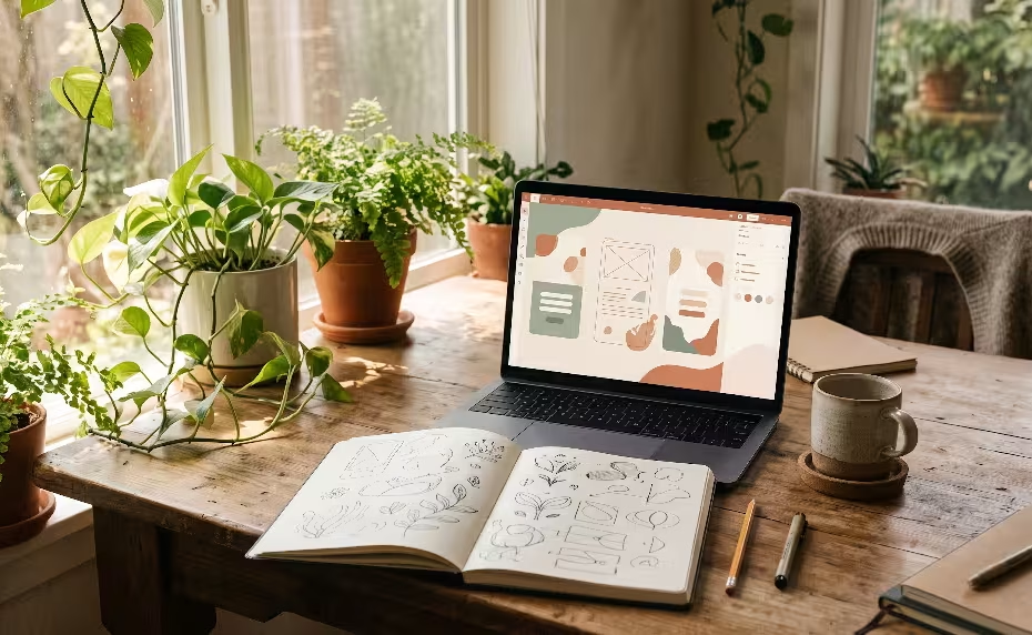
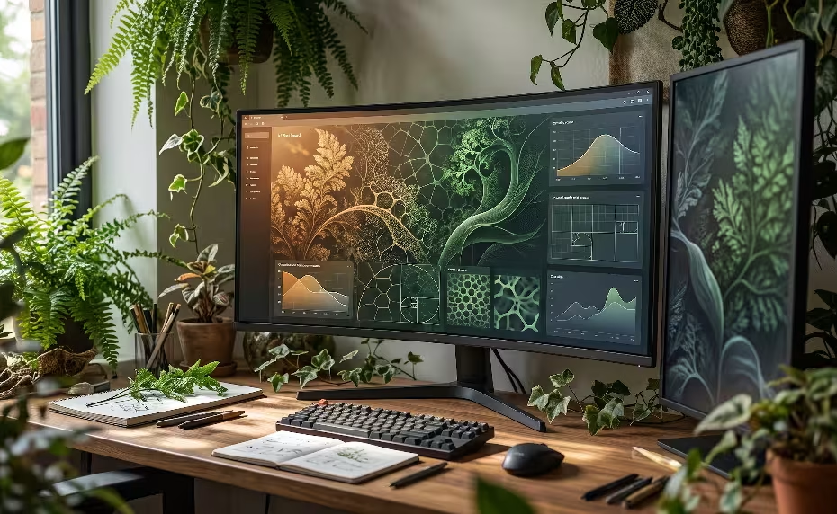
Hygge in digital product design on a laptop.

Designing for Calm: The Complete Guide to Hygge in Digital Product Design

Discover how applying hygge in digital product design transforms high-friction, attention-extractive interfaces into restorative digital sanctuaries. This architectural guide details ten criteria—spanning circadian color temperatures, natural kinetic spring physics, analog tactile feedback, and WCAG 2.2 AA compliance—to eliminate cognitive fatigue… Read More »Designing for Calm: The Complete Guide to Hygge in Digital Product Design

An asymmetric hero on a website.

Asymmetric Hero Section Optimization: The Complete Guide to Engineering Balance, Speed, and Conversions

Move past rigid 50/50 split screens with asymmetric hero section optimization. This engineering and UX guide examines how dynamic counterweights, negative space, and biophilic proportions guide user gaze without sacrificing Core Web Vitals. Learn how to implement responsive CSS Grid… Read More »Asymmetric Hero Section Optimization: The Complete Guide to Engineering Balance, Speed, and Conversions

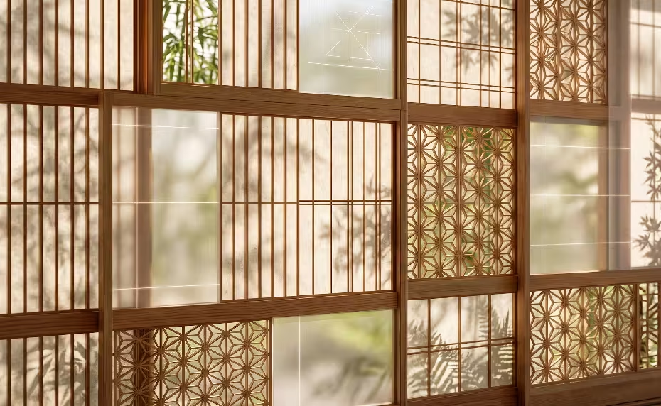
A shoji-inspired screen wall.

An Easy Guide to Shoji-Inspired Screen Grid Systems: Modular Harmony in Modern Digital Architecture

Explore how shoji-inspired screen grid systems solve digital visual fatigue by bridging traditional Japanese timber framing with modern CSS Grid and subgrid engineering. Learn how modular Ken ratios, washi-inspired light diffusion, and biophilic negative space translate into high-performance, WCAG-compliant responsive… Read More »An Easy Guide to Shoji-Inspired Screen Grid Systems: Modular Harmony in Modern Digital Architecture

The owner of this website has made a commitment to accessibility and inclusion, please report any problems that you encounter using the contact form on this website. This site uses the WP ADA Compliance Check plugin to enhance accessibility.