
Table of Contents
The modern computer screen often feels like a crowded room. Websites bombard our eyes with sharp neon colors, aggressive popups, heavy borders, and endless clutter. As digital workers and internet readers, we stare at glowing glass panels for eight to ten hours every day. This causes mental exhaustion, headaches, and eye fatigue. When we look at standard digital design systems today, we see an endless sea of rigid boxes that trap information rather than let it breathe.
To fix this digital fatigue, we can turn to the wisdom of traditional Japanese architecture. Centuries ago, builders solved the challenge of dividing indoor living space while maintaining a warm connection to the living world outside. They did this through the use of delicate, movable sliding partitions made of wood and paper. By translating these physical structures into web engineering, we discover the shoji-inspired screen.
A shoji-inspired screen brings peace, structural order, and soft filtered light into our digital devices. When we weave nature-centered design into web grids, we create layouts that feel alive, intuitive, and restful to the human nervous system.
The Intersection of Shoin-Zukuri and CSS Grid
During the Muromachi period in Japan, a distinct style of domestic architecture emerged called Shoin-zukuri. This architectural style was developed for the homes of the military elite, Buddhist monks, and scholars who required spaces for quiet study, deep contemplation, and structured meetings. Before this period, walls inside dwellings were mostly static, heavy, and dark. Shoin-zukuri changed human dwellings by introducing flexible interior partitions, elevated desks placed beside sunlit openings, and modular floor mats woven from natural rushes.
The structural foundation of this historic movement relied on light structural posts and sliding screen frames. Instead of permanent, load-bearing interior stone or plaster walls, rooms were formed by sliding wooden partitions along carved floor tracks. This allowed a single room to change shape depending on the time of day, the season of the year, or the number of people gathering inside.
In our modern digital space, the web browser operates under similar rules. A website is not a static piece of paper printed on a printing press. A website is viewed on mobile smartphones, small tablets, desktop monitors, and massive television displays. This shifting screen environment requires a flexible architectural foundation.
CSS Grid is the modern web language that allows us to build these flexible structures. For years, web builders used crude tools like HTML tables and floating layout hacks to push content into place. These early tools were brittle and snapped whenever a screen changed size.
When we look closely at CSS Grid, its underlying mathematical logic matches the wooden joinery of Shoin-zukuri. CSS Grid allows us to declare rows and columns, set boundaries, define gutters, and let layout areas stretch and collapse. When we build a digital layout modeled after traditional Japanese timber framing, we are building a digital shoji-inspired screen.
The structural wooden posts correspond to our primary grid tracks. The empty spaces between posts correspond to our grid cells. By uniting historical carpentry concepts with CSS Grid declarations, we produce digital surfaces that adapt effortlessly to any viewing device while retaining timeless human proportions.
Definition of a Shoji-Inspired Screen in Digital Spaces
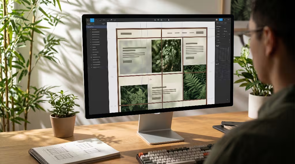
What exactly makes a website layout qualify as a shoji-inspired screen? It is not simply pasting a picture of cherry blossoms in the background or using an Asian-styled decorative font. Superficial decorations are not true design. True design is structural, functional, and psychological.
At its core, a shoji-inspired screen in user interface design is a system of modular spatial units bounded by structural framing lines and filled with soft, translucent visual surfaces. The classic traditional room panel consists of an outer rectangular wooden frame, an interior lattice of thin wooden ribs, and a backing sheet of handmade mulberry paper.
In the digital world, this translates into three specific design rules:
First, the structural boundary must be clear yet unobtrusive. In standard web layouts, containers often hide their borders entirely, relying on fuzzy drop shadows to create the illusion of floating cards. A shoji-inspired screen does the opposite. It celebrates the grid lines. It uses thin, quiet borders that mimic the delicate wooden joinery of the carpenter. These dividing lines give the eye an easy path to follow, which reduces cognitive strain.
Second, the interior surface of each cell must act like paper, not plastic. When you look at an authentic Japanese room divider, the paper surface does not reflect harsh glare like a mirror. Instead, it catches sunlight and scatters it evenly in every direction. In our digital layouts, panels avoid harsh white backgrounds or pitch-black blocks. Instead, we use semi-translucent surface treatments, subtle organic textures, and soft color tones that absorb harsh digital light.
Third, the entire structure must honor the relationship between the structural frame and empty space. In traditional Japanese aesthetics, this empty space is referred to as Ma. Ma is not empty void; it is pregnant silence that gives meaning to the objects around it. A shoji-inspired screen treats negative space on a screen as an active design element. The blank areas between paragraphs, images, and buttons are deliberately measured and proportioned. This balance of clean lines, filtered light surfaces, and thoughtful empty spaces creates a tranquil viewing experience for every visitor.
The Biophilic Axis: Natural Analogs and Diffused Visual Boundaries
Biophilic design is the practice of connecting people to nature within human-made environments. As a biologist and computer scientist, I study how human nervous systems respond to sensory inputs. For hundreds of thousands of years, humans evolved in wild outdoor landscapes under open skies, moving among trees, meadows, and rivers. Our optical systems were never built to stare directly into pinpoint artificial light bulbs or high-intensity glowing screens.
When you sit outdoors in a forest, the sunlight does not strike your retina as a harsh, unyielding glare. The sunlight filters through the layered canopy of oak, pine, and birch trees. The leaves break up the intense rays, scattering soft light down through the branches. Biologists call this dappled illumination. Looking at dappled light calms the amygdala in the brain, lowers heart rate variability, and reduces the stress hormone cortisol.
The physical room divider was designed specifically to recreate this natural phenomenon indoors. Made from the fibrous inner bark of the paper mulberry shrub, the translucent paper sheet contains thousands of tiny, interwoven plant fibers. When raw sunlight strikes the outside of the panel, the light rays bounce off these irregular botanical strands. The light that emerges inside the room is uniform, warm, and gentle.
When we create a digital shoji-inspired screen, we are applying these same biophilic principles to computer code. By using diffused visual borders, subtle gradients, and soft layered backgrounds, we soften the harsh direct light coming from the light-emitting diodes behind the glass screen.
Human vision also possesses specialized edge-detection neurons inside the visual cortex. Sharp, artificial, high-contrast borders force these neurons to work overtime, scanning back and forth to interpret where one object ends and another begins. The soft boundaries of a shoji-inspired screen provide enough contrast for clear navigation while easing visual strain. By mimicking the way light filters through plant cell walls, we transform the browser into an organic environment that comforts the user.
Wood to Code Mapping: Outer Frames, Subgrids, and Lattice Ribs
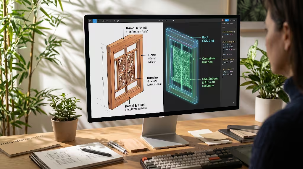
To build a reliable shoji-inspired screen in production software, we must translate physical carpentry terms into browser engineering concepts. Traditional master carpenters understood that a screen frame must be lightweight, perfectly square, and capable of withstanding physical stress without twisting or warping.
In Japanese timber construction, the master structural elements are the vertical posts and horizontal guide rails known as the Kamoi at the top and the Shikii at the bottom. These wooden tracks guide the sliding movement of the screens. Inside this primary structural perimeter sits the delicate lattice assembly, known as Kumiko.
Here is how we map these physical wood components directly into modern CSS code:
[Physical Timber Construction]       [Modern CSS Grid Architecture]
Outer Framework (Kamoi & Shikii)  ->  Root CSS Grid Container
Outer Screen Stile (Hone)         ->  CSS Container Queries & Direct Children
Internal Lattice Ribs (Kumiko)    ->  CSS Subgrid & auto-fit Column Tracks
Paper Infill (Washi)              ->  Translucent UI Panel Surfaces
The outer framing of the shoji-inspired screen corresponds to the root grid container in CSS. We establish this root container using explicit CSS Grid properties:
CSS
.shoji-viewport-system {
  display: grid;
  grid-template-columns: repeat(12, minmax(0, 1fr));
  grid-template-rows: auto;
  gap: 1.5rem;
  padding: 2rem;
  box-sizing: border-box;
}
However, real Japanese screens are not simply collections of disconnected outer boxes. The interior wooden ribs inside each sliding door must align across multiple panels. If the horizontal ribs on one sliding door fail to line up with the horizontal ribs on the door next to it, the room loses visual unity and looks broken.
In frontend web development, this alignment challenge was difficult to solve for decades because nesting a child grid inside a parent container broke the connection to the parent grid lines. With the arrival of modern CSS Subgrid, this problem is solved.
By applying grid-template-columns: subgrid to our nested UI cards, each individual shoji-inspired screen inherits the exact column positions and gutter gaps of the master layout. The result is visual consistency across the entire web page. The lattice lines of individual content cards lock into alignment across different rows, giving the user interface the solid, handcrafted balance of a master-built tea pavilion.
Geometric Dialects: Mizugoshi Shoji and Balanced Wireframes
Within traditional Japanese woodwork, carpenters do not use one single lattice design for every room. They choose different lattice styles depending on how much light, privacy, or airflow is needed. In web design, we can use these different patterns to match different content types.
The most common and classic lattice style is called Mizugoshi Shoji. In this design, the vertical and horizontal wooden ribs cross each other at regular, evenly spaced intervals, creating clean rows of vertical rectangles. The vertical wooden ribs run uninterrupted from the very top of the frame to the bottom, while the horizontal ribs pass through them.
In digital design, Mizugoshi Shoji serves as the baseline blueprint for standard wireframes, content feeds, and documentation portals. The steady, regular spacing of this shoji-inspired screen communicates stability, logic, and quiet confidence.
When translating Mizugoshi Shoji into web architecture, we avoid square grid cells. In traditional Japanese joinery, lattice cells are almost always taller than they are wide. A vertical rectangle carries an upward visual energy that mirrors tree trunks and tall bamboo stalks. In our web layouts, we configure our grid cells to respect an upright aspect ratio:
- Content preview blocks feature a consistent three-to-four or two-to-three vertical aspect ratio.
- Typography lines are grouped inside vertical reading bays that keep line lengths comfortable for reading.
- Navigation menus sit within slender vertical columns that mirror the outer stiles of a sliding screen.
When a visitor lands on a web page built with a Mizugoshi shoji-inspired screen, they do not feel disoriented. The eye flows easily from the top left corner down through the vertical channels. The content feels balanced, neatly filed, and uncluttered. It offers an antidote to the chaotic card walls found across modern news and social media feeds.
Geometric Dialects: Asanoha Fractal Patterns for Dense Hero Sections
While the simple rectangular grid of Mizugoshi Shoji works well for long reading sections, digital products also need areas that capture attention, celebrate brand personality, and present complex information cleanly. For these prominent areas, we look to a more intricate lattice style: Asanoha.
The Asanoha pattern is a geometric lattice based on the natural form of the six-pointed hemp leaf. In Japanese culture, hemp represents rapid growth, resilience, and vitality. To create this pattern, the carpenter begins with a standard triangular wooden frame. Then, using small wooden pieces cut at precise angles, the woodworker nests smaller triangles inside the larger frame without using a single nail or dab of glue.
This nesting behavior is an example of fractal geometry. A fractal is a complex geometric pattern where each individual part has the same character as the whole. We see fractals everywhere in nature: in Romanesco broccoli, fern fronds, snowflake crystals, and river deltas. The human brain recognizes fractals instantly and finds them satisfying to look at.
When we build a website hero section or an analytical dashboard, we can apply an Asanoha-patterned shoji-inspired screen. Instead of using flat, boring rectangles, we group modular panels into interconnected clusters:
+-------------------------------------------------------+
|  Asanoha-Inspired Digital Dashboard Layout            |
+---------------------------+---------------------------+
|                           | [Small Metric Box A]      |
|                           +---------------------------+
|                           | [Small Metric Box B]      |
| [Main Data Viewport]      +---------------------------+
|                           | [Small Metric Box C]      |
|                           +---------------------------+
|                           | [Small Metric Box D]      |
+---------------------------+---------------------------+
| [Full-Width Ambient Status Bar]                       |
+-------------------------------------------------------+
Notice how the smaller panels connect directly to the larger frame. In a traditional software interface, putting six metrics and a large chart together creates visual chaos. But when arranged through an Asanoha-inspired lattice system, the visual weight distributes evenly.
The smaller information panels act like the nested interior ribs of the lattice, leaning against the stronger structural frame of the main viewport. By using this geometric approach, we present dense data without overwhelming our users.
Geometric Dialects: Yukimi Shoji for Asymmetric Master-Detail Views
Another practical Japanese screen style is Yukimi Shoji, which translates to snow-watching screens. These ingenious partitions were designed for cold winter months in regions of Japan that receive heavy snowfall.
A traditional Yukimi screen is divided horizontally into two sections. The upper section contains the standard wooden lattice covered in translucent white paper. But the lower section contains a pane of clear glass behind an interior sliding wooden panel. On a snowy afternoon, a homeowner can slide the lower wooden panel upward. This reveals the clear glass window, allowing them to sit on warm tatami mats and watch the snowflakes fall outside, while the upper paper section continues to soften incoming daylight and block chilly drafts.
The Yukimi style offers a masterclass in functional asymmetry. It shows us that a single panel can serve two completely different visual purposes at the same time: one area offers a clear, high-definition view, while the other provides a diffused, protected background.
In user interface design, we can translate this concept into master-detail views, product customization interfaces, and interactive software dashboards. A Yukimi-style shoji-inspired screen splits the browser viewport into two balanced zones:
- The Transparent Observation Bay: This area behaves like the clear glass section of the Yukimi screen. It holds high-contrast, interactive content: rich photography, interactive three-dimensional models, map viewports, or live code terminals.
- The Translucent Context Panel: This area behaves like the paper lattice section. It holds supporting data, navigational menus, documentation text, and configuration controls. It uses soft colors, gentle borders, and muted typography.
By placing these two sections side by side within a single shoji-inspired screen frame, we eliminate visual competition. The eye knows where to focus because the interactive visual element sits cleanly inside its clear window, while the surrounding administrative controls rest quietly in their paper-like panels. This layout pattern brings calm clarity to complicated professional software tools.
The Physics of Light: Translating Washi Paper to Digital Surfaces

To build a convincing digital shoji-inspired screen, we must study the physics of the paper that covers the frame. Authentic Washi paper is made from the long fibers of the Kozo, Mitsumata, or Gampi plants. These natural bark fibers are washed in cold mountain river water, beaten with wooden mallets, and suspended in a vat of water along with a plant mucilage called Neri. When the papermaker lifts the screen out of the vat, the fibers interlock in irregular, natural layers.
When direct sunlight hits a sheet of Washi, the light encounters these intertwined plant fibers. Some of the light reflects off the top layer. Some light penetrates deeper and bounces around inside the fiber web before emerging on the other side. This internal bouncing scatters the light evenly in every direction. The paper acts as a visual filter, converting sharp, harsh light into an ambient, room-filling glow.
Modern web browsers give us the tools to simulate this light-filtering behavior using CSS. For years, web designers relied on flat, opaque color fills like #FFFFFF for white and #000000 for black. These flat fills look artificial and sterile. They lack the depth and warmth of physical matter.
To capture the feeling of paper in a shoji-inspired screen, we combine several modern CSS properties:
CSS
.shoji-paper-panel {
  background-color: hsla(45, 20%, 98%, 0.82);
  backdrop-filter: blur(16px) saturate(110%);
  border: 1px solid hsla(30, 15%, 80%, 0.65);
  box-shadow: inset 0 0 40px rgba(240, 235, 220, 0.4);
}
Let us examine what each line achieves in our shoji-inspired screen:
- Warm Color Values: Instead of stark, clinical whites, we select warm hues inspired by unbleached plant bark, warm cream, and pale straw.
- Alpha Channel Transparency: By setting the background color transparency to roughly eighty percent, we allow faint shapes from lower layers to show through, hinting at depth beneath the surface.
- Backdrop Blur: The
backdrop-filter: blur(16px)property scatters the background colors passing through the panel, directly imitating the way natural plant fibers diffuse sunlight. - Inner Shadow Inset: The faint inner shadow adds a gentle gradient near the wooden framing ribs, mimicking the natural falloff of ambient light inside a framed screen.
When a user scrolls content beneath a shoji-inspired screen built this way, the underlying images blur into soft washes of color. This prevents visual distraction while providing a warm, grounded visual anchor.
Circadian Rhythm Integration: Dynamic Lighting and Color Shifts
In traditional Japanese living, indoor lighting changed naturally with the sun. At dawn, a room wrapped in shoji screens filled with pale, cool blue light. By midday, the paper glowed bright and white. As the sun set, the panels warmed to deep amber and golden yellow. At night, candlelight cast soft silhouettes against the paper lattice. The indoor space stayed in harmony with the natural rhythms of the Earth.
Modern computer screens, however, often blast our eyes with intense blue light at eleven o’clock at night. This unnatural blue light tricks the human brain into thinking it is standing in midday sun. It suppresses the natural production of melatonin, ruins sleep quality, and strains the eye muscles.
A truly biophilic shoji-inspired screen can respond dynamically to the user’s local solar cycle. Using client-side JavaScript, we can check the time of day and adjust CSS custom properties across the entire layout system.
[Time of Day]   [Solar Angle]      [Shoji Grid Tone]        [Luminance]
Dawn            Low Horizon        Pale Lavender & Rose     Gentle / Soft
Midday          Zenith Overhead    Warm Clean Sandstone     Crisp / Diffused
Dusk            Golden Hour        Deep Amber & Ochre       Warm / Muted
Night           Nocturnal          Charcoal Ink & Tea Washes Low Glare
We can define these ambient lighting shifts using CSS variables embedded within our shoji-inspired screen:
CSS
:root {
  --shoji-frame-tone: #3b2f2f;
  --shoji-paper-tone: hsla(42, 25%, 97%, 0.88);
  --shoji-ambient-glow: rgba(255, 248, 230, 0.4);
  --shoji-text-main: #1c1917;
}

[data-solar-cycle="dusk"] {
  --shoji-frame-tone: #261d1d;
  --shoji-paper-tone: hsla(32, 35%, 92%, 0.85);
  --shoji-ambient-glow: rgba(255, 180, 100, 0.25);
  --shoji-text-main: #201a18;
}

[data-solar-cycle="night"] {
  --shoji-frame-tone: #181515;
  --shoji-paper-tone: hsla(30, 8%, 14%, 0.90);
  --shoji-ambient-glow: rgba(200, 140, 70, 0.08);
  --shoji-text-main: #e6e0d8;
}
By connecting our shoji-inspired screen to the user’s natural daily cycle, the website shifts from an aggressive light cannon into a living digital surface. It supports the natural biorhythms of the human body, turning the computer monitor into a peaceful window to the day outside.
Modular Scale and Spatial Ratios: The Ken and Tatami Proportions
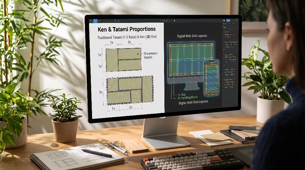
In Western architecture, measurements were historically based on the human foot or abstract decimal numbers. But in traditional Japanese architecture, buildings were designed around an organic spatial module called the Ken.
The Ken was originally based on the distance between two structural pillars in a wooden house, usually measuring roughly six Japanese feet (about 1.81 meters). Everything inside the home was proportioned using this base unit. Tatami floor mats were made to a one-to-two ratio, where the width was exactly half the length. Shoji screens were sized to slide within the tracks established by this Ken module.
Because every door, window, mat, and wall shared the same underlying mathematical ratio, Japanese rooms felt balanced and calm. You could rearrange sliding doors and swap floor mats without breaking the visual harmony of the home.
In modern web design, we often pick layout measurements at random. A developer might put twenty pixels of margin on one card, thirty pixels on another, and fifteen pixels on a button. This creates subtle visual disharmony that confuses the brain.
When building a shoji-inspired screen, we replace random spacing with a strict modular ratio based on traditional Japanese dimensions:
[Classic Tatami Ratio: 1 to 2 Proportion]
+---------------------------------------+
|                                       |
|               Width (1)               |
|                                       |
+-------------------+-------------------+
|                   |                   |
|    Length (1)     |    Length (1)     |
|                   |                   |
+-------------------+-------------------+
|      Total Combined Length: 2         |
+---------------------------------------+
We can implement these proportional rules directly in our web styling sheets:
CSS
:root {
  --shoji-ken-unit: clamp(1rem, 2.5vw, 2rem);
  --shoji-ratio-minor: calc(var(--shoji-ken-unit) * 1);
  --shoji-ratio-major: calc(var(--shoji-ken-unit) * 2);
  --shoji-ratio-expanded: calc(var(--shoji-ken-unit) * 3);
}

.shoji-grid-card {
  padding: var(--shoji-ratio-minor);
  gap: var(--shoji-ratio-major);
  border-radius: 2px;
}
By basing all margins, paddings, and column widths on this unified scale, every element in the shoji-inspired screen feels intentional. The spacing between headings matches the proportions of the structural frames, and the white space around paragraphs mirrors the margins of the tatami floor plan. This architectural discipline produces a calm rhythm that users feel immediately, even if they cannot name the math behind it.
CSS Grid Implementation: Semantic HTML and Lattice Alignment
Now, let us examine the practical frontend implementation of a shoji-inspired screen. A clean visual design is useless if the underlying code is messy, slow, or broken. To ensure our system is fast, responsive, and easy to maintain, we rely on semantic HTML5 tags and clean CSS Grid declarations.
We begin with an accessible HTML structure that mirrors the parts of a physical Japanese building:
HTML
<main class="shoji-structure">
  <header class="shoji-transom-ranma">
    <h1>Natural System Engineering</h1>
    <nav class="shoji-nav-lattice">
      <a href="#biology">Biology</a>
      <a href="#systems">Systems</a>
      <a href="#botany">Botany</a>
    </nav>
  </header>

  <section class="shoji-sliding-bay">
    <article class="shoji-screen-card">
      <div class="shoji-paper-content">
        <h2>Cellular Structures</h2>
        <p>Studying plant cell walls reveals lessons for flexible architecture.</p>
      </div>
    </article>

    <article class="shoji-screen-card">
      <div class="shoji-paper-content">
        <h2>Light Diffusion</h2>
        <p>Diffused natural light reduces cognitive strain during long reading sessions.</p>
      </div>
    </article>
  </section>
</main>
Next, we establish the CSS styling that locks these panels into a clean shoji-inspired screen arrangement:
CSS
.shoji-structure {
  display: grid;
  grid-template-columns: repeat(12, 1fr);
  gap: 1rem;
  max-width: 1400px;
  margin: 0 auto;
  background-color: #f7f5f0;
}

.shoji-transom-ranma {
  grid-column: 1 / -1;
  display: flex;
  justify-content: space-between;
  align-items: center;
  border-bottom: 2px solid #5a4a42;
  padding: 1.5rem 1rem;
}

.shoji-sliding-bay {
  grid-column: 1 / -1;
  display: grid;
  grid-template-columns: repeat(auto-fit, minmax(320px, 1fr));
  gap: 1.5rem;
}

.shoji-screen-card {
  position: relative;
  border: 1.5px solid #6b584d;
  background: hsla(40, 30%, 97%, 0.85);
  backdrop-filter: blur(12px);
  padding: 2rem;
  box-shadow: 0 4px 12px rgba(60, 45, 30, 0.05);
}

.shoji-screen-card::before {
  content: "";
  position: absolute;
  top: 4px;
  left: 4px;
  right: 4px;
  bottom: 4px;
  border: 1px solid rgba(107, 88, 77, 0.2);
  pointer-events: none;
}
Notice the subtle detail in the .shoji-screen-card::before pseudo-element. It adds a delicate secondary inner border inset just four pixels from the outer edge. In traditional joinery, the outer wooden stile is cut with a tiny decorative bevel along its inner edge. Adding this second thin line in CSS honors that physical detail, giving our digital shoji-inspired screen the depth of authentic handcrafted woodwork.
Fluid Responsiveness: Sliding Panels and Mobile Collapsing
A physical screen panel moves along horizontal tracks. If a room gets crowded, you slide the doors sideways so they overlap neatly against the wall. When you need privacy, you slide them back out to close off the room.
When we adapt a shoji-inspired screen to mobile devices, we must preserve this feeling of sliding movement. A common mistake in responsive web design is taking desktop content and simply stacking it into an endless vertical column on mobile phones. This turns an elegant layout into a dull, endless scroll that exhausts the thumb.
Instead of flattening the entire layout, our mobile shoji-inspired screen preserves horizontal sliding behaviors using CSS scroll-snap modules:
CSS
@media (max-width: 768px) {
  .shoji-sliding-bay {
    display: flex;
    overflow-x: auto;
    scroll-snap-type: x mandatory;
    gap: 1rem;
    padding-bottom: 1.5rem;
    -webkit-overflow-scrolling: touch;
  }

  .shoji-screen-card {
    flex: 0 0 85%;
    scroll-snap-align: center;
    border-width: 1px;
  }
}
On a mobile smartphone, this code transforms the desktop multi-column view into a series of overlapping sliding panels. As the user swipes their finger, each shoji-inspired screen glides smoothly across the screen, snapping neatly into the center of the display.
The user feels the tactile motion of a physical partition sliding along its wooden track. We retain the spatial rhythm of the desktop experience while respecting the physical limits of the smaller glass screen.
Biophilic Usability, Accessibility, and Cognitive Load
Every design choice carries a biological cost. Whenever a person sits in front of a website, their visual cortex, frontal lobe, and motor systems burn glucose to process information. When interfaces are messy, chaotic, and poorly structured, users experience cognitive fatigue.
Let us explore how a shoji-inspired screen reduces mental strain while maintaining high usability standards:
[Design Dimension]        [Standard Corporate Layout]      [Shoji-Inspired Screen Layout]
Border Strategy           Heavy shadows or invisible edges Clean, delicate structural framing lines
Visual Surface            Glossy white, high reflection    Diffused, paper-like matte tones
Information Flow          Scattered floating boxes         Aligned modular tracks and ratios
Biological Impact         High eye strain, mental fatigue  Calm ocular focus, reduced stress
A common concern among engineers is whether a soft, paper-like interface can pass strict web accessibility standards, such as the Web Content Accessibility Guidelines (WCAG) 2.2. Accessibility is non-negotiable; every user, including those with low vision or color blindness, must be able to read and navigate our work.
Fortunately, a shoji-inspired screen excels at meeting these standards:
First, accessibility guidelines require a contrast ratio of at least 4.5 to 1 for standard body text against its background. By choosing an unbleached rice-paper tone for the panel background (#F9F6F0) and pairing it with a rich sumi-ink tone for body typography (#1F1A17), we achieve a contrast ratio of 13.8 to 1. This comfortably exceeds even the strictest WCAG AAA level requirements, while eliminating the eye-searing glare of pure white screens.
Second, the visible lattice lines of the shoji-inspired screen provide clear visual boundaries for users with cognitive or visual impairments. Modern borderless interfaces confuse users because it is hard to tell where one button or card ends and another begins. The clean lines of the wooden framing establish distinct, predictable touch targets.
Third, we must respect users who experience motion sickness or vestibular disorders. In our sliding animations, we include the standard CSS media query:
CSS
@media (prefers-reduced-motion: reduce) {
  .shoji-screen-card,
  .shoji-sliding-bay {
    transition: none;
    scroll-behavior: auto;
    transform: none;
  }
}
By pairing biophilic principles with rigorous technical discipline, our shoji-inspired screen creates a digital home that is welcoming, calm, and fully accessible to all people.
Commonly Asked Questions about Shoji-Inspired Screen Grids
When digital agencies and frontend architects begin adopting these Japanese architectural methods, they often raise practical questions. Below are the most common inquiries regarding how to implement a shoji-inspired screen in production environments.
What is a shoji-inspired screen in digital web design?
A shoji-inspired screen in web design is a layout system that adapts the principles of traditional Japanese paper-and-wood sliding room partitions (shoji) into modern digital interfaces. It organizes visual space using structured lattice grids (kumiko), diffused semi-translucent surface backgrounds that mimic mulberry paper (washi), and intentional empty space (ma).
Unlike standard web design frameworks that rely on heavy container cards and drop shadows, a shoji-inspired screen organizes content using clear structural framing, balanced geometric modules, and soft ambient light diffusion that reduces user eye fatigue.
How do shoji grid layouts differ from the standard 12-column Bootstrap grid?
The standard 12-column grid popularized by frameworks like Bootstrap was designed primarily to divide a browser window into rigid vertical slices. It treats layout as an exercise in packing content boxes tightly onto a page. It often ignores row alignments, negative space, and visual surface textures.
In contrast, a shoji-inspired screen works in two dimensions at the same time. It uses modern CSS Subgrid and container queries to align both horizontal and vertical lines across nested cards.
Furthermore, while the 12-column system is based on arbitrary percentage math, a shoji-inspired screen uses natural modular scales, such as the Japanese Ken and Tatami ratios. This ensures that the space between elements breathes with the same visual harmony as a physical architectural pavilion.
Can a shoji-inspired screen design pass WCAG color contrast audits?
Yes, a shoji-inspired screen easily satisfies and even surpasses WCAG 2.2 AA and AAA contrast standards. While traditional Japanese screens soften physical sunlight, a digital layout controls contrast by pairing warm, muted background paper values with rich dark-ink typography.
The mistake some designers make is using faint gray text to achieve a gentle aesthetic. In an authentic shoji-inspired screen, contrast remains strong and legible. Deep charcoal, warm sumi-ink black, and rich walnut tones provide crisp readability against cream, sand, and unbleached paper backgrounds.
Additionally, the structural lattice borders provide clear visual indicators for interactive areas, helping users with low vision navigate the interface with confidence.
What are the best CSS properties to create the appearance of authentic Washi paper?
To reproduce the warm, light-filtering surface of authentic Washi paper without slowing down page load speeds with heavy image files, rely on modern CSS compositing features:
- Use
backdrop-filter: blur(12px) saturate(105%)to scatter colors beneath the panel, simulating the internal light bounce of mulberry plant fibers. - Use
background-colordeclared with translucent HSL or OKLCH values, such ashsla(40, 20%, 97%, 0.85). This creates a warm, natural paper tone while letting blurred light pass through from behind. - Add an inset box-shadow, such as
box-shadow: inset 0 0 30px rgba(220, 210, 190, 0.35), to reproduce the gentle falloff of light that occurs where paper meets a wooden frame. - Apply a lightweight SVG noise filter as a subtle background pattern. This adds the delicate, organic texture of real plant fibers without increasing page weight.
Architectural Synthesis: Building Digital Sanctuaries
We spend more of our waking lives inside web browsers and digital software than we do inside our physical living rooms. The software tools we use every day shape our emotions, our attention spans, and our physical health. When we surround ourselves with noisy, high-glare interfaces, our nervous systems remain in a state of low-grade, perpetual stress.
As software designers, web engineers, and digital architects, our job is not merely to capture user attention or pack screens with information. Our higher calling is to build digital spaces that respect the human mind and body.
By looking back to the time-tested wisdom of Shoin-zukuri carpentry and bringing it forward with modern CSS Grid engineering, we can replace digital noise with architectural serenity. The shoji-inspired screen offers a clear path forward. It gives us a framework where structure and space live in balance, where light is softened instead of weaponized, and where technology honors the natural world.
When we build a user interface as a shoji-inspired screen, we build a quiet digital sanctuary. We create digital environments where people can read with focus, work without exhaustion, and experience the timeless peace of a sunlit room crafted from wood and paper.