Skip to content

Biophilic Typography & Fonts

Biophilic Typography & Fonts posts.

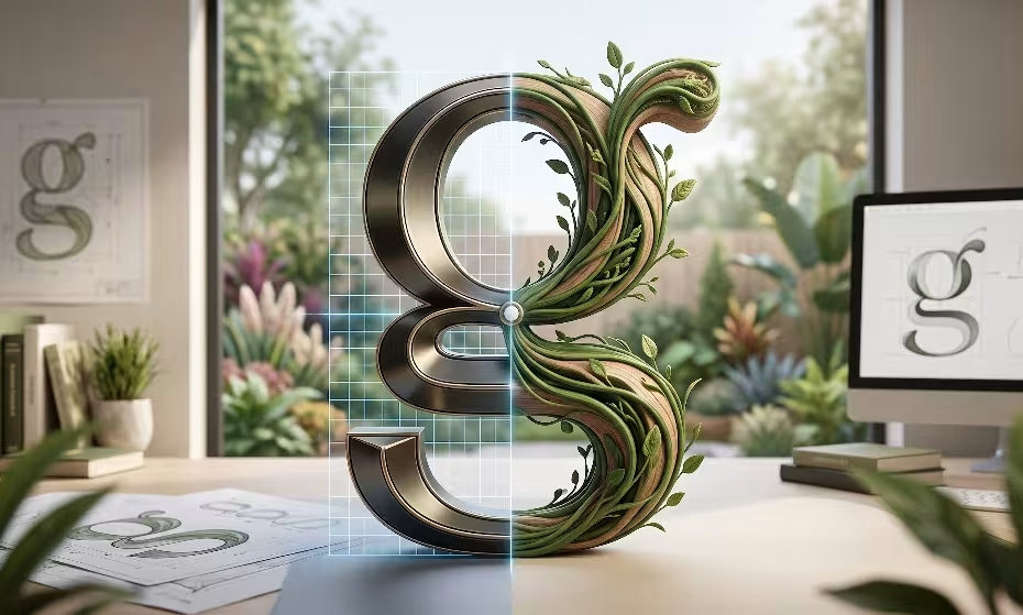
Biomorphic typography.

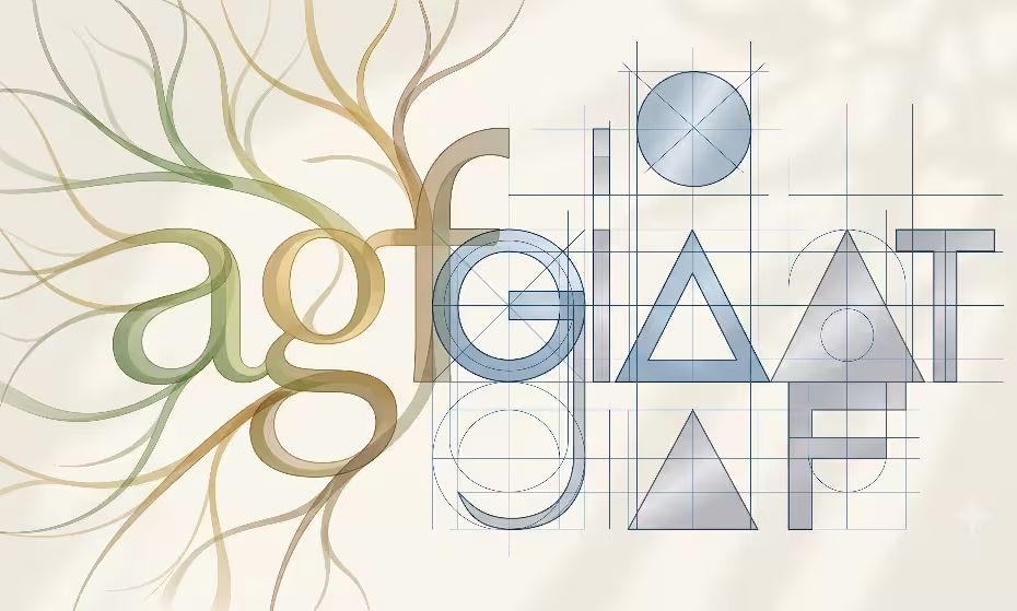
Biomorphic Typography vs Geometric Sans Serif Readability – An Easy UX Guide

An analytical comparison evaluating biomorphic typography vs geometric sans serif readability in digital user experience. Explore how nature-inspired letterforms reduce cognitive load, optimize saccadic eye movements, and mitigate screen-induced visual fatigue compared to rigid Euclidean typefaces in modern web design… Read More »Biomorphic Typography vs Geometric Sans Serif Readability – An Easy UX Guide

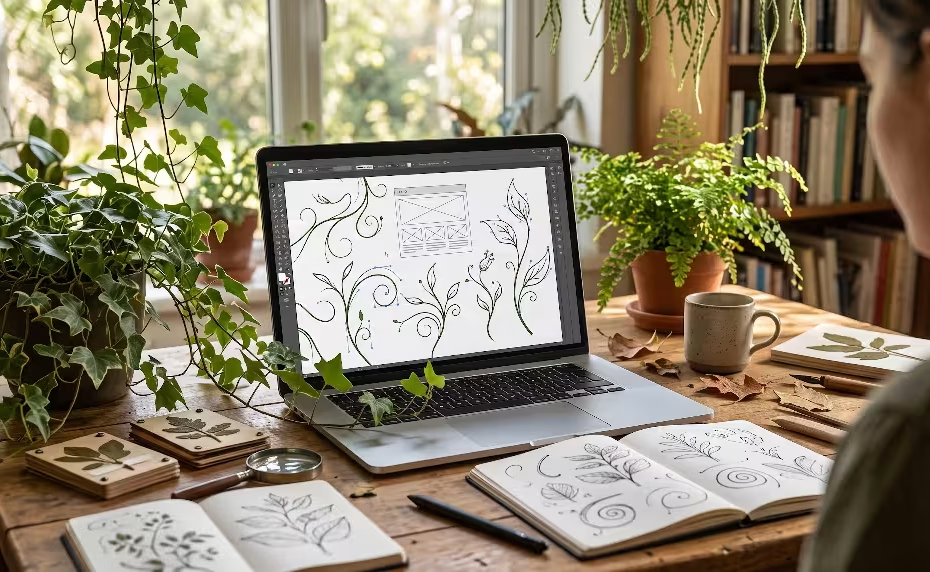
A laptop with light typography techniques for web readability on it.

Light Typography Techniques for Web Readability: Balancing Fabulous Aesthetics and Accessibility

The Weight of “Lightness” Imagine walking through a dense forest at noon. The sun does not hit the ground in a solid block of white; it filters through the canopy, creating dappled patterns of light and shadow. It is beautiful,… Read More »Light Typography Techniques for Web Readability: Balancing Fabulous Aesthetics and Accessibility

The owner of this website has made a commitment to accessibility and inclusion, please report any problems that you encounter using the contact form on this website. This site uses the WP ADA Compliance Check plugin to enhance accessibility.