
Table of Contents
When we look at the physical world around us, nature rarely creates perfectly straight lines. Trees bend toward the sunlight in gentle arcs. Riverbeds carve soft paths through canyons. Shells grow along mathematical spirals that expand in smooth proportion. These shapes represent natural curves that human eyes have evolved to process effortlessly over millions of years. In our built environments, incorporating these organic shapes creates a proven calming effect, reducing stress and restoring mental focus. When we bring these principles into digital design, we create what is known as biophilic web architecture.
However, translating natural curves onto computer displays introduces an immediate technical challenge. Digital screens are rigid grids of square pixels. For decades, computer typography favored rigid, geometric letterforms because straight lines and simple circles were easy for low resolution monitors to display. When traditional fonts tried to use expressive natural curves, the delicate arches and botanical flourishes often broke down into blurry, jagged pixels at small sizes. This visual noise forces the human brain to work harder just to recognize each letter, turning what should be a soothing visual experience into mental fatigue.
The central problem of organic digital typography is finding the balance between organic beauty and clear reading comfort. Web designers want to use natural curves to create warmth, identity, and visual connection. At the same time, users need to read body copy, articles, and interface text quickly and without eye strain. If natural curves are too exaggerated in small paragraph text, the loops inside letters fill in, the stems run together, and reading speed drops. If natural curves are removed entirely, the website loses its organic character and feels sterile.
The answer to this challenge lies in the modern technology of OpenType variable fonts. Unlike static font files that force a single fixed shape across every screen size, variable fonts allow letterforms to adapt dynamically. By using mathematical axes of variation, a variable font can showcase sweeping natural curves in large headlines where detail thrives, while gently simplifying those same natural curves in small body text to protect legibility.
By applying the combined insights of plant biology, architectural geometry, and computer science, we can create digital reading environments that feel both organic and effortless to read. Mastering how to balance natural curves and readability in variable fonts allows digital designers to honor the beauty of the living world while delivering exceptional reading ergonomics on every screen.
Typographic Physics: Legibility vs. Readability in Curvilinear Letterforms
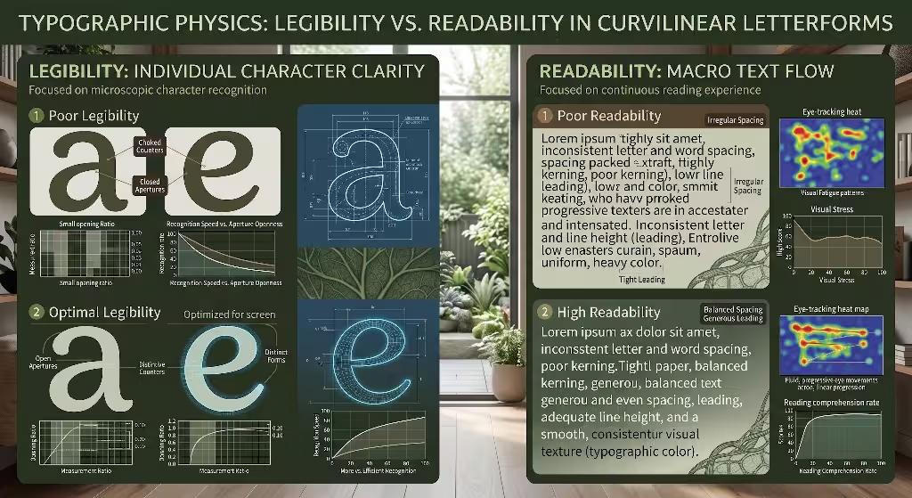
To understand how natural curves behave on digital screens, we must first separate two fundamental concepts in typography: legibility and readability. While these words are often used interchangeably, they describe completely different aspects of the reading experience. Legibility refers to how easily a reader can distinguish one individual letter from another. Readability refers to how easily and comfortably a reader can process entire sentences, paragraphs, and pages of continuous text.
+-------------------------------------------------------------------------+
|                          TYPOGRAPHIC ERGONOMICS                         |
+------------------------------------+------------------------------------+
|             LEGIBILITY             |            READABILITY             |
|   (Micro-Typographic Recognition)  |    (Macro-Typographic Text Flow)   |
+------------------------------------+------------------------------------+
| * Distinguishing individual glyphs | * Eye movement across paragraphs   |
| * Open aperture ratios (c, e, a)   | * Horizontal rhythm & letter space |
| * Distinct terminal treatments     | * Uniform typographic color/weight |
| * Internal counter volume stability| * Prevention of ink trap dark spots|
+------------------------------------+------------------------------------+
Legibility happens at the micro level of character recognition. When your eye lands on a letter, your visual cortex scans for key distinguishing features. In letterforms inspired by botanical structures, natural curves form the basis of every contour. For example, consider the lowercase letters c, e, a, and s. In a standard geometric font, these letters are formed by rigid circular arcs. In an organic typeface, these letters are shaped by natural curves that mimic vine growth, leaf margins, or logarithmic spirals.
If the natural curves in these letters curl too tightly inward, the openings of the letters, known as apertures, become restricted. When a lowercase e has an aperture that is pinched shut by tight natural curves, the human eye easily confuses it with an o or a c at small sizes. To maintain high legibility, the designer must ensure that the natural curves maintain open apertures. The outer contour can display expressive natural curves, but the entrance to the inner white space must remain clear and unobstructed.
       POOR APERTURE                      OPTIMAL APERTURE
  (Choked by tight curve)             (Preserved for screen)

        .-------.                           .-------.
       /         \                         /         \
      |   .---.   |                       |   .---.   |
      |   |   |   |                       |   |   |
      |   `---'--'                        |   `---'---.
       \       /                           \         /
        `-----'  <-- Pinched                `-------'  <-- Open
Another crucial factor in legibility is the treatment of terminals, which are the ends of letter strokes that do not finish in a traditional serif. In nature-inspired type design, terminals often feature teardrop shapes or gentle tapers. While these botanical details add elegance, overly complex natural curves at stroke endings can create visual static. If every terminal features sweeping natural curves, the distinct silhouette of the letter is compromised. High legibility requires terminals with clean, deliberate natural curves that guide the eye without adding unnecessary decorative clutter.
Internal counter space, which is the enclosed or semi-enclosed white space inside letters like b, d, p, and q, also controls legibility. In the physical growth of plants, cellular walls maintain internal pressure to keep the plant upright. Similarly, the internal counter of a letter must maintain structural volume. When designers draw stems with expressive natural curves, the outer stroke can easily push inward, compressing the counter. When internal counters lose their consistent geometric volume, letters become harder to identify. Stabilizing the internal counter while allowing the outer stroke to express natural curves preserves both letter recognition and organic style.
Readability operates at the macro level of text flow. When reading a long article, the eye does not look at individual letters one by one. Instead, the eye makes quick jumps across the line of text, known as saccades, pausing briefly at fixation points to capture groups of words. Smooth readability depends on a steady horizontal rhythm. When words flow with even spacing, reading feels effortless.
When fonts incorporate natural curves along vertical stems and horizontal connectors, maintaining this steady rhythm requires careful management. If the natural curves of one letter bow outward while the natural curves of the adjacent letter bow inward, the space between the letters fluctuates unevenly. This irregular spacing disrupts the reader’s saccadic rhythm, forcing the brain to restart its tracking across the line. To maintain high readability, the bounding boxes and side bearings of letters with natural curves must be balanced so that word shapes remain consistent.
Another major threat to readability is the uneven distribution of visual weight, often called typographic color. In traditional calligraphy and plant forms, where two branches or strokes meet, mass naturally accumulates. If a typeface allows natural curves to create thick junctions where stems meet arches, dark spots appear across the paragraph. When viewing a block of body text, these dark clusters pull the reader’s attention away from the sentence flow. To protect readability, type designers carve out tiny optical notches, known as ink traps or light wells, where natural curves intersect. These subtle adjustments ensure that paragraphs maintain a smooth, uniform typographic tone.
What is the difference between readability and legibility in organic typography?
Legibility in organic typography measures how easily a reader can identify single characters shaped by natural curves, such as distinguishing a lowercase b from a d. It relies on clear counter shapes, open apertures, and distinctive stroke terminals. Readability measures how easily a reader can read entire paragraphs of text set with natural curves. It depends on consistent letter spacing, uniform line height, and a steady visual texture that allows the eye to glide across sentences without distraction.
OpenType Variable Mechanics: Calibrating Curvature Through Parametric Axes
The breakthrough that allows modern web typography to successfully use natural curves without harming readability is the OpenType variable font format. Introduced as part of the OpenType 1.8 specification, variable fonts replace individual, static font files with a single file that contains continuous design spaces. In a static font system, a website might load a Regular file, a Bold file, and an Italic file. In a variable font, a single file contains mathematical master outlines, allowing the browser to interpolate and render any intermediate variation along defined parametric axes.
+-------------------------------------------------------------------------+
|                  OPENTYPE VARIABLE INTERPOLATION SPACE                  |
+-------------------------------------------------------------------------+
|                                                                         |
|   Display Master (Large Size)           Body Text Master (Small Size)   |
|   ===========================           =============================   |
|   * Pronounced natural curves           * Simplified natural curves     |
|   * Tapered, delicate stems             * Sturdy vertical stems         |
|   * Expressive flourishes               * Maximized open apertures      |
|   * Continuous G2 curvature             * G1 smooth curve continuity    |
|                                                                         |
|                \                             /                          |
|                 \   Interpolation Axis      /                           |
|                  \  (e.g., opsz, CRV_)     /                            |
|                   =========================                             |
|                                                                         |
|   Result: Font smoothly adapts its natural curves at every pixel size   |
|                                                                         |
+-------------------------------------------------------------------------+
Variable fonts operate through standard registered axes and custom design axes. The standard registered axes include Weight, Width, Slant, Italic, and Optical Size. For managing natural curves, the Optical Size axis, designated in code as opsz, is the most powerful tool available. The Optical Size axis automatically adjusts the physical structure of letterforms based on the font size being displayed.
When a variable font is displayed at large sizes, such as fifty or sixty pixels in a headline, the Optical Size axis activates the display master. In this state, the letterforms can showcase rich, expressive natural curves. The strokes can exhibit delicate tapering, terminals can flare into graceful leaf shapes, and the subtle natural curves of organic geometry can be fully expressed. Because the letters are large, there are hundreds of screen pixels available to render every delicate nuance of these natural curves clearly.
When the same font is used for fourteen-pixel body copy, the Optical Size axis smoothly transitions the glyph shapes toward the text master. In the text master, the natural curves are systematically calibrated for clarity. The stems straighten slightly to align with the pixel grid, the open apertures expand, and the interior natural curves become more compact to protect the counter spaces. The user still perceives the warm, organic personality created by the natural curves, but the letters no longer suffer from visual crowding or blurry edges.
Beyond optical sizing, the standard Weight axis, coded as wght, and Width axis, coded as wdth, also influence how natural curves behave. When a typeface increases in weight from regular to bold, the added thickness must go somewhere. If the stroke expands inward, the natural curves of the inner bowl will crowd the counter space, reducing legibility. In a well engineered variable font, the expansion along the weight axis is programmed to push outward, preserving the internal open spaces while allowing the outer natural curves to carry the heavier stroke.
       REGULAR WEIGHT                      HEAVY WEIGHT
(Balanced internal counter)        (Outward stroke expansion)

        .--------.                         .----------.
       /   .---.  \                       /   .----.   \
      |   /     \  |                     |   /      \   |
      |  |       | |                     |  |        |  |
      |   \     /  |                     |   \      /   |
       \   `---'  /                       \   `----'   /
        `--------'                         `----------'
                                  Counter stays open; outer
                                  natural curves carry weight
Type designers can also build custom axes into variable fonts to give developers precise control over natural curves. Custom axes use four-letter tags, often written in uppercase, such as CRV_ for Curvature, NAT_ for Naturalness, or FLR_ for Flourish. A custom curvature axis allows a designer to dial the intensity of natural curves up or down independently of font size.
For instance, a website header could increase the CRV_ axis to 100 to display flowing, organic natural curves that match an illustrated botanical banner. In an informational data table on the same page, the CRV_ axis can be dialed down to 10, flattening the natural curves into structured lines that keep numeric data crisp and easy to scan.
The underlying technology that makes this smooth transformation possible is vector mathematics. Digital fonts are constructed using Bezier curves, which rely on on-curve anchor points and off-curve control handles to define the shape of a line. In nature, curves exhibit what mathematicians call G2 continuity, meaning the curvature changes smoothly and continuously without sudden shifts in radius. Mechanical drawings, by contrast, often rely on G1 continuity, where two simple arcs meet at a single tangent point.
+-------------------------------------------------------------------------+
|                      BEZIER CURVE CONTINUITY MODELS                     |
+------------------------------------+------------------------------------+
|          G1 TANGENT CURVE          |       G2 CONTINUOUS CURVE          |
|        (Mechanical Arcs)           |        (Natural Curves)            |
+------------------------------------+------------------------------------+
|  * Sudden change in curve radius   |  * Continuous rate of radius change|
|  * Visible optical seam at junction|  * Seamless organic transitions    |
|  * Simple coordinate calculations  |  * Requires precise master matching|
|  * Rigid visual appearance         |  * Mimics botanical growth patterns|
+------------------------------------+------------------------------------+
Creating natural curves with G2 continuity in variable fonts requires extreme mathematical precision. For a variable font to interpolate smoothly between masters, every single master outline must have the exact same number of points, placed in the exact same sequence. If a display master uses eight control points to form the natural curves of a lowercase g, the text master must use those same eight points, even if the shape is simplified. If the point structure fails to align, the natural curves will warp, buckle, or distort during animation and resizing. When master outlines are correctly constructed, the interpolation engine renders flawless natural curves across every screen dimension.
How does optical sizing impact character curves at small screen sizes?
Optical sizing adjusts the physical geometry of letterforms based on their rendering size. At small screen sizes, the optical size axis automatically reduces the depth of natural curves, opens character apertures, thickens thin strokes, and increases letter spacing. This structural adjustment prevents natural curves from becoming blurry or distorted on low-pixel displays, ensuring that the text remains sharp and easy to read while retaining its organic design characteristics.
Responsive CSS and Dynamic Font Rendering
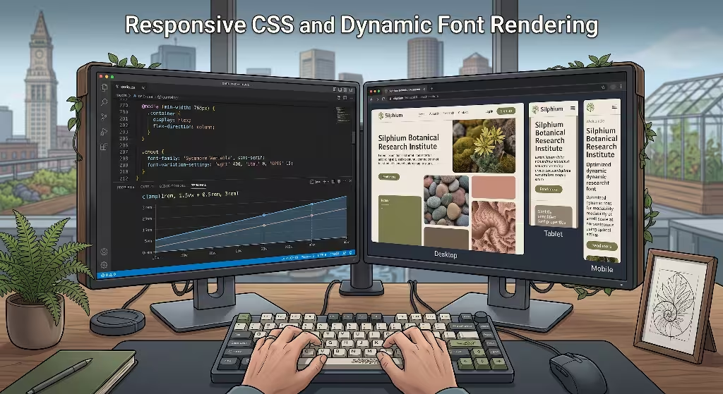
Bringing variable fonts with natural curves into modern web applications requires clean, modern CSS implementation. In the early days of web typography, controlling font variations was messy and poorly supported. Today, modern browsers provide complete support for variable font properties, allowing web developers to bind natural curves directly to responsive viewport measurements, container dimensions, and user preferences.
+-------------------------------------------------------------------------+
|                  RESPONSIVE TYPOGRAPHY ARCHITECTURE                     |
+-------------------------------------------------------------------------+
|                                                                         |
|  [ Viewport / Container ]  --->  [ CSS clamp() Function ]                |
|                                           |                             |
|                                           v                             |
|                           [ Dynamic Font Size: 1rem - 3.5rem ]          |
|                                           |                             |
|                     +---------------------+---------------------+       |
|                     |                                           |       |
|                     v                                           v       |
|       [ Small Screen (16px) ]                     [ Large Screen (56px) ]|
|       * font-optical-sizing: auto;                * opsz: 56;           |
|       * opsz: 16;                                 * CRV_: 85;           |
|       * Simplified natural curves                 * Expressive curves   |
|       * Maximum readability                       * High visual impact  |
|                                                                         |
+-------------------------------------------------------------------------+
The foundation of variable font implementation in CSS begins with the @font-face declaration. When loading a variable font containing natural curves, the developer specifies the supported ranges for each axis within the font file:
CSS
@font-face{
  font-family: 'FrauncesVariable';
  src: url('/fonts/Fraunces-Variable.woff2') format('woff2-variations');
  font-weight: 100 900;
  font-stretch: 50% 125%;
  font-style: normal;
  font-display: swap;
 }
Once the font is declared, high-level CSS properties are used to control standard axes. The standard property font-optical-sizing: auto; informs the browser to match the opsz axis value directly to the computed font-size of the element. For fine-grained control over natural curves and custom axes, developers utilize the font-variation-settings property.
To create fluid typography where font size and natural curves adjust in harmony with screen dimensions, developers combine the CSS clamp() function with variable font axes. The clamp() function takes three parameters: a minimum value, a preferred value based on viewport units, and a maximum value. This allows text to scale smoothly between mobile devices and large desktop monitors:
CSS
:root {
  /* Fluid sizing definitions */
  --body-size: clamp(1rem, 0.95rem + 0.25vw, 1.25rem);
  --h1-size: clamp(2.25rem, 1.5rem + 3.75vw, 4.5rem);
}

/* Body copy: natural curves are simplified for high readability */
p {
  font-family: 'FrauncesVariable', serif;
  font-size: var(--body-size);
  font-weight: 400;
  font-optical-sizing: auto;
  font-variation-settings: 'opsz' 16, 'SOFT' 10;
  line-height: 1.65;
  letter-spacing: -0.01em;
}

/* Headings: natural curves are fully expressed for visual warmth */
h1 {
  font-family: 'FrauncesVariable', serif;
  font-size: var(--h1-size);
  font-weight: 600;
  font-optical-sizing: auto;
  font-variation-settings: 'opsz' 72, 'SOFT' 100;
  line-height: 1.15;
  letter-spacing: -0.02em;
}
In modern component-driven websites, relying solely on viewport width (vw) can cause layout problems when components appear inside narrow sidebars or wide content columns. Modern CSS container queries solve this problem by allowing typography to respond directly to the dimensions of its parent container. This ensures that the natural curves of letterforms adapt perfectly regardless of where a component is placed on the page:
CSS
.card-container {
  container-type: inline-size;
}

.card-title {
  font-family: 'FrauncesVariable', serif;
  font-size: 1.5rem;
  font-variation-settings: 'opsz' 24, 'SOFT' 30;
}

/* When the container expands, elevate the expression of natural curves */
@container (min-width: 500px) {
  .card-title {
    font-size: 2.5rem;
    font-variation-settings: 'opsz' 48, 'SOFT' 80;
  }
}
Behind these CSS rules, the operating system and browser use specialized font rasterization engines to convert vector math into visible screen pixels. Windows uses DirectWrite, macOS and iOS rely on Core Text, and Linux and Android utilize FreeType. Each rasterizer processes the natural curves of variable fonts differently.
+-------------------------------------------------------------------------+
|                     SYSTEM RASTERIZATION ENGINES                        |
+-------------------+-----------------------------------------------------+
|      ENGINE       |                  RENDERING METHOD                   |
+-------------------+-----------------------------------------------------+
| Windows           | Uses ClearType subpixel rendering and horizontal    |
| DirectWrite       | grid alignment; needs sturdy stems on low-DPI.      |
+-------------------+-----------------------------------------------------+
| macOS / iOS       | Focuses on preserving pure typographic geometry;    |
| Core Text         | renders natural curves faithfully with anti-aliasing.|
+-------------------+-----------------------------------------------------+
| Linux / Android   | Highly configurable bytecode interpreter;           |
| FreeType          | auto-hinting smooths natural curves on mobile.      |
+-------------------+-----------------------------------------------------+
DirectWrite historically emphasizes fitting letter strokes to the physical pixel grid to keep text sharp on standard computer monitors. If a font features delicate natural curves along vertical stems, DirectWrite might snap those curves to straight vertical pixel rows, distorting the intended shape.
Core Text, by contrast, prioritizes preserving the exact design geometry of the font, relying on subpixel anti-aliasing to smooth out the edges of natural curves. FreeType offers a flexible middle ground, using auto-hinting algorithms to balance sharpness and geometric accuracy.
To ensure that natural curves render cleanly across all platforms, type designers include hinting instructions within the font file. Hinting acts as a set of rules that tells the rasterization engine how to align natural curves with the pixel grid at low resolutions. Auto-hinting programs analyze glyph outlines and insert hints automatically, but complex natural curves often benefit from manual Delta hinting.
Manual Delta hints instruct the rasterizer to widen a specific counter by half a pixel or adjust an arch stroke at twelve pixels, preventing the natural curves from blurring together on budget displays.
Can custom variable font axes affect website loading speed and Core Web Vitals?
Custom variable font axes do not slow down browser rendering speed or hurt Core Web Vitals if the font file is properly compressed and subsetted. A variable font containing multiple custom axes uses a single compact file, eliminating the need to download multiple separate static font files. This reduces the number of HTTP network requests, speeds up the Largest Contentful Paint metric, and prevents layout shifting during page loading.
Accessibility, WCAG 2.2 Compliance, and Visual Ergonomics
A website design must be accessible to everyone, including readers with low vision, color blindness, dyslexia, and cognitive processing differences. When implementing nature-inspired typography, designers must ensure that the beauty of natural curves never interferes with accessibility standards. The Web Content Accessibility Guidelines, known as WCAG 2.2, provide clear benchmarks for digital accessibility that directly affect how we use natural curves.
+-------------------------------------------------------------------------+
|                         WCAG 2.2 ERGONOMIC CRITERIA                     |
+-------------------------------------------------------------------------+
|                                                                         |
|   1. CONTRAST PRESERVATION (SC 1.4.3 & 1.4.6)                           |
|      * Minimum 4.5:1 ratio for regular text                             |
|      * Delicate natural curves require sufficient stroke weight to      |
|        prevent visual thinning on high-contrast backgrounds             |
|                                                                         |
|   2. CHARACTER AMBIGUITY ELIMINATION                                    |
|      * Distinguish mirror pairs: (b vs d), (p vs q)                     |
|      * Distinguish vertical stems: (uppercase I vs lowercase l vs 1)    |
|      * Asymmetric natural curves prevent disorientation                 |
|                                                                         |
|   3. SACCADIC READING ERGONOMICS                                        |
|      * Generous line height (1.5x - 1.75x) prevents descender clashes   |
|      * Calibrated letter spacing maintains distinct word shapes         |
|                                                                         |
+-------------------------------------------------------------------------+
One of the most important accessibility requirements is color contrast, covered under WCAG Success Criterion 1.4.3 for standard contrast and Criterion 1.4.6 for enhanced contrast. Standard body text must maintain a minimum contrast ratio of 4.5 to 1 against its background, while large text must achieve at least 3 to 1.
However, mathematical color contrast alone does not guarantee readability if the strokes forming the natural curves are too thin. When natural curves taper to ultra-fine lines, those portions of the letter can visually disappear on bright displays. This effectively breaks the letterform apart, making it fail accessibility in practice even if the color values pass automated checks.
To prevent this issue, variable fonts allow designers to increase the minimum weight of text strokes for body copy. By adjusting the weight axis slightly above regular, the fine tapers within natural curves remain solid and visible, ensuring that the full silhouette of each character maintains clear visual contrast against the background:
    POOR CONTRAST (Thin Taper)          WCAG COMPLIANT (Supported Taper)
  (Hairline curves vanish on screen)    (Solid stroke width across curve)

        .-------.                             .-------.
       /         \                           /         \
      |    .---.  \                         |   .----.  \
      |   /     \  \ <-- Hairline           |  /      \  \
      |  |       |  |    disappears         | |        |  |
      |   \     /  /                        |  \      /  /
       \   `---'  /                          \  `----'  /
        `--------'                            `--------'
Visual ergonomics also explores how human eyes physically scan lines of text. When reading continuous prose, our eyes make quick jumps across words. If letters feature extreme or erratic natural curves, the brain must spend extra cognitive energy decoding each unusual shape. This increases the duration of each fixation pause and causes readers to frequently backtrack over words they just read.
To maintain low cognitive load, natural curves in body text must remain quiet and supportive. The natural curves should establish a gentle, predictable reading cadence, reserving bold organic flourishes for large titles where the eye expects to pause and savor detail.
For readers with dyslexia and cognitive processing conditions, letterform differentiation is vital. Many traditional geometric fonts use perfectly mirrored shapes for letters, meaning a lowercase b is simply a flipped d, and a p is a flipped q. For a dyslexic reader, mirrored geometric letters can rotate and flip on the page, creating severe reading confusion.
Typefaces that incorporate natural curves naturally solve this problem. In nature, living forms exhibit subtle asymmetry. When natural curves are drawn with organic variation, a lowercase b develops distinct shoulder arches that differ completely from the bowl of a d. This inherent botanical asymmetry provides unique visual anchors for every character, helping dyslexic readers distinguish letters instantly.
   GEOMETRIC SYMMETRY (Confusing)        BIOPHILIC ASYMMETRY (Accessible)
   (Mechanical, mirrored shapes)         (Organic, unique natural curves)

         b           d                         b           d
      .-----.     .-----.                   .-----.     .-----.
      |     |     |     |                  /       \   |       \
      `-----'     `-----'                  \       /    \      /
                                            `-----'      `----'
     (Exact mirror twins cause            (Subtle natural curves create
       reading disorientation)              distinct visual identities)
Another common source of reading confusion is the distinction between an uppercase I, a lowercase l, and the numeral 1. In rigid sans serif fonts, these three characters often appear as identical vertical lines. A variable font that embraces natural curves can add a gentle botanical curve to the base of the lowercase l, include structured entry serifs on the numeral 1, and provide clear horizontal bars on the uppercase I. These subtle natural curves remove character ambiguity, ensuring that critical data, addresses, and code snippets remain accessible to all readers.
Finally, managing vertical line spacing, known as line height or leading, is essential when using fonts with natural curves. Organic typefaces often feature extended ascenders and descenders that evoke reaching branches and deep root systems. If the line height is set too tightly, the natural curves of descenders on one line will collide with the natural curves of ascenders on the line below.
To maintain WCAG compliance and avoid visual clutter, body text using natural curves should use a generous line height between 1.5 and 1.75 times the font size. This open vertical space gives the natural curves room to breathe without touching adjacent lines of text.
Performance Engineering: Core Web Vitals and Delivery
Creating a beautiful, accessible website with natural curves means little if the site takes too long to load. Web performance directly affects user experience, conversion rates, and search engine rankings. Google evaluates website performance through Core Web Vitals, which measure loading speed, visual stability, and interaction responsiveness. Incorporating variable fonts with natural curves requires smart performance engineering to ensure lightning-fast page delivery.
+-------------------------------------------------------------------------+
|                  CORE WEB VITALS OPTIMIZATION PIPELINE                  |
+-------------------------------------------------------------------------+
|                                                                         |
|  [ Full Font File (400KB+) ]                                            |
|                |                                                        |
|                v                                                        |
|  [ Glyph Subsetting (pyftsubset) ]  ---> Strips unused language tables  |
|                |                                                        |
|                v                                                        |
|  [ Axis Clamping ]                  ---> Strips unneeded custom axes    |
|                |                                                        |
|                v                                                        |
|  [ WOFF2 Brotli Compression ]       ---> Compresses to lean 35KB file   |
|                |                                                        |
|                v                                                        |
|  [ CSS Font Metric Overrides ]      ---> Eliminates Layout Shift (CLS)  |
|                                                                         |
+-------------------------------------------------------------------------+
The primary performance advantage of variable fonts is file size efficiency. In a traditional static font deployment, a website that wanted to use natural curves in headlines, medium weight subheadings, regular body copy, and bold accents had to download four to eight separate font files. Each static file required its own HTTP request, adding up to several hundred kilobytes of data transfer. A single variable font file contains all of these variations in one package, cutting total data payloads significantly and reducing network overhead.
To achieve maximum loading speed, variable font files must be delivered in the modern WOFF2 format. WOFF2 uses advanced Brotli compression algorithms specifically tuned for font data. When mathematical descriptions of natural curves are compressed with WOFF2, redundant coordinate points across masters are packed into extremely small byte streams, often resulting in complete variable font files that weigh less than forty kilobytes.
Web developers can optimize font delivery even further through character subsetting. A complete commercial font file often includes thousands of glyphs, supporting dozens of global languages, mathematical symbols, and historical characters. If a website only publishes content in English, downloading characters for Greek, Cyrillic, and specialized symbols wastes bandwidth. Subsetting tools like pyftsubset allow engineers to strip out unused glyphs, keeping only the exact characters needed for the site:
Bash
# Terminal command to subset a variable font preserving essential natural curves
pyftsubset Fraunces-Variable.ttf \
  --unicodes="U+0020-007F,U+00A0-00FF,U+2018-201D" \
  --layout-features="kern,liga,calt,opsz" \
  --flavor=woff2 \
  --output-file=Fraunces-Subset.woff2
Another crucial Core Web Vital is Cumulative Layout Shift, known as CLS. Layout shift occurs when web fonts load after the initial page structure is drawn, causing the text to suddenly change size, snap to a different height, and push surrounding content down the screen. Because fonts featuring natural curves often have different proportions than basic system fallback fonts like Arial or Times New Roman, the visual shift during loading can be jarring.
    WITHOUT METRIC OVERRIDES                 WITH METRIC OVERRIDES
   (Layout jump causes high CLS)          (Zero shift during font swap)

  +---------------------------+          +---------------------------+
  | Fallback text loads...    |          | Fallback text scaled...   |
  | [ Content Box ]           |          | [ Content Box ]           |
  +---------------------------+          +---------------------------+
               |                                      |
               v (Font pops in)                       v (Font pops in)
  +---------------------------+          +---------------------------+
  | Natural curve font loads! |          | Natural curve font loads! |
  |                           |          |                           |
  | [ Content Box PUSHED DOWN]|          | [ Content Box STAYS STILL]|
  +---------------------------+          +---------------------------+
To eliminate layout shifts and achieve a perfect CLS score of zero, modern CSS provides font metric override properties: size-adjust, ascent-override, and descent-override. By applying these properties to the system fallback font declaration, developers can stretch or shrink the temporary system font so that its line box perfectly matches the dimensions of the incoming variable font with natural curves:
CSS
/* Calibrate system fallback font to match variable font dimensions */
@font-face{ font-display:swap;
  font-family: 'FallbackGeorgia';
  src: local('Georgia');
  size-adjust: 102%;
  ascent-override: 95%;
  descent-override: 25%;
  line-gap-override: 0%;
 }

body {
  font-family: 'FrauncesVariable', 'FallbackGeorgia', serif;
}
When the page loads, the browser displays the adjusted fallback font instantly. When the variable font finishes downloading, it seamlessly swaps into place without shifting a single pixel of surrounding content. This delivers an instantaneous, stable reading experience that satisfies search engine performance standards while displaying rich natural curves.
Comparative Analysis: Biophilic Variable Typefaces in Practice
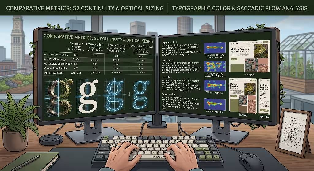
To see how natural curves and screen readability work in the real world, let us examine several open-source variable typefaces that successfully balance organic geometry with digital performance. Each of these typefaces approaches natural curves from a distinct historical and botanical perspective, offering valuable lessons for web designers.
+-------------------------------------------------------------------------+
|                  VARIABLE FONT FIELD COMPARISONS                        |
+-------------------------------------------------------------------------+
|                                                                         |
|  1. FRAUNCES (Designed by Undercase Type)                               |
|     * Style: Oldstyle Soft-Serif with botanical warmth                  |
|     * Key Axes: opsz (9-144), wght (100-900), SOFT (0-100), WONK (0-1)  |
|     * Performance: Full organic natural curves at display scale;        |
|       crystal clear readability down to 12px at low opsz.               |
|                                                                         |
|  2. LITERATA (Designed by TypeTogether)                                 |
|     * Style: Contemporary Literary Editorial Serif                      |
|     * Key Axes: opsz (7-72), wght (200-900), ital (0-1)                 |
|     * Performance: Smooth G2 natural curves in horizontal arches;       |
|       engineered specifically for intense continuous mobile reading.    |
|                                                                         |
|  3. NEWSREADER (Designed by Production Type)                            |
|     * Style: Classical Editorial Revival with calligraphic roots        |
|     * Key Axes: opsz (6-72), wght (200-800), ital (0-1)                 |
|     * Performance: Subtle, disciplined natural curves; exceptional      |
|       performance in dense multidimensional articles and data tables.   |
|                                                                         |
+-------------------------------------------------------------------------+
The first outstanding example is Fraunces, designed by Undercase Type. Fraunces is a variable “soft serif” typeface inspired by early twentieth century typography and organic forms. What makes Fraunces particularly innovative is its use of the custom Softness axis, tagged as SOFT.
When the SOFT axis is set to zero, the typeface exhibits crisp, traditional serifs and structured geometry. As the developer increases the SOFT axis toward 100, the corners soften, the serifs round off, and the strokes melt into flowing natural curves reminiscent of budding plant shoots.
Fraunces also includes an Optical Size axis ranging from 9 to 144 points. At 144 points, with high softness, the letters display expressive natural curves that give headlines an unmistakable biophilic charm.
When the optical size is reduced to 9 points for body copy, the software automatically straightens the vertical stems, sharpens the interior angles, and expands the counter spaces. This dynamic transformation allows Fraunces to maintain exceptional reading comfort in dense paragraphs while retaining its warm natural curves.
Another remarkable implementation is Literata, designed by the TypeTogether foundry. Commissioned for digital book reading on screens, Literata was engineered specifically to prevent eye fatigue during hours of continuous reading. Rather than using rigid geometric shapes, Literata incorporates gentle natural curves along its diagonal strokes and horizontal serifs.
The optical size axis in Literata ranges from 7 to 72 points. At seven points, the natural curves along the baseline and x-height are stabilized, providing sturdy anchors that guide the eye smoothly across small mobile screens. At display sizes, the natural curves become supple and expressive, echoing the fluid motion of classical calligraphy.
Newsreader, created by Production Type, represents a third successful model. Designed for long-form journalistic reading, Newsreader draws inspiration from classical editorial typefaces while refining its contours for modern high-resolution screens. Its natural curves are disciplined and subtle, avoiding decorative excess in favor of a steady, rhythmic cadence.
By varying stroke contrast smoothly through its optical size axis, Newsreader demonstrates that natural curves do not need to be overly ornate to convey warmth. Even subtle infusions of organic geometry can soften the clinical feel of a screen, elevating readability and user engagement.
| Typeface Family | Primary Design Role | Curvature Profile | Minimum Recommended Size | Supported Optical Range |
| Fraunces | Editorial, Hero Headers, Branding | Fluid botanical curves, adjustable softness | 12px (at low SOFT and opsz: 9) | 9pt to 144pt |
| Literata | Long-Form Digital Books, Mobile Copy | Ergonomic natural curves, sturdy base serifs | 11px (at opsz: 7) | 7pt to 72pt |
| Newsreader | Continuous Articles, Scholarly Journals | Calligraphic natural curves, balanced contrast | 12px (at opsz: 6) | 6pt to 72pt |
| Recollect | Subheadings, Navigation, UI Cards | Soft humanist natural curves, open bowls | 14px (fixed master) | Static Display Focus |
What are the best variable fonts for web readability with organic styles?
The best variable fonts that combine organic styling with high readability include Fraunces, Literata, Newsreader, and Bespoke Serif families. Fraunces offers customizable natural curves through its softness axis while maintaining sharp body copy through optical sizing. Literata provides exceptional reading comfort on digital devices, and Newsreader delivers polished editorial text with subtle organic warmth that prevents eye strain during long reading sessions.
How do variable fonts improve typographic hierarchy across complex layouts?
Variable fonts improve typographic hierarchy by allowing designers to create perfectly coordinated styling using a single font family. Instead of jumping between disconnected font files, a designer can smoothly transition weight, width, optical size, and natural curves across headers, subheads, blockquotes, and captions. This mathematical relationship creates a cohesive visual structure that guides the reader through the page naturally while reinforcing brand identity.
Practical Step-by-Step Production Checklist
To successfully implement variable fonts with natural curves in your web projects, follow this step-by-step production workflow. This checklist guides you from font selection through coding, testing, and final deployment.
+-------------------------------------------------------------------------+
|                  PRODUCTION IMPLEMENTATION CHECKLIST                    |
+-------------------------------------------------------------------------+
|                                                                         |
|  [Step 1: Master Vector Audit]                                          |
|  * Check glyph nodes across all extrema in font editor                  |
|  * Ensure continuous G2 curvature on key letters (a, c, e, g, s)        |
|                                                                         |
|  [Step 2: Optical Size Configuration]                                   |
|  * Enable font-optical-sizing: auto in global CSS                       |
|  * Set custom curvature thresholds for headlines vs body copy           |
|                                                                         |
|  [Step 3: Micro-Typographic Calibration]                                |
|  * Set line-height between 1.5 and 1.75 for paragraph text              |
|  * Adjust letter-spacing (-0.01em body, -0.02em headers)                |
|                                                                         |
|  [Step 4: Screen Resolution and Accessibility Testing]                  |
|  * Test on low-DPI 1080p monitors to inspect rasterization              |
|  * Verify 4.5:1 contrast ratio across all dynamic weight transitions    |
|                                                                         |
|  [Step 5: Performance Subsetting and Deployment]                        |
|  * Strip unused glyph tables and convert to WOFF2                       |
|  * Configure font metric overrides on system fallback fonts             |
|                                                                         |
+-------------------------------------------------------------------------+
Step 1: Audit Font Masters and Vector Geometry
Before writing code, inspect your variable font file using a font editor or online inspector like FontView. Examine the vector outlines of key letters such as lowercase a, c, e, g, and s across all interpolation masters. Verify that the on-curve anchor points and off-curve control handles transition smoothly from the text master to the display master. Ensure that the natural curves maintain continuous curves without kinked nodes or crossed paths that could cause rendering glitches during browser interpolation.
Step 2: Configure Optical Sizing Rules in CSS
Declare your variable font in CSS and enable automatic optical sizing across your design system. Establish clear rules separating display headings from body paragraphs. For large titles, allow natural curves to express their full character by increasing optical size and softness settings. For body text below eighteen pixels, clamp the optical size axis to its lowest setting, ensuring that the natural curves simplify into sturdy, readable strokes.
Step 3: Calibrate Line Height and Spacing Metrics
Set base typographic properties that support organic letterforms. Assign a comfortable line height between 1.5 and 1.75 for all continuous prose to ensure that reaching natural curves on ascenders and descenders never collide. Set letter spacing slightly tighter for large titles with expressive natural curves, and add a touch of positive tracking to small body text to keep letterforms distinct and clear.
Step 4: Test Across Hardware and Pixel Densities
Never evaluate typography solely on high-resolution smartphone screens or modern 4K laptop displays. High-density screens can make almost any font look acceptable. Test your typography on standard resolution desktop monitors and budget mobile devices. Inspect how the operating system rasterizers handle the natural curves on low-DPI displays. If delicate arches appear blurry or broken, slightly increase the baseline weight axis or adjust the optical size parameter until the text snaps into sharp focus.
Step 5: Optimize, Subset, and Deploy with Metric Overrides
Generate a streamlined WOFF2 font file by stripping out unused language tables and unnecessary glyphs using subsetting tools. Calculate the font metric overrides for your system fallback fonts and insert size-adjust, ascent-override, and descent-override rules into your CSS stylesheet. Test your page loading speed in Google PageSpeed Insights to confirm that the Largest Contentful Paint loads rapidly and the Cumulative Layout Shift registers as zero.
By uniting the timeless geometry of the natural world with modern variable font technology, web designers no longer have to choose between sterile readability and chaotic decoration. When we understand how human vision processes letterforms, how browser engines render vector math, and how variable axes dynamically adapt letter structure, we can build digital spaces that feel both organic and effortless to read. Harnessing natural curves through calibrated variable typography brings humanity, balance, and enduring comfort to the modern web screen.