
Table of Contents
Overview of Branding Strategies
Human beings spent hundreds of thousands of years living in close harmony with the natural world. Our eyes evolved to scan forest canopies, our ears learned to interpret the rustle of leaves, and our brains developed a deep calm when surrounded by living systems. Today, most people spend over ninety percent of their lives indoors staring at glowing glass rectangles. This sudden shift has created a profound sensory hunger. When modern consumers encounter digital interfaces and corporate identities built on sterile boxes, aggressive popups, and neon glare, their nervous systems register friction and fatigue.
This is where nature-focused branding strategies change everything. By weaving the principles of biophilic design, evolutionary psychology, and environmental biology into brand building, businesses can create digital and physical spaces that feel restorative rather than draining. Modern branding strategies must move past superficial logos and short-lived marketing tricks. True brand equity comes from biological resonance, honest communication, and sustainable practices. When companies root their identity in the time-tested patterns of nature, they build trust, lower cognitive stress, and cultivate lasting loyalty.
+-------------------------------------------------------------------------+
|                  THE BIOPHILIC BRANDING FRAMEWORK                       |
+-------------------------------------------------------------------------+
|                                                                         |
|   1. BIOLOGICAL FOUNDATION      Evolutionary psychology, Attention      |
|                                 Restoration, cognitive ease             |
|                                                                         |
|   2. VISUAL GEOMETRY            Fractals, Fibonacci curves, organic     |
|                                 shapes, visual balance                  |
|                                                                         |
|   3. SPECTRAL PALETTES          Circadian lighting, earth pigments,     |
|                                 accessible contrast                     |
|                                                                         |
|   4. KINETIC EXPERIENCES        Natural easing, fluid movement,         |
|                                 humanist typefaces                      |
|                                                                         |
|   5. SPATIAL ARCHITECTURE       Prospect (wide views) and Refuge        |
|                                 (calm, protected content nests)         |
|                                                                         |
|   6. MULTISENSORY TOUCHPOINTS   Tactile packaging, organic audio,       |
|                                 haptic feedback                         |
|                                                                         |
|   7. ETHICAL AUTHENTICITY       Radical transparency, life-cycle data,  |
|                                 anti-greenwashing                       |
|                                                                         |
|   8. SUSTAINABLE INFRASTRUCTURE Low-carbon code, green web hosting,     |
|                                 optimized asset delivery                |
|                                                                         |
|   9. COMMUNITY SYMBIOSIS        Circular economies, seasonal rhythms,   |
|                                 stewardship partnerships                |
|                                                                         |
|  10. EMPIRICAL VALIDATION       Core Web Vitals, dwell time, organic    |
|                                 search visibility, sentiment KPIs       |
|                                                                         |
+-------------------------------------------------------------------------+
Biological Resonance and Evolutionary Psychology
To understand why nature-focused branding strategies work, we must look at how the human brain processes visual information. The Biophilia Hypothesis, popularized by biologist Edward O. Wilson, suggests that humans possess an innate, genetically determined affinity for the natural world. Our sensory organs did not evolve to decipher rigid square grids, artificial drop shadows, or flashing banners. They evolved to recognize the curves of rivers, the dappled light beneath a tree canopy, and the earthy colors of fertile soil.
When people interact with standard digital media, their brains must work hard to filter out visual noise. This mental fatigue is known as cognitive overload. According to Attention Restoration Theory, natural environments and nature-inspired visual patterns engage our minds with soft fascination. This effortless attention allows the prefrontal cortex to rest, recover, and process information with clarity.
+-------------------------------------------------------------------------+
|                     ATTENTION RESTORATION IN UX                         |
+-------------------------------------------------------------------------+
|                                                                         |
|  Standard Digital Layouts:                                              |
|  [ Aggressive Grids ] --> High Cognitive Load --> Fatigue & High Bounce |
|                                                                         |
|  Biophilic Digital Layouts:                                             |
|  [ Natural Geometries ] -> Soft Fascination   --> Calmer State, Trust   |
|                                                                         |
+-------------------------------------------------------------------------+
Branding strategies that use these biological principles create an immediate sense of relief. When a visitor arrives at a website that uses generous white space, soft curves, and balanced proportions, their heart rate slows and their focus sharpens. The brain processes organic shapes roughly thirty percent faster than harsh angular shapes because curved forms represent safe, living objects rather than sharp, dangerous edges.
Building your brand around evolutionary psychology changes the entire customer journey. Instead of treating your audience as targets to capture through artificial urgency, your branding strategies treat them as living organisms seeking safety, clarity, and connection. A brand becomes a calm digital shelter. This biological resonance establishes deep subconscious trust before the visitor even reads a single headline.
Biomimetic Visual Architecture and Fractal Geometry
Biomimicry is the practice of looking to nature for solutions to complex human challenges. When applied to visual design, biomimetic branding strategies study how natural systems solve problems of balance, strength, and visual communication. Nature never wastes energy, and it never creates visual elements without purpose. Every curve of a seashell and every branch of an oak tree serves a functional and structural role.
One of the most effective tools in visual design is the use of fractal geometry. Fractals are repeating, self-similar patterns found throughout nature at different scales. You can see fractals in Romanesco broccoli, fern fronds, river deltas, clouds, and coastlines.
+-------------------------------------------------------------------------+
|                      FRACTAL SCALING IN NATURE                          |
+-------------------------------------------------------------------------+
|                                                                         |
|         Level 1 (Macro):     Main Trunk / Core Brand Mark               |
|                                     |                                   |
|         Level 2 (Meso):      Major Boughs / Navigation & Layout         |
|                                    / \                                  |
|         Level 3 (Micro):     Twigs & Leaves / Icons & Typography        |
|                                                                         |
|   Visual patterns repeat harmoniously across all structural scales.     |
+-------------------------------------------------------------------------+
Statistical physics and psychological studies show that humans find fractals with a mid-range statistical dimension (between 1.3 and 1.5 on the mathematical scale) uniquely soothing. When graphic designers use mid-range fractal dimensions in brand marks, background textures, and interface layouts, viewers experience an immediate drop in stress.
Effective branding strategies also rely on the Golden Ratio, represented by the Greek letter Phi (approximately 1.618), and the Fibonacci sequence. These mathematical proportions dictate how sunflower seeds pack into a flower head, how pinecones spiral, and how waves curl in the ocean.
| Design Element | Traditional Corporate Approach | Biomimetic Biophilic Approach |
| Grid System | Rigid rectangular 12-column boxes | Golden ratio proportions and organic fluid grids |
| Logo Geometry | Sharp polygons and harsh corners | Logarithmic spirals, branching forms, and leaf veining |
| Visual Texture | Flat solid colors or synthetic gradients | Subtle fractal noise, bark grain, and stone textures |
| Focal Points | Flashing popups and oversized buttons | Natural visual gravity and flowing eye paths |
When you construct an identity using these organic rules, your brand feels balanced and timeless. The eye moves naturally across the page along predictable, graceful curves. This visual flow reduces bounce rates and encourages visitors to explore deeper into your content.
Organic Chromatic Strategy and Circadian Spectral Mapping
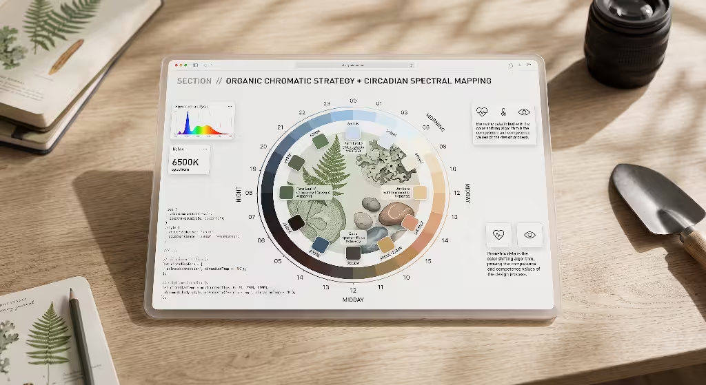
Color is often the first element a customer remembers about a brand, yet many branding strategies rely on arbitrary color picking or hyper-saturated digital tones. Standard screen colors like electric blue, bright magenta, and neon green demand intense visual processing from our photoreceptor cells. Over time, these harsh shades cause eye strain and mental irritation.
Nature-focused branding strategies replace synthetic neon tones with organic color palettes derived from earth minerals, botanical dyes, forest soils, and open water. Instead of using generic primary green, a biophilic palette draws inspiration from specific regional habitats.
+-------------------------------------------------------------------------+
|                    NATURAL HABITAT COLOR PALETTES                       |
+-------------------------------------------------------------------------+
|                                                                         |
|  Riparian Forest:   Deep River Moss  |  Wet River Stone  |  Alder Bark  |
|  Coastal Dune:      Weathered Sand   |  Sea Salt Mist    |  Driftwood   |
|  High Desert:       Terracotta Clay  |  Dried Sage       |  Warm Ochre  |
|  Alpine Meadow:     Slate Gray       |  Lichen Gold      |  Wild Aster  |
|                                                                         |
+-------------------------------------------------------------------------+
These palettes feel grounded because they mirror light spectra that human eyes have processed for millennia. However, an organic color strategy must also respect modern web accessibility. Every color pairing must pass Web Content Accessibility Guidelines (WCAG 2.2) standards for contrast. Contrast ratios of at least 4.5 to 1 for standard text and 3 to 1 for large headings ensure that every user, including those with visual impairments, can read your content comfortably.
+-------------------------------------------------------------------------+
|                   CIRCADIAN SPECTRAL MAPPING TIMELINE                   |
+-------------------------------------------------------------------------+
|                                                                         |
|   MORNING              AFTERNOON            SUNSET            NIGHT     |
|   (Soft Gold)         (Crisp Daylight)     (Warm Amber)    (Deep Slate) |
|   6:00 AM             12:00 PM             6:00 PM         10:00 PM     |
|      |                   |                    |                |        |
|      v                   v                    v                v        |
|   Awakening           High Energy          Relaxation       Deep Rest   |
|                                                                         |
+-------------------------------------------------------------------------+
Another advanced technique in modern branding strategies is circadian spectral mapping. Our biological clocks respond directly to changes in natural daylight. Modern digital platforms can adapt their themes dynamically based on the user’s local time. During morning hours, your interface can present crisp, clear light backgrounds with gentle contrast. As evening approaches, the interface can automatically transition to warmer, amber-shifted dark modes that limit blue light exposure. This thoughtful touch protects the user’s sleep cycle and shows deep respect for their physical well-being.
Biophilic Typography and Fluid Natural Motion in Branding Strategies
Typography is the voice of your brand on the screen. In many conventional branding strategies, typefaces are selected purely for their modern, geometric look. While stark, geometric sans-serif fonts have their place, they often feel cold, clinical, and detached. Biophilic typography introduces warmth and humanity to written language.
When selecting fonts for nature-inspired branding strategies, look for typefaces with humanist proportions, soft or rounded terminals, and open counters. Humanist fonts are modeled on the rhythm of classical calligraphy and the natural stroke of the human hand. Their letterforms breathe. They feature subtle variations in stroke thickness that resemble the organic growth rings of a tree or the stems of a flower.
+-------------------------------------------------------------------------+
|                    BIOPHILIC TYPOGRAPHY STRUCTURE                       |
+-------------------------------------------------------------------------+
|                                                                         |
|     ( Open Counter )        ( Soft Terminal )      ( Varied Stem )      |
|          _ _ _                   _ _ _                  |   |           |
|        /       \                /     \                 |   |           |
|       |    O    |              |   C   )                |   |           |
|        \ _ _ _ /                \ _ _ /                 |   |           |
|                                                         |   |           |
|   Generous Line Spacing (1.6x) Allows Visual "Canopy Breathing Room"    |
|                                                                         |
+-------------------------------------------------------------------------+
Generous line heights (typically 1.5 to 1.7 times the font size) and open letter spacing create visual canopy room. Just as sunlight filters gently through the leaves of a forest, white space around letters allows the reader’s eye to move across paragraphs without snagging.
Motion design is another vital part of biophilic user experience. In nature, nothing moves in abrupt, mechanical straight lines with instant starts and stops. Physical objects have mass, inertia, and momentum. Water flows around stones, leaves drift gently on air currents, and tree branches sway with flexible elasticity.
+-------------------------------------------------------------------------+
|                         DIGITAL MOTION CURVES                           |
+-------------------------------------------------------------------------+
|                                                                         |
|  Mechanical Linear Easing (Artificial, Harsh):                          |
|  Velocity: [ Instant Start ] ====================> [ Instant Stop ]     |
|                                                                         |
|  Biophilic Physics-Based Easing (Natural, Restorative):                 |
|  Velocity: ( Gentle Rise ) ~~~~ [ Smooth Flow ] ~~~~ ( Soft Drift Stop )|
|                                                                         |
+-------------------------------------------------------------------------+
Branding strategies that embrace organic movement use physics-based animation curves. Dropdown menus should glide with soft damping. Cards and dialog boxes should float into place with gentle deceleration, mimicking the settling of a leaf on calm water. Scroll mechanics should feel smooth and continuous rather than disjointed. These fluid interactions eliminate the jarring friction of digital interfaces, making screen navigation feel tactile and intuitive.
Prospect and Refuge in Digital Spatial Architecture
In 1975, geographer Jay Appleton developed Prospect-Refuge Theory to explain human environmental preferences. Appleton observed that humans feel most secure and relaxed in environments that offer two things at the same time:
- Prospect: A clear, unobstructed view of the surrounding landscape to survey opportunities and anticipate hazards.
- Refuge: A safe, sheltered place where one can hide and rest without being exposed from behind.
+-------------------------------------------------------------------------+
|               PROSPECT AND REFUGE IN INFORMATION DESIGN                 |
+-------------------------------------------------------------------------+
|                                                                         |
|   [ PROSPECT ZONE: Panoramic Hero, Clear Visual Hierarchy, Search ]     |
|   -------------------------------------------------------------------   |
|   |  Allows user to see the entire landscape and plan their route   |   |
|   -------------------------------------------------------------------   |
|                                                                         |
|   [ REFUGE ZONE: Enclosed Reading Sanctuaries, Distraction-Free Flow ]  |
|   -------------------------------------------------------------------   |
|   |  Allows user to read, reflect, and complete tasks peacefully    |   |
|   -------------------------------------------------------------------   |
|                                                                         |
+-------------------------------------------------------------------------+
Smart branding strategies translate these spatial instincts directly into information architecture and digital layouts. When users land on a website, they want immediate prospect. They need to understand where they are, what the site offers, and where they can go next. A broad, uncluttered header, a clear value statement, and an intuitive navigation menu provide this wide panoramic view.
Once users decide to engage with a specific piece of content, they seek refuge. If a long blog post or checkout page is surrounded by flashing sidebars, floating chat bubbles, and animated advertisements, the user feels exposed and distracted. Biophilic branding strategies create safe reading sanctuaries. By removing sidebar clutter, softening background colors, and centering long-form text in clean containers, you offer a peaceful digital arbor where the user can focus and learn.
| Layout Component | Prospect Function | Refuge Function |
| Site Navigation | Sticky, clear menu showing full site architecture | Collapsible drawer that tucks away during deep reading |
| Hero Sections | Wide panoramic banners with clear horizon lines | Grounded focal cards with solid, calming backing |
| Content Body | Clear section markers and visible progress indicators | Enclosed text wells with distraction-free margins |
| Checkout Flow | Transparent step-by-step progress tracking | Isolated, secure forms free of external exit links |
Balancing prospect and refuge removes online anxiety. Visitors feel empowered to explore because they always know how to navigate, yet they feel safe to linger because the content envelopes them in quiet comfort.
Multisensory Touchpoints and Tactile Materiality
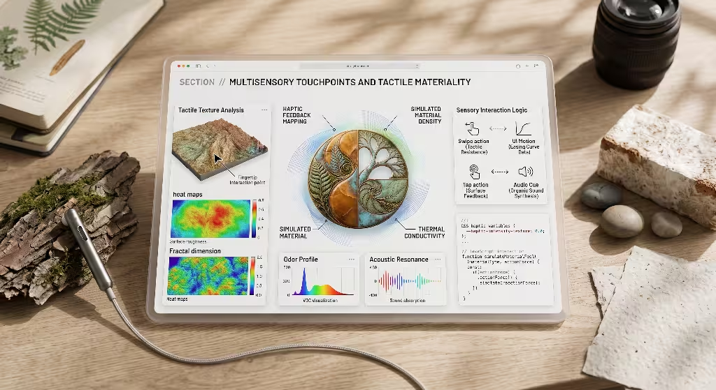
Branding exists far beyond computer monitors and phone screens. A comprehensive brand identity touches the senses of touch, sound, and smell. Many modern branding strategies make the mistake of focusing exclusively on two-dimensional visual assets. By ignoring the physical senses, brands miss the chance to create lasting emotional connections.
In the physical world, tactile materiality is the foundation of nature-focused branding strategies. When a customer receives a package in the mail, the unboxing experience sets the tone for the entire relationship. Replacing glossy, petroleum-based plastics with raw, tactile materials communicates environmental integrity instantly.
+-------------------------------------------------------------------------+
|                    REGENERATIVE PACKAGING ECOSYSTEM                     |
+-------------------------------------------------------------------------+
|                                                                         |
|  [ Mycelium Foam ] --------> Replaces Styrofoam (Composts in 30 Days)   |
|  [ FSC Kraft Stock ] ------> Replaces Bleached Paper (100% Recycled)    |
|  [ Algae & Soy Inks ] -----> Replaces Petroleum Inks (Non-Toxic)        |
|  [ Wildflower Seed Paper ] > Replaces Plastic Cards (Grows Wildflowers) |
|                                                                         |
+-------------------------------------------------------------------------+
Uncoated FSC-certified kraft paper, debossed textures that mimic stone or wood grain, and compostable mycelium packaging engage the sense of touch. Seed paper inserts, which customers can plant in their gardens to grow native wildflowers, turn disposable marketing flyers into living reminders of your brand.
+-------------------------------------------------------------------------+
|                       ORGANIC ACOUSTIC SPECTRUM                         |
+-------------------------------------------------------------------------+
|                                                                         |
|  Synthetic Audio:   Harsh Piezo Beeps, Digital Static, Loud Sine Waves  |
|  Biophilic Audio:   Resonant Wood Blocks, Running Water, Soft Wind Chime|
|                                                                         |
|  Application:       App notifications, video idents, podcast intros     |
|                                                                         |
+-------------------------------------------------------------------------+
Acoustic ecology is another powerful dimension. Harsh digital chimes and artificial alert sounds trigger mild fight-or-flight responses. Biophilic sound design uses organic resonance: the warm strike of a wooden block, the gentle drip of water, or the soft rustle of wind. Whether used in mobile application notifications, brand video introductions, or physical retail spaces, natural soundscapes lower blood pressure and make interactions memorable.
Anti-Greenwashing and Authentic Brand Storytelling
Modern consumers are smarter than ever before. They have seen decades of misleading corporate marketing where oil companies paint their logos green and plastic manufacturers show pictures of pristine forests. Consumers quickly spot superficial claims, and false environmental posturing can ruin a company’s reputation.
For branding strategies to succeed over the long term, they must reject greenwashing in favor of radical transparency. Greenwashing occurs when a business spends more time and money marketing its green credentials than actually reducing its environmental impact. Authentic nature-focused branding strategies are rooted in verifiable facts, life-cycle assessments, and honest accountability.
+-------------------------------------------------------------------------+
|                THE AUTHENTIC SUSTAINABILITY PROGRESSION                 |
+-------------------------------------------------------------------------+
|                                                                         |
|   1. Measure All Impacts      Conduct third-party Life-Cycle Audits     |
|              |                                                          |
|              v                                                          |
|   2. Disclose Truthfully      Publish open data on energy, water, waste |
|              |                                                          |
|              v                                                          |
|   3. Eliminate Green Sheen    Avoid vague words like "pure" or "natural"|
|              |                                                          |
|              v                                                          |
|   4. Earn Certifications      Validate through B-Corp, 1% for the Planet|
|              |                                                          |
|              v                                                          |
|   5. Share the Struggle       Admit supply chain hurdles honestly       |
|                                                                         |
+-------------------------------------------------------------------------+
To build lasting trust, brands must replace vague buzzwords like “eco-friendly,” “green,” and “all-natural” with specific, verifiable data. If a product package is recyclable, specify exactly how and where it can be recycled. If your company has reduced its carbon footprint, share the exact metrics, methodology, and third-party certifications that prove it.
+-------------------------------------------------------------------------+
|                       ETHICAL STORYTELLING MATRIX                       |
+-------------------------------------------------------------------------+
|                                                                         |
|  Superficial Greenwashing            Authentic Stewardship              |
|  ---------------------------------   ---------------------------------  |
|  - "100% Eco-Friendly"               - "72% Post-Consumer Plastic"      |
|  - Stock photos of hands holding saplings - Photos of actual supply chains |
|  - Hiding carbon footprint data      - Publishing annual impact audits  |
|  - Pretending to be perfect          - Sharing areas needing improvement|
|                                                                         |
+-------------------------------------------------------------------------+
Authentic storytelling does not require perfection. In fact, consumers respect brands that openly admit their challenges. Sharing the steps your company is taking to replace a stubborn plastic component or solve a difficult supply chain issue builds far more loyalty than pretending everything is flawless. True brand stewardship is an ongoing journey of care and improvement.
Low-Impact Digital Infrastructure and Sustainable Web Architecture
Many people think of the internet as a weightless cloud, but digital technology has a massive physical footprint. Millions of data servers, cooling systems, transmission lines, and personal devices consume enormous amounts of electricity every second. In fact, the global information technology ecosystem produces roughly four percent of global greenhouse gas emissions, an amount comparable to the global airline industry.
+-------------------------------------------------------------------------+
|                     DIGITAL CARBON REDUCTION PATH                       |
+-------------------------------------------------------------------------+
|                                                                         |
|   Bloated Traditional Website          Optimized Sustainable Website    |
|   ---------------------------          -----------------------------    |
|   - 4.5 MB Page Weight                 - Under 500 KB Page Weight       |
|   - 2.8g CO2 per pageview              - Under 0.2g CO2 per pageview    |
|   - Fossil-fueled servers              - 100% Renewable-powered host    |
|   - Heavy JavaScript bloat             - Lean semantic HTML and CSS     |
|   - Slow loading on mobile             - Sub-second Core Web Vitals     |
|                                                                         |
+-------------------------------------------------------------------------+
Forward-thinking branding strategies recognize that a brand’s environmental commitment must extend to its digital infrastructure. It is hypocritical for a business to claim environmental values while running a bloated, energy-wasting website that burns power on every page load.
Sustainable web architecture focuses on creating lightweight, fast, and energy-efficient digital experiences. By reducing page weights, streamlining code, and hosting on servers powered by renewable energy, brands can lower their digital carbon footprint while boosting technical search engine rankings.
| Web Optimization Area | Conventional Bloated Practice | Low-Carbon Biophilic Practice |
| Image Formatting | Uncompressed JPEG and PNG files (2-5 MB) | Next-gen AVIF and WebP files with lazy loading (<150 KB) |
| Iconography | Bulky font packs with hundreds of unused glyphs | Inline SVG vector assets rendered directly in code |
| Typography Delivery | Loading 8 different font weights from external CDNs | System fonts or a single self-hosted variable font |
| Hosting Infrastructure | Unregulated legacy data centers burning coal | Green web hosting verified by the Green Web Foundation |
| Code Structure | Heavy client-side frameworks and tracking scripts | Clean semantic HTML, modern CSS, and minimal JavaScript |
These technical improvements deliver major advantages for search engine optimization. Search engines reward websites that load quickly and provide clean user experiences. By improving your Core Web Vitals, including Largest Contentful Paint (LCP) and Cumulative Layout Shift (CLS), sustainable branding strategies make your site load in milliseconds, keep users engaged, and improve your organic search rankings.
Community Ecosystems and Regenerative Audience Alignment
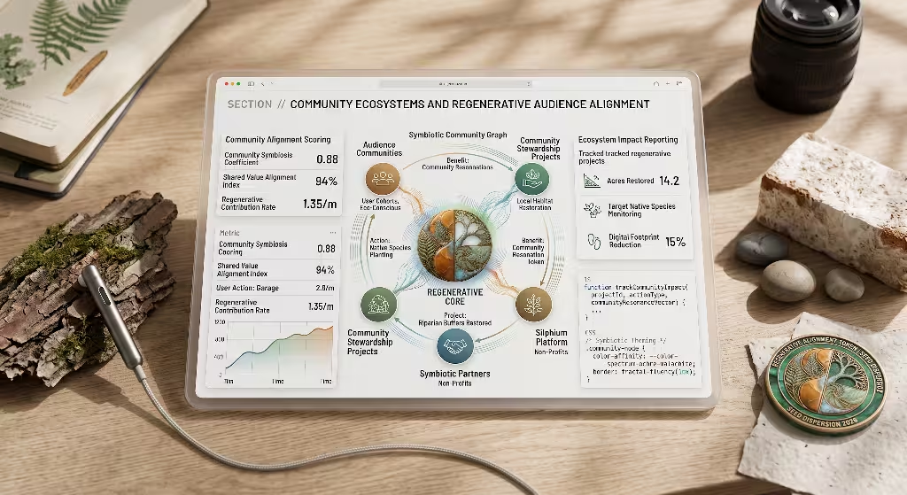
In the natural world, healthy systems do not operate as isolated individuals. They survive and thrive through symbiosis: complex networks of plants, fungi, animals, and microorganisms that exchange nutrients and support mutual life. The wood-wide web of mycorrhizal fungi beneath the forest floor allows trees to share water, sugars, and warning signals across miles of woodland.
+-------------------------------------------------------------------------+
|                     SYMBIOTIC BRAND ECOSYSTEM                           |
+-------------------------------------------------------------------------+
|                                                                         |
|                           [ THE BRAND ]                                 |
|                                 |                                       |
|             +-------------------+-------------------+                   |
|             |                   |                   |                   |
|             v                   v                   v                   |
|      [ Consumers ]      [ Local Habitats ]   [ Partner Orgs ]           |
|      Value & Health     Restoration Projects Non-Profits & Artisans     |
|             \                   |                   /                   |
|              +------------------+------------------+                    |
|                                 |                                       |
|                                 v                                       |
|                 [ SHARED REGENERATIVE VALUE ]                           |
|                                                                         |
+-------------------------------------------------------------------------+
Branding strategies can model their community building on these natural networks. Traditional marketing often views customers through an extractive lens: how much revenue can be extracted in the shortest possible time. Regenerative branding strategies view the audience as vital partners in a shared ecosystem.
This shift transforms customer loyalty programs. Instead of encouraging endless consumption through artificial urgency, flash sales, and manufactured scarcity, nature-inspired brands align their communications with natural seasonal rhythms.
- Spring: Focus on renewal, new habits, planting, and fresh beginnings.
- Summer: Celebrate high activity, outdoor community events, and shared projects.
- Autumn: Highlight harvesting, reflection, gratitude, and community sharing.
- Winter: Emphasize restoration, rest, maintenance, and deep planning.
+-------------------------------------------------------------------------+
|                   SEASONAL BRAND ENGAGEMENT CYCLES                      |
+-------------------------------------------------------------------------+
|                                                                         |
|   SPRING               SUMMER               AUTUMN            WINTER    |
|   (Renewal & Growth)   (Active Community)   (Harvest & Share) (Rest)    |
|   - Garden workshops   - Trail cleanups     - Impact reports  - Planning|
|   - New initiatives    - Outdoor festivals  - Giving programs - Repair  |
|                                                                         |
+-------------------------------------------------------------------------+
Regenerative branding strategies also build alliances with local conservation initiatives, watershed associations, and botanical foundations. By contributing resources to regional ecological restoration and inviting customers to participate in tree-planting days or river cleanups, companies turn passive buyers into active stewards. This shared purpose creates an enduring emotional bond that transactional advertising can never replicate.
Quantitative Measurement, SERP Performance, and Behavioral Metrics
A branding strategy must prove its value through clear, measurable results. Incorporating biophilic design and sustainability is not just an artistic choice. It is a powerful business decision that shows up in search engine performance, user engagement metrics, and revenue growth.
When brands use nature-focused branding strategies, they see positive shifts across their digital key performance indicators. The calming, clear layouts reduce cognitive strain, which keeps visitors on the site longer and encourages deeper reading.
+-------------------------------------------------------------------------+
|                   BEHAVIORAL AND SERP METRICS FLOW                      |
+-------------------------------------------------------------------------+
|                                                                         |
|  Biophilic Design & Clean Code                                          |
|        |                                                                |
|        v                                                                |
|  [ Sub-Second Page Loads ] ------> Lowers Bounce Rates                  |
|  [ Calming Visual Rhythm ] ------> Increases Average Dwell Time         |
|  [ Clear Spatial Prospect ] -----> Deepens Scroll Depth & Pages/Session |
|        |                                                                |
|        v                                                                |
|  Positive User Engagement Signals Sent to Search Engines                |
|        |                                                                |
|        v                                                                |
|  Higher Organic Rankings, Greater Brand Trust, and Increased Sales      |
|                                                                         |
+-------------------------------------------------------------------------+
To evaluate the success of your nature-focused branding strategies, track both technical metrics and brand sentiment across three primary areas:
Technical Performance Metrics
- Core Web Vitals: Maintain an LCP score under 1.8 seconds, an Interaction to Next Paint (INP) under 150 milliseconds, and a CLS score under 0.05.
- Carbon Score: Keep digital carbon emissions below 0.3 grams of CO2 per pageview, verified through independent auditing tools.
- Asset Efficiency: Target total page payloads under 500 kilobytes for primary landing pages.
User Behavior and Engagement Metrics
- Dwell Time: Monitor increases in average session duration as visitors read long-form content in distraction-free reading sanctuaries.
- Scroll Depth: Measure how far visitors travel down pages built with fractal proportions and fluid movement.
- Exit Rates on Key Pages: Track the drop in exit rates on checkout and contact pages after removing aggressive popups and visual clutter.
Brand Sentiment and Financial Health
- Net Promoter Score (NPS): Measure customer loyalty and willingness to recommend your brand based on shared environmental values.
- Repeat Customer Rate: Track long-term loyalty driven by seasonal community engagement rather than discount promotions.
- Organic Search Visibility: Monitor the growth of non-branded organic search traffic as search engines reward fast, high-quality, accessible content.
+-------------------------------------------------------------------------+
|                     KEY PERFORMANCE COMPARISON                          |
+-------------------------------------------------------------------------+
|                                                                         |
|   Metric                  Legacy Standard        Biophilic Standard     |
|   --------------------    -------------------    -------------------    |
|   Average Page Weight     3.8 MB                 380 KB                 |
|   Average Dwell Time      42 seconds             2 minutes 45 seconds   |
|   Mobile Bounce Rate      58%                    31%                    |
|   Carbon per View         2.1g CO2               0.18g CO2              |
|   Brand Trust Rating      Neutral / Skeptical    High Organic Affinity  |
|                                                                         |
+-------------------------------------------------------------------------+
The future of business belongs to organizations that understand our deep human need for connection with the living world. By anchoring your branding strategies in biological truths, biomimetic geometry, soothing color systems, and sustainable digital engineering, you create an identity that honors both your audience and the planet. This balanced approach builds resilience, wins organic search visibility, and creates an authentic legacy that stands strong for years to come.