
Table of Contents
The Intersection of Botany, Typography, and Biophilic UX
Typography forms the primary interface between human consciousness and digital systems. When we build digital spaces, the shapes of our letters determine how visitors feel, how easily they breathe, and how smoothly they absorb knowledge. The study of biophilic web design focuses on bringing natural forms, patterns, and living rhythms into digital architecture. At the center of this work sits a special group of type designs known as botanical web fonts.
The Biomorphic Principle in Digital Spaces
Biomorphic design draws its power directly from shapes found in nature. In natural ecosystems, we rarely see rigid, mechanical right angles or dead, lifeless lines. Instead, living organisms grow through fluid curves, tapered stems, soft transitions, and structural rhythms that have evolved over millions of years. When we look at trees, riverbanks, or flowering perennials, our visual cortex recognizes these patterns instantly.
Bringing these shapes into web development creates an immediate biological comfort. Botanical web fonts are not merely decorative novelties covered in clip-art leaves. True botanical web fonts take their fundamental geometry from plant morphology. Their letter stems taper like young tree saplings reaching upward for sunlight. Their terminal endings curve softly like expanding flower petals, swelling buds, or curling tendrils. Their interior whitespace and letter curves carry the subtle energy of living cells and vascular systems. When web designers implement well-crafted botanical web fonts, the digital screen shifts away from feeling like a harsh, sterile glass box. Instead, it becomes an inviting, organic environment where users feel calm, grounded, and attentive.
Why Open Source and Google Fonts Matter
Selecting the right typefaces for a web project requires balancing artistic vision with technical engineering and cost. Proprietary type foundries frequently charge thousands of dollars for annual web font licenses. These licenses often place restrictive limits on monthly pageviews, domain usage, and software modifications. Such barriers make it hard for small businesses, community conservation initiatives, non-profit gardens, and independent designers to build authentic biophilic websites.
Open source typefaces solve this issue completely. Distributed under open permissions such as the SIL Open Font License (OFL) or the Apache License, open source botanical web fonts give creators the freedom to use, modify, self-host, and distribute type designs across any digital platform without recurring licensing fees.
The Google Fonts library provides the largest global collection of these open-source designs. By hosting and cataloging these typefaces, Google Fonts makes testing, pairing, and deploying botanical web fonts fast and reliable. Designers can prototype diverse combinations directly in design software or through quick browser links. Developers gain access to reliable font files that can be embedded directly or downloaded for local self-hosting. In our biophilic design practice, open-source accessibility ensures that the beauty of nature-inspired digital design remains accessible to every creator.
Core Problem Statement: Display Expressiveness Versus Reading Legibility
Despite the visual appeal of nature-inspired type, working with botanical web fonts introduces a real design challenge: balancing expressive plant shapes with screen legibility. When an artist draws a typeface with complex vine flourishes, leaf-shaped serifs, and curling root tendrils, the letters look stunning at large scale. You can read a two-word title on an exhibition banner with ease.
However, when those same complex botanical web fonts are scaled down to paragraph size on a mobile screen, disaster strikes. Fine flourishing lines bleed into each other. Tiny floral terminals turn into visual static. The natural rhythm of the text breaks down, forcing the reader’s eye to work twice as hard to decode basic sentences. Web accessibility suffers, reading speed drops, and visitors quickly leave the page.
To solve this problem, we must treat typography like an ecological community. A healthy forest contains massive canopy trees, medium shrubs, and groundcover plants, each occupying a specific vertical niche. Similarly, a successful web layout pairs expressive, floral botanical web fonts for large headlines with clean, highly legible botanical web fonts for running body text. Understanding this distinction is the first step toward building balanced, readable, and organic web experiences.
Taxonomic Anatomy of a Botanical Web Font
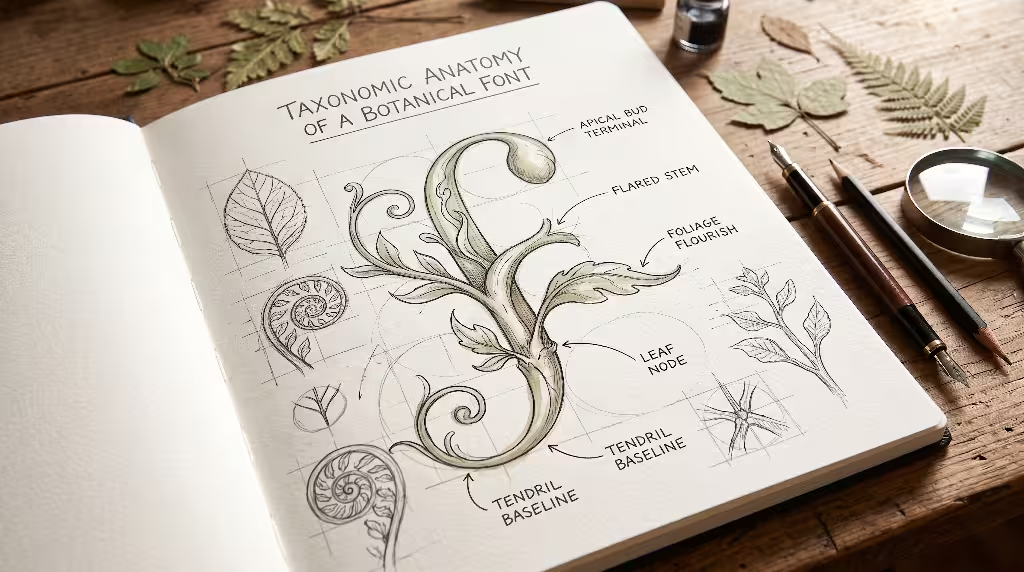
Just as field botanists classify flora by root habits, leaf venation, and floral anatomy, typographers can classify botanical web fonts by examining their physical letter strokes and construction details.
Biomorphic Stroke Characteristics
Every letterform consists of basic anatomical elements: stems, bars, bowls, serifs, terminals, ascenders, and descenders. In mechanical typefaces, these elements follow strict geometric formulas or static machine measurements. In contrast, botanical web fonts exhibit subtle variations that mirror biological growth:
- Flared Stems and Bud Terminals: Rather than keeping a constant, mechanical stroke width, the vertical stems in botanical web fonts often flare outward near their joints, echoing the way a branch thickens where it meets a tree trunk. Terminals may finish in rounded teardrop shapes or soft swellings that recall the apical buds of spring flora.
- Variable Weight and Natural Light Transmission: In nature, light filters through a forest canopy in dappled, uneven patterns. Botanical web fonts frequently exhibit gentle stroke contrast that mimics this soft illumination, avoiding the harsh, razor-thin lines of cold modern faces.
- Curvilinear Baseline Dynamics: The baselines and crossbars of organic fonts often feature very slight curves or micro-angles. This subtle movement reflects how climbing vines and runner stems wind across a forest floor, giving the overall text block a rhythmic, living pulse.
- Organic Ink Traps and Leaf Nodes: In print typography, ink traps prevent wet ink from pooling in tight letter joints. In digital botanical web fonts, these deep cutouts resemble the axils where leaf petioles connect to plant stems, adding visual depth and crispness on low-resolution screens.
Legibility Versus Expressiveness Index
To prevent layout failures, we evaluate botanical web fonts using a practical two-part index:
- Macro-Display Expressiveness: These are typefaces designed for large sizes, such as hero section banners, primary headlines, landing page titles, and short brand slogans. They showcase rich floral embellishments, dramatic calligraphic curves, and clear botanical silhouettes. Because their primary role is emotional resonance and theme establishment, they score high on expressiveness but cannot be used for lengthy body copy.
- Micro-Text Legibility: These are botanical web fonts built specifically for paragraphs, user interface buttons, data tables, and navigation links. Rather than using obvious flower graphics, they communicate nature through open counters, generous x-heights, soft rounded corners, and humanist proportions that aid long-form reading comfort. They score high on legibility and provide steady structural support for the entire site layout.
The Curated Open Source Botanical Web Fonts Google Fonts List
To help you choose the right typography for your projects, we have organized the best open source botanical web fonts available in Google Fonts into four distinct aesthetic categories.
Florid and Tendril Display Scripts (Expressive Flora)
These botanical web fonts bring immediate floral personality to websites that celebrate gardens, herbalism, botany, luxury sustainable goods, and organic living.
Fleur De Leah
Fleur De Leah is one of the most expressive floral botanical web fonts in the Google Fonts catalog. Created by type designer Robert Leuschke, it features delicate floral buds, leaves, and vine flourishes integrated directly into the uppercase capital letters and lowercase sweeping strokes.
- Botanical Characteristics: The capital letters feature full floral blossoms and twisting tendrils that resemble blooming climbing vines such as clematis or morning glory. The lowercase strokes flow like graceful stems.
- Ideal Use Cases: Best used for dramatic hero headlines, fine botanical art packaging titles, apothecary labels, and wedding stationery websites.
- Typographic Warning: Never set Fleur De Leah in all-caps or at small paragraph sizes. Because of its detailed botanical ornaments, keep it at 36 pixels or larger so its delicate floral lines do not blur on mobile devices.
Send Flowers
Send Flowers provides an approachable, cheerful, and fluid script style that captures the relaxed nature of fresh-cut garden stems.
- Botanical Characteristics: Unlike formal copperplate calligraphy, Send Flowers features monoline, rounded strokes that mimic supple, bendable plant shoots. Its loops and swashes stay open and welcoming, evoking the casual beauty of wildflower meadows.
- Ideal Use Cases: Garden center landing pages, organic florist shop headers, lifestyle wellness blogs, and seasonal spring promotional banners.
- Typographic Warning: Use Send Flowers for short phrases of two to six words. Pair it with an unadorned sans-serif to keep your page balanced.
Alex Brush and Tangerine
Alex Brush and Tangerine are classic, graceful script options among botanical web fonts.
- Botanical Characteristics: Alex Brush has smooth, tapered descenders that end in graceful curves like willow branches bending over water. Tangerine features tall, elegant ascenders with very light, thin strokes that resemble fine leaf veins or tall meadow grasses swaying in the breeze.
- Ideal Use Cases: Luxury eco-resort websites, spa treatment menus, organic wine labels, and delicate botanical book headers.
- Typographic Warning: Tangerine has very delicate strokes, which can fade into light backgrounds. Ensure you test its contrast against your site colors to maintain accessibility.
Organic Humanist Serifs (Vegetal Structure and Foliage)
Humanist serifs bridge the gap between classic editorial elegance and living, organic energy. These botanical web fonts excel at creating authoritative yet warm digital spaces.
Fraunces
Fraunces is an outstanding variable typeface designed by the Phaedra Charles and Flavia Zimbardi foundry (Undercase Type). It is one of the most versatile open-source botanical web fonts on the web today.
- Botanical Characteristics: Fraunces features plump, bulbous serifs and curved joints that feel like ripe seed pods, succulent leaves, or thick plant stems. Its unique “wonky” variable axis introduces intentional organic imperfections into the letter geometry, mimicking the natural irregularities found in living plant tissue.
- Ideal Use Cases: Editorial magazines, environmental essays, sustainable architectural firm portfolios, and organic food brand identities.
- Technical Strengths: Because Fraunces is a variable font with optical size adjustments, it can transition seamlessly from a bold, expressive headline face to a sturdy, highly legible body face.
Cinzel Decorative
Cinzel Decorative, designed by Natanael Gama, combines the classical proportions of ancient Roman inscriptions with flowing botanical flourishes.
- Botanical Characteristics: While its basic geometry is rooted in stone carving, its decorative alternate glyphs feature spiraling, branch-like serif terminals that curl like grapevine tendrils. It conveys an image of ancient stone covered in climbing ivy.
- Ideal Use Cases: High-end botanical garden visitor centers, luxury sustainable design firms, arboretum monument pages, and heritage environmental institutions.
- Typographic Warning: Use its ornate decorative alternates sparingly on first letters or headline accents. Do not crowd multiple decorative capitals together in a single word.
Cormorant Garamond
Cormorant Garamond, developed by Christian Thalmann, is an open-source revival of classic renaissance type that carries a strong organic spirit.
- Botanical Characteristics: With razor-sharp, petal-shaped serifs, flowing curved descenders, and fluid teardrop terminals, Cormorant Garamond resembles pressed botanical specimens from historical herbarium sheets. Its forms echo the sharp tips and gentle curves of rose petals and dried medicinal leaves.
- Ideal Use Cases: Scientific botanical journals, natural history museum archives, herbal medicine catalogs, and long-form nature essays.
- Typographic Warning: The standard weights feature high contrast between thick and thin strokes. On desktop screens, this looks breathtaking, but on low-resolution mobile displays, ensure you select a slightly heavier weight (such as Medium 500) to keep the thin strokes legible.
Soft-Canopy and Woodland Sans Serifs (Understory and Groundcover)
Not all botanical web fonts require serifs or calligraphic flourishes. Rounded and humanist sans-serif typefaces reflect nature through cellular geometry, pebble-like curves, and gentle terminals.
Comfortaa and Quicksand
Comfortaa and Quicksand represent geometric rounded typography inspired by organic cellular shapes.
- Botanical Characteristics: The terminals on both fonts are completely circular, eliminating sharp corners. These smooth endings resemble microscopic plant cells, swollen rain droplets, or budding seeds. Quicksand provides a lighter, more open rhythm, while Comfortaa offers distinctive wide circular bowls that evoke ripe berries and seed pods.
- Ideal Use Cases: Educational conservation websites for children, interactive plant care mobile applications, eco-friendly consumer goods, and playful community garden newsletters.
- Typographic Warning: Because both fonts have wide horizontal proportions, they take up substantial screen real estate. Use them for subheadings, buttons, and short callouts rather than continuous, multi-page reading.
Nunito
Nunito, created by Vernon Adams and expanded by Jacques Le Bailly, is a masterclass in approachable, organic sans-serif design.
- Botanical Characteristics: Nunito features carefully rounded terminals and warm, humanist proportions. It does not call direct attention to itself with obvious floral graphics. Instead, it creates a subtle feeling of smooth, water-smoothed river stones and soft forest moss.
- Ideal Use Cases: The gold standard for body text, button labels, form inputs, and site navigation on nature-focused websites.
- Technical Strengths: Excellent legibility across all screen sizes, nine complete weight variations, and full matching italics make Nunito one of the most reliable utility choices among modern botanical web fonts.
Naturalistic and Plant-Press Hand-Lettering
Hand-drawn botanical web fonts bring human warmth, authenticity, and the feel of field exploration to digital pages.
Indie Flower
Indie Flower, designed by Kimberly Geswein, is a relaxed, bubbly handwriting font that carries an authentic outdoor spirit.
- Botanical Characteristics: Its loose, casual lines, soft rounded corners, and slight baseline shifts evoke hand-written notes jotted down in a field journal while observing wildflowers along a woodland trail.
- Ideal Use Cases: Field notes sidebars, plant care tip callout boxes, personal gardening blogs, and community seed swap flyers.
- Typographic Warning: Indie Flower should be treated as an accent voice. Avoid using it for long technical descriptions or dense user interfaces.
Amatic SC and Caveat
Amatic SC and Caveat offer contrasting hand-drawn aesthetics that capture different facets of botanical field study.
- Botanical Characteristics: Amatic SC is a condensed, hand-drawn uppercase font with tall, thin stems that resemble dried flower stalks or pressed prairie grasses. Caveat is an energetic cursive script with variable stroke angles that recall the handwritten annotations of an 18th-century botanist writing quickly on an herbarium mounting sheet.
- Ideal Use Cases: Amatic SC shines on organic product badge labels, category filters, and image overlay banners. Caveat works beautifully for pull quotes, author signatures, plant collection dates, and personal field observations.
Botanical Type Pairing Matrix (Interactive CSS Architecture)
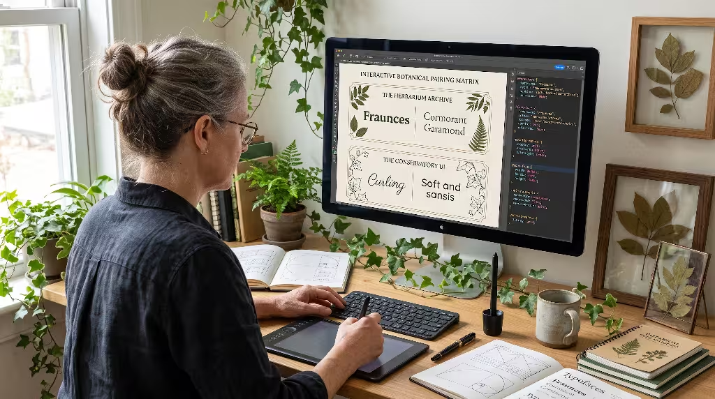
Choosing beautiful individual botanical web fonts is only half the battle. To build an engaging, cohesive website, you must combine multiple fonts so they support one another naturally.
Rule 1: Contrast in Growth Habit
In landscape design, an experienced gardener never groups plants with identical heights, foliage shapes, and leaf textures in a tight row. Doing so creates visual confusion. Instead, gardeners place tall canopy trees behind rounded shrubs, accented by flowering groundcovers.
We apply this exact ecological rule to botanical web fonts:
- Pair Display Flourishes with Grounded Roots: If your primary headline uses an expressive, climbing script font like Fleur De Leah or Send Flowers, your body font must be a grounded, highly legible sans-serif like Nunito or a clean humanist serif.
- Avoid Competing Stars: Never use two highly decorative botanical web fonts on the same page. When an ornate floral script clashes with a decorative serif headline, neither typeface can shine, and the user experiences visual exhaustion.
- Match Historical and Organic Tone: If your headline uses a formal, historic botanical face like Cormorant Garamond, do not pair it with a playful bubble font like Comfortaa. Pair it instead with an understated, classical companion.
Curated Pairings Table
The following matrix provides four tested combinations of botanical web fonts ready for production deployment:
| Design Theme | Headline Font (Canopy) | Body Font (Understory) | Accent / Metadata Font (Field Notes) | Aesthetic Mood |
| The Herbarium Archive | Fraunces (Variable Serif) | Cormorant Garamond (Serif) | Inter or Roboto Mono | Scholarly, archival, scientific, historic |
| The Conservatory UI | Fleur De Leah (Floral Script) | Nunito (Rounded Sans) | Quicksand (Medium Sans) | Lush, elegant, welcoming, floral |
| The Field Botanist | Amatic SC (Tall Display) | Vollkorn or Lora (Sturdy Serif) | Caveat (Handwritten Script) | Rustic, authentic, outdoor, exploratory |
| The Modern Succulent | Quicksand (Rounded Display) | Open Sans (Neutral Sans) | Comfortaa (Accent Badges) | Clean, cellular, contemporary, approachable |
Scale and Hierarchical Proportions
A natural typography system requires proportional balance. Rather than choosing random font sizes, biophilic web developers use mathematical scaling systems that mirror natural patterns. The Golden Ratio (one to one point six one eight) has governed the growth of shells, leaf arrangements, and flower petals for eons.
When organizing botanical web fonts on a webpage, build your size hierarchy using this organic growth curve:
- Main Hero Title (H1): 42px to 56px (expressive display botanical font)
- Section Heading (H2): 28px to 36px (structured organic font)
- Subsection Title (H3): 20px to 24px (supportive subhead)
- Standard Body Copy (P): 16px to 18px (clean, legible understory font)
- Captions and Field Notes: 12px to 14px (compact, readable metadata)
By maintaining consistent optical ratios, your typography develops an organic harmony that feels natural to the human eye.
Front-End Implementation and Performance Optimization
Even the most beautiful botanical web fonts will fail if they slow down your website. Modern search engines measure page speed and layout stability as primary ranking factors through Core Web Vitals. Heavy font files that load slowly cause jumpy pages, broken layouts, and high visitor drop-off rates.
Zero-CLS Loading Strategies
Cumulative Layout Shift (CLS) measures how much a webpage’s content shifts around while loading. When botanical web fonts load incorrectly, visitors experience two frustrating technical glitches:
- Flash of Unstyled Text (FOUT): The browser displays a basic system font like Arial or Times New Roman, and then suddenly snaps to the custom botanical font several seconds later. This snap alters the line wrapping, pushing paragraphs down the screen.
- Flash of Invisible Text (FOIT): The browser hides the text completely until the custom font finishes downloading, leaving visitors staring at blank white boxes.
To prevent these shifts when using botanical web fonts, implement modern CSS font loading rules:
CSS
@font-face{
  font-family: 'Fraunces';
  src: url('/fonts/fraunces-variable.woff2') format('woff2');
  font-weight: 100 900;
  font-style: normal;
  font-display: swap;
  size-adjust: 102%;
  ascent-override: 95%;
  descent-override: 25%;
 }
The font-display: swap property tells the browser to display an immediate system fallback font so the user can begin reading without delay. Then, the modern CSS descriptors size-adjust, ascent-override, and descent-override allow you to calibrate your fallback font’s dimensions so it occupies the exact same pixel space as your incoming botanical web fonts. When the custom font file arrives, it swaps in seamlessly without moving a single line of text.
Modern Self-Hosting Versus Google Fonts CDN
When deploying botanical web fonts, developers face an architectural choice: load fonts directly from Google’s content delivery network (CDN) or host the font files on their own web servers.
While Google’s CDN is convenient for rapid testing, professional web production increasingly favors self-hosting:
- Privacy and Legal Compliance: In several European jurisdictions, loading fonts directly from external Google servers has been ruled a violation of strict GDPR privacy regulations, because it shares visitor IP addresses with third-party servers without prior consent. Self-hosting your botanical web fonts completely avoids this legal liability.
- Elimination of Third-Party DNS Lookups: Loading fonts from an external domain requires your visitor’s browser to perform extra DNS resolutions, establish additional SSL handshakes, and negotiate separate server connections. Storing your botanical web fonts directly on your own web server or origin CDN eliminates these network delays.
- HTTP/3 and Modern Caching: Modern HTTP/3 protocols allow your server to push your font files over the exact same connection as your primary HTML document. Preloading critical fonts in your HTML
<head>ensures instant rendering:
HTML
<link rel="preload"
      href="/fonts/nunito-latin.woff2"
      as="font"
      type="font/woff2"
      crossorigin>
Subsetting Glyphs for Lightweight Payloads
A complete open-source font file often contains over one thousand glyphs, including obscure punctuation marks, mathematical operators, and language symbols for hundreds of global regions. Downloading all this data when your website only needs English headlines wastes bandwidth and slows page loads.
Subsetting is the engineering practice of cutting away unused characters from your font files. For instance, if you are using an ornate headline font like Fleur De Leah exclusively for English page titles, you can use open-source command line tools like pyftsubset to strip away everything except the basic Latin alphabet and standard punctuation:
Bash
pyftsubset FleurDeLeah-Regular.ttf \
  --unicodes="U+0020-007E" \
  --flavor=woff2 \
  --output-file=fleur-de-leah-subset.woff2
This simple optimization step can reduce your botanical web fonts file sizes from 150 kilobytes down to just 18 kilobytes. On mobile devices with spotty cellular connections, this dramatic reduction lets your botanical pages load with incredible speed.
Frequently Asked Questions about Botanical Web Fonts
To address common questions from designers and developers exploring botanical web fonts, here is a detailed review of frequent queries from search engines:
What Google Font Looks Like Plants or Flowers?
When users search for Google typefaces that look like real plants or flowers, they are usually looking for one of three visual treatments:
- Direct Floral Embellishment: Fleur De Leah is the top recommendation. It is one of the few fonts in Google Fonts with distinct flowers, petals, and curly vine tendrils woven directly into the letter shapes.
- Organic Cursive Stems: Send Flowers and Alex Brush provide smooth, flowing cursive curves that resemble flexible plant stems, flower stalks, and floral bouquet arrangements.
- Living Vegetal Geometry: Fraunces mimics biological structure through swollen, pod-like serifs, bulbous terminals, and subtle natural irregularities that echo succulent and broadleaf plant tissue.
Are Google Fonts Free for Commercial Botanical Branding?
Yes. The overwhelming majority of botanical web fonts in the Google Fonts collection are published under the SIL Open Font License (OFL) or the Apache License.
Under these open licenses, you are legally permitted to:
- Use the fonts on commercial websites, online stores, and mobile apps.
- Embed the fonts in client logos, brand identity guides, packaging, and eBooks.
- Use the fonts in printed books, business cards, signage, and marketing banners.
- Modify the font software itself, provided that modified versions are distributed under the same open license and do not use the original reserved font names.
You never have to pay recurring subscription fees, report your monthly pageviews, or purchase extra licenses as your site traffic expands.
How Do I Choose an Organic Font That Does Not Hurt Mobile Accessibility?
Maintaining web accessibility while using expressive botanical web fonts requires adherence to Web Content Accessibility Guidelines (WCAG 2.2 AA standards):
- Protect Contrast Ratios: Ensure your text achieves a contrast ratio of at least 4.5 to 1 against its background for regular body text, and at least 3.0 to 1 for large headings. When pairing botanical web fonts with earthy palettes, avoid light olive greens on cream backgrounds or dark moss greens on deep slate backgrounds.
- Generous Line Spacing: Organic letterforms feature dynamic strokes that need room to breathe. Set your CSS
line-heightfor body paragraphs between 1.5 and 1.7 to prevent overlapping ascenders and descenders. - Limit Decorative Usage to Headlines: Never assign decorative scripts or complex floral faces to navigation menus, forms, or body copy. Keep your display botanical web fonts at 24 pixels or larger, and rely on clean, rounded humanist sans-serifs for all interactive UI elements.
- Letter Spacing Adjustments: Display fonts with deep flourishes often require minor tracking adjustments. Add a touch of positive
letter-spacing(around 0.02em to 0.05em) to uppercase titles to prevent flourishes from tangling together on narrow mobile viewports.
What Are the Best Open-Source Alternatives to Commercial Botanical Typefaces?
Many designers fall in love with expensive commercial typefaces sold on boutique foundry websites. Fortunately, the Google Fonts catalog contains outstanding open-source botanical web fonts that serve as direct functional substitutes:
- Alternative to Herbarium or Botanica: Replace costly hand-drawn floral scripts with Fleur De Leah for ornate titles, or Send Flowers for casual organic script headings.
- Alternative to Plantin or Windsor: Windsor and Plantin are historic editorial faces renowned for their warm, rounded serifs. Fraunces serves as an exceptional open-source alternative, providing identical warmth with modern variable font technology.
- Alternative to Linotype Apercu or Sofia Pro Soft: Replace commercial soft-edge sans-serifs with Nunito or Quicksand. Both provide friendly, rounded, pebble-like terminals with full open-source freedom.
Environmental and Biophilic Digital Impact
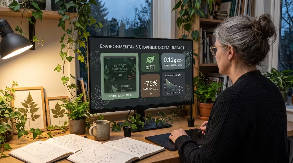
Biophilic design extends beyond visual appearance. It encompasses our ecological relationship with technology, energy consumption, and the living systems around us. When we choose, engineer, and deploy botanical web fonts, we must evaluate how our digital systems interact with both the human nervous system and the physical environment.
Dark Mode and Digital Photosynthesis
In architecture, biophilic design emphasizes the natural cycle of day and night. Human eyes did not evolve to stare into bright fluorescent light bulbs during the late hours of the evening. When users browse digital screens in low-light environments, intense pure white backgrounds cause visual strain, headaches, and sleep disruption.
Designing an organic dark mode provides a digital equivalent to evening in a peaceful forest understory:
- Earthy Background Palettes: Rather than using harsh, artificial pure black (#000000), construct your dark themes using deep organic tones like midnight forest slate, damp rich earth, or deep charcoal umber.
- Foliage-Derived Text Contrast: Instead of harsh pure white text (#ffffff), set your botanical web fonts in soft chamomile cream, pale sage, or warm morning mist tones.
- Preventing Visual Irradiation: In dark modes, bold white letters can appear to bleed outward into dark backgrounds, a visual distortion known as irradiation. When rendering botanical web fonts in dark mode, reduce their typographic weight slightly (for example, stepping down from 600 Semi-Bold to 500 Medium) and increase letter spacing slightly. This preserves the delicate curves of your botanical glyphs and provides effortless reading comfort.
Sustainable Web Design and Digital Carbon Reductions
Every time a user visits a website, physical servers in data centers consume electrical energy to process requests, transmit data packets across fiber-optic cables, and render pixels on mobile screens. A bloated webpage with multiple gigabytes of unoptimized assets directly contributes to global carbon emissions.
Typography plays a critical role in digital sustainability:
- Variable Fonts Replace Bloated Libraries: In traditional web design, loading four weights of a font with matching italics meant downloading eight distinct font files, totaling hundreds of kilobytes. Modern variable botanical web fonts consolidate all weights, widths, and stylistic axes into a single compressed WOFF2 file. One variable file saves data transfer on every pageview.
- Modern WOFF2 Compression: The WOFF2 format uses Brotli compression algorithms to achieve file sizes up to 30 percent smaller than older WOFF and TTF files. By serving solely modern WOFF2 botanical web fonts, you eliminate unnecessary data transmission.
- Lowering Device Processing Strain: Highly optimized, subsetted botanical web fonts require less CPU parsing time on mobile processors. When phones spend less battery power decoding complex web pages, devices stay charged longer, reducing reliance on the power grid.
Sustainable web design reminds us that true biophilic design is not just about drawing pictures of trees. It is about building lean, efficient digital tools that respect the physical resources of our planet.
Implementation Checklist for Botanical Typography
To guide your next biophilic web development project, review this final technical checklist before publishing your pages:
- Curate with Purpose: Did you choose an expressive botanical font for large headlines and a clean, legible companion for your body copy?
- Verify Commercial Licensing: Are all your selected botanical web fonts released under open-source licenses like the SIL OFL?
- Format and Compress: Are all font files converted to the modern WOFF2 format?
- Subset Glyph Tables: Have you removed unused characters, ligatures, and foreign language sets to keep your file sizes under 30 kilobytes per face?
- Enforce Zero-CLS Swapping: Did you include
font-display: swapalong with CSSsize-adjustrules to stop layout shifts during page loading? - Self-Host Font Files: Are your botanical web fonts stored directly on your own web server or origin CDN to guarantee user privacy and eliminate extra DNS lookups?
- Audit Contrast Ratios: Does your text meet WCAG 2.2 AA accessibility contrast standards across both light and dark display modes?
- Check Mobile Line Spacing: Is your mobile line height set comfortably between 1.5 and 1.7 to prevent flourishing letter ascenders from touching?
By uniting biological beauty with disciplined web engineering, botanical web fonts enable us to create websites that honor nature, welcome human readers, and operate with flawless digital efficiency. Use these open-source tools to build calm, grounded digital sanctuaries that leave a lasting, positive impression on every visitor.