
Table of Contents
The Intersection of Botany, Typography, and Digital Ergonomics
A central tool in biophilic web design is the selection of typography. Specifically, using a botanical serif font allows us to bring the structural beauty of nature into digital layouts. A botanical serif font is a typeface whose letter shapes take inspiration from organic growth, such as plant stems, leaves, vines, and natural curves. When users view a website, their eyes scan text by following subtle visual paths. Standard geometric fonts can feel cold and rigid. In contrast, a botanical serif font offers organic contours that match how human vision processes natural environments.
Combining botany, computer science, and web design creates what we call digital ergonomics. Modern screens can cause visual fatigue when users read dense information for long periods. By choosing a well crafted botanical serif font, we reduce eye strain, establish strong brand personality, and maintain fast loading speeds.
The main challenge in web design is balancing beauty with performance. Decorative fonts can sometimes slow down a page or make small text hard to read. In this guide, we will analyze how a botanical serif font functions, examine the best font families available, solve common web performance challenges, and review the technical steps needed to keep your website fast, accessible, and highly ranked on search engines.
Anatomy of a Botanical Serif Font: Deconstructing Nature-Inspired Glyph Architecture
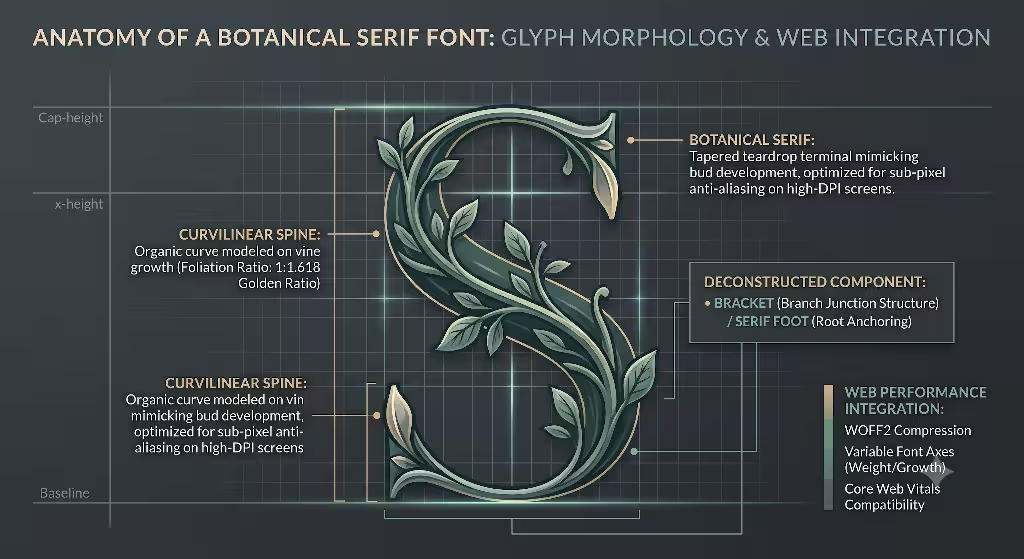
To understand why a botanical serif font works so well on the web, we must examine its physical structure. In typography, every letter is composed of specific structural parts. When a type designer creates a botanical serif font, they adapt these standard parts to mimic natural plant forms.
                  ANATOMY OF A BOTANICAL SERIF FONT

    Leaf-like Teardrop Terminal        Organic Bracketed Serif
               \                              /
                (o)                          /
                 |                          /
                 |    .--------------------'
                 |   /
               #####
                 #
                 #        #        ##########
                 #       # #       #        #
                 #      #   #      #        #
                 #     #######     #        #
                 #    #       #    #        #
               ##### #         #  ###      ###
              /                           \
             /                             \
     Asymmetrical Foot             Curved Vine-like Axis
Here are the key structural features that define a botanical serif font:
- Terminals and Spines: The terminal is the end of a letter stroke that does not end in a standard serif. In a botanical serif font, terminals often feature teardrop shapes or soft, leaf-like curves. The main curved stem of a letter, such as the spine of the letter S, mimics the natural bend of a vine or plant stem.
- Serif Bracketing: The bracket is the curved junction that connects the horizontal serif to the vertical stem of a letter. Standard fonts use sharp geometric angles. A botanical serif font uses soft, organic bracket radii that mirror the way branches connect to tree trunks or leaves connect to stems.
- Stroke Contrast: Stroke contrast refers to the difference between the thickest and thinnest parts of a letter. A botanical serif font often uses dynamic modulation in stroke width. This mimics the variable thickness of natural growth patterns and calligraphic ink strokes.
- Asymmetrical Feet: Standard serifs are usually perfectly symmetrical. A botanical serif font frequently uses subtle asymmetry in its letter feet, giving text a hand-crafted, organic ground anchor.
       [ DISPLAY CUT ]                   [ TEXT CUT ]
   (Large Headlines > 32px)         (Body Paragraphs 16px-18px)

    High Contrast Strokes            Moderate Contrast
    Delicate Leaf Terminals          Sturdier Serifs
    Exaggerated Curves               Larger X-Height

         #######                          #######
         #      #                         #      #
         #      #                         #      #
         #######                          #######
         #                                #
         #                                #
        ###                              #####
We must also distinguish between display cuts and text cuts when choosing a botanical serif font. A display cut is built for large headlines above 32 pixels. It features high contrast, delicate leaf-like terminals, and dramatic flourishes. However, if you use a display cut for tiny body text, those delicate details disappear, making the text blurry and difficult to read.
A text cut of a botanical serif font is designed for paragraphs sized between 16 and 18 pixels. It features moderate contrast, sturdy serifs, and a larger x-height, which is the height of lowercase letters like x. This structural balance ensures high legibility on screens of all sizes without losing its organic character.
Top Botanical Serif Font Options for Modern Web Design
Choosing the right botanical serif font requires evaluating visual style, available font weights, web performance, and licensing flexibility. Below is a comparative analysis of the top font options used in modern biophilic web design.
Cormorant Garamond
Cormorant Garamond is an open-source font family designed by Christian Thalmann. It is widely available on Google Fonts, making it one of the most accessible choices for web designers who want a botanical serif font with zero licensing fees.
- Design Characteristics: It features extremely delicate stroke contrast, sharp leaf-like serifs, and fluid teardrop terminals on letters such as a, c, and f.
- Screen Performance: Because of its high contrast and fine lines, Cormorant Garamond excels as a display font for headlines. For small body text on lower resolution displays, it requires careful line-height adjustments to preserve legibility.
- Best Use Cases: Hero section headers, editorial subheadings, and lifestyle brand titles.
Ogg and Ogg Text
Designed by the Klim Type Foundry, Ogg is inspired by the calligraphic lettering of 20th-century artist Oscar Ogg. It is an iconic botanical serif font family that brings fluid movement to digital layouts.
- Design Characteristics: Ogg features steep italic axes, deeply curved swashes, and organic stroke joins that recall twisting vines and leaf stems.
- Screen Performance: The standard Ogg family is built strictly for large display sizes. However, Klim Type Foundry developed Ogg Text, which increases letter thickness and widens spacing, allowing the font to function smoothly in longer body paragraphs.
- Best Use Cases: Luxury brand websites, editorial web magazines, and high-end botanical landing pages.
Recoleta
Recoleta, designed by Jorge Cisterna for Latinotype, blends soft 1970s organic curves with clear geometric structures. It offers a warm, friendly interpretation of a botanical serif font.
- Design Characteristics: It removes sharp angles in favor of smooth, rounded serif joins and plump, plant-like letter shapes.
- Screen Performance: Recoleta renders exceptionally well across display sizes and mobile screens. Its thick stems prevent thin lines from breaking up on low-density screens.
- Best Use Cases: Main headings for wellness brands, sustainable e-commerce sites, and interactive user interface elements.
GT Super
Created by Grilli Type, GT Super takes inspiration from display typography of the 1970s and 1980s. It interprets a botanical serif font through expressive, plant-like calligraphic terminals.
- Design Characteristics: GT Super features triangular serifs that resemble sharp thorn or leaf shapes, combined with dramatic curves in uppercase letters.
- Screen Performance: GT Super includes separate Display and Text sub-families. The Text family has robust serifs that withstand heavy screen rendering without causing visual artifacts.
- Best Use Cases: High-tech sustainability platforms, modern agricultural tech agency sites, and long-form articles.
Botanical by Pixel Surplus
Botanical is a hand-drawn display typeface specifically crafted to capture raw natural textures.
- Design Characteristics: It incorporates subtle line variations, deckled edges, and alternate glyphs that include leaf illustrations attached directly to letter stems.
- Screen Performance: Because of its high level of detail, Botanical should be used strictly as a display font for titles. File sizes can be larger if vector paths contain many points, so proper web compression is essential.
- Best Use Cases: Hero image overlays, short marketing callouts, and organic food packaging site headers.
Playfair Display
Designed by Claus Eggers Sørensen, Playfair Display is an open-source typeface optimized for web display typography.
- Design Characteristics: While rooted in traditional transitional serif design, its italic weight features sweeping botanical flourishes and soft organic terminals.
- Screen Performance: It is optimized for web rendering via Google Fonts, offering small file sizes and reliable cross-browser support.
- Best Use Cases: Section headings, quote blocks, and biophilic design blog titles.
Questions Answered about Botanical Serif Font
In this section, we answer common search engine questions regarding the use of a botanical serif font in web design. These answers focus on user experience, digital ergonomics, and search performance.
Are serif fonts readable on modern screens compared to sans-serif fonts?
Yes. In the early days of the web, low-resolution computer screens struggled to render the thin horizontal lines of serif fonts. This led designers to prefer simple sans-serif typefaces like Arial or Helvetica. Today, modern Retina and high-DPI (dots per inch) displays offer crisp sub-pixel rendering. A well-designed botanical serif font reads just as clearly as a sans-serif font. Readability depends far more on parameters such as x-height, letter spacing, font size, and line height than on whether serifs are present. Setting line spacing to 1.5 times the font size ensures excellent paragraph readability for any botanical serif font.
How do botanical serif fonts fit into biophilic web design?
Biophilic web design applies natural patterns and biological forms to digital interfaces. Human brain biology is hardwired to recognize shapes found in nature, such as curves, spirals, and branching foliage. A botanical serif font incorporates these natural curves and non-uniform line weights into written text. By replacing rigid, geometric shapes with natural visual forms, a botanical serif font provides an indirect experience of nature. This subtle visual connection helps lower user stress, reduces cognitive overload, and creates a welcoming online environment.
What is the cardinal sin of using botanical serif fonts in web layouts?
The biggest mistake in web design is using an ornate display version of a botanical serif font for small body text below 16 pixels. Display fonts feature delicate line weights, complex decorative swashes, and tight letter spacing built for large headlines. When applied to small paragraphs, thin lines disappear due to pixel rounding, causing letters to clash. This creates a messy visual appearance, hurts readability, and leads to accessibility failures under WCAG standards. Always use a dedicated text weight or a clean sans-serif font for body copy while reserving decorative botanical serifs for headlines.
Do botanical display fonts slow down website loading speeds?
Decorative fonts do not inherently slow down a website, but unoptimized custom font files will harm page performance. If you upload large font files in old formats like TTF or OTF without subsetting unused characters, font file downloads can delay your Largest Contentful Paint metric. Furthermore, if the browser waits to display text until the custom font finishes downloading, users see a blank screen or a sudden layout shift. By compressing your botanical serif font into WOFF2 format, removing unnecessary glyphs, and applying proper CSS loading rules, you can maintain fast page speeds and high search engine rankings.
Technical Implementation and Web Performance Engineering
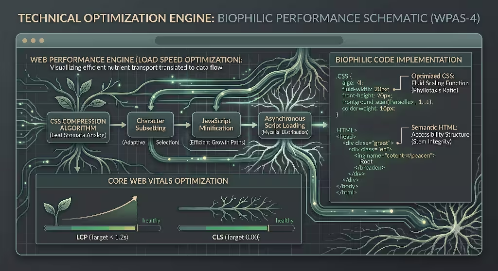
For a botanical serif font to perform well on a live website, we must apply rigorous computer science practices. Web performance directly affects search rankings, user retention, and conversion rates. Below is a detailed technical blueprint for loading a botanical serif font without slowing down your site.
                   FONT LOADING PIPELINE

 +------------------+      +-------------------+      +-------------------+
 |  Raw Font File   | ---> |  pyftsubset Tool  | ---> |   Compressed      |
 | (OTF/TTF, 250KB) |      | (Strip Unused)    |      | (WOFF2, < 25KB)   |
 +------------------+      +-------------------+      +-------------------+
                                                                |
                                                                v
 +------------------+      +-------------------+      +-------------------+
 |  Fast Page Load  | <--- | CSS font-display: | <--- |  Self-Hosted Web  |
 |  No Layout Shift |      | swap Directive    |      |  Server (Brotli)  |
 +------------------+      +-------------------+      +-------------------+
Font Compression with WOFF2
Web Open Font Format 2 (WOFF2) is the industry standard format for web fonts. It uses Brotli compression to reduce file sizes by 30% to 50% compared to older WOFF files. Never upload raw OTF or TTF font files directly to your web server for production use.
Glyph Subsetting Strategy
Most font files contain hundreds of characters, including foreign language symbols, mathematical operators, and decorative ornaments that your website may never use. Glyph subsetting strips out these unused characters to create a lightweight font file.
Using an open-source tool like pyftsubset from the Python fonttools library, you can compress a heavy botanical serif font down to essential Latin characters:
Bash
# Terminal command to subset a botanical serif font for web use
pyftsubset botanical-font.ttf \
  --latin \
  --unicodes="U+0020-007E,U+00A0-00FF" \
  --flavor=woff2 \
  --output-file=botanical-font.woff2
By removing unused glyphs, you can reduce file size from over 250 KB down to under 25 KB per font weight, speeding up font delivery.
Self-Hosting vs. Third-Party CDNs
While Google Fonts is convenient, self-hosting your botanical serif font on your own server or Content Delivery Network (CDN) is superior for performance and privacy. Self-hosting eliminates extra DNS lookups, avoids third-party tracking cookies, and allows you to set custom HTTP caching headers.
Optimized CSS @font-face Implementation
When implementing a botanical serif font in CSS, always use the font-display: swap directive. This tells the browser to render body text immediately using a system fallback font while your custom botanical serif font downloads in the background. This eliminates the Flash of Invisible Text (FOIT).
CSS
/* Optimized @font-face rule for a botanical serif font */
@font-face{
  font-family: 'BotanicalSerifDisplay';
  src: url('/fonts/botanical-serif-display.woff2') format('woff2');
  font-weight: 400 700;
  font-style: normal;
  font-display: swap; /* Prevents FOIT */
  unicode-range: U+0000-00FF, U+0131, U+0152-0153; /* Standard Latin Subset */
 }

/* Base styles applying the botanical serif font to headings */
h1, h2, h3 {
  font-family: 'BotanicalSerifDisplay', Georgia, 'Times New Roman', serif;
  font-weight: 700;
  letter-spacing: -0.01em;
}
Preventing Cumulative Layout Shift (CLS)
Cumulative Layout Shift occurs when a custom font finishes downloading and swaps with a fallback system font that has different letter dimensions. This difference causes text blocks to jump on screen, irritating users and lowering your Google Core Web Vitals scores.
To fix this issue, use CSS font metric overrides on your fallback font so its spacing matches your custom botanical serif font exactly:
CSS
/* Adjusting fallback system font metrics to match custom font dimensions */
@font-face{ font-display:swap;
  font-family: 'BotanicalFallback';
  src: local('Georgia');
  ascent-override: 92%;
  descent-override: 24%;
  line-gap-override: 0%;
  size-adjust: 102%;
 }

/* Applying fallback matching */
body {
  font-family: 'BotanicalSerifText', 'BotanicalFallback', serif;
}
Font Pairing Systems: Balancing Botanical Character with Interface Utility
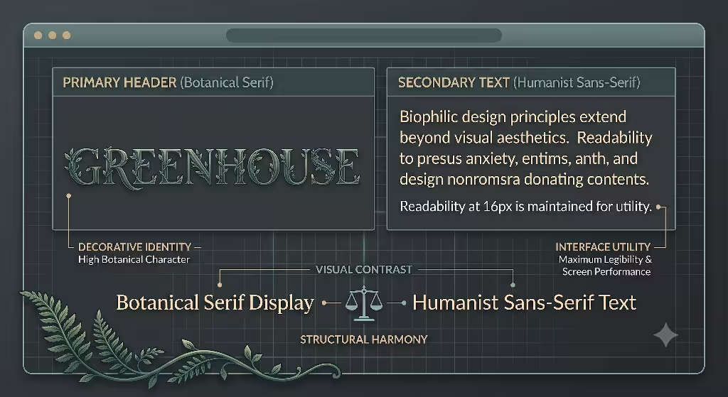
A successful website design rarely relies on a single font. To maintain clear visual hierarchy, you must combine your chosen botanical serif font with supporting typefaces that handle data tables, navigation menus, and body text smoothly.
                  VISUAL HIERARCHY STRUCTURE

 +-----------------------------------------------------------------+
 | HEADLINE (H1)                                                   |
 | Botanical Serif Font - Large, expressive, organic personality   |
 +-----------------------------------------------------------------+
                                  |
                                  v
 +-----------------------------------------------------------------+
 | SUBHEADLINE (H2)                                                |
 | Botanical Serif Font - Medium weight, high legibility           |
 +-----------------------------------------------------------------+
                                  |
                                  v
 +-----------------------------------------------------------------+
 | BODY COPY (Paragraphs)                                          |
 | Humanist Sans-Serif Font - Neutral, clean, 1.5x line height     |
 +-----------------------------------------------------------------+
                                  |
                                  v
 +-----------------------------------------------------------------+
 | UI LABELS & DATA                                                |
 | Monospace / Geometrical Sans - High utility contrast            |
 +-----------------------------------------------------------------+
Core Rules for Font Pairing
- Establish High Contrast in Function: Use your botanical serif font for headlines where personality and organic form draw user attention. Use a clean sans-serif font or a neutral text serif for long body copy to maximize reading comfort.
- Match Structural x-Heights: Ensure that the lowercase letter heights of your headline font and body font align naturally. If one font has a tiny x-height and the other has a massive x-height, text lines will feel unbalanced.
- Limit Total Font Variations: Do not load more than two font families or three total weights (such as Regular, Medium, and Bold). Loading too many weights increases page weight and confuses your visual hierarchy.
Recommended Pairing Frameworks
The following table presents tested font pairings that combine a botanical serif font with high-utility body and interface fonts across different business industries.
| Design Archetype | Headline Font (Botanical Focus) | Body Copy Font | UI & Data Font | Design Goal |
| Eco E-Commerce | Cormorant Garamond | Inter | Roboto Mono | Combines elegant leaf-like headline serifs with clean product descriptions and legible checkout forms. |
| Architectural Firm | Ogg Text | Open Sans | JetBrains Mono | Blends flowing organic curves with structured geometry to highlight sustainable building projects. |
| Wellness & Health | Recoleta | Noto Sans | System UI | Creates a warm, approachable brand voice that builds trust and reduces user strain. |
| AgTech & Biotech | GT Super Display | Source Serif 4 | Fira Code | Connects cutting-edge scientific code and data with bold natural leaf aesthetics. |
| Editorial Magazine | Playfair Display | Lora | Work Sans | Delivers a traditional literary aesthetic enhanced by organic italic flourishes. |
Accessibility (WCAG 2.2) and Sensory Design Compliance
Biophilic design and web accessibility share the same ultimate goal: creating web environments that accommodate human biological needs. When implementing a botanical serif font, you must adhere to Web Content Accessibility Guidelines (WCAG 2.2) to ensure your site is usable for everyone, including people with visual impairments.
Contrast Ratios and Color Palettes
A botanical serif font often features delicate stroke contrast between thick and thin lines. If background contrast is too low, thin lines disappear entirely for users with low vision.
       [ ACCESSIBLE CONTRAST ]              [ INACCESSIBLE CONTRAST ]

    Dark Forest Green Text                  Light Olive Text
    #1B3B2B on #F4F7F4                      #8A9A86 on #FFFFFF
    Contrast Ratio: 10.2:1 (PASS)           Contrast Ratio: 2.3:1 (FAIL)

           #####                                   #####
           #    #                                  #    #
           #####                                   #####
           #                                       #
           #                                       #
- Standard Text Minimum: Paragraph text must maintain a contrast ratio of at least 4.5:1 against its background color.
- Large Display Text Minimum: Headlines set at 24 pixels bold or 32 pixels regular using a botanical serif font must maintain a minimum contrast ratio of 3:1.
- Recommended Biophilic Palette: Pair a deep forest green text color (
#1B3B2B) against a soft cream background (#F4F7F4). Avoid harsh pure black (#000000) on stark white (#FFFFFF), as extreme contrast increases visual glare and eye strain.
Dark Mode Considerations and Halation
When users switch to dark mode, high-contrast serif fonts can cause an optical effect known as halation. Light text against a dark background can appear to bleed or glow outward, blurring the delicate serifs of a botanical serif font.
To fix halation in dark mode layouts:
- Reduce the font weight of your botanical serif font by one step (for example, shift from Bold 700 down to Medium 500).
- Use an off-white text color such as
#E0E0E0instead of pure#FFFFFF. - Increase letter spacing slightly by adding
letter-spacing: 0.02emin your CSS stylesheet.
Fluid Typography Scaling with CSS clamp()
Static font sizes fail to provide optimal reading experiences across modern device screens. Using CSS clamp(), you can allow your botanical serif font to scale smoothly between mobile screens and desktop monitors without requiring jerky breakpoint jumps.
CSS
/* Responsive fluid typography scaling for a botanical serif font */
h1 {
  /* Clamp formula: clamp(MIN, VAL, MAX) */
  font-size: clamp(2rem, 1.25rem + 3.75vw, 4.5rem);
  line-height: 1.15;
  font-weight: 700;
}

p {
  font-size: clamp(1rem, 0.95rem + 0.25vw, 1.25rem);
  line-height: 1.6;
}
This fluid typography setup guarantees that headlines set in a botanical serif font stay compact on small phone screens while growing gracefully on ultra-wide desktop monitors.
Strategic Recommendations to Incorporate Botanical Fonts
Biophilic web design is not merely a visual trend; it represents a scientific approach to user experience that improves brand engagement and search engine visibility.
Client Project Implementation Checklist
When building new client websites or re-architecting existing digital platforms, engineering teams must complete the following six-step font deployment protocol:
                  SILPHIUM DESIGN DEPLOYMENT CHECKLIST

  [1] FONT SELECTION AUDIT
      Choose a botanical serif font with matching text and display cuts.

  [2] LICENSING VERIFICATION
      Verify webfont pageview rights or select high-quality open-source fonts.

  [3] SUBSETTING & WOFF2 CONVERSION
      Strip unused glyphs with pyftsubset to keep files under 25KB.

  [4] SELF-HOSTED INFRASTRUCTURE
      Store files locally on CDN with font-display: swap and long caching headers.

  [5] METRIC MATCHING & CLS TESTING
      Configure fallback font overrides to achieve a 0.00 CLS score.

  [6] ACCESSIBILITY & PERFORMANCE AUDIT
      Verify 4.5:1 WCAG contrast and confirm sub-1.2s Largest Contentful Paint.
Local SEO and Authority Building for Biophilic Brands
In addition to technical implementation, using a botanical serif font reinforces brand positioning for clients in eco-friendly, agricultural, architectural, and wellness sectors. Search engines like Google evaluate user engagement metrics, including time on page, bounce rate, and content readability.
By building clear visual hierarchies with a botanical serif font, we keep visitors engaged longer, lower bounce rates, and improve overall domain authority. When paired with structured schema markup, fast page loading speeds, and localized content strategies, biophilic web design becomes a major competitive advantage in local search rankings.
Comprehensive Font Selection and Technical Reference Matrix
To assist designers and developers in evaluating font options quickly, the table below summarizes key technical parameters, rendering properties, and recommended implementation contexts for top botanical serif font choices.
| Font Name | Category / License | Primary Strengths | Minimum Size for Legibility | Performance Footprint | Ideal Pairings |
| Cormorant Garamond | Open-Source (OFL) | Delicate teardrop terminals, high elegance, zero licensing cost. | $28\text{px}$ (Display weight)$16\text{px}$ (Text weight) | Very Low (Available via Google Fonts or self-hosted) | Inter, System UI, Roboto |
| Ogg / Ogg Text | Commercial (Klim Type) | Steep calligraphic axis, expressive vine-like flourishes. | $36\text{px}$ (Ogg Display)$15\text{px}$ (Ogg Text) | Medium (Requires self-hosted WOFF2 subsetting) | Open Sans, Neuzeit Grotesk |
| Recoleta | Commercial (Latinotype) | Soft rounded serifs, approachable organic curves, durable stems. | $20\text{px}$ (Display)$14\text{px}$ (Body elements) | Low (Clean vector paths compress efficiently) | Noto Sans, Lato, Work Sans |
| GT Super | Commercial (Grilli Type) | Sharp thorn-like serifs, bold architectural structure. | $32\text{px}$ (Display)$15\text{px}$ (Text) | Medium (Multiple sub-families require careful subsetting) | Source Sans 3, Fira Code |
| Playfair Display | Open-Source (OFL) | Wide availability, sweeping italic flourishes, high screen contrast. | $30\text{px}$ (Headings)$18\text{px}$ (Subheadings) | Very Low (Optimized for web distribution) | Montserrat, Roboto, Lora |
Summary and Strategic Roadmap for Biophilic Web Typography
Incorporating a botanical serif font into your web design framework bridges the gap between organic nature and modern computer science. By understanding the physical anatomy of nature-inspired glyphs, choosing font cuts suited for specific screen sizes, and enforcing clean performance engineering, you create websites that excel in both aesthetics and functionality.
Key Takeaways for Web Designers and Engineers
- Respect Glyph Architecture: Reserve high-contrast display weights of your botanical serif font for headlines above 32 pixels. Use sturdier text weights or clean sans-serif fonts for small body paragraphs.
- Optimize for Web Speed: Always compress font files into WOFF2 format, subset unused characters to keep file sizes under 25 KB, and apply
font-display: swapin your CSS rules. - Prevent Layout Shift: Set CSS metric overrides (
size-adjust,ascent-override,descent-override) on fallback system fonts to eliminate Cumulative Layout Shift and protect your Core Web Vitals scores. - Prioritize Accessibility: Maintain minimum contrast ratios of 4.5:1 for body copy and 3:1 for display headings. Adjust font weights and colors in dark mode to prevent visual halation.
- Build Balanced Hierarchies: Pair your headline botanical serif font with high-utility body and UI typefaces, limiting your site to two font families and three total weights.
At Silphium Design LLC, we will continue leading the development of sustainable, high-performance, biophilic digital interfaces. By grounding our web design choices in biological principles and technical discipline, we build digital environments that support human well-being while delivering measurable business results for our clients.