A website is not just code, but is a living ecosystem. When we talk about how to implement light typography effectively, we are discussing the digital equivalent of sunlight filtering through leaves. It is a delicate balance.
Table of Contents
The Biological Basis of Light and Contrast
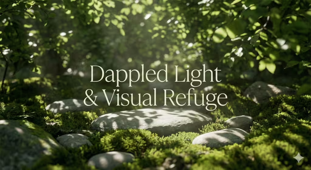
In nature, we are rarely confronted with harsh, heavy blocks of solid color. Instead, we see “dappled light,” which is the soft, scattered light that happens when sun passes through a tree canopy. This is why our eyes feel relaxed when they see plenty of open space and thin, elegant lines. Light typography refers to font weights that are very thin, usually ranging from 100 to 300 in technical terms.
The concept of “visual breathability” is essential here. Just as a forest needs clearings so you can see the sky, a website needs light typography so the user does not feel overwhelmed by a wall of heavy text. When we use light typography, we are following the rules of biophilic design. We are creating a sense of “Prospect and Refuge.” This means the reader feels they have a clear view of the information (prospect) while feeling safe and comfortable in a clean, organized space (refuge).
To implement light typography effectively, one must understand that beauty cannot come at the expense of function. If a font is so thin that a person cannot read it, the design has failed. We must use mathematical contrast and precise spacing to make sure these thin lines remain visible. This article will serve as your comprehensive guide to mastering this balance, ensuring your site is both a work of art and a highly functional tool for every visitor.
Defining “Light” in the Digital Context
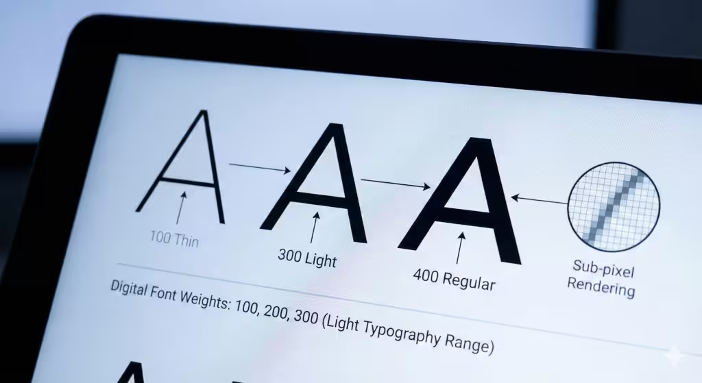
When we discuss light typography, we are specifically looking at the “weight” of a font. In the world of CSS (the language that styles websites), font weight is measured on a scale. A normal font is usually 400. A bold font is 700. Light typography lives in the 100, 200, and 300 range. These are often called “Thin,” “Extra Light,” or “Light.”
On a high-resolution screen, these fonts look like fine silk threads. However, on older screens, they can look broken or “fuzzy.” This happens because of the way pixels work. A pixel is a tiny square of light. If a font stroke is thinner than one pixel, the computer tries to guess where it should go. This is called sub-pixel rendering. To implement light typography effectively, you must choose fonts that are designed well enough to stay sharp even when they are very thin.
Technical terms like “kerning” and “tracking” are your best friends here. Kerning is the space between two specific letters. Tracking is the overall space between all letters in a block of text. Because light typography has less physical “ink” on the screen, the letters can easily blend together. By increasing the tracking slightly, you give each letter its own room to breathe. This makes the text much easier for the human brain to process.
How Do You Implement Light Typography Effectively in Web Design?
This is the question most designers ask when they want to modernize a site. The short answer is that you must treat light typography like a headline, not a workhorse. It is best used for large titles (H1 and H2 tags) where the size of the letters is big enough to show off the thin lines.
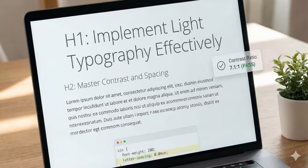
If you want to implement light typography effectively, follow the 4.5:1 rule, or even better 7:1. This is a contrast ratio. It means the color of your text must be much darker or much lighter than the background. For example, if you have a white background, your light typography should be a very dark gray or black. If the text is too light in color and too thin in weight, it will simply disappear for anyone with less than perfect vision. However, if the font is thicker, pure black (#000000), will produce too much contrast.
Another key rule is font size. You should never use a “thin” weight for text that is smaller than 18 pixels. In fact, 24 pixels or larger is even better. When the letters are large, the thin strokes look intentional and elegant. When they are small, they look like a mistake or a printing error. Always remember that the goal is to guide the reader’s eye, not to make them work hard to see your message.
The Biophilic Connection: Dappled Light and Visual Refuge
To understand how to implement light typography effectively through a biophilic lens, we must look at how our brains have evolved over millions of years. Humans are hardwired to respond to specific natural patterns. In my work at Silphium Design LLC, I apply these biological triggers to the digital screen.
The concept of “Dappled Light” is one of the most powerful tools in a designer’s kit. In nature, dappled light occurs when sunlight filters through the leaves of a tree canopy. It creates a shifting pattern of light and shadow on the forest floor. This is not a solid block of brightness; it is a delicate, broken texture. When you implement light typography effectively, you are recreating this texture on a webpage.
Stephen Kellert, a pioneer in biophilic design, talked about the importance of “organized complexity.” A website should be complex enough to be interesting but organized enough to be calm. Light typography helps achieve this by stripping away the “noise” of heavy, chunky fonts. It allows the user to focus on the essential information while enjoying a visual experience that feels organic and peaceful.
Thin font weights allow the background, whether it is a soft white, a gentle earth tone, or a natural texture, to flow through and around the letters. This prevents the text from looking like a heavy “wall” that blocks the user’s view. Instead, the words feel integrated into the environment. This mimics the “Complexity and Order” found in nature, where thin branches or blades of grass create a complex but peaceful visual field.
The Science of Prospect and Refuge
Another core principle I focus on is “Prospect and Refuge.” This theory suggests that humans feel most comfortable when they have a clear, wide-open view (prospect) but also feel protected and enclosed (refuge).
- Prospect: By using light typography for your main headings, you create a sense of openness. The thin lines don’t crowd the screen, giving the user a “wide view” of the page’s content. It feels like looking across a calm meadow.
- Refuge: When we combine these light fonts with plenty of white space—or what I call “digital clearings”—we provide a place for the eye to rest.
If a website is cluttered with heavy, bold text everywhere, it triggers a “fight or flight” response in the brain because it feels chaotic and trapped. However, when you implement light typography effectively, you provide the “prospect” of information without losing the “refuge” of a calm interface.
Natural Geometry and Mathematical Beauty
Light typography often follows the mathematical rules of fractals. The thin strokes of a high-quality light font often mirror the “Golden Ratio” found in seashells and sunflowers.
When a reader looks at a headline set in a light weight, their brain recognizes these thin, elegant proportions as “natural.” This lowers the user’s heart rate and makes them more likely to stay on the site and read your content. We are not just choosing a font; we are choosing a biological experience.
Creating “Visual Air”
Finally, we must consider the idea of “Visual Air.” In a dense forest, you can sometimes feel smothered. A clearing provides a breath of fresh air. On a website, light typography acts as that breath of air. Because the strokes are thin, there is more physical “air” (background space) within the letters themselves.
To implement light typography effectively, you must treat that empty space as a design element. The hole in a “o” or the space inside an “a” becomes a tiny window to the background. This creates a layered effect that feels three-dimensional and alive, rather than flat and static. This is the essence of biophilic design: making the digital world feel as breathable and life-affirming as the natural world outside our windows.
Why is Light Typography Hard to Read?
We must be honest about the challenges. The main reason light typography is hard to read is “cognitive load.” This is a fancy way of saying that your brain has to work harder to understand what it is seeing. When a font is very thin, the eye has less “data” to send to the brain. If the background is cluttered or the contrast is low, the brain has to “fill in the blanks” to figure out what the letters are.
This causes eye strain. If a user has to squint to read your website, they will leave. This is especially true for the millions of people with visual impairments or those who are reading your site in bright sunlight on a mobile phone. To implement light typography effectively, you must account for these real-world conditions.
Another issue is “vibration.” This happens when very thin white text is placed on a very dark black background. The edges of the letters can seem to shimmer or glow, which makes the text look blurry. To fix this, designers often use a slightly off-white color (like a very light cream) or a dark charcoal background instead of pure black. This softens the blow to the eye and makes the light typography much more legible.
Visual Hierarchy: Pairing Light Weights with Heavy Accents
In design, hierarchy is the order in which a person notices things. If everything is light typography, nothing stands out. It would be like a forest where every single tree is exactly the same height and width; your eyes wouldn’t know where to look. To implement light typography effectively, you must pair it with “anchors.”
An anchor is a heavier element that gives the page structure. For example, you might have a very large, thin headline in light typography. Underneath it, you might use a smaller, bolder font for the sub-header. The bold text “grounds” the light text. It tells the reader, “Look here first for the big idea, and then look here for the details.”
You can also use lines, shapes, or bright colors as anchors. If you have a thin font floating in the middle of a white page, it might feel lost. But if you place a small, colorful icon or a solid horizontal line near it, the light typography feels like it belongs there. This creates a balanced “ecosystem” on the page, where different elements work together just like different plants in a garden.
Can I Use Light Typography for Body Text?
This is a very important question. As a rule, you should avoid using light typography for body text (the long paragraphs of information on a page). Body text is usually read at a smaller size, around 16 or 18 pixels. At that size, light typography becomes almost invisible to many readers. It lacks what designers call “stroke thickness,” which is necessary for the eye to track quickly along a line of text.
When you use light typography for long paragraphs, it slows down the reading speed. This is bad for “User Experience” (UX). If people find it hard to read your blog posts or product descriptions, they will stop reading them. For body text, stick to a “regular” weight, which is usually 400.
However, there is one exception. If you have a very high-quality “Retina” or 4K display, light typography can sometimes work for short bits of text. But since you cannot control what screen your visitor is using, it is safer to be conservative. Use the thin weights for the “artistic” parts of your site, like quotes or big titles, and use standard weights for the “functional” parts where the information lives.
Technical Implementation Checklist (SEO & UX)
To implement light typography effectively, you need a technical plan. Here is a checklist to follow:
- Choose a High-Quality Font: Not all fonts are created equal. Use fonts like “Inter,” “Montserrat,” or “Roboto” which have been specifically designed to look good at light weights.
- Check the Contrast: Use a free online contrast checker to make sure your text color and background color are different enough.
- Adjust the Tracking: Add a little bit of extra space between the letters (usually
letter-spacing: 0.02em;in CSS). - Set the Right Size: Ensure your light typography headlines are at least 24 pixels or larger.
- Test on Mobile: Look at your site on a small phone screen. If the text looks like it is disappearing, you need to make it thicker or darker for mobile users.
- Use Variable Fonts: These are new types of font files that allow you to pick the exact weight you want (like 250 instead of just 200 or 300). This gives you much more control.
- Check Loading Speed: Thin fonts are beautiful, but don’t load ten different font weights. Each one makes your site slower. Only load the weights you actually use.
The Future of Weightless Design
As screens get better and better, we will see more designers wanting to implement light typography effectively. We are moving toward a digital world that feels more transparent, more open, and more connected to the natural world. Light typography is a big part of that movement. It allows us to build websites that don’t feel like heavy machines, but like light, airy spaces where ideas can grow.
The future is in “Variable Fonts.” These allow us to change the weight of the text based on the lighting in the room or the size of the screen. Imagine a website where the light typography becomes slightly thicker at night to make it easier to read in the dark, and thinner during the day when there is plenty of light. This is the ultimate goal of biophilic design: a digital environment that responds to the physical world.
Remember, the most important part of design is the person using it. If you implement light typography effectively, you are showing respect for your reader. You are giving them a beautiful, calm space to learn and explore. You are combining the best of biology, computer science, and art to create something truly special.