
Table of Contents
The Evolutionary Hook: Jay Appleton and Environmental Psychology
Human beings spent thousands of years living in natural habitats. Our eyes and brains developed to help us stay alive. In 1975, a geographer named Jay Appleton wrote a book called The Experience of Landscape. He looked at why people find certain views beautiful and comforting. He came up with a simple idea called prospect and refuge theory.
The main idea is very clear. To survive, an early human needed to see hazards and food from a distance. That ability to see far and wide across open land is called prospect. At the same time, that person needed to stay safe from predators, cold winds, and storms. They needed a secure, hidden spot to look out from without being seen. That safe shelter is called refuge.
When an environment has both elements, humans feel calm. A setting that offers only wide open space creates anxiety. You feel exposed, vulnerable, and easy to attack. A setting that offers only closed shelter makes you feel trapped and blind to what is coming next. When you stand under a sturdy cliff or beneath low tree branches while looking across an open meadow, your nervous system relaxes.
We carry this deep evolutionary programming into everything we do today. Even though modern humans work on laptops instead of hunting across savannas, our biology has not changed. When we browse the internet, our sensory systems seek the same basic signals of comfort and safety. We react to layouts on screens in the exact same way our ancestors reacted to physical landscapes. When a digital space lacks shelter, our eyes jump around without finding rest. Understanding prospect and refuge gives digital creators a direct way to work with human nature instead of fighting it.
The Digital Translation: Mapping Screen Space to Human Instincts
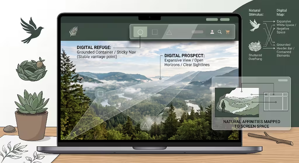
Every time a visitor opens a web page, their mind performs a fast spatial assessment. The visitor asks simple internal questions. Where am I? Where can I go? Am I in control of this page, or is this page going to surprise me?
The top portion of your screen acts as an entrance to a new physical territory. The area above the fold serves as the horizon. In physical geography, a horizon tells you how far you can travel and what obstacles sit in your path. On a screen, the background imagery, wide margins, and open white space provide digital prospect. They let the user see the landscape of your ideas and understand the scope of the site.
At the same time, the visitor needs a reliable base. If a web page is nothing more than a giant, floating photograph with text scattered across it, the eye gets lost. There is no firm ground. The site visitor feels like they are hanging in midair without any place to hold on.
Navigation bars, search boxes, framed control strips, and anchored buttons serve as digital refuge. They represent the safe, covered porch or the cave mouth where a visitor can stand. When you look at your interface through this lens, a website header stops being a simple list of links. It turns into an environmental experience. By balancing open sightlines with secure containers, you satisfy the basic human desire for prospect and refuge right away.
+-------------------------------------------------------------+
| [REFUGE: Grounded Container / Sticky Nav / Clear Controls]  |
|                                                             |
|                       [PROSPECT]                            |
|             Expansive View / Open Horizons /                |
|               Clear Sightlines into Content                 |
|                                                             |
+-------------------------------------------------------------+
The Value Proposition: Reducing Micro-Stress and Guiding Focus
Most modern websites accidentally produce tiny moments of mental fatigue. Designers call these moments cognitive friction or micro-stress. When a header has seven menus that drop down at random, bright flashing alerts, and ungrounded text sitting right over a busy photo, the human visual cortex has to work very hard. The brain does not know what to look at first. It searches for a stable surface to land on, finds none, and feels mild irritation.
When users feel this visual tension, they often leave the site within seconds. Web professionals call this a bounce. Even if visitors stay, their attention drops. They struggle to absorb information because their brains spend energy trying to orient themselves in space.
Applying prospect and refuge directly solves this problem. When a header gives the eye a solid home base, visual stress drops. The visitor knows exactly where the controls live. They feel protected from accidental clicks and confusing layout shifts.
With that feeling of safety secured, the visitor can use the open parts of the header to look ahead. They scan your headlines, explore your categories, and absorb your core message with zero strain. Balancing prospect and refuge turns a confusing header into a peaceful, clear focal point. The site visitor feels calm, stays longer, and moves smoothly into your content.
Defining Digital Prospect: Sightlines, Negative Space, and Depth
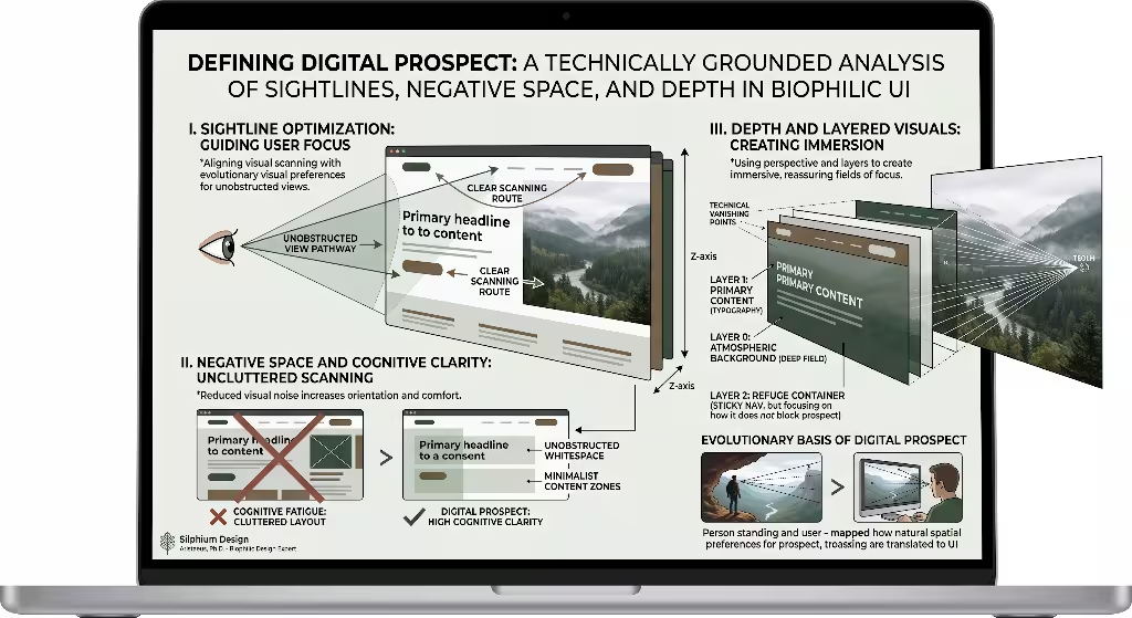
To create genuine digital prospect in a header, you must build visual openness that invites the eye to travel forward. Prospect is never about empty space for the sake of emptiness. It is about creating clear lines of sight so the visitor understands what lies ahead.
First, digital prospect relies on clean negative space. If you jam banners, social media icons, secondary links, phone numbers, and badges into the top two hundred pixels of your screen, you destroy the horizon. The user hits a wall of text. To provide true prospect, you must clear out non-essential elements. Leave wide, unobstructed visual runways around your main headlines and key statements.
Second, consider depth of field. A flat, solid block of uniform color can sometimes feel like a solid concrete wall. To human perception, a concrete wall right in front of your face offers zero prospect. You can build depth by using layered tones, gentle atmospheric gradients, or photographs that feature distant horizons. When an image contains natural vanishing points, the user’s eye follows those lines deep into the background.
Finally, prospect requires information transparency. A visitor looking across a natural valley wants to see the paths winding through the grass. In the same way, a visitor looking at a digital header needs clear pathways. Your layout should reveal the structure of your site at a glance. When users see clear categories and uncluttered pathways, prospect and refuge begin working together to create an inviting digital landscape.
+-------------------------------------------------------------+
|                     DIGITAL PROSPECT                        |
|                                                             |
|   Negative Space       Depth of Field       Clear Pathways  |
|   (Uncluttered room)   (Soft gradients)     (Visible trails)|
|          \                   |                    /         |
|           v                  v                   v          |
|    "The eye moves freely forward without visual barriers"   |
+-------------------------------------------------------------+
Defining Digital Refuge: Visual Anchors, Framed Bars, and Stability
While prospect pulls the eye forward, refuge holds the body steady. In digital design, refuge gives the user a reliable control station. It is the place where the user feels completely protected from mistakes.
A classic example of refuge in a header is a distinct navigation bar. Instead of letting links float loose across an open background, you place them inside a visible container. This container might have a subtle background color, a soft border, or a frosted glass treatment. This visual border tells the brain that the controls sit in a defined, stable shelter.
Refuge also comes from clear visual weight. When an interactive button looks solid, sturdy, and easy to target, it provides a sense of physical security. The user knows that clicking it will produce a predictable outcome. Buttons with high contrast, generous padding, and clear hover states give users a sense of grounded refuge.
+-------------------------------------------------------------+
|                     DIGITAL REFUGE                          |
|                                                             |
|   Visual Borders       Tactile Buttons      Predictability  |
|   (Contained boxes)    (Solid padding)      (Sticky layout) |
|          \                   |                    /         |
|           v                  v                   v          |
|      "The user feels anchored, safe, and in full control"   |
+-------------------------------------------------------------+
Another powerful tool for digital refuge is predictable positioning. When a navigation bar sticks to the top of the browser as the user scrolls, it acts as a portable shelter. No matter how deep into the wilderness of the page the user travels, their refuge remains within reach. They never have to worry about getting lost in the content. By establishing this sense of reliable protection, your header builds the foundational safety required for effective prospect and refuge.
Step 1: Establish the Spatial Hierarchy with CSS Grid and Layers
To build a header that uses prospect and refuge, you need a smart underlying layout structure. You can achieve this balance cleanly using modern web standards like CSS Grid and structured z-index layering.
Think of your header as two distinct spatial planes working in harmony:
- The Vista Plane (Layer 0): This layer handles prospect. It stretches edge-to-edge across the screen, using the full width of the browser window. It holds your broad visuals, soft atmospheric gradients, and generous white space.
- The Enclosure Plane (Layer 1): This layer provides refuge. It sits on top of the Vista Plane. It holds your primary controls, navigation items, brand mark, and search utilities inside structured, visible containers.
Here is a practical semantic markup pattern for this dual-layer approach:
HTML
<header class="biophilic-header">
  <!-- Vista Plane: Digital Prospect -->
  <div class="prospect-vista">
    <div class="vista-content">
      <span class="eyebrow">Natural Interface Frameworks</span>
      <h1>Designing with Human Instincts</h1>
      <p>Create visual balance by pairing wide horizons with stable shelters.</p>
    </div>
  </div>

  <!-- Enclosure Plane: Digital Refuge -->
  <nav class="refuge-enclosure" aria-label="Main Navigation">
    <div class="refuge-inner">
      <a href="/" class="brand-link">Silphium Design</a>
      <ul class="nav-links">
        <li><a href="#about">Philosophy</a></li>
        <li><a href="#work">Case Studies</a></li>
        <li><a href="#resources">Articles</a></li>
      </ul>
      <a href="#contact" class="refuge-action">Start Project</a>
    </div>
  </nav>
</header>
In your CSS, use CSS Grid to map these elements cleanly across the screen. You can position the refuge enclosure at the top while letting the prospect vista expand beneath and behind it:
CSS
.biophilic-header {
  position: relative;
  width: 100%;
  min-height: 80vh;
  display: grid;
  grid-template-columns: 1fr;
  grid-template-rows: auto 1fr;
  background-color: #f7f9f6;
  overflow: hidden;
}

.refuge-enclosure {
  grid-row: 1;
  grid-column: 1;
  z-index: 10;
  width: 100%;
  padding: 1.5rem 2rem;
}

.refuge-inner {
  max-width: 1200px;
  margin: 0 auto;
  display: flex;
  justify-content: space-between;
  align-items: center;
  padding: 0.75rem 1.5rem;
  background-color: rgba(255, 255, 255, 0.92);
  border: 1px solid rgba(44, 62, 45, 0.12);
  border-radius: 8px;
  box-shadow: 0 4px 12px rgba(0, 0, 0, 0.03);
}

.prospect-vista {
  grid-row: 1 / span 2;
  grid-column: 1;
  z-index: 1;
  display: flex;
  align-items: center;
  justify-content: center;
  padding: 8rem 2rem 4rem 2rem;
}
This clean structural separation ensures that your code mirrors physical reality. The protected refuge sits firmly in the foreground, while the expansive prospect stretches outward behind it. This organization makes your implementation of prospect and refuge technically sound and visually obvious.
Step 2: Designing the Refuge Enclosure: Materials, Edges, and Borders
Once your spatial layers exist, you must style the refuge so it feels protective and stable. In architecture, a refuge needs solid walls, a roof, or at least a defined overhead canopy. In digital design, we use visual styling to signal those same physical qualities.
To create a strong sense of refuge, focus on three specific visual traits:
- Defined Boundaries: Avoid letting menu links float loosely on bare backgrounds without edges. Use distinct bounding boxes. A soft outline or an enclosed pill shape creates a clear container that isolates your controls from outside clutter.
- Material Weight: Use surface treatments that look substantial. A solid, muted background color tells the eye that this area is grounded. If you use a semi-transparent background, use a modern CSS backdrop filter to create a frosted glass effect. Blurring the content beneath the container makes the refuge feel like a protective glass screen.
- Subtle Elevation: Ground your enclosure using realistic light and shadow. A gentle downward box shadow makes the navigation container appear to hover slightly above the background. This elevation separates the interactive tools from the background vista, reinforcing the natural balance of prospect and refuge.
Here is how you can write these refuge styles:
CSS
.refuge-inner {
  background-color: rgba(245, 247, 244, 0.88);
  backdrop-filter: blur(12px);
  -webkit-backdrop-filter: blur(12px);
  border: 1px solid rgba(30, 45, 30, 0.15);
  border-radius: 12px;
  box-shadow:
    0 2px 4px rgba(0, 0, 0, 0.02),
    0 8px 24px rgba(0, 0, 0, 0.06);
}

.refuge-action {
  background-color: #2d4a34;
  color: #ffffff;
  padding: 0.6rem 1.25rem;
  border-radius: 6px;
  font-weight: 600;
  text-decoration: none;
  border: 1px solid #1e3323;
  box-shadow: inset 0 1px 0 rgba(255, 255, 255, 0.2);
}
Notice how these details work together. The gentle backdrop blur protects the text from visual noise underneath. The border defines the territory, and the inner highlight on the button makes it look solid. These visual choices turn the navigation bar into a genuine haven. The user can rest their eyes here before looking back out into the wider page.
Step 3: Framing the Vista: Negative Space and Visual Horizons
With your refuge established, you can focus on building the prospect. A great digital vista does not mean overloading the header with giant illustrations. True prospect is about room to breathe, open sightlines, and natural visual movement.
In physical nature, your eyes look all the way to the horizon to judge distance, weather, and topography. On a screen, you recreate this experience using careful composition.
+-------------------------------------------------------------+
|  [Refuge Header Bar]                                        |
|                                                             |
|           === Wide Sky / Expansive Margins ===              |
|                                                             |
|   [Focal Headline] ---------> Sightline pulls eye downward  |
|                               to explore the rest of page   |
|                                                             |
|           === Open Ground / Generous Spacing ===            |
+-------------------------------------------------------------+
To create an open vista in your header, follow these core principles:
- Use Asymmetrical Margins: Symmetrical, centered blocks of text can sometimes feel static, like an eye chart. By placing your primary headline slightly to the left, you leave the right side of the screen wide open. This open area acts like an empty field, inviting the eye to explore the depth of the layout.
- Keep Backgrounds Atmospheric: If you use a photograph in your header, select images with clear skies, deep water, distant mountain ranges, or sweeping fields. Avoid close-up shots of complex objects, which crowd the user’s field of view. If you use color gradients, transition from a slightly deeper tone at the top down to a light, airy tone at the bottom. This transition mimics the natural illumination of the open sky.
- Establish Long Sightlines: Ensure that text lines are not too long. Keep reading lines between 45 and 75 characters. This restraint leaves open space on either side of your text, keeping visual corridors clear.
When a visitor sees wide, unobstructed pathways around your ideas, their natural instinct to explore kicks in. The combination of open space and comfortable borders ensures your implementation of prospect and refuge feels natural, welcoming, and easy to navigate.
Step 4: Dynamic Behavioral Shifts: From Vista to Sticky Haven
A website header is not a static painting. It changes as the visitor interacts with the page. You can strengthen the experience of prospect and refuge by changing how the header behaves as the user scrolls down the page.
When the visitor first lands at the very top of the page, they need maximum prospect. They are taking in the whole view, reading your main headline, and getting their bearings. At this initial moment, your header should feel open, light, and unobtrusive:
TOP OF PAGE (High Prospect):
+-------------------------------------------------------------+
| [Refuge: Clean, airy bar]                                   |
|                                                             |
|                   Expansive Hero Statement                  |
|                                                             |
+-------------------------------------------------------------+

DURING SCROLL (High Refuge):
+-------------------------------------------------------------+
| [Refuge: Compact, opaque sticky bar with clear controls]   |
+-------------------------------------------------------------+
| Content scrolls underneath smoothly...                      |
|                                                             |
+-------------------------------------------------------------+
As the visitor scrolls down, their needs change. They leave the top vista behind and dive into dense paragraphs, data tables, and forms. In this reading zone, exposure increases and the risk of disorientation rises. The user needs more refuge.
To respond to this need, transform your header dynamically:
- Compact the Container: Reduce the vertical padding of the navigation bar so it takes up less screen real estate.
- Increase Opacity and Shadow: Shift the background of the bar from semi-transparent to fully opaque. Deepen the drop shadow slightly to show that the bar sits firmly above the scrolling content.
- Persist the Controls: Keep the primary navigation links, search trigger, and back-to-top buttons anchored right at the top edge of the browser.
Here is a straightforward JavaScript and CSS pattern to handle this transition:
JavaScript
window.addEventListener('scroll', () => {
  const header = document.querySelector('.refuge-enclosure');
  if (window.scrollY > 50) {
    header.classList.add('scrolled-refuge');
  } else {
    header.classList.remove('scrolled-refuge');
  }
});
CSS
.refuge-enclosure {
  position: fixed;
  top: 0;
  left: 0;
  width: 100%;
  transition: all 0.3s ease;
}

.refuge-enclosure.scrolled-refuge .refuge-inner {
  padding: 0.4rem 1.2rem;
  background-color: #ffffff;
  border-color: rgba(0, 0, 0, 0.1);
  box-shadow: 0 4px 16px rgba(0, 0, 0, 0.08);
}
This interaction directly honors human instincts. When the user travels through the long trail of your page content, their protective refuge moves right along with them. They always feel secure, which makes their experience of prospect and refuge feel seamless from top to bottom.
Front-End Technical Execution and Code Optimization
A beautiful design concept fails if it makes your website slow or jittery. Environmental psychology relies on smooth, natural motion. If a website header stutters when it changes shape, the brain registers that mechanical failure as an unnatural distraction.
To keep your header running at sixty frames per second, you must optimize how the browser paints your prospect and refuge elements:
- Hardware Acceleration: When animating a sticky refuge bar, stick to the
transformandopacityproperties. Avoid animating layout properties likeheight,margin, orpaddingon scroll, because those force the browser to recalculate the entire page layout. - Use
will-changeJudiciously: Inform the browser engine which elements will move by applyingwill-change: transform;to the refuge container. This prompts the graphics processing unit (GPU) to handle the rendering work, preventing stutter. - Debounce Scroll Events: When tracking scroll position with JavaScript, wrap your event listener inside
window.requestAnimationFrame(). This keeps your script synchronized with your monitor refresh rate.
JavaScript
let isScrolling = false;

window.addEventListener('scroll', () => {
  if (!isScrolling) {
    window.requestAnimationFrame(() => {
      const refuge = document.querySelector('.refuge-enclosure');
      if (window.scrollY > 40) {
        refuge.classList.add('is-active');
      } else {
        refuge.classList.remove('is-active');
      }
      isScrolling = false;
    });
    isScrolling = true;
  }
});
Keeping your code lightweight and responsive protects the user from frustrating interruptions. A fast, smooth header helps the natural balance of prospect and refuge feel effortless.
Accessibility and Contrast: Safety for Every Visitor
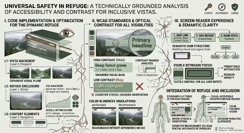
A true refuge must offer genuine safety to every person who visits your site, including people with low vision, color blindness, or cognitive disabilities. If an interface is hard to read or confusing to operate, it cannot provide comfort.
When implementing prospect and refuge, visual accessibility must guide your design choices:
- Strict Contrast Ratios: If your refuge container sits on top of an open, dynamic vista image, make sure your text meets the Web Content Accessibility Guidelines (WCAG) contrast standards. Text must have a contrast ratio of at least 4.5 to 1 against its background. Large text must meet a ratio of at least 3 to 1.
- Avoid Contrast Shifts Under Frosted Glass: Semi-transparent frosted glass containers can be tricky. As dark or light elements scroll underneath a translucent navigation bar, the contrast ratio shifts constantly. If dark content scrolls beneath dark navigation text, the links become unreadable. To fix this, use high-opacity backgrounds (at least 90 percent opaque) or ensure the background shifts to a solid, opaque color during scroll.
- Visible Keyboard Focus: Refuge requires control. People using keyboard navigation must always see exactly where they are. Never remove the outline on focused elements without providing an obvious, high-contrast replacement. A thick, clear focus ring gives keyboard users the exact same spatial security that sighted mouse users enjoy.
- Logical DOM Structure: The visual order of your header must match its underlying HTML order. Do not use visual absolute positioning tricks that cause screen readers to jump around unpredictably. Screen readers should encounter your landmark navigation elements first, followed by your main vista headings.
+-------------------------------------------------------------+
|                  ACCESSIBILITY CHECKLIST                    |
|                                                             |
|   [x] 4.5:1 Minimum text contrast ratio                     |
|   [x] Opaque backings prevent background bleed-through       |
|   [x] High-visibility focus indicators for keyboards        |
|   [x] Semantic HTML landmarks (<header>, <nav>, <main>)     |
+-------------------------------------------------------------+
When you design for accessibility, you ensure that every visitor experiences the psychological ease that comes with well-executed prospect and refuge.
What is Prospect and Refuge Theory in Graphic and Web Design?
People frequently ask how an architectural theory from the 1970s applies to digital graphics and user interfaces. In graphic and web design, prospect and refuge theory describes the intentional pairing of expansive scanning areas with secure, stable control elements.
In traditional graphic design, prospect is created through wide margins, deep photography, and uncluttered layouts that let the reader scan broad themes quickly. Refuge is created through stable grids, running page headers, uniform footers, and clear page numbers. These grounding elements tell the reader where they are in the physical document.
When we bring this idea to the web, interactivity adds a whole new dimension. Digital prospect lets the user look forward through information architectures, view pricing structures, and read article excerpts without hitting walls of popups. Digital refuge gives the user permanent anchors: persistent menus, visible undo buttons, and clear home links.
Graphic design creates this balance on static paper. Web design brings it to life as an interactive space that responds to user input. Understanding prospect and refuge gives designers a clear framework for deciding when to open space up and when to enclose it.
How Does Biophilic Design Improve Website Conversion Rates?
Many designers wonder how natural design principles influence business metrics like sign-ups, sales, and lead generation. The connection comes down to cognitive load and emotional comfort.
When a user visits a website to buy a product or hire a service, they often feel cautious. They wonder if the business is trustworthy, if the price is fair, and if their payment details will stay safe. A messy, chaotic layout increases this baseline anxiety. When a site header feels cluttered and unstable, those negative feelings transfer directly to the brand itself.
Messy, Unstable Header
  --> High Cognitive Load
  --> Heightened User Anxiety
  --> Low Trust
  --> High Bounce Rates

Balanced Header (Prospect + Refuge)
  --> Low Cognitive Load
  --> Visual Calm & Orientation
  --> High Trust
  --> Stronger Conversions
When you design with prospect and refuge, you directly lower that friction:
- Clear Refuge Builds Trust: When navigation bars are tidy, search tools work predictably, and security credentials sit in structured containers, users feel protected. That sense of shelter makes them more confident when entering payment details or completing forms.
- Clear Prospect Clarifies Value: When the open vista clearly displays what the user will gain, free from visual noise, your value proposition hits home right away. Users understand your offer without having to search for it.
By lowering stress and clarifying choices, balancing prospect and refuge creates an easy path to action. When users feel calm, oriented, and safe, conversion rates naturally climb.
Can Prospect and Refuge Principles Be Implemented on Mobile Headers?
Applying prospect and refuge to mobile devices is entirely possible, but the small screen requires adjustments. On a smartphone, you have very little room above the fold. You cannot build a massive, sweeping desktop vista without pushing essential content off the screen.
To implement prospect and refuge on mobile screens, use these techniques:
- The Bottom Thumb-Zone Refuge: On mobile, the top edge of the phone is the hardest place for human thumbs to reach. To give users a true sense of comfort, move the refuge to the bottom of the screen. A floating bottom navigation bar acts as a sturdy, accessible shelter right under the user’s thumb.
- Compact, Collapsible Headers: Keep the top header light and minimal. Use an uncluttered brand mark and a simple menu trigger inside a tidy pill container. As the user scrolls down, slide the top header completely out of view to maximize reading prospect. Bring it back into view instantly whenever the user scrolls upward.
- Vertical Focal Depth: Because mobile screens are narrow, build prospect vertically rather than horizontally. Use clear typography with comfortable vertical spacing. Let the eye travel down a smooth, unobstructed column of content that gives glimpses of upcoming sections.
+-----------------------+
| [Minimal Top Bar]     |  <- Light, uncluttered
|                       |
|                       |
|      VERTICAL         |
|      PROSPECT         |  <- Unobstructed reading column
|                       |
|                       |
+-----------------------+
| [BOTTOM REFUGE BAR]   |  <- Secure thumb-zone shelter
+-----------------------+
By anchoring controls where the hands rest naturally and keeping the reading column clear, mobile interfaces deliver the full psychological benefits of prospect and refuge on any screen size.
What Visual Elements Create a Sense of Refuge in Digital Interfaces?
To help you build refuge effectively, here is a practical list of visual elements that create a sense of shelter on a screen:
- Enclosed Containers: Cards, panels, and floating navigation bars that use visible boundaries rather than floating without borders.
- Muted Color Shifts: A subtle background color shift—such as moving from a pure white canvas to an off-white or soft cream container—that clearly marks a separate zone.
- Frosted Glass (Backdrop Blur): Translucent layers that blur the details passing underneath, creating a protective barrier against visual distraction.
- Protective Micro-Environments: Search bars that feature clear inner icons, tidy placeholder text, and distinct submit buttons wrapped in a single frame.
- Tactile Buttons: Interactive controls that use solid background fills, slight bevels, or subtle drop shadows to convey physical stability.
- Persistent Anchors: Fixed or sticky headers that stay put as the page moves, reassuring users that their exit path is always open.
Using these concrete design details lets you build reliable, comforting shelters. These elements balance your open layouts, bringing the timeless dynamic of prospect and refuge to life across your interface.
Minimalist SaaS Header: Case Study and Breakdown
Software-as-a-Service (SaaS) websites often struggle with cluttered headers. They try to pack product tours, feature lists, pricing links, documentation portals, and login forms into a single bar. The result is visual noise that overwhelms first-time visitors.
A minimalist SaaS company can fix this by using prospect and refuge to rethink their layout:
+-------------------------------------------------------------------------+
|  +-------------------------------------------------------------------+  |
|  | [Brand]   Features   Solutions   Pricing       [Log In] [Start]   |  |
|  +-------------------------------------------------------------------+  |
|                                                                         |
|                     Work Without Digital Friction                       |
|         Clear your team's workspace with natural focus tools.           |
|                                                                         |
|               [ Try Free for 30 Days ]   ( Watch 2-Min Tour > )         |
|                                                                         |
|                                                                         |
+-------------------------------------------------------------------------+
The Refuge Execution
The navigation bar sits inside a floating pill-shaped container centered at the top of the viewport. It uses an off-white background with a soft outline and a low-opacity drop shadow. The brand logo sits on the left, while links stay grouped together in the middle. The login and sign-up buttons occupy the right side, enclosed within clear visual borders. The entire bar takes up less than 65 pixels of vertical height, presenting a tidy, self-contained control center.
The Prospect Execution
Below the floating pill bar, the screen opens into an expansive, airy layout. There are no distracting background patterns or competing graphics. A bold headline sits in the upper third of the layout, supported by a short sub-headline. Generous margins surround the copy, leaving clear space on all sides. The call-to-action buttons sit with plenty of breathing room, pointing visitors down toward an interactive preview of the application.
The Psychological Result
The floating pill provides immediate refuge, reassuring visitors that account access and product information sit safely in one spot. At the same time, the wide negative space below delivers clear prospect, allowing users to understand the software’s core value without distraction.
Editorial Platform Header: Case Study and Breakdown
Digital magazines, long-form journalism sites, and news platforms face a different design challenge. They deliver high volumes of written content, which can easily overwhelm readers. If an editorial header feels heavy, reading fatigue sets in before the visitor finishes the first paragraph.
An editorial platform can use prospect and refuge to make reading comfortable and inviting:
+-------------------------------------------------------------------------+
|  THE FIELD JOURNAL                 Issue 42: Autumn    [ Search ] [ = ] |
|  ---------------------------------------------------------------------  |
|  Reading: "The Hidden Geometry of River Deltas"   [ 65% Completed -- ]  |
+-------------------------------------------------------------------------+
|                                                                         |
|                   The Hidden Geometry of River Deltas                   |
|                   How water shapes the edge of continents               |
|                                                                         |
|   Sediment patterns reveal how natural landscapes organize...           |
|                                                                         |
+-------------------------------------------------------------------------+
The Refuge Execution
The publication builds refuge with a slim, two-tier control bar. The top tier houses the publication name, issue number, and a search icon. As the reader scrolls into the story, the top tier slides away, and a compact reading utility bar takes its place. This bar displays the article title, estimated reading time, and a quiet progress line showing how far the reader has traveled through the piece. This persistent progress indicator acts as a psychological refuge, orienting readers within the long text.
The Prospect Execution
The headline area uses generous vertical space. The title sits above a clean, single-column reading layout. Wide side margins keep the text line length comfortable for the eyes. There are no flashing sidebars, unrelated links, or animated banner ads crowding the text. The words flow down the screen like a clear trail through the woods.
The Psychological Result
The reading progress bar provides continuous refuge, ensuring the reader never feels lost in the long article. Meanwhile, the wide, uncluttered margins preserve prospect, letting the reader focus on the story without feeling hemmed in by screen clutter.
E-Commerce Store Header: Case Study and Breakdown
Online shopping sites often create chaotic headers. Rotating promotional banners, category menus, customer support alerts, and sale tags fight for attention. This visual chaos makes shoppers feel overwhelmed, leading to cart abandonment.
An e-commerce store can resolve this tension by organizing its header around prospect and refuge:
+-------------------------------------------------------------------------+
|  [ Free domestic shipping on orders over $75 ]                          |
|  +-------------------------------------------------------------------+  |
|  | [Brand]   Apparel   Gear   Field Guides    [Search Bar]  [Cart(2)]|  |
|  +-------------------------------------------------------------------+  |
|                                                                         |
|                      Built for the Long Trail                           |
|              Handcrafted botanical equipment made to endure.            |
|                                                                         |
|                     [ Explore Field Collection ]                        |
|                                                                         |
+-------------------------------------------------------------------------+
The Refuge Execution
The e-commerce site concentrates its shopping utilities inside a well-defined utility band. The shopping cart, customer account link, and search bar sit within an enclosed, high-contrast module. The search bar looks like a deep, secure inset field, inviting users to type without second-guessing. The shopping cart shows an item badge in a contrasting color, clearly displaying active selections. This organized control hub gives the shopper a steady sense of security.
The Prospect Execution
Underneath the utility bar, the hero section displays an expansive landscape photograph showing outdoor gear in use. The image features a clear horizon, natural sunlight, and wide-open space. The promotional copy sits neatly on one side, allowing the natural vanishing lines of the image to guide the eye toward the “Shop the Collection” button.
The Psychological Result
The sturdy utility bar acts as a financial refuge, assuring shoppers that their account, cart, and search tools are safe and accessible. Meanwhile, the open landscape photograph provides genuine prospect, inspiring shoppers to explore the product catalog with confidence.
+-------------------------------------------------------------------------+
|                   HEADER IMPLEMENTATION COMPARISON                      |
+-------------------+-----------------------------+-----------------------+
| Context           | Refuge Mechanism            | Prospect Mechanism    |
+-------------------+-----------------------------+-----------------------+
| Minimalist SaaS   | Floating pill container,    | Deep negative space,  |
|                   | grouped action buttons      | clear visual runway   |
+-------------------+-----------------------------+-----------------------+
| Editorial Site    | Sticky progress tracker,    | Wide text margins,    |
|                   | compact utilities           | distraction-free view |
+-------------------+-----------------------------+-----------------------+
| E-Commerce Store  | Enclosed utility module,    | Sweeping scenery,     |
|                   | anchored cart and search    | open browsing space   |
+-------------------+-----------------------------+-----------------------+
Strategic Implementation Checklist and Design Heuristics
Before launching a new website header, review it against this practical checklist. These questions help ensure your design honors human biology while delivering a clean, modern user experience.
The Refuge Heuristics
- Is your primary navigation housed inside a distinct container, or do links float loosely across distracting backgrounds?
- When the user scrolls down, do key utilities stay accessible within a compact, sticky frame?
- Does your navigation container have enough contrast against the rest of the page, even when content scrolls underneath?
- Do interactive buttons feel sturdy, tactile, and clearly defined?
- Can keyboard and screen-reader users find a reliable orientation point at the top of every page?
The Prospect Heuristics
- Does your header offer generous negative space, or is it packed wall-to-wall with links and banners?
- Does your background imagery feature clear horizons or natural depth, rather than flat visual barriers?
- Can visitors understand what the site offers within five seconds of landing on the page?
- Are reading lines kept to comfortable widths, leaving clear visual paths on both sides of your text?
- Does your layout naturally guide the user’s eye toward the content below the fold?
The Balance Heuristics
- Do your prospect and refuge elements work together, or does one overpower the other?
- Does your navigation feel like a comfortable observation deck looking out over a wide landscape?
- Have you eliminated flickering animations, surprise layout shifts, and visual clutter that produce mental fatigue?
- Does the header adjust gracefully for mobile devices, moving shelters within easy thumb reach?
Designing digital interfaces with evolutionary psychology in mind is not an artistic indulgence. It is a practical way to build clearer, more respectful software. When you balance the human desire for wide horizons with the need for safe shelter, you create digital spaces that feel intuitively right. By implementing prospect and refuge in your website headers, you calm the nervous system, lower cognitive fatigue, and guide your visitors smoothly into your digital world.