
Table of Contents
The Cognitive Disconnect: The Physical Sanctuary vs. The Digital Junkyard
When a visitor steps onto the gravel path of a native plant nursery, their entire nervous system shifts. The ambient roar of highway traffic fades into the steady rustle of switchgrass and big bluestem. The air smells rich and damp, carrying the scent of dark compost, wet cedar, and blooming milkweed. Bees tumble over goldenrod, and dragonflies dart between potted wetland rushes.
It is an immediate physical sanctuary. Visitors slow their steps, lower their speaking voices, and take deeper breaths. They do not just visit your nursery to buy plants; they come to decompress, learn, and reconnect with regional ecology.
Unfortunately, the minute that same customer visits your online presence, that sense of peace is shattered. There is often no website vibe to matcth the natural surroundings.
Instead of a natural retreat, they land in what feels like a loud digital junkyard. Bright red alert bars scream about holiday shipping deadlines. Generic pop-up boxes drop from the ceiling, demanding email addresses before anyone has seen a single plant. Flashing automated chat bubbles wiggle in the lower corner of the screen. Synthetic neon greens dominate the color scheme, looking more like radioactive slime than living moss.
To make matters worse, anyone trying to see what plants are actually for sale is handed a static, forty-page PDF availability sheet. Trying to read that document on a smartphone while standing in the middle of a windy planting bed is nearly impossible. The screen jumps around, the text is tiny, and botanical names blur together. Navigation menus are tangled messes of mismatched categories that treat living root stock like plastic consumer toys.
This creates a severe cognitive disconnect. When your online space feels chaotic, your nursery brand suffers. Serious prospective clients, including commercial landscape architects, restoration ecologists, municipal project managers, and dedicated home gardeners, feel this friction immediately. If a grower cannot organize an inventory list online, how carefully are they maintaining local plant ecotypes?
When an online space feels broken or loud, buyers question your scientific authority and operational competence before they ever drive to your gate. A discordant website vibe breaks trust. When you build a harmonious website vibe, you bridge this painful gap and extend your physical sanctuary across the screen.
The Principles of Digital Decompression
Digital decompression is the conscious practice of using biophilic web design to lower user stress and restore focus. Just as a physical landscape architect uses stone, water, and plants to shape an outdoor environment, a web designer uses space, color, type, and speed to shape an online space.
Most websites on the modern internet are engineered for agitation. They use aggressive sensory cues, high contrast alerts, and rapid motion to demand attention. In contrast, an eco-retreat or a native nursery needs an online space that promotes cognitive rest. When a customer lands on your page, their heart rate should stay steady. They should feel invited to browse, study, and contemplate.
Creating this kind of tranquil website vibe does not mean making a dull or lifeless page. It means removing digital friction. It means stripping away unnecessary buttons, intrusive advertising banners, and frantic design gimmicks. A restorative website vibe gives every photo, plant description, and ordering button room to breathe. When you build an intentional website vibe, you demonstrate that your business respects the customer’s time and mental clarity.
Visual Connection to Nature Without Gimmicks

Many web templates attempt to look natural by plastering fake wood textures, cartoon leaf icons, and bright lime-green buttons across every page. These design choices feel cheap and artificial. Real nature does not look like a cartoon, and an authentic website vibe should avoid surface-level gimmicks.
A genuine visual connection to the natural world begins with a grounded, organic color palette. Instead of synthetic primary colors, look to your local soil horizons, native river rocks, and woodland understories. Deep charcoal, slate grey, lichen silver, rich loam brown, and muted clay tones provide stable foundations. When you need accent colors, pull them from local flora, like the dusty violet of wild bergamot, the burnt orange of butterfly weed, or the soft yellow of wild senna.
Every color you select must also pass strict accessibility checks. If a light green button sits against a pale background, visitors with visual impairments or older eyes will not be able to read it. Furthermore, people shopping for plants on their phones outdoors in direct sunlight need sharp contrast. Balancing organic tones with high contrast creates an inclusive, readable website vibe that looks professional on every screen.
Typography matters just as much as color. Clean, humanist typefaces reflect natural forms far better than blocky, mechanical fonts. Generous line spacing and comfortable margins give your text the open feeling of a sunlit woodland glade. A calm visual website vibe helps visitors absorb complex botanical information without straining their eyes.
Biomorphic Rhythms and Spatial Pacing
In an old-growth forest or a tallgrass prairie, patterns repeat in subtle, varied ways. No two leaves are completely identical, but they share a cohesive mathematical logic. Nature balances organic diversity with structural order. Your website layout should follow this same principle.
Standard retail websites rely on rigid, repetitive rows of tiny boxes that feel like digital grocery store aisles. This rigid grid exhausts the eye. An organic layout uses biomorphic rhythms. You can introduce gentle asymmetry by pairing wide, sweeping photography with neatly formatted text blocks. Varying the height and pacing of page elements keeps the browsing experience engaging without becoming chaotic.
Movement on the page should also mimic natural physics. When a user hovers over a button, the transition should be soft and gradual, resembling a leaf dipping in a gentle breeze rather than a camera flash. Aggressive, spinning animations distract the mind and destroy your site’s quiet atmosphere. By softening digital interactions, you cultivate a grounded website vibe that encourages unhurried browsing and thoughtful plant selection.
Prospect and Refuge in Digital Navigation
Environmental psychologists have long recognized the concept of prospect and refuge. Humans feel most comfortable in environments where they have an open view of their surroundings (prospect) while feeling sheltered and secure (refuge). This primal preference explains why people love sitting on covered porches overlooking wide meadows.
You can apply this exact spatial rule to web navigation.
Prospect means providing clear, predictable sightlines across your entire digital catalog. When a user arrives on your site, they should instantly understand where they are, where they can go, and how to return home. Simple, sticky navigation headers, clear breadcrumb links, and consistent categories give the user total control over their journey. An intuitive site structure eliminates the anxiety of getting lost in a maze of broken links.
Refuge refers to quiet, protected digital spaces. When a buyer clicks on an individual plant page, the layout should become clean, focused, and free from distraction. Remove flashing sidebars, unrelated advertisements, and urgent countdown clocks. Let the user study that specific species in peace. Giving your customers a safe, focused space to evaluate root systems, soil preferences, and ecological roles creates a reassuring website vibe that makes buying feel natural and stress-free.
Solving the Ecological Data Bottleneck
Native plant nurseries face an information challenge that regular retailers never encounter. Selling a t-shirt or a book requires minimal technical data: a size, a color, a price, and a title. Selling a native perennial, shrub, or tree requires an enormous amount of ecological data.
Every customer needs to know specific details before they can safely place a plant in the ground:
- What is the precise botanical Latin name and regional ecotype?
- What are its sunlight requirements, from deep shade to blazing sun?
- What soil moisture level does it demand, from dry sand to standing water?
- What is its ecological role, and what specific pollinators or caterpillars does it host?
- What size container is available, such as deep plugs, quarts, one-gallon pots, or bare-root bundles?
When this information is missing or poorly organized, your website hits a severe data bottleneck. Customers become confused and hesitant. They abandon their digital carts or overwhelm your staff with endless phone calls and emails just to verify basic specifications. A clumsy presentation degrades your website vibe and stalls sales. A well-engineered digital catalog turns complex botanical data into an effortless, empowering asset.
The Main Data Problem in Native Plant Operations
Most small nurseries handle their botanical inventory using handwritten clipboards or basic desktop spreadsheets. As the spring rush approaches, the nursery manager exports that spreadsheet into a dense forty-page PDF availability list and uploads it to the website.
This practice creates immense headaches for everyone involved:
- Search engines cannot read it effectively: A buried PDF document ruins your organic search engine visibility for valuable local species queries.
- Mobile users cannot navigate it: Zooming in and out on a microscopic table using a smartphone screen frustrates retail and wholesale customers alike.
- Availability is constantly out of date: A printed or uploaded PDF is obsolete the moment a commercial landscaper buys the last thirty trays of blue flag iris.
- Zero relational context: A basic list cannot show customers which grasses pair naturally with specific forbs, or which shrubs support local bird populations during late autumn.
Relying on outdated files damages your commercial standing. When wholesale buyers cannot easily check live quantities, they take their purchase orders elsewhere. Transforming this raw data into an interactive database is the single most effective way to elevate your website vibe and boost operational revenue.
The Decompressed Data Architecture
A truly decompressed website turns messy botanical spreadsheets into an elegant, user-friendly digital library. Customers should be able to filter hundreds of species in seconds using intuitive, everyday criteria.
Imagine a user arriving on your site who needs plants for a rain garden in partial shade. Instead of scrolling through dozens of irrelevant prairie species, they simply click two filters: “Wet Soil” and “Part Shade.” Instantly, the page updates to display swamp milkweed, cardinal flower, and tussock sedge. Each plant card displays crisp photography, clear container sizes, real-time stock numbers, and upfront pricing.
Behind the scenes, your site should use structured ecological schema data. This structured code tells search engines exactly what species, cultivars, and ecotypes you carry. When someone nearby searches for a specific local host plant, your nursery surfaces directly at the top of organic search results.
By organizing data cleanly, you deliver a responsive website vibe that respects the user’s intelligence. Customers feel supported, informed, and confident in their buying decisions, while your front-desk staff spends far less time answering routine stock questions over the phone.
Digital Ecology: Performance, Code Hygiene, and Carbon Footprint
True environmental stewardship does not stop at physical nursery borders; it extends to the digital infrastructure that powers your brand. The internet consumes massive amounts of electricity, with millions of servers humming in data centers around the globe. Bloated, poorly coded websites require excessive server power, waste bandwidth, and generate unnecessary carbon emissions.
For an ecological business, a bloated website creates an uncomfortable contradiction. You cannot credibly promote natural conservation while running an online presence held together by heavy, unoptimized code.
Cleaning up your website code directly improves its speed, accessibility, and environmental footprint. A lightweight website requires less electrical power to host and download. More importantly, it creates an exceptionally responsive website vibe that loads instantly on any device, anywhere.
The Technical Disconnect on Environmental Sites
Many nursery owners entrust their websites to commercial marketing agencies that do not understand sustainable development. These agencies often install dozens of bulky WordPress plugins, heavy analytics scripts, tracking cookies, and massive, uncompressed image files.
The result is a sluggish, overheating website that takes eight to ten seconds to load.
When a site is bogged down with code bloat, every user interaction feels sticky and unresponsive. The fan on the user’s computer spins up, their phone battery drains, and pages stutter as they scroll. This laggy performance ruins your website vibe. Visitors grow impatient and click away before your homepage even finishes rendering.
Furthermore, search engines aggressively penalize slow-loading web pages. If your site takes too long to deliver content, your search rankings will plummet, cutting off the organic flow of local customers seeking native landscaping solutions.
Engineering as Environmental Stewardship
Building a sustainable website requires the same care and precision as managing a healthy soil bed. Every line of code, image file, and server request should serve a clear, practical purpose.
Here is how modern sustainable web design transforms performance:
- Modern Image Formats: Converting old JPEG and PNG photos into streamlined WebP or AVIF formats reduces image file sizes by up to seventy percent without sacrificing visual quality.
- Vector Graphics: Using lightweight SVG files for logos and icons ensures crisp visuals at any screen size while using a fraction of the data of bitmap graphics.
- Eliminating Bloated Libraries: Replacing heavy third-party software frameworks with clean, vanilla code speeds up browser rendering times dramatically.
- Asset-Light Hosting: Hosting your site on modern servers powered by renewable energy ensures your digital operations align with your environmental ethics.
When your website loads in under a single second, the browsing experience becomes effortless. A swift, lightweight site delivers a seamless website vibe that feels refreshing and modern. It ensures that your pages load cleanly even for a field technician working in a remote area with spotty cell reception.
Intentional Conversion: Designing Paths for Trade and Retail Clients
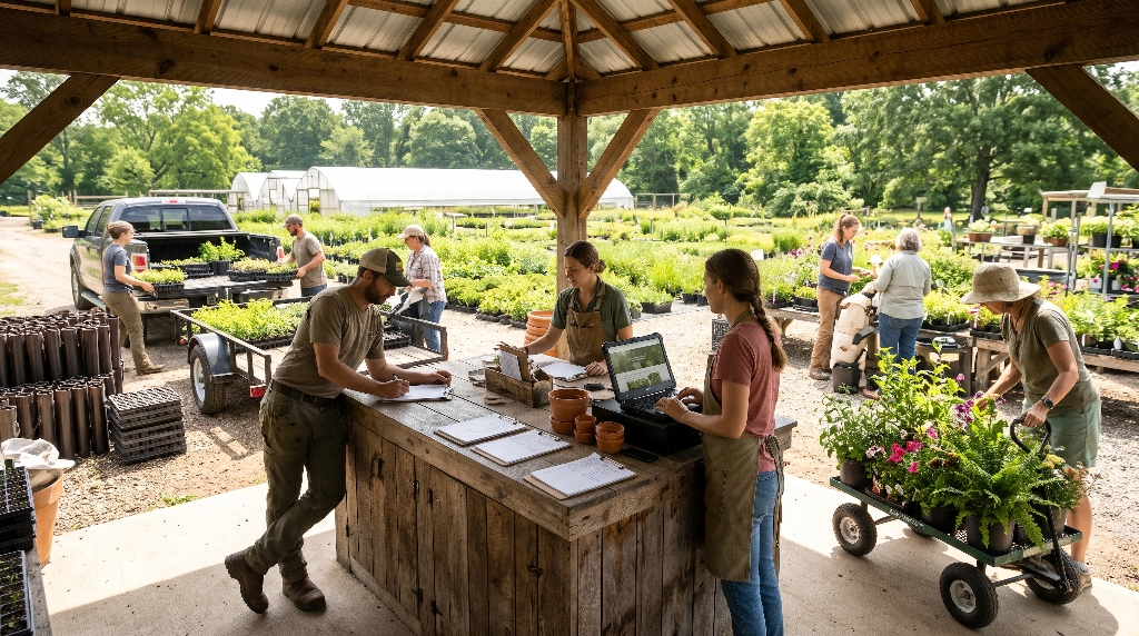
A tranquil, nature-inspired website must still be an effective sales engine. In fact, an intentional, decompression-focused design converts visitors into paying customers far more reliably than a loud, pushy site.
Traditional e-commerce design relies on manufactured panic. Marketers use countdown clocks, flashing banners warning that “only two items remain,” and exit-intent pop-ups to pressure visitors into impulsive purchases. While these tactics might work for disposable consumer goods, they alienate people shopping for native plants. Landscapers, property owners, and conservation managers make thoughtful, long-term investments. They want facts, clarity, and reliability, not manipulative marketing traps.
A healthy website vibe replaces artificial pressure with functional clarity. By organizing clear, dedicated customer pathways for both retail gardeners and wholesale trade professionals, you remove friction from the checkout process and build enduring client relationships.
Replacing Friction with Function
To convert visitors efficiently, your site must accommodate two very different types of buyers without forcing them into the same mold:
| Buyer Group | Primary Intent | Key Digital Requirements | Desired Digital Experience |
| Retail Homeowners | Weekend garden projects, pollinator habitat, curb appeal | Clear growth habits, bloom colors, deer resistance, beginner guides | Friendly, educational, inspiring, simple checkout |
| Wholesale Trade | Commercial landscaping, public restoration, municipal parks | Contract growing specs, plug flat counts, live quantities, tiered pricing | Fast bulk ordering, downloadable invoices, tax exemption forms |
When a professional contractor visits your site, they do not want to click through individual retail product pages one by one. They need a rapid order sheet where they can type SKU numbers, select plug quantities, and upload tax-exempt certificates in minutes. Conversely, a retail homeowner wants to browse curated collections, like “Monarch Waystation Bundles” or “Rain Garden Starter Kits.”
Meeting both groups with dedicated, streamlined interfaces creates a versatile website vibe that caters to every customer’s practical needs. Replacing sales pressure with intuitive functionality turns casual site visitors into loyal repeat customers.
Building Digital Goodwill and Scientific Authority
Native plant nurseries have a unique competitive advantage: deep regional expertise. You know which species tolerate your area’s heavy clay soils, which shrubs withstand late spring frosts, and which local ecotypes produce the most nutrient-rich seed heads.
Sharing this knowledge freely on your website builds immense digital goodwill. When you publish detailed regional growing guides, habitat design plans, and seasonal maintenance schedules, you establish your nursery as the premier botanical authority in your region.
Educational content also supercharges your local search engine presence. When local property owners search for advice on replacing invasive turfgrass or planting woodland borders, your articles will answer their questions.
A content-rich website provides an informative, generous website vibe that sets your business apart from big-box garden centers. People buy from nurseries they trust, and sharing your biological expertise online proves that your stock is grown with integrity and deep ecological care.
Bringing the Ecosystem Online: The Silphium Design Approach
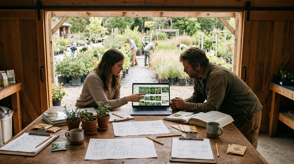
Achieving a harmonious digital presence requires more than basic web templates; it demands an intimate understanding of both biophilic design and botanical data architecture. General web design agencies do not understand the difference between a regional ecotype and a generic cultivar. They do not know why plug root depth matters to a restoration contractor, and they do not know how to translate a tranquil nursery path into a digital layout.
At Silphium Design, we bridge this gap. We build custom, sustainable web solutions tailored specifically to the operational demands of native plant growers, seed producers, and ecological restoration professionals.
Our approach treats your website as a digital extension of your living nursery rows:
- Custom Biophilic Architecture: We create calming, beautiful interfaces rooted in natural design principles, eliminating the clutter that drives customers away.
- Botanical Data Integration: We replace unreadable PDF files with dynamic, searchable catalogs that handle complex biological taxonomies, site requirements, and live inventory.
- High-Speed, Eco-Friendly Code: We build streamlined, accessible websites that load instantly, score at the top of accessibility audits, and consume minimal server energy.
- Tailored Sales Funnels: We build smooth, low-friction checkout pathways that serve both everyday retail gardeners and high-volume wholesale commercial buyers.
When every element of your site works in harmony, your website vibe becomes your strongest competitive asset. It reassures your clients, honors your plants, and grows your business on solid ground.
Transforming Your Digital Presence into a High-Converting Retreat
Your nursery is more than a commercial retail outlet; it is an ecological sanctuary that repairs fragmented habitats and reconnects people with the natural living world. Your digital presence should reflect that vital mission in every visual detail, layout decision, and line of code.
You do not have to settle for an ugly, frantic website that frustrates your visitors and buries your inventory in static documents. You can cultivate a digital decompression zone that calms the mind, showcases your botanical expertise, and makes purchasing effortless.
When your physical beds and your digital pages share the same peaceful, grounded website vibe, your entire brand becomes unforgettable. Prospective clients will feel the care, scientific rigor, and natural beauty of your nursery the moment their screen lights up.
If you are ready to retire your clunky PDF lists, clear out the digital clutter, and build an online space that truly honors your living inventory, contact Silphium Design
today. Let us transform your nursery’s web presence into a high-converting, biophilic digital retreat that helps your business flourish for years to come.