
Table of Contents
Foundational Architecture and the Biophilic Data Interface
When we look at numbers on a screen, our minds often struggle to connect them to the physical world. Generally we have found that raw environmental numbers fail to move people when they are trapped in static tables. Even less if they do not understand the data. Nature is dynamic, interconnected, and constantly flowing. When we build digital tools to communicate environmental shifts, we must treat the web browser as a living window rather than a dead spreadsheet.
Interactive tools for showing climate data on websites allow us to bridge the gap between abstract scientific models and human understanding. Instead of presenting a spreadsheet of temperature anomalies, an interactive interface lets a visitor touch, filter, and explore patterns over time and space. Modern web browsers possess immense graphics capabilities, from hardware-accelerated vector rendering to real-time spatial calculations.
The goal of a biophilic data interface is to organize complex information in a way that aligns with how humans naturally perceive natural systems. In the physical landscape, we observe patterns, gradients, light shifts, and seasonal rhythms. A well-constructed web interface translates these natural patterns into digital interactions. When users can scrub through decades of global temperatures or zoom into their local watershed, climate data transforms from cold arithmetic into an immediate, tangible reality.
+-------------------------------------------------------------+
|                     User Web Browser                        |
|                                                             |
|  +-------------------------------------------------------+  |
|  |             Biophilic Presentation Layer              |  |
|  |   Perceptual Color Palettes (Viridis, Magma, Batlow)   |  |
|  |     Fluid Sliders, Tactile Brushing & Linking UI      |  |
|  +-------------------------------------------------------+  |
|                             |                               |
|  +-------------------------------------------------------+  |
|  |           Client-Side Visualization Engine            |  |
|  |       WebGL / Canvas / SVG (Mapbox, D3, Deck.gl)      |  |
|  +-------------------------------------------------------+  |
|                             |                               |
|  +-------------------------------------------------------+  |
|  |               Data Processing & Caching               |  |
|  |    WebAssembly (Wasm), Web Workers, Quadtree Index    |  |
|  +-------------------------------------------------------+  |
|                             ^                               |
+-----------------------------|-------------------------------+
                              | HTTP / WebSocket / COG Range Requests
+-----------------------------v-------------------------------+
|                    Data Ingestion Layer                     |
|                                                             |
|   Open APIs (NOAA, Copernicus, Open-Meteo, NASA POWER)      |
|       Cloud-Optimized GeoTIFFs (COG), GeoJSON, Vector       |
+-------------------------------------------------------------+
The Cognitive Interface: How the Human Brain Processes Environmental Gradients
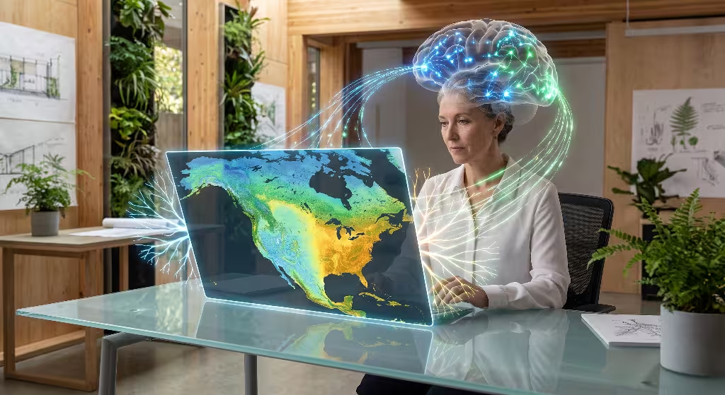
Human vision evolved over millions of years to track subtle environmental cues in nature. Our eyes notice changes in vegetation color, shifts in cloud cover, and the movement of water across terrain. When we present climate data on a digital screen, we should honor these visual instincts.
Standard web design often relies on bright, jarring colors and flashing elements that overwhelm the viewer. In contrast, an environmental interface should use gentle visual hierarchies and natural gradients. When a user explores regional precipitation changes, soft blue and terracotta shades communicate dry and wet zones much better than harsh neon lines.
Research in cognitive psychology shows that interactive controls help people remember information much longer than static text. When a reader clicks a timeline slider, the physical act of dragging the cursor connects cause and effect in the brain. As the user scrubs forward from 1950 to 2050, the continuous visual change shows the steady accumulation of heat or rainfall anomalies. By giving the user direct control over the climate data, we turn passive observation into active discovery.
Spatial context is equally vital. People understand global changes best when they can connect them to places they know personally. An effective digital tool lets visitors move between global views and local zip codes. This shift from global scale to regional detail gives the climate data personal relevance, which is essential for informed community planning and design.
The Taxonomy: Client-Side vs. Server-Side Data Architecture
When engineering a web application to display environmental metrics, choosing where to process the information is your first major decision. Environmental files generated by scientific models are often enormous, containing gigabytes of daily readings mapped over three-dimensional grids. You cannot simply send a five-gigabyte climate data file directly to a user’s smartphone.
+-------------------------------------------------------------------------+
|                  Client-Side vs. Server-Side Architecture               |
+------------------------------------+------------------------------------+
| Client-Side Rendering              | Server-Side Rendering & Tiling     |
+------------------------------------+------------------------------------+
| * Best for: Time series, small to  | * Best for: Gigabyte grids, global |
|   medium GeoJSON (<10 MB)          |   raster models, heavy historicals |
| * Execution: In browser via WebGL, | * Execution: Cloud servers slice   |
|   WebAssembly, and Canvas          |   data into vector/raster tiles    |
| * Advantage: Zero network latency  | * Advantage: Fast initial load, low|
|   during user scrubbing/zooming    |   client memory consumption        |
+------------------------------------+------------------------------------+
Client-Side Processing
Client-side processing happens directly within the visitor’s web browser using JavaScript and WebAssembly. This approach works best for localized datasets, time-series charts, and lightweight geographical boundaries.
- The browser downloads processed numbers formatted as JSON, CSV, or lightweight binary arrays.
- Visual updates happen instantly when the user moves a slider, because no extra network calls are needed.
- The device GPU and CPU calculate the visual elements on the fly.
- It enables smooth animations, real-time filtering, and custom mouse hover effects across the climate data.
Server-Side Processing
Server-side processing relies on cloud servers to do the heavy mathematical calculations before sending lightweight visual tiles to the user. This strategy is mandatory when handling global climate data models that cover decades of daily measurements across millions of geographic points.
- The server slices massive scientific files into small map tiles, similar to how modern satellite mapping applications work.
- The user web browser only downloads the specific image tiles or vector tiles visible on their screen.
- Memory usage remains low on mobile devices, preventing browser crashes.
- Dynamic analytical queries, such as averaging global temperatures across a custom drawn polygon, run on cloud clusters before returning a tiny summary payload to the client.
A modern web architecture often combines both approaches. A remote server handles heavy spatial tiling for global maps, while client-side scripts manage interactive charts and local climate data queries.
JavaScript Libraries and Client-Side Visualization Engines
Modern web developers have access to a rich collection of open-source JavaScript libraries for displaying environmental information. Selecting the right library depends on the size of your dataset, your performance requirements, and your visual goals.
+--------------------------------------------------------------------------+
|                  JavaScript Visualization Engine Matrix                  |
+---------------+-------------------+------------------+-------------------+
| Library       | Primary Strength  | Ideal Data Type  | Rendering Layer   |
+---------------+-------------------+------------------+-------------------+
| MapLibre GL   | Smooth Map Panning| Vector Tiles     | WebGL / GPU       |
| Leaflet       | Lightweight Maps  | Raster Overlays  | HTML5 Canvas/DOM  |
| Deck.gl       | Massive Datasets  | 3D Point Clouds  | WebGL2 / WebGPU   |
| D3.js         | Bespoke Charts    | Time Series, SVG | SVG / Canvas      |
| Three.js      | 3D Topography     | Elevation Grids  | WebGL             |
+---------------+-------------------+------------------+-------------------+
Geospatial Mapping Engines: MapLibre GL and Leaflet
For interactive maps, MapLibre GL JS provides exceptional performance by using WebGL to render vector tiles directly on the computer graphics card. This allows users to smoothly rotate, pitch, and zoom into geographical layers displaying regional drought indexes or temperature shifts without stuttering.
Leaflet is an outstanding lightweight alternative when your application needs simple map overlays without heavy GPU requirements. It loads quickly on low-bandwidth mobile connections and integrates easily with standard raster tile layers showing historical climate data.
High-Density Data Engines: Deck.gl and Kepler.gl
When your web application must render hundreds of thousands of individual points, such as historical storm paths, ocean buoy sensors, or wind vector fields, Deck.gl is the industry standard. Developed specifically for high-volume data visualization, Deck.gl interfaces directly with WebGL to draw complex geometries at sixty frames per second.
Kepler.gl builds on top of Deck.gl, offering an open-source geospatial analysis tool that can be embedded directly into custom React applications to allow non-technical visitors to filter layered climate data effortlessly.
Bespoke Charting: D3.js and Observable Plot
While maps give geographic context, charts explain temporal change. D3.js remains the definitive library for building custom interactive graphs. You can use D3 to construct specialized scientific visuals, such as Walter-Lieth climate diagrams that display monthly precipitation and temperature curves on shared axes. Observable Plot provides a concise, modern syntax built on top of D3, making it easy to create responsive scatter plots, box plots, and heat strips of annual climate data anomalies.
3D Spatial Rendering: Three.js
Three.js brings full three-dimensional graphics to the browser. By combining terrain elevation models with climate data, you can build interactive digital landscapes that show how sea-level rise directly impacts coastal flood zones, or how mountain topography influences regional rain shadows.
Data Formats, Ingestion Pipelines, and Open Climate APIs
One of the largest hurdles in building web tools for environmental metrics is converting scientific file formats into web-friendly structures. Climate scientists work with specialized binary file formats designed to store multidimensional arrays across time, latitude, longitude, and elevation.
+-----------------------------------------------------------------------------+
|                          Data Ingestion Pipeline                            |
|                                                                             |
|  [Raw Scientific Files]         [Cloud Conversion]      [Web Application]   |
|  * NetCDF-4 (.nc)       --->    * GDAL / Python    ---> * GeoJSON / Vector  |
|  * HDF5 / GRIB2                 * Cloud-Optimized       * GeoTIFF.js (COG)  |
|                                   GeoTIFF (COG)         * FlatGeobuf        |
+-----------------------------------------------------------------------------+
Scientific File Formats vs. Web Formats
- NetCDF-4 and HDF5: These files are standard in atmospheric and ocean research. They hold petabytes of information but cannot be parsed natively by standard web browsers without heavy client-side libraries.
- GRIB2: Used primarily by national weather prediction models, this format is heavily compressed and requires server-side decoders before web delivery.
- Cloud Optimized GeoTIFF (COG): A modern standard that organizes geospatial raster grids so web browsers can request only the exact spatial bounding box and zoom level they need using standard HTTP range requests.
- GeoJSON and TopoJSON: Standard web text formats for geographic vectors. TopoJSON eliminates shared boundary redundancy, reducing file sizes by up to eighty percent compared to standard GeoJSON when transmitting spatial climate data.
- FlatGeobuf: A fast binary vector format that allows spatial streaming without parsing large JSON strings, significantly improving page load times for regional maps.
Free and Open API Endpoints
Developers do not need to host all environmental records themselves. Several public scientific agencies provide open APIs to stream current and historical climate data directly into web applications.
+-----------------------------------------------------------------------------+
|                       Open Climate Data API Endpoints                       |
+-----------------------+-----------------------------------------------------+
| API Provider          | Dataset Coverage & Strengths                        |
+-----------------------+-----------------------------------------------------+
| NOAA CDO API          | Station observations, historical US & global baselines |
| Copernicus CDS        | Global ERA5 atmospheric and oceanic reanalysis data |
| Open-Meteo API        | No-key endpoint, 80+ years history, hourly projections|
| NASA POWER API        | Solar radiation and surface meteorology for green UI|
+-----------------------+-----------------------------------------------------+
- NOAA Climate Data Online API: Delivers station-level observations, daily summaries, and historical baseline normal values from weather stations around the globe.
- Copernicus Climate Data Store API: Managed by the European Union, this resource offers open access to the ERA5 reanalysis dataset, delivering continuous hourly estimates of atmospheric, land, and oceanic variables since 1940.
- Open-Meteo API: A developer-friendly open API that requires no access key for standard tiers. It provides high-speed endpoints for past weather history and downscaled future climate projections, delivering complete location time series in milliseconds.
- NASA POWER API: Supplies global solar radiation, wind speeds, and surface temperatures tailored for renewable energy and agricultural web tools.
Using modern JavaScript tools like geotiff.js or netcdfjs, web applications can parse these resources client-side, giving visitors direct access to authentic climate data without custom backend servers.
Biophilic UI/UX Design and Perceptual Palette Mapping
In biophilic design, digital interfaces should connect human perception with natural systems. In data visualization, this philosophy is critical when selecting color scales. Colors do not just decorate a chart; they communicate scientific meaning, risk, and natural boundaries.
+-------------------------------------------------------------------------+
|                  Color Palette Selection for Scientific Data            |
+---------------------+-----------------------+---------------------------+
| Palette Name        | Visual Characteristic | Ideal Use Case            |
+---------------------+-----------------------+---------------------------+
| Viridis / Cividis   | Sequential, Linear    | Temperature, Elevation    |
| Batlow / Roma       | Perceptually Uniform  | Continuous Physical Fields|
| Magma / Inferno     | High-Luminance Shift  | Extreme Heat, Solar Flux  |
| Earth Tones Diverge | Terracotta to Indigo  | Drought vs. Flood Spreads |
+---------------------+-----------------------+---------------------------+
Avoiding Distorting Rainbow Palettes
For decades, many weather maps used the classic “rainbow” or “jet” color scale. Scientific studies have proven that rainbow palettes distort the underlying numbers. Rainbow scales create false visual boundaries where colors change sharply, such as the sudden shift from green to yellow, even when the numerical values are changing at a perfectly steady rate. Furthermore, rainbow palettes are unreadable for people with common forms of color blindness.
Implementing Perceptually Uniform Palettes
Biophilic data design uses perceptually uniform color palettes like Viridis, Cividis, Magma, and Batlow. In a perceptually uniform palette, equal steps in numerical value correspond to equal steps in perceived brightness to the human eye.
- Sequential Gradients: Palettes like Viridis move smoothly from deep purple through teal to bright yellow. They present continuous measurements such as growing season lengths accurately without misleading visual jumps.
- Diverging Gradients: When displaying anomalies, such as how much warmer or drier a region is compared to a thirty-year baseline, use balanced diverging scales. A palette moving from muted terracotta for dry anomalies to deep slate indigo for wet anomalies communicates risk clearly without visual noise.
- Color Blindness Accessibility: Palettes like Cividis are optimized for both full-color vision and color-deficient vision, ensuring that all readers can interpret the climate data with equal clarity.
Organic Interaction Patterns
Make your user interface intuitive by using natural physical metaphors. Implement continuous timeline scrubbing where users slide their finger along a year axis to watch patterns shift across a map. Use coordinated views, where hovering over a specific region on a map instantly highlights the matching curve on an adjacent seasonal line graph. This linked interaction helps users understand how global climate data relates to specific geographical locations.
Performance Optimization and Low-Carbon Web Design
Displaying rich scientific metrics should not come at the cost of slow page loads or heavy energy consumption. The internet accounts for a noticeable portion of global electricity use. As designers building tools to communicate environmental health, we must ensure our own digital footprint remains as small as possible.
+--------------------------------------------------------------------------+
|                  Low-Carbon Optimization Strategies                      |
|                                                                          |
|  [Spatial Indexing]       [Memory Management]     [Rendering Pipeline]   |
|  * Quadtree / R-Tree      * Web Workers Offload   * Canvas / WebGL       |
|  * Viewport Slicing       * Garbage Collection    * Hardware Shaders     |
|  * Morton Code Sorting    * Typed Float Arrays    * CSS Fallback Static  |
+--------------------------------------------------------------------------+
Reducing Document Object Model (DOM) Overhead
A common beginner mistake is rendering thousands of SVG nodes directly into the webpage HTML DOM. When an interactive chart contains tens of thousands of data points, every individual SVG circle element consumes browser memory and slows down scrolling.
- For small datasets (under one thousand points), SVG is excellent because it scales cleanly and supports CSS styling.
- For large datasets (from ten thousand to several million points), render using HTML5 Canvas or WebGL. Canvas draws pixels onto a single surface, keeping DOM memory usage flat regardless of how much climate data is displayed.
Spatial Indexing and Bounding Box Downsampling
Do not render data points that sit outside the user current screen view. Implement spatial indexing algorithms, such as Quadtrees or R-Trees, to quickly identify which records fall inside the active viewport.
When a user zooms out to view the entire globe, downsample your geographic grid to show regional averages. When the user zooms into a single state or county, load the higher-resolution localized numbers. This dynamic loading approach saves network bandwidth and ensures that your climate data maps load instantly on mobile hardware.
Digital Carbon Footprint Mitigation
Rendering complex graphics can cause mobile processors to run hot, draining battery life and wasting electrical energy.
- Offload mathematical calculations, such as spatial sorting or rolling averages, to background Web Workers. This keeps the main browser thread free for smooth sixty-frame-per-second scrolling.
- Use
requestAnimationFrameto limit chart redraws to only when the user is actively interacting with the screen. - Serve web assets from green-powered content delivery networks using modern compression algorithms like Brotli.
- Ensure data payloads are cached using HTTP Cache-Control headers so repeat visitors do not re-download unchanged historical climate data.
Responsive Scaffolding and Multi-Modal Accessibility (a11y)

A truly successful web application must be accessible to every person, regardless of their device, physical ability, or network connection speed. Building accessible interfaces for visual data requires thoughtful scaffolding.
+-------------------------------------------------------------------------+
|                  Accessible Visualization Architecture                  |
|                                                                         |
|  [Visual Layer]        -> WebGL / Canvas Map with High-Contrast Colors  |
|  [Keyboard Navigation] -> Focusable Sliders and Granular Step Buttons   |
|  [Screen Reader Layer] -> Hidden Semantic HTML Table with ARIA Alerts   |
|  [Export Layer]        -> Plain CSV / JSON Download for Assistive Tech  |
+-------------------------------------------------------------------------+
Mobile Touch Considerations
Touchscreens require different interaction patterns than desktop computers.
- On desktop, a user can hover a mouse cursor over a point to reveal a tooltip. On mobile, touch interactions must support tap-to-select and touch drag gestures.
- Prevent map zoom interactions from trapping the user page scroll. Provide clear zoom buttons or require a two-finger gesture to pan the map, allowing visitors to scroll past the interactive widget without getting stuck inside the map frame.
- Ensure touch targets, such as year selection buttons or layer toggles, are at least forty-four pixels tall and wide to prevent mistaps.
WCAG Compliance and Screen Reader Integration
Dynamic graphical canvases are naturally invisible to screen readers unless developers build alternative semantic markup. To comply with modern Web Content Accessibility Guidelines (WCAG):
- Semantic HTML Fallbacks: Alongside every visual canvas or map, provide a visually hidden HTML table (
<table>) containing the underlying summary numbers. Screen readers can navigate this table directly, allowing visually impaired users to read the climate data. - ARIA Live Regions: Use
aria-live="polite"on summary boxes. When a user changes a date slider or selects a new scenario, the screen reader automatically announces the updated summary metric, such as “Selected year: 2040. Average regional temperature anomaly: plus one point eight degrees Celsius.” - Keyboard Navigation: Ensure that every slider, dropdown, and interactive node can be focused and adjusted using standard keyboard keys (Tab, Arrow keys, Enter, Space).
- Non-Color Indicators: Never rely solely on color to explain patterns. Use dashed versus solid lines, distinct geometric shapes, or hatching textures to distinguish multiple trendlines in your climate data charts.
Step-by-Step Implementation Blueprint: Building an Embedded Climate Widget
To understand how these components fit together, let us walk through building an interactive web component that visualizes regional temperature trends. We will use modern JavaScript, HTML5 Canvas, and open public APIs.
+-----------------------------------------------------------------------------+
|                     Climate Widget Component Flow                           |
|                                                                             |
|  1. Configuration    -> Define container, temporal ranges, baseline periods |
|  2. Ingestion        -> Fetch normalized JSON time series from Open API     |
|  3. Processing       -> Calculate 5-year rolling averages & min/max bounds  |
|  4. Canvas Draw      -> Render high-DPI axes, baseline grid, anomaly bars   |
|  5. User Interaction -> Touch/Mouse listener tracks position, updates tooltip|
+-----------------------------------------------------------------------------+
Step 1: Environment Setup and HTML Scaffolding
Create a lightweight container element in your HTML page. We include a canvas for the interactive chart, an accessible hidden table, and an interactive slider.
HTML
<div class="climate-widget" role="region" aria-label="Interactive Temperature History">
  <header class="widget-header">
    <h3>Regional Temperature Anomaly History</h3>
    <p>Compare local annual temperatures against the 1901-2000 historical baseline.</p>
  </header>

  <div class="canvas-container">
    <canvas id="climateCanvas" width="800" height="400" aria-hidden="true"></canvas>
    <div id="tooltip" class="chart-tooltip" style="opacity: 0;"></div>
  </div>

  <div class="controls">
    <label for="yearRange">Select Year Window:</label>
    <input type="range" id="yearRange" min="1950" max="2025" value="2025" step="1" />
    <span id="yearDisplay" aria-live="polite">Showing data up to: 2025</span>
  </div>

  <!-- Screen Reader Accessible Table Fallback -->
  <table class="sr-only" summary="Annual temperature anomalies from 1950 to present">
    <thead>
      <tr><th>Year</th><th>Anomaly (°C)</th></tr>
    </thead>
    <tbody id="accessibleTableBody"></tbody>
  </table>
</div>
Step 2: Data Ingestion and Normalization
Next, we fetch the historical numbers from a public endpoint. In this example, we request time-series climate data, calculate the thirty-year baseline, and prepare the numbers for drawing.
JavaScript
async function loadClimateData(latitude, longitude) {
  const endpoint = `https://archive-api.open-meteo.com/v1/era5?latitude=${latitude}&longitude=${longitude}&start_date=1950-01-01&end_date=2025-01-01&daily=temperature_2m_mean&timezone=auto`;

  try {
    const response = await fetch(endpoint);
    const rawData = await response.json();

    // Group daily records into annual averages
    const annualAverages = processAnnualData(rawData.daily);
    return annualAverages;
  } catch (error) {
    console.error("Failed to load climate data:", error);
    displayFallbackMessage();
  }
}

function processAnnualData(dailyData) {
  const years = {};
  dailyData.time.forEach((dateString, index) => {
    const year = dateString.split("-")[0];
    if (!years[year]) years[year] = { sum: 0, count: 0 };
    years[year].sum += dailyData.temperature_2m_mean[index];
    years[year].count += 1;
  });

  return Object.keys(years).map(year => ({
    year: parseInt(year, 10),
    avgTemp: years[year].sum / years[year].count
  }));
}
Step 3: High-DPI Canvas Rendering Engine
To ensure clean graphics on Retina and 4K screens, scale the canvas coordinate space by the device pixel ratio. Then, draw anomaly bars moving up or down from the historical baseline.
JavaScript
function renderChart(canvas, data, endYear) {
  const ctx = canvas.getContext("2d");
  const dpr = window.devicePixelRatio || 1;

  // Set display size versus coordinate size
  const displayWidth = canvas.clientWidth;
  const displayHeight = canvas.clientHeight;
  canvas.width = displayWidth * dpr;
  canvas.height = displayHeight * dpr;
  ctx.scale(dpr, dpr);

  ctx.clearRect(0, 0, displayWidth, displayHeight);

  // Filter dataset to selected year range
  const filteredData = data.filter(d => d.year <= endYear);
  const baseline = 14.0; // Historical average baseline in Celsius

  const barWidth = (displayWidth - 60) / filteredData.length;
  const zeroY = displayHeight / 2;

  filteredData.forEach((point, index) => {
    const anomaly = point.avgTemp - baseline;
    const x = 40 + (index * barWidth);
    const barHeight = anomaly * 40; // Scale factor for visual clarity

    // Biophilic color mapping: terracotta for warm, slate blue for cool
    ctx.fillStyle = anomaly >= 0 ? "#C85A32" : "#3B6E8C";

    if (anomaly >= 0) {
      ctx.fillRect(x, zeroY - barHeight, barWidth - 2, barHeight);
    } else {
      ctx.fillRect(x, zeroY, barWidth - 2, Math.abs(barHeight));
    }
  });

  // Draw baseline axis line
  ctx.strokeStyle = "#888888";
  ctx.lineWidth = 1;
  ctx.beginPath();
  ctx.moveTo(40, zeroY);
  ctx.lineTo(displayWidth - 20, zeroY);
  ctx.stroke();
}
Step 4: Reactive State and Event Binding
Connect the HTML range slider directly to the canvas rendering loop and update the accessible table to keep visual and assistive presentations synchronized.
JavaScript
function initializeWidget(data) {
  const canvas = document.getElementById("climateCanvas");
  const slider = document.getElementById("yearRange");
  const yearDisplay = document.getElementById("yearDisplay");
  const tableBody = document.getElementById("accessibleTableBody");

  // Populate accessible fallback table
  data.forEach(item => {
    const row = document.createElement("tr");
    row.innerHTML = `<td>${item.year}</td><td>${item.avgTemp.toFixed(2)} °C</td>`;
    tableBody.appendChild(row);
  });

  function update() {
    const selectedYear = parseInt(slider.value, 10);
    yearDisplay.textContent = `Showing data up to: ${selectedYear}`;
    renderChart(canvas, data, selectedYear);
  }

  slider.addEventListener("input", update);
  window.addEventListener("resize", () => renderChart(canvas, data, parseInt(slider.value, 10)));

  // Initial draw
  update();
}
Comparative Matrix: Turnkey Embeds vs. Bespoke Web Frameworks
When choosing interactive tools for showing climate data on websites, project managers and web developers must decide between pre-built turnkey widgets and bespoke custom programming.
+--------------------------------------------------------------------------+
|                  Turnkey Embeds vs. Custom Frameworks                    |
+-------------------------+--------------------+---------------------------+
| Evaluation Factor       | Turnkey Embeds     | Bespoke Web Frameworks    |
|                         | (Datawrapper, etc) | (D3.js, MapLibre, WebGL)  |
+-------------------------+--------------------+---------------------------+
| Development Time        | 1 to 4 Hours       | 2 to 6 Weeks              |
| Engineering Skill Need  | Low (No-Code)      | High (Full-Stack / WebGL) |
| Brand & UI Customization| Limited            | 100% Full Aesthetic Flow  |
| Data Scale Capacity     | < 10,000 Rows      | Millions of Data Points   |
| Ongoing Maintenance     | Low (Vendor Host)  | Moderate (API & Library)  |
| SEO & Direct DOM Index  | Moderate (iFrames) | Maximum (Semantic HTML5)  |
+-------------------------+--------------------+---------------------------+
Turnkey No-Code and Low-Code Tools
Tools such as Datawrapper, Flourish, and ArcGIS StoryMaps allow organizations to publish interactive charts and maps in a matter of hours.
- Pros: Rapid deployment, automatic responsive layout adjustments, zero server maintenance, and built-in basic accessibility features.
- Cons: Limited visual customizability, recurring subscription costs for enterprise use, potential branding watermarks, and difficulties embedding custom biophilic themes or connecting to specialized private streaming APIs.
- Ideal Use Case: Newsrooms, fast editorial blog posts, non-profit summary reports, and organizations without in-house software engineers.
Bespoke Code Frameworks
Building custom tools using MapLibre GL, Deck.gl, and D3.js gives you total control over the user experience.
- Pros: Unlimited design freedom to match your brand and biophilic guidelines, ability to process massive scientific raster grids directly on the GPU, zero third-party tracking scripts, and superior page performance.
- Cons: Higher initial engineering costs, longer development cycles, and the need for ongoing software maintenance as browser APIs evolve.
- Ideal Use Case: Scientific portals, municipal planning applications, high-traffic educational exhibits, and custom architectural software.
Common Questions Answered about Climate Data
Search engines frequently highlight specific questions from developers and researchers seeking practical guidance on web-based visualizations. Below are direct, authoritative answers to the most common queries.
What is the best interactive tool for showing climate data on websites?
The ideal tool depends entirely on your technical requirements and dataset size:
- For custom, high-performance web applications handling geospatial grids, MapLibre GL JS combined with Deck.gl offers the best hardware-accelerated rendering performance for massive datasets.
- For interactive time-series charts, anomaly graphs, and custom scientific diagrams, D3.js or Observable Plot provides unmatched design precision.
- For editorial teams and rapid publishing without coding, Datawrapper and ArcGIS Hub Web Maps deliver reliable, mobile-responsive interactive climate data charts that embed easily into any content management system.
                  +-----------------------------------+
                  |  What is your primary data type?  |
                  +-----------------+-----------------+
                                    |
          +-------------------------+-------------------------+
          |                                                   |
          v                                                   v
   [Geospatial Maps]                                   [Temporal Charts]
          |                                                   |
   +------+------+                                     +------+------+
   |             |                                     |             |
   v             v                                     v             v
[Massive Grid] [Simple Layers]                  [Bespoke / Custom] [Rapid Embed]
MapLibre GL    Leaflet                          D3.js / Plot       Datawrapper
Deck.gl
How do you display large climate datasets in a web browser without slowing down the site?
To render large climate data files without causing browser crashes or slow frame rates:
- Convert files to Cloud-Optimized Formats: Convert raw NetCDF-4 or HDF5 files into Cloud Optimized GeoTIFFs (COGs) or vector tile pyramids (
.pbf). - Stream Viewport Bounding Boxes: Use HTTP range requests to download only the geographic tiles visible on the user screen, rather than downloading the entire global file.
- Render with WebGL and Canvas: Draw graphic points and shapes using the device GPU rather than creating thousands of individual SVG nodes in the HTML DOM.
- Offload Math to Web Workers: Run heavy array slicing, rolling averages, and spatial indexing inside background Web Workers to keep the main user interface smooth and responsive.
How can climate data visualizations be made accessible to users with visual impairments?
To ensure environmental graphics meet WCAG 2.2 accessibility standards:
- Provide Fallback Semantic Tables: Pair every visual chart or map canvas with a hidden HTML table containing the source numbers so screen readers can navigate the data row by row.
- Adopt Perceptually Linear Color Palettes: Use palettes such as Cividis or Viridis that remain fully legible for individuals with red-green or blue-yellow color vision deficiencies.
- Implement ARIA Live Announcements: Add
aria-liveattributes to dynamic text callouts so screen readers announce updated values whenever a user adjusts a timeline slider or map filter. - Support Full Keyboard Control: Ensure users can navigate across all interactive elements, sliders, and buttons using standard keyboard inputs without needing a mouse.
Are there free APIs available for embedding real-time and historical climate data?
Yes, several major scientific organizations offer free, publicly accessible API endpoints for web developers:
- Open-Meteo API: Delivers free historical climate data, weather forecasts, and downscaled climate projections worldwide without requiring an API key for non-commercial tiers.
- Copernicus Climate Data Store (CDS): Provides open programmatic access to the European Union ERA5 reanalysis dataset covering global atmospheric variables from 1940 to the present day.
- NOAA Climate Data Online (CDO) API: Supplies daily and monthly observations from thousands of terrestrial weather stations across the United States and worldwide.
- NASA POWER API: Offers open solar radiation, humidity, and surface temperature datasets optimized for agricultural and renewable energy calculations.
The Next Generation: Sensor Telemetry and Ecological Digital Twins
Web-based visualization is moving beyond static historical records toward real-time ecological computing. The combination of Internet of Things (IoT) field sensors, edge computing, and browser-based machine learning is transforming how we monitor and interact with our environments.
+--------------------------------------------------------------------------+
|                     Ecological Digital Twin Pipeline                     |
|                                                                          |
|  [Microclimate IoT Sensors]  -> Soil moisture, canopy heat, air quality  |
|               |                                                          |
|               v                                                          |
|  [Edge Gateway Processing]   -> MQTT / WebSocket streaming               |
|               |                                                          |
|               v                                                          |
|  [Browser In-Memory Engine]  -> TensorFlow.js localized prediction model |
|               |                                                          |
|               v                                                          |
|  [Biophilic Digital Canvas]  -> Real-time visual feedback on web portal  |
+--------------------------------------------------------------------------+
Hyper-Local Microclimate Telemetry
Modern architectural sites and urban greening projects increasingly install localized sensor networks. These devices capture microclimate variables every minute, including soil moisture levels, urban tree canopy temperatures, ambient humidity, and local air quality.
Using lightweight communication protocols like WebSockets or MQTT over WebSockets, web developers can stream live sensor feeds directly into public dashboards. Visitors can observe how a newly planted urban forest cools the local neighborhood street in real time, connecting abstract regional climate data to immediate, living neighborhood impacts.
In-Browser Machine Learning with TensorFlow.js
Web browsers can now run machine learning models directly on the client device using libraries like TensorFlow.js. Instead of sending complex predictive queries to expensive remote servers, an application can run localized risk models right inside the user browser.
For example, a municipal planning dashboard can let a user simulate rainfall scenarios. As the user drags a storm severity slider, a client-side neural network instantly calculates and renders localized surface water runoff, showing which streets and urban rain gardens will absorb the water. This immediate interactivity allows urban planners, landscape designers, and citizens to test ecological solutions collaboratively.
Final Synthesis: Turning Numbers into Ecological Action
Building web interfaces for environmental metrics is more than an exercise in software engineering. It is an act of translation. When we transform massive scientific databases into accessible, beautiful, and responsive web tools, we help people understand the changing physical world around them.
Biophilic design teaches us that humans thrive when they feel connected to natural systems. By pairing clean code architectures, hardware-accelerated graphics engines, accessible semantic structures, and perceptually honest color palettes, web developers can create digital experiences that inform, educate, and inspire. As environmental challenges grow more urgent, delivering clear, trustworthy, and actionable climate data on the open web is one of the most vital contributions digital designers and software engineers can make for our shared future.