
Table of Contents
Every day, people sit down in front of glowing screens to buy tools, sign up for services, and make decisions about their lives. When they do, their bodies do not leave behind the instincts built over millions of years of living outdoors. Human senses evolved to read living systems, find shelter, watch for danger, and forage for resources in woods, prairies, and coastlines.
When a person visits a modern digital funnel, they are often met with harsh language, synthetic alarms, artificial countdown timers, and sudden pop-up boxes. These features cause cognitive strain. In contrast, natural systems feel calm and logical because they follow clear patterns of growth and seasonal rest.
This guide examines how writing small snippets of website text based on nature can transform online interactions. By learning how to write biophilic microcopy for conversion funnels, designers, copywriters, and developers can reduce user fatigue, boost trust, and improve conversion metrics.
The Neurobiology of Digital Friction
To fix digital problems, we must first understand how our brains and nervous systems respond to digital screens. Many web designs unknowingly create high levels of physical and mental stress.
The Cognitive Load of Modern UX
When a user visits a typical e-commerce site or sign-up page, their nervous system scans the environment for safety and clarity. The human sympathetic nervous system controls the fight, flight, or freeze response. It was built to spot predators in tall grass or avoid dangerous rock slides.
When a modern funnel shows flashing red warning text, loud warning icons, and aggressive countdown clocks, the brain processes these elements as threats. These are micro-stressors. While they might push a user to make a quick purchase once, they also cause emotional exhaustion.
This high level of friction makes users leave pages, abandon carts, and mistrust digital brands. It leads to decision paralysis. When a person feels overwhelmed by options and alarms, their cognitive capacity drops. They close the browser tab to return to a state of emotional safety.
Defining Biophilic Microcopy
In 1984, biologist Edward O. Wilson popularized the biophilia hypothesis. He suggested that humans have an innate, genetic tendency to seek connections with nature and other forms of life. People feel more at ease in spaces with sunlight, plants, water, and open views.
Biophilic microcopy brings this principle directly into digital design. It is the practice of crafting small snippets of interface text, such as button labels, form hints, security notices, and error messages, using the pacing, tone, and logic of living ecosystems.
Rather than using cold, robotic language or synthetic marketing pressure, biophilic microcopy relies on organic cadence. It uses metaphors drawn from biology, growth, and landscape wayfinding. It respects the mental energy of the user just as a well-planned garden trail respects the footsteps of a traveler.
Target Keyword Integration
Learning how to write biophilic microcopy for conversion funnels is not about decorating a page with random botanical words or flower names. It is an empirical approach to behavioral optimization.
When teams study how to write biophilic microcopy for conversion funnels, they connect human evolutionary biology with user experience metrics. The goal is to build an environment where users feel secure, oriented, and respected.
Biophilic microcopy reduces the effort it takes for the human brain to process digital interactions. When an online experience feels natural, conversions happen smoothly. Users do not convert because they were cornered or tricked; they convert because the pathway was clear, safe, and intuitive.
Theoretical Foundations: Evolutionary Psychology and Information Foraging

Digital design does not exist in a vacuum. It rests on human psychology and the strategies our ancestors used to stay alive.
Information Foraging Theory
In the late 1990s, researchers Peter Pirolli and Stuart Card at Xerox PARC developed Information Foraging Theory. They found that humans look for information online using the exact same mechanisms animals use to hunt for food or gather berries.
In nature, a creature follows an environmental scent trail. If the scent of food grows stronger, the animal keeps moving forward along that path. If the trail goes cold, or if the energy needed to cross thorny ground outweighs the calories found at the end, the animal turns back.
In a digital funnel, users follow a scent of information. Every button, link, and line of helper text acts like a trail marker. If a button uses biophilic microcopy, it provides a clear, refreshing scent trail. The user instantly understands where the path leads and what it will cost in effort.
When you use biophilic microcopy, you eliminate linguistic brush and mental thorns. You make the trail easy to follow, which keeps users moving down the funnel without frustration.
The 14 Patterns of Biophilic Design Applied to Syntax
Architects and environmental scientists use the 14 Patterns of Biophilic Design to build healing hospitals, productive schools, and functional workspaces. These spatial rules translate directly into interface writing.
Prospect and Refuge in Form Flows
In an open savanna, animals and early humans wanted a good view of their surroundings (prospect) while resting their backs against a solid cliff or under a cave ledge (refuge). Prospect allowed them to see opportunities and threats far away. Refuge kept them safe from behind.
In digital design, users need both. A multi-step form often terrifies users because they cannot see what lies ahead, and they fear their personal data will be abused.
Using biophilic microcopy, you provide prospect by telling the user exactly how many steps remain and what information will be needed. You provide refuge by placing reassuring notes next to sensitive inputs:
- Standard Copy: “Enter your phone number.”
- Biophilic Microcopy: “We only use your number to send dispatch updates. No marketing calls, no noise.”
This balance gives the user an expansive view of the process while protecting them from unwanted interruptions.
Mystery and Exploration
In nature, mystery is not about confusion; it is an inviting bend in a forest path that tempts you to walk just a little further to see the view. It suggests that there is more information waiting, and that exploring it will be enjoyable.
Most conversion funnels treat user actions like cold business transactions. They hit users with rigid demands: “Buy Now,” “Sign Up Here,” or “Submit Form.”
When you introduce biophilic microcopy, you replace these demands with invitations to explore. A newsletter sign-up can say: “Uncover our seasonal research.” A demo button can say: “Take a walk through the platform.”
Biophilic microcopy frames digital steps as low-stakes discovery. It pulls the user forward with natural curiosity instead of transactional pressure.
Biomorphic Forms and Natural Analogues
Nature rarely builds in sharp, mechanical, unnatural angles. Living organisms rely on organic shapes, cycles, and seasonal tempos. Trees grow through cell division, rivers meander along the path of least resistance, and daylight fades gradually rather than switching off like a light bulb.
Digital copy should mimic these rhythms. When an interface communicates using biophilic microcopy, it discards robotic technical jargon like “Error 404: Input String Invalid.” Instead, it uses natural dialogues.
Biophilic microcopy uses language that acknowledges natural cycles, human limitations, and steady progression. It creates an interface that feels alive, responsive, and humane.
Anatomical Breakdown: Funnel Stages and Biophilic Microcopy Patterns
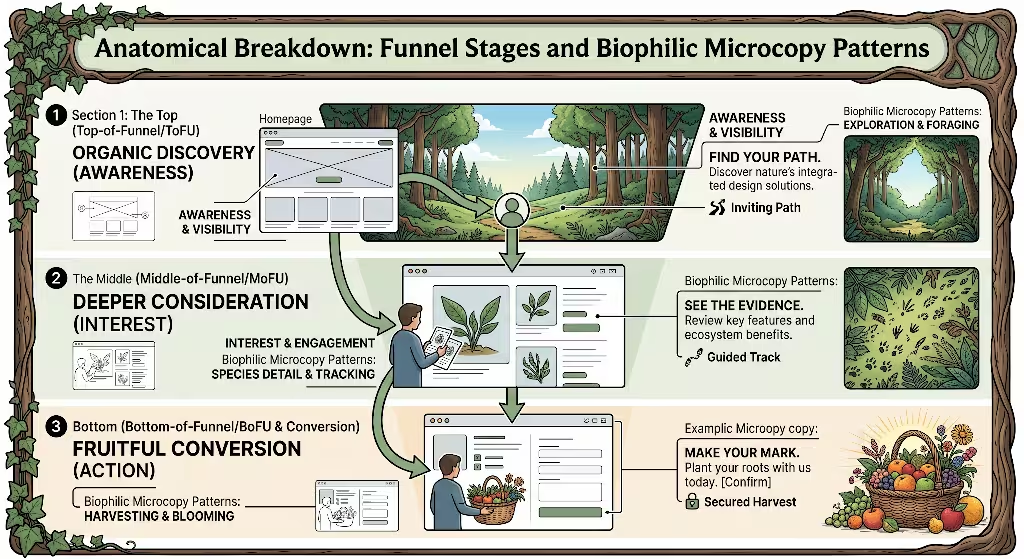
Every stage of a funnel has unique psychological needs. Applying biophilic microcopy across each stage ensures that user trust grows steadily.
+-------------------------------------------------------------------+
|               Top-of-Funnel: The Orientation Canopy               |
|            Focus: Psychological safety, ambient welcome           |
+-------------------------------------------------------------------+
                                  |
                                  v
+-------------------------------------------------------------------+
|            Middle-of-Funnel: Wayfinding and Ecology               |
|           Focus: Clearing paths, reducing choice fatigue          |
+-------------------------------------------------------------------+
                                  |
                                  v
+-------------------------------------------------------------------+
|           Bottom-of-Funnel: The Threshold Conversion              |
|          Focus: Rooted security, eliminating buyer regret         |
+-------------------------------------------------------------------+
Top-of-Funnel: The Orientation and Canopy Stage
The top of the funnel is the canopy of your digital forest. When a user first lands on a homepage or article, they need to feel oriented. If the air feels harsh, they will bounce away immediately.
Focus: Psychological Safety and Ambient Welcome
At this early stage, visitors are cautious. They do not know if your website is trustworthy, safe, or useful. Using biophilic microcopy here sets a steady, grounded tone.
The goal is to welcome the visitor without demanding their immediate commitment. You are offering shade, a comfortable place to stand, and a chance to look around.
Semantic Variants
- Natural interface copy
- Organic user onboarding
- Low-friction microcopy
- Calming UX writing
Biophilic Translations
Notice how standard corporate language compares to biophilic microcopy at the canopy stage:
- Standard Banner Copy: “Sign up to access our digital directory.”
- Biophilic Microcopy Translation: “Step inside our collective archive. Browse freely.”
- Standard Cookie Banner: “We use tracking cookies to optimize system utility. Accept all.”
- Biophilic Microcopy Translation: “We shape this space to your habits. Let us know if you want us to remember your path.”
- Standard Search Placeholder: “Type query here…”
- Biophilic Microcopy Translation: “Search our field notes, species lists, and guides…”
By swapping out sterile words for biophilic microcopy, you invite the user to settle in and explore without triggering defensive reactions.
Middle-of-Funnel: Wayfinding and Navigational Ecology
Once a user enters the middle of the funnel, they are exploring the understory of your site. They are evaluating tools, comparing features, or filling out intermediate fields.
Focus: Reducing Choice Paralysis Through Clear Pathways
In an unfamiliar forest, losing the trail causes immediate worry. When an interface presents twenty equal options without clear visual or verbal cues, the user experiences choice paralysis.
Here, biophilic microcopy serves as wayfinding signage. It points out milestones, highlights safe rest areas, and simplifies complex choices into manageable steps.
Semantic Variants
- Wayfinding UX copy
- Intuitive navigation micro-messaging
- Natural interaction prompts
- Frictionless progress labels
Biophilic Translations
Examine how biophilic microcopy clarifies choices in mid-funnel settings:
- Standard Progress Bar: “Step 2 of 4: Add Billing Details.”
- Biophilic Microcopy Translation: “Laying the foundation: Secure your workspace (Step 2 of 4).”
- Standard Pricing Filter: “Sort by Enterprise Tier vs Individual Plan.”
- Biophilic Microcopy Translation: “Choose your canopy: Solo work or collaborative ecosystem.”
- Standard Form Header: “Required Account Credentials.”
- Biophilic Microcopy Translation: “Tell us where to send your updates and access keys.”
By grounding these steps in biophilic microcopy, you turn an administrative chore into a calm, steady journey along an easy trail.
Bottom-of-Funnel: The Threshold and Conversion Event
The bottom of the funnel is the most vulnerable point in any digital interaction. This is where users enter payment details, sign multi-year contracts, or agree to a purchase.
Focus: Eliminating Buyer Regret and Anxiety
At the conversion threshold, the brain’s risk-detection center runs hot. Questions bubble up: Will this company steal my money? Will I be locked into a subscription I cannot cancel? Is this choice safe?
Standard funnels try to push users through this gate using pressure tactics. Biophilic microcopy takes the opposite approach: it offers solid ground to stand on. It plants roots.
Semantic Variants
- Conversion-optimized microcopy
- Transactional reassurance patterns
- Grounded check-out language
- Empathetic validation states
Biophilic Translations
See how biophilic microcopy replaces anxiety with reassurance at the finish line:
- Standard Checkout Button: “SUBMIT ORDER (NON-REFUNDABLE).”
- Biophilic Microcopy Translation: “Plant your roots. Supported by a 30-day effortless return guarantee.”
- Standard Recurring Payment Notice: “Automatic recurring billing applies.”
- Biophilic Microcopy Translation: “Renewed every spring. We will send you a reminder note two weeks before any billing date.”
- Standard Security Seal Copy: “Encrypted with 256-bit SSL.”
- Biophilic Microcopy Translation: “Your financial data remains private, sheltered, and entirely under your control.”
When you anchor the final conversion step with biophilic microcopy, you remove the fear of buyer regret. The user converts with confidence because the ground beneath them feels firm.
Step-by-Step Implementation: How to Draft and Refine Natural Microcopy
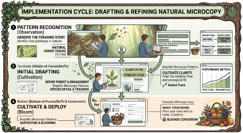
Adopting biophilic microcopy across your product or website requires a clear, methodical process. Here is how to execute this change across your design workflow.
+-------------------------------------------------------------------------+
| Step 1: Conduct a Cognitive Friction Audit                              |
| Locate digital choke points, rage clicks, and synthetic alarms          |
+-------------------------------------------------------------------------+
                                     |
                                     v
+-------------------------------------------------------------------------+
| Step 2: Map the Natural Linguistic Lexicon                              |
| Build an organic vocabulary guide for your brand's voice                |
+-------------------------------------------------------------------------+
                                     |
                                     v
+-------------------------------------------------------------------------+
| Step 3: Calibrate Pacing and Cadence                                    |
| Replace false urgency with natural, truthful progression                |
+-------------------------------------------------------------------------+
                                     |
                                     v
+-------------------------------------------------------------------------+
| Step 4: Tune Form Validation and Error States                           |
| Turn punitive alerts into supportive, symbiotic feedback                |
+-------------------------------------------------------------------------+
Step 1: Conduct a Cognitive Friction Audit
Before writing a single word of biophilic microcopy, you need to find where users feel stuck.
Examine your analytics data. Look for pages with high drop-off rates, form fields where users hesitate, and points where people click repeatedly out of frustration (rage clicks).
Common high-friction points include:
- Registration form headers
- Password rules with endless lists of red warning text
- Permissions requests for camera, location, or notifications
- Payment collection boxes
- Subscription cancellation pathways
Read the text at each friction point aloud. Does it sound like a person, or does it sound like a mechanical guard demanding papers? If it sounds cold, you have found an area in need of biophilic microcopy.
Step 2: Map the Natural Linguistic Lexicon
Next, build a dedicated vocabulary list for your product. This prevents writers from relying on tired clichés.
A natural linguistic lexicon is a shared list of words, metaphors, and pacing guides that reflect living systems. Group your terms into thematic buckets:
- Growth and Cultivation: Cultivate, root, branch, nurture, grow, bloom, build, establish, harvest.
- Shelter and Safety: Ground, shelter, protect, anchor, reserve, clear, steady, transparent, breathe.
- Navigation and Movement: Path, meander, explore, wayfinding, cross, step, clear, discover.
- Ecosystem and Community: Canopy, soil, network, collective, symbiotic, shared, seasonal.
Use these words thoughtfully. The goal of biophilic microcopy is not to disguise a software tool as a flower bed. It is to draw upon the reliable, comforting patterns these words evoke in the human mind.
Step 3: Calibrate Pacing and Cadence
Review your funnel for artificial urgency. Phrases like “HURRY! ONLY 2 SEATS LEFT AT THIS PRICE!” trigger anxiety and burn out user goodwill over time.
Replace these pressure tactics with honest, rhythmic pacing. If an event has a set capacity, explain why using biophilic microcopy:
- Artificial Urgency: “BUY NOW OR LOSE YOUR SPOT FOREVER!”
- Biophilic Microcopy Alternative: “We keep our cohorts small to ensure direct mentorship. Four spots remain open.”
If your product releases updates on a regular cycle, tell users directly:
- Artificial Urgency: “Flash Sale Ends in 12 Minutes!”
- Biophilic Microcopy Alternative: “Our seasonal harvest is ready. Order before Friday for next-day dispatch.”
When you align your conversion copy with truthful, natural cadences, users feel respected rather than manipulated.
Step 4: Tune Form Validation and Error States
Error states are often the most stressful moments in digital experiences. A user mistypes their email, and the system screams back in bright red: “INVALID INPUT. FIELD CANNOT BE BLANK.” This punitive language causes instant frustration.
In an ecosystem, there are no errors, only adaptations. If water hits a boulder, it does not stop and flash an alert; it flows around the rock.
Bring this mindset to error states using biophilic microcopy. Shift from blame to partnership:
| Trigger Event | Traditional Punitive Copy | Biophilic Microcopy Approach |
| Invalid Email Format | “Error: Invalid Email Address entered.” | “Looks like a character wandered off. Let us double-check that address.” |
| Weak Password | “Password does not meet complexity standards.” | “A little more shelter: add eight letters and a number to secure your account.” |
| Network Outage | “Network Connection Terminated.” | “We lost the trail for a moment. Take a breath while we reconnect to the stream.” |
| Card Declined | “Transaction Failed. Card rejected.” | “The bank could not confirm this route. You might want to check the card details.” |
When an interface offers supportive, adaptive feedback through biophilic microcopy, users stay calm, fix their input, and continue through the funnel.
Commonly Asked Questions about Biophilic Microcopy
To build a thorough resource, we must address the real questions users and search engines ask about this design approach.
What is biophilic UX writing?
Biophilic UX writing is the deliberate practice of crafting user-interface language that reflects human biological affinities for the natural world. It translates the patterns of living ecosystems into digital communication.
At its core, biophilic UX writing focuses on:
- Organic Pacing: Letting users read and decide at a human rhythm instead of under artificial pressure.
- Environmental Reassurance: Providing clear visual and verbal landmarks so users never feel lost.
- Sensory Balance: Using calm, descriptive phrases that lower cognitive strain rather than overwhelming the senses.
- Symbiotic Feedback: Treating user errors as simple adjustments along a path rather than punishable failures.
By uniting behavioral science with natural language, biophilic UX writing transforms cold software flows into welcoming, intuitive spaces.
How does nature-inspired copy improve website conversion rates?
Nature-inspired copy lifts conversion rates by removing the hidden mental barriers that cause users to abandon digital experiences.
                                  [Biophilic Microcopy]
                                            |
                                            v
                                 Lowers Cognitive Strain
                             (Reduces Mental Fatigue & Stress)
                                            |
                                            v
                                Restores Felt Trust & Safety
                               (Validates Information Scents)
                                            |
                                            v
                            Improves Behavioral Performance
                          - Lower Cart Abandonment
                          - Fewer Drop-offs on Long Forms
                          - Higher Long-Term Retention
When copy feels grounded and clear, several measurable changes take place:
- Reduced Cognitive Strain: When readers do not have to decode technical terms or filter out shouting sales pitches, their brains process information faster.
- Clear Information Scents: Nature-inspired text acts like steady trail markers. Users know where each link leads, keeping them moving down the conversion funnel without hesitation.
- Restored Trust: When a brand speaks with calm honesty rather than artificial urgency, users drop their natural skepticism.
- Fewer Abandoned Tasks: Clear, supportive error messages prevent users from giving up when they make a typo or hit a snag.
By honoring human biology, biophilic microcopy creates an effortless journey that makes conversion the natural next step.
What are examples of biophilic design in digital interfaces?
Biophilic design extends across both visual layouts and the words that inhabit them. When these elements work together, the interface feels cohesive and alive.
- Circadian Rhythm Styling: Interfaces that adjust their lighting, contrast, and messaging based on the user’s local daylight hours. For example, a morning dashboard might say, “Good morning. Here is the work planned for today,” while an evening view greets the user with, “Good evening. Wrapping up your tasks before sunset?”
- Organic Progress Displays: Rather than using rigid percentage bars, products can show progression using growth rings, river flows, or seasonal markers.
- Dynamic Wayfinding: Interfaces that use environmental metaphors—such as base camps, field guides, and observation decks—to help users organize complex datasets.
- Breathing Room in Layouts: Pairing biophilic microcopy with generous whitespace, natural colors, and clear typography allows users to scan pages without feeling crowded.
Does biophilic microcopy hurt SEO or keyword clarity?
No. When done properly, biophilic microcopy actually strengthens search engine optimization and clarity.
Search engines favor content that answers search intent quickly, keeps visitors engaged, and generates low bounce rates. When an interface uses biophilic microcopy, visitors stay longer, read more deeply, and complete actions without getting frustrated. These behavioral signals show search engines that a page is valuable.
However, balance is critical. Never swap out clear, recognizable navigation terms for poetic but confusing words. A link to your shopping cart should not be renamed “The Foraging Basket” if users cannot tell what it is.
Biophilic microcopy supports your primary keywords and action verbs; it does not hide them. It surrounds important terms with clear context, making the interface easily crawlable by search bots and accessible to screen readers.
Quantitative Measurement and Empirical Validation
Any design theory must prove its worth in real-world metrics. Here is how product teams can measure the business impact of biophilic microcopy.
A/B Testing Methodologies
The most reliable way to test biophilic microcopy is through controlled split testing. Run an experiment comparing your current interface text against an updated version that uses natural copy patterns.
+------------------------------------+      +------------------------------------+
|         Control Funnel A           |      |        Variant Funnel B            |
|       (Synthetic Language)         |      |      (Biophilic Microcopy)         |
+------------------------------------+      +------------------------------------+
| - "HURRY! 2 SPOTS LEFT"            |      | - "Small cohorts for focused work" |
| - "SUBMIT PAYMENT (REQUIRED)"      |      | - "Plant your roots. 30-day trial" |
| - "Invalid Phone Format"           |      | - "Let's check those digits again" |
+------------------------------------+      +------------------------------------+
                  \                                    /
                   \                                  /
                    v                                v
+--------------------------------------------------------------------------------+
|                             Evaluation Metrics                                 |
|         Form Completion Rates | Time-to-Convert | User Retention Rates         |
+--------------------------------------------------------------------------------+
When setting up your split test, keep the visual elements, button colors, and layout identical across both variations. Isolate the text as the single variable.
Key metrics to monitor include:
- Micro-Conversion Rate: The percentage of users who advance from step one to step two in a signup flow.
- Final Form Completion Rate: The percentage of visitors who finish a checkout or registration process.
- Time on Task: The time it takes for a user to complete a task. Biophilic microcopy often reduces hesitation, leading to smoother completion times.
- Drop-Off Rate at Payment: Tracking if calm, grounded reassurance reduces cart abandonment.
Biometric and Behavioral Signals
Beyond standard conversion rates, teams can measure how biophilic microcopy reduces user frustration using modern analytics tools:
- Rage Clicks: When users repeatedly click an unhelpful error message or broken button out of frustration. Biophilic microcopy should cause a noticeable drop in rage clicks.
- Form Field Hesitation: Measuring the time a user hovers over an input box before typing. Clear, supportive helper text reduces hesitation.
- Scroll Depth and Pacing: Evaluating whether visitors scan your pages in a frantic, scattered pattern or read through your funnel with steady focus.
SEO and Accessibility Benchmarks
A good user experience must be accessible to every person and every search engine crawler. When rolling out biophilic microcopy, verify these technical benchmarks:
- Accessibility Standards (WCAG): Ensure your error messages and helper text maintain high color contrast and clear semantic labels for screen readers.
- Descriptive Anchor Text: When linking between funnel pages, use clear, descriptive phrases that provide both contextual scent and helpful anchor text for search algorithms.
- Structured Data Integration: Support your copy with structured schema markup (such as FAQPage, Product, or BreadcrumbList data) so search engines understand the relationships between your content blocks.
Comparative Synthesis: Synthetic vs. Biophilic Approaches
To see how these principles work together, consider how synthetic, mechanical language contrasts with biophilic microcopy across common product scenarios.
| Funnel Context | Synthetic Mechanical Copy | Psychological Reaction | Biophilic Microcopy Alternative | Psychological Reaction |
| Newsletter Signup | “Subscribe to get blasted with promotional offers.” | Fear of spam, defensive avoidance. | “Receive our seasonal field dispatches. Unsubscribe anytime with one tap.” | Felt safety, open invitation to explore. |
| Account Creation | “You must fill all required inputs to proceed.” | Burdened, feels like paperwork. | “Let us set up your workspace so you can begin.” | Collaborative, focused on progress. |
| Cart Review | “Items held for 05:00 minutes only!” | Artificially stressed, suspicious. | “Your selections are saved here while you browse.” | Relaxed, in control of the decision. |
| Inactive Session | “Session timed out due to user inactivity.” | Blamed, alienated by technical phrasing. | “We paused your session to keep your work safe while you were away.” | Reassured, cared for by the system. |
| Unsubscribe Page | “Are you sure you want to quit? You will lose everything.” | Guilt-tripped, annoyed by manipulation. | “Stepping away? We will leave the clearing clear whenever you return.” | Respected, leaves a positive lasting impression. |
This comparison highlights how small word choices alter the emotional climate of a digital interaction. Synthetic copy creates tension; biophilic microcopy builds connection.
Designing for the Digital Animal
Every time a person sits down with a smartphone, tablet, or laptop, they are still a living organism with senses shaped by the natural world. They still respond to the biological cues of safety, shelter, mystery, and seasonal pacing.
When funnels treat users like machines that process data, they create mental fatigue. This synthetic pressure leads to high bounce rates, cart abandonment, and customer churn.
Learning how to write biophilic microcopy for conversion funnels offers a sustainable way out of this trap. By building digital spaces that honor human instincts, UX professionals create digital experiences that feel clear, welcoming, and intuitive.
Before publishing your next funnel update, run through this five-point audit:
- Audit for Fear: Have you removed artificial countdown clocks and aggressive warnings?
- Check the Trail: Does every button, link, and step offer a clear scent of information?
- Offer Refuge: Are sensitive form fields paired with reassuring privacy notes?
- Harmonize Errors: Do your error states guide users forward without blame?
- Respect Human Pacing: Does the overall tone feel like an organic conversation or a high-pressure demand?
When your interface breathes, your users breathe too. When you build digital habitats grounded in biophilic microcopy, you will find that conversion is not something you have to force. It becomes the natural outcome of a safe, rewarding journey.