
Table of Contents
The internet, as it looks today, is often very harsh. Sterile grid layouts take a physical toll on our bodies. Sharp corners, bright neon colors, and rigid boxes do not match our biological needs. Human beings have an innate, biological need for nature. We call this need biophilia. When we build websites that ignore this need, we cause stress and fatigue for the user.
This brings us to a very important question. What is adaptive biophilic web design? The answer is both beautiful and functional. It is the practice of combining organic, nature inspired visual rules with smart technology. By integrating organic aesthetics with smart, responsive code, we create digital habitats that feel alive.
The main idea here is that moving beyond static, unchanging looks is necessary. True adaptive biophilic web design uses artificial intelligence and smart coding to render interfaces that actually support the user physically. This lowers cognitive load. It makes reading easier. It reduces stress. In this comprehensive guide, I will walk you through every part of this process. I will show you how adaptive biophilic web design is changing the way we build the internet.
Core Principle I: Direct Nature Analogues
In the field of adaptive biophilic web design, direct nature analogues are the most basic building blocks. A direct analogue means something that directly copies exactly what we see in the natural world. First, we must talk about visual assets. When practicing adaptive biophilic web design, we must use strategic deployment of high resolution imagery and video. However, we cannot just use any pictures. We must avoid generic, fake looking stock photos of plastic plants. Instead, adaptive biophilic web design focuses on native botanical elements.
For example, if we are building a site for a client in North America, we might use images of the Solidago plant, commonly known as goldenrod. We might also use images of Symphyotrichum, which are native asters. Seeing real, native plants makes the user feel connected to a real place.
Next, we must look at dynamic lighting. In the physical world, light is never flat. Light changes. Leaves cast shadows that move with the wind. To recreate this in adaptive biophilic web design, we use special code called CSS variables. We use these variables to create soft color gradients and shadows that simulate natural light. As the user moves down the page, the shadows might shift slightly. This gives the website a feeling of real depth, just like a forest floor.
Finally, we must talk about fluid constraints. The internet is built on boxes. Everything is a square or a rectangle with perfect ninety degree angles. Nature does not work this way. In nature, lines are curved and flowing. Therefore, adaptive biophilic web design moves away from perfect angles. We use smooth curves, which we call bezier curves, to shape the edges of our images and text boxes. We also use asymmetrical layouts. This means the left side of the screen does not have to match the right side perfectly. A tree is not perfectly symmetrical, and a website built with adaptive biophilic web design does not have to be symmetrical either.
Core Principle II: Indirect Nature Analogues & Color Theory
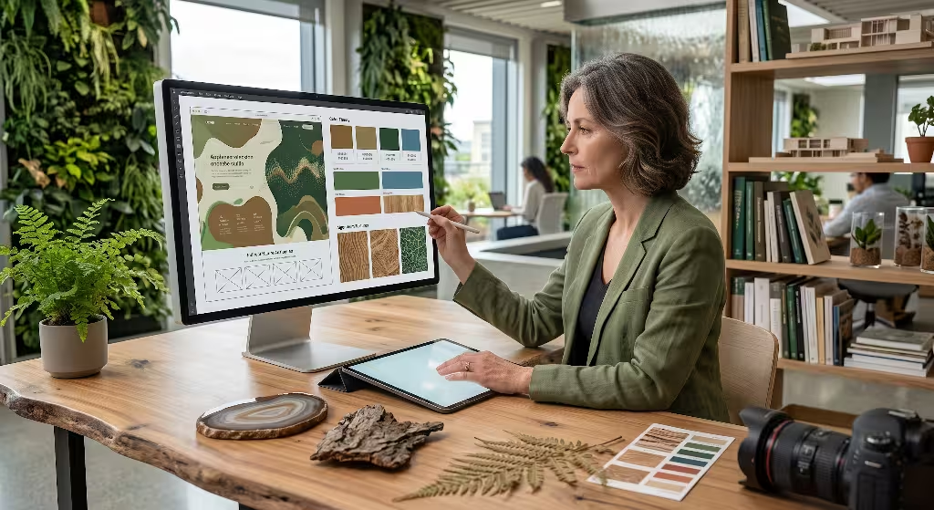
While direct analogues copy nature exactly, indirect analogues copy the feeling and patterns of nature. This is a very important part of adaptive biophilic web design. Let us start with color theory. For a long time, web developers used bright, artificial neon colors. These colors look exciting, but they cause severe eye strain over time. True adaptive biophilic web design relies on earth driven palettes. We use rich browns, warm terracotta, soft sky blues, and deep forest greens. These colors are easy on the eyes. When we use earth tones, we reduce ocular strain and make the user feel calm.
Texture is another big part of adaptive biophilic web design. A computer screen is made of smooth glass. This feels cold and unnatural to the human touch. While we cannot change the physical glass, adaptive biophilic web design uses code to create tactile textures on the screen. We add subtle visual noise and grain to the background colors. This makes the background look like thick paper, natural stone, or wood grain. This grounds the user interface in the real world.
Another indirect analogue used in adaptive biophilic web design is fractal scaling. In nature, things grow in mathematical patterns. A tree trunk splits into big branches. Those big branches split into smaller branches. Those smaller branches split into tiny twigs. This is called a branching structure. Leaves also grow on stems in mathematical patterns, which biologists call phyllotaxis. In adaptive biophilic web design, we use these same mathematical sequences to set up our text and menus. The main title of the page is the trunk. The smaller headings are the branches. The regular text is the leaves. When we size our text based on these natural math rules, the page feels perfectly balanced to the human eye.
The Adaptive Engine: AI and Algorithmic Biomimicry
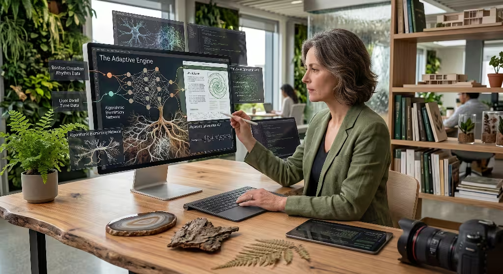
Up to this point, we have talked about how things look. But the word adaptive in adaptive biophilic web design means the website must change and react. This is where artificial intelligence and algorithmic biomimicry come in. Biomimicry means copying the actions of living things. First, we use real time manipulation of the web page based on what the user is doing. In adaptive biophilic web design, the background graphics might slowly grow or shift based on how far down the page the user scrolls. If the user stays on one section for a long time, the design might settle and become very still, much like an animal resting in the woods.
Second, adaptive biophilic web design uses phenological dark mode. Most modern websites have a simple button to switch between a bright light mode and a black dark mode. Adaptive biophilic web design goes much further. It creates themes that adapt to the local time of day and ambient lighting. It mimics the slow transition from the bright light of morning, to the golden colors of sunset, and finally to the deep blue of twilight. This protects the user’s circadian rhythms, which are the natural sleep cycles of the human body.
Third, we focus on behavioral responsiveness. This means the website watches how the user behaves to see if they are getting tired. If a user is scrolling quickly back and forth, they might be confused or stressed. An engine built with adaptive biophilic web design can detect this. The website will then simplify itself. It might increase the blank space on the screen, which we call whitespace. It might dim the contrast of the colors. By doing this, the website actively lowers the cognitive load and helps the user relax.
What is Biophilic Design in the Digital World?
When people hear about this topic, they often ask what it actually means for the digital world. Simply put, practicing adaptive biophilic web design means translating the rules of physical green architecture into a digital user experience. It means fostering a sense of connectedness and well being through a screen.
The main objective of adaptive biophilic web design is to create digital spaces that trigger the parasympathetic nervous system. This is the part of your body that helps you rest and digest. When you walk into a quiet forest, your parasympathetic nervous system turns on. Your heart rate slows down. Your breathing gets deeper. Good adaptive biophilic web design tries to create this exact same physical response when you open a web page.
It is also very important to talk about differentiation. We must separate true adaptive biophilic web design from superficial greenwashing. Greenwashing is when a company just slaps a picture of a leaf on their homepage and calls it a natural website. That is not enough. True adaptive biophilic web design is a functional, structural framework. It requires deep changes to the code. It requires prioritizing the human user as a biological organism first, and a computer user second.
What are the Benefits of Biophilic Web Design?
There are many reasons why companies are starting to care about this. The benefits of adaptive biophilic web design are very real and can be measured. The first major benefit is the psychological return on investment. When a company uses adaptive biophilic web design, they see measurable reductions in digital fatigue among their users. Because the colors and shapes are natural, the user’s brain does not have to work as hard to understand the page. This actually lowers cortisol levels. Cortisol is the chemical in our bodies that causes stress.
The second major benefit involves business metrics. When a website feels good to use, people stay longer. Websites built with adaptive biophilic web design see increased session durations. They also see lower bounce rates, which means fewer people leave the site immediately after arriving. Users engage in deeper content exploration because the calming nature of the interface makes them feel safe and relaxed.
The third benefit of adaptive biophilic web design is accessibility. Accessibility means making sure everyone can use the internet easily. Many people have visual sensitivities. Bright lights and sharp contrasts give them severe headaches. Other people are neurodivergent, meaning their brains process information differently. Cluttered, noisy websites can be very overwhelming for them. Because adaptive biophilic web design uses organic layouts, soft colors, and reduced glare, it inherently supports these users. It makes the web a friendlier place for everyone.
How to Implement Biophilic Design in Web Design?
If you want to start using adaptive biophilic web design, you must follow a few clear steps. The first step is to use minimalism as a foundation. Minimalism means keeping things simple. In adaptive biophilic web design, we must balance organic elements with strategic whitespace. Whitespace is the empty area between pictures and text. Just like a forest needs clearings so the trees have room to grow, a website needs whitespace to prevent visual clutter. If you put too many plants and textures on a screen, it becomes a jungle. The design must remain functional and easy to read.
The next step is programming micro interactions. A micro interaction is a tiny animation that happens when you do something, like hovering your mouse over a button. In adaptive biophilic web design, we program these transitions to mimic the physics of natural processes. Instead of a button instantly turning a different color, it might slowly fade, like a cloud passing over the sun. A menu might slide out with the fluid motion of flowing water. A loading icon might pulse with the rhythm of human breathing.
Finally, you can add sensory design. Adaptive biophilic web design is not just about what you see. Where appropriate, we can utilize subtle, asynchronous auditory feedback. This means adding very quiet natural soundscapes to the site. If a user clicks a button, there might be a soft sound like a snapping twig. In the background, there might be the very faint sound of wind. These sounds must be very quiet and the user must be able to turn them off easily. When done right, this enhances immersion greatly.
Technical Architecture: Sustainable Web Development
Adaptive biophilic web design is not just about looking like nature. It is also about protecting nature. The technical architecture behind the website must be sustainable. First, we must insist on green hosting. The computers that run websites are called servers. These servers use a massive amount of electricity. If a website is built to celebrate nature, it makes no sense to run it on servers powered by dirty coal. Therefore, a key part of adaptive biophilic web design is powering our nature inspired sites with renewable energy servers. We optimize our virtual private servers to run on wind or solar power. This aligns the hidden infrastructure with the visible design ethos.
Next, adaptive biophilic web design requires extreme code efficiency. When code is messy and bloated, it takes the server more energy to read it. This energy consumption creates a larger carbon output. As experts in adaptive biophilic web design, we write lightweight, minified scripts. Minified means we strip out all the useless spaces and characters in the code. This makes the files very small. Small files travel across the internet faster and use less electricity.
We must also balance performance with aesthetics. Adaptive biophilic web design uses many high resolution images of nature. Big images can slow down a website. A slow website burns more energy. To fix this, we ensure all biophilic assets are heavily optimized. We use modern image formats like WebP, which are very small but look great. We also use lazy loading. Lazy loading means an image does not load until the user scrolls down to look at it. This saves a huge amount of energy and keeps the DOM rendering very fast.
Real-World Applications & Industry Use Cases
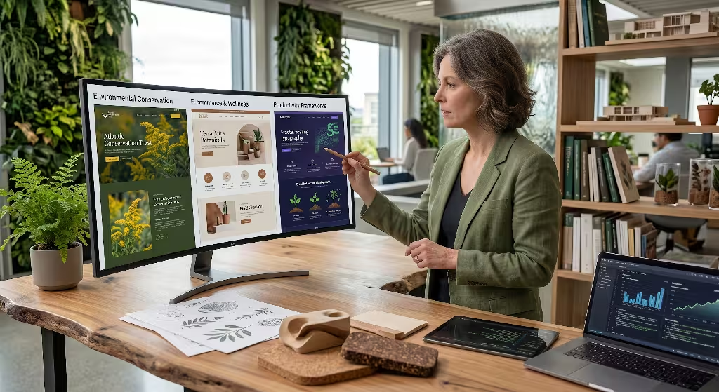
Adaptive biophilic web design is highly useful across many different industries. Here at Silphium Design LLC, we see demand for this growing every single day. The most obvious use case is for environmental conservation organizations. These groups spend all their time protecting the physical earth. It is strange when their websites look like sterile corporate grids. By using adaptive biophilic web design, these organizations can align their digital presence with their physical mission. By using authentic visual taxonomy and native plant imagery, they prove they care about nature in every detail.
Another massive industry that benefits from adaptive biophilic web design is e-commerce and wellness. Buying things online can be very stressful. People worry about spending money. They worry about their privacy. By using adaptive biophilic web design, online stores can reduce purchase anxiety. When a checkout flow uses calming, earth toned colors and smooth, flowing lines, the user relaxes. A relaxed user is more likely to trust the store and finish their purchase. Wellness brands, like yoga studios or natural medicine shops, absolutely must use this style to match their brand message.
Finally, adaptive biophilic web design is perfect for productivity frameworks. These are the tools and apps people use to get work done. Staring at a spreadsheet all day is boring and draining. By adding adaptive biophilic web design to these tools, we can help people focus. Some apps utilize gamified growth mechanics. For example, as the user finishes their tasks, a virtual tree on the screen might grow new leaves. This uses the natural human love for plant growth to sustain user focus and reduce digital distractions.
Building Living Web Applications
In summary, the way we build the internet must change. Adaptive biophilic web design is a necessary evolution in human computer interaction. It is not just a passing visual fad or a transient aesthetic trend. It is a deep, structural way to make technology healthier for the human body and mind. By using direct nature analogues like images of native plants, we ground the user in reality. By using earth tone colors and smooth curves, we reduce eye strain. By using smart artificial intelligence, we can change the website to support a tired user.
My final thought as a designer is that we must rethink our relationship with screens. For too long, the web has been a sterile tool that we pick up and use. The web must transition from a sterile tool into an environment we inhabit healthily. It should be a digital habitat that feels as safe and welcoming as a quiet garden.
This brings me to my call to action for you. I direct all designers, developers, and business owners to audit their existing frameworks today. Look at your websites. Are they harsh? Are they bright? Do they cause stress? It is time to update them. Bring in the principles of adaptive biophilic web design. Integrate organic shapes. Switch to sustainable, green coding practices. By embracing adaptive biophilic web design, we can build an internet that finally respects the biological needs of the people using it.