
Defining Place-Based Visual Identity
Table of Contents
When you visit most websites today, you see a sea of identical white boxes, generic blue buttons, and sterile stock photos. This trend of bland minimalism makes the digital world feel completely disconnected from the physical world. In the physical realm, every town, valley, coastline, and city has its own distinct character. Roman builders called this unique atmospheric quality the genius loci, or the spirit of place. When we create a website, we have an opportunity to bring this spirit of place into digital design.
A place-based visual identity is a design system rooted in the geography, biology, geology, and architectural traditions of a specific physical location. It takes the living textures, natural light patterns, and native colors of a region and translates them into digital design components. Instead of forcing every regional office, store, or branch into a rigid corporate template, a place-based visual identity celebrates local surroundings while keeping the overarching brand recognizable.
Human biology plays a major role in how we perceive websites. For hundreds of thousands of years, the human brain evolved to interpret natural landscapes. We learned to recognize local plant shapes, the angle of sunlight during different seasons, the colors of local soils, and the natural geometry of native trees. When a digital interface reflects these familiar natural patterns, our nervous system relaxes. We feel a sense of psychological comfort and trust. This concept is known as biophilia, which is the innate human desire to connect with nature. When biophilic principles guide a visual identity, visitors feel an immediate sense of belonging and ease.
Understanding how a place-based visual identity works is essential for modern businesses. Traditional geographic branding often relies on shallow clichés, such as placing a cartoon landmark or a generic state flag in a logo. A genuine place-based visual identity goes much deeper. It uses the mathematical ratios of local leaves, the exact color shades of local clay and limestone, and the vernacular building styles of local communities. It blends nature, computer science, and brand strategy into a unified system.
Search engines and modern digital platforms reward websites that offer authentic local experiences. Users are constantly searching for businesses that understand their specific community and environment. When a company builds its visual identity around genuine regional characteristics, it provides a strong foundation for local search optimization, user engagement, and lasting customer trust.
The Main Problem: Scalability vs. Regional Authenticity
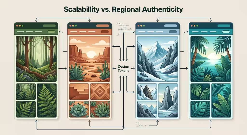
Creating a visual identity for a company that operates in multiple locations presents a major design challenge. On one side is the desire for total global uniformity. On the other side is the need for local authenticity. If a brand leans too far in either direction, problems quickly arise.
+-------------------------------------------------------------------+
|                        THE BRAND SPECTRUM                         |
+-------------------------------------------------------------------+
| TOTAL HOMOGENIZATION      BALANCED PLACE-BASED      FRAGMENTATION |
| Generic templates         Core rules + Local tokens Disjointed UI |
| Ignores local context     Unified & authentic       Damaged trust |
+-------------------------------------------------------------------+
The Homogenization Trap
Many large organizations fall into the homogenization trap. They create a single, rigid corporate design manual and apply it to every website, app, and landing page across the globe. A user visiting a branch page in the desert of Arizona sees the exact same visual identity, color scheme, and graphic assets as a user visiting a branch page in the lush forests of Maine.
This total homogenization strips away cultural and environmental context. It makes the company feel like a distant, uncaring entity with no roots in the community. When a visual identity ignores local reality, users feel disconnected. This emotional distance leads to higher bounce rates, lower time spent on the page, and reduced conversion rates. A sterile visual identity communicates that the company does not truly belong to the place where it operates.
The Fragmentation Risk
To avoid corporate blandness, some companies allow local branches to build their own independent websites. While this allows for local expression, it usually leads to severe brand fragmentation.
When regional teams design without shared rules, the visual identity falls apart. One branch might use low-quality clip art, another might select unreadable color combinations, and a third might ignore basic accessibility standards. This chaotic approach damages brand equity. Customers who travel between locations or interact with multiple digital channels become confused. When a visual identity lacks discipline, the brand loses its professional credibility.
The Technical Compromise
The solution is not to choose between global control and local freedom. The solution is to build a structured technical framework that supports both. By using modern design tokens and headless software systems, a brand can establish non-negotiable global invariants while allowing dynamic, location-specific variables.
A global invariant is a design rule that never changes. This includes core grid spacing, primary logomark proportions, base typography ratios, and core user experience patterns. Dynamic variables are design values that change based on location. These include native biome color palettes, localized background textures, regional architectural line styles, and local photography guidelines. This technical compromise lets an organization scale its visual identity efficiently across hundreds of locations without losing local authenticity.
Structural Framework: Maintaining Brand Consistency with Place-Based Visual Identity
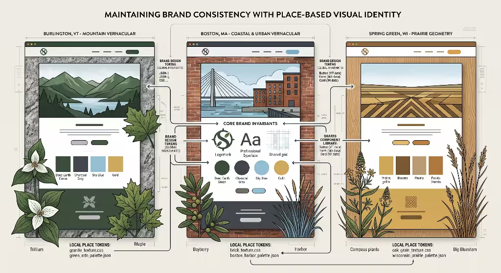
Building a scalable, place-based visual identity requires a clear architecture. We can divide the design system into two main layers: Global Invariant Tokens and Contextual Place Tokens. These tokens act as variables in code that store design decisions.
+-------------------------------------------------------------------+
|               DESIGN SYSTEM TOKEN ARCHITECTURE                    |
+-------------------------------------------------------------------+
|  GLOBAL INVARIANTS                                                |
|  - Layout Grids & Spacing Math                                    |
|  - Core Logomark Geometry                                         |
|  - Typography Scale Ratios                                        |
|  - Standard Interactive Component Behavior                        |
+-------------------------------------------------------------------+
                                 |
                                 v
+-------------------------------------------------------------------+
|  CONTEXTUAL PLACE TOKENS                                          |
|  - Native Biome Color Palettes (Soil, Flora, Light)               |
|  - Regional Fractal Geometry (D = 1.3 to 1.5)                      |
|  - Vernacular Material Textures (Stone, Timber, Clay)             |
|  - Localized Environmental Imagery & Micro-copy                   |
+-------------------------------------------------------------------+
                                 |
                                 v
+-------------------------------------------------------------------+
|  OUTPUT: CONSISTENT YET LOCALLY RESONANT WEBSITES                 |
+-------------------------------------------------------------------+
The Semantic Design Token Hierarchy
Design tokens are the foundational building blocks of a digital design system. They store values like colors, font sizes, padding, and border radius in a central data format such as JSON. These values then flow automatically into design tools like Figma and code repositories for web development.
To maintain a consistent visual identity across different regions, tokens are structured in a clear hierarchy:
- Global Invariant Tokens (Level 1): These tokens control structural layout math, fundamental component behavior, and the core logo geometry. A 12-column grid or an 8-pixel spacing system remains identical across every regional site to preserve the core visual identity.
- Contextual Place Tokens (Level 2): These tokens define the regional styling layer. They override specific color values, border radiuses, and vector background patterns based on the visitor’s geographic location or the regional market being served.
By separating layout structure from stylistic expression, developers can update the entire visual identity from a single central codebase while giving each regional website a distinctive local atmosphere.
Contextual Place Tokens for Colors and Palettes
Color is one of the most immediate ways a visual identity communicates with the human brain. Instead of selecting arbitrary colors from a digital color picker, a place-based visual identity extracts color values directly from the local natural environment.
Designers can analyze the native flora, regional geological strata, and the quality of natural sunlight in a specific area. For example, a website serving the Pacific Northwest might derive its secondary and accent color tokens from the deep green of Douglas fir needles, the slate gray of wet coastal stones, and the soft amber of native cedar wood. A website serving the American Southwest would extract its color tokens from red sandstone, desert sage, and terracotta clay.
/* Global Core Token */
:root {
  --font-base-scale: 1.25;
  --grid-gutter: 1.5rem;
  --brand-logomark-ratio: 1.618;
}

/* Regional Token: Pacific Northwest Theme */
[data-region="pacific-northwest"] {
  --color-primary-surface: #1b382b; /* Deep Douglas Fir */
  --color-secondary-surface: #4a5d6e; /* Coastal Slate */
  --color-accent-warm: #c67d3e; /* Aged Cedar */
  --color-background-soft: #f4f6f4; /* Morning Fog */
}

/* Regional Token: Desert Southwest Theme */
[data-region="desert-southwest"] {
  --color-primary-surface: #8a3324; /* Terracotta Clay */
  --color-secondary-surface: #5f6f65; /* Desert Sage */
  --color-accent-warm: #d9822b; /* Canyon Sandstone */
  --color-background-soft: #faf6f0; /* Caliche Sand */
}
Using modern color formats like OKLCH allows designers to maintain perceptual uniformity across all screens. This ensures that every local color palette meets contrast standards while keeping the visual identity rooted in real nature.
Form, Texture, and Natural Geometry
Nature is rarely built with perfect straight lines and sharp corners. Instead, natural forms follow organic geometry and fractal patterns. In nature, a fractal is a repeating geometric pattern that looks similar at different scales, such as the branching of a river, the growth of a fern, or the veins in a leaf.
Research in biophilic design shows that the human eye is most comfortable looking at patterns with a statistical fractal dimension between 1.3 and 1.5. Incorporating these natural mathematical patterns into background vectors, section dividers, and subtle line art strengthens the visual identity.
+-------------------------------------------------------------------+
|                FRACTAL PATTERNS IN UI DESIGN                      |
+-------------------------------------------------------------------+
|  LOW COMPLEXITY (D < 1.2)   OPTIMAL BIOPHILIC (D = 1.3 - 1.5)     |
|  Rigid corporate lines      Natural branching, leaf veins, waves  |
|  Feels sterile and cold     Promotes cognitive ease and focus     |
+-------------------------------------------------------------------+
A region with rolling prairie grasslands might use gentle wave curves in its digital containers and hero section transitions. A mountain region might use angular, branching vector lines that mimic local rock formations. These subtle structural choices reinforce the visual identity without cluttering the screen or confusing the user.
Materiality and Regional Physical Substrates
In physical architecture, vernacular building design relies on local materials. Builders in Vermont use local granite and weathered clapboard. Builders in the desert use adobe and rammed earth. Builders in the coastal south use cypress and coquina stone.
A digital visual identity can reflect this tactile materiality through modern CSS techniques. Subtle background textures, delicate linear gradients, and CSS blend modes can simulate the tactile feel of local substrates. For instance, a subtle grainy CSS pattern can suggest the texture of regional limestone or handmade brick. These details give digital layouts physical depth and make the visual identity feel grounded in a real environment.
Technical Implementation and Governance
Maintaining a consistent visual identity across dozens of regional websites requires automated tools and strict governance workflows. Without automated testing, small styling errors can accumulate and weaken the brand.
- Figma to Code Pipeline: Design tokens must be managed in a single system of record. When a designer adjusts a regional color token in Figma, that change should automatically compile into JSON tokens and generate CSS custom properties in the code repository.
- Automated Visual Regression Testing: Automated testing tools take screenshots of every regional webpage whenever code is updated. If a localized layout breaks or a button shifts out of place, the test flags the error before the code goes live. This safeguards the core visual identity.
- Component Libraries: Developers use shared component libraries, such as React or Vue components, where the underlying layout and accessibility features are locked, but the place-based theme tokens can be swapped dynamically.
+------------------+      +-------------------+      +------------------+
|  FIGMA TOKENS    | ---> |  STYLE DICTIONARY | ---> |  CSS / JSON      |
|  (Design System) |      |  (Token Engine)   |      |  (Web & Mobile)  |
+------------------+      +-------------------+      +------------------+
                                                       |
                                                       v
                                             +------------------+
                                             |  CI/CD PIPELINE  |
                                             |  - Visual Tests  |
                                             |  - Accessibility |
                                             |  - Performance   |
                                             +------------------+
Performance Optimization and Core Web Vitals
A beautiful visual identity is useless if the website takes too long to load. High-resolution images of local landscapes, complex vector patterns, and multiple custom fonts can slow down page speeds and harm search engine rankings.
To keep the visual identity fast and responsive, development teams must follow strict performance standards:
- Next-Generation Image Formats: All photographic assets must use modern, compressed formats such as AVIF or WebP. These formats reduce file sizes while preserving visual clarity.
- Variable Fonts: Instead of loading multiple separate font files for bold, light, and italic styles, websites should use a single variable font file. This reduces server requests and improves rendering speed.
- Inline SVGs for Geometry: Fractal patterns, natural dividers, and regional line art should be generated as clean, inline SVG code rather than large image files. Inline vectors load instantly and scale smoothly on any screen resolution.
- Optimizing Core Web Vitals: Keeping asset sizes small prevents Cumulative Layout Shift (CLS) and keeps the Largest Contentful Paint (LCP) under 2.5 seconds. A fast, stable page load ensures that the visual identity supports rather than harms SEO rankings.
Common Questions Answered about Visual Identity
Below are some of the most common questions people ask about visual identity.
What is a place-based visual identity?
A place-based visual identity is a comprehensive design system that aligns a brand’s digital presence with the natural, geographical, and architectural characteristics of a specific physical location. It goes beyond simple geographic markers like flags or landmark icons. Instead, it incorporates native biome colors, local geological textures, vernacular building proportions, and regional light qualities into digital layouts.
This approach allows multi-location organizations to maintain a recognizable, cohesive brand presence while creating deep personal resonance with local audiences. A strong place-based visual identity bridges the gap between digital interfaces and physical environments, making websites feel familiar, welcoming, and trustworthy.
How do you maintain brand consistency across multi-regional websites?
Maintaining consistency across multi-regional websites requires a token-driven design system that clearly separates global structural rules from regional stylistic themes.
+-------------------------------------------------------------------+
|               MULTI-REGIONAL CONSISTENCY MATRIX                   |
+-------------------------------------------------------------------+
| COMPONENT       GLOBAL INVARIANT RULE       LOCALIZED EXPRESSION  |
+-------------------------------------------------------------------+
| Navigation Bar  Fixed position and layout   Local accent color    |
| Typography      Consistent scale and font   Region-specific copy  |
| Cards / Panels  Identical padding and grid  Local biome palettes  |
| Hero Section    Standard layout structure   Native natural assets |
+-------------------------------------------------------------------+
By keeping layout grids, typography scales, logomark rules, and functional components locked at the global level, the core visual identity stays intact. Meanwhile, developers can switch regional tokens, such as native color palettes, local photography, and subtle vector textures, using simple data attributes in the code. Automated visual regression testing and unified component libraries ensure that changes made on one page do not break the visual identity across the wider web ecosystem.
Why does place-based branding improve digital conversion?
Place-based branding improves digital conversions because it reduces cognitive friction and activates biophilic familiarity. When users land on a website that mirrors their physical surroundings, their brains recognize the environmental cues. This recognition fosters an immediate sense of safety and trust.
Generic corporate templates often make users feel like they are interacting with an anonymous, overseas call center or a detached conglomerate. When a company uses a place-based visual identity, it signals that it understands and values the local community. This perceived proximity increases user dwell time, lowers bounce rates, and makes visitors significantly more likely to fill out forms, request quotes, or purchase products.
How does biophilic web design support SEO?
Biophilic web design directly supports search engine optimization by improving user experience metrics and supporting local search signals. Search engines prioritize websites that deliver fast, stable, and engaging user experiences.
When a visual identity incorporates biophilic principles, such as natural light contrasts, organic geometric curves, and harmonic spacing, users spend more time exploring the site. Increased dwell time and low bounce rates send positive user engagement signals to search engine algorithms. Furthermore, structuring a place-based visual identity around distinct regional subpages provides a clean framework for adding localized Schema.org structured data. This helps search engines understand the exact geographic relevance of each page, boosting local organic rankings.
Step-by-Step Implementation Protocol for Digital Product Teams
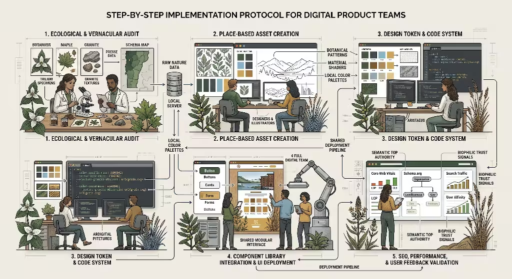
Transforming a traditional design system into a place-based visual identity requires a disciplined, step-by-step workflow. Product teams should follow this five-stage protocol to ensure seamless execution.
+---------------+      +---------------+      +---------------+
|    STEP 1:    |      |    STEP 2:    |      |    STEP 3:    |
| Ecological &  | ---> | Token Mapping | ---> | Generative    |
|  Vernacular   |      |  & System     |      |  Asset        |
|    Audit      |      |    Setup      |      |  Pipeline     |
+---------------+      +---------------+      +---------------+
                                                     |
                                                     v
                       +---------------+      +---------------+
                       |    STEP 5:    |      |    STEP 4:    |
                       | Multi-Locale  | <--- | Accessibility |
                       | QA & CI/CD    |      |    & WCAG     |
                       |  Deployment   |      |  Compliance   |
                       +---------------+      +---------------+
Step 1: Ecological and Vernacular Audit
Before opening design software, product teams must conduct a thorough environmental and cultural audit of the target region. This involves cataloging the visual patterns that define the local territory:
- Botanical and Ecological Research: Document dominant native trees, flowering plants, mosses, and grasses. Record their seasonal color transitions.
- Geological and Soil Analysis: Identify the underlying rock formations (such as granite, sandstone, or basalt) and local soil colors (such as red clay, dark loam, or pale sand).
- Architectural Vernacular: Study historical and traditional building styles in the area. Look at common roof pitches, window shapes, masonry patterns, and building materials.
- Atmospheric and Light Conditions: Observe the typical quality of light. Coastal regions often have cool, diffuse light, while mountain and desert regions experience high-contrast, warm sunlight.
This research creates a factual, objective foundation for building the localized visual identity.
Step 2: Token Mapping and System Setup
Once the audit data is collected, the design team translates the findings into digital tokens.
First, establish the global invariants. Define the base grid system, primary logomark clearances, interactive button dimensions, and core typography scales. Next, create the regional token themes. Map the audited natural colors into accessible digital color spaces. Name the tokens semantically so developers understand their purpose immediately:
/* Semantic Token Naming Example */
--color-brand-core: #111827;            /* Global Invariant */
--color-surface-regional-base: #2d4a3e; /* Localized Forest Tone */
--color-accent-regional-glow: #e0a96d;  /* Localized Sunset Tone */
--radius-regional-corner: 8px;          /* Subtle Organic Softness */
Organizing tokens semantically keeps the visual identity clean, manageable, and easy to scale across multiple digital platforms.
Step 3: Generative Asset Pipeline
Next, the team creates the visual assets that will bring the interface to life. Rather than downloading generic stock illustrations, designers use code and vector tools to build parametric assets inspired by local nature:
- Algorithmic Fractal Patterns: Generate lightweight SVG patterns based on local leaf veins or geological strata for use in subtle background headers.
- Dynamic Dividers: Create smooth, responsive section dividers that mimic regional river curves or mountain ridgelines.
- Optimized Photography Guidelines: Establish clear art direction for local photography. Photos should feature authentic native flora, recognizable regional architecture, and natural environmental lighting rather than staged studio setups.
This pipeline ensures that every visual asset directly reinforces the authentic regional visual identity.
Step 4: Accessibility and WCAG Compliance
A nature-inspired visual identity must always remain accessible to every user, including those with visual impairments. Organic earth tones, such as soft sands and muted greens, can sometimes fail digital contrast requirements if not carefully managed.
- Color Contrast Ratios: Every text and background pairing must meet or exceed the Web Content Accessibility Guidelines (WCAG 2.2) Level AA standard. This requires a contrast ratio of at least 4.5:1 for normal text and 3:1 for large text.
- Accessible Perceptual Contrast Algorithm (APCA): Use modern APCA tools to verify that text remains readable across different screen brightness levels and viewing angles.
- Non-Color Cues: Never rely on color alone to convey meaning or system status. Always pair localized color cues with clear icons, text labels, and structural underlines.
+-------------------------------------------------------------------+
|                 WCAG 2.2 ACCESSIBILITY CHECKLIST                  |
+-------------------------------------------------------------------+
| [X] Text Contrast meets minimum 4.5:1 ratio                       |
| [X] Large Headers meet minimum 3:1 ratio                          |
| [X] Interactive states include visible focus indicators           |
| [X] Dynamic vectors include descriptive ARIA labels               |
| [X] Text scaling up to 200% does not break layouts                |
+-------------------------------------------------------------------+
Ensuring high accessibility standards preserves the integrity and usability of the visual identity for all visitors.
Step 5: Multi-Locale Quality Assurance and Deployment
The final stage is deploying the design system through an automated testing pipeline.
Developers set up continuous integration scripts that automatically scan new code for token errors or layout breaks. Automated visual tests check that every regional theme renders correctly across desktop, tablet, and mobile screens. Once all tests pass, the site updates automatically across the global content delivery network. This automated workflow maintains complete brand consistency while delivering a locally tailored visual identity to every user.
Semantic Search and Structured Data Architecture
A well-executed place-based visual identity works hand-in-hand with search engine optimization. When visual design and technical search data align, search engines can easily understand, index, and rank regional content.
Schema Markup and Entity Stacking
Search engines rely on structured data in JSON-LD format to map relationships between companies, locations, and brands. By embedding nested Schema.org markup into every regional webpage, you create an explicit link between the digital page, the physical place, and the parent brand.
JSON
{
  "@context": "https://schema.org",
  "@graph": [
    {
      "@type": "Organization",
      "@id": "https://example.com/#organization",
      "name": "Silphium Living Systems",
      "url": "https://example.com",
      "logo": "https://example.com/assets/global-logo.svg"
    },
    {
      "@type": "LocalBusiness",
      "@id": "https://example.com/burlington/#localbusiness",
      "name": "Silphium Living Systems - Burlington Studio",
      "url": "https://example.com/burlington",
      "parentOrganization": {
        "@id": "https://example.com/#organization"
      },
      "address": {
        "@type": "PostalAddress",
        "streetAddress": "100 Church Street",
        "addressLocality": "Burlington",
        "addressRegion": "VT",
        "postalCode": "05401",
        "addressCountry": "US"
      },
      "geo": {
        "@type": "GeoCoordinates",
        "latitude": 44.4759,
        "longitude": -73.2121
      },
      "hasMap": "https://maps.google.com/?cid=1234567890",
      "knowsAbout": [
        "Biophilic Web Design",
        "Place-based Visual Identity",
        "Design Tokens"
      ]
    }
  ]
}
This structured data graph explicitly tells search engines that the local branch belongs to the parent organization while pinpointing its exact physical coordinates. This strong semantic foundation reinforces the regional focus of the visual identity.
Locational Information Scent
Information scent refers to the visual and textual cues that guide users toward the information they seek. When a visitor lands on a regional webpage, every element should confirm that they are in the right place:
- Localized Navigation: Regional sub-menus should highlight local services, community projects, and nearby branch contacts.
- Breadcrumb Navigation: Clear breadcrumb trails help both users and search engine crawlers understand the structural relationship between global and regional pages.
- Contextual Internal Linking: Linking regional pages to localized case studies, nearby client stories, and native environmental projects reinforces topical and geographic relevance.
When users follow clear cues supported by a coherent visual identity, their confidence in the website grows.
Topical Authority and Search Signals
Topical authority is built when a website demonstrates deep, comprehensive knowledge in its field. Creating content clusters around place-based design, regional color studies, and biophilic digital architecture positions the brand as an industry leader.
Search engines evaluate how thoroughly a website covers its subject matter. By publishing in-depth articles, case studies, and code architectures that explain how regional geography shapes the digital visual identity, an organization builds strong topical authority. This expertise attracts high-quality backlinks from design publications, technology blogs, and environmental organizations, driving long-term organic search traffic.
Strategic Synthesis and Long-Term Value
Building a place-based visual identity is a strategic investment in long-term brand equity and search performance. As digital markets become more crowded and competitive, generic corporate templates will continue to lose their effectiveness. Users want authentic, meaningful connections with the organizations they choose to support.
+-------------------------------------------------------------------+
|               LONG-TERM VALUE COMPARISON                          |
+-------------------------------------------------------------------+
| ATTRIBUTE          GENERIC MINIMALISM    PLACE-BASED IDENTITY     |
+-------------------------------------------------------------------+
| User Connection    Cold, transactional   Warm, biophilic, rooted  |
| Brand Recognition  Easily forgotten      Distinctive and memorable|
| Maintenance        Fragile when edited   Modular token system     |
| Local SEO Value    Weak location signals Strong entity graphs     |
| Longevity          Subject to fads       Timeless natural logic   |
+-------------------------------------------------------------------+
By grounding digital design in the timeless laws of biology, geology, and local architecture, businesses can create digital experiences that feel both modern and familiar. Separating global layout structures from localized design tokens provides the ideal technical balance. It gives global organizations the speed, scalability, and code governance they need, while granting regional branches the authentic local character they deserve.
A well-crafted place-based visual identity does more than make a website look attractive. It calms the human nervous system through biophilic harmony, respects the distinct cultural identity of every community, and provides search engines with a clear, well-structured digital architecture. Embracing this place-based philosophy ensures that your brand visual identity remains memorable, scalable, and deeply trusted for years to come.