Table of Contents
The Intersection of Biophilia and Color Science
Human beings are hardwired to respond to the natural world. For thousands of years, our survival depended on our ability to read the landscape. We looked at the sky to predict the weather. We scanned the forest floor for food. We checked the colors of plants to see if they were safe to eat. Because of this long history, our minds and bodies feel best when we are connected to natural environments. At Silphium Design LLC, we call this concept biophilic design. Biophilic design means bringing the patterns, structures, and systems of the natural world into the digital spaces we use every day.
One of the most powerful ways to bring the outside world into a website is through color. The colors found in the wild are never accidental. They are shaped by sunlight, moisture, atmosphere, and the chemistry of life itself. When you build a digital project, you can capture this natural harmony by using photos of nature to build your visual foundation. This article will show you the exact technical and artistic steps needed to transform photos of nature into professional, beautiful, and accessible color systems.
The main technical problem we face as digital creators is translation. The physical world is full of chaotic, shifting waves of light. A camera captures this light and saves it as millions of individual pixels. Each pixel has its own distinct digital code. To make a clean website or app, we cannot just use a chaotic mess of millions of colors. We must translate those complex images into a small, structured set of design variables. We need a system that is easy for a web browser to read and pleasant for a human eye to look at.
[Natural Landscape] -> [High-Res Photography] -> [Algorithmic Sampling] -> [Structured Design Variables]
Our ultimate goal is to move past arbitrary color choices. Many designers pick colors simply because they look nice in the moment or because they follow a passing trend. By learning how to create a color palette from photos of nature, you can build a robust design system grounded in evolutionary science. Your digital projects will inherit the same color balance that humans have loved for thousands of years. This guide will teach you the exact science, math, and design rules to make that happen.
Sourcing and Preparing the Input Data (Photos of Nature)
Every great color palette starts with high-quality source material. If you want to extract clean, useful color systems, you must choose your photos of nature with care. Not every picture will yield a good design palette. A photo that looks beautiful on a screen might actually turn into a messy or muddy collection of hex codes if it lacks the right internal structure.
Compositional integrity is your first priority. When you evaluate photos of nature, look for images that feature clear focal points and distinct geometric structures. Think of a single green leaf covered in morning dew sitting on a dark stone, or a sharp line where a blue ocean meets an orange desert cliff. These images have clear color boundaries.
You want to avoid highly chaotic, low-contrast landscapes where everything blends together into a blurry gray or brown mass. For example, a picture of a dense, overgrown forest taken on a deeply foggy day will often compress all the unique tones into a very narrow, muddy range. This makes it difficult for any software tool to pull out distinct, vibrant color variables.
Good Composition: [Clear Sky Blue] ------------ [Sharp Desert Horizon] ------------ [Deep Rock Shadow]
Poor Composition: [Foggy Grey-Green] ~~~~ [Blurry Transition Zone] ~~~~ [Muddy Shadow-Green]
There are three strict technical specifications you should follow when preparing your photos of nature for color analysis:
- Resolution demands: You should always use high-resolution files. Aim for images that measure between 2000 and 3000 pixels on the long edge. High-resolution photos of nature contain thousands of tiny micro-variations in tone. This gives your color extraction software a rich data set to analyze. If your image is too small or highly compressed, the pixels will become blocky and ruin the natural gradients.
- Noise mitigation: Digital noise is the grainy texture you see in photos taken in low light. This grain introduces random red, green, or blue pixels that do not actually belong in the natural scene. To fix this, use a photo editing tool to apply gentle noise reduction. This cleans up the image and ensures that your final color codes represent the true environment.
- Lighting variables: Watch out for extreme lighting. Photos of nature with overexposed, blinding white highlights or completely compressed, solid black shadows should be avoided. These extreme areas hide the true color depth of the scene. You want images with an even, balanced exposure where the mid-tones are fully visible.
Before you run any mathematical extraction scripts, it is smart to build a digital mood board. A mood board is a curated collection of visual assets that sets the tone for your project. Group your selected photos of nature together on a digital canvas. Look at them as a whole to make sure they match the emotional goal of your website.
If you are building a website for a calm, professional medical office, your mood board might feature photos of nature showing cool blue oceans and steady gray slate stones. If you are designing an energetic fitness app, your mood board might include photos of nature showing bright orange sunrises and vibrant green fields. Setting this visual baseline early ensures that your final code matches your initial design intent.
The Computational Engine: How Color Extraction Works
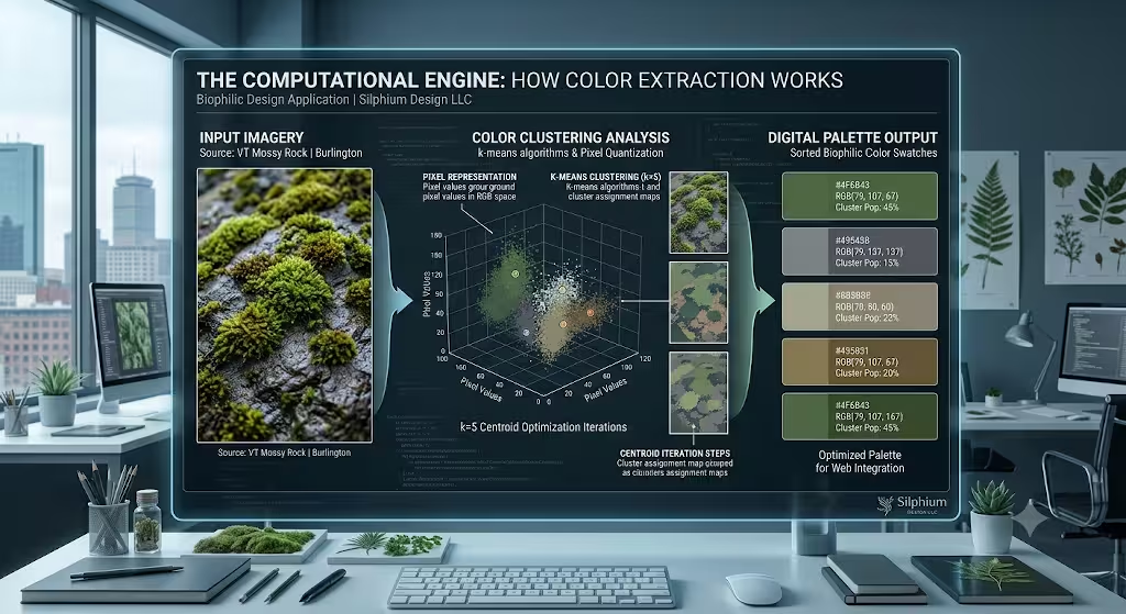
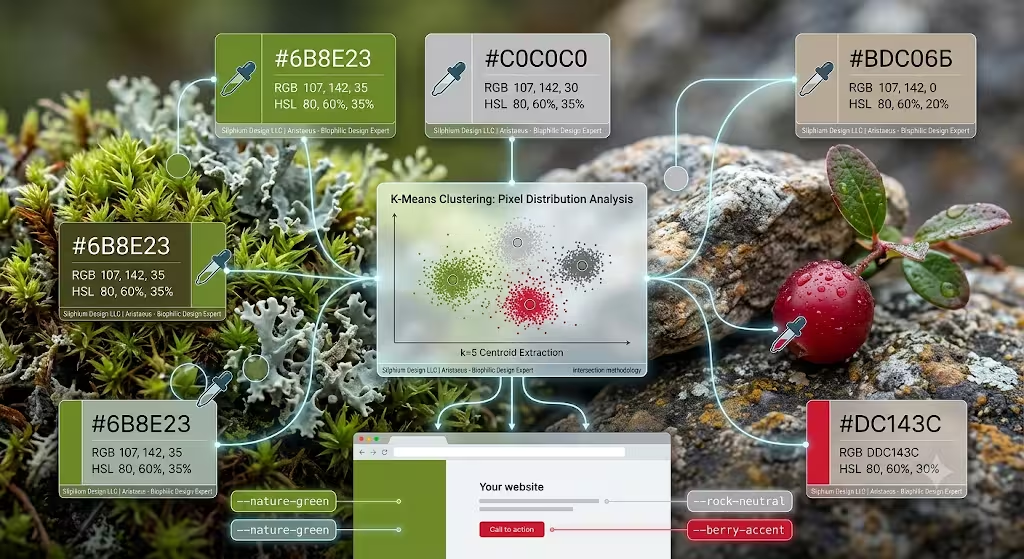
To understand how we get clean colors from photos of nature, we have to look under the hood at the computer science involved. Software tools do not just guess which colors are important. They use a specific math process called k-means clustering. K-means clustering is an algorithm, which is a step-by-step set of mathematical rules used by a computer to group similar items together.
Imagine every single pixel in your photos of nature as a tiny point floating in a large, three-dimensional space. The three axes of this space represent the amounts of red, green, and blue light inside the pixel. A typical high-resolution photo contains millions of these points floating in a giant digital cloud. The k-means algorithm simplifies this cloud by performing the following actions:
- The software randomly chooses a few starting points in the cloud called centroids. If you want a five-color palette, the software will pick five starting centroids.
- The computer measures the mathematical distance between every single pixel point and these five centroids.
- Each pixel is assigned to the closest centroid, creating five distinct groups or clusters.
- The computer calculates the exact center point of each new cluster and moves the centroid to that true middle position.
- The system repeats this process over and over until the centroids stop moving.
The final positions of these centroids represent the average colors of the most common pixel groups in your photos of nature.
Step 1: Place random centroids in the pixel cloud.
Step 2: Group every pixel with its nearest centroid.
Step 3: Move centroids to the true mathematical center of each group.
Step 4: Repeat until the color groups are perfectly stable.
The underlying architecture of color extraction tools relies heavily on modern web standards. When you use an online tool to scan photos of nature, the system usually runs client-side scripts. Client-side means the software runs directly inside your own web browser using your computer’s power, rather than uploading your heavy files to a faraway corporate server. This process is fast, safe, and private.
These web tools typically use JavaScript along with something called the Canvas API. The Canvas API is a built-in web tool that allows code to look directly at the individual pixels of an image. The code renders your photos of nature onto an invisible digital canvas, extracts the raw pixel data array, and passes those numbers into the clustering algorithm.
A popular open-source software library used for this task is called Color Thief. Color Thief is a lightweight JavaScript tool that organizes the pixel data into a structured grid. It looks at the total pixel populations across the entire image. This means it counts exactly how many pixels belong to each color group. It then sorts the final colors based on how common they are. This gives you an accurate list of the dominant tones that make up the unique atmosphere of your original photos of nature.
Step-by-Step Production Framework for Using Photos of Nature
Now that we understand the science and the math, let us look at the actual step-by-step production framework for building your color palette. This is the practical workflow we use to transform raw photos of nature into an organized design system.
Phase 1: Isolating Dominant and Accent Tones
The first phase is all about separating your colors into two main categories: background anchors and focal highlights. When you look at your analyzed photos of nature, the algorithm will give you a list of the most common colors. The colors with the largest pixel populations are your dominant tones. These are usually the soft, neutral colors that form the background canvas layer of the image. Think of the deep charcoal gray of a stormy mountain cliff or the soft sandy tan of a desert dune. These dominant tones will be used for large areas of your website, such as backgrounds, large sections, and footer blocks.
Next, you must find your accent colors. Accent colors have smaller pixel populations, but they carry a lot of visual weight. These are the bright focal highlights that draw the human eye. Examples include the brilliant orange of a sunset sky or the sharp crimson red of a wild berry. On your website, these colors must be saved for small, highly important elements like buttons, links, notification alerts, and navigation menus.
+---------------------------------------------------------+
| Dominant Tone: Deep Charcoal Gray (Large Backgrounds)   |
|                                                         |
|    [Button: Sunset Orange Accent]                       |
|                                                         |
+---------------------------------------------------------+
Phase 2: Defining Palette Caps (Size vs. Scale)
The second phase requires setting a strict limit on how many colors you keep. It is tempting to save every single pretty color you find in your photos of nature, but too many colors will break the visual balance of your website. You must decide on a palette cap based on the type of project you are building.
For a standard corporate website or a clean application interface, a lean capsule palette of 3 to 5 colors is optimal. A small palette creates a strong identity and prevents the screen from looking cluttered. It gives you one dominant background color, one secondary layout color, one dark tone for text readability, and one or two bright accent colors for interactive elements.
However, there are times when you need to scale up your system. If you are designing complex data dashboards with lots of different charts, or if you are creating detailed digital illustrations, you can expand your system to a larger set of 8 to 10 colors. When you expand your palette from photos of nature, make sure the extra colors are just lighter shades or darker tints of your original core tones. This keeps the expanded system feeling connected and harmonious.
Phase 3: Fine-Tuning Selections Manually
The third phase is manual fine-tuning. Algorithms are brilliant at math, but they do not have human artistic taste. Sometimes, a color extraction tool will sample a muddy transition pixel. A transition pixel is a pixel that sits right on the border between two objects, such as a blurry blend of green leaves and brown dirt. This can result in a strange, muddy brown-green color that looks dirty on a clean webpage.
To fix this, open your extraction tool’s manual override mode. This allows you to click and drag the sampler nodes around the surface of your photos of nature. Move the nodes away from blurry, out-of-focus areas or muddy borders. Place them directly on top of sharp, high-contrast structural zones where the colors are pure and bright. This human touch ensures that your final digital palette feels crisp, deliberate, and truly alive.
Harmonization, Formats, and Accessibility Standards for Photos of Nature
Once you have extracted your core colors from your photos of nature, you need to format them properly and check them against modern web standards. Colors must be written in languages that browsers understand, and they must be arranged so that everyone can read them safely.
Decoding Technical Formats
When you save your colors, your extraction tools will give you numbers in three primary data architectures. It is important to know how to use each one:
- Hexadecimal (HEX): This is the most common format used in web design. A HEX code is a 6-digit combination of letters and numbers preceded by a pound sign, like #2A4B7C. The first two characters represent Red, the middle two represent Green, and the final two represent Blue. HEX codes are short, clean, and perfect for copying and pasting into your main stylesheets.
- RGB: This model defines colors by using three absolute value numbers ranging from 0 to 255. For example, rgb(42, 75, 124). RGB is useful when you want to use modern CSS to add transparency to a color background by adding an alpha channel value, like rgba(42, 75, 124, 0.5).
- HSL (Hue, Saturation, Lightness): This is the most useful model for design systems. Hue is expressed as a degree on a color wheel from 0 to 360. Saturation and Lightness are expressed as percentages from 0% to 100%. For example, hsl(216, 49%, 33%). HSL makes it incredibly easy to create light and dark variations of a color. If you need a lighter version of your background color extracted from photos of nature, you do not have to guess a new HEX code. You simply increase the Lightness percentage number in your code.
Refining via Color Theory
Even though colors pulled from photos of nature are naturally balanced, you should still check them against classic mathematical color theory to optimize their placement.
Analogous:   [Color A: Olive] ---> [Color B: Moss] ---> [Color C: Sage]
Complementary: [Color A: Deep Ocean Blue] <=======================> [Color B: Coral Orange]
An analogous color layout uses colors that sit right next to each other on the color wheel, like a series of soft moss greens, sage greens, and olive tones pulled from an image of a forest floor. This layout creates a very calm, quiet, and unified web experience.
A complementary layout uses colors that sit directly opposite each other on the color wheel, like a deep ocean blue paired with a bright coral orange pulled from photos of nature showing a marine reef. Complementary combinations create high energy and massive visual contrast. Use analogous tones for the overall layout of your pages, and use complementary tones when you need an element to jump out at the user.
The UI Color-Blocking Check
Before you write any code, perform a quick color-blocking check on a temporary design canvas. Create simple square blocks of your extracted colors and place them directly next to each other. Watch out for visual clashing. Sometimes, two colors look amazing inside a photo of a mountain range because they are separated by natural light and shadow textures. However, when you place those same two colors as flat, solid blocks right next to each other on a screen, they can vibrate and hurt the reader’s eyes. If this happens, slightly lower the saturation percentage of one of the colors to give the eyes a place to rest.
Accessibility Constraints
The most critical step in building a web color system is meeting strict accessibility laws. As a designer, it is your ethical and legal duty to make sure your text is readable for everyone, including people with low vision or color blindness. You must evaluate your text contrast levels against the official Web Content Accessibility Guidelines, which are known as the WCAG standards.
The WCAG AA minimum contrast benchmark states that standard, everyday text must have a contrast ratio of at least 4.5:1 against its background color. Large text must have a contrast ratio of at least 3:1. Never guess about this. Use an online contrast checker tool to compare the HEX codes you pulled from your photos of nature. If you place white text on top of a light green tone extracted from a forest photo and the contrast ratio is only 2.5:1, your site fails the accessibility check.
To fix this, you must adjust the values. Slide the lightness setting down to make the background color darker, or make the text color darker until the contrast checker gives you a passing green light. Always remember that usability must never be sacrificed for aesthetics.
Developer Integration: Exporting to Modern Code Frameworks
Once your color palette is clean, balanced, and accessible, it is time to move it from your design tool into your actual codebase. Modern web development frameworks use organized systems to manage color tokens efficiently.
The cleanest way to handle colors in modern CSS is by using CSS Custom Properties, which are commonly called CSS variables. You should define these variables inside the :root selector of your global stylesheet. The :root selector matches the highest level element in your code document, which means every style rule across your entire website can see and use these colors. By saving your colors from photos of nature as CSS variables, you can update your entire website’s look in the future by changing a single line of code.
CSS
/* Global Color Variable Architecture */
:root {
  --biophilic-bg-dominant: #f4f7f5;     /* Soft sage mist */
  --biophilic-surface-secondary: #e2ebd5; /* Pale moss cream */
  --biophilic-text-dark: #1c2421;         /* Deep spruce bark */
  --biophilic-brand-accent: #d97706;      /* Vibrant autumn amber */
}

/* Application Example */
body {
  background-color: var(--biophilic-bg-dominant);
  color: var(--biophilic-text-dark);
}

.cta-button {
  background-color: var(--biophilic-brand-accent);
}
If you work with modern utility-first CSS frameworks like Tailwind CSS, you will want to compile your extracted colors into a clean JSON data structure inside your configuration file. Open your tailwind.config.js file and extend the core theme settings. By adding your custom colors here, Tailwind will automatically generate thousands of custom utility classes for you, such as bg-nature-green or text-nature-bark. This keeps your code lean and ensures that your developers always stay aligned with your original design intentions.
JavaScript
// tailwind.config.js
module.exports = {
  theme: {
    extend: {
      colors: {
        nature: {
          slate: '#2f3e46',
          forest: '#354f52',
          sage: '#52796f',
          mint: '#84a98c',
          bone: '#cad2c5',
        },
      },
    },
  },
}
For teams that use older nested preprocessing environments like Sass or SCSS, you can structure your colors as standard SCSS variables or save them in an organized SCSS map layout. This map structure allows developers to loop through the colors programmatically to create complex UI states, hover effects, and decorative borders automatically. No matter what framework you choose, keeping your color names clean and functional ensures a smooth handoff between design and development teams.
Frequently Asked Questions about Color Palettes from Photos of Nature
To finish our masterclass on color extraction, let us look at the most common practical questions asked by digital creators across major search engines. These answers provide direct, actionable solutions to everyday design roadblocks.
How do I generate a color palette from an image automatically?
If you want to create a color system instantly without writing your own custom code, you can use built-in industry platforms that have powerful extraction tools built right into them. Three of the best platforms available today include:
- Adobe Color / Adobe Express: This is an industry-standard web tool. You can upload your photos of nature directly into the interface. The tool instantly uses k-means algorithms to build a five-color system. It also features a drop-down menu that lets you choose different design moods, such as colorful, bright, muted, or deep.
- Coolors: This is a highly popular, lightning-fast palette generator. It allows you to upload an image and pick out colors instantly. You can lock down the colors you like, tap your spacebar to generate matching tones for the remaining slots, and export the entire asset system as a clean image, PDF, or CSS block.
- ColorMagic: This is a modern, AI-powered palette generator. Instead of uploading an image, you can type in a descriptive prompt like “sunny spring meadow” or “deep volcanic rock.” The system scans a database of relevant images and builds a matching color palette automatically based on natural lighting distributions.
Can I extract exact HEX codes from my phone’s camera roll?
Yes, you can easily pull professional color data while you are out exploring the physical world using a mobile device. The easiest way to do this without installing heavy applications is to use a free mobile web tool like Coolors or Adobe Color inside your phone’s default internet browser.
When you open the extraction tool on your mobile browser, tap the upload button. The browser will automatically ask if you want to take a new picture using your native camera or open your existing camera roll. Select an image from your camera roll. The mobile tool will run the exact same client-side canvas sampling algorithms used on desktop computers. It will render the image onto an invisible digital container, pull the pixel values, and display the exact HEX codes right on your screen. You can then copy these codes directly into your mobile notes app or send them straight to your web development workspace.
What is the difference between an eye-dropper tool and a palette extractor?
This is a common point of confusion for new designers, but the difference between these two tools comes down to scale, intent, and math.
+------------------------------------------------------------------------+
| Eye-Dropper Tool: Individual Pixel Level                               |
| [Single Target Pixel: #4A7C59]                                         |
+------------------------------------------------------------------------+
| Palette Extractor: Algorithmic Cluster Level                           |
| [Group A: 45%] -> #335C43 | [Group B: 30%] -> #6B8F71 | [Group C: 25%] |
+------------------------------------------------------------------------+
An eye-dropper tool works at an individual pixel level. When you click on an image with an eye-dropper, you are selecting one single, isolated point in space. This tool does not care about the rest of the image. It simply reads the exact red, green, and blue values of that one pixel and hands you the code. This can be problematic if you click on a tiny speck of digital noise or an accidental highlight reflection, because you will end up with a strange color that does not represent the overall feel of the image.
A palette extractor works at an algorithmic cluster level. It does not look at just one pixel. It looks at the entire population of millions of pixels across all your photos of nature at the exact same time. It uses clustering math to calculate the true geometric averages of the dominant color families within the scene. A palette extractor gives you a big-picture view of the environment’s true atmosphere, making it the superior tool for building unified, balanced, and professional design systems.
Summary of Technical Target Elements
To ensure your design systems are built correctly, use this simple checklist to review your technical variables before launch:
- Source Resolution: 2000 to 3000 pixels on the long edge. Clean, uncompressed imagery free of low-light digital grain.
- Extraction Core: K-means clustering via JavaScript Canvas API to isolate true population centroids.
- Palette Framework: 3 up to 5 colors for standard UI layouts; 8 up to 10 colors for complex data visualization systems.
- Target Formats: HEX for general stylesheets, RGB for opacity adjustments, and HSL for generating light or dark shades.
- Compliance Check: Minimum 4.5:1 contrast ratio for standard body text to guarantee full WCAG AA accessibility compliance.
By mastering this complete technical process, you can confidently turn raw photos of nature into highly functional web systems that capture the ancient, beautiful balance of our natural world.