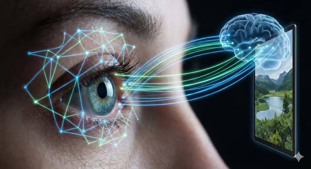
It is fascinating to think about how much our surroundings dictate our internal state. When we talk about digital design, we often get caught up in code and pixels, but at the core of the user experience is a biological reality. We are creatures of the Earth, and our brains are still tuned to the rhythms of the wild.
In this article, we are going to explore a very important topic: the impact of color and light on emotional responses. This is not just about making a website look “pretty.” It is about understanding how humans have evolved over millions of years to react to the world around them. When you see a bright blue sky, you feel energized. When you see the warm glow of a campfire, you feel safe.
My goal today is to show you how we can use these natural cues to create websites that don’t just provide information, but also make people feel good, focused, and relaxed. By bridging the gap between biology and computer science, we can build a digital world that feels as natural as a walk in the woods.
Table of Contents
The Neurobiology of Visual Stimuli
To understand why color and light matter so much, we have to look back at our ancestors. For most of human history, we did not have light bulbs or computer screens. We had the sun. Our bodies developed a system called the circadian rhythm. This is like an internal clock that tells us when to be awake and when to sleep. The color and light we see throughout the day are the gears that turn this clock.
When the sun comes up, the light is very bright and has a lot of blue in it. This blue light hits special cells in our eyes and tells our brain to stop making the sleep hormone called melatonin. This makes us feel alert and ready to work. As the sun sets, the light becomes warmer, turning into shades of orange and red. This shift in color and light signals to our body that it is time to wind down.
In web design, we often ignore these rules. We blast users with bright, harsh light at all hours of the day. This can cause a lot of stress. By using biophilic design, which means design inspired by nature, we can help reduce cortisol, which is the hormone that causes stress. When a website uses the right color and light, it helps the user’s brain stay calm and focused. It makes the digital space feel like a safe environment rather than a stressful one.
The Physics of Light and Emotional Regulation
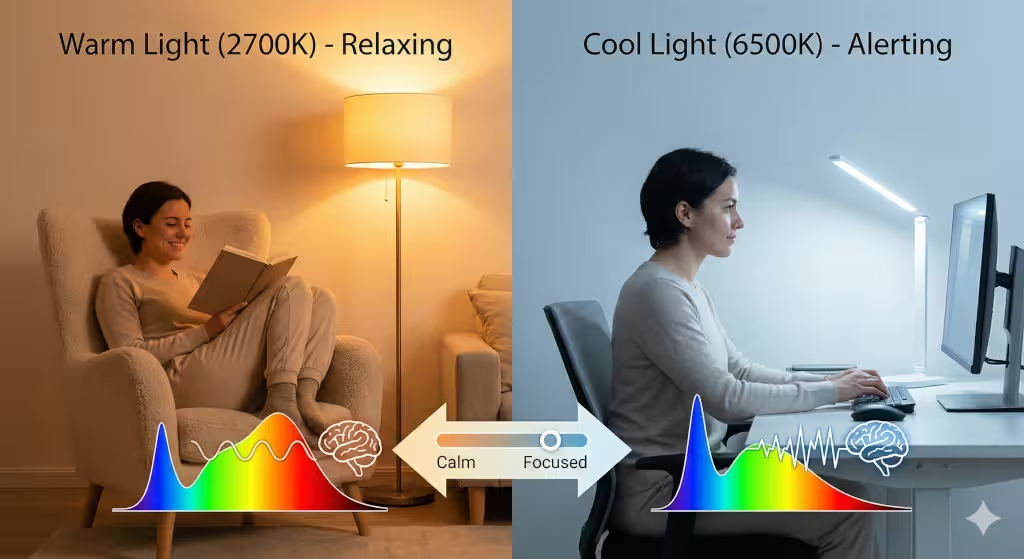
Light is more than just something that helps us see; it is energy that moves in waves. We measure the “warmth” or “coolness” of light using something called Kelvin. If you have ever bought a light bulb, you might have seen numbers like 2700K or 6500K. This represents the color and light quality.
Low numbers like 2700K are warm and yellowish, like a candle. These colors make us feel relaxed and cozy. High numbers like 6500K are cool and blue, like the midday sun. This kind of color and light makes us feel sharp and awake. On a website, if you use too much cool light in the evening, you might accidentally make your users feel anxious because you are tricking their brains into thinking it is noon when it is actually midnight.
We also need to think about how light is placed on a screen. In nature, the brightest light usually comes from above (the sky) and the darker colors are below us (the ground). This is called the “Sky Ceiling” effect. When we design a website header with a light gradient and a darker footer, it feels “right” to the human eye. It mimics the horizon. This simple use of color and light can make a user feel much more comfortable without them even knowing why.
The Psychology of Color
Every color sends a specific message to our nervous system. This is a field called chromotherapy, or color healing. When we choose a color and light scheme for a website, we are actually choosing how we want the user to feel.
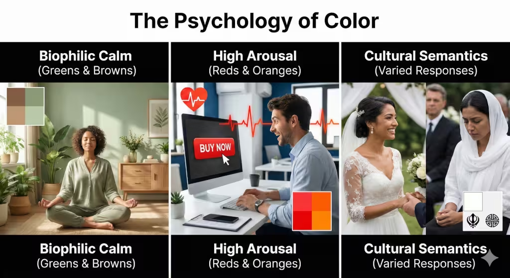
Let’s look at green. Green is one of the most important colors in biophilic design because it represents life, water, and food. When we see green, our brains relax because, historically, green meant we were in a place where we could survive. Earth tones like brown, tan, and soft greens provide a sense of security. This is linked to something called Prospect-Refuge Theory. This theory says that humans feel best when they can see a wide open space (prospect) but also feel like they have a safe place to hide (refuge). We can use color and light to create these feelings on a page by using deep colors for “safe” areas and bright colors for “open” areas.
High-arousal colors like red and orange are different. These colors grab our attention quickly. They can even make our hearts beat faster! While they are great for buttons that say “Buy Now,” using too much of this color and light can make a person feel overwhelmed. On the other hand, blue and green activate the parasympathetic nervous system, which is the part of the body that helps us stay calm and digest our food.
Designing for Digital Daylight
As a designer, I am always looking for ways to create “Digital Daylight.” This means making a website that changes based on the world around the user. Many devices now have a “dark mode,” but we can go further than that.
Imagine a website where the color and light change based on what time it is for the person reading it. In the morning, the site could have a crisp, bright layout to help them wake up. In the evening, the site could automatically shift to warmer tones and lower contrast. This is called dynamic UI. It respects the user’s biology.
We also have to think about “Digital Eye Strain.” When there is too much of a difference between the color and light of the screen and the room the user is in, it hurts their eyes. By using soft transitions and organic shading, we can make the screen feel less like a glowing box and more like a window. Using math, like the Fibonacci sequence, to decide how colors blend can create a look that feels natural because those same patterns are found in seashells and sunflowers.
Common Questions about Color and Light
A lot of people have questions about how color and light affect them daily. One common question is: “How do specific colors affect mood?” As we discussed, blues are calming and reds are exciting. But it goes deeper. Yellow can make people feel happy but can also cause frustration if it is too bright. Purple is often linked to creativity and mystery.
Another question is: “Can lighting improve mental health?” The answer is a big yes. People who live in places with very little sun in the winter often use “SAD lamps.” These lamps provide a specific type of color and light that mimics the sun to help prevent sadness. We can apply this to web design by making sure our sites aren’t too “gray” or “drab,” which can lower a user’s mood.
Finally, people ask: “Why does blue light make you feel awake?” This is because of a protein in our eyes called melanopsin. This protein is very sensitive to blue color and light. When it sees blue, it tells the brain to stay awake. This is why looking at your phone in bed makes it so hard to fall asleep!
Technical Details about Color and Light
For the experts watching, we have to look at the technical side of color and light. We use things like the Hue-Saturation-Luminance (HSL) model to fine-tune our designs. Luminance is how bright a color appears to be. If the luminance is too high, it creates glare. If it is too low, people can’t read the text.
We also look at “Circadian Entrainment.” This is the scientific term for keeping your body clock in sync with the sun. In the world of biophilic design, we use Pattern Number 10, which is about the balance of color and light. This pattern suggests that we should use a variety of light intensities to mimic the way light filters through trees. This creates a “dappled” effect that is very pleasing to the human brain.
Other important terms include Photobiomodulation, which is how light affects our cells, and Neuroesthetics, which is the study of how our brains perceive beauty. All of these concepts show that the impact of color and light is a serious science that affects every person who visits a website.
The Future of Biophilic Web Design
As we move forward, the way we use color and light will become even more advanced. We are moving toward “Human-Centric Lighting.” This means that technology will put the needs of the human body first. Instead of just making things look cool, we will make things that help people feel healthy.
Software developers are starting to realize that they have a responsibility to the people using their products. If a website uses the wrong color and light, it can ruin a person’s sleep or increase their stress levels. But if we do it right, we can create a digital world that supports us. We can use color and light to create spaces that feel like a garden or a sunny beach.
When you understand the impact of color and light on emotional responses, you stop being just a designer and start being someone who cares for the well-being of others. It is a powerful tool. By using natural colors, respecting the user’s body clock, and paying attention to the physics of light, we can build a better internet for everyone.
How Color and Light Create Harmony
To wrap things up, we must remember that the digital world is not separate from the physical world. Our eyes and brains do not know the difference between the color and light coming from a leaf and the color and light coming from a screen. They just process the signals.
If we want people to stay on our websites, to trust our brands, and to feel good while they browse, we must embrace these biophilic principles. We must use color and light to create harmony. We should avoid harsh, flashing lights and neon colors that don’t exist in nature. Instead, we should look to the sky, the forest, and the ocean for our inspiration.
The next time you look at a screen, notice how the color and light make you feel. Are you feeling tense? Are your eyes hurting? Or do you feel calm and focused? The difference is often in the design. As we continue to spend more time online, the importance of healthy color and light will only grow. It is up to us to make sure the digital future is a bright, and naturally colored, one.
The Evolution of Digital Visuals
When we first started making websites, we were limited by the technology of the time. Screens could only show a few colors, and the light was very flickery. Today, we have screens that can show millions of different shades of color and light. This gives us a huge opportunity. We are no longer limited by the machine; we are only limited by our understanding of the human heart and mind.
By studying the impact of color and light on emotional responses, we can see that humans crave variety. In nature, color and light are never static. The sun moves, clouds pass by, and shadows shift. A website that is perfectly still can feel “dead” to our subconscious. By adding very subtle changes in color and light, like a button that glows softly like a firefly or a background that shifts slightly as you scroll, we can make the digital space feel “alive.”
This is the heart of biophilia. It is the love of life and living systems. When we bring that love into our code and our layouts, we create something truly special. The balance of color and light is the key to this transformation.
Understanding the Visual Spectrum
To really get deep into this, we have to talk about the visual spectrum. This is the range of color and light that humans can actually see. It goes from red on one end to violet on the other. Each part of this spectrum has a different energy level. Red has long waves and low energy, while violet has short waves and high energy.
This energy affects us physically. Red color and light can actually increase your blood pressure slightly. It wakes up your “fight or flight” instincts. This is why stop signs are red. Blue color and light, being on the other end of the spectrum, has a cooling effect. It’s like jumping into a cool pool on a hot day.
When we combine these, we create a “visual diet.” Just like you need different vitamins to stay healthy, your eyes need different types of color and light to stay balanced. A website that is only one color can be “boring” to the brain, leading to what we call “sensory deprivation.” By mixing color and light in a way that mimics a natural landscape, we keep the brain engaged and happy.
The Role of Contrast and Clarity
Another big part of color and light is contrast. Contrast is the difference between the light parts and the dark parts of a page. If the contrast is too low, like light gray text on a white background, it is very hard to read. This causes the user to strain their eyes, which leads to headaches and frustration.
However, if the contrast is too high, like bright neon yellow on a black background, it can be too much for the brain to handle. The best use of color and light is to find a middle ground. In nature, we rarely see “pure black” or “pure white.” We see shades of charcoal, deep brown, cream, and soft ivory. Using these “off-white” and “soft-black” tones makes the color and light on a website feel much more expensive and professional. It also makes it easier for everyone to read, including people who might have trouble seeing clearly.
Summary of Biophilic Color Principles
- Use Nature’s Palette: Stick to colors you would see on a hike.
- Respect the Clock: Use warmer color and light in the evening and cooler tones during the day.
- Follow the Horizon: Put lighter color and light at the top and darker tones at the bottom.
- Avoid Glare: Make sure the luminance isn’t so high that it hurts to look at the screen.
- Add Life: Use subtle movement in your color and light to keep the user engaged.
By following these simple steps, we can make sure the impact of color and light on emotional responses is a positive one. We can build websites that don’t just work, they heal.
Final Thoughts on Design and Emotion
In the end, design is about communication. We are communicating with the user’s subconscious mind. Every choice we make with color and light is a word in a silent conversation. If we use harsh colors, we are shouting. If we use soft, natural colors, we are speaking kindly.
I hope this guide has helped you see the digital world in a new way. Whether you are a designer, a business owner, or just someone who uses the internet, remember that color and light are powerful forces. They shape how we feel, how we think, and how we live. Let’s use them wisely to create a world that is beautiful, healthy, and full of light.