
Table of Contents
Welcome to this guide on how we can turn technical sensor readings into clear visual interfaces that anyone can read. When we look at natural streams, lakes, and coastal bays, our eyes pick up immediate cues about health. We notice light bouncing across the surface, sediment moving downstream, and plants swaying under clear currents.
When environmental monitoring stations report water quality on these systems, they share spreadsheets, raw numbers, and abstract line charts. Most people look at numbers like milligrams per liter or microsiemens per centimeter and have no idea what they mean. They cannot tell if the river in their town is safe for swimming, healthy for fish, or in trouble.
We need to close the gap between cold digital readings and intuitive human perception. In this guide, we will look at how to take raw sensor telemetry and translate it into clear visuals. We will look at how our brains evolved to read patterns in nature, explore visual techniques that reduce mental effort, and examine how digital design can inspire real civic action.
The Raw Telemetry Paradox
Modern environmental science gathers huge amounts of automated data. Government agencies like the United States Geological Survey and community watershed groups maintain thousands of sensor stations. These instruments measure streams and rivers around the clock. Every fifteen minutes, they upload numbers for temperature, clarity, acidity, and chemical concentrations.
The public rarely sees the value of this massive data stream. The main issue is the raw telemetry paradox. Scientists often assume that if they simply publish raw information, people will understand it and make smart choices. In reality, large tables of raw measurements confuse and push away everyday readers.
When non-scientists encounter an unfiltered list of water quality metrics, they face cognitive overload. They are forced to perform mental calculations to figure out if five parts per million of dissolved oxygen is good or bad, or whether an increase in electrical conductance means pollution. Because they lack the background to evaluate these numbers, they often walk away with no clear understanding. The sheer volume of raw data ends up hiding the true story of the ecosystem.
We can fix this issue by turning raw streams of water quality metrics into structured visual narratives. A visual narrative of water quality data does not hide the truth or remove necessary scientific details. Instead, it organizes the data in a clear order:
[Level 1: Immediate Safety & Status]
       │
       ▼
[Level 2: Comparative Historical Trends]
       │
       ▼
[Level 3: Full Technical Telemetry]
This tiered approach lets a parent check if a local beach is safe in three seconds, while still allowing a student, journalist, or researcher to inspect the underlying numbers.
Biophilic Translation and Human Instincts
Human beings did not evolve looking at digital spreadsheets or scatter plots. For thousands of generations, human survival depended on reading physical landscape patterns. Our ancestors looked at the ripple of a stream, the clarity of a pool, the color of pond algae, and the activity of aquatic insects to decide if water was safe to drink. These survival instincts are wired directly into our visual and emotional systems.
Biophilic design is the practice of connecting modern human creations with natural patterns, processes, and living systems. When applied to digital tools, biophilic design uses intuitive visual cues that match our evolutionary instincts. Rather than forcing a person to memorize abstract numerical limits for water quality metrics, we can design software interfaces that reflect natural balance.
Consider how we perceive depth and clarity. When a pond fills with suspended mud or an algae bloom, natural light cannot pass through it. The water shifts from a deep, translucent blue-green to a flat, opaque brown or bright green scum. Our eyes spot that change right away. In a digital dashboard, we can mirror that physical reality using simulated opacity, layered visual depth, and natural movement.
When a river has healthy levels of oxygen, it moves with energy and clarity. When it becomes stagnant and starved of oxygen, its physical motion slows, and organic debris gathers on the surface. By applying these organic patterns to user interface elements, we help users understand complex environmental changes instantly, without forcing them to decode abstract numbers.
Main Design Imperative: Bridging Biochemical Precision and Civic Literacy
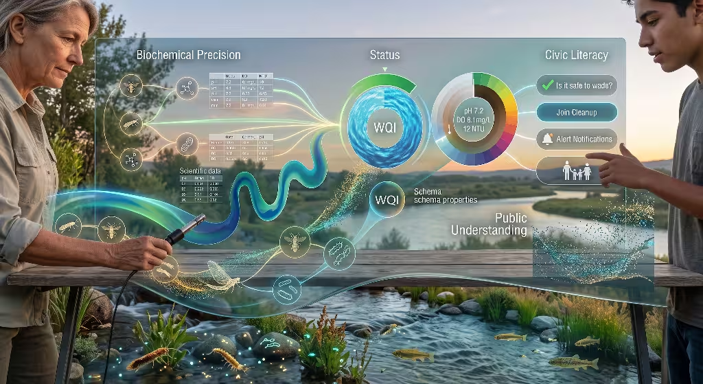
A successful environmental education platform must balance two opposing needs: biochemical precision and civic literacy. Biochemical precision demands that every sensor reading remain exact, mathematically sound, and tied to verifiable instruments. Civic literacy demands that any person in a community can quickly read the interface, grasp the main takeaway, and know what steps to take.
┌────────────────────────────────────────────────────────┐
│               Biochemical Precision                    │
│   • Sensor Calibration & Error Margins                 │
│   • Micrograms per Liter (µg/L) & NTU                  │
│   • Longitudinal Baseline Comparisons                  │
└──────────────────────────┬─────────────────────────────┘
                           │
                 [Visual Translation Layer]
                           │
┌──────────────────────────▼─────────────────────────────┐
│                   Civic Literacy                       │
│   • Is the water safe to touch?                        │
│   • Are fish and wildlife thriving?                    │
│   • What practical action should we take today?        │
└────────────────────────────────────────────────────────┘
If we design only for scientific accuracy, our work stays locked inside academic circles, leaving the public uninformed. If we simplify the data too much, we risk losing scientific accuracy, misrepresenting complex cycles, or creating false alarms.
The visual design system serves as the translation bridge. We keep full scientific precision inside the code while presenting intuitive graphics on the screen. The user can view water quality metrics through dynamic dials, natural color shifts, and clear status summaries, with the option to click in and review the exact measurements, laboratory tests, and sensor records.
Deconstructing Primary Aquatic Vital Signs
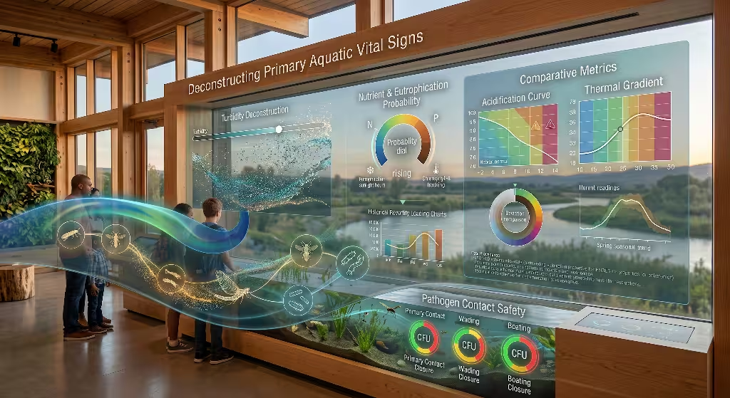
To display aquatic health clearly, we must understand the core parameters measured by field scientists. Every parameter represents a physical, chemical, or biological property of the water. Below, we break down these vital signs and explore how to show them effectively to the public.
       Core Aquatic Vital Signs
 ──────────────────────────────────────
   [DO]   Dissolved Oxygen Balance
   [pH]   Acidity & Alkalinity
   [T]    Thermal Energy & Temperature
   [NTU]  Turbidity & Light Penetration
   [N/P]  Nutrient Loading & Eutrophication
   [CFU]  Pathogens & Bacterial Indicators
Dissolved Oxygen Balance
Dissolved oxygen measures the amount of free oxygen gas dissolved in water. Fish, macroinvertebrates, and beneficial microbes need this oxygen to breathe. Cold, tumbling mountain streams often carry high concentrations of dissolved oxygen, between nine and twelve milligrams per liter. Warm, stagnant waters or areas overloaded with decaying algae can drop below two milligrams per liter, creating dead zones where aquatic animals suffocate.
Instead of showing dissolved oxygen as an isolated number, we can use visual energy and color gradients. We can illustrate healthy oxygen levels with lively currents, bright water, and clear indicator lines. As oxygen levels drop, we can shift the display to muted, heavier tones, signaling ecological stress before the user even reads the number.
pH and Acidity
The pH scale measures how acidic or basic the water is, running from zero to fourteen. Pure distilled water sits at seven, right in the middle. Most freshwater fish and plants thrive in a narrow window between 6.5 and 8.5. When runoff carries industrial waste, mine drainage, or excessive organic acids into a stream, the pH swings. These shifts damage fish gills, kill delicate eggs, and disrupt natural chemical reactions.
Many people find logarithmic scales confusing, and pH is a base ten logarithmic scale. That means water with a pH of five is ten times more acidic than water with a pH of six, and one hundred times more acidic than water with a pH of seven.
We can make this scale easier to understand by pairing pH with its direct effects on aquatic life. Rather than relying on standard chemistry rainbow charts, we can frame the scale around healthy habitat zones. We can anchor the normal baseline with a calm, neutral color, and use visible warning markers as the value moves into dangerous acidic or basic territory.
Thermal Energy and Temperature
Water temperature controls nearly every process in an aquatic habitat. It dictates how much dissolved gas water can hold, sets metabolic rates for cold blooded animals, and drives seasonal movements. Warm water holds less dissolved gas than cold water. When warm runoff from sun-baked city streets and parking lots washes into a creek, it shocks fish and drops oxygen levels.
We can illustrate water temperature by comparing current readings with normal seasonal patterns, rather than showing a basic standalone number. When we place the current temperature against the historic range for that specific week, users can see right away if the reading is normal or unseasonably warm.
Historical Range (Spring):   [══════════ 52°F - 61°F ══════════]
Current Sensor Reading:                                 ▲ 68°F (Unseasonably High)
This approach helps readers connect water quality metrics to broader seasonal shifts, watershed tree cover, and thermal runoff.
Turbidity and Suspended Solids
Turbidity measures the cloudiness of water caused by suspended sediment, microscopic algae, organic debris, and dirt. It is measured in Nephelometric Turbidity Units, or NTU. When dirt washes from construction sites, farms, and bare banks into a stream, high turbidity blocks sunlight, clogs fish gills, and smothers gravel beds where fish lay their eggs.
We can display turbidity through simulated visual clarity. Instead of using a standard vertical bar chart, we can show a cross section of a stream that changes its visual opacity based on real-time NTU readings:
| Water Appearance | Turbidity Range (NTU) | Impact on River Life |
| Crystal Clear | 0 to 5 NTU | Sunlight reaches riverbed; plant photosynthesis thrives |
| Mildly Hazy | 5 to 25 NTU | Minor visibility drop; robust sight-feeding predators adapt |
| Murky / Brown | 25 to 100 NTU | Light blocked; silt settles on delicate fish nesting gravel |
| Opaque Mud | Over 100 NTU | Fish gills clog; sight feeding stops; serious habitat loss |
Users immediately understand this visual cue. Seeing an on-screen riverbed fade as NTU values rise communicates water clarity much faster than a number can.
Nutrient Loading: Nitrogen and Phosphorus
Nitrogen and phosphorus act as fertilizers in lakes, streams, and bays. In balanced amounts, they support plant and algae growth at the base of the food web. When excess fertilizer runs off suburban lawns, farms, and sewage systems, it triggers explosive algae growth. When this algae dies, decomposing bacteria consume the water’s oxygen, creating widespread dead zones.
We can visualize nutrient levels using risk meters for algae blooms. Instead of showing nitrogen and phosphorus as isolated chemical values, we can map them to potential algae growth. By combining nutrient levels, water temperature, and sunlight hours, our visual system can estimate bloom risks and display them as low, rising, or critical.
[ Nitrogen Sensor ] ──┐
[ Phosphorus Data ] ──┼──► [ Environmental Risk Engine ] ──► Algae Bloom: HIGH RISK
[ Sunlight Hours  ] ──┤                                      (Next 48 Hours)
[ Water Temp      ] ──┘
This turns technical chemical measurements into a clear, forward-looking tool for community awareness.
Pathogen Indicators: Bacterial Counts
When public health officials evaluate swimming safety, they monitor indicator bacteria like Escherichia coli (E. coli) in freshwater or Enterococci in saltwater. These bacteria live in the guts of warm-blooded animals. Their presence shows that water is contaminated with fecal matter, which may bring dangerous viruses, parasites, and bacteria.
Bacterial counts are usually reported as Colony Forming Units, or CFU, per one hundred milliliters of water. This is an unfamiliar metric for most people. A visual interface should translate these counts into simple recreational safety guidelines:
[ Under 126 CFU ]  ──► Green Status   ──► Safe for swimming and full contact
[ 126 to 235 CFU ] ──► Yellow Status  ──► Caution: Safe for boating and paddling
[ Over 235 CFU ]   ──► Red Alert      ──► Unsafe: Avoid water contact
This clear grouping gives families the direct information they need to protect their health.
Comparing Data Visualization Patterns
Different layout styles communicate environmental measurements in different ways. Choosing the right design pattern depends on user questions, the time they have to browse, and the complexity of the data.
┌────────────────────────────────────────────────────────────────────────┐
│                   Overview Map: Sensor Network                         │
│                                                                        │
│        [Node 1: Clear]                     [Node 3: Clear]             │
│               \                                   /                    │
│                ▼                                 ▼                     │
│         [Main Stem Creek: 14 NTU - Mild Turbidity Alert]                │
│                                │                                       │
│                                ▼                                       │
│                    [Node 2: Runoff Inflow]                             │
└────────────────────────────────────────────────────────────────────────┘
Spatial Hydrologic Maps
A hydrologic map plots sensor stations across their actual geographic watershed. Watersheds follow physical ridgelines and drainage basins, not city or county lines. Showing measurements across a river basin helps users see how upstream problems affect downstream areas.
When designing spatial maps, keep the interface clean:
- Group nearby sensor stations into regional clusters to avoid visual clutter.
- Use recognizable, accessible color markers to show immediate status.
- Allow users to filter layers by single measurements, like temperature or clarity.
- Let users tap a station to see recent trends and dive into detailed telemetry.
A clear map helps users trace a spike in sediment back to an upstream tributary, turning scattered numbers into an interconnected watershed story.
Status Rings, Dials, and Aggregated Indexes
Status rings and radial dials summarize overall conditions at a single point in time. They often combine multiple measurements into an overall Water Quality Index score between zero and one hundred.
These dials give an immediate snapshot of environmental health, but they must be designed thoughtfully. When averaging multiple measurements into a single score, an extreme reading can get hidden. For example, if dissolved oxygen, temperature, and turbidity are all healthy, but bacterial counts are dangerously high, a simple mathematical average might show a safe green score even though the water is unsafe to touch.
Simple Numeric Average:
DO: 95/100 | Temp: 90/100 | Turbidity: 90/100 | Bacteria: 5/100
Weighted Arithmetic Result: 70/100 (Shows false "Moderate" rating)

Protective Priority Logic:
Override Flag Triggered: Critical Bacterial Contamination Detected
Interface Status: RESTRICTED CONTACT ALERT (Red Override)
To prevent this issue, build priority overrides into the interface. If any single parameter crosses a critical safety line, the dial should highlight that specific danger, ensuring users are never misled by an oversimplified score.
Streamgraphs and Longitudinal Flow Models
Streamgraphs and dynamic area charts display changes over weeks, months, and seasons. Unlike standard line charts, which can feel thin and clinical, streamgraphs use fluid, organic ribbons of color that expand and contract as values rise and fall.
Longitudinal Seasonal Stream Flow:
High Flow Spring  : ~~~~~~~~~~~~~~~~~~~~~~~~~~~~ (Broad ribbon, high dilution)
Low Flow Late Fall: ---------------------------- (Narrow band, low dilution)
These designs work well for showing changes across time, such as spring snowmelt, summer dry spells, and autumn storms. A viewer can see how heavy rainfall washes silt into the river, drives up turbidity, and gradually settles back to baseline. The flowing visual reflects the actual physical behavior of the river system.
Interactive Clarity Shaders and Sliders
Digital clarity sliders and shader animations give users an intuitive way to explore physical measurements. An interactive slider lets visitors scrub between different values to see how the ecosystem changes.
As a user slides a turbidity control from five NTU to one hundred NTU, the on-screen water shifts from clear to murky, while underwater plants and fish fade from view. Interactive tools like this help users connect numbers on a page with conditions they see outside, building practical environmental intuition.
Frequently Asked Questions about Water Quality Metrics
When people search online for information about waterways, they ask clear, practical questions. Below, we address these common questions and explain how to answer them visually.
What are the five main indicators of aquatic health?
While field technicians monitor dozens of substances, the five most important baseline indicators are:
- Dissolved oxygen
- Water temperature
- pH balance
- Turbidity
- Nutrient levels (nitrogen and phosphorus)
In many regions, biological monitoring teams also track macroinvertebrates, like stoneflies, mayflies, and caddisflies. These bottom-dwelling insects have differing sensitivities to pollution. Displaying their populations provides a clear, biological readout of long-term health.
How is an overall Water Quality Index calculated?
A Water Quality Index, or WQI, transforms multiple complex measurements into a single score, usually from zero to one hundred.
Raw Field Sensors (DO, pH, NTU, Temp, Bacteria)
                       │
                       ▼
          [Mathematical Normalization]
   (Converts different units to a 0 to 100 scale)
                       │
                       ▼
          [Parameter Weighting Calculation]
  (Applies ecological weight factors to each parameter)
                       │
                       ▼
       Unified Index Score (e.g., 84: Clean / Good)
The process begins by measuring individual water quality metrics in their native units, such as milligrams per liter, degrees Celsius, or NTU. These values are converted into dimensionless scores from zero to one hundred based on ecological curves.
Each score is multiplied by an importance weighting factor, reflecting its overall impact on aquatic life. The weighted numbers are combined to produce a single final score. When presenting this score, always include an option to expand the calculation, so users can see how each individual measurement contributed to the total.
What is the best way to display environmental data to the public?
The most reliable method is progressive disclosure:
┌────────────────────────────────────────────────────────┐
│  Tier 1: Status Banner (Safe / Caution / Action Needed) │
├────────────────────────────────────────────────────────┤
│  Tier 2: Interactive Graphic (Index dials & graphs)    │
├────────────────────────────────────────────────────────┤
│  Tier 3: Full Sensor Tables (Exportable raw readings)   │
└────────────────────────────────────────────────────────┘
- Tier 1: Plain Language Status. Start with a simple, clear message, like “Safe for swimming” or “Caution: high sediment levels.”
- Tier 2: Visual Comparison. Show interactive dials and seasonal trends, giving context on whether conditions are improving or getting worse.
- Tier 3: Complete Technical Records. Provide direct access to raw sensor readings, instrument calibrations, and scientific notes for students and researchers.
This three-tier structure keeps the interface clean and approachable for casual readers, while preserving full detail for advanced users.
How can schools and community groups present environmental data?
Schools and civic groups see the best engagement when they connect digital tools to physical places:
- Watershed Markers with QR Codes. Place scannable signs along river paths and boat launches, letting visitors check live water quality metrics on their phones.
- Classroom Action Tools. Build simple classroom projects where students compare digital sensor feeds with manual testing kits, helping them verify what the digital tools show.
- Community Alert Subscriptions. Allow residents to sign up for text or email alerts when local streams experience low oxygen or elevated bacteria levels.
These hands-on connections transform passive numbers into active community learning experiences.
Biophilic Design Principles for Environmental User Interfaces
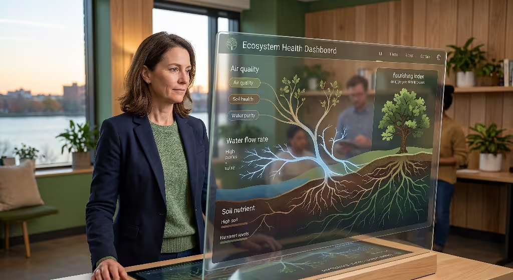
Biophilic design in software goes beyond adding leaf illustrations or green backgrounds. It involves structuring the entire interface around patterns, rhythms, and relationships found in the natural world.
       Biophilic Design Dimensions
 ───────────────────────────────────────
   Patterns  Natural fractal textures & curves
   Rhythms   Light matching local sun cycles
   Movement  Fluid motion matching streamflow
   Palettes  Earth and mineral color systems
Visual Biomimicry and Natural Motion
Natural water systems are constantly in motion. They pulse with seasonal rains, swirl around river bends, and shift in clarity with passing weather. Digital interfaces can borrow these natural movement patterns to convey information without words.
For instance, rather than showing a static loading icon or an artificial bar, an interface can use smooth, flowing movement to indicate live telemetry. The speed and smoothness of the visual motion can even reflect actual river velocity.
Using organic curved lines instead of sharp, rigid boxes reduces visual tension and creates an inviting environment for exploration. These subtle design choices make technical environmental software feel alive and connected to nature.
Ecological Color Palettes and Accessibility
Color is one of our most powerful design tools, but it is often misused in scientific charts. Many dashboards use bright, neon colors that strain the eyes and confuse readers. Even worse, standard green-to-red scales cause serious problems for users with color vision deficiencies.
Common Problematic Color Scheme:
[ Bright Red ]  ──► Fails for Deuteranopia/Protanopia readers
[ Bright Green ] ──► Indistinguishable from red under common vision profiles

Accessible Biophilic Palette:
[ Deep River Teal ]   ──► High Clarity / Healthy Baseline
[ Warm Amber Gold ]   ──► Moderate Caution / Environmental Shift
[ Deep Rust Plum ]    ──► Serious Ecological Alert / Action Required
A biophilic color system uses organic, grounded tones inspired by real environments:
- Riverbed Stone and Mineral Grays: Clean backgrounds that provide strong contrast without screen glare.
- Deep River Blues and Forest Teals: Indicate stable, healthy baseline conditions.
- Warm Amber and Ochre: Signal caution, temperature rises, or seasonal shifts.
- Deep Plum and Terracotta Rust: Highlight critical alerts, low oxygen, or high bacteria counts.
Every color state must be paired with clear text labels, shapes, or patterns. This guarantees that whether a user has full color vision, red-green color blindness, or is reading on a mobile phone in direct sunlight, the information remains readable.
Building a Modern Environmental Data Pipeline
Creating an intuitive educational tool requires a clean, reliable data pipeline behind the scenes. Sensor networks sit outdoors in harsh conditions, where batteries drain, wireless connections drop, and sediment clogs intake tubes. The software must handle these real-world challenges gracefully before drawing a single visual element.
[ Field Sensor Node ] ──(LoRaWAN / Cellular)──► [ Caching & Validation Engine ]
                                                          │
                                                          ▼
                                            [ Automated Sanity Checks ]
                                            (Drops impossible spikes)
                                                          │
                                                          ▼
                                            [ Visual Presentation Layer ]
                                            (Renders WebGL / SVG graphics)
Ingestion, Caching, and Validation
Raw environmental data must be checked and cleaned before it is displayed to the public. If a sensor probe dries out or suffers an electrical short, it may transmit an impossible number, like a pH of fourteen or a water temperature below freezing in midsummer.
If that bad number passes directly to an automated dashboard, it can trigger false alarms and erode public trust. The data ingestion engine needs clear validation rules:
Raw Sensor Input (e.g., pH Reading)
           │
           ▼
[ Is reading between 0 and 14? ] ──► NO  ──► Flag for Maintenance & Suppress
           │
          YES
           ▼
[ Does reading change > 3 units in 15 min? ] ──► YES ──► Flag Spike & Review
           │
           NO
           ▼
Publish Verified Value to Educational Dashboard
The system should also cache verified readings across a regional content delivery network. Environmental dashboards often see sudden surges in traffic during severe storms, floods, or chemical spills. Storing pre-calculated visual summaries prevents database crashes right when the community needs information most.
Rendering Technologies: Vector SVG vs. Canvas WebGL
Choosing how to draw visuals inside a web browser involves balancing clarity, interactive features, and processing performance.
| Display Method | Best Use Case | Key Strength | Main Limitation |
| Scalable Vector Graphics (SVG) | Focused gauges, responsive dials, single-station trend lines | Sharp text at any zoom level; accessible to screen readers | Slows down when drawing thousands of simultaneous points |
| HTML5 Canvas / WebGL | Basin-scale watershed maps, flowing particle streams | Renders hundreds of thousands of dynamic particles smoothly | Difficult for screen readers to inspect without extra markup |
A well-architected dashboard uses both approaches where they fit best. Use WebGL to drive dynamic map layers, particle flows, and watershed-wide visual simulations. Use SVG for individual gauges, detailed charts, and text readouts. This combination ensures smooth graphics while keeping the interface accessible to assistive technologies.
Accessibility, Search Discoverability, and Civic Action
An environmental education platform succeeds only if people can find it, use it across all devices, and use its information to improve their communities.
Three Pillars of Modern Environmental Platforms:
1. Search Discoverability (Structured data and semantic markup)
2. Accessibility (Full WCAG 2.2 support across devices)
3. Civic Engagement (Direct tools for community action)
Semantic Structure for Search Engines
To help search engines surface local environmental readings, web pages should use clear semantic HTML and structured schema markup.
Tagging pages with structured data, such as Dataset, Place, and Observation, helps search algorithms understand that a page provides verified environmental data for a specific river or lake.
HTML
<script type="application/ld+json">
{
  "@context": "https://schema.org",
  "@type": "Dataset",
  "name": "Local Creek Real-Time Water Quality",
  "description": "Continuous monitoring of water quality metrics including dissolved oxygen, turbidity, and temperature.",
  "spatialCoverage": {
    "@type": "Place",
    "name": "Mill Creek Watershed"
  },
  "variableMeasured": [
    "Dissolved Oxygen",
    "Water Temperature",
    "Turbidity",
    "pH"
  ]
}
</script>
When search engines read this structured metadata, they can include the information in local search answers, rich snippets, and regional knowledge panels. This helps residents find immediate answers when they search for safety conditions at their local creek.
Accessible Web Design (WCAG 2.2)
Public educational tools must be usable by everyone, including people with visual, motor, or cognitive disabilities. Meeting Web Content Accessibility Guidelines requires deliberate design choices:
- Provide full keyboard navigation, so users can browse maps, charts, and dials without a mouse.
- Include screen-reader compatible table backups for every visual chart.
- Use text labels alongside all color-based alerts.
- Avoid rapid blinking or pulsing animations that can distract users or trigger seizures.
HTML
<!-- Chart with Screen-Reader Fallback -->
<div class="chart-container" role="region" aria-label="Turbidity Historical Chart">
  <svg aria-hidden="true">
    <!-- Visual line graph rendered here -->
  </svg>
  <table class="sr-only">
    <caption>Hourly Turbidity Measurements for Mill Creek</caption>
    <thead>
      <tr><th>Time</th><th>Turbidity (NTU)</th><th>Status</th></tr>
    </thead>
    <tbody>
      <tr><td>10:00 AM</td><td>4.2</td><td>Clear</td></tr>
      <tr><td>11:00 AM</td><td>8.5</td><td>Slight Turbidity</td></tr>
    </tbody>
  </table>
</div>
Providing an accessible table alongside dynamic charts ensures that visually impaired community members, assistive screen readers, and low-bandwidth browsers get the exact same information as any other user.
Turning Insights into Civic Action
The ultimate goal of visualizing water quality metrics is to help communities take care of their shared resources. Presenting clear information is the first step; the second is providing clear paths for positive action.
When an environmental dashboard reveals poor conditions, it should offer practical next steps:
[ Low Oxygen Alert Detected ]
               │
               ▼
[ What is causing this? ] ──► Warm water runoff & decaying organic debris
               │
               ▼
[ What can you do today? ]
  • Plant shade trees along neighborhood drainage banks.
  • Reduce summer lawn fertilizer use before rainstorms.
  • Join this weekend's local watershed cleanup event.
Connecting clear visual data with practical local actions turns passive viewers into engaged environmental stewards.
When people understand how their daily choices affect local water quality metrics, they are far more likely to support habitat restoration, join creek cleanups, and back infrastructure projects that protect clean water.
By combining reliable scientific data, biophilic design, and accessible web standards, we can transform complicated sensor feeds into engaging educational platforms that serve and protect the entire community.