
Table of Contents
When you browse the modern internet, you often encounter sharp boxes, bright glowing lights, and loud flashing banners. These harsh shapes and aggressive colors do not match how human eyes and brains evolved. For years, web design relied on strict box grids and flat minimalism. This style was easy for computers to build, but it causes real mental fatigue for human users. Today, we are seeing a massive shift toward organic design. People want digital experiences that feel calm, natural, and alive. This movement is why trends in biophilic web design are transforming how we build websites.
Biophilic web design means bringing natural elements into user interfaces and digital user experiences. It is not just about placing a photo of a forest on a homepage. True biophilia is about using natural patterns, light, movement, and shapes to make digital tools feel easy to use. The latest trends in biophilic web design combine cognitive psychology, green code engineering, and human-centered design into one clear framework. When we look at trends in biophilic web design, we see a bridge between human biology and modern code.
Main Principles and Biological Foundations

Understanding trends in biophilic web design requires us to look at how humans respond to nature. Our brains evolved over thousands of years in forests, oceans, and grasslands. We are hardwired to process natural environments with very little mental effort. When web designers use natural patterns, they work with human biology instead of fighting against it.
Adapting Kellert’s Biophilic Patterns to Digital Spaces
Building great websites starts with core principles. Stephen Kellert, a famous environmental scholar, created a list of biophilic design patterns for physical buildings. Today, modern web developers adapt these patterns for screens. These patterns form the backbone for trends in biophilic web design.
First, we have visual connections with nature. In web design, this means using natural textures, soft plant movements, and color palettes found in soil, leaves, and water. When a visitor lands on a web page with soft stone colors and leaf shapes, their stress levels drop.
Second, we have non-visual connections. On a screen, we cannot smell pine needles or feel cold rain. However, we can use soft audio cues and gentle touch feedback on mobile phones. For example, a tiny click sound that feels like tapping a smooth pebble can make a digital button feel real and grounded.
Third, we have non-rhythmic sensory stimuli. In nature, things move in unpredictable ways. A leaf sways in the wind, or light flickers through water. Machine motion on old websites used strict loops that repeated every two seconds. Modern trends in biophilic web design use smart code to create gentle, random movements that feel truly alive.
The Neuroscience of Biophilic UX
Why do these natural patterns work so well on a computer screen? The answer comes from neuroscience and attention restoration theory. When you stare at dense text and flashing ad boxes, your brain uses directed attention. Directed attention requires a lot of mental energy. Over time, your brain gets tired, and you feel frustrated.
Nature provides what psychologists call soft fascination. Natural shapes give your eyes interesting things to look at without forcing your brain to work hard. By studying trends in biophilic web design, designers learn how to give users mental breaks while they read a screen.
Neuroscientists also look at natural geometry. In nature, patterns repeat at different scales. This is called fractal geometry. Look at a fern leaf. Each small leaf looks like a miniature version of the whole frond. Your visual cortex processes fractal patterns with mathematical ease. Scientists measure this visual density with a value called fractal dimension. When web layouts use a fractal dimension value between 1.3 and 1.5, human eyes feel instantly relaxed. Incorporating these natural geometric ratios is one of the most exciting trends in biophilic web design today.
Top Trends in Biophilic Web Design
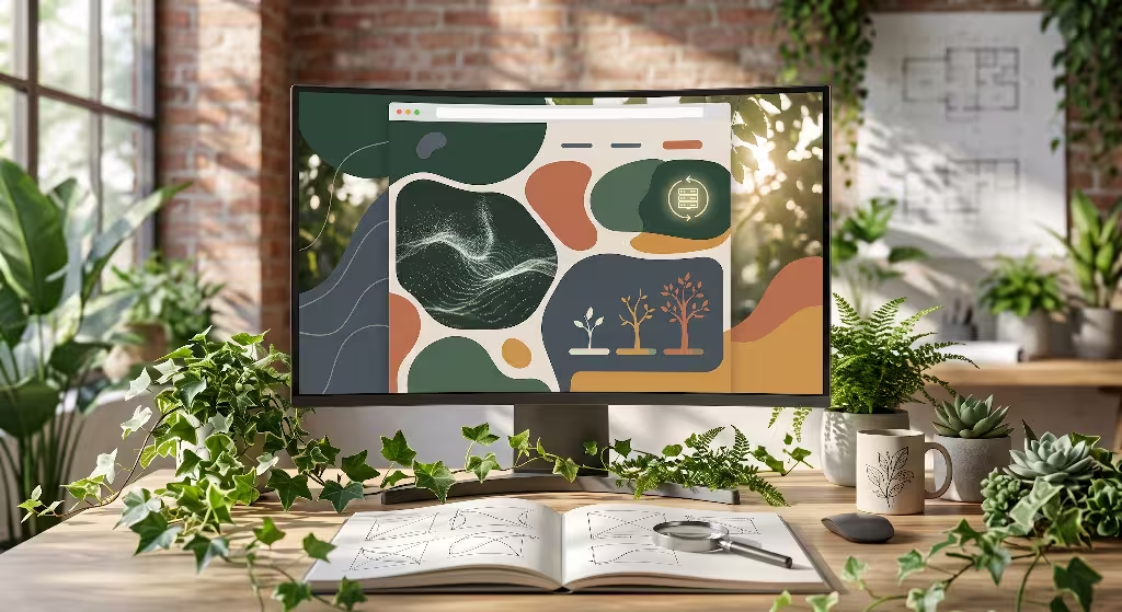
As technology gets faster, designers have better tools to build organic web pages. Here are the five most influential trends in biophilic web design shaping the internet right now.
Trend 1: Nature-Distilled and Earthy Color Systems
For a long time, websites used bright neon blues, stark whites, and harsh black backgrounds. These high-contrast combinations irritate human eyes during long browsing sessions. One of the primary trends in biophilic web design is the move toward natural, soil-derived color palettes.
Instead of pure white backgrounds, modern websites use warm limestone, pale canvas, or soft ivory shades. Instead of harsh digital blue, designers choose deep ocean navy, moss green, slate gray, and warm terracotta clay. These colors reflect the natural world around us.
Furthermore, dynamic lighting is changing how these colors behave. Humans have an internal biological clock called a circadian rhythm. Bright blue light at night disrupts sleep cycles. Advanced trends in biophilic web design use browser triggers to adjust color temperatures based on the user’s local time. When a user visits a site at night, the colors smoothly shift to warm sunset tones. This reduces eye strain and helps maintain natural sleep patterns.
Trend 2: Biomorphic Forms and Fluid Geometry
If you look closely at nature, you will notice that pure straight lines and 90-degree right angles rarely exist. Tree trunks bend, riverbanks curve, and clouds drift in soft clusters. Standard web pages rely heavily on square boxes and sharp rectangles. One of the visual trends in biophilic web design is replacing rigid containers with soft curves and biomorphic shapes.
Biomorphic forms are shapes that look like living organisms. Designers use curved frame borders, teardrop buttons, and flowing background shapes. Using modern web tools like responsive vector graphics and CSS shape-outside properties, text can flow naturally around the curved edges of an image, just like water flowing around river rocks.
These smooth shapes reduce visual friction. When a user looks at a website made with soft curves, their eyes glide smoothly across the screen. This organic layout style keeps visitors relaxed while guiding them toward important buttons and reading content.
Trend 3: Algorithmic Organic Motion and Dynamic Micro-Interactions
Movement on standard websites can often feel robotic. A button pops into view instantly, or a side panel slides out at a mechanical speed. Natural movement in the physical world is never stiff or mechanical. Gravity, wind, and friction constantly shape how objects move.
Among the technical trends in biophilic web design, algorithmic motion is leading the way. Developers use spring physics and noise algorithms in code to simulate natural physics. Instead of standard CSS animation timings, buttons bounce gently with weight when clicked, like a soft pine branch returning to its position after a bird lands on it.
Micro-interactions also mimic natural events. When you move your cursor across a home page, background shapes might gently part like water ripples. Soft ambient motion, such as leaves drifting slowly in the background, keeps the page feeling active without distracting the reader from important text.
Trend 4: Tactile Depth and Organic Textures
Flat web design removed all depth from screens, making everything look like flat paint. Human hands and eyes crave texture. We understand the physical world by feeling rough wood, smooth glass, and grain-filled stone. One of the tactile trends in biophilic web design is bringing subtle depth back to digital screens.
Designers add light overlays that mimic handmade paper, woven linen, rough sand, or wood grain. These textures are applied lightly so they do not make reading difficult. When combined with soft natural light source effects, buttons look like carved river stones resting on a wooden table.
Advanced web tools like WebGL allow browsers to render 3D organic objects directly on the page. A user can interact with a 3D leaf model that shifts light realisticly as they drag their mouse. This physical depth makes digital tools feel touchable, friendly, and grounded in reality.
Trend 5: Sustainable Green Web Engineering
Biophilic design is not just about visual aesthetics. True nature-inspired design must also protect the natural environment. The global internet powers millions of data servers, consuming massive amounts of electricity. Every heavy image, bloated code file, and unoptimized video requires power that burns energy.
Therefore, sustainable green web engineering is one of the most critical trends in biophilic web design. Designers and programmers work together to make websites lightweight and fast. By trimming bloated code and compressing images into modern web formats, web pages load faster and draw less power from the electrical grid.
At Silphium Design LLC, we combine sustainable green hosting with clean code structure. A biophilic website hosted on renewable energy servers creates a complete cycle of eco-friendly digital practice. Building lightweight web pages protects the planet while giving visitors a fast, seamless experience.
Impact on User Experience and Business Metrics
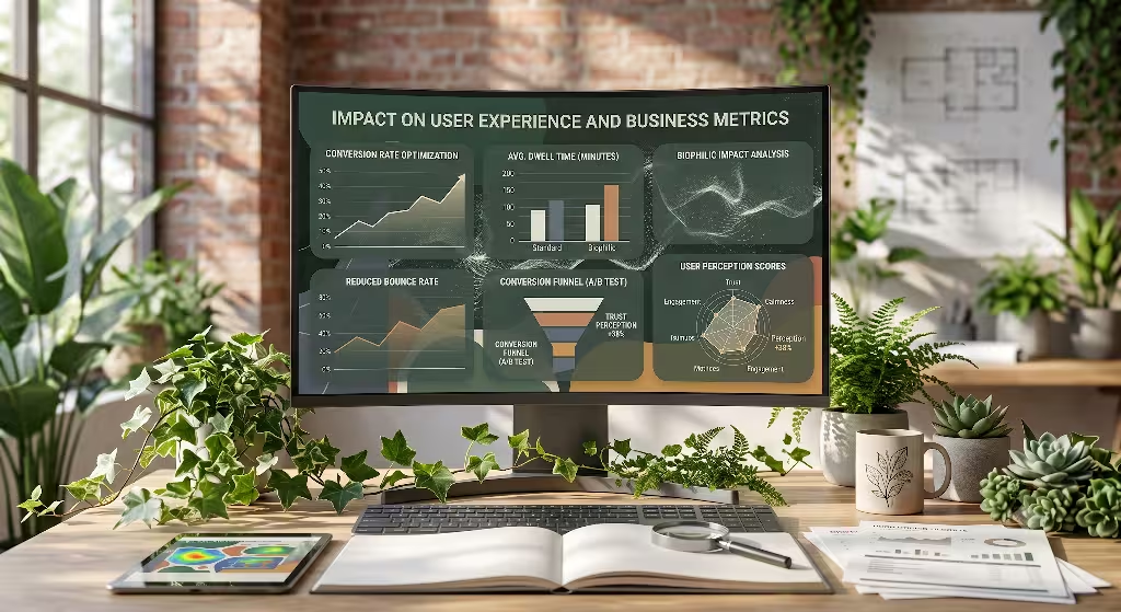
Some people think natural web design is just an artistic choice. However, business managers and analytical thinkers want to see real data. Exploring trends in biophilic web design reveals significant improvements in user experience and business performance metrics.
Cognitive Load and Dwell Time Optimization
When a user visits a crowded, noisy website, their visual system experiences sensory overload. They get frustrated, close the tab, and look for another business. This behavior increases what marketers call a bounce rate.
By applying trends in biophilic web design, you lower the cognitive load on the user’s brain. Soft earthy colors, clean layout spacing, and natural shapes make information easy to digest. When visitors feel calm on a website, they stay longer. This extra time spent reading a site is known as dwell time.
Studies show that websites using natural elements hold visitor attention far better than rigid, cluttered sites. Long dwell times mean visitors are more likely to read your message, trust your company, and purchase your products or services.
Emotional Branding and Sustainability Messaging
A company website serves as its digital front door. The visual design tells visitors what the company values before they read a single sentence. Modern consumers care deeply about wellness, mental health, and environmental sustainability.
Using trends in biophilic web design signals that your brand values human well-being and natural harmony. Organic layouts create emotional connections with readers. Instead of feeling like they are dealing with a cold corporation, users feel like they are interacting with a thoughtful, human-centered business.
This emotional connection creates long-term brand loyalty. When customers feel comfortable on your website, they remember the positive experience and return in the future.
Accessibility and WCAG Alignment
A key value of good design is making sure every person can access information, including people with vision impairments or sensory sensitivities. Following trends in biophilic web design naturally supports digital accessibility and Web Content Accessibility Guidelines.
Earthy color palettes are selected carefully to maintain high visual contrast between text and backgrounds. This helps users with low vision read articles without straining their eyes. Furthermore, organic web design avoids flashing neon colors and fast, jarring animations that can trigger headaches or dizziness.
For users who are sensitive to screen motion, biophilic sites respect reduced-motion settings in user browsers. If a user turns off motion, natural animations pause smoothly. Designing with empathy for human biology ensures your website serves everyone effectively.
Technical Implementation and Performance Framework
Building an organic website requires careful technical planning. You cannot simply upload massive photos of forests and expect your site to work well. If a web page takes ten seconds to load, visitors will leave immediately. Mastering trends in biophilic web design means balancing rich visual beauty with raw performance speed.
Balancing Visual Richness with Core Web Vitals
Google uses a set of technical metrics called Core Web Vitals to measure website performance and determine search engine rankings. These metrics measure loading speed, visual stability, and interaction responsiveness. Understanding trends in biophilic web design helps web developers pass these tests with high scores.
- Largest Contentful Paint: This metric measures how fast the main content loads on the screen. To keep hero images fast, developers use next-generation image formats like WebP or AVIF. These formats shrink file sizes without losing visual quality.
- Cumulative Layout Shift: This metric measures whether page elements jump around unexpectedly while loading. When building curved, organic layouts, developers use CSS Grid frames to lock elements in place so text never jumps while images load.
- Interaction to Next Paint: This metric measures how fast a web page responds when a user clicks a button or taps a link. Complex organic background animations can slow down the main thread of a web browser. Smart developers offload heavy mathematical calculations to background web workers, keeping button clicks instant and responsive.
Lightweight Implementation Checklist
If you want to apply trends in biophilic web design to your own digital projects without slowing down performance, follow this simple technical checklist:
- Use Native Vector Graphics: Use lightweight SVG code for organic curves, leaf icons, and custom borders instead of heavy image files.
- Apply CSS Clip-Paths: Create organic image containers using native CSS clip-paths rather than editing raster images in photo software.
- Optimize Web Fonts: Choose readable, human-centered typography with rounded terminals, and load only the specific font weights you need.
- Implement Smart Motion Queries: Always wrap ambient CSS motion inside media queries that respect user reduced-motion browser preferences.
- Choose Green Web Hosting: Host your website files on modern energy-efficient servers powered by renewable wind or solar energy.
Frequently Asked Questions about Trends in Biophlic Web Design
When clients and web developers first discover trends in biophilic web design, they often have specific technical and strategic questions. Here are clear answers to the most common questions.
What is the main objective of biophilic web design?
The main objective of biophilic web design is to reconnect human users with natural patterns while they use digital screens. It replaces stressful, artificial interface habits with calm visual layouts, earthy colors, and smooth organic motion. This approach reduces mental fatigue, improves reading focus, and creates a relaxing user experience that keeps visitors engaged longer.
Does biophilic design slow down website performance?
Not when it is engineered properly by experienced web developers. While poor implementation of large imagery can slow down a server, true trends in biophilic web design rely on clean code, lightweight vector graphics, and efficient CSS styling. By focusing on green web performance standards and code optimization, a nature-inspired website can load in under one second and achieve top Google speed scores.
Can biophilic design be applied to corporate or B2B websites?
Yes, biophilic principles work exceptionally well for corporate and business-to-business websites. You do not need to make a website look like a dense wilderness to benefit from natural design. Subtle application of earthy tones, balanced whitespace, rounded container corners, and clear, human-centered typography instills trust, stability, and professional quality across any industry.
Building Sustainable Digital Ecosystems
As our daily lives become increasingly connected to screens, the boundary between physical spaces and digital environments continues to blur. Spending hours staring at cold, rigid digital interfaces takes a clear toll on human focus, mood, and mental clarity. Embracing trends in biophilic web design offers a healthier path forward for web designers, business owners, and everyday internet users.
By bringing natural principles into user interfaces, we transform flat digital pages into calm, restorative spaces. We replace jarring flashes with warm light shifts that match human circadian rhythms. We trade strict box grids for fluid, organic shapes that match the geometry of the physical world. Most importantly, we combine these beautiful visual patterns with green code engineering to lower internet carbon footprints.
At Silphium Design LLC, we believe the future of web design belongs to living digital ecosystems. When technology respects human biology and honors natural design principles, everyone wins. By following trends in biophilic web design, we create digital spaces that do not just hold human attention, but support human well-being for years to come.