
Table of Contents
One of the most promising concepts in modern web architecture is phenological dark mode. In this article, I will explain what phenological dark mode is, how it works, and why it represents the future of biophilic web development.
From Static Inversion to Phenological Adaptation
Defining Digital Phenology
In natural biology, phenology is the study of seasonal timing. It looks at when trees sprout leaves in spring, when flowers bloom in summer, and when animals migrate in winter. Phenology teaches us that living things constantly change their physical states based on the sun and climate.
Digital phenology brings this same natural timing into web development. Most websites today treat display themes like a simple light switch. A site is either in light mode or dark mode. In some cases, a site switches to a standard dark theme based on your device clock. However, this simple light-to-dark switch ignores the real world.
Using phenological dark mode allows a website interface to act like a living leaf. Instead of a hard, sudden change from white to black, a interface using phenological dark mode continuously shifts its background shades, text brightness, and visual weight. These changes match the exact position of the sun and the current season in the user’s local region. A website using phenological dark mode changes slowly over the day, creating a smoother experience for the human eye.
Traditional Dark Mode (Binary Switch):
[Light Mode: 100% Brightness]  ---> (Trigger) --->  [Dark Mode: Static Black #000000]

Phenological Dark Mode (Dynamic Adaptation):
[Dawn: Warm Hue] -> [Midday: High Contrast] -> [Dusk: Low Blue Spectrum] -> [Night: Compressed Density]
The Chronobiology of Human Visual Processing
To understand why phenological dark mode matters, we must look at how the human eye works. The retina in your eye contains special cells called intrinsically photosensitive retinal ganglion cells. These cells do not help you read text directly. Instead, they measure the amount of blue light around you and send signals to your brain to set your internal biological clock.
During midday, natural sunlight contains high amounts of blue light. This tells your brain to stay awake, alert, and focused. As the sun sets, blue light naturally drops away, allowing your body to produce melatonin for rest.
When you look at a traditional screen at night, static light themes or poorly adjusted dark modes emit bright blue light. This tricks your eyes and brain. A website built with phenological dark mode adjusts its color spectrum automatically. By calculating the real elevation of the sun, phenological dark mode reduces blue spectrum light as dusk turns into night. This protects the biological rhythm of the user while keeping text fully readable.
Biophilic Design Alignment
Biophilic design relies on clear patterns drawn from nature. Architectural researchers have identified key principles that make human spaces feel healthy and restoring. Two of these key principles are visual connection with nature and natural patterns and processes.
Phenological dark mode applies these spatial principles directly to website code. Nature rarely presents us with harsh, static colors like pure white or pure pitch black. Natural lighting shifts through warm golds, deep slate blues, soft greys, and earthy charcoals.
By applying phenological dark mode, we replace synthetic color flips with natural lighting curves. The website user feels a subtle connection to the outdoor world, even while staring at a glass screen inside an office. This reduces digital eye fatigue and makes long browsing sessions much more comfortable.
Main Architectural Principles of Phenological Dark Mode
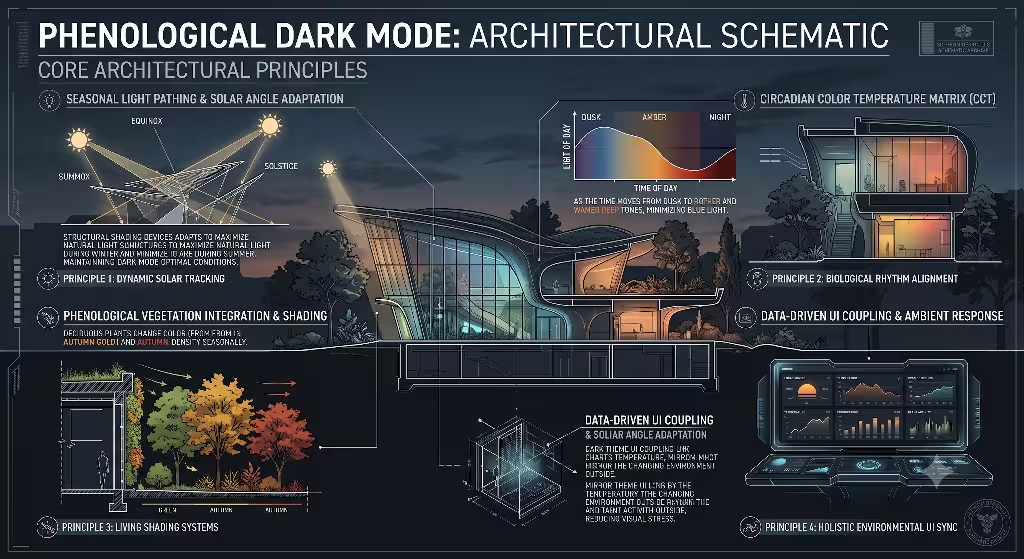
To implement phenological dark mode successfully, web teams must move beyond basic design presets. At Silphium Design LLC, we break down phenological dark mode into four core architectural principles.
| Principle | Biological Analogy | Technical UI Mechanism |
| Photoperiodic Contrast Scaling | Sunlight passing through a forest canopy across different hours | Dynamic WCAG text contrast ratios ($12:1$ at solar noon to $4.5:1$ during late twilight) |
| Seasonal Chromaticity Shifting | Changing forest leaf colors from spring to winter | Shifting theme background undertones using OKLCH color space variables |
| Melanopic Lux Attenuation | Natural drop of blue sky light during sunset | Lowering blue light frequencies ($<460\text{ nm}$) as solar angle drops below civil twilight |
| Circadian Spatial Density | Animals conserving energy during dark night hours | Reducing screen animation speeds and condensing non-essential white space late at night |
Photoperiodic Contrast Scaling
In natural environments, light levels change smoothly. Midday sun creates sharp shadows and high contrast, while twilight softens edges.
Standard web guidelines state that text must meet a contrast ratio of at least $4.5:1$ for regular text and $3:1$ for large text to pass accessibility checks. However, a high-contrast screen with white text on a pure black background can cause severe glare in a dim room.
Phenological dark mode solves this through dynamic contrast scaling. During midday solar maximum, phenological dark mode raises text contrast to $12:1$ or higher to combat screen glare from sunlight. As evening approaches, phenological dark mode lowers text contrast to a softer, fully compliant level like $5:1$ or $6:1$. This keeps text easy to read without blinding the reader in low ambient light.
Seasonal Chromaticity Shifting
The outdoor world looks very different in June than it does in December. In summer, days are long and natural ambient light has cooler tones. In winter, days are short and natural light sits at a lower angle.
A true system for phenological dark mode accounts for these seasonal photoperiods. In the middle of summer, phenological dark mode uses deep slate and cool dark undertones for night viewing. In autumn and winter, phenological dark mode shifts its base tokens toward warm charcoal, deep earth, and soft wood tones. This reflects the natural shifts of the local landscape and provides a rich visual experience.
Melanopic Lux Attenuation
Melanopic lux is a measurement of light based on how strongly it affects the human body clock. High melanopic lux keeps you awake, while low melanopic lux lets you rest.
Standard dark themes lower overall screen brightness, but they often leave bright blue buttons or neon icons intact. Phenological dark mode actively filters these accent colors. When the solar elevation angle drops below $-6^\circ$ (the start of civil twilight), phenological dark mode shifts accent colors like bright blue or cool violet toward warmer, amber tones. This ensures that the blue light spectrum below $460\text{ nm}$ is lowered, helping users maintain natural sleep cycles.
Circadian Spatial Density
When night falls, ecosystems naturally slow down. Animals rest, and plants close their blooms. Web interfaces can follow this same natural pattern.
Under a phenological dark mode system, layout density and user interface motion adapt to the user’s time of day. Late at night, phenological dark mode slows down interface animations and reduces bouncy visual effects. It can also clean up visual clutter, dimming sidebars and background banners so the user can focus easily on primary content without unnecessary visual noise.
System Implementation and Technical Architecture
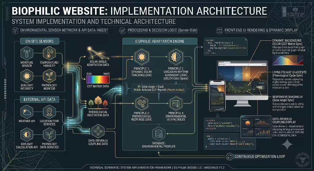
Building a website with phenological dark mode requires clean, modern web engineering. You do not need bloated JavaScript libraries to build phenological dark mode. Instead, you can combine light astronomical math with modern CSS custom properties.
Client Location Data / Geolocation
               │
               ▼
   Solar Angle Math (Ephemeris)
               │
               ▼
 Calculates Solar Elevation (-90° to +90°)
               │
               ▼
 Sets Dynamic CSS Variables (OKLCH Space)
               │
               ▼
[Phenological Dark Mode UI State Rendered]
Ephemeris Math and Location State Engine
To adjust screen elements accurately, your code needs to know the angle of the sun relative to the user. This calculation relies on solar ephemeris math, which determines the sun’s position in the sky based on time, date, latitude, and longitude.
Instead of tracking precise user coordinates, which raises privacy concerns, a system using phenological dark mode can use rough latitude and longitude estimates from an IP address or broad region selection.
Here is a lightweight JavaScript pattern that calculates solar elevation and applies it directly to the root element of a website:
JavaScript
// Calculate basic solar position for phenological dark mode
function updatePhenologicalState(latitude, longitude) {
  const now = new Date();

  // Calculate day of the year and solar declination
  const startOfYear = new Date(now.getFullYear(), 0, 0);
  const diff = now - startOfYear;
  const oneDay = 1000 * 60 * 60 * 24;
  const dayOfYear = Math.floor(diff / oneDay);

  // Solar math approximations
  const declination = 23.45 * Math.sin((2 * Math.PI / 365) * (dayOfYear - 81) * (Math.PI / 180));
  const timeOffset = (now.getHours() * 60) + now.getMinutes();
  const solarTime = timeOffset + (4 * longitude); // Simple solar time conversion
  const hourAngle = (solarTime / 4) - 180;

  // Convert angles to radians
  const latRad = latitude * (Math.PI / 180);
  const declRad = declination * (Math.PI / 180);
  const hourRad = hourAngle * (Math.PI / 180);

  // Calculate solar elevation angle
  const sinElevation = Math.sin(latRad) * Math.sin(declRad) +
                       Math.cos(latRad) * Math.cos(declRad) * Math.cos(hourRad);
  const solarElevation = Math.asin(sinElevation) * (180 / Math.PI);

  // Update HTML document attribute for CSS consumption
  document.documentElement.style.setProperty('--solar-elevation', solarElevation.toFixed(2));

  // Set explicit attribute for phenological dark mode state target
  if (solarElevation < -6) {
    document.documentElement.setAttribute('data-pheno-mode', 'night');
  } else if (solarElevation < 0) {
    document.documentElement.setAttribute('data-pheno-mode', 'twilight');
  } else {
    document.documentElement.setAttribute('data-pheno-mode', 'day');
  }
}

// Run update on load
updatePhenologicalState(42.36, -71.05); // Example coordinates for Boston, MA
CSS Custom Properties and Tokenization Framework
Once you have calculated the solar angle, you can feed that information into your stylesheet using CSS variables. The modern CSS oklch() color space is ideal for phenological dark mode because it handles brightness and color changes smoothly without sudden shifts in visual weight.
Here is an example showing how CSS tokens adapt when phenological dark mode is active:
CSS
/* Base values for phenological dark mode using OKLCH */
:root {
  /* Solar elevation variable updated by JavaScript engine */
  --solar-elevation: 15;

  /* Hue adjustment based on season (0 = Winter slate, 45 = Autumn warm) */
  --seasonal-hue: 220;

  /* Calculate dynamic background lightness based on sun position */
  --bg-lightness: clamp(10%, calc(15% + (var(--solar-elevation) * 0.8%)), 98%);

  /* Calculate body text lightness for accessibility */
  --text-lightness: clamp(15%, calc(90% - (var(--solar-elevation) * 0.3%)), 95%);

  /* Apply values to CSS color tokens */
  --site-background: oklch(var(--bg-lightness) 0.02 var(--seasonal-hue));
  --site-text: oklch(var(--text-lightness) 0.01 var(--seasonal-hue));
  --accent-color: oklch(60% 0.15 40); /* Warm amber for late hours */
}

/* Specific styling rules applied in phenological dark mode */
[data-pheno-mode="night"] {
  --seasonal-hue: 240; /* Shift toward deep night sky tones */
  --site-background: oklch(12% 0.015 var(--seasonal-hue));
  --site-text: oklch(88% 0.005 var(--seasonal-hue));
  --accent-color: oklch(55% 0.12 35); /* Low-blue amber accent */
}

body {
  background-color: var(--site-background);
  color: var(--site-text);
  transition: background-color 1.5s ease, color 1.5s ease;
}
Hardware-Level Efficiency and Power Metrics
A key benefit of phenological dark mode is lower energy use. Modern smartphones, laptops, and desktop screens use OLED or AMOLED panels. Unlike older LCD screens that illuminate the entire display from behind, OLED pixels produce their own individual light. When an OLED pixel renders true dark grey or black, it consumes significantly less power.
Using phenological dark mode optimizes screen power draw across the entire day. By dimming background surface elements naturally during local twilight hours, phenological dark mode reduces sub-pixel power consumption on mobile devices. This extends battery life while helping lower the overall energy footprint of browsing the web.
Frequently Asked Questions about Phenological Dark Mode
As search engine algorithms evolve, users look for clear, direct answers to technical design questions. Here are the most common questions regarding phenological dark mode along with simple answers.
What is phenological design in web UI?
Phenological design in web UI is an approach where website elements automatically adjust based on natural real-world cycles. Instead of staying static, the colors, contrast levels, text sizes, and background shades shift according to local solar angles, daylight length, and changing seasons. It brings the biological timing of the physical world directly into digital design.
How does phenological dark mode differ from standard night mode?
Standard night mode is a simple, binary toggle that switches a screen from light to dark based on a clock setting or a user switch. It uses fixed colors regardless of ambient lighting. Phenological dark mode calculates the real position of the sun, local twilight phases, and current season. It gradually interpolates background colors, contrast ratios, and blue light levels to match natural outdoor light conditions.
Does dynamic dark mode improve energy efficiency and battery life?
Yes, dynamic dark mode built on phenological dark mode principles reduces power consumption on modern OLED and AMOLED displays. Because these screens use individual light-emitting pixels, rendering darker surface colors during late hours lowers sub-pixel power draw. This helps extend device battery life and lowers overall power use.
How do you maintain WCAG accessibility compliance with shifting UI colors?
You maintain compliance by locking text contrast formulas to strict lower boundaries. An interface using phenological dark mode uses dynamic code variables that never allow text contrast to fall below WCAG standards (minimum $4.5:1$ for regular text and $3:1$ for large text). As background shades shift along natural color curves, text lightness adjusts automatically along the OKLCH lightness scale to keep text readable.
UX Research, Core Web Vitals, and SEO Impact
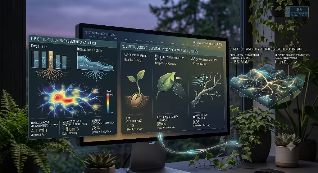
Creating beautiful web interfaces is important, but web performance and search visibility matter just as much. At Silphium Design LLC, we measure how biophilic techniques like phenological dark mode impact user experience metrics and search engine rankings.
Organic Search Advantages and UX Engagement
Search engines like Google prioritize websites that deliver outstanding user experiences. When a user visits a site with harsh glare at night, they often leave immediately. This increases the site’s bounce rate.
Implementing phenological dark mode creates a welcoming environment for visitors at all hours. By reducing eye strain during night hours, phenological dark mode encourages readers to spend more time on your page. Longer session durations and lower bounce rates send positive user engagement signals to search engines, helping boost your organic keyword rankings over time.
Core Web Vitals Optimization Strategies
To maintain strong search performance, phenological dark mode must be lightweight and fast. If JavaScript scripts cause screen flickers or layout shifts, your Core Web Vitals scores will suffer.
To protect performance metrics while running phenological dark mode:
- Avoid Layout Instability: Never change container padding, layout margins, or element positions when changing themes. Keep adjustments focused purely on CSS color properties to ensure zero Cumulative Layout Shift (CLS).
- Prevent Thread Blocking: Perform heavy solar angle math using lightweight JavaScript functions, or run calculations inside a Web Worker. This ensures smooth performance and keeps your Interaction to Next Paint (INP) score low.
- Avoid Theme Flash: Read cached solar values from local storage before rendering the page content. This prevents a bright light theme from flashing on screen before switching to phenological dark mode.
Low-Carbon Web Design Metrics
Sustainable web design aims to lower the digital carbon footprint of websites. Every kilobyte of data transferred and every pixel illuminated requires electricity.
By combining optimized asset files with phenological dark mode, you create a more energy-efficient web platform. Lowering sub-pixel power demands on mobile devices across thousands of daily sessions reduces carbon emissions. Building a site with phenological dark mode shows a clear commitment to environmental responsibility while improving user experience.
Implementation Checklist for Development Teams
If you want to add phenological dark mode to your website projects, follow this simple step-by-step checklist.
- Switch to Modern Color Units: Convert older Hex or RGB color definitions to OKLCH. This allows phenological dark mode to shift brightness and color smoothly without losing color accuracy.
- Add Solar Angle Functions: Implement a lightweight script to calculate local solar elevation without collecting sensitive user location data.
- Define Seasonal Tones: Set up basic color themes that shift undertones across summer, autumn, winter, and spring.
- Set Accessibility Floor Limits: Ensure your dynamic contrast variables never drop text contrast below WCAG $4.5:1$ requirements.
- Test Core Web Vitals: Verify that theme transitions run smoothly without causing layout shifts or blocking main-thread performance.
- Audit Display Energy Draw: Test your phenological dark mode build on mobile OLED screens to ensure reduced power usage during evening hours.
Final Thoughts
Phenological dark mode is more than a trendy visual style. It represents a fundamental shift in how we build human-centered software. By taking inspiration from nature and matching digital screens to outdoor solar cycles, phenological dark mode creates digital spaces that feel natural, comfortable, and intuitive.
At Silphium Design LLC, we believe the future of web design belongs to interfaces that adapt to human biology rather than forcing humans to adapt to screens. By implementing phenological dark mode, developers can lower eye strain, improve accessibility, save battery power, and boost organic search performance all at once.