As a biophilic design expert at Silphium Design LLC, I look at the world of screens through the lens of a biologist. We often think of the internet as something separate from nature, but our eyes do not. When you look at a website, your eyes are doing the same work they would do if you were looking at a leaf or a sunset.
One of the biggest debates in the field is whether we should use a dark mode or a light mode for our digital spaces. This is not just about what looks “cool.” It is about how our brains and bodies react to light. In this guide, we will look at a dark mode vs. light mode: readability comparison to find out what truly helps us see better.
Table of Contents
The Digital Circadian Rhythm
As a biophilic designer at Silphium Design LLC, I look at your computer screen as if it were a window. In nature, light changes throughout the day. It starts with the soft, blue tones of dawn, moves to the bright, white light of midday, and finishes with the warm, amber hues of sunset. Our bodies have spent thousands of years learning to follow this rhythm. This is what we call the digital circadian rhythm, and it is the heart of the dark mode vs. light mode: readability comparison.
The Biological Clock in Your Eyes
Inside your brain, there is a tiny clock called the suprachiasmatic nucleus. This clock is controlled by light. Specifically, it reacts to blue light, which is very common in the morning sky. When your eyes see blue light, your brain stops making melatonin. Melatonin is the chemical that makes you feel sleepy. This is great at 10:00 AM because it helps you stay awake and focused at work.
The problem with our modern world is that our screens are full of blue light. When you use a white background in light mode late at night, your brain thinks the sun is still up. It stays in “daytime mode.” This makes it very hard to fall asleep even after you turn the computer off. By using dark mode in the evening, you reduce the amount of blue light hitting your eyes. This helps your body transition into its natural nighttime state.
Why White Screens Feel Like “Noon”
For a long time, web designers thought that a white background was the only way to make a site look professional. This was because we were trying to mimic physical paper. But paper doesn’t glow. A white screen is a light source. In a dark mode vs. light mode: readability comparison, we have to recognize that a bright white screen can be up to 100 times brighter than the room around you at night.
This creates a massive “contrast gap.” When the screen is much brighter than the room, your eyes have to work extra hard. This can lead to digital eye strain. By switching to dark mode, you bring the brightness of the screen closer to the brightness of your room. This feels much more natural to our biological systems. It’s like stepping into the shade on a hot summer day.
The Biophilic Approach to Screen Time
At Silphium Design LLC, we don’t just care about dark mode; we care about the right mode for the right time. A truly biophilic website follows the sun.
- Morning/Midday: Light mode is often better. It matches the bright world outside and keeps your brain alert for deep reading and complex tasks.
- Evening/Night: Dark mode is the healthier choice. It signals to your brain that the day is ending. It protects your sleep cycle and reduces the harsh glare that causes headaches.
When we look at a dark mode vs. light mode: readability comparison, we aren’t just looking at letters on a screen. We are looking at how light affects your hormones, your sleep, and your overall health. By understanding the digital circadian rhythm, we can design websites that don’t just look good, but actually help you feel better in your daily life.
The Science of the Pupillary Reflex
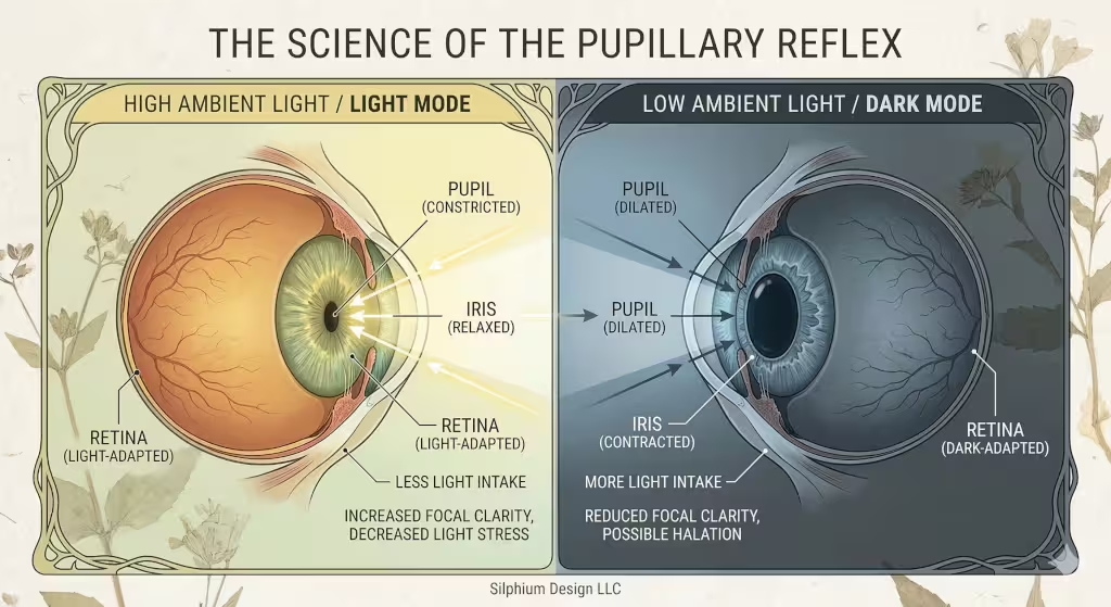
To understand the dark mode vs. light mode: readability comparison, we have to look at how the eye works. Your eye has a part called the iris. The iris controls the size of your pupil, which is the black hole in the center of your eye. When you are in a bright place, your pupil gets small. This is called the pupillary light reflex. A smaller pupil helps you focus better. It is like a camera lens closing to get a sharper picture.
In light mode, the bright background causes your pupil to constrict. This makes the dark text look very sharp. However, in dark mode, your pupil has to open up wider to let in more light. When the pupil is wide, it is harder for the eye to focus perfectly. This can lead to a “blurry” feeling for some people. This is the first big trade-off in our dark mode vs. light mode: readability comparison. Light mode gives you a sharper focus, but dark mode is less intense for the eye in low light.
Readability Comparison: Performance Metrics
As a biophilic design expert at Silphium Design LLC, I often look at how we measure success on a website. When we talk about performance, we usually mean how fast a page loads. But there is another kind of performance. This is the human performance. It is how well your brain can process the words on the screen. In our dark mode vs. light mode: readability comparison, we use metrics like reading speed, error rates, and “glanceability” to see which mode is the true winner.
Reading Speed and Accuracy
For decades, scientists have studied how humans read from screens. Most of these studies show a very clear result. For long pieces of text, light mode is faster. When you have black text on a white background, the contrast is very high. This high contrast makes the shapes of the letters stand out. Your brain does not have to guess what the word is. It can see the “edges” of the letters very clearly.
In a dark mode vs. light mode: readability comparison, users reading in light mode usually finish an article faster than those using dark mode. They also make fewer mistakes when they have to answer questions about what they read. This is because the bright background causes the eye to focus more sharply. If you are a student studying for a test or a researcher reading a long paper, light mode is your best friend. It keeps your brain sharp and your reading pace high.
The Concept of Glanceability
Reading speed is not the only metric we care about at Silphium Design LLC. We also care about “glanceability.” This is how quickly you can find a specific piece of information without reading every word. Think about a car dashboard or a weather app. You don’t want to read a paragraph. You just want to see the temperature or your speed.
In this part of the dark mode vs. light mode: readability comparison, dark mode often wins. Because dark mode uses different colors for different types of information, it creates a visual hierarchy. On a dark background, a bright red alert or a neon green “go” button stands out much more than it would on a white background. This is why many pilots, doctors, and computer programmers use dark mode. It allows them to scan a complex screen and find the most important data in a split second.
Cognitive Load and Brain Power
Cognitive load is a fancy way of saying “how hard your brain is working.” When a website is hard to read, your cognitive load goes up. This means you get tired faster. You might start to feel frustrated or bored. In our dark mode vs. light mode: readability comparison, we find that dark mode can actually lower cognitive load in certain situations.
If you are in a dark room, using light mode creates a very high cognitive load. Your brain is trying to handle the “glare” from the screen while also trying to read the text. It’s like trying to listen to someone whisper while a loud siren is going off nearby. By switching to dark mode in low light, you remove that “noise.” Your brain can relax and focus only on the content. This makes the overall experience feel much more pleasant and natural.
Interaction and Retention
Does the mode you choose change how much you remember? This is a big question for marketers and teachers. Some research suggests that because light mode is easier to read, people might skim it too quickly. Because dark mode requires a little more focus, it might actually help with “retention,” which is how much you remember later.
However, if the dark mode is poorly designed, it can have the opposite effect. If the text is too dim, the user will just give up. At Silphium Design LLC, we use these metrics to build sites that match the goal of the user. If the goal is to learn a new skill, we might lean toward light mode. If the goal is to check a quick status update, dark mode is often the superior choice. This balance is what makes a dark mode vs. light mode: readability comparison so important for modern design.
Sustainable Engagement
Finally, we look at how long a user stays on a page. This is called engagement. In many cases, users report that dark mode feels more “premium” or “cool.” This emotional response can make people stay on a website longer. If a user feels comfortable, they are more likely to explore.
In a dark mode vs. light mode: readability comparison, we see that dark mode is often the favorite for entertainment sites, like movie streaming apps or social media. These sites want you to stay for hours. Light mode is more common for “productive” sites, like email or word processors, where you want to get work done and then move on. By matching the mode to the “vibe” of the site, we can create a digital environment that feels as balanced as a walk in the woods.
Accessibility and Ocular Health
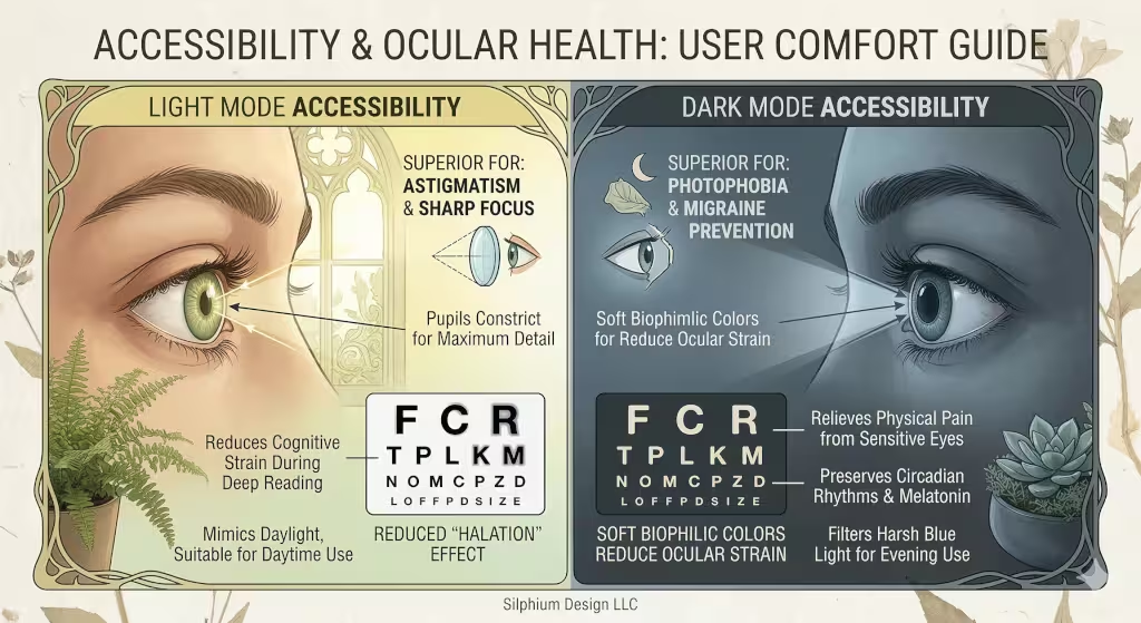
Accessibility means making sure everyone can use a website, including people with different eye conditions. For many years, people thought dark mode was always better for eye health. We now know that this is not always true. One big issue is called the halation effect. This happens when bright text on a dark background seems to “bleed” or glow into the dark areas.
This effect is a major problem for people with astigmatism. About half of the people in the world have some form of astigmatism. For them, dark mode can make text look blurry and hard to read. On the other hand, people with photophobia, or light sensitivity, find dark mode to be a lifesaver. Without dark mode, these users might get headaches or feel pain when looking at a screen. This is why at Silphium Design LLC, we always suggest giving users a choice. There is no “one size fits all” for eye health.
The Biophilic Evolution: Organic Dark Mode
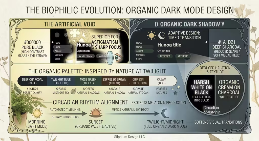
As a biophilic design expert at Silphium Design LLC, I often find that the biggest mistake in technology is being too “artificial.” When most people think of dark mode, they think of a screen that is pure, pitch black with bright, neon white text. In nature, we almost never see a true #000000 black. Even the night sky is a deep navy, and the shadows in a forest are dark greens and charcoal greys. This is where the biophilic evolution comes in. We call it “Organic Dark Mode,” and it changes the entire dark mode vs. light mode: readability comparison.
Moving Beyond Pure Black
In a standard dark mode, the contrast between pure black and pure white is actually very hard on the human eye. This is called “high-contrast glare.” It causes the letters to look like they are vibrating. For a dark mode vs. light mode: readability comparison, this high-contrast version of dark mode actually performs worse than light mode. It makes your eye muscles work too hard to keep the letters still. This is similar to using dark navy text instead of pure black.
At Silphium Design LLC, we use “off-blacks.” Instead of a dead, flat black, we use colors like deep slate, midnight blue, or espresso brown. These colors have “warmth” or “coolness” that feels like a natural shadow. When you use a soft dark grey for the background, the white text doesn’t need to be as bright. This reduces the “glow” or “bleeding” that makes dark mode hard to read for many people.
The Palette of the Natural World
When we design an organic dark mode, we look at the colors of the earth at twilight. Think about the way a forest looks just after the sun goes down. You see deep moss greens and dark bark browns. These colors are very soothing to the human brain. In our dark mode vs. light mode: readability comparison, these “organic” colors actually help people stay focused for longer periods of time.
Using a dark forest green background with cream-colored text is much easier to read than harsh black and white. It mimics the natural world where light is filtered through leaves. This reduces visual fatigue and makes the website feel like a digital garden. It is a more “human” way to design. We want the user to feel relaxed, not like they are staring into a void.
Adaptive Design: The Sun’s Influence
The ultimate goal of biophilic design is to make the digital world match the physical world. This is why we use “Adaptive Design.” This means the website knows what time it is where you live. In the morning, the site might use a light mode with warm, sun-like tones. As the afternoon fades, the site slowly shifts into an organic dark mode.
This transition is very important for the dark mode vs. light mode: readability comparison. If you switch instantly from a bright white screen to a black one, it shocks your eyes. It takes several minutes for your pupils to adjust. But if the colors shift slowly over an hour, your eyes don’t even notice the change. This mimics the way the sun sets. It is a gentle way to help your body prepare for the end of the day.
Textures and Depth in Dark Mode
In nature, nothing is perfectly flat. Shadows have depth and texture. Most digital dark modes are very flat, which can make them feel “cold” or “boring.” At Silphium Design LLC, we add subtle gradients or textures to our dark backgrounds. We might use a very faint pattern that looks like stone or recycled paper.
In a dark mode vs. light mode: readability comparison, adding a little bit of “grain” or texture to the background helps the eye stay anchored. It gives the eye something to rest on. This makes the text feel like it is sitting “on” the background rather than floating in space. This small change makes a big difference in how comfortable it feels to read a long article in dark mode.
The Emotional Connection
Finally, organic dark mode is about how a website makes you feel. A harsh, black-and-white dark mode feels like a computer terminal from the 1980s. It feels “techy” and cold. An organic dark mode feels like a cozy library or a quiet walk at night. It builds trust and comfort with the user.
When we look at the dark mode vs. light mode: readability comparison, we have to include “emotional readability.” If a user feels stressed by the colors on a screen, they won’t want to read the content. By using biophilic principles, we create a dark mode that feels safe, natural, and inviting. This keeps people on your website longer and helps them remember what they read.
Technical and Environmental Impact
Choosing between modes is not just about our eyes; it is also about our devices and our planet. If you have a phone with an OLED or AMOLED screen, dark mode can save a lot of battery life. These screens work by lighting up each pixel individually. When a pixel is black, it is actually turned off. This means it uses zero power. Using dark mode on these devices can make your battery last much longer.
From a biophilic and sustainable view, saving energy is a big deal. When millions of people use dark mode, it adds up to a lot of saved electricity. This is a great way to make the internet a little bit greener. However, this only works on certain types of screens. Older LCD screens use a backlight that stays on even if the screen is showing black. For those screens, dark mode does not save any power.
Frequently Asked Questions about Dark Mode and Light Mode
Many people have questions when they look at a dark mode vs. light mode: readability comparison. Here are some of the most common ones:
Is dark mode better for your eyes?
It depends on the room you are in. In a dark room, dark mode is better because it reduces glare. In a bright room, light mode is usually better because it is easier to focus on the text.
Does dark mode save battery?
Yes, but only on OLED or AMOLED screens. On these screens, dark mode can save up to 60% of your battery if the brightness is high.
Why is dark mode harder to read for some people?
This is usually due to astigmatism. The wide-open pupil makes the light text look like it has a halo around it, which makes the letters look fuzzy.
Related Terms to Know
To really understand this topic, you should know a few technical terms:
- Contrast Ratio: This is the difference in brightness between the text and the background.
- WCAG: These are the rules that tell designers how to make websites accessible for everyone.
- Blue Light: This is a type of light from screens that can keep you awake at night.
- Visual Fatigue: This is the tired feeling your eyes get after looking at a screen for a long time.
Summary: The Verdict
In the end, our dark mode vs. light mode: readability comparison shows us that both modes have a place in our lives. Light mode is the king of clarity and fast reading. It is great for work, school, and bright offices. Dark mode is the king of comfort and style. It is perfect for late-night browsing, saving battery, and helping people who are sensitive to light.
At Silphium Design LLC, we believe the best websites are the ones that let the user decide. By offering a dark mode toggle, you are respecting the biological needs of every visitor. Whether someone is a night owl or a morning person, they should be able to enjoy the internet without straining their eyes. As we continue to blend biology and technology, we will find even better ways to make our digital world feel as natural as the one outside our windows.