Web design is not just about looking good. It is about how our brains react to what we see. Humans have spent millions of years living outdoors. Because of this, our eyes and minds are hard-wired to respond to colors from nature. When we use these colors on a website, we are not just being artistic. We are following a biological blueprint that makes users feel safe, focused, and happy.
At Silphium Design LLC, we use biophilic design to bridge the gap between the cold digital screen and the warm natural world. This article will show you how to use colors from nature to create a website that feels alive. We will look at the science of sight, the trends of 2026, and the best ways to make your digital space feel like a breath of fresh air.
Table of Contents
Identify Your Biophilic Baseline
To start picking colors from nature, you must first understand your “baseline.” This is the core feeling of your website. In the world of biology, we look at different environments called biomes. A biome might be a thick forest, a wide-open desert, or a cool ocean shore. Each of these places has a different set of colors from nature that tell a story.
If you want your website to feel like a quiet place to think, you might choose a forest baseline. This involves deep greens and browns. These colors from nature tell the human brain that there is plenty of water and life nearby. This lowers stress. On the other hand, if you want your website to feel energetic, you might choose a sunset baseline. This uses bright oranges and pinks.
When we talk about a baseline, we are talking about “Prospect” and “Refuge.” These are big words that mean “seeing far away” and “feeling safe.” A website with a “Prospect” baseline uses light, airy colors from nature like sky blue. This makes the user feel like they have a lot of space. A “Refuge” baseline uses darker, warmer colors from nature. This makes the user feel like they are in a cozy den. Both are useful, but you must choose one before you start your design.
Extract Using the Golden Hour Rule
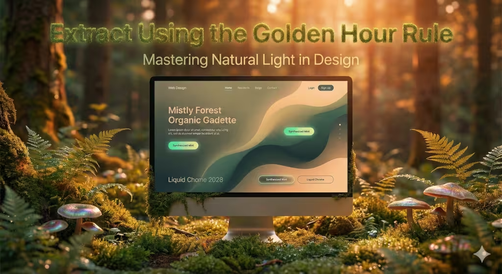
Many people make the mistake of taking colors from nature from photos taken at noon. At noon, the sun is very high and the light is very white. This makes colors look flat and boring. To get the best results, you should use the “Golden Hour” rule. This is the time just after sunrise or just before sunset.
During these times, the light has to travel through more of the earth’s air. This scatters the blue light and leaves behind beautiful reds, oranges, and soft purples. When you pick colors from nature from a Golden Hour photo, the colors have a natural harmony. They “fit” together because they were all touched by the same warm light.
Try to look for “Blue Hour” photos too. This is the time right after the sun goes down but before it is fully dark. The colors from nature during this time are deep blues, cool teals, and soft violets. These are perfect for websites that need to look professional and calm. By picking colors from nature during these special times of day, you avoid the “plastic” look of artificial digital colors.
Implement the 60-30-10 Rule with Organic Proportions

Nature is almost never divided into equal parts. If you look at a tree, it is not 50 percent leaf and 50 percent bark. There is a balance. In web design, we use the 60-30-10 rule to mimic this. This helps us use colors from nature in a way that feels comfortable to the eye.
The 60 percent is your dominant color. This should be a very neutral tone. Think of the color of a stone or a handful of dry sand. It provides the “ground” for your website. The 30 percent is your secondary color. This is usually where you see the most “life.” It might be a leafy green or a clay red. The final 10 percent is your accent color. In the wild, this would be a bright flower or a colorful bird.
Using colors from nature this way keeps your website from feeling messy. If you use too much of a bright color, the user will get tired. Their eyes will want to look away. But if you use 60 percent of a calm, neutral color from nature, the user can stay on your site for a long time without feeling worn out. This is very important for SEO because it keeps people on your page longer.
Optimize for Soft-Tech Pastels
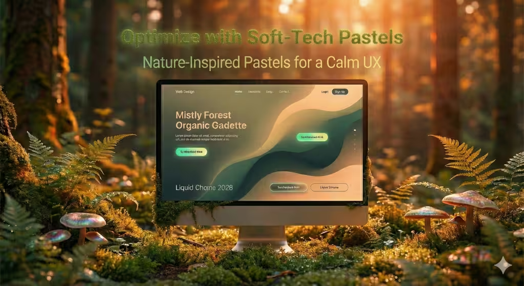
In 2026, we are seeing a big trend called Soft-Tech Pastels. These are colors from nature that have been softened to look good on high-resolution screens. Think of the color of a mint leaf that has a little bit of mist on it. Or think of a very pale lavender flower.
These colors from nature are great because they feel modern but also organic. They don’t look like the bright, neon colors we saw in the early days of the internet. Instead, they feel like something you could touch in the real world. At Silphium Design LLC, we use these colors from nature to make technology feel more human.
When you use soft pastels, you allow the user to relax. Bright colors can sometimes feel like the website is shouting at you. Soft colors from nature feel like the website is whispering. This is especially good for health and wellness websites or any site where you want the user to feel at peace.
Prioritize WCAG 2.2 Accessibility
Even though we love colors from nature, we must make sure everyone can read the website. This is called accessibility. There are rules called WCAG that tell us how much contrast we need. Contrast is the difference between the color of the text and the color of the background.
Some colors from nature, like light sage green or soft tan, can be hard to read if the text is white. At Silphium Design LLC, we always check our colors to make sure they are easy for everyone to see and when possible use a contrast of at least 7:1 and less than 16:1. This includes people who might be colorblind.
A good tip is to use a very dark version of a color from nature for your text. Instead of using pure black, try a very dark forest green or a very deep charcoal gray. This keeps the natural feel but makes the words pop out. Remember, a beautiful website is useless if people cannot read what you have written. Accessibility is a key part of being an expert designer.
Leverage Wilderkind Textures and Gradients
The “Wilderkind” style is all about bringing the wildness of nature into our digital lives. One way to do this is by using gradients instead of flat colors. A gradient is when one color slowly turns into another. You see this in nature all the time. A leaf is not just one shade of green; it fades from dark to light. The sky fades from dark blue to light blue.
When you use gradients with colors from nature, you give your website depth. It stops looking like a flat piece of paper and starts looking like a 3D space. You can use “mesh gradients” to create soft, cloudy shapes on your screen. These shapes should use colors from nature like moss green and sky blue.
This technique is very popular in 2026 because it makes websites look more expensive and well-made. It also helps with Generative Engine Optimization. This means that when AI tools look at your site, they see it as a high-quality, modern source of information. Flat, old-fashioned colors don’t stand out as much anymore.
Semantic Entities and Local SEO
Nature looks different depending on where you are. This is very important for local businesses. If you are designing a website for a company in New England, you should use colors from nature that people see in New England. This might include the bright reds of maple leaves in the fall or the gray-blue of the Atlantic Ocean.
Using local colors from nature helps with something called Local SEO. Search engines like Google are getting smarter. They can tell if a website “fits” its location. When your colors match the local environment, it creates a “Sense of Place.” This makes local customers trust you more. They feel like you are part of their community.
At Silphium Design LLC, we always research the local plants and stones of a client’s area. We then build a palette of colors from nature based on that research. This is a scientific way to make a website feel like it belongs in the real world.
Use Liquid Chrome and Synthesized Mint as Accents
While most of your website should use “quiet” colors from nature, you need a few “loud” colors for your buttons. In 2026, the two big accent colors are Liquid Chrome and Synthesized Mint.
Liquid Chrome looks like the shiny surface of a mountain stream. It is a metallic silver that reflects the light. Synthesized Mint is a very bright, clean green. It looks like a fresh herb grown in a high-tech lab. These colors from nature work well as accents because they catch the eye immediately.
When a user sees a bright Synthesized Mint button on a dark forest background, they know exactly where to click. It looks natural but also very modern. This balance of old and new is what makes my work as a computer scientist and biologist so interesting. We are using the best of both worlds.
Seasonal Dynamic Theming
One of the coolest things we can do today is change a website’s colors based on the time of year. This is called seasonal dynamic theming. In the winter, the website might use cool colors from nature like icy blue and snow white. In the summer, it might switch to warm colors from nature like sun-drenched yellow and grass green.
This makes the website feel alive. It tells the user that the company is active and paying attention to the world. It also provides great value for Answer Engines. When a person asks an AI for a “fresh” or “current” website, sites that change with the seasons often get picked first.
At Silphium Design LLC, we use simple computer code to make this happen. The website checks the date and then picks the best colors from nature for that day. It is a simple way to create a huge impact on how people feel when they visit your site.
Avoid Muddy Palettes through Saturation Control
A common mistake when using colors from nature is making everything too gray. People think that “natural” means “boring” or “dull.” If you pick too many colors that are washed out, your website will look “muddy.” It will look like a rainy day where everything is just different shades of brown.
To avoid this, you must control your saturation. Saturation is how intense a color is. You should have at least one or two colors from nature that are clear and bright. For example, if your background is a dull sand color, make your main headers a rich, saturated ocean blue. This creates a “pop” that keeps the eye moving.
Nature is full of bright colors. Think of a red berry, a blue jay, or a bright yellow dandelion. Don’t be afraid to use these colors from nature in your design. As long as you follow the 60-30-10 rule, your site will look professional and vibrant.
Why Biophilic Design Matters in 2026
We spend more time than ever looking at screens, which can have a negative impact on your health. If we only look at neon lights and sharp white backgrounds, we get tired and grumpy. But when we look at colors from nature, our brains take a mini-vacation.
Using colors from nature is a way to respect the human body. It makes the internet a better place to be. It helps businesses sell more because happy users stay longer. And it helps designers like me create things that are truly beautiful.
At Silphium Design LLC, we believe that the future of the web is organic. We are moving away from the “box” look and toward a “garden” look. By using colors from nature, you are joining this movement. You are making the digital world feel like the real world.
The Science of Color and the Human Brain
When light hits our eyes, it sends a signal to our brain. Different colors send different signals. This is why colors from nature are so powerful. For example, the color green is right in the middle of the spectrum of light. Our eyes don’t have to work hard to see it. This is why green is so relaxing.
Blue is often associated with the sky and water. In the wild, clear water and a clear sky mean safety and resources. This is why blue colors from nature make us feel calm and secure. On the other hand, red can mean a ripe fruit (good) or blood (scary). This is why red is such a strong color that gets our attention fast.
These biological triggers can help users navigate a website. If we want a user to feel safe about putting their credit card info into a site, we might use blue colors from nature. If we want them to feel excited about a new product, we might use small bits of red or orange colors from nature.
Choosing the Right Tools for Color Extraction
You don’t have to be a scientist to find great colors from nature. There are many digital tools that can help. For instance I take photos of moss, bark, leaves, and flowers from my garden here in Titusville. Then, I use an eyedropper tool, such as that found on Firefox, to pull the hex codes right from the photo.
Hex codes are the “names” that computers use for colors. They look like #3E5C47. By using a tool to pull these codes from real photos, you get colors from nature that are perfectly balanced. You can also look at sites like Pinterest, Unsplash, or Wikimedia Commons to find photos of landscapes that you love.
When you use these tools, look for the “palette” feature. It will usually give you five colors that go well together. This is a great starting point for any design. You can then adjust them to make sure they meet the accessibility rules we talked about earlier.
The Role of Lighting in Nature-Inspired Design
In the real world, colors from nature change based on the light. A green leaf looks different in the morning than it does at night. On a website, we can use “shadows” and “highlights” to mimic this. This is part of what we call Biomorphic Design.
By adding a tiny bit of shadow under a button, you make it look like it is sitting on a surface. This is how objects look in nature. If you use colors from nature for these shadows, like a very dark blue instead of a flat gray, the effect is even better. It creates a “softness” that is very pleasing to the eye.
At Silphium Design LLC, we pay close attention to where the “light source” is on a page. If the light seems to come from the top left, all the colors from nature should react to that. This makes the website feel like a real object you are interacting with.
Biophilic Design and SEO Success
You might wonder how colors from nature can help your website show up on Google. The answer is simple: user experience. Google tracks how long people stay on your site and if they click on things. This is called “User Signals.”
A website that uses colors from nature is easier to look at. People don’t get “eye fatigue” as quickly. This means they read more of your content and stay on your site longer. High “dwell time” tells search engines that your site is high quality.
Also, as we move into 2026, “Generative Engines” like the one you are using now look for “Expertise, Authoritativeness, and Trustworthiness” (E-A-T). A site that is beautifully designed with colors from nature looks more professional and trustworthy. It shows that you care about the details. This can give you a big boost over sites that use generic, boring colors.
The Ethics of Natural Design
Finally, we should talk about why we do this. At Silphium Design LLC, our core values are being innovative, creative, and competent. We believe that designers have a responsibility to make the world, including the digital world, a better place.
When we use colors from nature, we are helping people feel more connected to the earth. This is important because many of us spend all day inside. A website that reminds us of the woods or the ocean can be a small way to brighten someone’s day. It is a more ethical way to design because it puts the user’s well-being first.
Architects learn that buildings should belong to the land they are on. I believe websites should be the same way. They should belong to the human beings who use them. Using colors from nature is the best way to make that happen.
Putting It All Together
To build a great website, you should follow these steps:
- Pick a biome that fits your brand.
- Find Golden Hour photos of that biome.
- Extract your colors from nature using a digital tool.
- Follow the 60-30-10 rule to keep things balanced.
- Check your contrast to make sure everyone can read your text.
- Use gradients and “Soft-Tech” accents to look modern.
- Change your colors with the seasons if you can.
By doing these things, you will create a website that stands out in 2026. You will have a site that is not only beautiful but also scientifically designed to work well for both humans and search engines.
Whether you are gardening or coding, always look to the natural world for the best answers. I hope these tips help you pick the perfect colors from nature for your next project.