The Neurobiology of the Curve
When you walk through a lush forest, your eyes do not struggle to find their way. You do not see sharp right angles or perfectly straight lines in the trees, the leaves, or the winding paths. Instead, you see a world filled with organic shapes. Your brain was built over millions of years to understand these natural forms. This is the core of biophilic design. It is the idea that humans feel better and work better when they are connected to nature.
As we look at the internet in 2026, we are seeing a massive shift in how we build websites. We are moving away from the cold, rigid boxes of the past. We are moving toward a style I call Soft Digitalism. This style uses organic shapes to make the digital world feel as comfortable as a walk in the park.
Our work at Silphium Design LLC focuses on this very transition. We believe that using organic shapes is not just a trend for artists. It is a vital part of making the web easy for everyone to use. In the world of science, we call this cognitive ergonomics. That is just a fancy way of saying we want to make things easy for the human mind to process.
When a website uses organic shapes, the brain does not have to work as hard to figure out where to look. This reduces stress and makes the site more accessible to people with different needs. If you want to build a site that truly helps people, you must understand how to use the best organic shapes for accessible UI.
For many years, web designers loved boxes because they were easy to code. A box has a clear top, bottom, and sides. But a box can also feel like a trap for the eye. It stops the visual flow. Organic shapes do the opposite. They lead the eye from one point to another in a gentle way. This is why we are seeing a shift from the year 2025 into 2026. We are no longer trying to make websites look like technical manuals. We are making them look like living systems.
By using organic shapes, we create a bridge between the cold metal of a computer and the warm reality of human life. This article will show you how to use these shapes to create a site that is both beautiful and easy for everyone to navigate.
Table of Contents
Technical Taxonomy: Defining Organic Shapes in Web Design
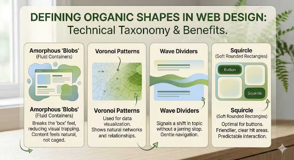
To use these patterns correctly, we first need to define what we mean by organic shapes in a digital space. In nature, nothing is perfectly identical. Every leaf is a little bit different. Every river bend has its own unique curve. In web design, we use four main types of organic shapes to bring this natural feel to the screen.
The first type is what we call amorphous blobs. These are fluid containers that do not have a set form. They look like a drop of water on a table or a soft cloud in the sky. When you use these organic shapes as backgrounds for content, you break the “box” feel of the site. It makes the information feel like it is floating naturally rather than being locked in a cage.
The second type of organic shapes we use are Voronoi patterns. You can see these in the structure of a dragonfly wing or the way a leaf is divided into small cells. These are great for data visualization. Instead of a boring bar chart, we can use these organic shapes to show how different pieces of information relate to each other. It looks more like a natural network.
The third type is the wave divider. For a long time, we used straight horizontal lines to separate sections of a webpage. Now, we use soft, rolling waves. These organic shapes signal to the user that they are moving to a new topic without a jarring stop. It feels like a smooth transition from one room to another.
Finally, we have fractal scaling. Fractals are patterns that repeat at different sizes. Think of a fern leaf. The whole leaf has a shape, and each small part of that leaf has the same shape. We use these organic shapes to build navigation menus. It helps users understand where they are in a big website. If the small buttons look like a part of the big header, the brain understands the connection instantly. By mixing these different organic shapes, we create a visual language that feels alive. This makes the user feel more at home and less like they are fighting with a machine.
The Intersection of Biophilia and Accessibility
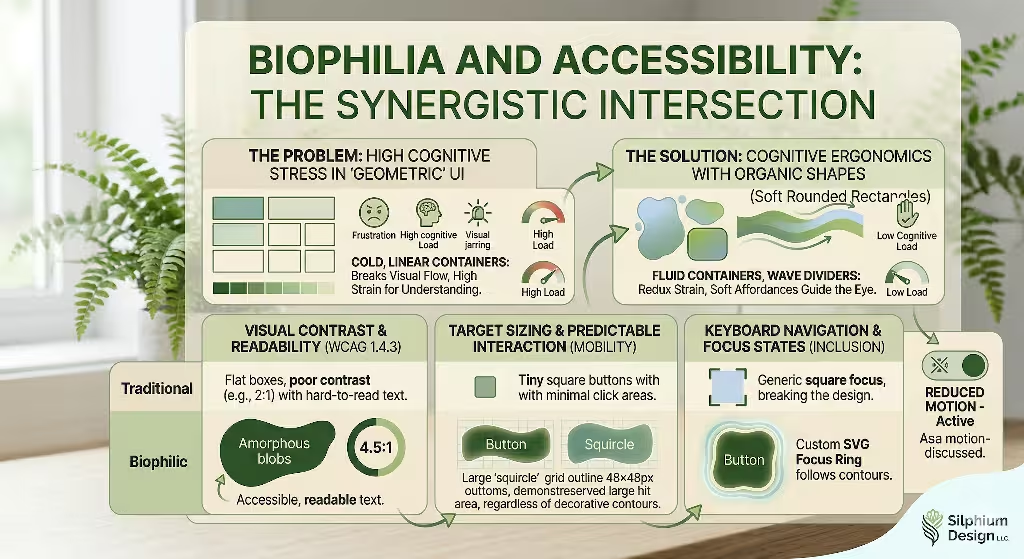
When we talk about accessibility, we are talking about making sure everyone can use a website. This includes people who might have trouble seeing, people who use a keyboard instead of a mouse, or people who get overwhelmed by too much information. Using organic shapes is a secret weapon for accessibility. Some people think that using “blobs” makes a site harder to use, but the opposite is true if you follow the rules. The first rule is visual contrast. Even if you use beautiful organic shapes, you must make sure they stand out. The colors must be different enough so that someone with low vision can see where the shape ends and the background begins.
In the world of web rules, we call this WCAG compliance. For 2026, we aim for high contrast levels. This means your organic shapes should have a clear edge. If you put text inside one of these organic shapes, that text must be very easy to read. You cannot let the shape get in the way of the words.
Another big part of accessibility is target sizing. This is very important for people who use their phones or have shaky hands. A button might be a cool, wavy organic shape, but the area you can click must be large enough. We usually aim for a size of at least 48 by 48 pixels. Even if the visual part of the organic shapes looks thin or irregular, the hidden “hit area” should be a nice, big square or circle.
We also have to think about focus states. When a person uses a keyboard to move through a site, a “ring” usually appears around the item they are looking at. If your buttons are organic shapes, a standard square ring looks terrible. It breaks the magic. Instead, we design custom focus rings that hug the curves of our organic shapes. This helps the user see exactly where they are without ruining the natural design. By paying attention to these details, we prove that organic shapes are not just for decoration. They are a tool for inclusion. They allow us to create a digital world that welcomes everyone, regardless of how they interact with their screen.
FAQs About Organic Shapes for Accessible UI
At Silphium Design, we get many questions about how to use organic shapes without breaking a website. One of the most common questions is: How do organic shapes guide user navigation? The answer lies in what we call visual affordances. An affordance is a clue that tells you how to use something. A door handle is an affordance that tells you to pull. In web design, organic shapes can act like a path in the woods. A soft curve can point toward a button or an important piece of news. Because our eyes naturally follow curves, these organic shapes can lead a user through a story much better than a series of flat boxes.
Another question is: Can I blend organic shapes with traditional grids? People worry that if they use organic shapes, their site will look messy. My answer is always yes, you can and should blend them. I call this Hybrid Morphology. Think of a tree. The trunk is strong and somewhat straight, like a grid. It provides the structure. But the leaves and branches are organic shapes that fill the space with beauty. You can keep your text in a neat grid so it is easy to read, but use organic shapes for your photos, buttons, and backgrounds. This gives you the best of both worlds: the order of a grid and the comfort of nature.
The third big question is about speed: Are organic shapes bad for site performance? People think that complex curves take a long time to load. This was true ten years ago, but not today. In 2026, we use SVGs, which are Scalable Vector Graphics. These are not heavy picture files. They are actually small bits of code that tell the computer how to draw organic shapes. Because they are code, they load almost instantly.
We also use CSS to create organic shapes. This keeps the website fast and snappy. As long as you do not use huge, unoptimized images to create your organic shapes, your site will be very fast. Fast sites are better for SEO and better for users who have slow internet.
Selecting the Best Organic Shapes for Specific Accessible Use Cases
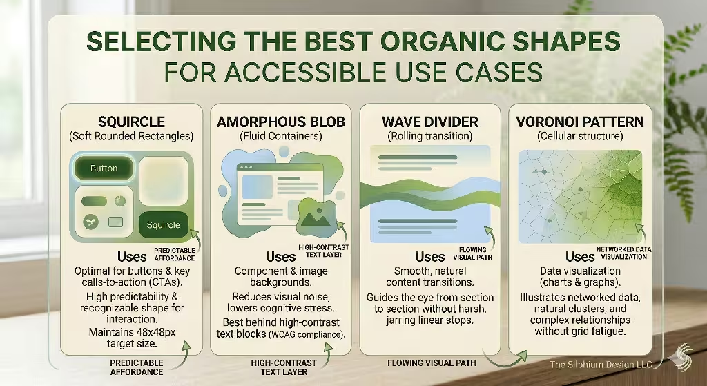
Not all organic shapes are the same. Some are better for buttons, while others are better for big backgrounds. If you want to make an accessible site, you have to choose wisely. For buttons, I highly recommend the “Squircle.” A squircle is a mix between a square and a circle. It has soft, rounded corners but still feels like a solid object.
These are some of the best natural shapes for buttons because they provide a clear area to click. They feel friendly and modern, but they do not confuse the user. When a user sees a squircle, they know exactly what it is and what it does. To go even further it is helpful to have a border that changes when the button is pushed.
If you are designing a hero section, which is the big area at the top of a homepage, you should use asymmetrical blobs. These are organic shapes that do not look the same on both sides. You can place a large, soft blob behind your main headline. This helps the text pop out from the background image. These natural shapes act like a frame. They tell the user, “Look here, this is the most important part.” Because they are not perfect circles, they feel more natural and less like an advertisement. This helps build trust with the person visiting your site.
For links and small details, I love using hand-drawn underlines. Instead of a perfectly straight line under a link, use a slightly wavy line. These small organic shapes make the site feel like it was made by a human, not a robot. This is especially good for accessibility because it makes links very easy to see for people who are color blind. They do not have to rely on the color of the text to know it is a link. They can see the unique organic shapes of the underline. By choosing the right organic shapes for each task, you create a site that is functional, beautiful, and easy for everyone to navigate.
Implementation Strategy: The Technical Silphium Approach
When we build a site at Silphium Design LLC, we follow a strict process to ensure our organic shapes work for everyone. The first step is what we call SVG Semantics. When we add natural shapes to a page, we do not just dump them there. We give them names and roles in the code.
For example, if a shape is just there for looks, we tell screen readers to ignore it. If the shape is part of a button, we give it a label. This way, a person who is blind can still understand the site. They might not see the organic shapes, but their computer can explain what is happening. This is a key part of modern design.
Another technical step is handling motion. Many designers like to make organic shapes float or wiggle. While this looks cool, it can make some people feel sick. This is why we use a setting called “prefers reduced motion.” If a user has this setting turned on in their computer, our organic shapes stay still. We also make sure that our organic shapes do not block any important content. Sometimes, a designer might let a “blob” cover up a bit of text. We never do this. We use layers to make sure the organic shapes stay in the background where they belong.
We also test our organic shapes on all kinds of screens. An organic shape might look great on a big desktop computer but look weird on a tiny phone. We use flexible code to make sure the organic shapes shrink and grow the right way. This is called responsive design. By using these technical steps, we make sure that our love for nature does not get in the way of a good user experience. We want the organic shapes to enhance the site, not break it. This careful approach is what makes our work stand out in the field of biophilic web design.
The Future of Inclusive Web Morphology
As we look toward the future, it is clear that organic shapes are here to stay. We are moving away from a world where technology feels separate from nature. Instead, we are building a digital world that feels like an extension of our physical world. Using the best organic shapes for accessible UI is the most effective way to do this. It allows us to create websites that are not just tools, but environments. When a site uses organic shapes, it creates a sense of calm. This is very important in a world that often feels fast and stressful.
By following the rules of accessibility, we ensure that this calm environment is open to everyone. We use organic shapes to lead the eye, to soften the interface, and to make the web a friendlier place. We have learned that we do not have to choose between beauty and function. With organic shapes, we can have both.
As a designer and a scientist, I am excited to see how this trend continues to grow. We are finally learning how to build a web that respects the human brain and the natural world. Remember, nature does not move in straight lines. Our digital lives shouldn’t have to, either. By embracing organic shapes, we are creating a more inclusive and beautiful future for the internet.