Alright, let’s ignite that spark of curiosity. Forget dry definitions for a moment. Think about the last time a website made you feel something – perhaps a sense of calm and order, like gazing at a perfectly structured crystal lattice? Or maybe it evoked a feeling of vibrant energy, a dynamic flow akin to watching wind patterns ripple across a field? That immediate, often subconscious, emotional response? It frequently stems from the most fundamental visual elements at play: shapes.
We navigate a universe composed of both the predictable, reassuring lines of geometry and the wonderfully complex, irregular forms of the natural world. On our screens, this dichotomy isn’t just aesthetic window dressing; it’s a powerful language influencing perception, guiding interaction, and ultimately shaping user experience. So, the crucial question isn’t just what these shapes are, but why they affect us so profoundly. How can the rigid certainty of a square coexist with the gentle curve of a riverbend in a digital layout? How do we, as creators, effectively translate inspiration drawn from the elegance of natural forms into interfaces that connect and communicate?
In this exploration, we will journey through the distinct realms of organic and geometric shapes. We’ll dissect their psychological undertones, examine their practical applications in crafting compelling web layouts, and uncover the potential that lies in their thoughtful combination. Because here at Silphium Design LLC, we believe that understanding these foundational building blocks isn’t just good practice – it’s essential for designing digital experiences that resonate with integrity and purpose. Let’s begin.
Table of Contents
Defining the Dichotomy: What Are We Really Talking About?
So, we speak of “geometric” and “organic” shapes. But are these merely artistic terms, or do they represent fundamentally different ways of structuring visual information? Let’s clarify.
Geometric Shapes: The Architecture of Order

Think of the building blocks – literally. Geometric shapes are those defined by mathematics: circles, squares, triangles, rectangles, hexagons, and so on. They possess uniform measurements, clear edges, and often, symmetry. You can describe them with formulas. In the digital realm, they manifest as the grids that underpin layouts (thank you, CSS Grid and Flexbox!), the crisp rectangles of buttons and input fields, the perfect circles of profile picture masks. They are the essence of structure, predictability, and human-engineered order. They feel stable, strong, sometimes even rigid.
Organic Shapes: The Signature of Nature

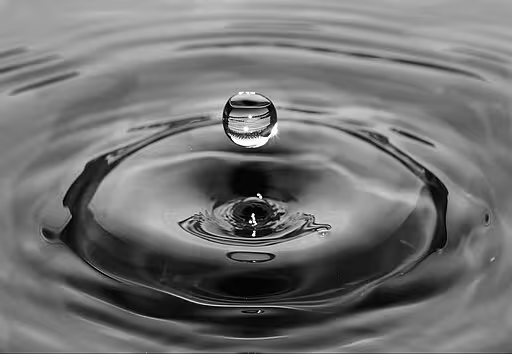
Contrast this with organic shapes. These are irregular, free-flowing, curved, and often asymmetrical. Think of the outline of a leaf, the splash pattern of water, the edge of a cloud, the morphology of a cell under a microscope, or the patterns of a butterfly. These shapes often lack precise mathematical definition; their beauty lies in their inherent variability and connection to living systems. In web design, we see them emerge as fluid background elements, custom illustrations that break the mold, uniquely shaped content containers using techniques like CSS clip-path, or even the subtle softening of corners via border-radius. They evoke nature, dynamism, comfort, and flow.
But here’s a question to ponder: Is the distinction always so absolute? Consider the near-perfect geometry of a honeycomb or the fractal patterns in a snowflake. Nature utilizes mathematical principles, too. Perhaps the distinction lies less in the origin and more in the feeling they evoke and the predictability they offer?
The Psychological Resonance: How Shapes Influence Perception and UX
Why should a designer – or indeed, anyone crafting a digital experience – care about this distinction? Because shapes aren’t just seen; they’re felt. They tap into deep-seated psychological associations and cognitive biases that profoundly influence User Experience (UX).
The Geometric Mindset: Stability, Trust, Efficiency

Geometric shapes often communicate logic, control, and reliability. Squares and rectangles feel stable and balanced – think of foundations, building blocks. They create a sense of order and predictability. This is immensely valuable when you need to convey trustworthiness and efficiency. Imagine a banking application or a complex data dashboard – users often prefer clear, geometric layouts because they feel secure and easy to navigate. Triangles can direct the eye or imply motion/direction, but their sharp points can also signify caution or energy. Circles, while geometric, often feel softer, suggesting community, wholeness, or focus (like a target). (This elaborates on what geometric shapes represent). However, overuse of strict geometry without relief can sometimes feel cold, impersonal, or overly corporate.
The Organic Connection: Nature, Comfort, Creativity
Organic shapes, drawing inspiration from the natural world, often make interfaces feel more human, approachable, and calming. Curves are generally perceived as softer, friendlier, and more welcoming than sharp angles. They can create a sense of movement, elegance, and dynamism. Think of websites for artists, environmental groups, children’s brands, or wellness services – organic shapes help establish an emotional connection, foster creativity, and guide the user’s eye along gentle pathways. They can make a brand feel unique and less constrained. The potential downside? Too much irregularity without underlying structure can lead to visual clutter or a perceived lack of professionalism if not implemented thoughtfully.
Understanding this shape psychology is fundamental. It allows us, as designers and developers at Silphium Design, to make intentional choices that align the visual presentation with the desired user feeling and the site’s core purpose. It’s about designing not just how it looks, but how it communicates on a subconscious level.
Crafting Layouts: Practical Applications in Web Design
Theory is fascinating, but how does this translate into pixels on a screen? How do these shapes tangibly affect layout and design choices?
Laying the Foundation with Geometry
Geometric shapes are the bedrock of most web layouts.
- Techniques: The ubiquitous grid system (whether explicit via CSS Grid/Flexbox or implicit) relies on rectangles to organize content blocks. Card-based designs, prevalent in blogs, e-commerce, and portfolios, use rectangles or squares to create modular, easily scannable units. Buttons, forms, modals – all typically employ clean geometric forms for clarity and ease of interaction.
- Best Use Cases: Ideal for interfaces requiring high information density, clear structure, and straightforward navigation. Think corporate sites, SaaS platforms, online stores, dashboards, and applications where efficiency and clarity are paramount. Geometric layouts excel at creating visual hierarchy and guiding the user through predictable paths.
Weaving in Nature with Organic Shapes
Organic shapes offer ways to soften structures, create focal points, and inject personality.
- Techniques: We can use large, flowing background shapes (often created with SVGs or CSS gradients) to add depth and visual interest without disrupting core content. CSS
clip-pathallows us to break free from rectangular image or container constraints, creating unique visual entries. Subtle curves on section dividers can guide the eye downward more gently than a harsh straight line. Illustrations and icons often utilize organic forms to appear more friendly and engaging. (This covers how organic shapes are used). - Best Use Cases: Excellent for sites aiming for a strong brand personality, creativity, or a connection to nature/wellness. Portfolios, marketing sites for creative agencies, non-profits, travel blogs, and sites targeting younger audiences often benefit from the approachability and visual intrigue of organic forms. They are powerful tools for creating visual flow and making specific elements, like calls-to-action, stand out uniquely.
The key takeaway? Shapes are not mere containers; they actively define negative space, influence reading patterns, and establish the rhythm and flow of the entire user interface.
The Synthesis: Can Order and Nature Coexist Harmoniously?
Must we choose between the grid and the grove? Absolutely not. Often, the most compelling and effective designs arise from the synergy between geometric structure and organic fluidity. Think of nature itself – the rugged, irregular coastline (organic) meeting the vast, geometrically perceived plane of the ocean. Or the precise hexagonal structure of a honeycomb (geometric) built by buzzing bees (organic). (This directly answers: Can you mix organic and geometric shapes?)
Blending with Purpose:
The magic lies in purposeful integration, creating balance and contrast:
- Structure Meets Accent: Use a strong geometric grid for the main layout, providing order and scannability. Then, introduce organic shapes as accents – perhaps an undulating background element, a curved call-to-action button, or hand-drawn icons – to add personality and visual interest without sacrificing clarity.
- Organic Containers in Geometric Frames: Place organically shaped illustrations or photographs within clean, rectangular frames or grid cells. This contrast draws the eye and highlights the contained element.
- Flowing Dividers: Replace standard horizontal rule separators with subtle, wave-like curves to guide the eye more gently down the page while maintaining overall section structure.
- Hierarchical Contrast: Use geometric shapes for primary navigation and functional elements (for clarity) and organic shapes for secondary content, testimonials, or decorative elements (for visual appeal).
Achieving Balance:
Success hinges on understanding why you’re blending. Are you using an organic shape to soften a corporate feel? Or employing a geometric container to bring order to a complex illustration? Avoid mixing shapes arbitrarily, as this can lead to visual confusion. Ensure the blend serves the overall communication goals and enhances, rather than detracts from, the user experience.
(Entity Connection): Sometimes, this blend echoes mathematical principles found in nature, like the Golden Ratio or Fibonacci Sequence. While not always consciously applied, these ratios often result in proportions and spirals that feel inherently “right” – a harmonious blend of mathematical structure and naturalistic, organic-seeming form.
Technical & Accessibility Considerations (Integrity & Competence)
Implementing diverse shapes, especially organic ones, requires technical consideration and a commitment to inclusivity – core values here at Silphium Design. It’s not just about aesthetics; it’s about responsible creation.
Implementation Choices:
- CSS: Simple curves (
border-radius) and some basic shapes (clip-pathon simple polygons) are performant and easy to manage. However, complex organic shapes can be verbose or impossible with CSS alone. - SVG (Scalable Vector Graphics): The workhorse for complex shapes. SVGs are resolution-independent (they scale perfectly), often have small file sizes, and can be manipulated with CSS and JavaScript. They are excellent for icons, illustrations, and complex background elements. However, overly complex SVGs can impact performance if not optimized.
- Bitmap Images (PNG, JPG, WebP): Can be used for organic shapes, especially photographic elements or complex textures masked into shapes. Downside: they are raster-based (pixelate when scaled up) and file sizes can be larger. Often used in conjunction with CSS masking or clipping.
Responsiveness:
How does that beautiful, flowing organic shape behave on a narrow mobile screen versus a wide desktop monitor? Designs must be tested across viewports. Complex clip-path shapes or large background SVGs might need simplification or alternative presentations on smaller screens to avoid awkward cropping or overwhelming the layout. Fluidity in implementation is key.
Accessibility (A Non-Negotiable):

This is where integrity truly comes into play.
- Contrast: Text placed over complex or organically shaped backgrounds must maintain sufficient color contrast according to WCAG (Web Content Accessibility Guidelines) standards. This might require solid color fills behind text or careful background design.
- Focus Indicators: Buttons or links with non-standard shapes must have clearly visible focus indicators for keyboard navigators. The default browser outline might be insufficient or clip oddly; custom focus styles are often necessary.
- Meaningful Images: If shapes convey information (e.g., an organically shaped progress indicator), ensure this is accessible via ARIA attributes or alternative text descriptions for screen reader users. Decorative shapes should typically be hidden from assistive technologies (e.g., using
aria-hidden="true"or empty alt text). - Readability: Ensure that flowing shapes don’t disrupt text flow or make content difficult to read.
Maintainability:
Consider the long-term implications. How easy will it be for another developer (or your future self) to update or modify these shape implementations? Well-commented code, reusable SVG components, and logical CSS structures are vital, especially when dealing with complex visual elements.
Choosing the right technique involves balancing visual goals with performance, accessibility, and maintainability – a hallmark of technically competent and reliable web development.