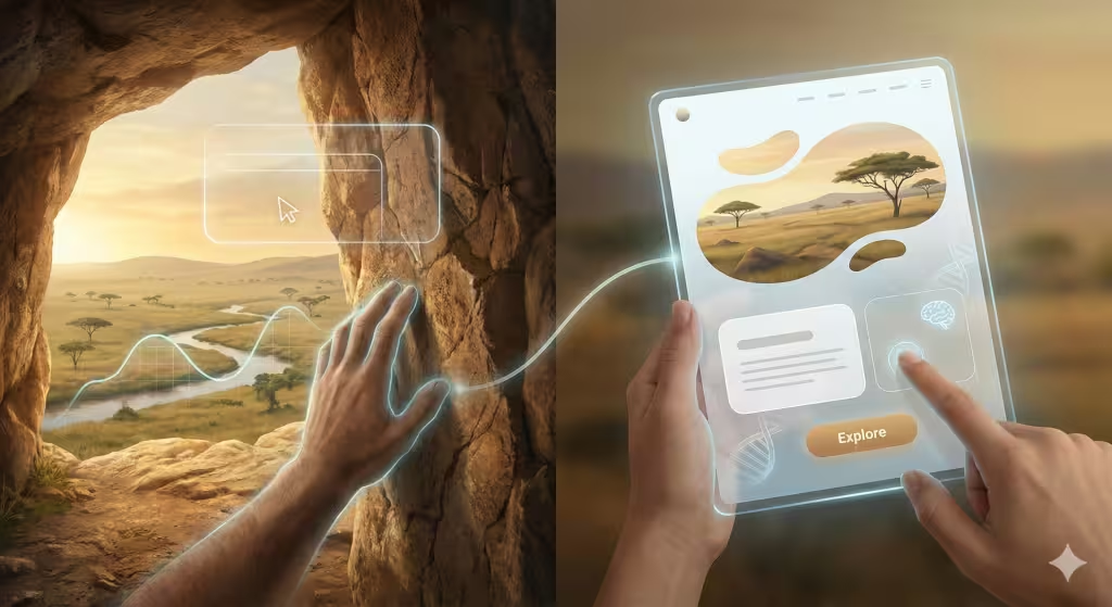
With my background in biology and web design, I look at a website the same way a botanist looks at a forest. It is not just a bunch of code; it is an environment where people spend their time.
Today, we are going to talk about creating mood in design through landscape shapes. Have you ever noticed how you feel different when you are standing on a flat beach versus standing at the foot of a tall, jagged mountain? Nature uses shapes to tell our brains how to feel.
In the design world, we can use these same shapes to help people feel calm, excited, or safe the moment they click on a link. This is a big part of biophilic design, which is just a fancy way of saying “design that loves nature.” By using the shapes we see in the Great Outdoors, we can make the internet feel more like home.
Table of Contents
The Biological Basis of Digital Contours
To understand how to set a mood in design, we have to look back at our ancestors. Thousands of years ago, humans did not have phones or laptops. They had trees, rocks, and caves. Our brains learned to scan the shapes around us to see if we were in danger or if we found a good place to rest.
When we see a soft, rounded shape, our brains relax. We think of fruit, rolling hills, or the curve of a river. These are “safe” shapes. When we see sharp, pointy shapes, our brains wake up. We think of thorns, teeth, or jagged rocks. By putting these landscape shapes into a website, we are talking directly to the oldest part of the human brain. We are creating a specific mood in design that makes a visitor stay longer because they feel like they belong in the space we built for them.
The Psychology of Form: Savannah Theory vs. Prospect-Refuge
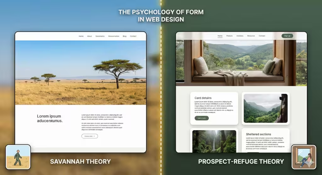
There is a famous idea called the Savannah Hypothesis. It says that humans are happiest in places that look like the African plains where we first evolved. These places have wide-open views with scattered trees. In web design, we recreate this by using plenty of “white space.” If a website is too crowded, it feels like a dark, scary forest. If it is open and uses horizontal landscape shapes, it feels like a peaceful field. This creates a mood in design that is bright and easy to navigate.
Another idea is “Prospect and Refuge.” This means we like to have a good view (prospect) but also feel tucked away and safe (refuge). We can use shapes to do this on a screen. A big, beautiful hero image at the top of a page gives us that wide view. Then, using boxes or “containers” with soft edges for the text makes the reader feel like they are in a safe little nook. Balancing these two helps us master the mood in design.
Rolling Hills: Using Curvilinear Shapes for Calm
Think about the shape of a rolling hill. It is a slow, gentle curve. In the world of art and design, we call these curvilinear shapes. When you use these on a website, you are creating a mood in design that feels very friendly and relaxed.
You can use these shapes in the buttons on a site or in the way one section flows into the next. Instead of a hard, straight line between the top of the page and the bottom, you might use a soft wave. This mimics the horizon of a meadow. It tells the user’s eyes to flow smoothly down the page. This is great for brands that want to seem kind, helpful, or organic.
Jagged Peaks: Angular Shapes for Energy
Sometimes, a calm mood is not what you want. Maybe you want your visitors to feel excited or ready to take action. This is where we look at the shapes of mountains or jagged rocks. These are called angular shapes. They have sharp points and diagonal lines.
Using triangles or slanted sections creates a mood in design that feels fast and powerful. It draws the eye quickly to a specific point, like a “Buy Now” button. Just like a mountain climber feels a rush of energy looking at a peak, a website visitor feels a sense of movement when they see these sharp landscape shapes. It is important not to use too many, though, or the site might start to feel “sharp” or unfriendly.
Water Bodies: Using Fluidity and Blobs
Water is essential for life, so humans are naturally drawn to it. In digital design, we often use something called “organic blobs.” These are shapes that don’t have a perfect circle or square look. They look like a puddle or a lake seen from an airplane.
These fluid shapes help create a mood in design that feels very modern and creative. Because water is always moving, these shapes make a website feel “alive.” They are great for backgrounds because they don’t distract the user, but they add a soft, natural texture that keeps the brain happy.
Practical Application: Implementing Topography in Web Design
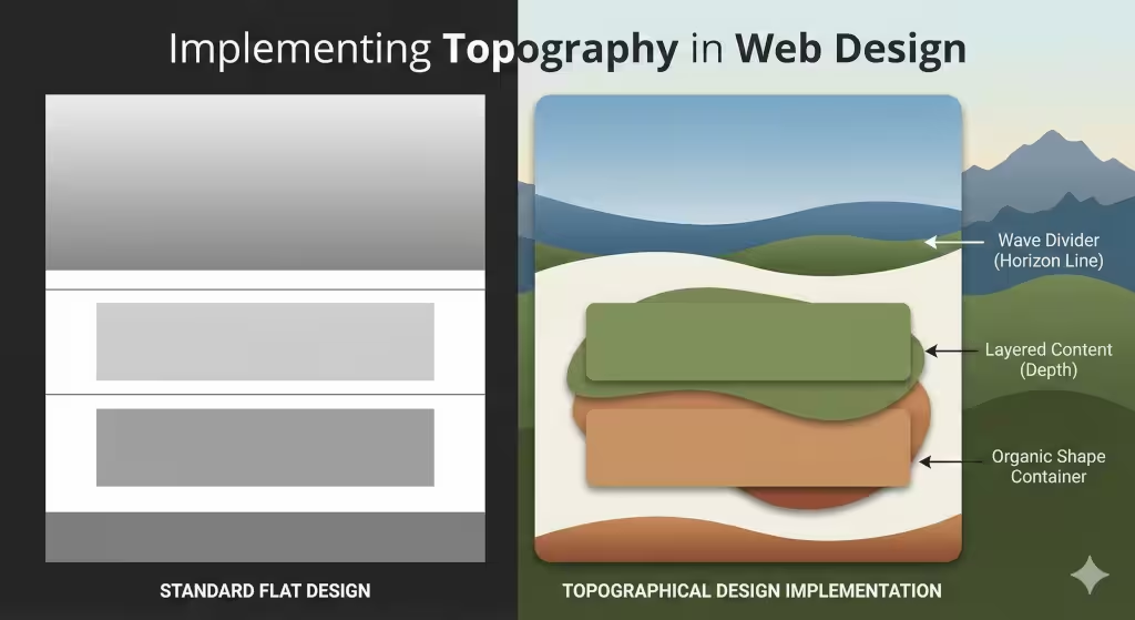
So, how do we actually build these landscape shapes into a site? One way is through section dividers. Most websites use straight lines to separate the “About Us” section from the “Services” section. But if you use a “horizon line” that looks like a distant mountain range, you change the whole vibe.
We also use “layering.” Think about looking at a forest. You see the grass right in front of you, the trees a bit further back, and the blue mountains in the far distance. We can do this on a screen by using shadows and different colors. This creates depth. When a website has depth, it feels like a real place you can walk into. This deepens the mood in design and makes the digital world feel less flat and boring.
Questions about How Do Shapes Affect Our Feelings?
Many people ask how a simple shape can change how they feel. It comes down to “visual metaphors.” When we see a circle, we think of a whole, like the sun or a flower. This makes us feel “complete.” When we see a square, we think of a brick or a wall, which makes us feel “stable.”
Another common question is about the “7 organic shapes.” These are shapes found in nature, like leaves, shells, and clouds. By using these instead of perfect geometric shapes, we make the technology feel more human. This is the secret to a successful mood in design. It bridges the gap between the cold machine and the warm human heart.
Local SEO and Niche Entities in Biophilic Design
It has been noticed that people are starting to look for “natural websites” or “green web design.” They want their online presence to match their physical values.
In places like Burlington, Vermont, people love the mountains. A design with rugged, earthy landscape shapes works very well there. In a city like Boston, people might respond better to shapes that remind them of the ocean or the harbor. Understanding the local “landscape” helps us pick the right shapes to create a mood in design that fits the local culture.
Impact on User Experience and SEO
You might wonder why a biology expert cares about SEO. The truth is, search engines like Google are getting smarter. They can tell if a person likes a website or if they leave right away. If we use landscape shapes to create a comfortable mood in design, people stay longer. They click on more pages.
This tells Google that the website is high-quality. Also, biophilic design usually leads to a cleaner layout. A clean layout loads faster, which is very important for ranking high in search results. By following the rules of nature, we are actually following the best rules for the modern internet.
The Future of Biophilic Interfaces
As we look toward the future, websites are going to look less like spreadsheets and more like gardens. We are moving away from boring boxes and toward the beautiful, flowing landscape shapes that we see when we go for a walk in the woods.
Creating a mood in design is not just about picking a pretty color. It is about understanding who we are as living beings. It is about building a digital world that feels as good as the real one. When we use the shapes of the earth to build our websites, we create a space where people can breathe, explore, and connect.
Key Design Entities and Terms to Remember
- Biomorphism: Designing things to look like living organisms.
- Fractals: Patterns that repeat at different scales, common in trees and clouds.
- Golden Ratio: A mathematical ratio found in nature that humans find beautiful.
- Neuro-aesthetics: The study of how our brains perceive beauty.
How to Use Prospect and Refuge in Your Website
Expanding on the Prospect and Refuge theory is important because it perfectly bridges the gap between our ancient survival instincts and how we browse the internet today. If you want to master the mood in design, you have to understand that humans are essentially “edge-dwellers.” We like to have our backs to a wall while looking out at a wide, open space.
In the digital world, we can recreate this feeling to make a user feel both excited and safe. Here is how we dive deeper into that specific topographic strategy.
Creating the View: The Power of Prospect
In nature, “prospect” is what you feel when you stand on top of a hill. You can see everything coming, both the good things (like food or friends) and the bad things (like storms or predators). When a user first lands on a website, they need a sense of prospect to feel in control.
If a website is too “tight” or zoomed-in, it feels claustrophobic. To create a successful mood in design, we use large, sweeping “hero” sections at the top of the page. This is like the digital version of a mountain lookout. By using wide landscape shapes and open photography, we give the user’s eyes room to breathe. This tells their brain, “You are safe here, and you can see everything you need to see.”
Building the Shelter: The Art of Refuge
While we love a good view, we don’t want to stand out in the open forever. We eventually want to pull back into a “refuge,” a cave, a forest thicket, or a cozy room. In web design, refuge is created through “containers.” These are the boxes, cards, and sections that hold your text and images.
To keep the mood in design feeling natural, these refuge areas shouldn’t feel like cold, metal cages. We use soft corners (border-radius in tech terms) and gentle shadows. This makes the text boxes look like they are slightly lifted off the page, like a comfortable nest. When a user reads your content inside a well-defined “refuge” shape, they feel more focused and less distracted by the “openness” of the rest of the site.
Balancing the Two: The “Edge” Effect
The most interesting part of any landscape is the “edge”—where the forest meets the meadow, or the beach meets the ocean. In design, we create this “edge” by overlapping our landscape shapes.
Imagine a website where a soft, organic “blob” shape (the refuge) partially sits over a wide, high-definition photo of a forest (the prospect). This overlap creates a very sophisticated mood in design. It tells the user they have the best of both worlds: they have the big-picture information, but they also have a specific, safe place to focus their attention. This balance is what keeps people from feeling overwhelmed by too much information.
How Landscape Shapes Reduce “Bounce Rates”
Anybody who works in SEO, talks a lot about “bounce rates,” that’s when someone leaves a site almost immediately. Often, people leave because the mood in design feels “sharp” or confusing. If a site uses too many jagged landscape shapes without enough open space, the user’s brain goes into a minor “fight or flight” mode. It feels like walking through a thorny bush.
By using the Prospect and Refuge balance, we lower the “cognitive load.” This is a technical way of saying we make it easier for the brain to think. When the brain doesn’t have to work so hard to figure out where it is, it stays longer. That is the biological secret to a successful website.
Using Color to Enhance Landscape Shapes
Shapes are the bones of a design, but color is the skin. To truly nail the mood in design, the colors must match the shapes. For “prospect” areas, we use light, airy colors like sky blues, pale yellows, or soft whites. These colors help the landscape shapes feel even bigger and more open.
For “refuge” areas, we might use slightly darker or “earthier” tones, like deep forest greens, slate grays, or warm browns. This makes the “shelter” parts of the website feel solid and grounded. When you combine a “hill” shape with a grassy green color, you aren’t just making a button; you are making a psychological connection to the earth.
The Role of Movement and Flow
In a real landscape, nothing is ever truly still. Leaves rustle, water flows, and clouds move. We can bring this into the digital mood in design using “micro-animations.”
If a user hovers their mouse over a curvilinear shape and it moves slightly, like a leaf in the wind, it creates a sense of “life.” This is part of what we call Biomorphic Design. It makes the technology feel less like a dead machine and more like a living partner. However, we have to be careful; too much movement is like a windstorm, and it ruins the peaceful mood in design we worked so hard to build.
Why the Eighth-Grade Level Matters for Design
I often write at a simpler level because nature itself is simple. You don’t need a Ph.D. to know that a soft bed of moss feels better than a pile of broken glass. Great design should be the same way. The mood in design should be so clear that anyone can feel it instantly, regardless of their education or background.
When we use landscape shapes, we are using a universal language. A circle means the same thing to someone in Boston as it does to someone in a small village halfway across the world. By keeping our designs “natural,” we make them accessible to everyone.
Putting it All Together
When we look at a website through the lens of a biologist, we see more than just pixels. We see a habitat. By using mood in design strategies like:
- Prospect: Giving users a wide view and a sense of control.
- Refuge: Providing safe, enclosed spaces for reading and interaction.
- Landscape Shapes: Using the geometry of the earth to guide emotions.
We create digital spaces that don’t just “work,” they “thrive.” This is the core mission of Silphium Design LLC. We believe that the more we look to the hills, the mountains, and the rivers, the better our digital future will be.