
Table of Contents
The Trailhead Friction: Why Desktop-Centric Nursery Sites Fail in the Field
Field botanists, ecological restoration volunteers, and Master Naturalists spend hundreds of hours every year walking trails, exploring wetlands, and surveying regional forests. While standing among the trees or scanning a prairie restoration plot, these workers look closely at the plant life in front of them. When they spot a thriving native population, they take out their smartphones right away. They check botanical identities, record observations, and immediately try to find out if local nurseries have those specific native plants in stock.
These active naturalists want to connect what they observe in the wild with commercial stock they can buy for upcoming habitat projects. They are eager to support local biodiversity, and they have project budgets ready to spend.
When these dedicated volunteers pull out their phones on the trail, they face an unexpected digital wall that can be solved with mobile-first nature. Most native plant nursery websites were built on desktop computers, for desktop computers, and tested only on high-speed office fiber networks. When a field researcher opens one of these pages out in the woods, the site breaks down. Heavy code, uncompressed images, and clunky layouts choke on weak cell service. The mobile visitor stares at an endless loading animation while the phone drains its battery trying to download scripts that should never have been sent to a handheld device. Instead of helping users quickly, the page stalls out entirely.
The technical failure points are obvious to anyone who works outdoors. Nursery websites often feature massive, uncompressed photo galleries where a single picture file weighs five to ten megabytes. That size will bring a low-bandwidth cellular connection to a dead halt.
Even worse, many growers publish their plant availability only as a downloadable PDF file. Out in the elements, a field volunteer has to wait minutes for a huge PDF to open. Once it opens, they must pinch, zoom, and pan across hundreds of tiny rows of text just to see if a certain sedge or milkweed is in stock. If they need to check another species, they have to repeat the entire awkward routine. On top of that, standard desktop navigation menus use hover interactions and micro-sized submenus that misfire on small touchscreens.
These technical flaws lead directly to severe commercial losses for native plant nurseries. When a field ecologist cannot load an inventory page or quickly check a plant list on a smartphone, they close the tab. That single abandoned visit represents a lost wholesale contract or a missed retail sale.
Volunteers who want to purchase regional plants for school gardens, park restorations, or backyard wildlife corridors simply give up. Nurseries lose valuable revenue, and the broader regional ecosystem loses out on getting more native plants into the ground. Adopting mobile-first nature design principles removes these digital hurdles. By shaping web pages specifically for handheld tools and outdoor field conditions, growers can turn casual trail lookups into confirmed plant orders.
Field-First Ergonomics: Designing for Dirt, Glare, and Gloves
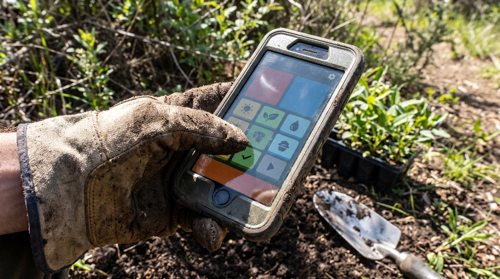
Modern website design often assumes that visitors sit indoors in climate-controlled rooms with steady overhead lighting and both hands free to type. That assumption completely falls apart the moment someone steps onto a trail. When you build for mobile-first nature contexts, you must understand the real physical environment of field work. A volunteer may stand in the middle of an open meadow under the midday sun. Their hands might be coated in damp soil from planting plugs, or covered by thick leather work gloves. They might hold a clipboard, a GPS unit, or a ten-power hand lens in one hand while trying to operate their smartphone with the other.
Every interface choice must account for bright ambient light, harsh shadows, dirty fingers, and variable field weather. If an interface fails to function smoothly under these rugged conditions, field workers will stop using it. Creating a truly field-ready tool requires thoughtful attention to the physical realities of the outdoors, starting with screen legibility and tactile accessibility.
Direct Sunlight Contrast and Optical Legibility
Direct sunlight washes out digital displays. When sunlight hits a smartphone screen outdoors, screen brightness drops sharply, and fine visual contrast disappears. Standard web design often uses soft gray text, light green borders, and subtle pastel badges to convey an earthy, organic brand feel. While those delicate design choices may look refined on a desktop monitor in an office, they become unreadable on a sunny hillside.
To solve this problem, mobile-first nature layouts require the highest possible contrast standards. Web designers should follow the Web Content Accessibility Guidelines 2.2 AAA standard, aiming for a contrast ratio of at least 7 to 1 between text and its background. Vital plant information must be set in clear, high-contrast type. Scientific binomials, light requirements, moisture needs, and live inventory numbers should never use faint gray or light pastel fonts. They need rich black text on pure white cards or bright white text on deep charcoal backgrounds.
+---------------------------------------------------------+
| [ High Sun Mode ]                     [ Deep Canopy ]   |
|                                                         |
|  Asclepias tuberosa                                     |
|  Butterfly Weed                                         |
|                                                         |
|  SUN: Full Sun (>6 hrs)       MOISTURE: Dry to Medium   |
|  SOIL: Well-Drained           STATUS: 348 Plugs Ready   |
|                                                         |
|  [ + ADD 50 PLUGS TO FIELD LIST ]                       |
+---------------------------------------------------------+
Display controls should also include simple, fast-action viewing modes. A dedicated high-contrast sunlight toggle allows a user to instantly strip out all background gradients and switch the interface to a stark, high-visibility layout with a single tap. Similarly, an outdoor contrast setting helps field workers transition smoothly between bright meadow sunlight and the dim shade of an old-growth forest canopy without squinting or straining their eyes.
Physical Touch Ergonomics
Operating a smartphone with one hand requires larger, well-placed interactive elements. When a volunteer holds a field specimen or a trowel in their non-dominant hand, they must navigate the entire nursery website using only their thumb. If buttons and interactive links are tiny or clustered too close together, the user repeatedly misclicks, causing frustration and wasted time.
Touch targets across all mobile-first nature interfaces must measure at least forty-eight pixels tall and forty-eight pixels wide. Spacing between interactive components should be generous, preventing accidental taps on neighboring links. Furthermore, all primary navigation elements, search inputs, and filter triggers should sit within the natural sweep of a user’s thumb along the lower third of the display.
+---------------------------------------------------------+
|                                                         |
|                    SCREEN DISPLAY                       |
|                                                         |
|  [Hard-to-Reach Zone: Informational Details Only]       |
|                                                         |
|                                                         |
|  -----------------------------------------------------  |
|  [Natural Thumb Arc: Interactive Touch Targets]        |
|                                                         |
|  [ Filter Species ]                  [ View Inventory ] |
|                                                         |
+---------------------------------------------------------+
Drop-down menus that require steady hands and precise finger tracking must be completely eliminated. Instead, mobile-first nature layouts rely on broad, tappable filter pills that toggle on or off with a clear, firm tap. When a field worker wearing garden gloves taps a filter for full sun or sandy soil, the button should provide clear visual feedback instantly. This tactile visual response confirms the selection without requiring the user to take off their gloves or repeatedly press the glass.
Technical Architecture: Speed and Offline Resilience
Field botany and ecological surveys rarely take place near strong cell towers. Volunteers frequently work in deep stream valleys, remote state forests, wildlife reserves, and rural agricultural areas where wireless reception drops down to a single fragile bar of signal, or disappears completely. If a website requires a continuous, high-speed internet connection just to load its basic interface, it is useless in these remote landscapes.
Building a true mobile-first nature platform requires an advanced technical architecture designed to handle unreliable data connections. The website must be engineered from the ground up to operate smoothly even when the network connection stutters or drops out entirely.
Progressive Web App Capabilities and Service Workers
The most effective way to protect mobile-first nature websites against poor cell service is to build them as Progressive Web Apps, or PWAs. A Progressive Web App allows a regular website to function like an installed mobile application directly inside any smartphone web browser. This setup gives the site direct access to modern browser storage and background computing capabilities.
At the core of this system is a script called a service worker. The service worker runs in the background of the browser, completely independent of the web page itself. When a user first visits the nursery website while connected to home Wi-Fi or strong urban cell service, the service worker automatically downloads and saves the essential site files. This saved data includes the site style sheets, core layout code, navigation buttons, and a compressed local database of the nursery’s plant inventory.
[ Smartphone Browser ]
        |
        v
[ Service Worker Cache Manager ]
        |
   +----+-------------------------+
   | (Has Signal)                 | (No Signal / Remote Field)
   v                              v
[ Live Nursery Server ]    [ Local Device Storage Cache ]
   |                              |
   +------------+-----------------+
                |
                v
   [ Fast, Unbroken Field Display ]
When that same user walks deep into a forested wetland where there is zero cellular service, the site continues to work without interruption. Instead of reaching out to a distant server across the dead cellular network, the browser loads the necessary files and plant records directly from the phone’s internal storage. The volunteer can search through species records, verify botanical details, and check standard container sizes without seeing a connection error screen.
Background data synchronization takes this capability one step further. When an ecological worker flags three species of native ferns they need for an upcoming wetland planting project, they can tap a button to save those plants to a field requisition list. Even though the smartphone has no internet signal, the service worker saves that action locally on the device. The moment the user drives back into an area with cellular data, the service worker automatically sends that saved request to the nursery server. This automation works smoothly in the background, without requiring the user to reload the page or re-enter their plant selections.
Lightweight Asset Pipelines
Loading speed depends heavily on managing file sizes. Traditional websites often deliver bloated, multi-layered code libraries and giant raw images that overwhelm mobile processors and weak rural data networks. To deliver reliable mobile-first nature performance, every single byte of data sent over the airwaves must be carefully optimized.
Modern image formats like WebP and AVIF provide dramatic improvements in compression efficiency over older JPEG and PNG files. By adopting these modern formats, nurseries can cut the file size of a high-resolution plant photograph by sixty to eighty percent without any noticeable loss in visual clarity. Botanical details like leaf veining, flower structure, and root systems remain crisp and sharp, but the picture loads in a fraction of a second.
Image Format Size Comparison (Average Botanical Specimen Photo)
+---------------------------------------------------------+
| Legacy PNG File:  4.2 MB                                |
| Legacy JPEG File: 1.8 MB                                |
| Optimized WebP:   380 KB                                |
| Modern AVIF:      210 KB                                |
+---------------------------------------------------------+
Furthermore, images should be served dynamically based on the exact screen size of the device making the request. A smartphone with a narrow viewport should never be forced to download a four-thousand-pixel image intended for a wide desktop monitor. Clean, mobile-first nature code uses responsive picture elements to deliver the exact image dimensions needed for the user’s specific screen.
Beyond visual assets, the website’s underlying code must be kept lean and clean. Heavy, unnecessary JavaScript libraries and bloated external scripts must be pruned away. By relying on native browser capabilities and clean modern CSS, the site can render its content almost instantaneously. This disciplined approach ensures that the Largest Contentful Paint, the metric that tracks when the main content of a page becomes visible, occurs in less than 1.2 seconds, even across a sluggish 3G or low-tier 4G mobile network.
Botanical Data Architecture: Mobile-Optimized Plant Finding
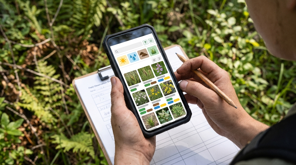
The way a nursery organizes its botanical data determines whether field workers can find what they need or give up in frustration. Traditional plant websites arrange inventory like a standard clothing store, dividing products into broad buckets like perennials, shrubs, and trees. While that simple setup works for casual suburban flower shoppers, it fails the practical needs of ecological restoration teams, native plant growers, and field volunteers.
Volunteers and conservation professionals evaluate plants based on ecological functionality and regional environmental tolerances. To serve these users, a mobile-first nature website must treat botanical information as a rich, structured database, presenting complex scientific facts in clear, bite-sized components on a smartphone screen.
Faceted Taxonomic Filtering Built for Handhelds
Field naturalists classify planting sites according to specific ecological requirements. When an ecologist inspects a degraded retention basin or a dry hillside, they already know the precise environmental conditions of the soil. They need to find native species that match those exact site characteristics immediately.
A mobile-first nature platform organizes plant data using faceted search filters tied to practical ecological categories:
- Soil Moisture Gradients: Ranging cleanly from hydric (wet, saturated soils) through mesic (average garden moisture) to xeric (bone-dry, rocky soils).
- Sunlight Exposure: Broken down by full sun, partial shade, and deep forest canopy cover.
- Wetland Indicator Status: Displaying official codes from the United States Army Corps of Engineers, such as Obligate Wetland, Facultative Wetland, and Upland species.
- Ecological Associations: Identifying specific larval host relationships, such as native milkweeds supporting monarch butterflies or spicebush supporting spicebush swallowtails.
- Ecoregion and Provenance: Indicating the exact geographic origin of the seed or parent stock to guarantee local adaptation and genetic fitness.
+---------------------------------------------------------+
| [Filter Plants]  (3 active filters)                     |
|                                                         |
|  [x] Obligate Wetland (OBL)  [x] Full Sun  [x] Plugs    |
|                                                         |
|  Matching Species (14 Found):                           |
|                                                         |
|  Carex stricta (Tussock Sedge)                          |
|  Qty: 450 Plugs | Seed Source: Blue Ridge Ecotype       |
|                                                         |
|  Iris versicolor (Blue Flag Iris)                       |
|  Qty: 180 Quarts | Seed Source: Ridge and Valley        |
+---------------------------------------------------------+
On a compact mobile screen, these extensive taxonomic filters must be fast and easy to adjust. Field researchers need instant search systems that match both scientific Latin binomials and common regional names without reloading the entire page. If a volunteer begins typing Asclepias into the search box, the mobile-first nature interface should show matching local milkweed species instantly, keeping the focus on finding the right plant without unnecessary scrolling or delays.
Replacing Static Inventory PDFs with Interactive Tables
One of the most persistent problems on modern nursery websites is the weekly availability PDF sheet. Nurseries prefer these files because their office managers can export a spreadsheet directly into a PDF with one click. However, for a volunteer or landscape contractor standing in a field, reading a static PDF on a mobile phone is a terrible experience.
PDF files lock data away in fixed, rigid grids. The text is too tiny to read without zooming, columns run off the edges of the screen, and the document cannot connect directly to an online shopping cart or quote builder. If a field buyer finds an item they want, they usually have to leave the PDF, switch to an email app or telephone dialer, and manually type out the items and quantities they wish to order.
Traditional PDF Workflow vs. Mobile-First Nature Workflow

Static PDF Workflow (Broken, Slow):
[ Export Excel to PDF ] -> [ Upload File to Web ] -> [ User Downloads Large PDF ]
       -> [ Frustrating Pinch and Zoom ] -> [ Separate Phone Call or Email to Order ]

Mobile-First Nature Live Workflow (Fast, Connected):
[ Live Database Sync ] -> [ Responsive Handheld Grid ] -> [ Instant Field Filter ]
       -> [ One-Tap Add to Requisition ] -> [ Direct Confirmation Sent to Nursery ]
A well-designed mobile-first nature platform replaces static PDF files with responsive, interactive data tables created specifically for mobile displays. Instead of showing twenty columns at once, the mobile table displays the vital details first: scientific name, common name, container size, unit price, and current stock count. The user can tap any row to expand it, revealing additional information like regional seed source, root depth, and specific soil tolerances.
Most importantly, every row in an interactive mobile-first nature table includes an immediate action button. A project leader standing on a muddy restoration site can tap a single button to add one hundred sedge plugs directly into a project order list. They do not have to copy and paste text or write down catalog numbers on scrap paper. The live inventory data connects directly to the nursery’s ordering system, cutting out hours of manual data entry and speeding up project timelines.
The Commercial Conversion Bridge: From Volunteer Observation to Nursery Revenue
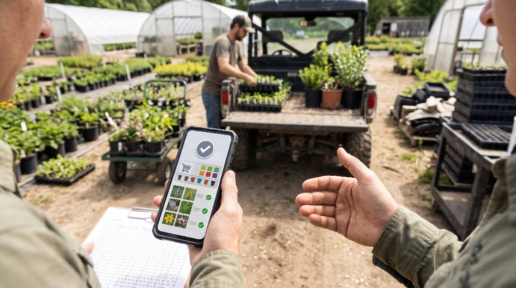
Volunteers and citizen scientists do not study nature in an economic vacuum. The people who spend their weekends identifying wildflowers, tracking pollinators, and restoring community parks are often the very same people who influence major plant purchases. They serve on church property committees, advise municipal shade tree commissions, run corporate green teams, or manage their own home landscaping projects. When a nursery supports these field volunteers with accessible digital tools, it builds an immediate bridge to profitable sales.
Every field identification is an opportunity to generate revenue. When a user looks up an ecological plant community on their phone, they are actively showing high interest in those exact plants. A mobile-first nature website helps nurseries turn that trailside interest into actual plant sales through thoughtful, supportive features.
Connecting Citizen Science to Habitat Restoration Purchases
Millions of nature enthusiasts use platforms like iNaturalist and Seek every day to identify wild plants and animals. When a volunteer snaps a photo of a native aster or goldenrod blooming along a woodland border, they often ask themselves a simple question: Where can I buy this plant for my own garden or our local park restoration?
A forward-thinking nursery website uses mobile-first nature principles to close the gap between identification and purchase. By offering lightweight, mobile-friendly regional plant guides, the nursery attracts search traffic from users who are researching wild plants out on the trail. When a user reads about a specific native perennial, the page should clearly display live nursery availability for that exact species.
+---------------------------------------------------------+
|  BOTANICAL FIELD GUIDE                                  |
|                                                         |
|  Symphyotrichum novae-angliae                           |
|  New England Aster                                      |
|                                                         |
|  * High pollinator value for late-season bumblebees.    |
|  * Essential host plant for Pearl Crescent larvae.      |
|                                                         |
|  -----------------------------------------------------  |
|  NURSERY PROPAGATION STATUS                             |
|                                                         |
|  [ In Stock Now: 210 Gallons - $11.00 each ]            |
|  [ Local Ecotype: Allegheny Plateau Provenance ]        |
|                                                         |
|  [ RESERVE PLANTS FOR WEEKEND PICKUP ]                  |
+---------------------------------------------------------+
Even when a sought-after plant is temporarily out of stock, the site can still capture a valuable sales lead. Instead of showing a dead-end out-of-stock message, a mobile-first nature interface presents a quick notification form: “Notify me when this local ecotype is available.” The field researcher enters their email address with two taps, and the nursery secures a qualified, eager customer for their next batch of plugs.
B2B Field Ordering for Restoration Crews
While retail sales from individual plant enthusiasts provide steady revenue, wholesale contracts with professional restoration crews, environmental engineering firms, and municipal agencies drive large-scale volume for native plant nurseries. These commercial buyers spend much of their working time out in the field inspecting project sites, calculating square footage, and checking soil quality.
When an environmental contractor calculates that a retention basin needs eight hundred native grass plugs and three hundred wetland shrubs, they want to secure those plants right away, while standing on the site. If the nursery makes them wait until they return to their office to submit a formal request for quote, that contractor may buy from a competing grower instead.
+---------------------------------------------------------+
|  WHOLESALE FIELD PORTAL                                 |
|                                                         |
|  Project: Mill Creek Bank Stabilization                 |
|  Client: Watershed Conservation District                |
|                                                         |
|  Active Spec List:                                      |
|  - Cornus amomum (Silky Dogwood) - 150 (3-Gal)          |
|  - Carex vulpinoidea (Fox Sedge) - 600 Plugs            |
|                                                         |
|  Calculated Subtotal: $3,425.00                         |
|                                                         |
|  [ SUBMIT SPEC FOR HOLD (48-HR ESTIMATE GUARANTEE) ]    |
+---------------------------------------------------------+
A streamlined, mobile-first nature wholesale portal allows verified trade partners to log in with a single tap, check wholesale pricing tiers, and hold batches of container stock directly from their phones. By making it easy for busy contractors to reserve plants from the field, the nursery locks in commercial orders before competitors even know the project exists.
Engineering the Ecosystem: The Silphium Design Solution
Creating an effective, resilient website for native plant nurseries requires deep expertise in two very different fields: complex botanical science and advanced digital web engineering. Most traditional web design agencies build generic websites for standard retail stores or corporate offices. They treat native plants like ordinary factory-made commodities, relying on bloated page templates, heavy graphics, and cookie-cutter e-commerce platforms that fail in the field.
A standard retail agency does not understand why genetic provenance matters to a restoration ecologist. They do not know the difference between an obligate wetland sedge and an upland grass, and they do not design interfaces to withstand bright outdoor sunlight or weak rural cell connections. When a native plant nursery hires an ordinary web agency, they usually end up with a visually busy desktop site that leaves outdoor workers frustrated and fails to drive revenue.
Why Generic Web Agencies Fail Native Plant Nurseries

Generic Agency Approach:
- Large, slow e-commerce templates built for indoor desktop shoppers.
- Unstructured product listings that treat native plants like manufactured retail items.
- Bloated page designs that crash on weak rural cellular towers.
- Rigid, hard-to-read PDF availability lists that make field ordering difficult.

Silphium Design Approach:
- Lightweight, custom Progressive Web Apps engineered specifically for field use.
- Precise botanical data architecture matching scientific standards and ecological requirements.
- High-contrast, sun-readable interfaces built for one-handed outdoor operation.
- Live, responsive inventory systems that convert field lookups into direct nursery sales.
Silphium Design bridges this gap. By combining rigorous botanical taxonomy with modern, mobile-first nature web architecture, Silphium Design builds websites specifically for the native plant industry, conservation organizations, and ecological restoration professionals. Every digital platform is engineered from the ground up to handle the unique physical demands of field work, using high-contrast typography, lightweight code, offline database caching, and intuitive thumb-driven navigation.
Our systems eliminate the bottlenecks that cost nurseries money. We replace static, frustrating PDF availability sheets with live, searchable inventory catalogs that load instantly, even on weak rural networks. We build custom wholesale portals that allow commercial contractors to reserve project quantities from the field with a few taps. By aligning digital performance with the real-world habits of field naturalists and restoration crews, we turn nursery websites into reliable lead-generation engines.
If your nursery website struggles to perform out on the trail, it is costing you plant sales and commercial orders every day. Visit Silphium Design
to schedule a comprehensive Mobile Botanical UX and Performance Audit. Our team will evaluate your site’s load speeds in low-coverage zones, audit your plant taxonomy structure, and show you how mobile-first nature architecture can turn trailside lookups into direct nursery revenue.