
Table of Contents
The Biophilic Intersection of Botanical Imagery and Geometric Proportion
When you walk through an arboretum, your eyes take in an enormous amount of information without feeling exhausted. A fern unfurls its fronds. A sunflower packs hundreds of florets into its center. A pinecone turns in quiet spirals. Plants do not grow by pure chance. They build themselves using strict geometric formulas. These growth patterns let them catch the most sunlight, shed heavy raindrops, and survive harsh weather.
As a garden photographer, you capture these exact patterns through your lens. You spend hours waiting for the right dawn mist to hit an open blossom. You adjust your aperture to isolate the fine hairs on a stem. Yet, when it comes time to build an online gallery, many photographers drop their work into standard, boxy websites.
A standard website gallery often treats every photograph like a flat file in a plastic filing cabinet. Standard square grids chop your visual flow into stiff segments. They ignore the natural movement that makes plant life compelling to human eyes. When people look at living plants, their brains light up with a sense of calm focus. In the design world, we call this natural affinity biophilia. Biophilic design shows us that humans work best when their surroundings echo the organic patterns of nature.
This is where mathematical proportion comes into play. The golden ratio, represented by the Greek letter Phi, is roughly equal to 1.618. This number is not an arbitrary human invention. It is the mathematical bridge that connects plant biology to visual balance.
In nature, we see this number everywhere. A plant sprouts leaves around a central stem in a spiral pattern called phyllotaxis. By turning by a golden angle of about 137.5 degrees between each new sprout, the plant ensures that higher leaves do not block the sun from lower leaves. The Fibonacci sequence, where each number is the sum of the two preceding numbers (1, 1, 2, 3, 5, 8, 13, and so on), mirrors this ratio as the numbers grow larger.
When you display your photographs using a golden ratio portfolio theme, you bring the mathematics of plant life directly to the web screen. A golden ratio portfolio theme creates neurological visual fluency. This means the human brain can read, process, and enjoy the website layout with less mental fatigue. The viewer’s eyes glide across your gallery following the same curves and proportions found inside the flowers you photograph. Choosing an intentional golden ratio portfolio theme transforms a simple portfolio into an organic extension of your botanical work.
What Makes a Theme Truly “Golden Ratio”? (The Technical Mechanics)

Many website templates claim to use sacred geometry, but they often use the terms as decorative buzzwords. A true golden ratio portfolio theme is built on rigorous structural mathematics. To find a layout that actually honors these proportions, you need to understand the underlying mechanical blueprint.
The Phi Grid vs. Rule of Thirds
Most photographers learn the rule of thirds early in their training. You draw two horizontal lines and two vertical lines across your viewfinder, dividing the frame into nine equal rectangles with a 1:1:1 split. It is a helpful, quick guide for framing a shot in the field. However, the rule of thirds is only a rough approximation of natural balance.
A true golden ratio portfolio theme relies on the Phi Grid. Instead of dividing space equally, the Phi Grid breaks the screen into sections that follow the ratio of 1 to 0.618 to 1. The center column or row becomes slightly narrower than the outer sections. This subtle shift pulls the composition inward, mirroring the way human binocular vision naturally concentrates on a focal core. In a botanical gallery, this setup allows your main showcase image to command attention without overwhelming the supporting shots.
Rule of Thirds Grid:
+----------+----------+----------+
|  1.0     |  1.0     |  1.0     |
+----------+----------+----------+

Phi Grid:
+----------+----------+----------+
|  1.0     |  0.618   |  1.0     |
+----------+----------+----------+
Modular Scale Typography
Text and photography must live together on a webpage. When the text sizing is chosen at random, the overall layout feels uneven. A well engineered golden ratio portfolio theme uses a modular typographic scale based on 1.618.
To build this scale, the web designer picks a base font size for the paragraph body text, such as 16 pixels. Every other text size is calculated by multiplying or dividing that base by 1.618:
- Small caption text: 16 divided by 1.618 = approximately 10 pixels
- Body text: 16 pixels
- Subheadings (H3): 16 multiplied by 1.618 = approximately 26 pixels
- Section titles (H2): 26 multiplied by 1.618 = approximately 42 pixels
- Main page titles (H1): 42 multiplied by 1.618 = approximately 68 pixels
This geometric progression removes visual friction. When visitors read the Latin name of a perennial below your photograph, the size of that caption feels related to the heading above it. The proportional type hierarchy lets the images stay center stage while keeping written descriptions easy to read.
Golden Spiral Layouts for Asymmetrical Galleries
Symmetry can be clean, but pure symmetry rarely appears in wild gardens. A garden grows in controlled asymmetry. Plants balance each other out through contrasting textures, heights, and volumes rather than identical mirror shapes.
A golden ratio portfolio theme uses the golden spiral to organize asymmetrical gallery walls. Imagine a series of connected squares whose widths match the Fibonacci numbers: 1, 1, 2, 3, 5, 8, and 13. When you draw an arc through the corners of these squares, you get a logarithmic spiral. In web design, this spiral controls the size and placement of image thumbnails. A large hero shot occupies the largest block, while medium and smaller detail shots tuck neatly along the curve of the spiral. The user’s eye naturally enters at the largest focal image and sweeps comfortably across the smaller botanical close-ups.
Biophilic Spatial Ratios
Empty space on a webpage is just as important as the images. In design, we call this negative space or white space. Without enough white space, an image gallery feels like an overgrown, weed-choked flowerbed where nothing has room to breathe.
A properly coded golden ratio portfolio theme balances content against negative space using the 61.8% to 38.2% distribution rule. If a gallery section spans the full width of the screen, the visual content might take up 61.8% of the area, leaving 38.2% open for margins, padding, and subtle breathers. This specific balance prevents sensory overload. It gives the visitor space to pause, reflect, and appreciate the color grading of each garden shot.
| Design Element | Standard Website Approach | Golden Ratio Portfolio Theme Approach |
| Grid Division | Equal 1:1:1 split (Rule of Thirds) | 1 : 0.618 : 1 dynamic division (Phi Grid) |
| Typographic Scale | Arbitrary sizes (14px, 18px, 24px, 32px) | Proportional steps scaled by 1.618 |
| Thumbnail Flow | Uniform, square-cropped blocks | Fibonacci-based asymmetrical blocks |
| Negative Space | Random padding or cramped borders | Balanced 61.8% to 38.2% spatial margins |
Top Golden Ratio Portfolio Themes for Garden Photographers by CMS
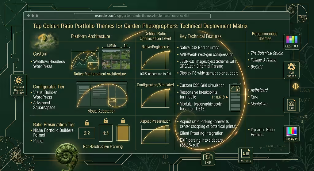
Finding the right platform and template requires looking past superficial demos to inspect the underlying code. Let us review the primary platforms and templates that deliver a genuine golden ratio portfolio theme experience for horticultural artists.
WordPress (Self-Hosted)
Self-hosted WordPress remains a top choice for photographers who need total ownership of their files and search engine data. Because WordPress supports custom CSS grids and block themes, it offers deep mathematical precision.
1. Frost and Ollie (Custom Block Theme)
Frost and Ollie can be built from the ground up for botanical artists. Instead of using heavy, bloated visual page builders, it uses native WordPress blocks wired directly to a CSS Grid calculated on Phi.
- The Layout: The primary showcase uses a dynamic two-column split where the main landscape image spans 61.8% of the viewport width, while an accompanying vertical macro shot and the plant field notes occupy the remaining 38.2%.
- Performance: It does not load external JavaScript libraries to calculate its layout. Everything is handled by lean, modern CSS. This keeps the initial page load fast, which is critical for retaining visitors who browse on mobile devices.
- Botanical Features: The theme includes native field inputs for plant hardiness zones, blooming seasons, and geographic coordinates, rendering them in a clean, proportioned side panel.
2. GeneratePress Premium Theme
A GeneratePress Theme that has 8/5/3/ column spans approaches gallery design through the lens of algorithmic growth. It is an ideal golden ratio portfolio theme for photographers who document formal estate gardens, topiary art, and historic arboretums.
- The Layout: The theme features an automated Fibonacci masonry wall. As you upload new garden plates, the theme arranges them into an asymmetrical spiral. You can mark specific captures as anchors, and the theme assigns them the primary 1.618 sizing blocks automatically.
- Color Processing: BioGrid includes an automated script that scans your uploaded garden images, extracts the dominant leaf and petal colors, and subtly shifts the website background tint to an earth tone that matches the photo set.
- Technical Build: It includes built-in structured schema for creative works, making it simple for search engines to index your botanical image library accurately.
Squarespace
Squarespace is favored by many creative professionals for its visual polish and reliable hosting. While its default Fluid Engine uses an open grid, several templates can be configured to act as a golden ratio portfolio theme.
1. Kuro (Configured for Golden Section Layouts)
The Kuro template family is designed for artists who value stark, quiet elegance. While out of the box it looks like a minimal black-and-white gallery, its underlying spacing controls allow for exact mathematical adjustments.
- The Layout: By setting your site margins to 6.18% and using custom code blocks with fractional widths, Kuro creates an expansive showcase for high-resolution garden landscapes.
- Horizontal Scrolling: Kuro features a horizontal gallery strip that moves sideways as the user scrolls down. By setting the image widths to alternate between 100vw divided by 1.618 and 100vw divided by 2.618, you create an undulating rhythm that mirrors a visitor walking down a winding garden path.
- Ease of Use: Squarespace handles all server maintenance, image delivery networks, and security updates, which lets you focus on plant photography rather than software patches.
2. Montclaire (Custom Portfolio Adjustment)
Montclaire offers wide editorial layouts that work well for botanical storytellers who pair image series with essays on conservation and horticulture.
- The Layout: The main project pages use an asymmetrical two-column format. The text narrative runs down the left rail at 38.2% width, while your photographic plates scroll down the right rail at 61.8% width.
- Visual Balance: This proportion keeps the visitor anchored. The text never feels uncomfortably wide to read, and your photographs have enough space to show off fine details like dew drops on petals and leaf veins.
Webflow
For complete control over web mechanics, Webflow stands alone. It lets you write visual CSS code directly in your browser.
The Botanical Studio Template
The Botanical Studio is an advanced web template built specifically around mathematical ratios and fractional units.
- The Layout: Instead of using fixed pixel widths, the layout uses CSS fractional units set to
1.618frand1fr. This means that no matter what screen size your visitor uses, whether an ultrawide desktop monitor or a compact smartphone, the relationship between your primary garden image and secondary elements never breaks. - Interactive Viewport Scaling: As the user moves their cursor over a macro image of a flower, the canvas responds by subtly zooming along a golden spiral curve. This draws the eye straight into the reproductive structures of the plant, such as the stamens and pistils.
- Clean Code: Webflow produces clean, W3C-compliant semantic HTML code. Search engine crawlers can index every botanical photo, heading, and descriptive paragraph without getting caught in messy scripts.
Format and Pixpa
Format and Pixpa are dedicated portfolio builders created specifically for working photographers. They emphasize aspect ratio protection and easy client proofing.
Dynamic Ratio Presets on Format and Pixpa
Both platforms offer dedicated themes with ratio-locking features that are essential for fine-art botanical prints.
- Aspect Ratio Protection: A common problem with generic website themes is that they crop images to fit rigid squares. If you shoot a sweeping garden vista in 3:2 or a towering delphinium in 4:5, automatic cropping ruins your careful composition. These specialized themes let you lock the display container to golden proportions without cutting off the edges of your frames.
- Client Proofing Integration: If you photograph public botanical gardens, commercial nurseries, or private estates, these themes include password-protected client galleries. The client proofing area uses the same refined golden ratio portfolio theme layout as your public front page, maintaining your professional look from pitch to delivery.
+--------------------------------------------------------------------------+
|                     TYPICAL 38.2% / 61.8% THEME LAYOUT                   |
+------------------------------------+-------------------------------------+
|  38.2% Column:                     |  61.8% Column:                      |
|  - Botanical Field Notes           |  - Hero Garden Plate                |
|  - Latin Nomenclature              |  - High-Resolution Display          |
|  - Exposure Data (EXIF)            |  - Natural Aspect Ratio Maintained  |
|  - Typographic Modular Scale       |  - Golden Spiral Focus Point        |
+------------------------------------+-------------------------------------+
Critical Theme Evaluation Matrix for Horticultural Portfolios
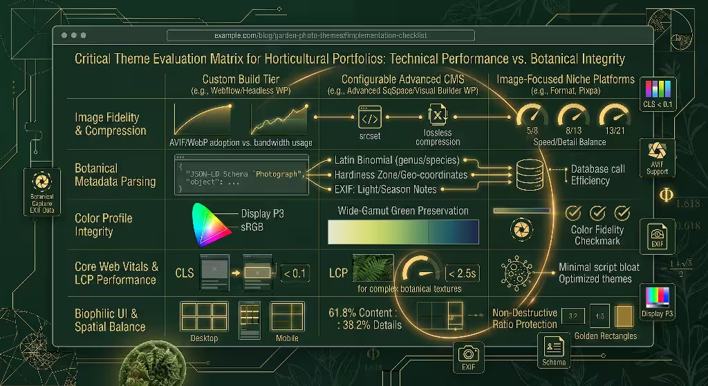
Selecting the right golden ratio portfolio theme requires evaluating factors beyond visual layouts. Horticultural photography presents unique technical challenges. You are dealing with complex organic textures, subtle green color gradients, and extensive technical metadata. Use this matrix to evaluate any theme before committing your body of work to it.
Technical Performance vs. High-Resolution Imagery
A garden photograph is packed with fine details. A wide shot of an English cottage garden contains thousands of individual leaves, petals, and gravel stones. These detailed images create large digital files. If your theme cannot handle large files gracefully, your site will load slowly, causing visitors to click away.
A top-tier golden ratio portfolio theme must support next-generation image formats like WebP and AVIF. These formats compress complex organic files to a fraction of the size of traditional JPEGs without blurring delicate details.
Furthermore, your theme must generate responsive srcset code. When a person visits your site on a phone, the theme should serve a small, lightweight version of the image. When someone visits on a 4K studio display, the theme should serve the full-resolution file.
Finally, check the Cumulative Layout Shift (CLS) score of the theme. If a gallery jumps around while images load, it disorients the viewer and hurts your standing in search engine results. A properly coded theme reserves the exact golden ratio proportions for the image box before the image finishes downloading, preventing jarring shifts.
EXIF & Botanical Metadata Display
True garden photography serves both artistic and educational purposes. Viewers often want to know what they are looking at, where it was grown, and how the photograph was made.
Your golden ratio portfolio theme should read and display EXIF metadata cleanly:
- Camera Data: Camera model, lens focal length, aperture, shutter speed, and ISO rating.
- Botanical Details: Standardized fields for the plant’s common name, Latin botanical name (in italics), plant family, and regional hardiness zone.
- Lighting and Season: Notes on whether the shot was captured in open shade, golden hour sunlight, or overcast conditions, along with the season of bloom.
This information should never clutter the image. Look for a golden ratio portfolio theme that places these notes neatly within the 38.2% side rail or tucks them into an unobtrusive slide-out panel that opens only when clicked.
Color Profile Fidelity
Green is the most difficult color family for digital displays to render accurately. Plants produce hundreds of distinct shades of green, from the pale yellow-green of new spring beech leaves to the deep blue-green of mature spruce needles.
Many cheap web templates force all images into a compressed sRGB color profile that can wash out vibrant greens and bright floral reds. Your golden ratio portfolio theme must support modern wide-gamut color spaces like Display P3. When paired with high-quality browser rendering, a wide-gamut theme ensures that the chlorophyll in your leaves and the carotenoids in your orange poppies look as vibrant online as they did in the garden.
Color Space Gamut Coverage:
+---------------------------------------------+
| Display P3 (Wide Gamut - Vibrant Foliage)   |
|   +-------------------------------------+   |
|   | sRGB (Standard Web - Limited Green) |   |
|   +-------------------------------------+   |
+---------------------------------------------+
Minimalist Interface Controls
When people look at nature, they want peace. They do not want flashing buttons, intrusive pop-up subscription boxes, or busy navigation bars.
The ideal golden ratio portfolio theme practices visual restraint. The navigation should be clean and quiet. Dropdown menus should open smoothly. The interface controls, such as next and previous buttons, should be small and elegant, letting the geometry of the photos carry the visitor through the site.
| Feature Criterion | Essential Standard | Substandard Warning Signs |
| Image Compression | Automatic AVIF/WebP generation | Only accepts standard, heavy JPEGs |
| Layout Shift (CLS) | CLS score under 0.1 during image load | Screen jumps violently as images load |
| Plant Information | Built-in fields for Latin names and zones | No captions or clumsy text overlays |
| Color Rendering | Display P3 wide-gamut color support | Images appear dull, desaturated, or muddy |
| Site Navigation | Minimal, silent, responsive controls | Cluttered menus and aggressive pop-ups |
Frequently Asked Questions about Golden Ratio Portfolio Themes
To help your website attract organic visitors through search engines, your site content must directly address the common questions asked by photographers, designers, and art collectors. Here is how your golden ratio portfolio theme helps answer these real-world user queries.
How do you use the golden ratio in photography portfolio web design?
You use the golden ratio in portfolio web design by applying the proportion 1:1.618 to your page architecture, image sizing, and text spacing. Instead of placing photos into identical square boxes, you divide your screen into major and minor sections.
For example, on a desktop monitor, you can create a two-column layout where the main gallery display takes up 61.8% of the horizontal space, and your navigation and project stories take up the remaining 38.2%. Within the gallery itself, you size thumbnail images using the Fibonacci sequence. A featured macro shot might be 800 pixels wide, while secondary context shots are 494 pixels wide (800 divided by 1.618). This mirrors natural growth patterns and guides the visitor through your work in a clear visual order.
Why is the golden ratio better than the rule of thirds for displaying nature photography?
The rule of thirds is a simple mechanical shortcut that chops space into equal blocks. It works well enough for quick compositions in a camera viewfinder, but it creates stiff, boxy divisions when used across an entire website page.
Nature does not divide itself into neat thirds. A flower does not grow three identical petals, nor does a tree branch into equal 33% intervals. Living things grow by cellular division that expands in proportional curves. The golden ratio reflects this biological growth. When you use a golden ratio portfolio theme, the layout feels organic rather than manufactured. It frames your plant images with the same mathematical harmonies that created the plants themselves, resulting in a more relaxing experience for the viewer.
Does a golden ratio layout negatively impact mobile responsiveness?
A well-designed golden ratio portfolio theme enhances mobile responsiveness rather than hurting it. A common misconception is that using mathematical proportions makes a website rigid. In modern web design, designers do not hard-code fixed pixel measurements. Instead, they use responsive CSS formulas based on percentages and viewport units.
When a visitor opens your portfolio on a smartphone, the horizontal 61.8% and 38.2% columns smoothly collapse into a single vertical column. The theme preserves the golden ratio by adjusting vertical heights and padding instead of horizontal widths. A hero image might be set to a height that is 61.8% of the screen height, while the descriptive botanical text below it occupies the remaining 38.2%. The proportional harmony remains fully intact, whether viewed on a phone, a tablet, or a workstation monitor.
Desktop Layout: Side-by-Side (Horizontal Phi)
+-----------------------------+-------------------+
|                             |                   |
|      61.8% Width            |    38.2% Width    |
|      Main Garden Plate      |    Story & Info   |
|                             |                   |
+-----------------------------+-------------------+

Mobile Layout: Stacked (Vertical Phi)
+-----------------------------+
|                             |
|      61.8% Height           |
|      Main Garden Plate      |
|                             |
+-----------------------------+
|      38.2% Height           |
|      Story & Info           |
+-----------------------------+
What are the best CMS platforms for implementing mathematical design grids?
The best content management system (CMS) depends on your technical comfort level:
- WordPress (Self-Hosted): Best for photographers who want complete control and strong search engine optimization. You can install custom block themes, edit underlying CSS stylesheets, and manage metadata without restrictions.
- Webflow: Best for designers who want visual control over every line of code without managing servers. It allows you to build custom fractional CSS grids that scale cleanly across every screen size.
- Squarespace: Best for photographers who want a low-maintenance, hosted platform with attractive typography and built-in commerce tools.
- Format or Pixpa: Best for working photographers who need integrated client proofing, print sales, and aspect-ratio protection for standard photo print sizes.
Image SEO & Technical Optimization for Garden Photographers
A stunning portfolio has little value if no one can find it. Search engine optimization (SEO) is the practice of organizing your website so search engines can easily find, read, and recommend your pages to people searching online.
Images are heavy assets that search engines cannot view the way humans do. Search engines rely on written descriptions, code architecture, and speed signals to understand what your photographs show. A modern golden ratio portfolio theme gives you the underlying framework to build strong search visibility.
Descriptive Botanical Alt Text Structure
Alt text (alternative text) is a short written description embedded inside an image tag. Its primary job is accessibility: if a visually impaired person uses a screen reader to browse your site, the software reads this text aloud. Search engine bots also read alt text to determine the subject matter of your images.
Many photographers write weak, generic alt text, or worse, leave it completely blank. Writing “yellow flower in garden” tells the search engine very little. Instead, use a structured formula that includes the plant’s common name, botanical name, location, and visual details:
- Weak Alt Text: “Pretty rose in the sun.”
- Good Alt Text: “Yellow rose bush blooming in garden.”
- Expert Botanical Alt Text: “David Austin English climbing rose ‘Teasing Georgia’ blooming on a wooden garden trellis in Portland, Oregon, captured in soft morning light.”
This detailed formula gives search engines clear context. If an art director or magazine editor searches for specific heirloom rose photography, your image is far more likely to appear at the top of the search results.
Alt Text Formula:
[Plant Variety / Common Name] + [Latin Name in quotes] + [Setting / Garden Architecture] + [Lighting & Composition Style]
Schema Architecture for Visual Artists
Schema markup is a specialized code vocabulary that you place on your website to tell search engines exactly what your content represents. Instead of hoping a search engine guesses that an image is a piece of fine-art photography, schema markup explicitly states: “This object is a photograph taken by this artist, depicting this specific plant subject.”
Your golden ratio portfolio theme should support or easily integrate ImageObject and Photograph JSON-LD schema. This structured data can include:
- The artist’s name and portfolio URL.
- The title of the photograph.
- The copyright status and licensing terms.
- The geographic location where the garden photo was taken.
- A direct link to an image licensing or print purchasing portal.
When search engines read this clean schema, they can display your work with rich snippets in image searches, showing price tags, copyright notices, and artist credits directly on the search results page.
JSON
{
  "@context": "https://schema.org",
  "@type": "Photograph",
  "name": "Echinacea purpurea in Autumn Frost",
  "author": {
    "@type": "Person",
    "name": "Jane Doe"
  },
  "description": "Macro photograph of purple coneflower seed heads covered in early autumn frost.",
  "contentLocation": {
    "@type": "Place",
    "name": "Chicago Botanic Garden"
  },
  "license": "https://example.com/licensing"
}
Core Web Vitals and Page Speed
Search engines want to send their users to fast, reliable websites. They measure this using a set of real-world performance metrics called Core Web Vitals:
- Largest Contentful Paint (LCP): How long it takes for the largest image or text block on the screen to load. For an image-heavy photography site, this metric is critical. Your LCP should occur within 2.5 seconds of a user clicking your link.
- Interaction to Next Paint (INP): How quickly your website responds when a user clicks a gallery filter or taps a navigation menu. A good INP score is under 200 milliseconds.
- Cumulative Layout Shift (CLS): How much the page moves around while loading. Your CLS score should be 0.1 or lower.
A poorly coded gallery template often uses heavy JavaScript plugins for sliding animations and lightbox pop-ups. These scripts drag down your performance scores. A streamlined golden ratio portfolio theme uses modern CSS to handle layout proportions and smooth animations, keeping your site fast, nimble, and highly ranked in search algorithms.
A Checklist for Deploying Your Theme
Transitioning your botanical photography portfolio to a dedicated mathematical layout requires careful planning. Follow this step-by-step checklist to launch your new golden ratio portfolio theme cleanly.
Step 1: Audit Your Photographic Archive
- [ ] Review your portfolio and select your top 20 to 30 garden captures. Resist the urge to upload hundreds of images; a curated portfolio makes a much stronger impression.
- [ ] Group your chosen images into logical botanical stories (e.g., “Alpine Rock Gardens,” “Heirloom Orchard Blossoms,” “Macro Mosses and Lichens”).
- [ ] Identify your primary hero shots. These are the showstopper images that will occupy the large 61.8% Fibonacci blocks in your new layouts.
Step 2: Crop and Compose with Intention
- [ ] Test your hero images against a golden spiral overlay in your editing software (such as Lightroom or Photoshop).
- [ ] Adjust your crops so that key focal points—such as the center of a sunflower, a water droplet on a succulent leaf, or a bee landing on a petal—align with the tight curve of the golden spiral.
- [ ] Export your master images in a wide color space to preserve rich foliage greens and bright floral hues.
Step 3: Configure Your Site Framework
- [ ] Install your chosen golden ratio portfolio theme on your preferred CMS platform.
- [ ] Set your site margins and container padding using proportional scales (such as 38.2% and 61.8% fractional splits).
- [ ] Establish your typographic scale using the 1.618 multiplier, starting from a base body font size of 16px.
- [ ] Confirm that your theme’s aspect ratio settings prevent your photos from being automatically cropped into basic squares.
Step 4: Build Your Optimization Engine
- [ ] Set up an automated image compression pipeline to convert uploaded files into lightweight WebP or AVIF formats.
- [ ] Write descriptive botanical alt text for every single photograph using the plant variety, Latin name, setting, and lighting formula.
- [ ] Populate the EXIF and field note panels with accurate plant family details, bloom seasons, and growing conditions.
- [ ] Add
ImageObjectandPhotographJSON-LD schema markup to your project pages, including copyright and licensing details.
Step 5: Test and Refine
- [ ] Run your website through Google PageSpeed Insights to verify that your Largest Contentful Paint loads in under 2.5 seconds.
- [ ] Check your site on multiple physical screens, including desktop monitors, laptops, tablets, and smartphones, to ensure the golden ratio columns collapse gracefully.
- [ ] Test all interactive links, client proofing galleries, and contact forms to confirm that the visitor experience is completely frictionless.
LAUNCH WORKFLOW:
Audit Archive  -->  Golden Crop  -->  Configure CMS  -->  SEO & Alt Text  -->  Speed Test & Launch
The Long-Term Impact of Biophilic Web Architecture
When you build a portfolio using a golden ratio portfolio theme, you do more than organize digital files on a server. You create an intentional digital habitat. Garden photography is not just another genre of commercial imagery; it is a visual record of life, growth, and natural beauty.
A standard website gallery built on flat, industrial grids works against the spirit of horticultural art. It forces organic, living subjects into rigid digital boxes. By grounding your online home in the golden ratio, you align your digital presence with the same natural laws that shape the plants you photograph.
The logarithmic spirals that govern your layout are the very same geometry that unfurls a fiddlehead fern in early spring. The proportional margins that frame your work echo the spacing of leaves reaching toward sunlight. This deliberate harmony puts visitors at ease, invites them to spend more time exploring your galleries, and presents your botanical work with the depth and respect it deserves. When your imagery and your website architecture speak the same mathematical language, your portfolio becomes a living garden of its own.