
Table of Contents
Building an effective earth tone pinterest board requires an understanding of how natural environments shape human perception. When you build an earth tone pinterest board, you are not simply gathering attractive pictures of dried leaves, clay jars, and sand dunes. You are assembling a functional visual system rooted in biology, environmental psychology, and digital design. Natural palettes connect people to the outdoors. Whether you design a website, plan an interior remodel, or build a company brand identity, an earth tone pinterest board gives you the structure needed to ground your work in authentic natural forms.
Many people start an earth tone pinterest board by saving random pictures of beige rooms and brown clothing. That approach creates cluttered boards with no clear purpose. To make an earth tone pinterest board that serves as a true reference library, you must treat your board like a botanical field catalog. You need to organize pins by color family, material structure, light balance, and interface utility. This guide walks through every step of planning, curating, and refining an earth tone pinterest board so your creative projects remain balanced, accessible, and visually clear.
The Neurobiology of Earth Tones: Why Grounded Palettes Resonate
Understanding human biology helps explain why an earth tone pinterest board feels calming. For thousands of years, the human eye developed within wild landscapes. Our visual systems evolved to read subtle shifts in leaves, soils, stones, and waterways. When modern screens present intense, neon colors, our eyes tire quickly. An earth tone pinterest board taps into ancient evolutionary patterns to make visual spaces feel stable and restful.
Evolutionary Aesthetics and the Savannah Hypothesis
The Savannah Hypothesis suggests that human beings retain an inborn preference for natural settings that support survival. These settings feature scattered trees, open grasses, water sources, and changes in terrain. The colors in these landscapes are rarely pure, primary hues. Instead, they are complex, low-saturation shades like clay red, moss green, stone grey, and weathered straw.
When you create an earth tone pinterest board around these organic colors, you tap directly into this hardwired preference. Looking at natural tones lowers heart rates and decreases mental stress compared to looking at artificial, high-glare surfaces. An earth tone pinterest board acts as a digital sanctuary where each pinned image echoes the calm spectral balance of a healthy outdoor environment.
Biophilic Visual Form: Beyond Literal Greening
Many designers think that biophilic design only means adding potted plants to a room or using green buttons on a webpage. Real biophilic design is much deeper. It involves the direct mimicry of natural colors, mineral strata, and botanical textures.
Using an earth tone pinterest board lets you catalog these deeper natural patterns. You can collect examples of sedimentary rock layers, iron deposits in clay, the velvet skin of woodland moss, and the papery bark of river birch trees. When you study these physical materials on your earth tone pinterest board, you learn how nature balances light and dark values without harsh transitions. This knowledge allows you to build physical rooms and digital websites that feel organic rather than synthetic.
What Colors Are Actually Considered Earth Tones?
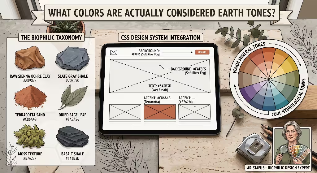
A common question people ask is: What colors are considered earth tones? The answer spans far beyond basic brown and tan. Real earth tones encompass any shade that originates from natural geological, botanical, or hydrological processes. When setting up an earth tone pinterest board, dividing your colors into precise natural families keeps your curation clean and functional.
The Mineral Spectrum
The mineral spectrum forms the warm, dense bedrock of an earth tone pinterest board. These colors come from oxidized metals, volcanic formations, and crushed rocks found across the globe:
- Iron Oxide and Terracotta: Warm, baked clay tones that provide physical presence and energy without the visual sting of primary red.
- Raw Sienna and Burnt Umber: Deep, nutrient-rich soil browns derived from natural iron and manganese ores.
- Ochre Clay: A soft, golden-yellow pigment made from ferric oxide mixed with fine sand and clay.
- Chalk and Travertine: Off-white, calcium-rich mineral shades that soften stark digital spaces.
Saving these geological swatches to your earth tone pinterest board gives you dependable foundation tones for walls, structural elements, and primary page layouts.
The Vegetative Spectrum
Plants generate a vast range of greens, yellows, and deep purples that bring life to an earth tone pinterest board. Unlike chemical dyes, plant colors shift with the seasons:
- Sage and Olive: Soft, desaturated greens containing high amounts of grey and yellow, mirroring leaves adapted to conserve moisture under intense sun.
- Forest Moss and Lichen: Deep, damp understory greens that anchor lower visual sections and provide rich contrast.
- Dried Grasses and Straw: Soft, golden, sun-bleached fibers that bring gentle warmth without artificial tint.
- Spruce and Pine Needle: Blue-cast greens found in high-altitude conifer forests that lend an air of cool, quiet shade.
Curating vegetative swatches on your earth tone pinterest board ensures your palettes stay balanced between warm earth and fresh foliage.
The Lithic and Hydrological Spectrum: Warm vs. Cool Earth Tones
Another frequent question is: Are earth tones warm or cool? The truth is that earth tones span both sides of the color wheel. While mineral soils tend to be warm, water and mountain rock provide striking cool tones.
- Cool Earth Tones: River slate, basalt charcoal, storm-cloud grey, glacial silt, and deep riverbed navy belong to this category. They offer crisp, quiet anchors for your design.
- Warm Earth Tones: Sun-baked clay, canyon silt, desert sand, and dried pine needles supply ambient warmth and comfort.
By balancing both temperatures on your earth tone pinterest board, you prevent your work from looking monochromatic or stale. A slate grey header pairs naturally with a warm travertine background, reflecting the balance between mountain rock and sunlit valley dirt.
Architectural Blueprint: How to Structure and Organize an Earth Tone Pinterest Board
Building a truly helpful resource requires careful structure. A cluttered board makes it impossible to locate specific swatches when you need them for an active design project. Learning how to organize an aesthetic Pinterest board saves you hours of searching and improves your creative workflow.
Board Information Architecture
To keep your earth tone pinterest board organized, break it into dedicated sections. Each section should capture a different facet of natural design:
- Mineral and Soil Swatches: Focus exclusively on raw pigments, sand samples, rammed earth walls, and clay vessels.
- Vegetative Patterns: Devote this section to leaf venation, moss colonies, forest understories, and dried botanical collections.
- Lithic and Water Elements: Pin river pebbles, split slate pavers, ocean foam, and cloudy skies to capture cool neutrals.
- Physical Spaces and Architecture: Collect finished rooms, building exteriors, and material joints that show earth tones applied at human scale.
- Digital Interfaces and Typography: Save web pages, app components, and editorial spreads that successfully translate natural earth tones into clean digital layouts.
When pinning to your earth tone pinterest board, write detailed descriptions for each item. Include search terms like hex values, material names, and natural light conditions. This habit makes your earth tone pinterest board easy to search through Pinterest’s internal search bar.
The Pin Ratio Matrix: The 40/30/20/10 Rule
A common mistake is pinning only finished living rooms or single swatches. To build a versatile design resource, follow the 40/30/20/10 pin ratio across your earth tone pinterest board:
+-------------------------------------------------------+
|  40% Raw Textures & Natural Materials                 |
|  (bark, stone slabs, clay deposits, woven linen)      |
+-------------------------------------------------------+
|  30% Contextual Physical Applications                 |
|  (interiors, architectural finishes, furniture)       |
+-------------------------------------------------------+
|  20% Direct Chromatic Swatches                        |
|  (isolated hex codes, paint formulas, color bars)     |
+-------------------------------------------------------+
|  10% Digital UIs & Graphic Systems                    |
|  (accessible typography, web cards, UI button states) |
+-------------------------------------------------------+
- 40% Raw Textures: Close-up photographs of tree bark, split granite, unglazed stoneware, and natural linen. These images teach you how physical surfaces handle light and shadow.
- 30% Contextual Physical Spaces: Photographs of rooms, patios, and facades where natural materials interact with real sunlight throughout the day.
- 20% Direct Chromatic Swatches: Clean digital graphics displaying exact color codes, including hex values, RGB values, and paint names.
- 10% Digital UIs and Graphic Systems: Screenshots of live websites and branding manuals showing how natural colors support readable text and functional buttons.
Following this balance ensures that your earth tone pinterest board remains a practical working tool rather than an unfocused mood collection.
Curated Board Themes and Palette Formulations (With Hex Specs)
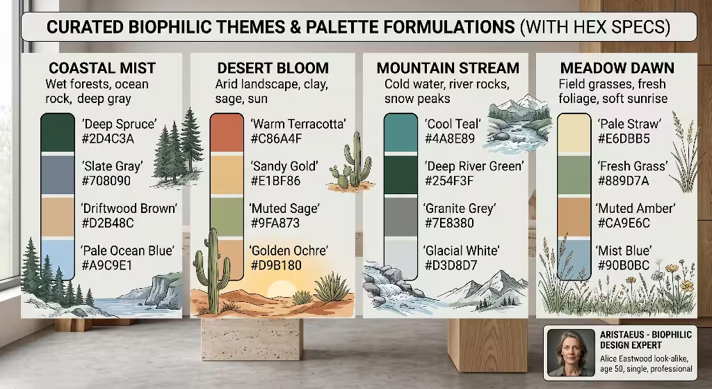
To help you launch your earth tone pinterest board, here are three complete, battle-tested palette formulas. Each theme reflects a specific outdoor biome, complete with exact digital color specifications that you can test on your own boards.
Theme A: Sedimentary Strata (High Warmth, High Tactility)
This theme mirrors the desert canyon landscapes of the American Southwest and ancient Mediterranean clay plastering. It is ideal for warm interior design projects and friendly, inviting brand websites.
+-----------------------------------------------------------------+
| SEDIMENTARY STRATA PALETTE SPECIFICATION                        |
+-------------------+-------------+-------------------------------+
| Color Name        | Hex Code    | Primary Role                  |
+-------------------+-------------+-------------------------------+
| Terracotta Ridge  | #C86A4B     | Primary Brand & Call-to-Action|
| Raw Umber Soil    | #735340     | Heading Text & Deep Shadow    |
| Sandstone Base    | #D9C5B2     | Card Surfaces & Border Accents|
| Caliche Bone      | #F4EFEA     | Main Background & Page Canvas |
+-------------------+-------------+-------------------------------+
- Terracotta Ridge (
#C86A4B): A warm, sun-dried clay hue that serves as a friendly accent color for buttons or key decor items. - Raw Umber Soil (
#735340): A deep, rich brown that works well for headlines, footers, or dark wood furniture. - Sandstone Base (
#D9C5B2): A warm, neutral stone tone suited for web cards, subtle dividers, or linen drapery. - Caliche Bone (
#F4EFEA): An organic off-white that replaces harsh digital white, eliminating screen glare while keeping layouts clean.
Pinning images of rammed earth structures, hand-built clay pottery, and bleached desert sandstone to your earth tone pinterest board supports this tactile theme.
Theme B: Riparian Understory (Cool Earthy Greens and Deep Lithics)
This theme takes inspiration from riverbanks, shady mountain hollows, and damp forest floors. It offers a calm, professional tone suitable for health clinics, wellness brands, and tranquil modern bedrooms.
+-----------------------------------------------------------------+
| RIPARIAN UNDERSTORY PALETTE SPECIFICATION                       |
+-------------------+-------------+-------------------------------+
| Color Name        | Hex Code    | Primary Role                  |
+-------------------+-------------+-------------------------------+
| Forest Moss       | #4A5340     | Hero Accents & Anchored Shapes|
| Wet Basalt        | #343B3D     | High-Contrast Body Text       |
| Pale Celadon      | #A3B19B     | Secondary Backgrounds & Tags  |
| River Fog         | #D1D5CE     | Muted Borders & Canvas Base   |
+-------------------+-------------+-------------------------------+
- Forest Moss (
#4A5340): A shaded, velvet-green tone that grounds headers, focal furniture, or primary illustrations. - Wet Basalt (
#343B3D): A deep, slate-charcoal color providing strong contrast for long body text without the harshness of pure black. - Pale Celadon (
#A3B19B): A soft, sage-tinted tone useful for highlight boxes, tags, or indoor plant accents. - River Fog (
#D1D5CE): A cool, misty neutral that acts as a gentle backdrop for digital content or smooth wall plaster.
To build out this section on your earth tone pinterest board, collect photos of river stones, dripping moss, slate ledges, and quiet water reflections.
Theme C: Desert Vernacular (Sun-Bleached and Mineral)
This theme borrows from sun-baked soils, dry agave stalks, and mineral dust found in arid plains. It brings a crisp, spacious feeling to minimalist design work.
+-----------------------------------------------------------------+
| DESERT VERNACULAR PALETTE SPECIFICATION                         |
+-------------------+-------------+-------------------------------+
| Color Name        | Hex Code    | Primary Role                  |
+-------------------+-------------+-------------------------------+
| Sun-Baked Adobe   | #B77B57     | Warm Visual Accents & Links   |
| Muted Ochre       | #C29B38     | Secondary Badges & Highlights |
| Canyon Shadow     | #523B33     | Editorial Headings & Trim     |
| Limestone Wash    | #EBE5D8     | Ambient Structural Canvas     |
+-------------------+-------------+-------------------------------+
- Sun-Baked Adobe (
#B77B57): An earthy, red-orange shade that brings gentle warmth to primary focal points. - Muted Ochre (
#C29B38): A weathered mustard-yellow that highlights notices, callouts, or cushions. - Canyon Shadow (
#523B33): A dense iron-brown that delivers high-readability typography and architectural framing. - Limestone Wash (
#EBE5D8): A soft, chalky canvas color that reflects light evenly without blinding the viewer.
When saving pins for this theme on your earth tone pinterest board, look for open desert plains, dried palm fronds, whitewashed mud brick, and natural woven baskets.
Translating Mood Boards to Cross-Discipline Applications
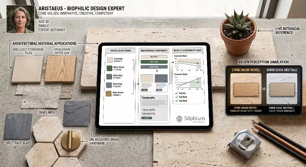
An earth tone pinterest board is more than a digital scrapbook; it is a bridge between creative inspiration and real-world construction. Translating digital pins into physical rooms or working websites requires a practical understanding of physical light and digital screens.
Physical Architecture and Interior Design
When you move ideas from an earth tone pinterest board into an actual living space, the way materials reflect natural light becomes essential:
- Material Pairing: Match warm earth tones with genuine, open-grain woods such as white oak, walnut, or ash. Avoid plastic laminates that lack authentic depth. Use brushed bronze or matte black iron fixtures to give warm plaster walls clear visual boundaries.
- Color Temperature of Artificial Light: The light bulbs you select can make or break an earth tone palette. A warm wall painted in sandstone beige will look lively under a 2700K (warm white) bulb. That same wall under a 5000K (daylight white) bulb can look cold, sickly, and grey. Always test your physical paint chips under the exact light fixtures you plan to use before painting an entire room.
- Surface Texture: Flat, glossy paint rarely works well with earth tones because it reflects light like plastic. Choose matte, eggshell, or Roman clay plaster finishes. These textural surfaces trap light in microscopic ridges, producing soft gradients similar to natural stone formations.
Web Design and Digital Product UI
Translating an earth tone pinterest board into a digital user interface requires attention to technical performance and user accessibility:
- Digital Accessibility (WCAG 2.2 Standards): Nature frequently pairs soft browns with muted beiges, but web screens require clear contrast for readability. The Web Content Accessibility Guidelines (WCAG) require a contrast ratio of at least 4.5:1 for standard body text against its background. When using colors from your earth tone pinterest board, ensure your body text is dark enough—such as
#343B3D(Wet Basalt) over#F4EFEA(Caliche Bone)—to provide effortless reading for users with visual impairments. - Surface Tokens and Card Layouts: On modern websites, blinding white boxes (
#FFFFFF) against light grey backdrops can cause eye fatigue. Replace pure white background panels with soft stone tones like#FAF8F5. Use thin borders in subtle slate (#E6E0D8) instead of harsh black lines to separate sections. - Screen Calibration: Computer monitors and smartphone displays render colors differently. An earth tone that looks rich and warm on a mobile OLED screen may appear pale on an uncalibrated office desktop monitor. Use your earth tone pinterest board to cross-reference your chosen digital shades across several hardware devices to verify that your colors stay consistent.
Troubleshooting Earth Tone Palettes: Balancing and Accent Tones
Even carefully curated natural palettes can sometimes feel dull or heavy. Understanding how to troubleshoot your earth tone pinterest board ensures your resulting projects stay vibrant, legible, and balanced.
Avoiding the Muddy Baseline
A frequent issue with amateur natural palettes is the “muddy baseline.” This problem occurs when all the colors on an earth tone pinterest board share the exact same lightness and saturation values:
BAD: Flat Mid-Tone Sludge (Zero Contrast)
[ Tan Mid-Tone #A89078 ]  over  [ Khaki Mid-Tone #998B6D ]
(Result: Low visibility, visual boredom, high reading fatigue)

GOOD: Balanced Value Gradient (Clean Contrast)
[ Canyon Shadow #523B33 ]  over  [ Caliche Bone #F4EFEA ]
(Result: Crisp legibility, organic warmth, effortless scanning)
To diagnose this issue, take a screenshot of your earth tone pinterest board and convert the image into black and white. If all the pins blend into an identical shade of medium grey, your board lacks tonal depth.
To fix a muddy palette, introduce extreme ends of the value spectrum. Add deep, charcoal shale (#2B2E2E) for strong shadows, and pair it with bleached bone (#FBF9F5) for highlights. This contrast gives the human eye clear paths to scan, making your overall design feel fresh rather than sluggish.
Complementary Punctuation: What Colors Complement an Earthy Palette Without Clashing?
Another common question from designers is: What colors complement an earthy palette without clashing? While nature is full of browns and muted greens, it also produces bright accents that draw the eye without disrupting the natural mood:
- Mineral Blues: Lapis lazuli, deep river navy (
#1F3A52), and muted teal provide a stunning, natural contrast to warm terracotta and raw sienna. Because blue and orange sit opposite each other on the color wheel, mineral blues make warm clay tones look richer. - Botanical Berry and Persimmon: Muted pomegranate red, dried rosehip, and dusty persimmon inject energetic focal points into mossy green rooms and digital interfaces without looking like cartoon colors.
- Raw Metals: Unlacquered brass, copper, and blackened steel act as neutral highlights. Their reflective properties catch ambient light, adding dimension to matte plaster and flat web interfaces.
Pinning examples of these accent pairings onto your earth tone pinterest board keeps you from building designs that feel repetitive or lifeless.
Step-by-Step Execution: Building Your Board from Search to Pinning
Creating an authoritative, beautiful earth tone pinterest board requires steady curation. Follow this step-by-step process to build a board that serves as an indispensable reference library for your work:
PHASE 1: Search Strategy
Target long-tail queries (e.g., "biophilic web UI palette", "mineral pigment textures")
          │
          ▼
PHASE 2: Direct Uploads
Upload your own photos of stone, bark, and soil with hex values overlaid
          │
          ▼
PHASE 3: Section Sorting
Organize pins into Mineral, Vegetative, Lithic, and Digital UI sections
          │
          ▼
PHASE 4: Metadata Optimization
Write rich descriptions with exact hex codes, RGB values, and search terms
Step 1: Execute Targeted, Long-Tail Search Queries
Avoid typing only generic phrases like “earth tones” into Pinterest. Those broad searches return repetitive, low-resolution interior snapshots. Use specific, descriptive search queries that target specialized natural subjects:
biophilic interior architectural materialsmineral pigment texture macro photographyearth tone web UI design systemsrammed earth construction detailsbotanical leaf venation pattern high resolution
These detailed queries uncover pins uploaded by architects, industrial designers, and botanical gardens. Pinning these assets elevates the quality of your entire earth tone pinterest board.
Step 2: Photograph and Upload Your Own Natural Textures
To make your earth tone pinterest board truly unique, do not rely solely on pins from other accounts. Act as your own botanical field researcher:
- Go outdoors with your smartphone or camera and photograph weathered tree trunks, decomposing granite, dried oak leaves, and muddy river shores.
- Bring those photos into a free editing tool or color picker application to identify their exact hex codes.
- Create a simple digital graphic showing the original photograph alongside five color swatch boxes containing the extracted hex values.
- Upload that bespoke graphic directly to your earth tone pinterest board.
Original pins with clear color swatches frequently earn high repin numbers on Pinterest. Other designers searching for an earth tone pinterest board will discover your pins, expanding your influence and authority in the design community.
Step 3: Organize Pins into Sections Immediately
Never let pins sit unsorted in the main section of your earth tone pinterest board. The moment you save an image, assign it to its proper section: Mineral, Vegetative, Lithic, Physical Spaces, or Digital Interfaces.
If you are gathering inspiration for a specific client or room, create a dedicated subsection. For instance, you might title a subsection “Master Bedroom Plaster” or “Homepage Hero Section.” This level of organization transforms your earth tone pinterest board from a casual pastime into a professional production asset.
Step 4: Add Structured Metadata and Descriptions
Pinterest functions as a visual search engine. To ensure your pins can be found by your collaborators and other designers, write informative pin descriptions. Include:
- The exact hex codes found within the image.
- The natural source of the color (for example: “French yellow ochre clay” or “coastal granite ledge”).
- The recommended application (such as: “ideal for website card backgrounds” or “recommended for kitchen cabinetry”).
- Relevant search terms like “earth tone pinterest board ideas,” “biophilic color scheme,” and “accessible UI colors.”
By maintaining this high standard of documentation, your earth tone pinterest board becomes a reliable design system that accelerates your projects and keeps your work true to nature.
Real-World Case Study: Applying an Earth Tone Pinterest Board to a Digital Brand
To see this workflow in action, consider how a design studio uses an earth tone pinterest board to build a digital website for an outdoor education non-profit:
PROJECT WORKFLOW: PINTEREST BOARD TO LIVE PRODUCT
1. Curate Board       ──>  50 pins of riverbed granite, hemlock needles, and wet silt
2. Extract Values     ──>  Isolate #343B3D (Basalt), #4A5340 (Moss), and #FAF8F5 (Ivory)
3. Audit Accessibility──>  Run WCAG 2.2 checks (Basalt on Ivory yields 11.2:1 contrast)
4. Build System       ──>  Code CSS tokens for typography, card surfaces, and buttons
5. Deploy Interface   ──>  Publish a fast, readable website free from digital eye strain
- Board Curation: The design team starts by pinning 50 images to an earth tone pinterest board. They gather photos of hemlock needles, crushed riverbed granite, lichen-covered boulders, and wet forest loam from northern New England forests.
- Color Extraction: Using a digital color picker on their earth tone pinterest board, they isolate three primary brand colors: Wet Basalt (
#343B3D) for body copy, Forest Moss (#4A5340) for buttons, and Soft River Fog (#FAF8F5) for the site background. - Accessibility Testing: The team tests the colors using online accessibility tools. Wet Basalt text on the Soft River Fog background achieves an 11.2:1 contrast ratio, easily surpassing the WCAG 2.2 requirement of 4.5:1. Forest Moss on River Fog achieves a 5.8:1 contrast ratio for subheadings and buttons, ensuring all readers can navigate without difficulty.
- Design System Creation: The designers convert these extracted values into reusable CSS design tokens:
--canvas-background: #FAF8F5;--text-primary: #343B3D;--accent-vegetative: #4A5340;--border-subtle: #D1D5CE;
- Final Output: The resulting website feels calm, readable, and deeply connected to the natural world. Visitors read through articles without encountering harsh white glare or unreadable text. The entire visual framework traces its roots directly back to the careful curation of the team’s earth tone pinterest board.
Long-Term Maintenance: Keeping Your Board Fresh and Useful
A successful earth tone pinterest board is not a one-time project. As seasons change and design needs evolve, your reference library must grow with you:
- Quarterly Pruning: Every three months, review your earth tone pinterest board to delete duplicate pins, broken links, or images that no longer meet your quality standards. A tightly curated board of 200 excellent pins is far more useful than an unorganized board with 3,000 mediocre pictures.
- Seasonal Color Audits: Update your vegetative and mineral sections as nature shifts through spring, summer, autumn, and winter. Spring brings crisp, yellow-green buds, while autumn supplies deep iron rusts and golden straw. Tracking these seasonal transitions on your earth tone pinterest board keeps your palettes dynamic and connected to current natural cycles.
- Cross-Pollination with Physical Samples: Pair your digital pins with physical material samples. Keep small pieces of real linen, wood chips, and stone swatches on your desk. Comparing your physical swatches to your earth tone pinterest board ensures that your digital designs always reflect the physical reality of natural materials.
By following this disciplined method, your earth tone pinterest board will remain a dependable, creative guide that inspires grounded, beautiful, and accessible design work for years to come.