The Biological Imperative of Nature-Based Branding
Nature is the best designer in the world. It has had billions of years to practice. When we look at a forest or a flower, we feel a sense of peace. This is not an accident. It is part of our biology. A famous scientist named Edward O. Wilson called this biophilia. Biophilia is the idea that humans have a deep, built-in need to connect with nature. This connection is very powerful. It affects how we think and how we feel.
At Silphium Design LLC, we use this power to build a brand identity for our clients. We do not just make pretty pictures. We look at how the human brain works. Our brains are wired to recognize natural shapes much faster than squares or perfect triangles. This is called neuromorphic resonance. When a brand identity uses shapes from nature, the brain likes it more. It feels familiar and safe.
In the modern world, we spend a lot of time looking at screens. Most websites and logos feel cold and robotic. They use sharp corners and bright colors that do not exist in the wild. This makes people feel tired or stressed. We believe a brand identity should feel like a living system. It should work like an ecosystem where every part helps the other parts grow. This article will show you how to use the secrets of plants and landscapes to create a brand identity that truly breathes.
Table of Contents
The Botanical Blueprint: Morphology and Logo Design
To understand the botanical blueprint, we must look at how plants build themselves. In biology, morphology is the study of the size, shape, and structure of animals, plants, and microbes. When we apply this to a brand identity, we are looking for the underlying “skeleton” of the design. Nature does not waste energy. Every curve of a leaf and every twist of a vine has a purpose. By following these same rules, we can create a brand identity that feels both efficient and beautiful.
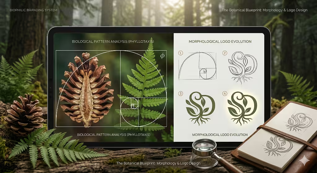
The Math of Organic Growth: Phyllotaxis
One of the most powerful tools in my kit at Silphium Design LLC is phyllotaxis. This is the botanical term for how leaves, scales, or seeds are arranged. If you look at a succulent or a pinecone, you will notice they follow a very specific spiral. This is not random. It is governed by the Fibonacci sequence. This is a series of numbers where each number is the sum of the two before it: 1, 1, 2, 3, 5, 8, 13, 21 and so on.
When you divide a number in this sequence by the one before it, you get closer and closer to a special number called the Golden Ratio, or phi.
In a brand identity, we use this ratio to create balance. When a logo is designed using these proportions, the human eye finds it more pleasing. It creates a sense of “rightness” that is hard to explain but easy to feel. For example, the curve of a logo might follow the same spiral found in a nautilus shell or a budding rose. This gives the brand identity a timeless quality because it speaks the language of the natural world.
Biomorphism: Beyond the Literal Drawing
Many people think a nature-inspired brand identity just means drawing a tree. That is a very basic way to think. As a biophilic expert, I look deeper. I use biomorphism. This means taking the patterns and shapes of life and turning them into abstract symbols. We want to capture the “spirit” of the plant, not just its photo.
Consider the difference between a rigid, straight line and a “curvilinear” line. In nature, straight lines are almost non-existent. Rivers meander. Vines twist. Tree trunks have a slight taper. When we build a brand identity, we use these organic lines to create a sense of movement. A brand identity for a tech company might use shapes inspired by the branching of a nervous system. A brand identity for a wellness company might use shapes inspired by the soft, overlapping petals of a lotus.
This approach creates a visual DNA. Just like a single cell contains the instructions for a whole plant, every part of the brand identity should contain the “code” of the brand. Whether it is a small icon or a large banner, the user should recognize the organic logic behind it. This makes the brand identity feel unified and strong.
Scaling the System: From Micro to Macro
In botany, we look at plants at different scales. We look at the microscopic cells, the individual leaves, and the entire forest canopy. A successful brand identity must work exactly the same way. It needs to be effective at every level of the “ecosystem.”
- The Micro Level (Icons and Favicons): At this scale, we look at cellular structures. We use simple, repeating shapes that suggest growth. Even a tiny icon can contribute to the overall brand identity if it follows the same geometric rules as the main logo.
- The Meso Level (The Logo): This is the “flower” of the brand identity. It is the most recognizable part. It should use the Fibonacci spirals we discussed earlier to ensure it is perfectly balanced.
- The Macro Level (Websites and Landscapes): Here, we look at the brand identity as a whole landscape. The way images are placed and how text flows should mimic the way light filters through a forest or how a river moves through a valley.
By thinking in scales, we ensure the brand identity is not just a flat image. It is a multi-dimensional system that feels as rich and complex as a real ecosystem. This depth is what keeps customers engaged. They find new details every time they interact with the brand identity.
Visual Metaphors and Resilience
In the wild, plants must be resilient. They must survive wind, rain, and drought. A brand identity must also be resilient. It has to survive changing trends and different digital platforms. We use visual metaphors to communicate this strength.
For example, we might use the concept of “deep roots.” This doesn’t mean we draw roots. It means we use a heavy, grounded base in the typography of the brand identity. We might use colors that suggest the richness of dark soil. These subtle cues tell the customer that the brand identity is stable and trustworthy.
We also look at “tropism.” This is how plants move toward a stimulus, like a flower turning toward the sun. A brand identity can show this by using designs that feel like they are reaching upward or outward. This suggests a brand identity that is forward-thinking and full of energy. By using these biological concepts, we create a brand identity that doesn’t just sit there. It feels like it is reacting to its environment.
The Role of Symmetry and Asymmetry
Nature is rarely perfectly symmetrical. If you fold a leaf in half, the two sides are almost the same, but not quite. This is called “near-symmetry.” It feels more natural than the cold, perfect symmetry of a machine. When we design a brand identity, we often use this slight variation. It makes the brand identity feel “human” and approachable.
On the other hand, radial symmetry, like you see in a starfish or a daisy, can be used to show focus and harmony. Choosing between these types of symmetry is a key part of defining the brand identity. A brand identity that wants to feel very organized might use radial symmetry. A brand identity that wants to feel creative and free might use “dynamic asymmetry,” where the balance comes from different shapes working together rather than mirroring each other.
By mastering these botanical principles, we at Silphium Design LLC build a brand identity that is more than just a marketing tool. It is a bridge between the digital world and the natural world. It satisfies the human need for biophilia while providing the technical precision required for modern business. This is how we ensure that a brand identity doesn’t just survive, but truly flourishes.
Landscape Archetypes: Establishing the Visual Vernacular
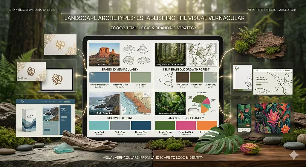
Every brand lives in a specific “climate.” Some brands are fast and exciting like a jungle. Other brands are calm and stable like a desert. When we build a brand identity, we choose a landscape archetype. This helps us pick the right colors and layouts. We do not just pick colors we like. We pick colors that come from the earth.
We look at terrain-based color theory. Instead of using a basic neon green, we might use the color of wet moss or a sage leaf. These colors have more depth. A brand identity based on a high desert might use burnt orange and mineral blue. These colors remind people of the sun and the sky. They feel grounded and real.
We also use a concept called prospect and refuge. A scientist named Jay Appleton talked about this. Humans like to have a view of the world (prospect) but they also like to feel protected (refuge). A good brand identity provides both. It gives the customer a big vision of the future but also makes them feel safe and at home. We use space in a website or a brochure to create these feelings. We use wide areas for the “view” and cozy areas for the “refuge.” This makes the brand identity feel like a place where people want to stay.
Ecosystemic Logic: Brand Strategy as a Mycorrhizal Network
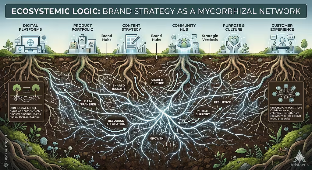
An ecosystem is a community of living things that work together. A brand identity should work the same way. In a forest, trees talk to each other through a mycorrhizal network. This is a web of mushrooms and roots under the soil. They share food and information. If one tree is sick, the others help it.
We think a brand identity should have its own “wood wide web.” All the parts of a brand, like the website, the social media, and the business cards, should be connected. They should share the same “nutrients” or values. When a brand identity is built like a network, it becomes much stronger. It can survive hard times because all the parts support each other.
This leads to resilience. In nature, plants adapt to their environment. A brand identity must do the same. It needs to look good on a tiny phone screen and a giant billboard. It needs to change as the market changes. By using ecosystemic logic, we make sure the brand identity is not just a static image. It is a living thing that can grow and evolve over time. Organizations like the Biomimicry Institute teach us that the best designs are the ones that learn from life.
Technical Execution: Where Nature Meets Code
In the digital world, we use code to build things. But code can still be biophilic. We use something called fractal fluency. Fractals are patterns that repeat at different scales. You can see them in ferns, clouds, and coastlines. When a person looks at a fractal, their stress levels go down.
We put these patterns into the backgrounds and layouts of a brand identity. This creates what we call restorative UX. Most websites make people feel tired because they are too busy. A biophilic brand identity uses “soft fascination.” This is a type of attention that does not require effort. It is like looking at a fire or a stream. By making a brand identity easy to look at, we keep people on the website longer. They feel better after visiting the site. This builds a positive bond between the customer and the brand identity.
Common Questions About Biophilic Branding Answered
People often ask us what makes a good plant-inspired brand. The answer is authenticity. You cannot just put a picture of a leaf on a logo and call it biophilic. A good brand identity must feel like it grew from the ground up. It needs to have information richness. This means it should have small details that you notice the more you look at it, just like a real plant.
Another common question is how to develop a great nature-based brand identity. We start with a botanical audit. We look at the values of the company and match them to a plant or a landscape. Then we map out the ecosystem. We decide how all the parts will work together. Finally, we use rhythmic sensory stimuli. This means we use patterns that feel like the heartbeat of nature.
People also ask about the 14 patterns of biophilic design. These were created by a group called Terrapin Bright Green. They include things like having a visual connection to nature and using materials that feel natural. We use these patterns as a checklist. We make sure every brand identity we build follows as many of these rules as possible. This ensures that the design is scientifically proven to make people feel better.
SEO and Semantic Growth: Why Search Engines Love Natural Systems
Search engines like Google are actually very much like ecosystems. They use a system called the Knowledge Graph. This is a giant web of facts and ideas that are all connected. It is very similar to how a forest organises information. When we build a brand identity, we make sure it is easy for search engines to understand.
We call this organic SEO. Just like a plant needs good soil and water, a brand identity needs good content and links. We build content clusters that act like groves of trees. Each piece of content supports the others. This makes the brand identity grow tall in the search results. Search engines like websites that are organized in a natural, logical way.
We look at people like Stephen R. Kellert and Christopher Alexander. They taught us how to build spaces that humans love. We apply those same rules to the internet. A brand identity that is built with these rules will naturally attract more people. It does not need to shout to be heard. It grows steadily and surely, just like a redwood tree.
The Regenerative Future
The world is changing. People are tired of fake, plastic brands. They want something real. They want a brand identity that feels like it belongs in the world. We are moving from a time of just being “sustainable” to being “regenerative.” This means a brand identity should actually make the world a better place. It should provide value to the people who see it.
When you design a brand identity inspired by plants, landscapes, and ecosystems, you are choosing a path of health and growth. You are building something that will last for a long time. At Silphium Design LLC, we are proud to lead the way in this new field. We believe that by looking at nature, we can find the future of design. A brand identity that follows the laws of nature is a brand identity that will always succeed.
Nature has all the answers we need. We just have to be quiet enough to listen. By using the secrets of biology and the power of technology, we can create a brand identity that is truly beautiful. This is the biophilic way. It is a way of designing that honors the earth and the people who live on it. Let us build a brand identity that grows together with the world.