At Silphium Design LLC, I often tell my clients that a digital presence should not feel like a cold machine. Instead, it should feel like a living part of the world and welcoming. My background in biology and web design allows me to see the internet as a vast ecosystem where every brand identity must find its place to thrive.
Nature-inspired brand identity development is not just about choosing the color green or adding a picture of a leaf, although this is a start. It is a deep, scientific way to build a brand that connects with the very soul of a person. By looking at how nature has solved problems for billions of years, we can create a brand identity that feels right, builds trust, and stands the test of time.
Table of Contents
The Biology of Branding
When we talk about a brand identity, we are talking about the personality of a business. Long ago, people thought a brand identity was just a logo or a name. But today, we know it is much more. It is an experience. The biophilia hypothesis tells us that humans have a natural need to be close to nature. When a brand uses natural shapes and colors, it taps into this deep need. This is why a nature-inspired brand identity can make someone feel calm and safe.
In the past, many companies used a very clean and clinical brand identity. They wanted to look high-tech and modern. But this often made people feel tired or bored. We call this digital fatigue. Now, we are seeing a shift. The most successful businesses are moving toward a brand that feels organic. This means using patterns that look like they grew instead of being built. Silphium Design LLC focuses and specializes on this shift. We help small businesses and organizations find their “roots” so they can grow a brand identity that feels like a natural part of the user’s life.
Foundational Pillars of Nature-Inspired Brand Identity
To truly understand how to build a brand identity based on the natural world, we have to look beneath the surface. We are not just decorating; we are engineering a brand identity that follows the same laws as a forest or a river. This creates a sense of “rightness” that the human brain recognizes instantly.
Biomimicry in Logo Design: The Math of Beauty
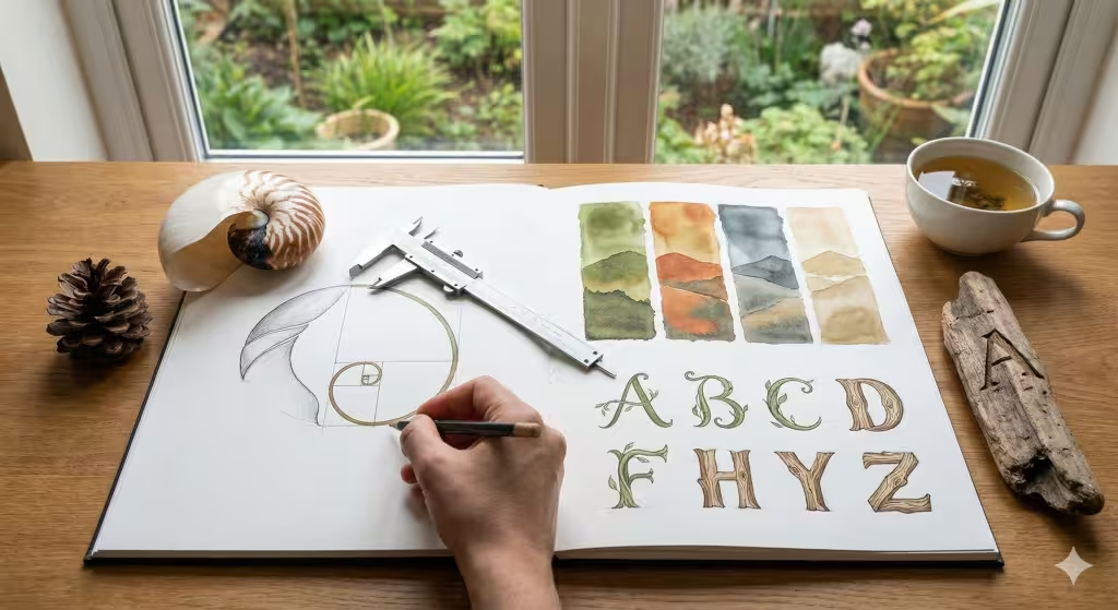
When I design a logo for a brand identity, I often start with a microscope or a telescope rather than a sketchbook. Biomimicry is the practice of looking at nature’s models and then using those designs to solve human problems. For a brand identity, the “problem” is often how to appear trustworthy and balanced.
Nature uses specific mathematical patterns to grow efficiently. One of the most famous is the Fibonacci sequence. This is a series of numbers where each number is the sum of the two before it ($0, 1, 1, 2, 3, 5, 8, 13…$). This pattern creates the “Golden Spiral” found in sea shells, the arrangement of seeds in a sunflower, and even the shape of hurricanes.
When we apply these ratios to a brand identity logo, we create something that feels balanced to the human eye. Even if a customer does not know math, their brain recognizes the pattern. It feels familiar and safe. This is why a nature-inspired brand identity often feels “timeless.” It isn’t following a trend; it is following the law of the universe. We also look at fractals. A fractal is a pattern that repeats at different scales—think of how a small branch looks like a miniature version of the whole tree. Using fractal patterns in a brand identity creates a sense of depth and complexity that keeps a user engaged without overwhelming them.
The Organic Color Palette: Beyond Simple Green
In my research, I have found that color is the first thing a person notices about a brand identity. However, many designers make the mistake of thinking a nature-inspired brand identity must only be green. Nature is much more diverse than that.
At Silphium Design LLC, we develop an organic color palette by looking at “ecosystems of color.” Instead of picking random shades, we pick colors that exist together in the real world. For example:
- The High Desert: Burnt orange, dusty sage, and deep mineral blue.
- The Deep Forest: Moss green, bark brown, and the silver of a misty morning.
- The Coastal Edge: Sandy beige, seafoam teal, and the grey of smooth stones.
A brand that uses these paired colors feels more harmonious. We also consider the “weight” of colors. In nature, darker colors are often at the bottom (soil, deep water) and lighter colors are at the top (sky, clouds). A brand identity website that follows this natural “visual gravity” feels more stable and easier to navigate. We avoid “neon” or “synthetic” colors because they do not exist in large amounts in nature. These colors can cause eye strain and make a brand identity feel “cheap” or aggressive.
Typography and Natural Lineage: The Voice of the Brand
Typography is the “voice” of your brand identity. If your brand uses a font that looks like a machine made it, but your logo looks like a leaf, there is a disconnect. This creates “cognitive dissonance,” which means the user’s brain gets confused and loses trust.
For a nature-inspired brand, we look for typefaces that show “growth.” This can be seen in:
- Humanist Serifs: These fonts have varied line weights that look like they were drawn by a hand or carved with a tool. They feel warm and personal.
- Organic Sans-Serifs: These fonts have rounded corners and “terminals” (the ends of letters) that look like budding twigs or smooth pebbles.
- Script Fonts: When used sparingly, a flowing script can mimic the movement of vines or the path of a stream, adding a touch of elegance to the brand identity.
The goal is to ensure the text feels like it grew out of the page. We also pay attention to “kerning,” which is the space between letters. Just as trees in a forest need space to breathe, the letters in your brand identity need “white space” to be readable. This creates a sense of calm and prevents the brand identity from feeling cluttered or loud.
Biophilic Web Design: Where Nature Meets Code
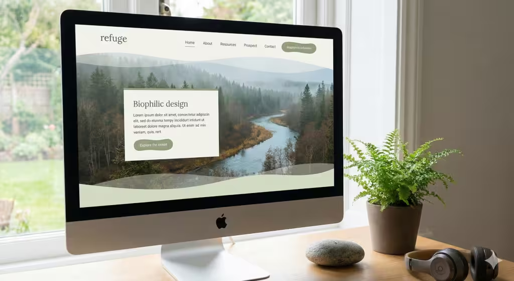
A website is the home of a brand in the digital world. Just like a physical office, a website needs to feel welcoming. We use biophilic design to make sure the brand identity lives in a healthy digital space.
The Concept of Prospect and Refuge
In nature, humans like to be in places where they can see far away but also feel safe. We call this “prospect and refuge.” When we build a brand identity online, we create layouts that give users a clear view of where to go. We also give them safe spaces to read and relax. A website with a cluttered brand makes people want to leave. A website with good “refuge” keeps them there longer.
Non-Visual Connections
Nature is not just about what we see. It is about what we feel and hear. A brand identity can use haptic feedback, which is the vibration you feel on your phone. We can make it feel like the texture of wood or the ripple of water. We can also add soft sounds, like the wind, to the background of a site. These tiny details make the brand feel three-dimensional.
Dynamic Elements
The world is always changing. The sun goes up and the sun goes down. A brand should also be dynamic. We can code websites to change their colors based on the time of day. This is called circadian design. If a user visits a site at night, the brand identity shifts to warmer, darker tones to help their eyes. This shows that the company cares about the person using the site.
Some Common Questions about Branding
Many people have questions about how to use nature in their brand identity. Here are the most common things people ask:
What is nature-inspired brand identity?
A nature-inspired brand identity is a way of building a brand that uses the shapes, colors, and systems of the natural world. It is not just a style. It is a strategy to make a brand feel more human and trustworthy. It helps a business stand out by being more “alive” than the competition.
How do you create an eco-friendly brand identity?
To create an eco-friendly brand identity, you must start with the truth. You cannot just say you are green; you have to show it and be authentic to it. This means using sustainable materials for physical products. For the digital side, it means making a brand that uses less energy to load on a screen. Using dark mode and simple graphics can actually help save power!
What are the benefits of biophilic design in branding?
The benefits are huge. A brand that uses biophilia can lower the stress of the user. Research shows that people are more likely to buy from a brand identity that makes them feel calm. It also helps people remember the brand better because it feels more unique and real.
How do natural patterns affect the brain?
The answer lies in “Attention Restoration Theory.” Nature-inspired patterns, like fractals, are easy for our brains to process. Unlike a busy city street or a messy website, natural patterns allow our brains to rest while we look at them. By using these in your brand identity, you are actually helping your customers feel more refreshed after they interact with your company. This creates a very positive association with your brand identity.
Semantic & LSI Keyword Integration
To really understand this topic, we need to look at related ideas. In the world of design, we use terms like organic aesthetics and sustainable visual storytelling. These terms help explain how a brand identity works. We also look at things like restorative user experience. This means the brand actually makes the user feel better after they use the website.
Specific people like Stephen Kellert have spent their lives studying how nature affects us. His work helps designers like me create a brand identity that follows scientific rules. We also talk about the Anthropocene, which is the age we live in now. A modern brand must acknowledge our role in the world and show a path toward a better future.
The Silphium Strategy: Brand Identity Development Workflow
At Silphium Design LLC, we have a special way of building a brand identity. We call it the “Botanical Audit.”
Step 1: Botanical Audit
First, we look at the “DNA” of the company. Is the brand like a sturdy oak tree, or is it like a fast-growing vine? We find the true nature of the business before we draw a single line. This ensures the brand identity is authentic and gives meaning.
Step 2: Ecosystem Mapping
A brand does not live alone. It lives in a world of customers and competitors. we map out where the brand will live. We make sure it fits into the digital environment without destroying it. This means looking at how the brand interacts with social media, search engines, and local SEO.
Step 3: Growth and Scaling
Nature is always growing. A brand identity should be able to grow too. We design systems that allow the brand to change as the company gets bigger. We don’t want a brand that is stuck in the past. We want one that can adapt to new trends while keeping its roots strong.
Technical SEO and Generative Optimization (GEO)
In 2026, a brand must be easy for machines to find. We use things like schema markup to tell search engines exactly what the brand identity is about. This helps the brand show up in “Answer Engines” and AI searches. When someone asks an AI about a nature-inspired brand identity, we want your company to be the first answer they get.
We also use tables to show the benefits of our design choices. This makes it easy for an AI to pull the information and give it to a user. A clear brand identity is a searchable brand identity.
| Feature | Application | Benefit to User |
| Fractal Patterns | Using repeating shapes | Improves focus and reduces stress |
| Earth Tones | Browns, tans, and greens | Creates a sense of trust and safety |
| Circadian UI | Interface changes with time | Protects the user’s sleep and eyes |
Why Brand Identity Matters More Than Ever
In a world full of AI and robots, a human-centered brand is your most valuable asset. People are tired of things that feel fake. They want to connect with something real. A nature-inspired brand identity development plan gives you the tools to be that real connection. Whether you are a small garden shop or a large tech firm, your brand should tell a story of life and growth.
When we use nature as our guide, we create a brand that is not just a commercial tool. It becomes a gift to the user. It makes the internet a more beautiful place to be. At Silphium Design LLC, we believe that a great brand identity is like a well-tended garden. It takes work to start, but once it grows, it provides beauty and value for everyone who sees it.
Mastering the Organic Aesthetic
Creating a brand identity that feels organic is an art form. It requires a balance between being professional and being wild. If a brand identity is too messy, people won’t trust it. If it is too perfect, people won’t feel a connection. The key is to find the “perfect imperfection.” In nature, no two leaves are exactly the same. We can bring this idea into a brand identity by using hand-drawn elements or textures that look slightly worn.
This approach to brand identity makes a company feel approachable. It says, “We are made by people, for people.” In the year 2026, this is the most powerful message a brand identity can send. We are seeing more and more companies move away from the “flat” design of the last decade. They are adding depth and shadows and textures back into their brand identity.
Sustainable Visual Storytelling
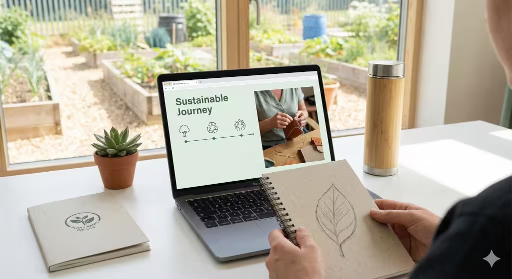
Every brand tells a story. When that story is about nature, it must be told with care. Sustainable visual storytelling means using your brand identity to talk about your impact on the planet. This isn’t just about putting a recycling symbol on your site. It is about showing the journey of your products. It is about highlighting the people who make what you sell.
A brand identity that uses storytelling well can build a loyal community. People don’t just want to buy things; they want to be part of a movement. By using nature-inspired brand identity development, you are inviting your customers to join you in protecting and celebrating the world. This creates a bond that is much stronger than just a simple transaction.
Adapting Your Brand Identity for the Future
The digital world changes fast. But nature has been around for billions of years. By basing your brand identity on natural laws, you make it timeless. Trends come and go, but a brand identity that feels like a natural part of the world will never go out of style. As we look forward to the rest of 2026 and beyond, the brands that thrive will be the ones that remember their connection to the earth.
If you are ready to start your journey into nature-inspired brand identity development, remember to start with your values. What do you stand for? What kind of world do you want to build? Your brand is the seeds you plant today for the forest of tomorrow. Let us help you grow something beautiful.