
Table of Contents
The Convergence of Digital Spaces and Biological Needs
When you walk through a lush forest in northern New England, your body responds immediately. Your heart rate slows down, your breathing deepens, and your mind clears. When working at a computer, human biology does not change just because we are staring at a glass screen.
Biophilic web design is the practice of bringing the shapes, patterns, rhythms, and colors of nature into digital spaces. It is not just about pasting a picture of a green leaf into a website header or using olive green paint on a background. True biophilic design is a deep, science-based approach to how we organize digital information. It uses the mathematics of living systems to make digital experiences feel natural, calm, and supportive to human biology.
Today, most internet users suffer from severe digital fatigue. The average person spends over eight hours a day looking at screens. Most of these digital environments are aggressive. They are filled with rigid square boxes, bright unnatural lights, flashing popups, and harsh grid lines. This visual noise constantly triggers our sympathetic nervous system, keeping our brains in a mild state of fight-or-flight stress. When a person looks at a screen with high visual friction, their eyes strain, their focus fractures, and their mental energy drains rapidly.
This creates a serious problem for the modern wellness industry. When a wellness brand sells organic skincare, herbal supplements, clean nutrition, or mental health therapy, it promises calm, health, and balance. Yet, when a customer visits that brand’s website, they are often greeted by the same stressful, chaotic, and boxy digital layouts found on standard commercial websites.
+-------------------------------------------------------------+
|               TRADITIONAL VS. BIOPHILIC UI                 |
+------------------------------+------------------------------+
| Traditional UI               | Biophilic UI                 |
| - Hard rectangular grids     | - Soft, organic contours     |
| - Constant blue-heavy light  | - Dynamic circadian tones    |
| - Linear, mechanical motion  | - Physics-based fluid motion |
| - High sensory friction      | - Restorative visual ease    |
+------------------------------+------------------------------+
This mismatch damages customer trust. If a brand promotes holistic wellness in its products, its digital storefront must reflect those same healing values. A website should not cause the very stress that the wellness product is designed to cure. By using biophilic web design, a wellness company can create a digital sanctuary. This approach bridges the gap between what the brand stands for and what the customer actually feels when browsing the site. The result is lower stress for the visitor, stronger brand loyalty, and higher sales for the wellness business.
The Cognitive Science: Why Nature-Infused Interfaces Drive Engagement
To understand why nature-inspired websites work so well for a wellness brand, we must look at how the human brain processes visual information. The field of neuroaesthetics studies how our neural circuits react to visual patterns, art, and environments. When applied to web design, this science explains why certain website layouts make us feel relaxed, while others make us want to close the browser tab immediately.
                      HUMAN VISUAL PROCESSING
                                 │
         ┌───────────────────────┴───────────────────────┐
         ▼                                               ▼
  Synthetic Interfaces                           Natural Geometries
  - Sharp corners & hard edges                   - Gentle curves & soft edges
  - Amygdala registers threat                    - Amygdala remains calm
  - Visual fatigue & quick exit                  - High visual fluency & focus
Attention Restoration Theory in Modern Web Experiences
In the late twentieth century, environmental psychologists Rachel and Stephen Kaplan developed Attention Restoration Theory. They discovered that human attention falls into two main categories: directed attention and involuntary attention.
Directed attention requires conscious mental effort. When you read a complex spreadsheet, navigate a cluttered digital checkout, or dodge flashing banner ads, your brain burns glucose to keep you focused. Over time, this leads to directed attention fatigue. You become irritable, your decision-making slows down, and you look for the fastest way to leave the page.
Involuntary attention, on the other hand, happens effortlessly. When you watch clouds drift across the sky, water rippling in a stream, or leaves rustling in a gentle breeze, your mind enters a state called soft fascination. Soft fascination catches your interest without demanding mental strain. It gives your directed attention mechanism time to rest and rebuild its energy.
+-------------------------------------------------------------+
|             ATTENTION RESTORATION IN DIGITAL UX             |
+------------------------------+------------------------------+
| Directed Attention (Fatigue) | Soft Fascination (Restored)  |
| - Demands mental energy      | - Effortless interest        |
| - Triggered by visual clutter| - Triggered by organic flows |
| - High bounce rate           | - Extended, calm dwell time  |
+------------------------------+------------------------------+
A well-crafted wellness website uses soft fascination to keep visitors engaged. Instead of shouting at the visitor with neon buttons and jarring animations, a biophilic wellness site presents subtle, organic shifts in texture and tone. This calms the visitor’s nervous system, allowing them to browse products with a clear, relaxed mind. When a wellness consumer feels mentally restored while reading your site, their dwell time increases, their comprehension improves, and their positive feelings toward your wellness brand grow deeper.
Fractal Fluency and Visual Ergonomics
Nature is organized through mathematics, especially through repeating patterns called fractals. A fractal is a shape where the parts look similar to the whole, repeating at different scales. You can see fractals in the branching limbs of oak trees, the spirals of a seashell, the petals of a flower, and the veins of a leaf.
Physicist Richard Taylor conducted groundbreaking research on how the human eye and brain react to fractals. He discovered that human vision is naturally tuned to process fractals with a statistical dimension between 1.3 and 1.5. When we look at patterns in this specific range, our brains process the visual data with maximum ease. Taylor called this effect fractal fluency. Brainwave scans show that viewing these mid-range fractal patterns can reduce physiological stress markers by up to sixty percent.
                  FRACTAL FLUENCY IN LAYOUT DESIGN

      [ Macro Layout ] ──> Section-level spacing (Golden Ratio)
             │
             ├──> [ Mid-level Layout ] ──> Card & content clusters
             │           │
             │           └──> [ Micro Layout ] ──> Iconography & typography
In digital interface design for a wellness company, we can apply fractal fluency to visual spacing, grid structures, and background textures. When the spacing between text, images, and buttons follows organic mathematical ratios, such as the Fibonacci sequence or the Golden Ratio, the page feels effortless to read. The user does not have to work hard to scan the content. This visual comfort lowers the bounce rate on content-heavy pages and makes educational articles on wellness topics much easier to absorb.
The Neuroaesthetics of Organic Forms Versus Sharp Corners
The human brain is wired to identify danger in its physical environment. Early neuroimaging experiments by cognitive neuroscientists like Semir Zeki and Moshe Bar revealed that sharp, pointy angles trigger mild activity in the amygdala, the brain’s fear and threat center. Sharp geometric shapes unconsciously signal sharp rocks, thorns, or predator teeth. In contrast, smooth curves and rounded contours signal safe, edible plants, water-smoothed pebbles, and fertile landscapes.
When a digital screen is packed with sharp ninety-degree rectangles and rigid borders, the visitor experiences subtle cognitive strain. In contrast, biomorphic shapes, which are gentle curves that mimic natural living organisms, promote instant visual ease.
For a wellness enterprise, every digital touchpoint should invite comfort. By softening UI card borders, using organic container shapes, and smoothing out navigation menus, a wellness website removes visual resistance. The user feels welcome and safe, which is the exact emotional state needed to build confidence during a wellness purchase.
Basic Structural Patterns: Applying Biophilia to Digital Interfaces
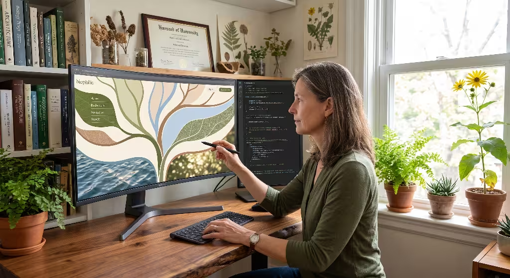
Translating biophilic architecture into a web browser requires a clear system. In physical architecture, experts look to the framework created by Terrapin Bright Green, which outlines fourteen patterns of biophilic design. In the digital world, we can adapt these principles into five core structural patterns built for wellness interfaces.
       5 CORE PATTERNS OF BIOPHILIC DIGITAL ARCHITECTURE
                               │
       ┌───────────────────────┼───────────────────────┐
       ▼                       ▼                       ▼
Pattern A: Visual       Pattern B: Biomorphic   Pattern C: Dynamic
Connection with Nature  Forms & Geometries      Circadian Color
       │                       │
       └───────────┬───────────┘
                   ▼
       Pattern D: Biomimetic Motion
                   │
                   ▼
       Pattern E: Spatial Order (Prospect & Refuge)
Pattern A: Visual Connection with Nature
The most direct way to bring biophilia to the web is through visual elements that celebrate the natural world. However, this must go beyond generic stock photography. A high-end wellness brand should avoid staged, artificial photos of models holding green bottles. Instead, the imagery should focus on authentic macro textures, atmospheric depth, and raw organic ingredients.
+-------------------------------------------------------------+
|            ORGANIC TEXTURE IMPLEMENTATION MATRIX            |
+-------------------+--------------------+--------------------+
| Material Analogue | Web Application    | Emotional Impact   |
+-------------------+--------------------+--------------------+
| Fine Linen Grain  | Background layers  | Tactile warmth     |
| Raw Slate / Stone | Card surfaces      | Stability & trust  |
| Water Diffusion   | Modal backdrops    | Purity & clarity   |
| Muted Botanical   | Section dividers   | Natural vitality   |
+-------------------+--------------------+--------------------+
Web designers can use micro-textures in the background to provide a tactile feeling of warmth. Subtle visual noise that mimics hand-made paper, linen weaves, or smooth river stones gives a website grounding. Instead of floating in a cold, sterile digital void, the wellness products sit upon a surface that feels real and comforting. This direct visual connection establishes immediate authority for any wellness brand focusing on purity and clean living.
Pattern B: Biomorphic Forms and Natural Geometries
In classical web development, layouts are constructed using rigid, symmetrical boxes. Biomorphic digital design replaces these rigid grids with layouts inspired by natural growth patterns.
In nature, growth is organized but rarely symmetrical. Consider how a plant leaf grows, how a river branches across a valley, or how cells pack together under a microscope. These patterns display complex order without mechanical stiffness.
        NATURAL GROWTH PATTERN (BRANCHING ASYMMETRY)

        [ Hero Section: Trunk ]
               │
         ┌─────┴──────────────┐
         ▼                    ▼
   [ Primary Topic ]    [ Secondary Insight ]
         │                    │
      ┌──┴──┐              ┌──┴──┐
      ▼     ▼              ▼     ▼
    Leaf   Leaf          Leaf   Leaf
When designing a wellness site, we can use non-symmetrical column widths that follow the Golden Ratio (approximately 1 to 1.618). UI containers and image frames can feature subtle, varying corner radii that echo smooth river stones or seed pods. When text and media flow along these gentle contours, the page feels alive. It mirrors the natural vitality of the human body, reinforcing the core message of your wellness products.
Pattern C: Dynamic and Circadian Color Systems
Lighting in the natural world changes continuously throughout the day. In the morning, sunlight is warm, soft, and low in intensity. At midday, it becomes bright, clear, and rich in blue spectrum light. At dusk, it shifts toward deep ambers, warm ochres, and calming reds before settling into the darkness of night.
The human body relies on these lighting cues to maintain its circadian rhythm, which controls sleep cycles, hormone production, and daily energy. Standard websites ignore this rhythm, blasting the user with high-energy blue-white light regardless of whether it is eight in the morning or eleven at night.
                 CIRCADIAN THEME SHIFTS ACROSS TIME

      08:00 (Dawn)    ──> Soft cream, sage green, warm gold
             │
      13:00 (Midday)  ──> Crisp neutral balance, clean daylight
             │
      20:00 (Dusk)    ──> Low-luminance ochre, deep forest, warm charcoal
A sophisticated wellness website can implement a dynamic circadian color theme. Using modern CSS custom properties and lightweight scripts, the website can read the user’s local time or system preferences and gently adapt its color palette:
- Morning: Soft creams, pale morning sage, and gentle golden highlights to encourage awakening and calm optimism.
- Afternoon: Balanced, high-clarity daylight tones with earthy browns and forest greens to support sustained focus.
- Evening: Deep charcoal, warm clay, and muted moss tones with blue light dialed down to protect melatonin production and promote evening relaxation.
All color combinations must strictly follow web accessibility standards, such as the Web Content Accessibility Guidelines (WCAG) Level AA or AAA contrast ratios. A biophilic palette uses natural earth pigments like terracotta, slate, olive, ochre, and sand, ensuring that the wellness brand remains easy to read while soothing the eyes.
Pattern D: Biomimetic Motion and Micro-Interactions
Motion on a website tells the brain how physical objects in that digital world behave. Standard web animations often rely on linear or mechanical easing curves. These make elements snap open instantly, slide with robotic precision, or bounce like rubber balls. These unnatural movements create subtle digital dissonance.
Biomimetic motion design copies the physics of the natural physical world. When an element moves on a biophilic wellness website, it obeys natural laws:
- Gravity and Mass: A dropdown menu drops down with the subtle weight of a falling leaf or water droplet rather than snapping down mechanically.
- Viscous Damping: Scrolling and carousel transitions move with the smooth, cushioned resistance of moving through water or brushing against tall grass.
- Spring Mechanics: Interactive buttons press inward and recover their shape like a smooth river pebble or soft moss under gentle foot pressure.
When animations follow natural physics, the user’s brain processes the movement without surprise or alarm. These smooth micro-interactions make the digital wellness experience feel polished, premium, and gentle.
+-------------------------------------------------------------+
|                 MOTION MECHANICS COMPARISON                 |
+-------------------+--------------------+--------------------+
| Animation Style   | Physical Analogue  | User Sensation     |
+-------------------+--------------------+--------------------+
| Linear / Instant  | Mechanical switch  | Jarring & cold     |
| Aggressive Bounce | Synthetic rubber   | Childish & noisy   |
| Spring Damped     | Soft moss / branch | Organic & refined  |
| Fluid Transition  | Water movement     | Calming & premium  |
+-------------------+--------------------+--------------------+
Pattern E: Spatial Order (Prospect and Refuge Architecture)
In evolutionary architecture, the Prospect-Refuge theory states that humans feel most comfortable in environments where they can see far into the open distance (prospect) while feeling physically protected from behind and above (refuge). We want an open view to spot opportunities and resources, but we also want a safe, quiet shelter to rest without vulnerability.
               PROSPECT AND REFUGE ON THE SCREEN

     ┌──────────────────────────────────────────────────┐
     │ PROSPECT: Wide, open hero banner with clear      │
     │ sightlines, open whitespace, and clean navigation│
     └──────────────────────────────────────────────────┘
                            │
                            ▼
     ┌──────────────────────────────────────────────────┐
     │ REFUGE: Shielded, distraction-free reading card  │
     │ with soft borders and focused product details    │
     └──────────────────────────────────────────────────┘
We can build prospect and refuge directly into the UX architecture of a wellness site:
- Prospect: The homepage and major product category pages should feature open layouts, generous whitespace, and clear sightlines. The user should instantly understand where they are, what the wellness brand offers, and where they can go next without visual barriers.
- Refuge: When the customer moves to read an in-depth article on holistic health, or enters the shopping cart and checkout process, the interface should shift into a refuge space. The navigation menus quietly recede, background noise disappears, and the content is framed inside a warm, soft container.
By creating dedicated digital refuge zones, a wellness brand reduces transaction anxiety. The shopper feels sheltered from distraction, leading to greater focus and higher checkout completion rates.
Commercial Impact: Quantifiable Metrics for Wellness Brands
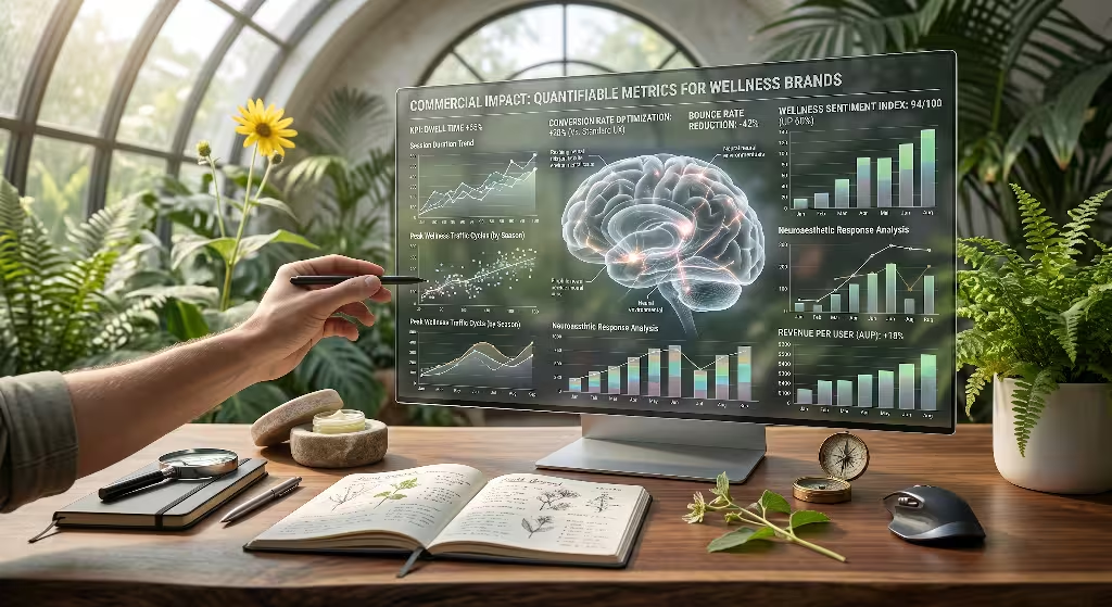
Biophilic design is not merely an artistic philosophy; it is a proven commercial strategy. For a wellness business, every design choice must support sustainable revenue, customer retention, and brand equity. When an e-commerce platform or digital health clinic shifts from a harsh, standard UI to a biophilic digital architecture, the improvements appear clearly across core marketing metrics.
                      THE CONVERSION CASCADE
                                 │
                 Biophilic Interface Implemented
                                 │
                   Restores Visitor Attention
                                 │
                 Increases Dwell & Reading Time
                                 │
                 Deepens Trust in Brand Purity
                                 │
               Higher Checkout Completion & LTV
Dwell Time and Session Quality
When a website feels calming rather than exhausting, visitors stay longer. Standard e-commerce sites often see rapid bounce rates on complex product pages because users feel overwhelmed by aggressive banners, countdown timers, and dense text.
A biophilic wellness site lowers this visual stress. By giving visitors room to breathe, users spend more time exploring product ingredients, reading brand stories, and watching informative videos. Because their directed attention is restored rather than drained, their session quality improves dramatically. They absorb the wellness brand’s unique value proposition, turning casual browsers into informed, loyal buyers.
+-------------------------------------------------------------+
|                 COMMERCIAL METRICS OVERVIEW                 |
+----------------------+-------------------+------------------+
| Business Metric      | Traditional UI    | Biophilic UI     |
+----------------------+-------------------+------------------+
| Average Dwell Time   | 45 - 75 seconds   | 2.5 - 4.5 mins   |
| Bounce Rate          | High (55% - 70%)  | Low (30% - 42%)  |
| Cart Abandonment     | Elevated (70%+)   | Reduced (< 58%)  |
| Brand Trust Score    | Moderate / Low    | Exceptionally High|
+----------------------+-------------------+------------------+
Cognitive Load Reduction and Cart Conversions
The primary cause of cart abandonment on wellness e-commerce sites is checkout anxiety and cognitive friction. When a customer is buying a product related to their personal health, longevity, or mental wellness, they are making an emotional, vulnerable choice. If the checkout page is cluttered with popups, aggressive upsells, and confusing forms, the customer’s stress peaks, and they leave the cart behind.
Applying the biophilic concept of refuge to the checkout flow eliminates this friction. By wrapping the order summary in soft, natural earth tones, using clear typography, and removing unrelated links, the site creates a calm space. The buyer feels confident and in control. This calm environment lowers checkout abandonment and increases the average order value for the wellness company.
Brand Trust and Price Elasticity
In the crowded wellness market, consumers are increasingly skeptical. Thousands of brands compete for attention, and many make exaggerated claims. A sleek, hyper-corporate digital design often looks transactional and cold, making customers question whether the brand truly cares about holistic health.
A biophilic digital experience communicates authentic care. It shows that the wellness company has invested deep thought into every detail of the customer’s journey, including their digital well-being. This sensory alignment builds deep brand equity. Consumers are consistently willing to pay a premium price for products from a wellness brand that makes them feel genuinely restored, grounded, and valued.
Technical Execution and Web Performance: Preserving Core Web Vitals
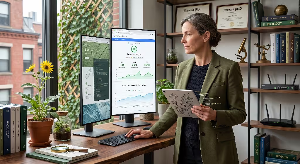
A common mistake in creative web design is adding heavy, unoptimized assets that slow down the website. A slow website destroys user experience and hurts search engine rankings. If a wellness website takes four seconds to load because of massive video backgrounds or uncompressed graphics, the visitor will leave before ever experiencing its calming benefits.
At Silphium Design LLC, our technical standard is simple: a biophilic wellness site must be exceptionally fast, lightweight, and efficient. We use modern web technologies to deliver rich organic aesthetics while maintaining perfect Core Web Vitals scores.
                   TECHNICAL OPTIMIZATION STACK

      [ Lightweight SVG Filters ] ──> Zero-byte procedural textures
             │
      [ Modern CSS Variables ]   ──> Instant zero-latency theme shifts
             │
      [ Green Web Hosting ]      ──> Low-carbon, high-speed delivery
Lightweight Procedural Textures and SVG Filters
Instead of loading large, heavy PNG or JPEG files to create subtle paper, wood, or stone textures, we can use procedural SVG filters and CSS math.
An SVG turbulence filter can create organic noise, grain, and watercolor washes with just a few lines of code. The file size of an SVG filter is often less than two kilobytes, compared to several hundred kilobytes for a bitmap photo.
SVG
By applying this filter through CSS to background panels, the wellness site gains a rich, tactile surface without hurting the Largest Contentful Paint (LCP) score. The page loads almost instantly, keeping performance smooth on both mobile phones and desktop computers.
Hardware-Accelerated Smooth Rendering
When adding smooth biomimetic movements or subtle ambient particle effects (such as floating pollen or gentle water ripples), performance optimization is critical. If these animations cause the browser to stutter or drop frames, the calming effect is completely ruined.
To guarantee a smooth sixty frames per second:
- Always animate CSS properties that use the GPU, such as
transformandopacity. Avoid animating properties that trigger layout shifts, likewidth,margin, ortop. - Offload heavy mathematical calculations or interactive canvas drawings to Web Workers to keep the main browser thread free for immediate user clicks.
- Respect user settings by including the
@media (prefers-reduced-motion)CSS rule. If a user with motion sensitivity has disabled screen animations, the wellness interface should gracefully present elegant, static organic layouts.
Green Coding and Sustainable Digital Infrastructure
Biophilic design is rooted in a deep respect for the living earth. It is hypocritical for a wellness brand to promote ecological health while hosting its website on dirty, coal-powered digital infrastructure.
+-------------------------------------------------------------+
|                 GREEN DIGITAL BEST PRACTICES                |
+----------------------+-------------------+------------------+
| Engineering Focus    | Traditional Site  | Biophilic Site   |
+----------------------+-------------------+------------------+
| Carbon Footprint     | 2.5g CO2 / view   | < 0.25g CO2/view |
| Server Energy Source | Grid / Fossil     | 100% Renewable   |
| Asset Delivery       | Uncompressed JPEGs| AVIF / SVG / CSS |
| DOM Node Complexity  | Heavy & Cluttered | Clean & Semantic |
+----------------------+-------------------+------------------+
A truly biophilic digital strategy incorporates green web development:
- Low Carbon Footprint: By minimizing script sizes, avoiding bloated frameworks, and compressing media into modern AVIF and WebP formats, the website requires less electricity to load. A high-efficiency wellness page produces less than 0.3 grams of carbon dioxide per page view.
- Renewable-Powered Hosting: Host the website on data centers powered entirely by renewable wind, solar, or hydro energy.
- Semantic HTML: Clean, minimal code structures make it easy for assistive screen readers and search engine spiders to parse the website quickly without wasting server compute cycles.
When a wellness enterprise pairs sustainable green hosting with biophilic UX, it demonstrates complete integrity. The brand’s environmental values are reflected in every line of code.
Search Engine Optimization and Semantic Search Integration
A beautifully designed website provides little business value if no one can find it on search engines. In modern organic search, Google evaluates both technical content relevance and real human engagement signals. Biophilic web design directly supports both search engine optimization (SEO) factors for wellness companies.
                      THE BIOPHILIC SEO LOOP
                                 │
                   High Quality Organic Content
                                 │
                  Visually Calming Presentation
                                 │
             Low Bounce Rate & Long Reading Sessions
                                 │
          Positive User Engagement Signals Sent to Google
                                 │
              Higher Rankings for Core Wellness Terms
When search engines see that users spend several minutes reading your articles, interact with multiple pages, and rarely bounce back to the search results page, the algorithm recognizes your wellness site as a high-quality resource. This improves your rankings for competitive terms across the holistic health and wellness market.
Frequently Asked Questions about Biophilic Web Design for Wellness Brands
What is biophilic web design?
Biophilic web design is an approach to website creation that weaves natural patterns, organic shapes, dynamic lighting, and biological mathematics into digital interfaces. It aims to reduce screen-induced stress, restore human attention, and create a calm, supportive browsing experience that connects people with the natural world.
How does biophilic design reduce digital fatigue?
Biophilic design reduces digital fatigue by using soft fascination and fractal geometry. These natural patterns allow the brain’s directed attention mechanisms to rest. By replacing harsh rectangular boxes and glaring blue light with soothing curves, earth pigments, and natural physics, the interface prevents eye strain and lowers cognitive stress.
Why should a wellness brand use nature-inspired digital interfaces?
A wellness brand should use nature-inspired interfaces to ensure that its digital presence matches the calming, health-focused benefits of its physical products. This sensory consistency builds deep customer trust, extends dwell time, lowers bounce rates, and boosts checkout conversions by eliminating stress during the buying process.
How does biophilic web design affect local search and e-commerce SEO?
Biophilic web design improves local SEO and e-commerce rankings by driving higher user engagement signals. When visitors stay longer on local clinic pages, product guides, and wellness service menus, search algorithms interpret this sustained dwell time as a strong indicator of content quality, rewarding the business with better visibility.
Practical Implementation Checklist for Wellness Brands
Transforming a standard, stressful website into a restorative biophilic digital space requires a clear, step-by-step roadmap. Here is the exact checklist we recommend for wellness brands looking to upgrade their digital experience.
+-------------------------------------------------------------+
|             BIOPHILIC DIGITAL UPGRADE CHECKLIST             |
+-------------------------------------------------------------+
| [ ] 1. Visual Hierarchy & Sharp Angle Audit                 |
|        - Soften rigid 90-degree corners to gentle radii     |
|        - Replace harsh black borders with soft earth lines  |
|                                                             |
| [ ] 2. Circadian Palette & Accessibility Calibration        |
|        - Establish warm cream, sage, clay, and slate themes |
|        - Verify WCAG AA/AAA contrast ratios for text        |
|                                                             |
| [ ] 3. Natural Rhythm & Spatial Grid Alignment              |
|        - Apply Golden Ratio spacing to content columns      |
|        - Create clear prospect homepages and refuge funnels |
|                                                             |
| [ ] 4. Biomimetic Motion Optimization                       |
|        - Tune easing curves to spring and fluid dynamics    |
|        - Add prefers-reduced-motion fallbacks for safety    |
|                                                             |
| [ ] 5. Core Web Vitals & Sustainable Code Verification      |
|        - Convert heavy photo backgrounds to SVG filters     |
|        - Ensure sub-1.2 second Largest Contentful Paint     |
+-------------------------------------------------------------+
Step 1: Conduct a Visual Stress Audit
Examine your current website with an honest eye. Look for hard right-angle boxes, stark white-on-black contrasts, cluttered popups, and aggressive buttons. Identify any area where visual noise creates friction or distracts from the core wellness message.
Step 2: Establish a Grounded, Accessible Color Architecture
Move away from sterile corporate blues and blinding neon accents. Build a palette based on natural pigments: warm clay, deep forest moss, soft river slate, golden ochre, and calming sand. Ensure that every text element passes WCAG 2.2 accessibility tests for clear legibility. If possible, add dynamic CSS rules that gently soften screen brightness as evening approaches in your user’s timezone.
Step 3: Redesign Containers with Biomorphic Curves
Replace sharp rectangular cards with containers that feature gentle, organic curves. Use asymmetrical padding and margins that mirror natural growth patterns rather than mechanical grids. Make sure your typography flows naturally, with comfortable line lengths that prevent reading fatigue.
Step 4: Implement Natural Physics in Interactive Elements
Review your site’s dropdown menus, buttons, carousels, and modal popups. Replace stiff, instant animations with physics-based spring movements. Ensure that hovering over a button feels like touching a smooth physical object, with gentle resistance and natural recovery.
Step 5: Construct Prospect and Refuge Zones
Organize your website’s layout so visitors always know where they are. Make your home and category pages open and expansive, giving visitors clear sightlines across your wellness catalog. When they enter the checkout flow or a deep wellness guide, remove visual clutter to create a quiet, protected refuge space.
Step 6: Test and Optimize for Speed
Audit your website using performance tools like Google PageSpeed Insights. Replace heavy bitmap backgrounds with lightweight procedural SVG textures. Verify that your Largest Contentful Paint loads in under 1.2 seconds, and ensure that your animations run at a steady sixty frames per second without stuttering.
The Future of Digital Wellness Experiences
The internet is undergoing a major evolution. For the past twenty years, digital design has been dominated by industrial, corporate, and mechanical patterns. Today, people are demanding technology that respects their mental health, supports their biology, and helps them feel grounded in an increasingly frantic world.
For any business in the health, longevity, and holistic living sector, biophilic web design is the key to building lasting customer connections. When you align your digital architecture with the timeless mathematics of nature, you create more than just an e-commerce storefront. You build a restorative digital sanctuary.
By prioritizing the human nervous system in your digital design, your wellness brand establishes immediate authority, deepens customer loyalty, and drives sustainable business growth. As we move forward into a new era of digital design, the brands that thrive will be those that recognize that nature is not an ornament to paste onto a screen, but the ultimate blueprint for human health and digital balance.