At Silphium Design LLC, we study how nature builds things. Think about a tree. It has a thick trunk. That trunk splits into big branches. Those branches split into smaller twigs. Finally, you see the leaves. This is a natural way to organize parts. In the digital world, we call this a biophilic hierarchy. Most websites feel like a cold, gray box. They are hard to use because they do not match how our brains work. Our brains evolved in forests and fields. We like things that have a natural flow.
When we build a biophilic hierarchy for product categorization, we are making a digital forest. We use biological blueprints to make websites easier to read. This is not just about looking pretty. It is about web design and biology working together. We want to reduce the stress you feel when you shop online. By using a biophilic hierarchy, we create a site that feels familiar. It feels like home because it follows the rules of the earth.
Table of Contents
The Biological Blueprint of Information
To understand the Biological Blueprint of Information, we have to look at how nature solves the problem of “too much stuff.” In a forest, there are millions of living things, but you don’t feel overwhelmed when you walk through it. This is because nature uses a biophilic hierarchy to keep everything in its place. At Silphium Design LLC, we use this same blueprint to organize website data so it feels as natural as a walk in the woods.
The Trunk: The Core Foundation
In a biophilic hierarchy, everything starts with the “trunk.” On a website, this is your homepage. A tree trunk is strong and carries all the nutrients from the roots to the rest of the tree. Similarly, your homepage should hold the core identity of your brand. If the trunk is weak or confusing, the rest of the biophilic hierarchy will fall apart. We design this area to be a “clear clearing”—a place where the user can stand, breathe, and see all the possible paths they can take.
The Branches: Categorical Logic
As you move up from the trunk, you find the big branches. These represent your main product categories. In a biophilic hierarchy, these branches must be spaced out properly. If a tree has too many branches in one spot, they block each other’s light. On a website, if you have twenty different tabs in your menu, they block the user’s focus.
We use the “Rule of Three” or the “Golden Ratio” to decide how many branches a biophilic hierarchy should have. This ensures that the user’s eye can follow the flow from the center out to the edges without getting lost. Each branch serves as a guide, pointing toward more specific information. This is the heart of a biophilic hierarchy, it turns a giant pile of data into a growing, organized system.
The Twigs: Sub-categories and Specialized Paths
Smaller than branches but more numerous are the twigs. In our biophilic hierarchy, these are your sub-categories. For example, if the branch is “Gardening Tools,” the twigs might be “Shovels,” “Pruners,” and “Gloves.”
The transition from a branch to a twig should feel like a natural progression. In a biophilic hierarchy, we make sure these connections are logical. You wouldn’t find an apple growing on a pine tree, and you shouldn’t find kitchen appliances under a “Fashion” category. By keeping the biophilic hierarchy semantically “pure,” we help the user’s brain predict where things will be. This reduces stress and makes the shopping experience feel intuitive.
The Leaves: The Product Level
Finally, we reach the leaves. These are the individual product pages. In nature, every leaf is unique but belongs to the whole. In a biophilic hierarchy, the product page is the final destination. It should feel like the most detailed part of the tree.
Even though a leaf is small, it has a complex system of veins. Your product pages should be the same—offering deep details like size, color, and materials. However, because it is part of a biophilic hierarchy, the leaf is always connected back to the twig, the branch, and the trunk. This is why “breadcrumbs” (the links at the top of a page like Home > Garden > Tools) are so important. They are the “veins” that keep the leaf connected to the rest of the biophilic hierarchy.
Why the Blueprint Works
The reason a biophilic hierarchy is so effective is that it mirrors Taxonomy, which is how biologists classify every living thing on Earth. Humans have been using this mental model for thousands of years to understand the world. When we apply a biophilic hierarchy to a website, we aren’t teaching the user a new way to think. We are simply using the way they already think.
By following this biological blueprint, we create an Information Architecture that is:
- Scalable: Like a tree, your website can grow more branches without falling over.
- Discoverable: Users can “climb” the biophilic hierarchy to find exactly what they need.
- Comforting: The lack of chaos makes the user feel safe and supported.
At Silphium Design LLC, we don’t just build menus; we grow systems. We ensure that every piece of content has a place within the biophilic hierarchy, ensuring that your digital presence is as healthy and organized as a climax forest.
The Science of Fractal Categorization
Nature uses fractals. A fractal is a shape that repeats itself. If you look at a fern leaf, the small parts look just like the big leaf. This is a very smart way to grow. We can use this same idea for a biophilic hierarchy. When a customer clicks from a main category to a subcategory, the layout should feel similar. It should scale down in a way that feels natural.
Using a biophilic hierarchy means using the Golden Ratio. This is a math rule found in seashells and galaxies. It tells us how much space to put between things. If a website is too crowded, it feels like a thicket of thorns. If it has a biophilic hierarchy, it feels like an open meadow. This helps with something called cognitive load. That is just a fancy way of saying “brain power.” A good biophilic hierarchy saves your brain power so you can focus on the products.
Implementing the Forest Floor Taxonomy
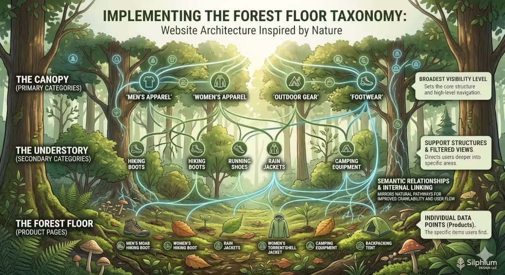
Think about the layers of a forest. The top layer is the canopy. These are your primary categories. They are the first things people see. A biophilic hierarchy puts these big ideas at the top. They give shade and structure to the rest of the site. Under the canopy is the understory. These are your secondary categories. They are the smaller groups that live under the big ones.
The bottom layer is the forest floor. These are the individual products. In a biophilic hierarchy, the products are like the leaves or flowers. They are all connected to the branches above them. This helps search engines like Google. Google’s robots act like birds flying through the trees. They follow the biophilic hierarchy to see how everything is linked. If the links are broken, the birds get lost. If the biophilic hierarchy is clear, the robots can index the site perfectly. This helps more people find your business online.
Frequently Asked Questions about Biophilic Hierarchy
People often ask what the main parts of this design style are. There are three big parts. First is “Nature in the Space.” This means putting actual plants or water in a room. Second is “Natural Analogues.” This is what we do with a biophilic hierarchy. We use patterns and shapes that look like nature. Third is “Nature of the Space.” This is how the room or website is shaped to make you feel safe or excited.
Another question is how this helps stores. A biophilic hierarchy stops “decision fatigue.” This happens when you have too many choices and your brain gets tired. A natural order makes the choices feel simple. People also ask if a website can really be like nature. The answer is yes. We use a biophilic hierarchy to create a digital environment. It may be made of code, but it follows the laws of biology.
Prospect and Refuge in Navigation
In the wild, animals like to see far away. This is called “prospect.” They also like a safe place to hide. This is called “refuge.” A biophilic hierarchy uses these two ideas. The main menu gives you prospect. It lets you see the whole “landscape” of the store. You can see everything that is available from one spot. This makes you feel in control.
When you click on a specific product, you need refuge. The page should feel quiet and safe. There should not be a lot of flashing ads. A biophilic hierarchy ensures the product page is a calm place to read. It protects the user from too much noise. By balancing prospect and refuge, a biophilic hierarchy makes the shopping trip feel like a walk in a park. It is a peaceful experience that brings people back again and again.
The Savanna Principle and User Flow
Long ago, humans lived on the savanna. We liked wide open spaces with a few trees. We could see water and food from a distance. A biophilic hierarchy uses this “Savanna Principle.” We do not want a website to be a dark, scary cave. We want it to be open and bright. The user flow should be like a path through a field.
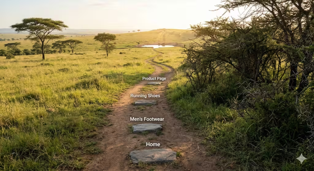
A biophilic hierarchy uses “nature trails” instead of walls. We use breadcrumbs at the top of the page. These are little links that show you where you have been. They are like stones left on a path so you can find your way home. When a site has a strong biophilic hierarchy, you never feel trapped. You always know where the “water” (the checkout) and the “shade” (the home page) are located. This flow is essential for a good user experience.
Strategic Keyword Integration and SEO Architecture
To make a website show up on Google, we use SEO. A biophilic hierarchy is great for SEO. It creates a map that search engines love. We use keywords like “organic architecture” and “nature based design” near the term biophilic hierarchy. This tells the computer that our site is about natural systems. It helps the website rank higher in search results.
The technical side of a biophilic hierarchy involves the code. We organize the code so the “trunk” is the most important part. Then the “branches” come next. This is called a semantic structure. It means the computer understands the meaning of the layers. A biophilic hierarchy is not just for people. It is for the machines that read our websites too. When both people and machines like the site, the business grows.
Case Study The Mycelium Network Model
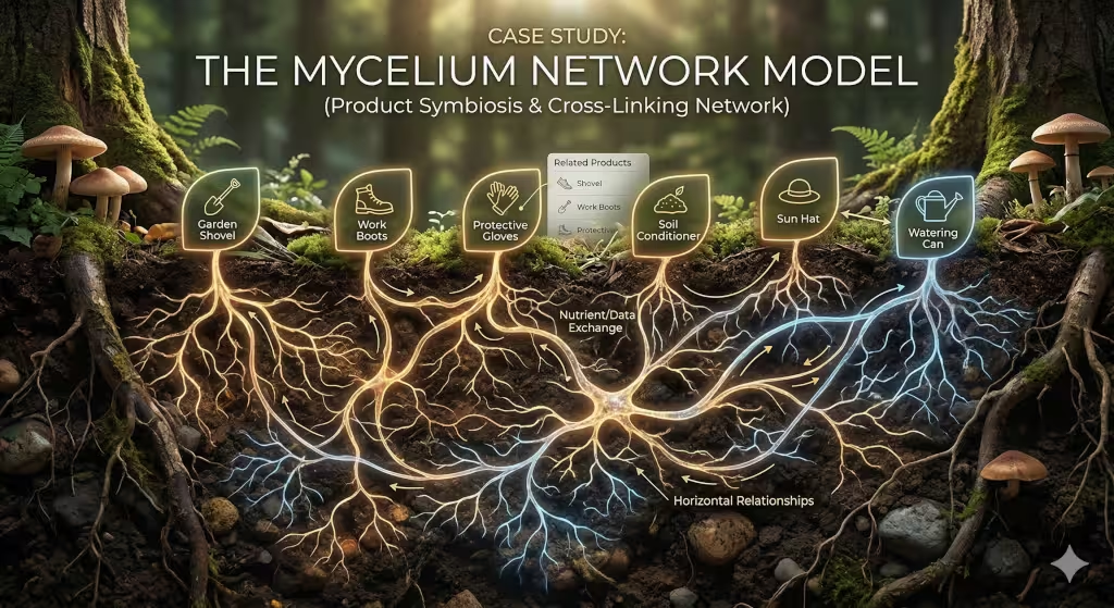
In the forest, mushrooms are connected by a hidden web underground. This is called a mycelium network. It shares food and information between trees. We can use this as a model for a biophilic hierarchy. Products on a website should be connected to each other. If you look at a garden shovel, the site should suggest seeds or gloves.
This horizontal connection is part of a biophilic hierarchy. It is not just a top-down list. It is a web of helpful links. This keeps the user moving through the site like a bee going from flower to flower. A mycelium style biophilic hierarchy increases the time people spend on the page. It makes the site feel alive and helpful. It turns a simple shop into a supportive ecosystem.
Visual Components Beyond the Taxonomy
A biophilic hierarchy also involves how things look. Most websites use sharp corners and square boxes. Nature does not have many perfect squares. It uses curves and soft edges. In our biophilic hierarchy, we use “biomorphic shapes.” This means the buttons and images look more like river stones or leaves. This feels better to the human eye.
We also use light and shadow. A biophilic hierarchy can include colors that change based on the time of day. If it is evening, the website might get a bit warmer and darker. This matches our internal body clock. This connection to the sun and the moon is a deep part of the biophilic hierarchy. It makes the digital world feel like the real world. It makes the user feel more connected to the brand.
The Future of Biophilic E-Commerce
The world is becoming very digital and very fast. Many people feel stressed because they spend too much time looking at cold screens. A biophilic hierarchy is the cure for this stress. By building websites that mimic the forest, the sea, and the stars, we make the internet a better place. A biophilic hierarchy is the best way to organize products because it is the way nature has done it for millions of years.
As we move toward the year 2026, more companies will use a biophilic hierarchy. They will realize that being “natural” is a huge advantage. People want to buy from brands that feel human and grounded. Using a biophilic hierarchy is a sign of quality and care. It shows that Silphium Design LLC understands both the high-tech world of computers and the ancient world of biology. A biophilic hierarchy is the future of design.
A biophilic hierarchy makes every click feel like a step in a garden. It makes every category feel like a branch on a tree. We want our users to breathe easy when they visit our sites. By using a biophilic hierarchy, we create harmony between the screen and the soul. It is a simple idea, but it has a massive impact. From the canopy of the home page to the forest floor of the products, a biophilic hierarchy is the golden thread that holds it all together.
When you think about your next project, think about a biophilic hierarchy. Think about how you can make your data grow like a living thing. A biophilic hierarchy is more than a list. It is a living map. It is a way to honor the earth while we build the future. The biophilic hierarchy is the bridge between our wild past and our digital tomorrow. We invite you to explore the power of a biophilic hierarchy in everything you create.
Using a biophilic hierarchy is a smart business move. It is a smart design move. Most importantly, it is a smart human move. A biophilic hierarchy respects the user. It respects the information. It respects the beauty of the natural world. Let the biophilic hierarchy guide your path as you build better, more natural websites for everyone to enjoy.