The Biophilic Imperative in Modern Design
The human brain is built for the outdoors. For thousands of years, our ancestors lived among rolling hills and dense forests. Today, we spend hours looking at screens. This shift has created a lot of stress. At Silphium Design LLC, we believe that web design should bridge this gap. By learning how to represent landscapes through design elements, we can create digital spaces that feel like home. This is the heart of biophilic design. It is not about just looking pretty. It is about how our bodies react to what we see. When we use shapes and colors from natural landscapes, we help people relax. Their hearts beat slower and they can think more clearly.
When we build a website using these ideas, we are doing more than just coding. We are engineering a digital habitat. Think about the last time you felt calm outside. Maybe you were standing on a beach or looking at a mountain range. Those landscapes have certain patterns. They have specific lines and textures. When we put those same patterns into a website, we get the same good feelings. This is very important for businesses. If a person feels good on your site, they will stay longer. They will trust you more. They might even buy more. In this article, we will look at how to take the beauty of landscapes and turn it into a high-performing website.
Table of Contents
Deconstructing the Physical Landscape
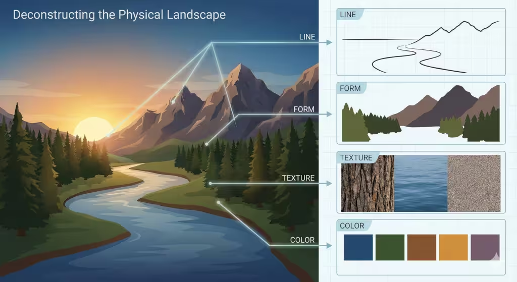
To bring the outside in, we have to look closely at what makes landscapes look the way they do. We break these down into four main parts.
The Power of Line
Lines in landscapes tell a story. Think about the horizon. It is a long, flat line where the sky meets the earth. In design, this line stands for stability and peace. When we use horizontal lines on a website, it makes the user feel grounded. Now, think about the sharp, diagonal lines of a mountain peak. These lines show energy and strength. They pull the eye upward. We can also look at the winding lines of a river. These are called sinuous lines. They feel soft and natural. Using these curves on a page helps a reader’s eyes move smoothly from one part to another.
Understanding Form
Form is about the 3D shapes we see in landscapes. A forest looks like a big mass of soft shapes. A rock wall looks hard and jagged. On a computer screen, everything is flat, but we can use shadows and layers to make shapes feel real. If we want a website to feel like a wide open field, we use lots of empty space. If we want it to feel like a cozy cave, we use darker colors and smaller sections. These forms help the user know where they are in the digital space.
The Feel of Texture
Even though you cannot touch a website, your eyes can still “feel” it. Landscapes are full of textures. There is the rough bark of a tree, the smooth surface of a lake, and the soft look of moss. In web design, we use background images and small patterns to show these textures. A rough texture can make a site feel organic and handmade. A smooth, glass-like texture can make it feel modern and clean. By mixing these, we can make landscapes come to life on the screen.
The Science of Color
Color is the first thing people notice. Different landscapes have different color sets. A desert has warm oranges and yellows. A forest has deep greens and earthy browns. An ocean has many shades of blue. We use these palettes to set the mood. Blue colors often make people feel calm. Green colors make them feel refreshed. When we pick colors for a website, we look at the landscapes that fit the brand. We want the colors to feel like they belong in nature, not like they came from a neon sign.
Biophilic Design Principles: Natural Analogues
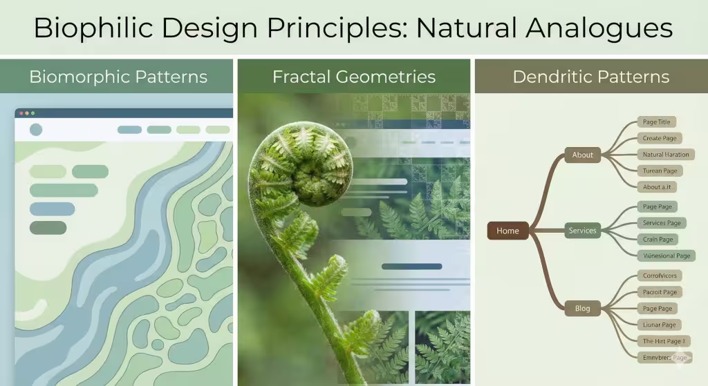
We do not always need to show a literal photo of landscapes to make a site feel natural. We can use what we call natural analogues.15 These are design choices that remind the brain of nature.
Biomorphic Patterns
Biomorphic means “life-shaped.” Most things humans make have straight lines and 90-degree angles. But in landscapes, you rarely see a perfect square. Nature is full of circles, ovals, and wavy lines. When we design buttons or image frames, we can round the corners. We can make the edges look like leaves or stones. These biomorphic shapes feel more comfortable to the human eye. They make the website feel less like a machine and more like a living thing.
Fractal Geometries
Fractals are one of the coolest parts of landscapes. A fractal is a pattern that repeats at different sizes. Think of a fern leaf. Each little part of the leaf looks like a smaller version of the whole leaf. Trees and clouds also have these patterns. Our brains are very good at looking at fractals. It actually takes less brain power to look at a fractal than a plain box. This means that using fractal patterns in the background of a website can make the user feel less tired. It creates a sense of “organized complexity” that we love in the wild.
Dendritic Patterns
Dendritic patterns look like branches. You see them in tree limbs, in the veins of a leaf, and in the way rivers split into smaller streams. These patterns are perfect for organizing a website. We can use a dendritic style for the navigation menu. One main “trunk” leads to several large “branches,” which lead to smaller “twigs” or pages. This feels very logical to us because it is how landscapes organize information in the real world. It makes it easy for a visitor to find their way without getting lost.
Implementing the “Nature of the Space”
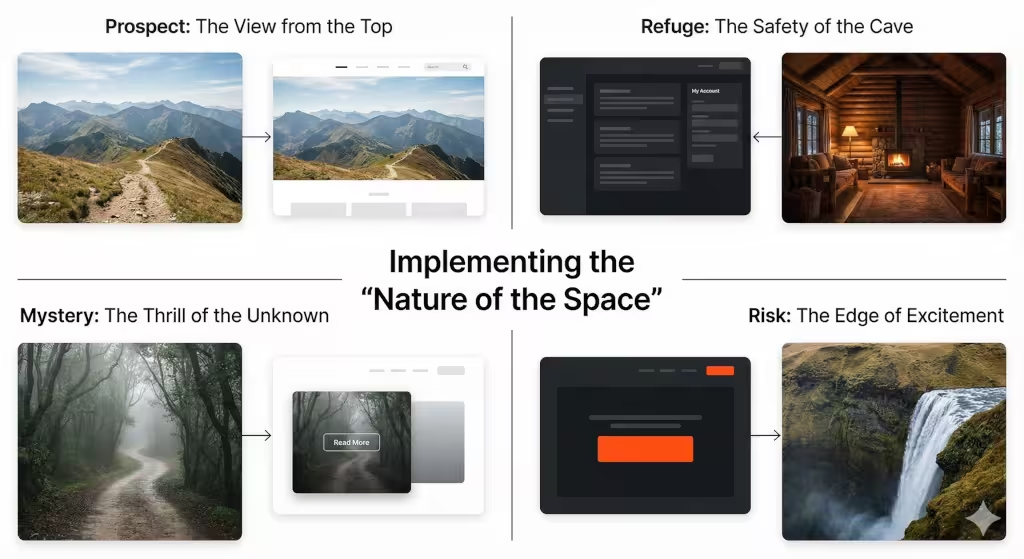
A landscape is not just a bunch of objects. It is a space that we move through. To make a website feel like a real place, we use two main ideas: Prospect and Refuge.
The View from the Top: Prospect
Prospect is the feeling of having a wide, open view. Think of standing on a hill and looking down at the landscapes below. You can see everything. You feel powerful and safe because nothing can surprise you. In web design, we create prospect by using big hero sections. These are the large images or videos at the top of a page. They give the user a “big picture” of what the site is about. Large margins and plenty of white space also create this open feeling.
The Safety of the Cave: Refuge
Refuge is the opposite of prospect. It is the feeling of being in a safe, enclosed space. Think of sitting under a big tree or in a small cabin. You are protected from the wind and the rain. On a website, we create refuge by using containers. These are boxes that hold text or images. A sidebar can also feel like a refuge. When a user is reading a long article, having a clear “border” around the text makes them feel more focused. It stops their eyes from wandering and makes them feel safe in that digital space.
The Thrill of Mystery and Risk
Great landscapes always have a little bit of mystery. You might see a path that goes around a big rock. You want to know what is on the other side. We can do this on a website by using “partial reveals.” Maybe an image is half-cut off at the bottom of the screen. This makes the user want to scroll down to see the rest. Risk is a bit different. In nature, risk might be a high cliff. In design, we use high contrast or bold colors to create excitement. It keeps the user awake and engaged with the content.
Technical Execution: SEO, GEO, and AEO
We want our websites to be found by people and by computers. This is where search engine optimization (SEO), generative engine optimization (GEO), and answer engine optimization (AEO) come in. We use the beauty of landscapes to help these systems understand our site.
| Design Element | Landscape Counterpart | User Experience Benefit |
| SVG Shape Dividers | Mountain Ranges / Waves | Visual Rhythm & Flow |
| Gradient Overlays | Atmospheric Perspective | Depth & Spatial Orientation |
| Organic UI Grids | Forest Floor Distribution | Reduced Cognitive Fatigue |
| Stochastic Motion | Leaves in Wind / Water Ripple | Micro-interactions for Calm |
When we talk about landscapes in our text, we use words that help AI understand the topic. We don’t just say “nice view.” We use words like “topography,” “ecosystem,” and “biodiversity.” This helps search engines know that we are experts. GEO is important because AI models now summarize websites for users. By using clear headings about landscapes, we make it easy for the AI to give a good summary. AEO is for voice search and quick answers. We make sure to answer common questions about landscapes directly so that devices like Alexa or Siri can find the answer quickly.
Common Questions about Landscapes
People have a lot of questions about how to use nature in their work. Here are some of the most common ones we see.
What are the 5 elements of landscape design?
In the physical world, these are line, form, texture, color, and scale. In the digital world, we use these same five. However, we also add motion. In landscapes, things move. The wind blows through the grass. The water ripples. Adding subtle movement to a website makes it feel much more alive.
How do you create a natural feel in a digital layout?
The best way is to stop using so many boxes. Most websites are just boxes inside other boxes. To make it feel natural, use shapes that look like they were found in landscapes. Use soft curves. Use colors that you would see at sunrise or sunset. Also, try to use fonts that look a bit more organic and less like a typewriter.
Why is biophilic design important for SEO?
It all comes down to how long people stay on your site. Google looks at “dwell time.” If a person comes to your site and leaves right away, Google thinks your site is bad. But if they stay and read because the site feels like a walk through beautiful landscapes, Google thinks your site is great. This helps you rank higher in search results.
Common Terms Associated with Landscapes
Below are some of the people and ideas that started this movement.
- Edward O. Wilson: He was a famous scientist who popularised the word “biophilia.” He believed that humans have a deep, genetic need to be around nature.
- Stephen Kellert: He took Wilson’s ideas and turned them into rules for architects and designers. He showed us exactly how to use landscapes to make better buildings.
- Terrapin Bright Green: This is a group that wrote a famous report on the 14 patterns of biophilic design. We use these patterns for our websites at Silphium Design LLC.
- Fibonacci Sequence: This is a math pattern found in seashells and flowers. It helps us create layouts that feel perfectly balanced.
The Evolutionary Interface
The future of the internet is not more metal and glass. It is a return to our roots.42 By learning how to represent landscapes through design elements, we are making the digital world a better place for humans. We are moving away from cold, boring screens and moving toward vibrant, living environments.
At Silphium Design LLC, we know that a website is more than just a place to sell things. It is a place where people spend their time. We want that time to be peaceful and productive. When we use the math of a snowflake or the curve of a river, we are speaking a language that every human brain understands. We are creating websites that feel like they have always been there, growing naturally out of the digital soil.
Whether you are a designer or a business owner, think about the landscapes you love. Think about the peace you feel when you are outside. That is the feeling we want to bring to every user. It is good for people, and it is good for business.