Table of Contents
When you step outside on an overcast morning, your pupils adjust, your skin senses the drop in barometric pressure, and your brain immediately shifts your behavior. You look for shelter, grab a jacket, or feel a calm focus as rain begins to fall.
The digital spaces we inhabit every day should acknowledge this basic truth. Most websites still sit frozen in time. They serve the exact same bright white background, the same fixed stock photos, and the same rigid layouts whether a visitor is reading from a humid heatwave in mid-July or a snowy, dark afternoon in January.
At Silphium Design LLC, my work centers on bridging this gap between human biology and modern web development. By blending principles of plant biology, environmental psychology, and computer science, we build digital interfaces that respond to natural conditions. A website should not act like a dead print brochure behind glass. It should behave like a living, responsive ecosystem.
This brings us directly to the concept of weather-adaptive web design. At its heart, weather-adaptive web design is a method of crafting websites so that their visual appearance, interface colors, content, and interactive features automatically shift according to the current, real-time atmospheric conditions of the person viewing the page.
In this guide, we will break down every single dimension of weather-adaptive web design. We will explore how nature-based ergonomics influence our minds, examine the code and network edge tools that power real-time updates, study the data showing dramatic conversion increases in modern e-commerce, and review the accessibility guidelines you must follow to keep your site fast, usable, and open to everyone.
The Modern Foundation of Living Interfaces
To master weather-adaptive web design, we must first define what it is, what it is not, and why the traditional way of building websites is falling behind.
The Static Web Problem
For decades, web design has followed a static model. Designers made fixed layouts in desktop graphic tools, developers converted those mockups into static HTML and CSS files, and servers delivered those identical assets to every single user on Earth.
The mobile revolution brought responsive web design, which solved an important geometric challenge: making layouts fit different screen widths, from desktop monitors to pocket smartphones.
Responsive web design, however, only cares about the physical dimensions of the plastic and glass screen. It completely ignores the actual environment surrounding the human being holding that device.
Weather-adaptive web design steps in to fill this blind spot. Instead of just asking, “How wide is this display screen?”, weather-adaptive web design asks, “What is happening in the physical environment where this person is reading right now?”
Technical Definition
Technically speaking, weather-adaptive web design is an advanced branch of context-aware, client-server web development. In weather-adaptive web design, client-side scripts, reverse proxy routing, or edge compute functions determine the physical region of an incoming visitor.
The server queries a secure weather data feed to pull current environmental metrics. These metrics include:
- Ambient temperature (both actual and “feels like” heat indexes)
- Sky condition (clear sunshine, cloud cover, dense overcast, fog)
- Precipitation (light mist, torrential rain, hail, snowfall)
- Solar position (astronomical sunrise, midday zenith, twilight, civil sunset)
- Barometric pressure, humidity, and real-time air quality metrics
Once these variables arrive, the browser maps them to CSS variables, layout states, and content prioritization rules. The result is a seamless, contextual experience.
When you look at weather-adaptive web design from a systems engineering point of view, it converts real-time atmospheric data points into front-end visual states. Weather-adaptive web design represents the natural evolution of responsive design, taking digital media from static documents to active, ambient platforms.
The Biophilic UX Framework: Nature-Connected Interfaces
To understand why weather-adaptive web design works so well on a psychological level, we must look at biophilic design. Biophilia is a term popularized by biologists to describe the deep, innate tendency of human beings to seek connections with nature and other forms of life.
Our nervous systems evolved over hundreds of thousands of years out in the open air, under changing skies, shifts in daylight, and changing seasons. Our brains are hardwired to read environmental cues constantly.
Circadian Ergonomics
Inside an office or living room, artificial fluorescent bulbs and bright computer screens flood our eyes with high-energy blue light at unnatural times. Traditional website dark modes try to help with this, but they rely on a blunt, manual toggle switch.
Weather-adaptive web design handles lighting organically. In weather-adaptive web design, a website can automatically calculate the exact solar elevation angle for the user’s latitude and longitude.
As twilight approaches in the user’s city, a website built with weather-adaptive web design gently warms its color palette. It shifts hex codes from stark, high-glare white (#FFFFFF) to soft parchment or muted stone tones. It reduces harsh blue contrast and softens line weights.
By mirroring the natural transition of outdoor light, weather-adaptive web design reduces eye strain, prevents screen glare during dim rainstorms, and supports the natural circadian rhythms of our bodies.
Visual Biophilia and Reduced Cognitive Load
Cognitive dissonance happens when your senses receive conflicting signals at the same time. If a user is sitting next to a window watching a thunderstorm rattle the glass, a digital interface filled with bright yellow beach scenes and neon accents feels jarring, loud, and artificial.
By using weather-adaptive web design, the interface reflects subtle visual textures of the surrounding world:
- Soft slate grays and muted blues during rainy weather
- Warm earth tones and golden highlights during sunny afternoons
- Crisp whites, deep forest greens, and cozy charcoal shades during winter snow
When weather-adaptive web design aligns digital visuals with physical surroundings, the human brain expends less energy processing the screen. The website feels natural, intuitive, and welcoming.
This sense of environmental harmony keeps visitors calm, helps them absorb educational material faster, and makes them stay on the page longer. Through weather-adaptive web design, digital design stops fighting the real world and starts working in harmony with it.
Architectural Stack: How It Works Under the Hood
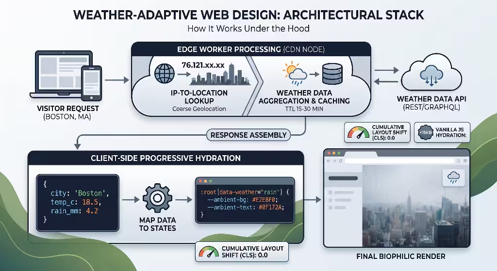
Implementing weather-adaptive web design requires a clean, fast, and secure software architecture. Because modern web standards demand high performance, weather-adaptive web design must be engineered without bloated code libraries or slow server calls.
Here is the exact technical pipeline that powers modern weather-adaptive web design.
[Visitor Browser Request]
         │
         ▼
[Edge Worker CDN (Cloudflare / Fastly)]
  ├── Reads Geolocation Headers (City, Lat, Long)
  └── Queries Weather Cache (TTL: 15-30 mins)
         │
         ├── Fetch from Weather API (if cache expired)
         │
         ▼
[HTML Injected with Critical CSS Variables]
         │
         ▼
[Browser Paints Instant Ambient Theme]
  (Zero Cumulative Layout Shift / No Screen Flash)
Layer 1: Geolocation Without Privacy Intrusions
Early attempts at contextual personalization often failed because they triggered aggressive browser pop-ups asking, “This site wants to know your exact location.” Users find these pop-ups scary and usually hit “Block.”
Modern weather-adaptive web design does not need your exact street address. It only needs to know your general metro region or climate zone.
We solve this cleanly using edge compute workers through networks like Cloudflare, Fastly, or AWS CloudFront. When a browser requests a page, edge servers read the incoming IP routing data.
Headers such as cf-ipcity, cf-region, and approximate latitude and longitude coordinates are read instantly at the network level. No personal data is stored, and no annoying permission dialogs interrupt the user.
Layer 2: Weather API Integration and Smart Caching
Once the edge node detects the user’s general area, it checks its memory cache for recent weather records matching that grid. If the data is older than thirty minutes, the edge server calls a reliable weather API endpoint, such as OpenWeatherMap, Tomorrow.io, or WeatherAPI.
These services return a clean, lightweight JSON data payload that looks like this:
JSON
{
  "temp_c": 18.5,
  "condition": "Rain",
  "precipitation_mm": 4.2,
  "cloud_cover_pct": 92,
  "is_day": 1,
  "uv_index": 1.2
}
To make weather-adaptive web design lightning fast, this API response is cached at the edge server for twenty to thirty minutes. Weather conditions do not change every single second.
Caching prevents repetitive external network calls, saves API operational costs, and ensures the page loads in milliseconds for the visitor.
Layer 3: Dynamic CSS Variables and Document Roots
The real magic of weather-adaptive web design happens when this weather data is mapped directly to native CSS custom properties on the HTML document root.
Instead of writing dozens of complex, heavy CSS classes for every condition, weather-adaptive web design injects lightweight variable tokens directly into the base document:
CSS
:root {
  --ambient-bg: #f4f6f8;
  --ambient-surface: #ffffff;
  --ambient-text: #1a202c;
  --ambient-accent: #2b6cb0;
  --weather-density: 1rem;
}

/* Atmospheric overrides mapped by weather data */
:root[data-weather="rain"] {
  --ambient-bg: #e2e8f0;
  --ambient-surface: #cbd5e1;
  --ambient-text: #0f172a;
  --ambient-accent: #334155;
}

:root[data-weather="clear-day"] {
  --ambient-bg: #fffbeb;
  --ambient-surface: #ffffff;
  --ambient-text: #451a03;
  --ambient-accent: #d97706;
}
Because modern web browsers recalculate CSS variables instantly in native memory, weather-adaptive web design changes interface colors, drop shadows, and typography tints without re-rendering the whole page.
This approach uses vanilla web standards, eliminates heavy JavaScript dependencies, and guarantees that weather-adaptive web design performs with clean, reliable efficiency.
Semantic Entities and Secondary Terminology Integration
To help search engines and developers understand the breadth of this approach, we must place weather-adaptive web design within its broader technical ecosystem.
Weather-adaptive web design does not exist in a vacuum. It sits at the intersection of several emerging disciplines in computing and design.
The table below outlines the core semantic concepts that interact with weather-adaptive web design, their functional roles, and how they apply directly to front-end development:
| Core Industry Term | Functional Role in Architecture | Practical Implementation |
| Contextual Computing | Analyzing the user’s physical surroundings to deliver tailored information without manual commands. | Changing page layouts based on whether the user is in a hot, dry region or a freezing, wet area. |
| Ambient User Experience | Subtle interface changes that operate quietly in the background of human awareness. | Gradual shifts in background saturation that match natural light changes outside. |
| Dynamic CSS Tokens | Native browser variables that allow real-time theme swapping without reloading stylesheets. | Linking --surface-color directly to calculated outdoor temperature values. |
| Edge Personalization | Running data checks on global server nodes close to the user’s actual physical location. | Reading coarse coordinate headers and injecting weather flags within the edge cache layer. |
| Circadian Color Systems | Adjusting color temperatures and contrast levels to support natural human sleep-wake cycles. | Lowering blue light emission automatically when the user’s local sun sets below the horizon. |
| Meteorological Triggers | Logical conditional rules based on specific environmental thresholds (rain, snow, heat). | Displaying localized service alerts when local wind speeds pass forty miles per hour. |
| WebGL Shaders | Hardware-accelerated graphics programs that draw visual surface effects directly on the display. | Rendering gentle, photorealistic water ripples across background containers during spring rain. |
By understanding these terms, we see that weather-adaptive web design is part of a larger, long-term movement across software engineering. The internet is moving away from static, one-size-fits-all pages toward dynamic, context-aware web applications that adapt intelligently to the physical world around them.
Frequently Asked Questions about Weather-Adaptive Web Design
When developers, marketing executives, and business owners first encounter weather-adaptive web design, they ask practical questions about implementation, security, and search engine optimization.
Let us answer the most common questions directly.
How does a website detect local weather?
A site using weather-adaptive web design detects local weather by reading the visitor’s network routing location. When your browser connects to a web server, the request passes through Internet Service Provider (ISP) nodes.
Edge computing platforms inspect the incoming request headers to determine the nearest major municipality. The server then sends those coarse city coordinates to a dedicated weather service API.
The weather API returns an up-to-date atmospheric report for that specific zone. This process happens on the server before the page ever reaches your screen, or it runs asynchronously in the background via a fast API call.
At no point does the site track your street address, personal identity, or exact GPS coordinates. The site only looks at the general, regional climate conditions around you.
Does weather-adaptive web design hurt SEO or page speed?
No, not when it is built according to modern engineering standards. When weather-adaptive web design is implemented poorly—such as loading giant JavaScript files, running unoptimized background videos, or delaying text rendering—it can hurt page speed and harm Core Web Vitals.
However, professional weather-adaptive web design uses lightweight edge compute workers and native CSS variables. The base HTML document delivers all primary text, images, and structured schema tags immediately, ensuring search engine bots like Googlebot can index the page without delay.
Because the dynamic adjustments rely on native CSS variables, weather-adaptive web design introduces zero cumulative layout shift (CLS) and preserves your site’s search rankings.
Is weather-based personalization good for conversion rates?
Yes, the data consistently shows that it produces strong business results. Consumer psychology is closely tied to local weather conditions.
When it rains, people stay inside, read longer articles, and shop online for comfort foods, books, and home improvement items. During intense summer heatwaves, consumers look for cooling solutions, outdoor gear, and light clothing.
By applying weather-adaptive web design, an e-commerce platform can automatically showcase weather-relevant products on its homepage.
Presenting the right product at the exact moment a shopper feels that environmental need removes friction from the buying journey. Across retail and travel brands, this contextual relevance can increase conversion rates by fifteen to thirty percent.
How does weather-adaptive design differ from responsive web design?
The difference comes down to physical scale versus atmospheric context. Responsive web design adapts layouts to the geometry of your hardware display. It uses CSS media queries (@media (max-width: 768px)) to rearrange columns and menus so they fit on phones, tablets, or wide desktop screens.
Weather-adaptive web design, by contrast, adapts the interface to the user’s physical environment. While responsive web design reshapes content to fit the screen, weather-adaptive web design shifts the mood, color palette, imagery, and recommendations to match the weather outside.
Responsive design handles the device itself; weather-adaptive web design connects with the human being using it.
Commercial and Practical Applications Across Modern Industries
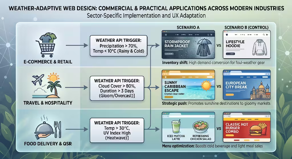
Weather-adaptive web design is not just a creative art project; it is a practical commercial tool. Businesses across many industries are using weather-adaptive web design to create helpful, context-aware digital experiences for their customers.
       [Weather-Adaptive Web Design Engine]
                         │
      ┌──────────────────┼──────────────────┐
      ▼                  ▼                  ▼
[E-Commerce & Retail]  [Travel & Tourism]   [Food & Hospitality]
Rain: Waterproof gear  Snow: Beach escapes  Cold: Warm chowders
Sun:  UV & eye wear    Rain: Indoor spas    Heat: Cold drinks
E-Commerce and Retail Merchandising
Retail brands often struggle with regional inventory promotion. A national apparel store running a single homepage banner in April faces a problem: customers in Maine might still be wearing heavy wool coats, while customers in Arizona are wearing shorts in ninety-degree heat.
With weather-adaptive web design, that homepage changes automatically. A customer visiting from rainy Seattle sees waterproof jackets, sturdy umbrellas, and water-repellent footwear front and center.
At the very same moment, a shopper opening the site from sunny Miami sees lightweight linen shirts, polarized sunglasses, and sun hats.
Weather-adaptive web design cuts out the guesswork. It presents the exact items customers need right now, shortening the path to purchase and boosting overall sales.
Travel and Hospitality
Travel booking websites use weather-adaptive web design to tap into emotional buying triggers. When someone experiences a cold, gloomy, five-day winter storm, their desire for sunshine and warm weather peaks.
Using weather-adaptive web design, a travel booking engine can identify users browsing in freezing, gray regions and adjust its hero banners to feature warm Caribbean beaches, sunny mountain retreats, and bright blue skies.
Conversely, when summer heatwaves make city life uncomfortable, the site can promote relaxing cabin escapes in cool northern forests.
Aligning the emotional tone of the site with what the visitor is experiencing outside creates a compelling, persuasive message that encourages bookings.
Food Delivery and Restaurant Operations
Human cravings shift directly with changes in the weather. Cold, rainy weather triggers cravings for hearty, warming meals like hot soups, ramen, and fresh-baked bakery items.
Hot, sunny afternoons shift preferences toward iced coffees, smoothies, crisp salads, and refreshing cold drinks.
On-demand delivery services using weather-adaptive web design update their category menus dynamically based on local temperature and rainfall data.
Highlighting warm, comforting dishes on chilly, wet evenings helps customers decide faster and boosts order volumes for local restaurant partners.
Accessibility, Contrast, and Sensory Compliance (WCAG Standards)
Every dynamic web project must prioritize digital accessibility. A website that adapts to the weather is useless if it creates barriers for people with disabilities, visual impairments, or sensory sensitivities.
When you build with weather-adaptive web design, you must adhere strictly to the Web Content Accessibility Guidelines (WCAG 2.2).
Respecting User Motion Preferences
One exciting feature of weather-adaptive web design is adding subtle atmospheric touches to the background, like falling rain streaks, drifting fog layers, or shimmering sunlight reflections.
However, motion can cause serious dizziness, nausea, and disorientation for people with vestibular disorders.
Developers must pair weather-adaptive web design with the standard prefers-reduced-motion media query:
CSS
@media (prefers-reduced-motion: reduce) {
  /* Disable dynamic weather animations completely */
  .weather-canvas,
  .rain-particle-layer,
  .atmospheric-shimmer {
    display: none !important;
    animation: none !important;
  }
}
If a visitor turns on “Reduce Motion” in their operating system settings, the site must turn off all dynamic animations immediately.
The site can still adapt its background colors and text recommendations gracefully, but the movement stops. Accessibility must always come before visual flair.
Color Contrast and Readability
A common danger in weather-adaptive web design is letting dynamic themes wash out text contrast. For example, if a site switches to a soft gray color scheme during rainy conditions, the text must not fade into an unreadable light slate color.
Under WCAG 2.2 Level AA requirements, regular body text must always maintain a contrast ratio of at least 4.5 to 1 against its background. Large header text must maintain a ratio of at least 3 to 1.
Modern weather-adaptive web design solves this by calculating contrast values automatically:
CSS
:root[data-weather="storm"] {
  /* Background drops to deep storm slate */
  --ambient-bg: #1e293b;
  /* Text must shift to high-contrast crisp off-white */
  --ambient-text: #f8fafc;
  /* Contrast ratio exceeds 12:1, far exceeding WCAG standards */
}
By carefully planning color pairings for every weather state, weather-adaptive web design ensures the screen remains clear, legible, and comfortable for all users, including those with low vision or color blindness.
Safe Fallback States
What happens when a visitor uses a privacy-focused browser that blocks location data, or when the third-party weather API server goes down?
A fragile website will crash, display a blank white page, or show broken image boxes.
A resilient website built with weather-adaptive web design uses progressive enhancement. The core CSS stylesheet must define clean, neutral, high-contrast defaults right from the start.
If the weather script times out or fails, the site stays on its default theme without throwing errors or breaking the layout.
The visitor still gets a fast, fully functional experience, completely unaware that an external API call was skipped.
Search Engine Optimization and Technical Performance
A common concern among digital marketers is whether weather-adaptive web design could confuse search engine crawlers or harm keyword rankings.
Search engines value predictability, clear content, and fast load speeds. Here is how to implement weather-adaptive web design while protecting and strengthening your SEO performance.
Progressive Hydration vs. Cloaking
Cloaking means showing one set of content to search engine crawlers (like Googlebot) while showing completely different content to human visitors, often to manipulate rankings.
Search engines penalize cloaking heavily.
Weather-adaptive web design never engages in cloaking. When Googlebot crawls a page, it typically arrives from data center IP addresses located in California, Iowa, or Virginia without human browser headers.
A well-architected weather-adaptive web design setup handles this cleanly:
[Googlebot Request]
        │
        ▼
[Edge Server Check]
        │
        ├── Detects Bot User-Agent OR Missing Metro Coordinates
        │
        ▼
[Delivers Standard Canonical HTML]
  ├── Default Semantic Article Content
  ├── Neutral Accessible Theme Tokens
  └── Full Schema.org JSON-LD Structured Markup
Googlebot receives the complete, clean, canonical version of your page.
When a human visitor opens the page from Denver during an afternoon snowstorm, the underlying article text and semantic markup stay identical, but the CSS custom properties hydrate smoothly to apply the snowy theme.
Because the core text, canonical tags, and page structure never change, search engines can easily crawl, understand, and index the content.
Protecting Core Web Vitals
Search engines use Core Web Vitals to measure page experience. Weather-adaptive web design must be engineered to protect three key metrics:
- Largest Contentful Paint (LCP): Measures how fast the main content loads. Weather-adaptive web design protects LCP by keeping all API calls asynchronous and caching weather data at the network edge. The browser never has to wait for a third-party weather server before painting the main text.
- Cumulative Layout Shift (CLS): Measures whether elements jump around on the screen during loading. Weather-adaptive web design prevents layout shifts by updating colors, opacities, and image assets inside containers with fixed dimensions, avoiding sudden size changes.
- Interaction to Next Paint (INP): Measures how quickly the page responds to clicks and taps. By relying on native CSS variables instead of heavy JavaScript libraries, weather-adaptive web design keeps the browser’s main thread free and responsive.
Structured Schema Markup
To help search engines understand your content, your HTML should include rich structured data. Adding WebPage or Article schema using JSON-LD gives search crawlers clear metadata about your topic:
HTML
<script type="application/ld+json">
{
  "@context": "https://schema.org",
  "@type": "TechArticle",
  "headline": "What is Weather-Adaptive Web Design? The Complete Guide",
  "description": "An in-depth exploration of weather-adaptive web design, biophilic UI principles, and context-aware front-end architectures.",
  "author": {
    "@type": "Person",
    "name": "Aristaeus"
  },
  "publisher": {
    "@type": "Organization",
    "name": "Silphium Design LLC"
  }
}
</script>
By combining clean structured data with fast, accessible code, weather-adaptive web design helps you build a modern, high-ranking website that delights both human visitors and search engine algorithms.
The Step-by-Step Developer Guide
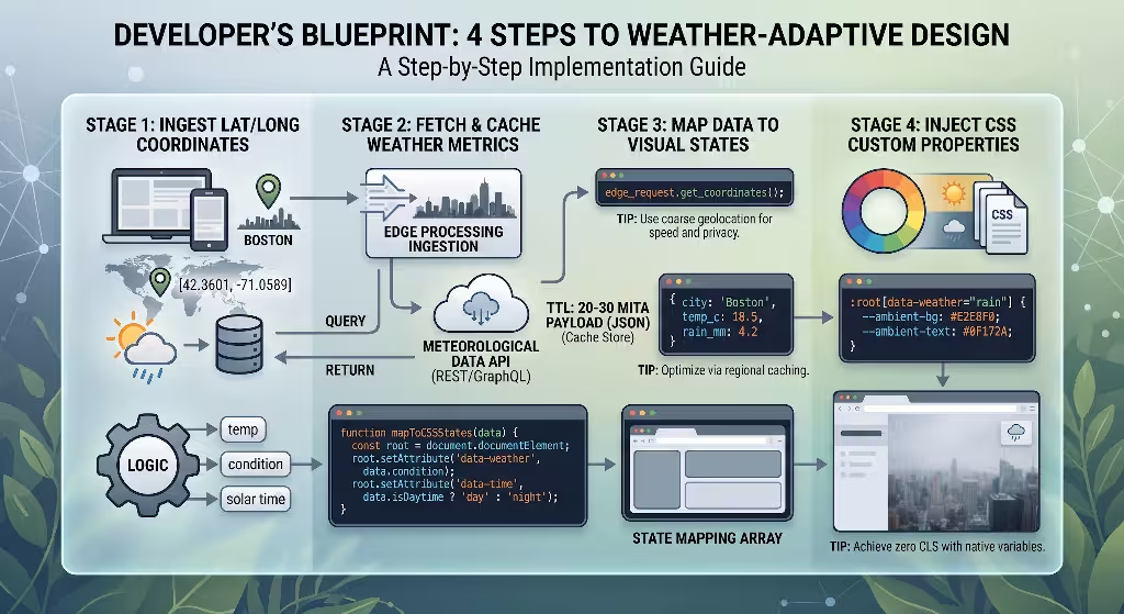
Now, let us walk through the practical implementation. Building a production-ready system with weather-adaptive web design is straightforward when you follow this clear, step-by-step workflow.
Step 1: Set Up Lightweight Geolocation
First, retrieve the visitor’s approximate location at the network edge without prompting for invasive device permissions.
If you are using Cloudflare Workers, you can read these values directly from the request object:
JavaScript
// Edge Worker snippet
addEventListener('fetch', event => {
  event.respondWith(handleRequest(event.request));
});

async function handleRequest(request) {
  // Read geographic data from edge headers
  const latitude = request.cf.latitude || "42.3601";
  const longitude = request.cf.longitude || "-71.0589";
  const city = request.cf.city || "Boston";

  // Pass geographic variables down to the client application
  const response = await fetch(request);
  const newHeaders = new Headers(response.headers);
  newHeaders.set('X-User-City', city);
  newHeaders.set('X-User-Lat', latitude);
  newHeaders.set('X-User-Lon', longitude);

  return new Response(response.body, {
    status: response.status,
    statusText: response.statusText,
    headers: newHeaders
  });
}
Step 2: Fetch and Cache Environmental Metrics
Next, retrieve the current atmospheric conditions. Use a serverless function with built-in caching so you only check external weather services when necessary:
JavaScript
// Serverless Weather Aggregator
async function getCachedWeatherData(lat, lon) {
  const cacheKey = `weather_${Math.round(lat)}_${Math.round(lon)}`;
  const cachedData = await myCacheStore.get(cacheKey);

  if (cachedData) {
    return JSON.parse(cachedData);
  }

  // Fetch from an open weather API if cache has expired
  const apiKey = "YOUR_SECURE_API_KEY";
  const url = `https://api.openweathermap.org/data/2.5/weather?lat=${lat}&lon=${lon}&units=metric&appid=${apiKey}`;

  const res = await fetch(url);
  const data = await res.json();

  const weatherPayload = {
    temp: data.main.temp,
    condition: data.weather[0].main.toLowerCase(), // e.g., 'rain', 'clear', 'clouds'
    isDaytime: (Date.now() / 1000) > data.sys.sunrise && (Date.now() / 1000) < data.sys.sunset
  };

  // Cache the payload for 20 minutes (1200 seconds)
  await myCacheStore.set(cacheKey, JSON.stringify(weatherPayload), { ttl: 1200 });
  return weatherPayload;
}
Step 3: Map Environmental Data to Visual States
Once the client receives this weather data, map it to a single data attribute on the root HTML tag.
Avoid writing complex JavaScript to restyle every element manually. Let your CSS handle the visual changes:
JavaScript
// Client-side Hydration
function applyWeatherTheme(weatherPayload) {
  const root = document.documentElement;
  const condition = weatherPayload.condition; // 'rain', 'snow', 'clear', etc.
  const timeOfDay = weatherPayload.isDaytime ? 'day' : 'night';

  // Apply clean state attributes to the root element
  root.setAttribute('data-weather', condition);
  root.setAttribute('data-time', timeOfDay);
}
Step 4: Define Clean, Scalable CSS Variable Palettes
Finally, define how those data attributes affect your website’s design. Set up your color palettes, backgrounds, and accents using standard CSS variables:
CSS
/* Base default styles */
:root {
  --theme-bg: #ffffff;
  --theme-surface: #f1f5f9;
  --theme-text: #0f172a;
  --theme-accent: #0284c7;
  transition: background-color 0.4s ease, color 0.4s ease;
}

/* Overcast or Rainy Weather */
:root[data-weather="rain"],
:root[data-weather="drizzle"] {
  --theme-bg: #e2e8f0;
  --theme-surface: #cbd5e1;
  --theme-text: #020617;
  --theme-accent: #475569;
}

/* Sunny Day Profile */
:root[data-weather="clear"][data-time="day"] {
  --theme-bg: #fffdf5;
  --theme-surface: #fef3c7;
  --theme-text: #451a03;
  --theme-accent: #d97706;
}

/* Clear Night Profile */
:root[data-weather="clear"][data-time="night"] {
  --theme-bg: #0b0f19;
  --theme-surface: #1e293b;
  --theme-text: #f8fafc;
  --theme-accent: #38bdf8;
}

/* Apply CSS variables directly to your elements */
body {
  background-color: var(--theme-bg);
  color: var(--theme-text);
  font-family: system-ui, -apple-system, sans-serif;
}

.card {
  background-color: var(--theme-surface);
  border: 1px solid rgba(0, 0, 0, 0.08);
}
By following this four-step blueprint, you create a complete weather-adaptive web design system that runs smoothly, loads quickly, and keeps maintenance simple for your development team.
The Future of Living Digital Ecosystems
As we look toward the future of web development, our interfaces will continue to move closer to the natural world. The early days of the web were defined by skeuomorphism, where digital buttons looked like shiny plastic and digital notepads had yellow paper textures.
That was followed by flat design, which simplified layouts but left our screens looking sterile, cold, and disconnected from reality.
Weather-adaptive web design represents a much more thoughtful, sophisticated philosophy: genuine digital biophilia.
By combining modern browser performance with real-time environmental data, weather-adaptive web design allows websites to breathe alongside the people using them.
It respects the natural daylight cycles that govern our sleep, mirrors the atmospheric conditions outside our windows, and delivers timely, helpful solutions when we need them most.
Looking ahead, weather-adaptive web design will expand even further:
- Ambient Light Sensor Integration: Connecting weather data with the browser’s native Ambient Light Sensor API to adjust screen contrast when sunlight hits the display.
- Barometric Stress Detection: Softening visual density and typographic layouts during low-pressure storm fronts to reduce digital fatigue.
- Hyper-Localized Ecology Themes: Displaying native plant life cycles, seasonal foliage shifts, and regional phenology data that reflect local natural cycles.
The internet does not have to be a cold, static collection of isolated pages. By embracing weather-adaptive web design, we can build digital spaces that honor our shared biology, respect our physical surroundings, and create a warmer, more human experience across the web.