Table of Contents
Introduction to Native Plant Colors
Understanding how to use native plant colors requires a balance of art, botany, and computer science. When you look at an indigenous meadow, your eyes take in a complex tapestry of light, texture, and organic chemistry. Bringing that living harmony onto an illuminated glass screen is not as simple as pointing a digital eyedropper tool at a photograph of a wild flower. Digital monitors emit light, whereas plant leaves and petals absorb and reflect sunlight. If you pull raw shades from digital photographs without calibrating them, you will create dull, muddy interfaces that fail basic usability standards.
In this article we will look at how to capture native plant colors accurately, calculate their contrast mathematically, and organize them into scalable digital design tokens. Through thoughtful execution, we can build digital spaces that heal attention fatigue, support search discoverability, and celebrate regional biodiversity.
The Science of Botany: What Native Plant Colors Really Are
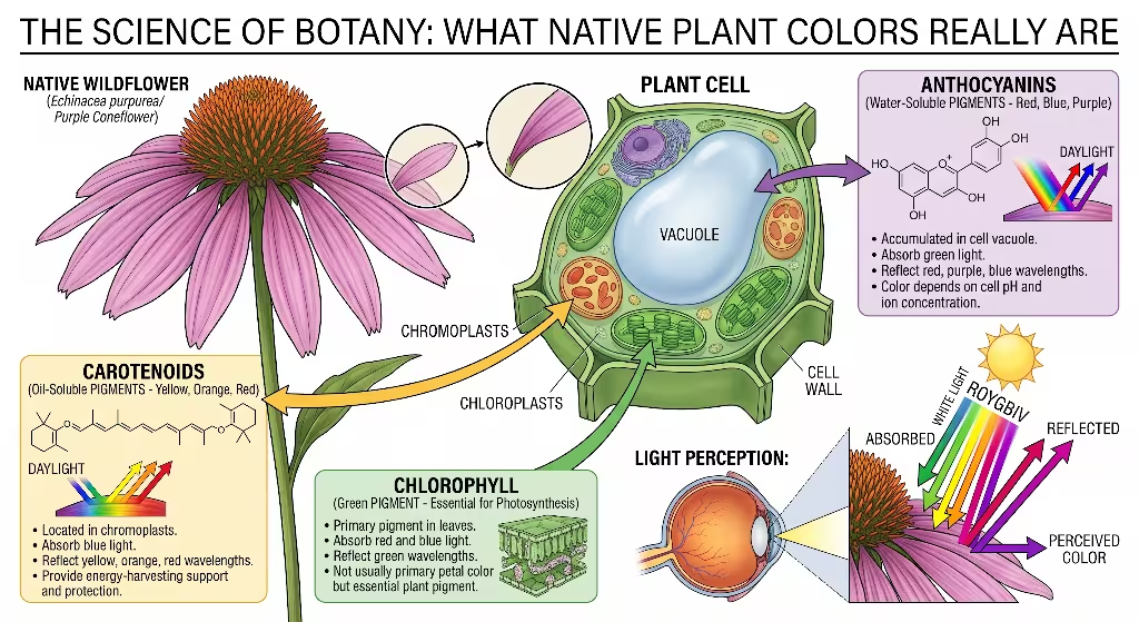
To understand how to use native plant colors in digital design, we must first understand the biological mechanisms that produce them. The colors we observe in wild flora are not accidental. They are precise biochemical adaptations that help plants survive, reproduce, and protect themselves against environmental stress.
Plants produce color primarily through four major classes of pigments: chlorophylls, carotenoids, anthocyanins, and betalains.
Chlorophyll is the primary pigment responsible for life on Earth. It absorbs blue and red wavelengths of light from the sun and reflects green light, allowing plants to perform photosynthesis. In native plants, chlorophyll creates a wide range of greens, from the bright yellow-greens of spring fiddleheads to the deep, blue-greens of mature spruce needles. Understanding these natural green variations is critical for web designers. When inexperienced designers create a green button, they often pick a blinding, synthetic neon green. By studying native plant colors found in wild foliage, designers can select greens that feel grounded, restful, and authentic.
Carotenoids produce the warm yellows, oranges, and deep ambers found in native wildflowers, autumn leaves, and seed pods. These pigments help plants capture additional light energy and protect delicate leaf tissues from sun damage. Carotenoids create the brilliant golden tones of wild black-eyed Susans and the warm orange petals of butterfly weed. Unlike artificial yellows that can feel aggressive on a screen, native plant colors derived from carotenoids carry natural warmth that draws the eye without causing visual strain.
Anthocyanins are water-soluble pigments stored inside plant cell vacuoles. Depending on the acidity of the surrounding cell sap, anthocyanins produce rich reds, purples, and deep blues. These pigments serve as sunscreens for young foliage and act as visual beacons for pollinating insects and birds. We see anthocyanins in the deep purple petals of wild asters, the scarlet leaves of sumac in autumn, and the blue calyxes of wild lupine. These pigments give native plant colors an extraordinary range of emotional expression, from quiet drama to lively celebration.
Finally, some plant families produce betalains, which create distinctive reddish and yellow pigments. These pigments, combined with surface textures, micro-hairs, and waxy coatings, scatter light in unique ways. In the wild, these factors work together to create subtle surfaces that never appear flat or harsh. When we adapt native plant colors for web interfaces, we must honor these organic pigment balances. We are not just borrowing pretty shades from nature; we are adopting visual solutions that have been tested and refined by natural selection over millions of years.
From Field Specimen to Digital Sensor: Calibrated Color Capture
The greatest mistake a designer can make when working with biophilic palettes is relying on casual, uncalibrated photography. Many designers walk through a park, snap a picture of an interesting wild blossom with a smartphone, open the image in design software, and use the eyedropper tool to grab a hex code. This approach always produces poor results.
A digital camera sensor does not see the world the same way the human eye does. Camera sensors record raw light levels, which are then processed by aggressive internal software algorithms that boost contrast, sharpen edges, and artificially saturate hues to make photos look appealing on mobile screens. Furthermore, ambient lighting conditions in the field alter how colors appear. A wild cardinal flower photographed on a sunny afternoon will yield an entirely different digital readout than the exact same flower photographed on an overcast morning. If you sample uncalibrated photographs, you are not capturing true native plant colors; you are capturing software artifacts shaped by random atmospheric conditions.
To capture authentic native plant colors, designers must follow a disciplined, scientific process. When I sample plants in the field, I use a high-resolution camera shooting in uncompressed RAW format. RAW files preserve the unprocessed sensor data, preventing the camera from applying unwanted digital sharpening or artificial saturation.
Next, you will want to introduce a standardized color reference target into the photographic frame. It is helpful to use an industry-standard color checker chart placed directly beside the botanical specimen. This target contains precisely manufactured squares of known color values, including calibrated white, gray, and black chips. By photographing the target in the exact same natural light as the plant, you can create a reliable visual baseline.
We also pay close attention to ambient lighting conditions. Direct, midday sunlight produces harsh highlights and deep shadows that obscure the true pigments of leaves and petals. The best time to sample native plant colors is under a light, overcast sky or during the gentle, diffuse light of early morning. Diffuse cloud cover acts as a giant softbox, scattering sunlight evenly across the plant tissue and revealing the plant’s true pigmentation.
You then want to import the RAW image files into color calibration software. Using the photographed target, the software automatically calculates any color cast caused by the ambient sunlight and corrects the entire image back to a standard daylight standard known as D65 illumination. D65 represents average midday daylight with a color temperature of roughly 6500 Kelvin. Once the image is mathematically balanced, I can extract accurate chromatic values from the petals, stems, seeds, and leaves. This calibrated approach ensures that the native plant colors we bring into our digital design workflow are faithful representations of the living specimens.
The Mathematics of Display: Moving from sRGB to Modern Color Models
Once you have extracted accurate color data from a wild plant, the next challenge is converting that data into a format that web browsers can render accurately. For decades, web designers were confined to the sRGB color space. Created in the late 1990s, sRGB was designed to match the limited capabilities of old cathode-ray tube computer monitors. While sRGB is widely supported, it has serious mathematical limitations that make working with organic palettes difficult.
The traditional way to specify web colors is through red, green, and blue coordinates, often expressed as a six-character hexadecimal code such as #4A7C59. Hex codes describe how much red, green, and blue light a monitor should emit to produce a specific tone. Later, the web adopted HSL, which organizes colors by hue, saturation, and lightness. Many designers love HSL because it seems intuitive. If you want to make a shade lighter, you simply increase the lightness value.
However, both sRGB and HSL suffer from a critical flaw: they are not perceptually uniform. They do not account for the fact that human eyes are far more sensitive to green light than to blue light. In HSL, a pure yellow with a lightness setting of fifty percent looks blindingly bright to a human user, while a pure blue with the exact same lightness setting of fifty percent looks dark and shadowy. If you try to build a functional design system using HSL, your calculated contrast ratios will be unpredictable. A color step that works perfectly for a green leaf hue will fail completely when applied to a yellow petal hue.
To handle native plant colors properly, modern web designers should use the OKLCH color space. OKLCH is a modern, perceptually uniform color model supported by all modern web browsers. It organizes color into three simple components: Lightness, Chroma, and Hue.
Lightness in OKLCH represents perceived brightness as seen by the human visual system. If you set two different colors to a lightness value of seventy percent in OKLCH, both colors will appear to have the exact same visual brightness to a human observer, regardless of their hue. This mathematical predictability makes OKLCH an exceptional tool for accessible design.
Chroma represents the purity or saturation of the color. In OKLCH, chroma starts at zero, which represents a completely neutral gray, and increases outward. Native plant colors generally have lower, more subtle chroma values than synthetic corporate colors. By using OKLCH, we can keep our chroma values within an authentic natural range, preventing our digital interfaces from looking like cheap plastic imitations of nature.
Hue is represented as an angle on a color circle, ranging from zero to 360 degrees. Zero degrees corresponds to a purplish-red, ninety degrees to a warm yellow, 140 degrees to a lush green, and 260 degrees to a cool blue.
When we convert native plant colors into OKLCH coordinates, we can lock the exact natural hue angle of a wildflower and adjust its lightness and chroma up or down with mathematical precision. This allows us to generate light surface backgrounds, balanced card borders, and bold interactive buttons while maintaining the authentic botanical hue of the original plant. The resulting color scales feel organic, harmonious, and completely cohesive across the entire website.
Contrast Math and Web Accessibility Standards
Web accessibility is a moral and legal necessity. The web must be usable by everyone, including people with low vision, aging eyes, situational visual impairments, or color vision deficiencies. The international standard for digital accessibility is the Web Content Accessibility Guidelines, commonly known as WCAG.
The primary challenge when designing with native plant colors is that wild flora did not evolve to satisfy WCAG contrast algorithms. In nature, a plant does not need its petals to have a 4.5 to 1 contrast ratio against its supporting leaves to survive. A hummingbird or a bumblebee sees into the ultraviolet spectrum and relies on polarized light, scent trails, and motion to locate a flower. Human users viewing a flat, two-dimensional screen do not have those sensory inputs. They must rely entirely on visible luminance contrast to read words and find navigation links.
Under WCAG Level AA guidelines, standard body text must have a minimum contrast ratio of 4.5 to 1 against its surrounding background. For large text, defined as eighteen-point regular text or fourteen-point bold text, the minimum contrast ratio is 3 to 1. User interface components, such as input field borders, navigation icons, and active button states, also require a minimum contrast ratio of 3 to 1 against adjacent surfaces. For higher-level compliance, known as Level AAA, body text must achieve an enhanced contrast ratio of at least 7 to 1.
WCAG calculates contrast using a formula based on relative luminance. Relative luminance represents the relative brightness of any point in a color space, normalized to zero for the darkest black and one for the cleanest white. The mathematical formula for calculating the contrast ratio between two colors is straightforward: you add 0.05 to the relative luminance of the lighter color, and divide that by the relative luminance of the darker color plus 0.05.
If you take raw, unedited native plant colors directly from nature and place them onto a website, they will almost always fail these calculations. For instance, the golden petals of wild goldenrod have a high natural luminance, while standard white web backgrounds also have high luminance. If you place raw goldenrod yellow text onto a white background, the contrast ratio will often fall below 2 to 1, rendering the text completely illegible for many users. Similarly, placing deep forest green text onto a dark charcoal background creates a muddy interface that strains the eyes.
The solution is not to abandon native plant colors, but to calibrate them. When building an accessible palette, we take the botanical hue angle of the plant and generate a full tonal spectrum ranging from pure lightness to deep darkness. We use the light end of the spectrum for card backgrounds and page surfaces, and the dark end of the spectrum for typography and primary interactive buttons.
For example, if we want to use the rich crimson of a native cardinal flower (Lobelia cardinalis) for a primary call to action button, we do not use the raw, mid-tone red from the petal, which might achieve only a 3.5 to 1 ratio against white. Instead, we keep the exact botanical hue angle of the cardinal flower, maintain a natural chroma level, and reduce the lightness until the calculated contrast ratio against the white background reaches 4.8 to 1 or higher. This mathematical adjustment preserves the distinct character of the cardinal flower while guaranteeing that the interactive button passes all WCAG Level AA requirements.
Color Vision Deficiency and Visual Ergonomics
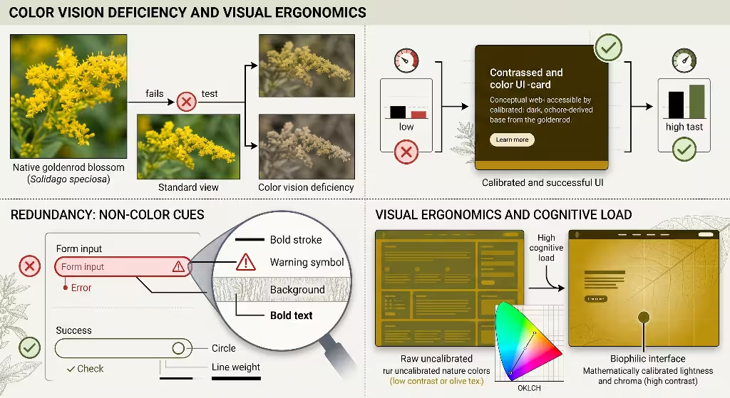
An essential aspect of accessibility that is frequently overlooked when working with natural palettes is Color Vision Deficiency, commonly called colorblindness. Approximately eight percent of men and half a percent of women of Northern European descent have some form of red-green color vision deficiency.
The three most common forms of color vision deficiency are protanopia, deuteranopia, and tritanopia. Protanopia is the absence of working red cone photoreceptors in the eye, making reds appear dark and difficult to distinguish from greens and browns. Deuteranopia is the absence of green cone photoreceptors, which similarly impairs the ability to distinguish red, green, and yellow tones. Tritanopia is a rarer condition involving the absence of blue cone photoreceptors, making it difficult to tell blues from greens and yellows from pinks.
This biological reality creates an immediate hazard for biophilic designers. In the physical world, plants frequently pair red berries with green foliage, or yellow blossoms with green stems. A classic example is the native winterberry holly (Ilex verticillata), which displays bright scarlet berries against deep green branches. While this pairing looks striking to an individual with standard vision, it becomes completely invisible to someone with protanopia or deuteranopia. To a red-green colorblind user, those bright red berries and green leaves blend into an indistinguishable, uniform brownish-gray tone.
If a web designer uses a palette inspired by winterberry and uses green for a success confirmation message and red for an error alert without any supporting visual cues, colorblind users will struggle to navigate the interface. This directly violates WCAG Success Criterion 1.4.1, which states that color must not be used as the sole visual means of conveying information, indicating an action, prompting a response, or distinguishing a visual element.
When designing with native plant colors, we must build redundant visual systems. Whenever we use color to indicate a status or an action, we must accompany that color with secondary visual cues. A form field with an error should feature a distinct red border inspired by winterberry, but it must also include a clear textual explanation and an alert icon. A successful form submission can use a serene green inspired by sweetfern leaves, but it must also display a clear checkmark icon.
Furthermore, we must run our digital palettes through digital color blindness simulators during the design phase. By viewing our native plant colors through simulated protanopic and deuteranopic filters, we can confirm that our visual hierarchy holds up even when color perception is altered. We ensure that our interfaces rely on strong differences in lightness and value rather than subtle differences in hue. If a design works well in greyscale, it will work well for users with any form of color vision deficiency.
Building a Systematic Palette and CSS Token Architecture
To make native plant colors practical for modern web development, we must organize them into a structured design token system. A design token is a named variable that stores a visual design attribute, such as a color value, a font size, or a spacing unit. Tokens allow developers to maintain consistency across large web applications and update visual styles across thousands of pages by modifying a single file.
When I build a biophilic design system, I organize our native plant colors into a three-tiered token architecture: Global Tokens, Semantic Tokens, and Component Tokens.
Global Tokens sit at the foundation of the system. These tokens store the raw mathematical color values extracted from our calibrated botanical specimens. We name these tokens after the actual plant species and assign them a numerical scale from fifty to nine hundred based on their OKLCH lightness value. For example, a global token scale based on native Pennsylvania goldenrod might look like this in modern CSS:
CSS
:root {
  /* Global Botanical Tokens - Solidago altissima */
  --botanical-goldenrod-50: oklch(0.97 0.03 92);
  --botanical-goldenrod-100: oklch(0.92 0.06 92);
  --botanical-goldenrod-200: oklch(0.85 0.10 92);
  --botanical-goldenrod-300: oklch(0.78 0.14 92);
  --botanical-goldenrod-400: oklch(0.70 0.16 92);
  --botanical-goldenrod-500: oklch(0.62 0.15 92);
  --botanical-goldenrod-600: oklch(0.52 0.13 92);
  --botanical-goldenrod-700: oklch(0.42 0.10 92);
  --botanical-goldenrod-800: oklch(0.32 0.08 92);
  --botanical-goldenrod-900: oklch(0.22 0.05 92);
}
Notice how the lightness values decrease systematically as the number increases, while the hue angle remains firmly locked at ninety-two degrees. This guarantees that every shade on the scale retains the authentic hue of the living goldenrod blossom.
The second tier consists of Semantic Tokens. Semantic tokens describe what a color is used for, rather than what it looks like. Instead of telling a browser to make a container goldenrod, a semantic token tells the browser to use a specific surface tone or warning tone. Semantic tokens point directly to our global botanical tokens:
CSS
:root {
  /* Semantic Tokens - Light Mode Default */
  --color-surface-base: var(--botanical-goldenrod-50);
  --color-surface-highlight: var(--botanical-goldenrod-100);
  --color-border-subtle: var(--botanical-goldenrod-200);
  --color-interactive-primary: var(--botanical-goldenrod-700);
  --color-text-primary: var(--botanical-goldenrod-900);
}
This semantic layer provides immense architectural power. It allows us to build an elegant dark mode theme with minimal effort. In traditional web development, creating a dark mode often results in an unappealing, high-contrast inversion where backgrounds become pure black and text becomes blinding white. In a biophilic design system, we handle dark mode by remapping our semantic tokens to reflect the natural experience of walking through a forest at night:
CSS
@media (prefers-color-scheme: dark) {
  :root {
    /* Semantic Tokens - Dark Mode Adaptive */
    --color-surface-base: var(--botanical-goldenrod-900);
    --color-surface-highlight: var(--botanical-goldenrod-800);
    --color-border-subtle: var(--botanical-goldenrod-700);
    --color-interactive-primary: var(--botanical-goldenrod-300);
    --color-text-primary: var(--botanical-goldenrod-50);
  }
}
Finally, the third tier consists of Component Tokens. These tokens are bound directly to individual interface elements, such as buttons, cards, and input fields:
CSS
.card-featured {
  background-color: var(--color-surface-highlight);
  border: 1px solid var(--color-border-subtle);
  color: var(--color-text-primary);
}

.button-primary {
  background-color: var(--color-interactive-primary);
  color: var(--color-surface-base);
}
By organizing our native plant colors into this structured, multi-tiered token architecture, we bridge the gap between organic field botany and production-grade software engineering. The code remains clean, modular, and easy for any development team to maintain.
Psychological and Cognitive Benefits of Nature-Inspired Interfaces
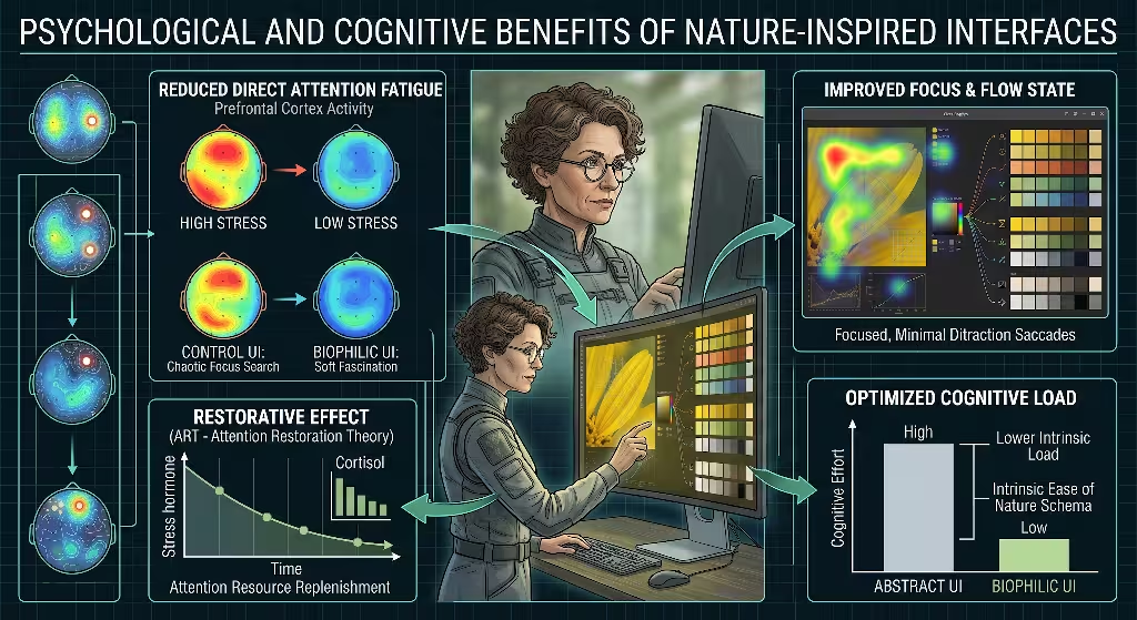
The visual aesthetics of an interface have a direct impact on how users think, feel, and behave. In modern psychology, this relationship is examined through Attention Restoration Theory, originally developed by Rachel and Stephen Kaplan.
Attention Restoration Theory posits that human attention can be divided into two distinct modes: directed attention and involuntary attention. Directed attention is the focused, conscious mental effort required to complete demanding cognitive tasks, such as writing code, reading complex contracts, or calculating financial data. Directed attention is an exhaustible mental resource. When you spend hours staring at visually cluttered, high-contrast screens filled with blinking ads and neon notification badges, your directed attention capacity becomes depleted. This state, known as directed attention fatigue, leads to increased error rates, mental irritation, and reduced focus.
Involuntary attention, by contrast, requires no conscious effort. It is triggered effortlessly by gentle, engaging natural stimuli: the rustle of leaves in an autumn breeze, sunlight rippling across water, or the varied textures of wild meadow vegetation. Psychologists call this quality soft fascination. When a person experiences soft fascination, their directed attention mechanisms are given an opportunity to rest, recover, and restore themselves.
Most modern websites demand aggressive directed attention. They hit users with high-saturation primary colors, jarring contrasts, and chaotic grid layouts that feel like a neon-lit commercial strip. These designs trigger subtle visual stress.
Biophilic web design uses calibrated native plant colors to introduce elements of soft fascination into digital spaces. When a user lands on a website designed with natural palettes, their visual system experiences an immediate sense of ease. The muted, complex tones of wild grasses, forest mosses, and indigenous flowers do not scream for attention. They sit quietly on the screen, providing a restful backdrop that allows the user to focus on reading and interacting with the content without visual strain.
Scientific research shows that viewing natural color harmonies can lower salivary cortisol levels, decrease blood pressure, and reduce muscle tension around the eyes. By substituting synthetic commercial colors with native plant colors, we build digital products that respect the biological limits of human attention. We create websites that leave users feeling calm and focused rather than drained and overwhelmed.
Search Engine Optimization and Digital Content Strategy
A well-architected website must perform exceptionally well on major search engines. As someone who actively monitors the intersection of technical SEO, local search, and biophilic design, I know that visual aesthetics and search engine rankings are closely intertwined.
Modern search engine algorithms have evolved far beyond simple keyword matching. Today, search engines evaluate websites using sophisticated machine learning systems that measure user satisfaction, content depth, semantic authority, and core page experience signals.
A critical factor in organic search ranking is user engagement, often reflected in metrics like dwell time, bounce rate, and organic scroll depth. When a user clicks a search result, the search engine observes what happens next. If the user lands on an abrasive, poorly formatted page with jarring colors and immediately clicks the back button to return to the search results, the algorithm registers a negative user experience. This rapid departure suggests that the page did not fulfill the user’s expectations.
Conversely, when a website incorporates clean, biophilic typography and soothing native plant colors, the immediate visual impression is professional, credible, and welcoming. Users stay on the page longer, scroll deeper into the text, and click through to explore secondary articles. These sustained engagement signals indicate to search engines that the content provides real, enduring value, which helps protect and improve the website’s search ranking over time.
Furthermore, integrating native plant colors into your digital strategy opens up rich content marketing and local SEO opportunities. Search interest in sustainability, native gardening, local conservation, and green living has grown steadily over the last decade. By explicitly documenting how your web design reflects regional flora, you can create engaging, highly original content that attracts valuable organic backlinks from academic institutions, conservation organizations, and environmental groups.
For example, a business based in the Mid-Atlantic region can publish an in-depth design case study explaining how their brand palette was derived from native Appalachian wildflowers. This case study naturally incorporates relevant geographic and environmental keywords, establishing strong local relevance signals for search engines. By aligning your brand with local environmental identity, you differentiate your organization from competitors who rely on generic corporate templates. At Silphium Design LLC, we use this integrated approach to help our clients dominate search rankings while celebrating the natural heritage of their home regions.
Practical Case Studies: Regional Flora in Web Interfaces
To demonstrate how this philosophy translates into real-world applications, let us look at three distinct case studies based on North American ecosystems. Each region features its own unique plant communities, offering an authentic palette of native plant colors that can inspire a complete web design system.
Case Study 1: The Northern Appalachian Hardwood Forest
The Northern Appalachian forest is an ecosystem defined by sugar maple, eastern hemlock, yellow birch, and wild understory ferns. It is a world of filtered green light, damp granite stones, rich leaf litter, and delicate spring ephemeral wildflowers.
For a conservation organization or an eco-conscious forestry enterprise in this region, we can draw a cohesive digital palette directly from local woodland flora:
- Foundational Surface: Inspired by the pale, papery bark of yellow birch (Betula alleghaniensis). In OKLCH, this translates to a soft, warm off-white (
oklch(0.96 0.015 85)) that reduces screen glare compared to harsh pure white. - Secondary Containers and Cards: Inspired by the muted green fronds of marginal wood fern (Dryopteris marginalis), calibrated to a gentle, light sage (
oklch(0.90 0.04 145)). - Structural Borders: Derived from damp river slate, yielding a balanced neutral gray (
oklch(0.75 0.02 240)). - Interactive Buttons and Links: Extracted from the deep, protective purple stems of blue cohosh (Caulophyllum thalictroides), calibrated to an accessible deep plum (
oklch(0.38 0.12 310)) that easily passes WCAG AAA contrast checks against our birch bark surface. - Primary Typography: Drawn from rich forest loam, producing a deep, warm charcoal brown (
oklch(0.20 0.02 55)) that provides exceptional legibility without the eye-straining sharpness of pure black text.
This palette creates an immediate sense of quiet, contemplative calm, perfectly matching the character of a northern forest.
Case Study 2: The Midwestern Tallgrass Prairie
The Midwestern tallgrass prairie is a sun-drenched ecosystem shaped by deep-rooted native grasses and brilliant summer blossoms. It is a landscape of expansive skies, warm golden light, and bold, energetic color contrasts.
For a sustainable agricultural cooperative or an environmental education center in the Midwest, we can build a dynamic palette using native prairie flora:
- Foundational Surface: Derived from the soft, sun-dried husks of big bluestem grass (Andropogon gerardi) in late autumn, yielding a luminous, warm cream (
oklch(0.97 0.02 75)). - Card Surfaces and Modals: Inspired by the pale, silvery-green leaves of leadplant (Amorpha canescens), calibrated to a quiet, desaturated mint (
oklch(0.92 0.03 160)). - Interactive Accent: Drawn from the brilliant, sun-lit petals of showy goldenrod (Solidago speciosa). We use an accessible dark amber (
oklch(0.45 0.14 85)) for interactive buttons, ensuring that this energetic prairie hue passes all Level AA contrast standards against light backgrounds. - Supporting Alert and Interactive States: Extracted from the deep purple cones of purple coneflower (Echinacea purpurea), providing a rich, authoritative violet (
oklch(0.35 0.11 320)). - Body Typography: Sourced from the deep, fertile prairie sod, delivering a solid, grounding black-brown (
oklch(0.18 0.01 60)).
This combination captures the lively, resilient energy of the open prairie while maintaining the strict contrast ratios needed for seamless digital interaction.
Case Study 3: The Southeastern Coastal Plain
The Southeastern coastal plain features sandy soils, longleaf pine savannas, maritime forests, and saltwater marshes. The vegetation in this region is shaped by salt spray, high humidity, and intense coastal sunlight.
For an ecotourism operator or a coastal research institute, we can construct an interface palette drawn from native coastal flora:
- Foundational Surface: Inspired by the pale, weathered seed heads of sea oats (Uniola paniculata), producing a warm, sandy parchment tone (
oklch(0.96 0.02 80)). - Secondary Panels: Derived from the muted, blue-green foliage of cabbage palm (Sabal palmetto), calibrated to a serene, desaturated seafoam (
oklch(0.88 0.03 190)). - Interactive Buttons: Extracted from the vibrant, salt-tolerant petals of seaside goldenrod (Solidago sempervirens), adjusted to a bold, rich ochre (
oklch(0.48 0.13 88)). - Accent Highlights: Drawn from the delicate rose petals of saltmarsh mallow (Kosteletzkya pentacarpos), calibrated to a refined, warm terracotta (
oklch(0.42 0.12 25)). - Primary Typography: Inspired by the dark, resinous bark of mature longleaf pine (Pinus palustris), yielding a deep, slate-tinted pine charcoal (
oklch(0.22 0.02 120)).
By grounding each design system in real, regional plant communities, we create websites that celebrate local identity, educate visitors about native biodiversity, and provide a visually soothing digital experience.
The Future of Biophilic Web Architecture
As digital screens become an ever more dominant part of human existence, the responsibility of the web designer grows. We can no longer treat software interfaces as disposable digital billboards engineered purely to capture clicks through visual shock. The human eye and the human mind deserve environments that nurture focus, health, and calm.
Biophilic web design offers a clear, scientifically grounded path forward. By stepping away from synthetic defaults and studying the intricate beauty of the natural world, we can build digital spaces that honor human biology. Native plant colors provide an extraordinary foundation for this work. They carry the subtle harmony of evolutionary adaptation, offering sophisticated visual relationships that artificial systems cannot replicate.
Bridging the gap between wild botany and modern software requires technical discipline. We must use calibrated photography, modern perceptually uniform color spaces like OKLCH, and rigorous contrast mathematics to ensure our palettes are universally accessible. We must organize our colors into scalable design tokens that integrate seamlessly with modern web frameworks. And we must use thoughtful content strategies to help search engines recognize the quality and regional value of our work.
When we write clean code that celebrates the living patterns of our planet, we bring the web into balance. We can create an internet that is not an escape from reality, but a thoughtful reflection of the living world that sustains us all.