
Table of Contents
The Unseen Convergence of Human Emotion and Digital Carbon Footprints
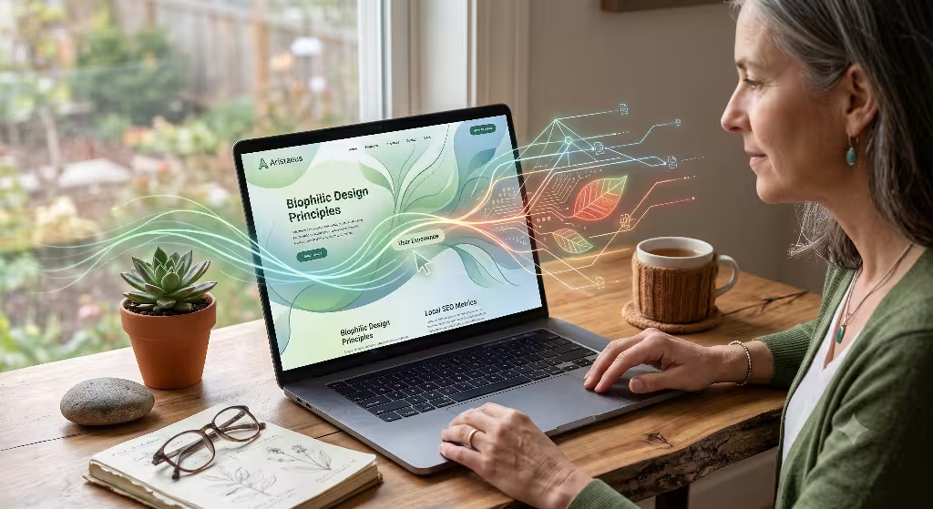
When we think about modern digital design, we usually focus on how fast a website loads or how pretty it looks on a phone screen. We count speed in milliseconds and file sizes in megabytes. However, the true baseline of how a website works relies entirely on human behavior. If a person gets confused while using an app, they do not just feel bad. They also cause their phone and the server to work much harder. This is exactly why empathy matters in sustainable digital design. By understanding how people feel, think, and act online, we can build digital spaces that respect both the human mind and the planet.
Many people view computers and the internet as clean, weightless tools that exist only in a cloud. In reality, every single click, search, and video view requires physical energy. The internet runs on massive networks of computers called data centers, which stay on all day and night. These data centers consume large amounts of electricity and water to keep running and stay cool.
When we talk about sustainable digital design, we are talking about a method of building websites that uses as little electricity as possible. It is a way to cut down on web waste. If a designer creates a website without empathy, the user suffers, and the environment suffers too. This forms a direct bridge between human friction, which means the stress or confusion a user feels, and ecological damage.
Think about what happens when you visit a website that is hard to use. You might get lost in a messy menu, or you might click a button that does not do what you expected. When you get frustrated, you often refresh the page, click the back button, or try typing your search again. Each of these small actions sends a brand new request across the internet to a physical server.
The server must then spend processing power to bundle up the files and send them back to your phone or laptop. This extra work uses up battery power on your device and electrical power at the data center. When we practice sustainable digital design, we realize that a frustrated user is an energy-wasting user.
The core idea of this article is that designing without empathy creates a long chain of wasteful digital habits. Users waste time, get lost, and end up loading the same pages over and over again. This human friction turns into redundant server requests, prolonged computer processing cycles, and a much higher demand for energy across the global web network. By choosing to implement sustainable digital design, we can fix these issues at the root. We can use human-centered frameworks to design clear paths that let people find what they need on the first try. When a user can achieve their goal effortlessly, the website uses fewer resources, which is the main goal of sustainable digital design.
To truly appreciate this connection, we must look at how digital tech impacts our world. The energy used by our phones, laptops, and the networks that connect them creates a real carbon footprint. As more people use the internet every day, the total amount of pollution from digital tools continues to grow. We can no longer treat web development as a process with zero real-world footprint. Every image we upload, every script we run, and every layout we build has an ecological price tag. That is why sustainable digital design is becoming a vital framework for modern web teams who want to build a better web.
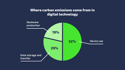
The visual chart above shows how much energy is spent just using our devices, storing data, and moving files across networks. Because over half of the energy impact comes directly from device use, the choices we make during the design phase matter immensely. If we can make a website run smoother and faster on a personal device, we can directly lower that fifty-two percent slice of the energy pie. This is where the power of sustainable digital design shines brightest. It gives us a blueprint to minimize energy waste during the active use phase of digital products.
The Technical Mechanics: How Poor UX Drives Up Digital Carbon Intensity
To understand how bad user experience, or UX, hurts the planet, we have to look closely at user habits. One common habit is rage-clicking. This happens when a user clicks a button or link multiple times very quickly because the website is being slow or responsive elements are broken. The user thinks their click did not work, so they slam their finger down again and again. In the background, the browser is trying to process each of these commands. This causes the device processor to spike in energy use, draining the battery and demanding more power from the electrical grid. This is a clear example of why bad design prevents us from achieving sustainable digital design.
Another common problem is circular navigation. This happens when a website has a confusing menu layout. A user clicks on a link, realizes it is the wrong page, goes back to the home screen, and tries a different link. They run in circles just trying to find a simple piece of information like a phone number or an email address. From the view of sustainable digital design, this is a total failure. Every time the user opens a new page in that confused circle, they are downloading megabytes of data. They are transferring images, fonts, layouts, and tracking scripts over and over. This extra data transfer increases the total digital carbon intensity of the session.
Failed search queries also drive up digital waste. If a website has a poorly built search feature, a user might have to type five different phrases before they get the right result. Each search requires a complex database query on the remote server. The server has to sift through thousands of files to find a match, which uses a lot of computer processing power. If the website had been built with an empathetic understanding of how people type and look for things, the first search would have worked perfectly. This shows that sustainable digital design is not just about writing clean code. It is about understanding the human mind to prevent tech systems from doing unnecessary work.
When we look at the data payload consequences, the facts are clear. A data payload is the total amount of digital information sent across the internet during a single visit. When a user is frustrated, the size of this payload grows fast. Unoptimized images are a huge part of this problem. A designer might upload a massive photo straight from a camera without resizing or compressing it first. This means a user has to download a five-megabyte image when a fifty-kilobyte image would look exactly the same on their screen. This kind of waste runs completely counter to the goals of sustainable digital design.
Bloated JavaScript bundles also create massive problems for sustainable digital design. JavaScript is the programming code that makes websites interactive, like showing pop-ups or animations. Many modern sites use giant piles of code called frameworks or libraries. Often, a site will load a huge library of code just to power one single animated button. The user has to wait for this code to download, and then their phone has to spend power parsing and running that code. This slows down the device and uses up battery power. When we focus on sustainable digital design, we try to write minimal code that only does what is absolutely necessary for the user.
To measure these effects, web teams track specific technical metrics. One major metric is the Document Object Model size, which people call the DOM size. The DOM is the structural map of a webpage that the browser creates to show content. If a page has a giant DOM size with thousands of nested elements, the browser has to use a lot of memory and processing power just to render it on screen. A large DOM size makes a site slow and power-hungry. Keeping the DOM small and simple is a fundamental rule when you want to achieve sustainable digital design.
Another key metric is total page weight, which is measured in megabytes. Over the years, the average page weight of websites has gone up drastically. This growth means websites are becoming heavier and more damaging to the environment. Sustainable digital design focuses heavily on reducing this weight by stripping out useless elements, compressing media files, and avoiding heavy design trends. By keeping the total page weight low, we ensure that the page loads fast and uses very little power, regardless of whether the user has a brand new phone or an old device.
Finally, we look at server response times, also known as Time to First Byte or TTFB. This metric tracks how long it takes for a server to send the very first piece of data back to a browser after a user clicks a link. When a website has inefficient user paths, it causes users to trigger complex database queries constantly. This bogs down the server, making it run hotter and use more electricity. If we map out user journeys with care, we can cache common pages so the server does not have to rebuild them from scratch every time. This approach forms a core strategy within the broader world of sustainable digital design.
Basic Pillars: How Empathetic Design Generates Sustainable Code

The first major pillar of this strategy is reducing cognitive load. Cognitive load is the amount of mental effort it takes for a human brain to process information on a screen. When a website has too many choices, flashy ads, and chaotic layouts, the brain has to work overtime to filter out the noise. This causes mental tiredness for the user. It also keeps their device screen turned on longer, using up valuable battery power. By simplifying our choice architecture, we make it easy for users to make decisions. This speed keeps their sessions short and directly supports the practices of sustainable digital design.
To lower this mental and physical load, we should rely on native semantic HTML tags. HTML is the basic language used to build web pages. Semantic tags are specific words like header, nav, main, and footer that tell the browser exactly what kind of content is inside them. Many web developers avoid these tags and use generic, empty tags for everything instead. This habit requires them to write extra JavaScript and CSS code just to make the page work and look right. By using native tags, we create clean files that browsers can parse with very little processing power. This simple shift is a beautiful example of how sustainable digital design works in practice.
The second pillar focuses on inclusive and accessible design, which matches up perfectly with the official Web Content Accessibility Guidelines, or WCAG 2.2. Inclusive design means making sure that everyone can use a website easily, including people with vision, hearing, or physical challenges. When a website works well with screen readers and keyboard navigation, users with assistive tech can find information on their very first try. They do not have to fight with the interface or refresh the page out of frustration. This efficiency means that accessible design is automatically a form of sustainable digital design because it eliminates long, wasteful web sessions.
Accessibility also means writing code that works on older devices and slower internet connections. Not everyone has a high-speed fiber connection or the newest smartphone. If a website requires a huge amount of processing power just to open, it locks out people who are using older technology. By keeping our layouts accessible and light, we respect the user’s financial situation while reducing the environmental impact of our code. This dual focus on human equity and environmental health is the true heart of sustainable digital design.
The third pillar is the creation of low-stimulus, eco-friendly interfaces. For a long time, web design trends favored bright colors, huge video backgrounds, and lots of moving parts. While these elements might look exciting at first, they demand a massive amount of energy from the user’s device. A low-stimulus interface uses calm, nature-inspired colors and simple layouts that do not overwhelm the eyes or the brain. This design style matches the principles of biophilic design, which brings the balance of nature into our digital worlds. It also happens to be a perfect match for sustainable digital design.
One practical step in building a low-stimulus interface is using dark mode alternatives. Many modern electronics use OLED display technology. On an OLED screen, every single pixel creates its own light. When a pixel displays the color black, it turns off completely and uses zero energy. By providing a clean dark mode option that uses true blacks and dark tones, we can significantly reduce the physical power draw of a user’s phone or tablet. This simple design choice helps save battery life and reduces carbon emissions, showing how visual choices link directly to sustainable digital design.
We must also eliminate autoplaying video backgrounds and heavy animations. A video that starts playing automatically might seem like a cool design feature, but it forces the user’s device to stream large video files continuously. This activity drains the battery, causes the phone to heat up, and uses up the user’s mobile data plan. Heavy animations also force the device’s graphics processor to work at maximum capacity. By choosing static images or simple, CSS-based transitions instead, we respect the user’s data limits and save energy. This respect for resources is what sustainable digital design is all about.
When we combine these three pillars, we see that good design and good code are not separate ideas. When you design with deep empathy for the user’s time, attention, and device limits, you naturally write cleaner, lighter code. You stop adding useless features that serve no real purpose. You build a website that is elegant, fast, and light on resources. This is the ultimate goal of sustainable digital design. It shows that we can protect our planet’s resources by simply treating the people who visit our websites with more care and respect.
Frequently Asked Questions about Sustainable Digital Design and Empathy
What is the role of empathy in sustainable design?
The role of empathy in sustainable design is to shift our focus away from bad business tricks and toward long-term value for the user. In the past, many websites were built using dark patterns, which are tricky layouts designed to make users click on things they did not mean to buy or sign up for. These tricks cause anger, lead to extra clicks, and force people to spend way too much time fixing mistakes. Empathy forces us to design with the user’s environment, age, and data limits in mind. It teaches us to treat a visitor’s time and attention as precious resources that must not be wasted.
When we practice sustainable digital design, empathy acts as a tool that cuts away digital waste. For instance, if a designer knows that their target audience includes people living in rural areas with poor cellular service, they will deliberately make the website lighter. They will not include heavy fonts or massive tracking scripts that take minutes to load. By thinking about the real-world conditions of the user, the designer makes a site that works fast on any connection. This user-first mindset naturally creates a lightweight digital product that aligns with the best practices of sustainable digital design.
Empathy also helps us resist the urge to add features just because they are new or trendy. It makes us ask whether a new feature actually helps the user solve a problem, or if it just adds clutter. If a feature does not add real value, an empathetic designer will leave it out. This keeps the website clean, easy to read, and cheap to host. By focusing deeply on what the user truly needs, we save building materials, time, and energy. This is how empathy serves as the foundational mindset for sustainable digital design.
How does digital design impact the environment?
Digital design impacts the environment through the massive network of physical infrastructure that keeps the internet alive. Every website we create sits on a hard drive inside a data center. These data centers are giant buildings filled with thousands of computers running twenty-four hours a day. They require massive amounts of electricity from local power grids to stay running. They also need millions of gallons of water to run cooling systems so the computers do not overheat. The electricity used by these facilities often comes from burning fossil fuels, which releases greenhouse gases into our atmosphere.
When a designer creates a heavy website with unoptimized media and sloppy code, they are increasing the amount of electricity these data centers must use. Every time someone loads that heavy site, the data center has to work harder to transmit those large files across thousands of miles of cables. This transmission requires network routers and switches to draw more power from the grid. Therefore, a single poorly designed website might seem small, but when multiplied by millions of visits every month, it creates a large carbon footprint. This environmental impact is the exact problem that sustainable digital design aims to solve.
Furthermore, heavy websites place a major strain on the consumer’s personal devices. When a phone has to process a bloated website, its battery drains much faster. This forces the user to plug their phone into the wall more often, consuming more residential electricity. Over time, running heavy apps and websites makes devices run hot, which degrades the internal battery health. This causes people to throw away their phones and buy new ones sooner than they should. The manufacturing of new electronics creates a massive amount of mining waste and pollution, making sustainable digital design vital for extending the lifespan of our current hardware.
Why is empathy critical in UX/UI frameworks?
Empathy is critical in UX/UI frameworks because it helps design teams isolate and remove user pain points before they turn into digital waste. Organizations like the Nielsen Norman Group have shown that objective empathy is the most powerful tool a designer has. Without empathy, designers often build interfaces based on their own personal preferences or high-end office computers. They forget that the average user might be distracted, using an old phone, or dealing with a slow internet connection. When a design team uses an empathetic framework, they test their ideas against real-world human limits.
By identifying where users get stuck, an empathetic design team can eliminate unnecessary steps in a signup form or checkout process. Removing these steps means the user completes their task faster, which translates to fewer page refreshes and less data sent across the web. This direct optimization of the user journey is a core part of sustainable digital design. It shows that fixing a user’s frustration is the exact same thing as reducing a website’s energy consumption. You cannot have an efficient digital product without a deep understanding of human behavior.
In addition, empathy prevents teams from deploying bloated features that add no value but take up massive amounts of server storage and network bandwidth. When companies build features just to hit a deadline or copy a competitor, they create digital clutter. This clutter confuses users and fills up servers with dead weight. An empathetic framework keeps the focus on simplicity and clarity. It ensures that every line of code and every visual element has a clear purpose. This disciplined approach to product management is what allows sustainable digital design to succeed in large business settings.
Operationalizing Empathy: A Technical Framework for Teams

To bring these ideas into reality, web development teams need a clear roadmap. The first step in this framework is an auditing strategy that uses the official W3C Web Sustainability Guidelines. These guidelines give teams a clear checklist to measure the environmental impact of their digital products. Instead of waiting until a website is completely finished to think about performance, teams must include these sustainability metrics right at the beginning during the initial wireframing and user journey mapping phases. This ensures that efficiency is built into the very bones of the project.
During the wireframing phase, designers should look at every layout and ask how much data it will take to display. They should plan for text-based elements instead of heavy images wherever possible. They should also design clear, direct navigation paths so users never have to guess where to click next. By mapping out user journeys with a strict focus on minimizing steps, teams can ensure their early concepts match the goals of sustainable digital design. This preventive care saves hours of coding time and prevents digital waste down the road.
The second step in our framework is performance budgeting. A performance budget is a set of strict limits that a website must not exceed. For example, a team might decide that their homepage must weigh less than one megabyte in total file size, load in under two seconds on a slow mobile connection, and make fewer than thirty individual server requests. This budget acts as an empathetic boundary line that protects users who have strict mobile data caps or older hardware. It forces the design team to make careful choices about what elements are truly necessary.
If a developer wants to add a new tracking script or a flashy animation, they must look at the performance budget first. If the new feature pushes the website over the one-megabyte limit, they must find something else to remove or optimize to make room for it. This practice ensures that the website remains fast, light, and eco-friendly over time. Performance budgeting is a brilliant way to turn the abstract concept of empathy into a concrete, measurable practice that guarantees sustainable digital design across every phase of a website’s life cycle.
+-----------------------------------------------------------------------+
|                      THE SUSTAINABLE DESIGN LOOP                      |
+-----------------------------------------------------------------------+
|                                                                       |
|   1. EMPATHETIC UX   -->  Reduces user confusion & extra clicks.      |
|          |                                                            |
|          v                                                            |
|   2. LIGHTER PAYLOAD -->  Lowers data weight & server requests.       |
|          |                                                            |
|          v                                                            |
|   3. LESS GRID POWER -->  Reduces electricity used by data centers.   |
|          |                                                            |
|          +------------->  [ Result: Sustainable Digital Design ]      |
|                                                                       |
+-----------------------------------------------------------------------+
The third step in the framework connects our front-end design choices with back-end infrastructure optimization. It is not enough to just make the user interface light; we must also host our files on servers that care about the environment. This means choosing green hosting companies that power their data centers with renewable energy sources like wind, solar, or hydro power. By pairing an efficient front-end design with a clean back-end power source, we can drastically reduce the total carbon footprint of our digital properties, achieving the true goal of sustainable digital design.
Teams should also implement advanced caching policies and utilize Content Delivery Networks, which people call CDNs. A CDN is a global network of servers that stores copies of a website’s files in multiple locations around the world. When a user visits the site, the CDN delivers the files from the closest physical server. This reduces the distance the data has to travel across the internet, which saves energy and speeds up load times. Caching allows the user’s browser to store parts of the website locally, so they do not have to download the exact same logo and navigation menu every time they click a new page. These technical choices are core pillars of a successful sustainable digital design strategy.
Finally, teams must focus on code optimization on the server side. This means writing clean, direct database queries that execute quickly without burning up server processor cycles. It means minifying text files by stripping out useless spaces, comments, and formatting from the live code. It also means using modern, highly efficient file types like WebP or AVIF for images, and WOFF2 for custom web fonts. These technical steps might seem small on their own, but when combined, they transform a slow, heavy website into a masterpiece of sustainable digital design that respects both the user and the planet.
The Sustainable ROI of Empathetic UX in Sustainable Digital Design
In the end, we must realize that empathetic design is fundamentally low-impact design. When we take the time to truly understand the people who use our digital tools, we naturally build better websites. We create paths that are clear, layouts that are simple, and code bases that are light. By prioritizing user clarity and minimizing human frustration, we automatically create streamlined, fast-loading, low-carbon digital spaces. This shows that empathy is not just a soft, emotional concept. It is a highly practical engineering tool that drives the success of sustainable digital design.
The return on investment, or ROI, of this approach is massive. From a business view, a faster, simpler website leads to higher conversion rates, better search engine rankings, and lower server hosting costs. When users can find what they need without getting confused, they are much happier and more likely to return. At the exact same time, from an environmental view, we are reducing data waste, saving electricity, and cutting down on digital carbon emissions. This is a perfect win-win scenario where human-centered design directly creates ecological benefits through the framework of sustainable digital design.
As software engineers, digital product designers, and business owners, we must move past lazy web development habits. We can no longer afford to build bloated, heavy websites that ignore the real-world resource limits of our users and our planet. It is time to abandon flashy, useless design trends that serve only to clutter the web. We must adopt a biophilic, human-centered approach to engineering an eco-friendly internet. By infusing our technical workflows with genuine empathy, we can transform the web into a sustainable resource for generations to come.
Sustainable digital design is not a temporary trend or a set of rules you can ignore. It is the future of how we must build things online. Every digital product we create should stand as a testament to our respect for human attention and planetary health. Let us commit to auditing our current websites, setting strict performance budgets, and designing with a deep sense of care. When we build digital spaces with love for the user and respect for the earth, we create an internet that is truly sustainable, fast, and beautiful for everyone.