My background is in biology and web design, which means I look at your computer screen the same way I look at a forest floor. I see systems, I see patterns, and most importantly, I see life.
Today, we are going to talk about a very special concept: movement in design.
Table of Contents
The Evolutionary Need for Motion
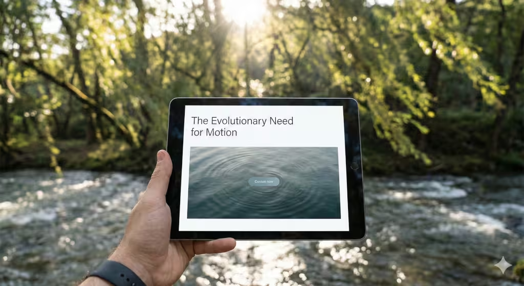
Have you ever sat by a campfire or watched the waves at the beach? You can stare at those things for hours. You don’t get bored, and your eyes don’t get tired. This is because your brain is programmed to love a specific kind of movement in design.
For thousands of years, our ancestors lived outside. They had to watch the grass blow in the wind to see if a predator was hiding there. They had to watch the flow of a river to find clean water. Because of this, our eyes are very good at spotting “living” movement. In the world of web design, we call this the Biophilic Hypothesis. It is the idea that humans have a built-in need to connect with nature.
When you use movement in design that feels natural, you are talking directly to the oldest part of the user’s brain. Most websites today are very stiff. They feel like a box made of glass and cold metal. But when we add “breathing” movements, the website starts to feel like a living place. This makes people feel safe, interested, and calm. Our goal today is to learn how to move away from boring, jerky animations and move toward a digital world that feels as real as a garden.
Understanding Biomorphic Forms and Patterns
Before we can make things move, we have to understand the shapes we are using. “Biomorphic” is a big word, but it just means “shapes that look like life.” Think of the curve of a seashell or the way a tree branch splits into smaller twigs. These are not perfect squares or circles. Nature rarely uses a straight line.
When we talk about movement in design, we have to start with these organic shapes. If you take a square box and make it bounce, it still looks like a machine. But if you take a shape that looks like a water droplet and make it ripple, the user feels a connection to it.
We can look at history for help here. An architect named Frank Lloyd Wright used “organic architecture” to make buildings feel like they grew out of the ground. Another man named Ernst Haeckel drew thousands of tiny sea creatures with amazing, twisting shapes. By using these forms in our buttons, menus, and backgrounds, we create a base for movement in design that feels right to the human eye.
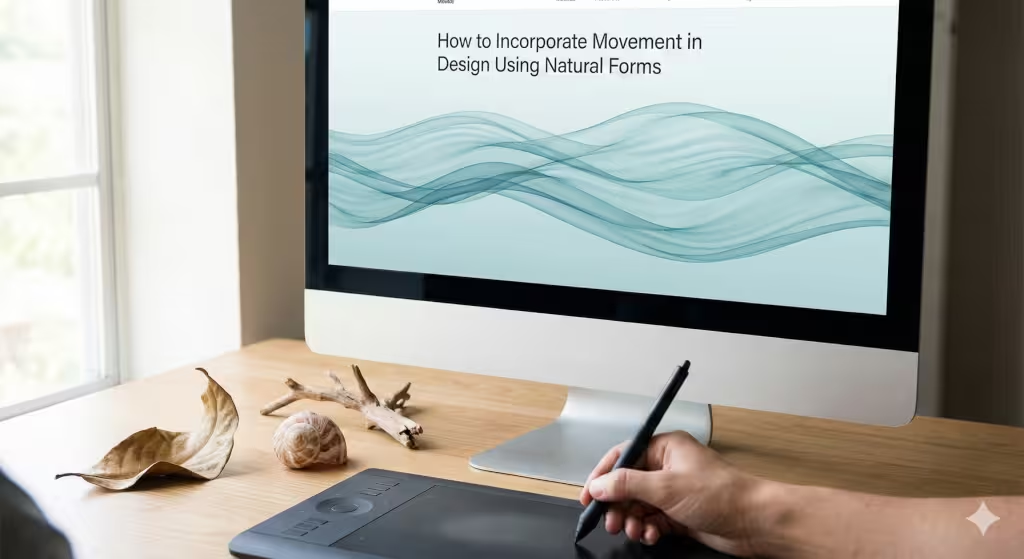
Core Strategy: How to Incorporate Movement in Design Using Natural Forms
Now, let’s get into the “how-to” part. How do we actually make a website move like a living thing? The secret is something called “non-rhythmic sensory stimuli.”
Imagine a grandfather clock. It goes tick-tock, tick-tock. That is rhythmic. It is predictable. After a minute, your brain ignores it. Now, imagine a leaf falling from a tree. It swerves left, then right, then tumbles, then floats. You can’t guess exactly where it will land. This is non-rhythmic movement.
To use movement in design effectively, you should avoid perfect loops. If a background video or an icon animation repeats perfectly every two seconds, the brain gets bored. We call this “banner blindness.” To fix this, we use “stochastic motion.” This is a fancy way of saying we add a little bit of randomness.
For example, if you have a “contact us” button that gently pulses, don’t make it pulse the same way every time. Use a little bit of code to make the timing change slightly. This tiny bit of variety makes the movement in design feel like it is coming from a living creature rather than a computer chip.
Technical Implementation: The Science of the Screen
When we build these sites, we have to think about how a plant or an animal reacts to the world. Have you ever seen a “sensitive plant”? If you touch its leaves, they fold up instantly. This is a perfect example of how to use movement in design for buttons.
Instead of a button just changing color when you click it, what if it reacted like a leaf? What if it shrunk slightly and then slowly opened back up? This is called a micro-interaction. It makes the user feel like they are actually touching something real.
Another great trick is using “parallax.” This is when the background moves slower than the front of the page. It’s exactly what happens when you look out a car window. The trees close to you zoom by, but the mountains far away move slowly. Using this kind of movement in design gives the website depth. It makes the user feel like they are walking through a forest or looking into a deep pond.
We also use “fractals.” Fractals are patterns that repeat at different sizes. You see them in snowflakes and ferns. If you make your loading screen or your page transitions follow a fractal pattern, the movement in design will feel balanced and beautiful.+1
Your Questions Answered
A lot of people ask, “How do you represent movement in a design if it’s just a flat screen?” The answer is transitions. Movement isn’t just about things flying across the screen. It is about how one thing turns into another. Instead of a new page just “popping” up, it should “unfold” or “fade in” like a mist clearing.
People also ask, “What are examples of natural forms?” Think of meanders, which are the curvy paths rivers take. Think of spirals, like the way a vine grows. These are the shapes we use to guide the user’s eye.
Finally, people ask if this helps with SEO. Yes, it does! SEO stands for Search Engine Optimization. It’s how Google decides if your site is good. When people like looking at your site because the movement in design is soothing, they stay longer. Google sees that people are staying on your page and thinks, “This must be a great website!” This helps you show up higher in search results.
Entities Associated with Movement in Design
At Silphium Design LLC, we keep an eye on the leaders of this field. Groups like Terrapin Bright Green study how nature affects our happiness. They found that seeing movement in design that mimics nature can actually lower your heart rate.
When we talk about the “Natural Web,” we are talking about a future where the internet isn’t just a tool, but an environment. Search engines are getting smarter. They don’t just look for keywords anymore. They look for “user experience.” By following the rules of biophilic design, we are making sure our sites are ready for the future of the internet.
The Psychology of Flow States
Have you ever been so focused on a task that you forgot what time it was? That is called a “flow state.” Good movement in design helps people reach this state.
There is something called the “Savannah Hypothesis.” It says that humans feel most comfortable when they have a clear view of an open space but also have a safe place to hide. On a website, this means having a clean, open layout with gentle movement in design in the background, but clear “refuge” areas like a solid menu or a footer where the user can find help.
We can even change the movement in design based on the time of day. In the morning, the site can have bright, quick movements like a bird chirping. In the evening, the movements can slow down and get warmer, like a sunset. This matches the user’s “circadian rhythm,” which is the body’s natural clock.
The Future of Biophilic Interfaces
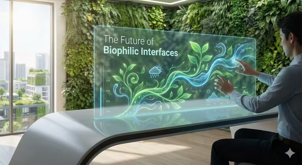
As we look toward the future, movement in design will only get more important. We are moving away from mouse clicks and moving toward touch and even eye-tracking. When the way we interact with computers changes, the way the computer moves must change too.
In conclusion, movement in design should not be a loud distraction. It should be a quiet conversation. It should feel like the wind in the trees or the tide coming in. It should be there to guide you, comfort you, and remind you that even in a world of code and pixels, we are still a part of nature.
Next time you go for a walk, look at the way the world moves. Look at the ripples in a puddle. Look at the way a cat stretches. Then, bring those lessons back to your desk. That is the secret to great design.
Understanding Movement Terms
| Term | What it Means for You |
| Fibonacci Sequence | A math rule that makes things look perfectly balanced. |
| Golden Ratio | A special shape that humans find very pretty. |
| Biomimicry | Copying nature to solve human problems. |
| Saccadic Masking | How our brain hides the “blur” when our eyes move fast. |
Why Biophilic Movement Matters for Your Brand
When a business uses movement in design that feels natural, it builds trust. Think about the difference between a neon sign that blinks “SALE” and a beautiful wooden sign that swings gently in the breeze. Which one do you trust more? The one that feels like it belongs in the real world. For example, the Strawbridge Pools, Spas, & Fencing website, completed by Silphium Design, uses the movement of water in a pool.
By using organic movement in design, you tell your customers that you care about their well-being. You aren’t just trying to grab their attention; you are trying to give them a good experience. This is especially important for local SEO because it makes your brand feel like a real part of the community, not just another faceless company on the web.
The internet can be a stressful place. There are too many pop-ups, too many bright lights, and too much noise. By focusing on calm, natural movement in design, we can make the web a better place for everyone.
Bringing it All Together
So, we have learned that movement in design should be:
- Non-rhythmic: Not a boring, perfect loop.
- Biomorphic: Using shapes found in nature.
- Subtle: It should be felt more than it is seen.
- Responsive: It should react to the user like a living thing.
If you follow these steps, your website will do more than just show information. it will create an emotion. And in the world of business, emotions are what make people remember you.
A Note on Accessibility
While we love movement in design, we must also be careful. Some people get dizzy or sick if things move too much on a screen. This is why we always make sure our natural movements are gentle. We also make sure there is an easy way to turn them off if someone needs to. Good design is for everyone. It should be as inclusive as a public park.
In the end, biophilic design is about bringing the outdoors in. It is about remembering that we are biological creatures using digital tools. When we bridge that gap with smart movement in design, we create something truly special.
Bonus Section: To Get You Started, Here Are Some Image Prompts
Moving from theory to visual application is where the real magic happens. As I mentioned, the key is subtlety. You want backgrounds that feel alive, not ones that scream for attention.
Here are four distinct image generation prompts, crafted to create biomorphic backgrounds that embody the principles of natural movement. I have designed these to be abstract enough for use as website backdrops without interfering with text legibility.
1. The “Fluid Dynamics” Prompt
Concept: Mimicking the non-rhythmic flow of water or air currents. This is perfect for creating a sense of calm progress.
Image Generation Prompt:
A macro photograph of translucent, abstract fluid patterns in motion. Slow-moving, swirling currents of calming blues, soft aquamarines, and muted moss greens. The style is like ink diffusing in water, but more controlled and organic, showing gentle ripples and eddies. Natural, soft light filtering from above, creating gentle caustics and refractions. The overall feeling is serene, slow, and continuous. No hard edges. 4K resolution, organic texture.
Silphium’s Note on Application: Use this as a hero section background. The gentle, non-repeating flow lures the eye down the page, encouraging the user to begin their journey on your site without feeling rushed.
2. The “Botanical Fractal” Prompt
Concept: Using the self-similar branching patterns found in plants to create a sense of ordered complexity and growth.
Image Generation Prompt:
An abstract, close-up view of overlapping organic vein patterns, similar to the underside of a leaf or a dragonfly wing. The structure is a complex, branching fractal network in warm earth tones: muted gold, soft sepia, and pale olive. The background is a soft, out-of-focus gradient of creamy off-white. The veins appear to be gently pulsing with a subtle inner light, suggesting slow growth or energy transfer. Macro lens, shallow depth of field, natural textures.
Silphium’s Note on Application: This works beautifully for a “Services” or “About Us” section. The branching pattern subtly implies growth, connection, and a solid foundation, building trust with the user.
3. The “Atmospheric Drift” Prompt
Concept: Replicating the slow, unpredictable movement of particles in the air, like pollen, mist, or dust motes in a sunbeam.
Image Generation Prompt:
A soft-focus, ethereal landscape of slow-moving atmospheric particles. Thousands of tiny, golden and white specks drifting lazily in shafts of warm, natural sunlight that pierce through a soft, hazy canopy of deep greens and browns. The movement is random and non-rhythmic, like dust motes floating in a quiet room. The overall effect is dreamlike and airy. Cinematic lighting, high detail in the particles, bokeh effect in the background.
Silphium’s Note on Application: This is an excellent choice for a footer or a “contact” section. The upward drift of particles can subconsciously create a feeling of hope or a “send” action, leaving the user on a positive final note.
4. The “Geological Flow” Prompt
Concept: Using the slow, inexorable patterns of geology, like flowing lava or sedimentary layers, but softened for a digital context.
Image Generation Prompt:
An abstract visualization of slow-moving geological layers. Soft, undulating bands of mineral colors: charcoal grey, burnt sienna, muted copper, and cream. The layers appear to be slowly flowing over one another, like molten earth cooling over millennia, creating gentle, rolling hills and valleys on a microscopic scale. The texture is matte and stony, but the movement is fluid. Soft, ambient side-lighting to emphasize the topography.
Silphium’s Note on Application: Use this for sections with dense information or data. The grounding, solid colors combined with the slow, powerful movement provide a sense of stability and authority, making complex information feel more digestible.