
Table of Contents
Most websites today feel loud, bright, and exhausting to look at. Stark white backgrounds blast blue light into your eyes, while neon buttons and harsh black text compete for your attention on every scroll. A well-crafted Japandi color palette solves this problem by bringing the calm balance of nature directly onto your screen.
This design approach blends two beloved interior styles: Japanese wabi-sabi and Scandinavian hygge. Wabi-sabi teaches us to find beauty in simplicity, natural materials, and quiet imperfection. Hygge focuses on warmth, comfort, and practical everyday living. When you translate these physical ideas into digital web design, you create interfaces that feel peaceful, trustworthy, and effortless to use.
From a biological and visual science perspective, human eyes did not evolve to stare at glowing white rectangles. For thousands of years, our visual system adapted to outdoor environments filled with soft daylight, forest shade, river stones, clay soil, and tree bark. High-chroma digital colors and pure white screens force the muscles in your eyes to work harder, which leads to rapid eye strain and mental fatigue.
A biophilic Japandi color palette uses low-saturation, earth-derived wavelengths that mirror natural light and organic textures. By lowering the visual intensity of your user interface, you reduce cognitive load so visitors can read, think, and browse without feeling overwhelmed.
In this guide, you will learn how to build a complete Japandi color palette from the ground up. We will explore why warm undertones beat sterile grays, give you four copy-paste color palettes with HEX, RGB, and OKLCH codes, and show you how to apply the 60-30-10 layout rule. You will also get tested contrast ratios for Web Content Accessibility Guidelines (WCAG) compliance, dark mode strategies, and production-ready CSS code you can drop into your next web project today.
The Anatomy of a Japandi Color Palette: Living Undertones vs. Sterile Neutrals
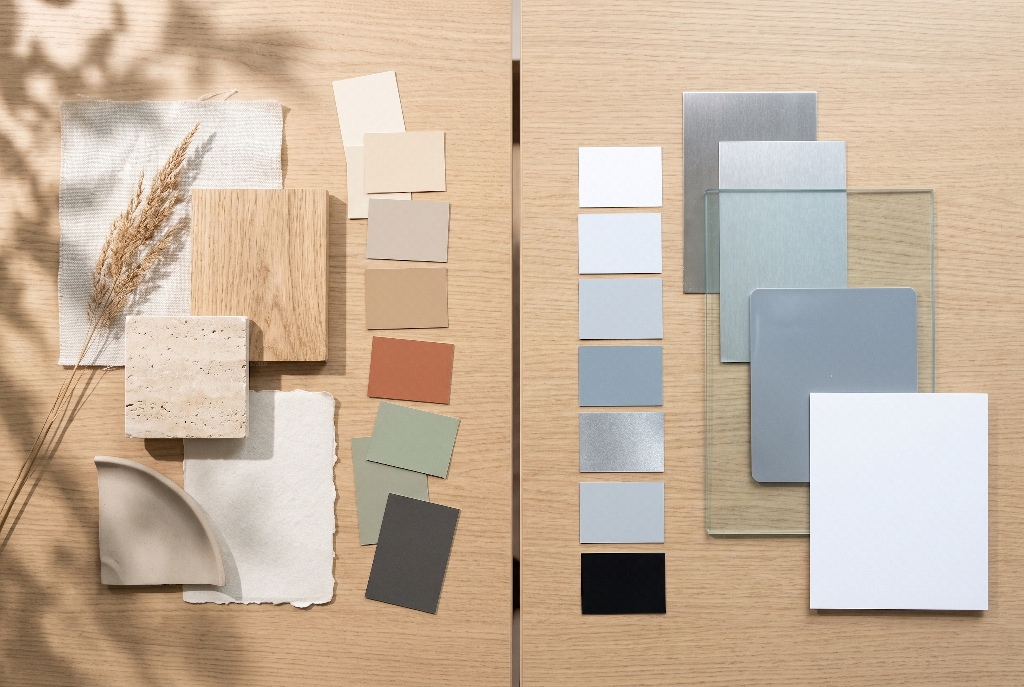
To build an authentic Japandi color palette, you first need to understand why standard web neutrals fail. Most default website templates rely on pure white (#FFFFFF), pure black (#000000), and cool, blue-tinted grays. On a backlit computer monitor or phone screen, cool grays feel cold, mechanical, and clinical. They remind users of spreadsheets, hospital hallways, or generic corporate software rather than a welcoming human space.
A true Japandi color palette replaces cold digital grays with “living” neutrals that carry warm, organic undertones. Think about the colors of raw materials in a quiet room: unbleached cotton curtains, warm plaster walls, smooth river pebbles, and freshly planed oak timber. Every neutral in a Japandi color palette has a subtle hint of yellow, red, or warm brown underneath it. These undertones soften the harsh glare of pixels and make the screen feel tactile, almost like reading ink on handmade paper.
Every strong Japandi color palette relies on four foundational color pillars working together in harmony:
- Warm Base Whites and Creams: Instead of pure white, Japandi websites use soft off-whites inspired by Japanese shoji paper screens and unbleached linen. These shades carry gentle cream or ivory undertones that reflect light softly and prevent eye fatigue during long reading sessions.
- Bridging Mid-Tones (Greige, Oat, and Taupe): Mid-tones sit between light backgrounds and dark text. Colors like warm greige (a blend of gray and beige), oat milk, and soft taupe anchor cards, sidebars, and navigation menus without creating jarring lines.
- Timber and Clay Warmth: Wood and earth tones bring life and soul to the screen. Shades inspired by Scandinavian white oak, honey bamboo, raw terracotta clay, and toasted walnut add cozy warmth so a minimalist page never feels empty or boring.
- Soft Sumi Ink Anchors: Pure
#000000black creates too much visual shock against warm cream backgrounds. Instead, a Japandi color palette uses deep, desaturated charcoal and charred-oak tones (#232220to#353530). These dark shades mirror traditional Japanese sumi ink made from pine soot, giving your text crisp readability with a soft, organic edge.
Four Curated Japandi Web Design Color Palettes with HEX, RGB, and OKLCH Values
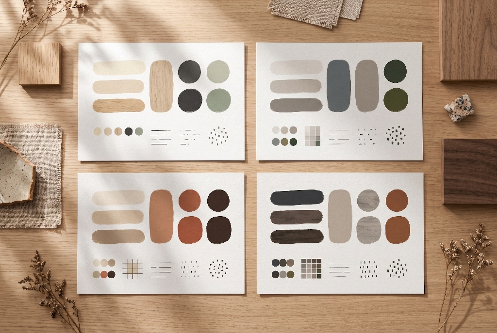
Choosing colors by eye alone often leads to muddy layouts or clashing undertones. Below are four tested palettes ready for modern web design. Each table provides standard HEX and RGB values alongside OKLCH values. OKLCH is a modern CSS color format that measures perceptual lightness, chroma (color intensity), and hue. Using OKLCH makes it much easier to keep brightness consistent across different buttons and cards.
1. Classic Daylight Shoji and White Oak
This is the signature daytime Japandi color palette. It pairs sun-warmed shoji cream backgrounds with soft oat surfaces, white oak accents, and calm sage green buttons. It works wonderfully for lifestyle brands, architecture portfolios, editorial blogs, and wellness platforms.
| UI Role | Color Name | HEX | RGB | OKLCH |
| Canvas Background | Shoji Cream | #F4F0E8 | 244, 240, 232 | oklch(95.3% 0.012 85.4) |
| Elevated Surface / Card | Oat Linen | #E6E0D4 | 230, 224, 212 | oklch(90.6% 0.017 82.1) |
| Primary Typography | Sumi Charcoal | #2B2A27 | 43, 42, 39 | oklch(28.5% 0.007 84.6) |
| Muted Border / Divider | Warm Travertine | #CFC6B6 | 207, 198, 182 | oklch(82.4% 0.023 80.5) |
| Primary Call to Action | Deep Moss Sage | #4E5B49 | 78, 91, 73 | oklch(45.2% 0.033 136.8) |
| Secondary Accent | White Oak | #C19E85 | 193, 158, 133 | oklch(71.4% 0.056 54.2) |
2. Botanical Moss and River Stone
If your brand focuses on nature, sustainability, organic skincare, or outdoor living, this biophilic Japandi color palette brings forest calm onto the page. Cool river-stone greige balances warm alabaster backgrounds, while deep forest green provides high-contrast action buttons.
| UI Role | Color Name | HEX | RGB | OKLCH |
| Canvas Background | Fog Alabaster | #F2F1ED | 242, 241, 237 | oklch(95.6% 0.006 95.2) |
| Elevated Surface / Card | Pebble Greige | #E1DDD3 | 225, 221, 211 | oklch(89.5% 0.013 88.4) |
| Primary Typography | Slate Ink | #242725 | 36, 39, 37 | oklch(26.9% 0.008 152.1) |
| Muted Border / Divider | River Silt | #C5C1B6 | 197, 193, 182 | oklch(80.6% 0.015 89.7) |
| Primary Call to Action | Deep Forest Pine | #3D463B | 61, 70, 59 | oklch(38.1% 0.024 139.5) |
| Secondary Accent | Olive Lichen | #7A826B | 122, 130, 107 | oklch(58.4% 0.036 121.3) |
3. Kiln Terracotta and Raw Clay
This variation leans deeper into warm earth pigments. Desaturated terracotta clay and rich espresso bark give the interface a grounded, handcrafted feeling. It is an ideal Japandi color palette for ceramic artists, artisan coffee roasters, boutique hotels, and sustainable home goods stores.
| UI Role | Color Name | HEX | RGB | OKLCH |
| Canvas Background | Warm Bone | #F6F2EA | 246, 242, 234 | oklch(96.0% 0.011 84.8) |
| Elevated Surface / Card | Raw Sand | #E7DDD0 | 231, 221, 208 | oklch(90.1% 0.021 71.6) |
| Primary Typography | Espresso Bark | #2E2622 | 46, 38, 34 | oklch(27.8% 0.017 44.2) |
| Muted Border / Divider | Dried Clay | #D1C3B3 | 209, 195, 179 | oklch(82.1% 0.027 68.9) |
| Primary Call to Action | Kiln Terracotta | #9A5B3A | 154, 91, 58 | oklch(52.3% 0.088 45.7) |
| Secondary Accent | Warm Ochre | #C4936B | 196, 147, 107 | oklch(70.2% 0.074 61.4) |
4. Moody Dark Japandi with Smoked Oak and Sumi
Dark interfaces can still feel cozy and natural when you avoid harsh black. This moody Japandi color palette uses charred oak and smoked walnut surfaces paired with warm stone typography and burnished clay accents. It works beautifully for evening reading modes, luxury furniture showrooms, and creative agencies.
| UI Role | Color Name | HEX | RGB | OKLCH |
| Canvas Background | Charred Oak | #1C1B19 | 28, 27, 25 | oklch(22.1% 0.005 78.4) |
| Elevated Surface / Card | Smoked Walnut | #282623 | 40, 38, 35 | oklch(27.0% 0.007 75.2) |
| Primary Typography | Warm Stone | #EAE5DC | 234, 229, 220 | oklch(91.9% 0.013 84.1) |
| Muted Border / Divider | Ash Timber | #3E3B36 | 62, 59, 54 | oklch(35.3% 0.010 76.8) |
| Primary Call to Action | Burnished Clay | #C67E50 | 198, 126, 80 | oklch(65.4% 0.098 51.9) |
| Secondary Accent | Muted Sage Mist | #8B9884 | 139, 152, 132 | oklch(66.2% 0.031 136.2) |
Applying the Japandi 60-30-10 Ratio to UI Architecture
Picking pretty colors is only half the battle. If you scatter muted green, terracotta, and wood tones evenly across every section of a webpage, the layout will still look busy. Interior architects use the 60-30-10 rule to balance rooms, and the exact same proportion governs a successful Japandi color palette on the web.
60% Dominant Canvas (Negative Space and Ma)
Sixty percent of your visible screen should remain your primary neutral canvas color, such as Shoji Cream (#F4F0E8) or Fog Alabaster (#F2F1ED). In Japanese design philosophy, this open area is called Ma, which translates to meaningful negative space. Ma is not empty wasted room; it is an active design element that gives your content room to breathe. When you surround headlines and product photos with generous warm background space, the user’s eye naturally rests on what matters most.
30% Structural Surfaces and Containers
Thirty percent of your interface should use your secondary mid-tone neutral, such as Oat Linen (#E6E0D4) or Pebble Greige (#E1DDD3). Use this tier to define structural sections without drawing thick black boxes around everything. Apply your 30% tone to feature cards, navigation headers, footer blocks, pricing tables, and testimonial containers. Because the color shift between your 60% canvas and 30% surface is gentle, users understand the page hierarchy effortlessly.
10% Intentional Accents and Interactive States
Save the final ten percent of your screen for your primary typography, subtle dividers, and high-intent call-to-action buttons. Your accent hue, whether Deep Moss Sage (#4E5B49) or Kiln Terracotta (#9A5B3A), acts like a single ceramic vase sitting on an oak table. Because the rest of the page is quiet and neutral, even a soft, low-saturation button stands out clearly and invites clicks.
The Four-Color Ceiling
To protect the calm spirit of a Japandi color palette, follow the four-color ceiling rule. Limit your core interface tokens to four functional roles: one canvas neutral, one surface neutral, one dark ink tone, and one primary accent hue. You can create lighter or darker tints of those four colors for hover states or borders, but avoid adding extra rainbow hues for badges, icons, or charts unless data visualization strictly requires them.
WCAG AA and AAA Contrast with Muted Hues
One of the biggest mistakes designers make with a Japandi color palette is sacrificing readability for softness. Muted, low-saturation colors look peaceful, but if you place light gray text on a cream background, or pure white text on a pale sage button, people with low vision or older screens will struggle to read your site. Worse, your site will fail Web Content Accessibility Guidelines (WCAG) standards.
Under WCAG 2.1 and 2.2 rules, normal body text needs a contrast ratio of at least 4.5:1 against its background to pass Level AA, and 7.0:1 to pass Level AAA. Large headlines (18pt or 14pt bold) need at least 3.0:1 for Level AA. You do not need harsh neon colors to pass these tests. You simply need enough difference in perceptual lightness between your foreground text and background surface.
Use the contrast-verified pairings below to keep your Japandi color palette both tranquil and accessible:
| Foreground Color | Background Color | Contrast Ratio | WCAG Rating | Best UI Use Case |
Sumi Charcoal (#2B2A27) | Shoji Cream (#F4F0E8) | 12.6 : 1 | AAA Pass | Body copy, long articles, headings |
Sumi Charcoal (#2B2A27) | Oat Linen (#E6E0D4) | 10.8 : 1 | AAA Pass | Card text, navigation links, labels |
Shoji Cream (#F4F0E8) | Deep Moss Sage (#4E5B49) | 6.5 : 1 | AA Pass (AAA Large) | Primary CTA buttons, active pills |
Warm Bone (#F6F2EA) | Kiln Terracotta (#9A5B3A) | 5.1 : 1 | AA Pass (AAA Large) | Warm earth CTA buttons, alerts |
Sumi Charcoal (#2B2A27) | White Oak (#C19E85) | 6.8 : 1 | AA Pass (AAA Large) | Secondary buttons, warm badges |
Warm Stone (#EAE5DC) | Charred Oak (#1C1B19) | 13.4 : 1 | AAA Pass | Dark mode body copy and headings |
Charred Oak (#1C1B19) | Burnished Clay (#C67E50) | 5.6 : 1 | AA Pass (AAA Large) | Dark mode primary CTA buttons |
When designing interactive states like button hovers or keyboard focus rings, avoid bright blue browser defaults that clash with your earthy tones. Instead, shift the button’s OKLCH lightness down by 8% to 10% on hover (for example, shifting Deep Moss Sage from 45.2% lightness to 36.0% lightness). For keyboard focus rings, use a 2px solid outline in your primary typography color (#2B2A27) with a 2px offset so keyboard users always see where they are on the page.
Light Mode vs. Dark Japandi UI Systems
Offering both a light and dark theme is now standard practice for modern websites and apps, and a Japandi color palette adapts naturally to both lighting environments. During daytime hours, warm cream and oat backgrounds match ambient room light, making your interface feel like a sheet of stationery resting on a wooden desk.
At night or in dimly lit rooms, bright cream screens can feel too luminous. Switching to a dark Japandi color palette solves this without plunging the user into a cold, pitch-black void. Many dark mode websites fail because they pair pure #FFFFFF text with a pure #000000 background. This extreme contrast causes a visual distortion called halation, where white letters appear to bleed or glow into the dark background, making text blurry and tiring to read.
A dark Japandi color palette prevents halation by pairing deep, warm-tinted charcoal (#1C1B19) with soft, warm stone text (#EAE5DC). Notice how the contrast ratio between #EAE5DC and #1C1B19 is an ultra-legible 13.4:1, yet the warm cream undertone in the text eliminates the harsh glare of pure white. Elevated cards sit one gentle step brighter in Smoked Walnut (#282623), mimicking how subtle lamplight illuminates dark timber furniture in the evening.
Pairing Color with Digital Texture, Typography, and Whitespace
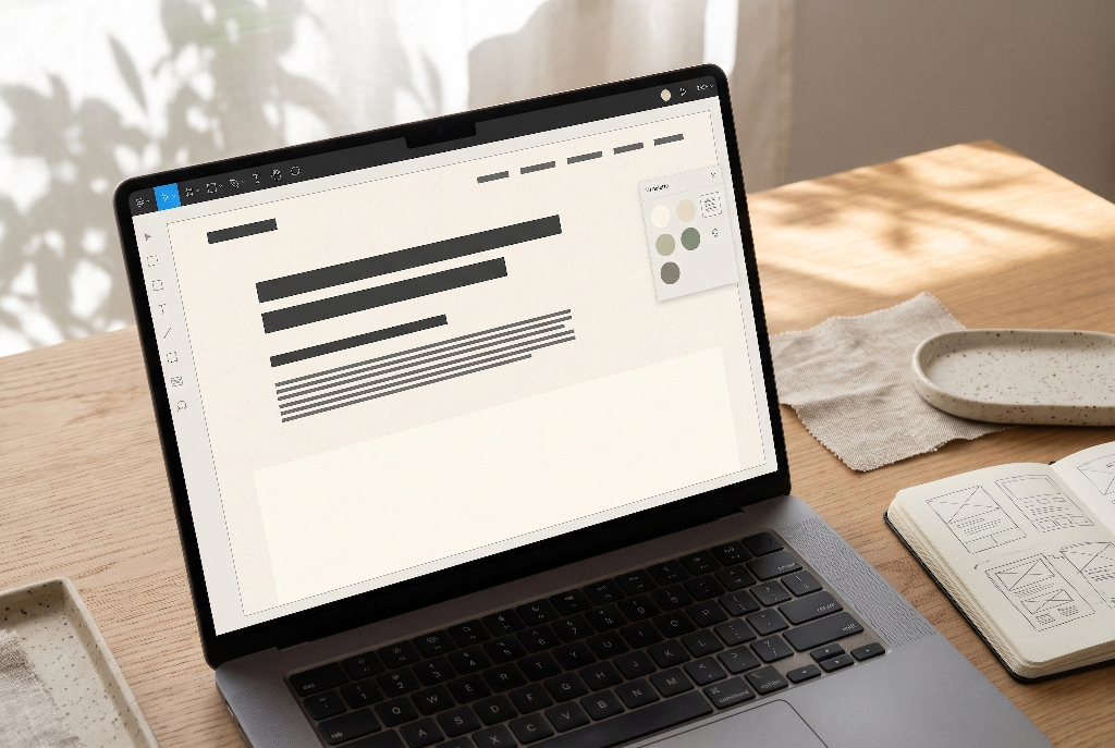
Color never exists in isolation on a webpage. To make your Japandi color palette feel genuinely warm and crafted rather than flat, pair your color tokens with thoughtful surface textures, typography, and photography.
Tactile Surface Simulation
Traditional Japanese and Nordic interiors celebrate raw, tactile materials like washi paper, lime plaster, woven linen, and unfinished wood. On a flat glass screen, you can hint at these textures using subtle design details:
- Micro-Grain Overlays: Adding a barely visible SVG noise texture at 2% to 3% opacity over your background canvas breaks up flat digital perfection and gives the color a soft, papery warmth.
- Crisp 1px Hairline Borders: Instead of heavy drop shadows, separate cards and table rows using
1pxsolid borders in Warm Travertine (#CFC6B6) or River Silt (#C5C1B6). This echoes the clean geometric timber grids of Japanese shoji screens. - Matte Layering: Avoid glossy glassmorphism blurs or shiny plastic gradients. Keep surfaces matte and honest, relying on gentle shifts between your 60% canvas and 30% surface tokens to show depth.
Typographic Harmony
Typography carries the dual heritage of a Japandi color palette. Pair an editorial serif font with a clean humanist sans-serif font. Use a graceful, slightly high-contrast serif (such as Cormorant Garamond, Newsreader, or Playfair Display) for main headings to reflect Japanese calligraphic elegance. Pair it with a clean, legible Scandinavian-inspired sans-serif (such as Inter, Plus Jakarta Sans, or DM Sans) for body paragraphs, buttons, and navigation menus. Always render your typography in Sumi Charcoal (#2B2A27) or Espresso Bark (#2E2622) so the letterforms blend softly into the background.
Photography and Art Direction
Even the most carefully tuned Japandi color palette will fall apart if you drop bright, neon-saturated stock photos onto the page. When selecting or editing photos for your website, apply consistent color grading. Warm up the white balance slightly, lift the black point just a touch so shadows look soft and matte, and dial down bright greens and blues. Photos featuring natural window light, linen fabrics, ceramics, plants, and warm wood tones will sit inside your layout as if they were painted from the same pigment set.
Engineering Implementation: Production-Ready CSS Custom Properties
The cleanest way to manage a Japandi color palette in code is to separate your raw color definitions (primitive tokens) from how they are used on the page (semantic tokens). This architecture makes it effortless to maintain consistency across large websites and switch between light and dark modes with a single HTML attribute.
Copy and paste this production-ready CSS stylesheet into your project:
CSS
/* ==========================================================================
   Japandi Web Design Color System (Light & Dark Modes)
   ========================================================================== */

:root {
  /* 1. Primitive Tokens (Raw Natural Pigments) */
  --palette-shoji-100: #F4F0E8;
  --palette-oat-200: #E6E0D4;
  --palette-travertine-300: #CFC6B6;
  --palette-oak-400: #C19E85;
  --palette-sage-600: #4E5B49;
  --palette-sage-700: #3E493A;
  --palette-sumi-900: #2B2A27;
  --palette-sumi-700: #57544E;

  /* 2. Semantic Tokens (Daylight Light Mode Default) */
  --bg-canvas: var(--palette-shoji-100);
  --bg-surface: var(--palette-oat-200);
  --border-subtle: var(--palette-travertine-300);
  --text-primary: var(--palette-sumi-900);
  --text-secondary: var(--palette-sumi-700);
  --accent-primary: var(--palette-sage-600);
  --accent-primary-hover: var(--palette-sage-700);
  --accent-primary-text: var(--palette-shoji-100);
  --accent-secondary: var(--palette-oak-400);
  --focus-ring: var(--palette-sumi-900);
}

[data-theme="dark"] {
  /* 3. Semantic Tokens (Moody Dark Japandi Mode) */
  --bg-canvas: #1C1B19;
  --bg-surface: #282623;
  --border-subtle: #3E3B36;
  --text-primary: #EAE5DC;
  --text-secondary: #B5AEA2;
  --accent-primary: #C67E50;
  --accent-primary-hover: #D48E61;
  --accent-primary-text: #1C1B19;
  --accent-secondary: #8B9884;
  --focus-ring: #EAE5DC;
}

/* ==========================================================================
   Base UI Component Application
   ========================================================================== */

body {
  background-color: var(--bg-canvas);
  color: var(--text-primary);
  font-family: "Plus Jakarta Sans", -apple-system, BlinkMacSystemFont, sans-serif;
  line-height: 1.65;
  margin: 0;
  transition: background-color 0.25s ease, color 0.25s ease;
}

.japandi-card {
  background-color: var(--bg-surface);
  border: 1px solid var(--border-subtle);
  border-radius: 12px;
  padding: 2rem;
}

.japandi-btn-primary {
  background-color: var(--accent-primary);
  color: var(--accent-primary-text);
  border: none;
  border-radius: 8px;
  padding: 0.75rem 1.5rem;
  font-weight: 600;
  cursor: pointer;
  transition: background-color 0.2s ease;
}

.japandi-btn-primary:hover {
  background-color: var(--accent-primary-hover);
}

.japandi-btn-primary:focus-visible {
  outline: 2px solid var(--focus-ring);
  outline-offset: 3px;
}
If your engineering team uses Tailwind CSS, you can map these exact variables inside your tailwind.config.js file under theme.extend.colors. Mapping Tailwind utility classes like bg-canvas, bg-surface, text-ink, and bg-moss directly to your CSS variables gives developers fast utility styling while guaranteeing nobody accidentally sneaks a raw #FFFFFF or #000000 hex code into your templates.
Industry Use Cases and Real-World Web Applications
Every color system communicates a psychological promise to visitors before they read a single word of copy. Because a Japandi color palette signals calm intentionality, craftsmanship, and emotional safety, it delivers measurable conversion lifts in specific industries:
- Mental Health, Therapy, and Wellness Platforms: Meditation apps, counseling practices, and holistic health clinics benefit hugely from low-arousal earth tones that lower user anxiety the moment the page loads.
- Architecture, Interior Design, and Landscape Studios: A neutral shoji and oak canvas acts like a quiet gallery wall, allowing architectural photography and spatial renderings to shine without competing colors.
- Sustainable E-Commerce and Artisanal Goods: Brands selling organic linen clothing, clean botanical skincare, handcrafted ceramics, or specialty tea use a Japandi color palette to visually prove their commitment to natural, eco-friendly materials.
- Boutique Hospitality and Slow Travel: Eco-resorts, Nordic spas, and ryokan-inspired retreats use warm stone and charcoal palettes to help guests feel relaxed while booking their stay.
- Calm Productivity and Writing Software: Note-taking tools, digital journals, and distraction-free reading apps use warm paper tones to protect users from eye strain during hours of deep work.
At the same time, good design means knowing when not to use a style. Avoid a Japandi color palette if you are building high-speed financial trading terminals, loud youth gaming portals, emergency alert dashboards, or flash-sale discount stores. Those interfaces rely on high-arousal chromatic contrast, urgent reds, and electric blues to trigger fast split-second reactions rather than slow, peaceful reflection.
Japandi Color Palette FAQ
What are the main colors used in a Japandi color palette?
A classic Japandi color palette combines warm off-whites (like shoji cream and unbleached linen), bridging mid-tones (oat, greige, and river-stone gray), natural wood and clay shades (white oak, walnut, and muted terracotta), and soft sumi charcoal instead of pure black. Small touches of muted sage or olive green often serve as nature-inspired accent colors.
What is the difference between Japandi and Scandinavian color palettes?
Traditional Scandinavian palettes lean cooler and brighter, relying heavily on crisp snow whites, pale cool grays, blond woods, and icy pastel blues to maximize winter sunlight. A Japandi color palette warms up that Nordic foundation by blending in Japanese wabi-sabi earth tones, including creamy off-whites, warm taupe, raw clay, smoked dark woods, and deep charcoal ink.
What is a moody Japandi color palette?
A moody Japandi color palette is a dark, cozy variation built on low-saturation deep tones like charred oak (#1C1B19), smoked walnut (#282623), deep mushroom, and slate charcoal. Instead of stark white text, it pairs these rich dark surfaces with warm bone typography (#EAE5DC) and burnished terracotta accents to create an intimate, restful atmosphere.
How many colors should a Japandi website have?
A Japandi website should use three to four core functional colors: one dominant neutral background, one secondary mid-tone for cards and containers, one soft charcoal tone for typography, and a single muted natural accent for buttons and links. Keeping your Japandi color palette within this four-color ceiling preserves negative space and prevents visual clutter.
Can you use pure white (#FFFFFF) in Japandi web design?
Pure #FFFFFF is generally avoided in Japandi web design because it emits harsh blue light on digital screens and feels clinical rather than natural. Instead, designers substitute warm, creamy whites like #F4F0E8 or #F6F2EA that mimic handmade shoji paper and raw cotton, keeping the interface bright while protecting visual comfort.