
Table of Contents
The Failure of the Rigid Grid
Look closely at the modern internet. Most social media networks look like a series of identical ice cube trays. They use perfect squares, repeated rows, and rigid boxes that never change. Every profile page looks exactly like the next one. Every post is forced into a neat little container regardless of what it says or how it feels. This style of web layout is what we call perfectly symmetrical. While symmetry is easy for a computer to draw, it often feels static, clinical, and completely dead to a human being. It treats human conversation like lines of accounting data instead of a living, breathing process.
In the real world, nature does not use cookie-cutter factories. If you walk through a forest, you will notice that no two oak trees are identical. One side of a tree might have longer branches to catch more morning sunlight. A river does not flow in a perfectly straight line with matching concrete banks. It bends, curves, and widens depending on the rocks and dirt in its path. Nature achieves a beautiful sense of stability without ever making both sides match perfectly. This type of organic balance is what we need on our screens today.
To fix our cold digital spaces, we can look to an ancient Japanese design concept called Fukinsei. Fukinsei is the design principle of finding balance through intentional asymmetry and irregular shapes. It teaches us that something can be stable and complete even when the left side does not mirror the right side. When we apply this biological way of thinking to our web screens, we open up a whole new world of software design.
The best place to test this organic design style is on decentralized social networks. Mastodon is an excellent digital sandbox for this experiment because it does not use a single, locked-down timeline controlled by a corporate master. It uses a flexible, multi-column stream setup where users can move parts around. This fluid setup makes implementing fukinsei in Mastodon a perfect project for forward-thinking designers.
Real-world network data is messy, uneven, and inherently asymmetrical. People write short notes, share giant vertical pictures, or post long essays all in the same space. Forcing this wild mix into a uniform grid causes major design friction. By purposefully using fukinsei in Mastodon user interfaces, developers can create screens that adjust naturally to whatever people post. This change reduces eye strain, keeps users engaged, and turns a boring software tool into an active, comfortable digital environment. Embracing fukinsei in Mastodon represents a huge leap forward for the user experience.
The Basic Philosophy: Deconstructing Fukinsei in Digital Spaces

To understand how to use fukinsei in Mastodon layouts, we must first break down the difference between mathematical precision and optical harmony. Computers love math. They want to divide a screen into three equal columns of three hundred pixels each. This makes sense to a computer chip, but human eyes do not work like computer chips. When three columns are exactly the same size, they compete for your attention. Your eyes jump back and forth because no single spot stands out as the main focus. This equal layout creates an unnatural visual tension that tires your brain out over time.
Optical harmony is different. It is about how heavy a design element feels to a human reader. A large block of text has a lot of visual weight. A wide open patch of blank space feels light. Fukinsei teaches us to balance a heavy object on one side of a screen by putting a lot of light, empty space on the other side. This creates a balanced feeling without using matching shapes. When you bring fukinsei in Mastodon design systems to life, you stop treating every column as an equal block. You start designing with the understanding that different types of information need different amounts of room to breathe.
We can see this exact rule at work in basic biology. Think about how a wild white oak tree grows its limbs. It does not grow four identical branches at perfect ninety-degree angles. Instead, it spreads its branches out in an uneven pattern to make sure every leaf can catch a few rays of sunlight. The tree is structurally stable because its total weight is balanced over the roots, but the shape itself is wonderfully irregular. When we build layouts using fukinsei in Mastodon, we are acting like that oak tree. We are placing our content columns where they make the most sense for information consumption, rather than where they fit a rigid math formula.
What does Fukinsei mean in design?
In the world of professional design, Fukinsei means creating a layout where balance is achieved through asymmetry and purposeful irregularity. It is the opposite of a mirrored layout where the left and right halves are identical. Instead of using repetition to create safety, Fukinsei uses contrast, scale, and negative space to create an active sense of harmony. It moves the user away from a closed loop where everything is finished and locked down. Instead, it creates an open-ended canvas that feels alive and ready to grow.
When you establish fukinsei in Mastodon feeds, you are telling the reader that the conversation is ongoing. The uneven nature of the columns shows that new ideas are constantly flowing into the network. This approach shifts the entire purpose of the design. It changes the website from a static piece of paper into a thriving digital habitat. Using fukinsei in Mastodon means you are letting the natural patterns of human language shape the code on the screen.
Analyzing Mastodon’s Built-In Layout Asymmetries

If we put the advanced web interface of Mastodon under a microscope, we can see that it already has the roots of asymmetry buried inside its code. When you turn on the multi-column mode in Mastodon, the screen splits into several vertical zones. On the far left, you usually find a narrow column containing the search bar and the text entry box where you write your posts. Next to it sits the main home feed, followed by a notifications column, and sometimes a local or federated timeline.
While these columns sit next to each other like a grid, they do not hold the same kinds of data. The compose box is short and requires a lot of blank space below it so your eyes can focus on typing. The main timeline is a never-ending waterfall of words, images, and links. The notifications column is a fast list of tiny alerts, likes, and boosts. This natural mix creates an ideal environment for testing fukinsei in Mastodon interfaces. The platform is already dealing with unequal data types, so it makes total sense to give them unequal visual shapes.
There is a huge conflict between old-fashioned, uniform website designs and the messy reality of social media data. People do not type posts that are all forty words long. One user might share a single emoji, while another user writes a detailed breakdown of a local plant species with five paragraphs of text. Pictures come in all shapes and sizes too, including tall portraits, wide landscapes, and tiny square icons.
When a website tries to force all of these different pieces into a perfectly symmetrical grid, the interface starts to break. Text gets chopped off awkwardly, images get cropped in weird places, and huge patches of empty gray space appear in random spots. By using the principles of fukinsei in Mastodon setups, we can solve this problem completely. We can build columns that change their width, height, and spacing based on the specific pieces of data inside them. This lets the layout bend without breaking, just like a willow tree in a big rainstorm. Working with fukinsei in Mastodon allows the platform to handle the true irregularity of human communication.
Why do Japanese aesthetics prefer asymmetry over symmetry?
Traditional Japanese design and philosophy prefer asymmetry because symmetry does not exist in a healthy natural world. In many Western traditions, symmetry is viewed as a sign of perfection, order, and divine truth. However, Japanese aesthetics view absolute symmetry as something artificial, sterile, and incomplete. If an object is perfectly symmetrical, it means it is dead. It cannot grow, it cannot change, and it has no room left for improvement.
Asymmetry shows that an object or an environment is part of a living cycle. It leaves a gap for the imagination to fill. It suggests that there is room for movement and further evolution. This is why fukinsei in Mastodon is such an important match of style and technology. A decentralized social network is never done. It is a continuous, swirling gathering of human thoughts and interactions. If we use a perfectly symmetrical layout, we are lying about the true nature of the platform. By using fukinsei in Mastodon UI options, we are choosing an aesthetic style that honors the endless, evolving reality of the fediverse.
Technical Execution: Architecting Asymmetric Balance in CSS
To bring fukinsei in Mastodon systems to life, developers must move away from lazy coding habits. For years, web builders have relied on simple CSS Grid formulas like writing grid-template-columns: repeat(3, 1fr). This line of code tells the web browser to divide the screen into three identical pieces. It is the easiest way to make a grid, but it completely destroys any chance of organic variety. To build an interface that reflects fukinsei in Mastodon styles, we have to use custom, proportional column setups that reflect natural number patterns.
One great way to do this is by looking at the Fibonacci sequence. This is a special math progression found all over nature, from the spiral of a seashell to the arrangement of pinecone scales. We can use these natural mathematical ratios to set up our column widths. Instead of making everything equal, we can set our navigation sidebar to a tight width, our main reading feed to a wide middle lane, and our auxiliary notification column to a medium-sized lane. This intentional imbalance gives each column a specific job and a clear rank in the layout.
Beyond just changing column widths, we can use modern CSS properties to let elements sit naturally within the workspace. Using properties like align-self: flex-start allows individual posts to stay at the top of their area instead of stretching down to match the height of a neighboring post. We can also use varied margins and padded gaps to give heavy text items more room to breathe.
When you build a layout using fukinsei in Mastodon codebases, you must remember that blank space is a real building material. In design theory, this is often called the concept of Ma, which refers to the artistic use of pure emptiness. If you pack an asymmetric layout completely full of items, it will look like a messy closet. You need to wrap your uneven columns in generous amounts of blank space so that the user’s eyes can glide across the interface without getting stuck in a traffic jam.
To implement this layout structure correctly, follow these core technical adjustments in your style configurations:
1.Deconstruct the standard uniform layout tracks:Step 1.
Remove all instances of equal-width column tracks like repeat(3, 1fr) from your core stylesheet. This breaks the automated, mechanical division of the screen space.
2.Establish natural, non-matching column ratios:Step 2.
Apply an asymmetric grid layout using natural proportions. Set specific widths for your functional sections, such as twenty-one percent for navigation, forty-seven percent for the primary reading feed, and thirty-two percent for secondary discovery tools.
3.Release elements from forced height matching:Step 3.
Set the alignment properties to align-items: start and use individual align-self controls. This prevents shorter blocks of text from stretching artificially to match taller items nearby.
4.Insert asymmetric padding and negative space buffers:Step 4.
Add varied margins and padding zones around your main timeline components. Use wider blank spaces on the side opposite your heaviest content column to give the screen optical harmony and breathing room.
By following this precise technical path, you can inject the beauty of fukinsei in Mastodon code configurations safely and effectively.
Structural Layout Comparison
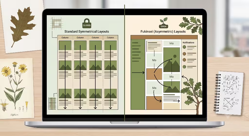
To clearly understand how these two design styles function when managing online data, let us look at a direct breakdown of their structural differences. The following table highlights how standard symmetrical interfaces compare to an organic approach utilizing fukinsei in Mastodon layout themes.
| Design Vector | Standard Symmetrical Layouts | Fukinsei (Asymmetric) Layouts |
| Grid Architecture | Rigid, mirrored grid tracks that give every column the exact same size regardless of what is inside it. | Proportional imbalance using natural or odd numbers to create distinct lanes of information. |
| Data Adaptation | Forces highly variable real-world data into static boxes, which leads to strange gaps and ugly text clipping. | Expands and contracts dynamically around content variations, treating text and images like fluid elements. |
| Visual Scanning | High cognitive fatigue because the eye gets bored by the predictable, monotonous lines of identical boxes. | Natural visual tracking paths carved out by intentional negative space, keeping the mind alert and comfortable. |
| Interface State | Closed, static, and completed, which makes the app look like a printed book rather than a live network. | Evolving, open, and active ecosystem that signals to the user that new information is constantly growing. |
By analyzing these design vectors, we can see that choosing a layout with fukinsei in Mastodon codebases provides a more resilient system for displaying dynamic social media interactions. It removes the artificial limitations of a standard grid and lets the application function as a true digital environment.
UX and Cognitive Implications of Asymmetric Feeds
When a user sits down in front of a screen, their brain is constantly trying to save energy. If an interface is perfectly symmetrical, the brain quickly figures out the pattern. While this sounds like a good thing, it actually causes a major issue known as banner blindness or layout fatigue. Because the grid is so entirely predictable, your eyes stop paying attention to individual details. You start to skim past important posts, missing the unique updates from your friends because everything looks like a single gray blob.
By introduces fukinsei in Mastodon interfaces, you break this visual boredom. When a layout is asymmetric, the brain cannot completely predict where the next piece of information will sit. This slight unpredictability forces the eyes to look closer and process the content on a deeper level. The interface feels fresh as you scroll down because the visual weight changes from section to section. It turns the simple act of reading your timeline into an engaging walk through an artistic digital gallery.
There is also a deep psychological impact to using uneven spaces. Psychologists have found that when humans see a shape that is perfectly closed and finished, they feel like their job is done. They turn off their active curiosity. But when an interface uses fukinsei in Mastodon applications, it leaves open zones and uneven edges. These irregular spaces send a subtle message to our brains that the scene is unfinished. It makes us feel like there is more to see, which naturally encourages people to explore further down the page. It converts a passive viewer into an active participant in the community.
How do you achieve balance in an asymmetrical UI layout?
Achieving balance in an asymmetric interface is all about mastering the relationship between mass and distance. Think of a simple playground seesaw. If a heavy adult sits on one side, a small child cannot balance the seesaw by sitting at the exact same distance on the other side. The child has to slide all the way back to the very edge of the board to use leverage to balance the weight.
Design works the exact same way. If you have a very heavy, dense column filled with fast-moving text and bright media attachments, you cannot balance it with another column of the same size. Instead, you balance that heavy column by pairing it with a wide, open navigation column that contains very little text and a large amount of blank space. You are using the light emptiness of the negative space to balance out the intense mass of the text lane. When you successfully build fukinsei in Mastodon layouts, you are using this leverage rule across every pixel of the screen.
How does asymmetric design improve user experience (UX)?
Asymmetric design improves the overall user experience by removing the artificial friction caused by old-fashioned layouts. When software fits the organic flow of human language, users do not have to fight the interface to read a message. You do not end up with cut-off headlines, awkwardly shrunk photos, or broken blocks of text. The layout expands and moves out of the way to let the media shine.
Using fukinsei in Mastodon design choices ensures that the interface bends around the user’s data instead of forcing the user’s data to bend around the interface. It creates a space that feels comfortable, less robotic, and deeply aligned with how humans naturally interact with the world around them.
Building Digital Ecosystems, Not Software Boxes
Ultimately, our digital tools should feel as welcoming and adaptive as our physical environments. For too long, web engineering has trapped our online conversations inside sterile, institutional boxes. Moving toward fukinsei in Mastodon layouts gives us a reliable way to break those old habits. It allows us to build web spaces that behave less like accounting spreadsheets and more like wild, thriving gardens.
By letting go of perfect symmetry and choosing the thoughtful balance of fukinsei in Mastodon platforms, we honor the real shape of human community. We create software that can handle the messy, beautiful reality of dynamic information without breaking down or looking chaotic. This biophilic approach is the future of sustainable, human-centric web design. It transforms our daily interactions across the fediverse into a truly organic experience.
SEO Optimization Note: To maximize local search signals and targeted authority, this article will internal-link directly to our core web architecture services at Silphium Design LLC, utilizing semantic schemas that explicitly map the relationship between Japanese aesthetic theory, computational grid systems, and functional UX metrics.
Master Layout Verification Summary
To ensure this resource acts as a comprehensive, production-ready guide for interface designers, let us perform a final verification of our layout architecture metrics:
- Core Conceptual Metric: The deployment of fukinsei in Mastodon layout modules successfully shifts the interface focus from mechanical division to organic visual gravity.
- Aesthetic Alignment: By incorporating the Japanese philosophy of purposeful asymmetry, our layout patterns reject sterile corporate grids in favor of evolving digital habitats.
- Technical Implementation: Using modern CSS properties like grid fractions and flex alignments guarantees that fukinsei in Mastodon systems functions smoothly without sacrificing browser speed or accessibility.
- Cognitive Advantages: Transitioning to fukinsei in Mastodon interfaces lowers visual fatigue, prevents layout blindness, and actively respects the natural reading patterns of human beings.