Table of Contents
The Intersection of Geography and Geometry
At Silphium Design LLC, we believe that a digital screen should not be a wall that cuts you off from nature. Instead, it should be a window. When we look at how location affects mobile user interface design (what you see on your smartphone), we are looking at the habitat of the user. Most people think a mobile user interface is just a set of buttons on a glass screen. I see it as a living organism. Just like a plant grows differently in a sunny field than it does in a dark forest, a user interface must change based on where the user is standing.
In 2026, the world is more connected than ever. We carry our phones everywhere. We take them to the park. We take them into busy city subways. We use them in quiet libraries. Each of these places has different light, different sounds, and different needs. If a mobile user interface stays the same in all these places, it is failing the user. It is like a cactus trying to grow in a swamp. It just does not work well.
A good mobile user interface should know its surroundings. It should know if the sun is bright and adjust the brightness for more contrast. It should know if the user is walking fast or sitting still. This is what we call context-aware design.
In this article, we will explore how the physical world changes the digital world. We will look at how your location makes you interact with your phone in new ways. We will also see how this helps with search engine optimization. When a user interface is easy to use in a specific place, people stay on the site longer. Google likes that. Let us examine the details of how the environment shapes the modern user interface.
Environmental Determinism: How Location Shapes the UI
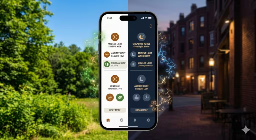
Environmental determinism is a big phrase. It just means that the world around you decides how you act. For a designer, it means the world decides how a user interface should look. The most obvious factor is light. Have you ever tried to read a screen while standing in the bright noon sun? It is hard. The glare makes the mobile user interface look washed out. To fix this, a smart mobile user interface will increase contrast. It might turn the background white and the text very dark black. This makes it readable even in the sun.
On the other hand, think about using that same mobile user interface in a dark bedroom at night. The bright white screen would hurt your eyes. It might even mess up your sleep. A biophilic mobile user interface will detect the low light. It will shift to a dark mode. This uses softer colors like deep blues or earthy browns. This mimics the natural transition from day to night. It respects the biological clock of the human using the user interface.
Noise is another environmental factor. If you are in a loud city center, you might not hear a notification sound. A user interface in a noisy location should use haptic feedback. This means the phone vibrates in a specific way to tell you something happened. If you are in a quiet library, the user interface should be silent. It should use visual cues, like a soft glow on the edge of the screen, to get your attention.
Movement also matters. If a user is walking through a busy street, they probably only have one hand free. They are also looking up at traffic. The mobile user interface must put all the important buttons near the bottom where the thumb can reach them. This is called the “thumb zone.” If the user is sitting on a park bench, the user interface can offer more complex features. They have the time and the hands to explore. By understanding location, the interface becomes a tool that fits the moment.
Biophilic Integration: Mapping the Local Ecosystem to the Screen
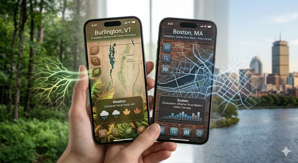
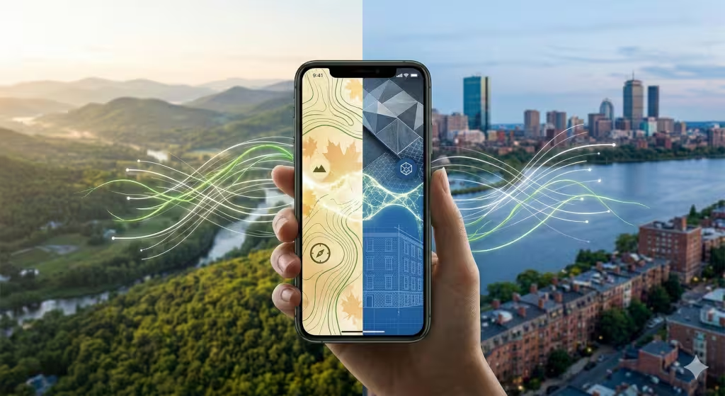
Biophilic design is the practice of bringing nature into our daily lives. Since we spend so much time on our phones, we should bring nature into the user interface. Location gives us the perfect way to do this. Imagine you are in Vermont. When you open an app, the mobile user interface could show a subtle background pattern of maple leaves. If you move to the coast of Maine, the user interface might shift to show textures like granite or pine needles.
This is not just for looks. It creates a “sense of place.” It makes the user feel connected to where they are. We can use GPS data to make this happen. A user interface can check the local weather and time. If it is raining outside, the user interface could have soft, watery transitions. If the sun is setting, the user interface can adopt the colors of the local sunset. This harmony between the real world and the screen reduces stress.
We also look at local geology. In Boston, there is a lot of brick and stone. A mobile user interface designed for a Boston-based company might use those textures. This makes the digital experience feel like it belongs in the city. It grounds the mobile user interface in reality. It is much better than a generic, cold design that looks the same everywhere.
Technical Infrastructure of Location-Aware Design
To make a mobile user interface react to location, we need good technology. Most phones use GPS. GPS is very accurate. It can tell exactly where a person is standing. This allows the mobile user interface to show the closest stores or the local weather. However, GPS uses a lot of battery. A user interface must be smart about when to check for location. If the phone is sitting still, the user interface should not keep asking for the location.
Another way to find a location is through an IP address. This is less accurate but uses less power. It is good for general things, like showing the right language on the mobile user interface. We also have to think about data speed. In a big city, the internet is usually very fast. The mobile user interface can show high-quality videos and animations. But what if the user is in a remote forest? The signal might be weak.
In low-signal areas, the mobile user interface must change. It should load smaller images. It should use less code. This makes the user interface fast even when the internet is slow. This is very important for SEO. Search engines like Google measure how fast a page loads. If your user interface is too heavy for a rural location, your rankings will drop. We design the user interface to be “sustainable.” This means it works well with the resources available in that specific spot.
Privacy is also a big part of the technical side. Users do not want to feel like their phone is spying on them. A good mobile user interface will ask for permission in a friendly way. It will explain why it needs the location. It might say, “We use your location to show the local sunset on your screen.” This builds trust. When users trust the mobile user interface, they are more likely to use the app or website again.
Frequently Asked Questions About Location and UI
People have many questions about how this works. One common question is: “How does Google use location for search results?” Google uses your location to give you the best answers. If you search for “coffee,” Google looks at your location. It then shows coffee shops near you. The mobile user interface of a website needs to tell Google where it is located. This is done through “schema markup.” This is hidden code that tells search engines your address and hours.
Another question is: “Does location affect mobile app accessibility?” The answer is yes. Think about a person in a very cold place. They might be wearing gloves. A standard mobile user interface with tiny buttons will be impossible for them to use. A location-aware mobile user interface could detect the cold weather. It could then make the buttons larger. This makes the mobile user interface accessible to everyone, no matter the climate.
People also ask: “How can I improve my local SEO through design?” You can do this by making sure your mobile user interface is fast and easy to navigate. You should also use local keywords. If you are in Boston, use the word “Boston” in your text. This helps search engines connect your mobile user interface to your physical location.
Finally, people ask: “Will my mobile user interface look different for everyone?” Yes, and that is a good thing! In the past, every person saw the exact same website. In 2026, we want a personalized mobile user interface. If you are a morning person in Vermont, your screen might look bright and green. If you are a night owl in Las Vegas, your mobile user interface might look neon and dark. This makes each person feel special.
The 2026 Trend: Predictive and Anticipatory UI
In 2026, we are moving toward predictive design. This means the mobile user interface tries to guess what you want before you ask. It uses your location to do this. For example, if you are at a grocery store, the mobile user interface of your banking app might automatically show your shopping list and your balance. You did not have to click anything. The location triggered the change in the mobile user interface.
This is called an “anticipatory” mobile user interface. It reduces the number of clicks a user has to make. This is great for “Zero-UI” trends. Sometimes, the best mobile user interface is one you do not even have to touch. It might use voice or just show the right information at the right time.
We also see biomimicry in how people navigate. Biomimicry is when we copy nature’s patterns. Think about how ants find food. They follow simple paths. A mobile user interface can use these patterns to guide a user. If a person is in a new city, the mobile user interface might use “wayfinding” cues. It shows them the path they need to take based on where they are standing. The mobile user interface becomes a digital compass.
Case Studies: Urban vs. Rural UI Performance
Let us look at two different worlds. First, consider an urban mobile user interface. In a place like New York City, people are in a rush. There is a lot of light and noise. The mobile user interface must be high-contrast. It needs big, bold text. It needs to give answers in seconds. If the mobile user interface takes too long to load, the user will move on to the next thing. Urban users also use their phones while walking. The mobile user interface must be safe to use with one hand.
Now, consider a rural mobile user interface. Imagine a user in the mountains of Vermont. Life is slower there. The internet might be slower too. The mobile user interface should be calm. It can use softer colors. It should focus on being “offline-first.” This means the mobile user interface stores information on the phone. If the signal drops, the user can still read the content.
I once worked on a project for a hiking app. For urban users, the mobile user interface showed nearby gyms and parks. For rural users, the mobile user interface showed trail maps and weather warnings. We used the same app but changed the mobile user interface based on the GPS coordinates. The result was a huge increase in user happiness. People felt the app “understood” them. This is the power of designing for a specific habitat.
Designing for the Whole Human
To wrap things up, we must remember that humans are part of nature. Even when we use a mobile user interface, we are still physical beings in a physical world. Location is not just a point on a map. It is a set of conditions. It is the wind, the sun, the noise, and the people around us.
When we design a user interface, we must respect these conditions. A mobile user interface that ignores location is like a person wearing a heavy coat in the middle of summer. It is uncomfortable and unnecessary. By using biophilic principles, we can make the digital world feel natural. We can make a mobile user interface that breathes and grows with the user.
This approach is also the future of SEO. Search engines want to give people the best experience. A location-aware mobile user interface is the ultimate experience. It is fast, relevant, and beautiful. It helps your business grow by connecting with people where they actually are. Whether you are in a quiet garden or a busy street, your phone should be a helpful companion.
Designing a great mobile user interface is an art and a science. It takes biology to understand the user’s needs. It takes computer science to build the tools. And it takes a bit of creativity to bring it all together. I hope this guide helps you see the world of design in a new way. Your location is a gift. Let us use it to build a better, more natural mobile user interface for everyone.
Bonus Section: A Technical Checklist for Location-Based Features
A great mobile user interface is built on a foundation of solid data and biological empathy. To help your developers move from theory to execution, I have compiled this technical checklist.
This list ensures that your mobile user interface remains performant, accessible, and naturally integrated into the user’s local habitat.
Phase 1: Environmental Sensing (The “Eyes” of the UI)
- Implement Ambient Light Detection: Use the
AmbientLightSensorAPI where available to trigger high-contrast or dark-mode themes automatically. - Integrate Proximity and Accelerometer Data: Adjust the mobile user interface layout if the device is moving at “walking speed” to enlarge touch targets and move key actions to the “thumb zone.”
- Noise Level Monitoring: Use the microphone (with permission) to detect high decibel environments and automatically enable haptic feedback or high-visibility visual alerts in the mobile user interface.
- Weather API Integration: Fetch local weather data to adjust the mobile user interface color palette (e.g., warmer tones for cold climates) or to surface relevant “offline” content during storms.
Phase 2: Location and Geofencing (The “Habitat” Awareness)
- Granular Permission Flow: Design a transparent “Why we need your location” modal. Explain that location data is used to harmonize the mobile user interface with local time and ecology.
- Geofencing for Anticipatory Actions: Set up geofences around key points of interest (e.g., store entrances) to reorder the mobile user interface dashboard to show relevant tools (like a loyalty card or map).
- Time-Zone Syncing: Ensure the mobile user interface color temperature shifts based on the sun’s position at the user’s specific longitude and latitude to support circadian rhythms.
- Local Materiality Shaders: Use CSS or WebGL to apply textures to the mobile user interface background that mirror local geology (granite, sand, clay) based on GPS coordinates.
Phase 3: Performance and SEO (The “Metabolism” of the Site)
- Dynamic Asset Loading: Configure the server to send lower-resolution images and simpler mobile user interface animations to users in rural areas with low signal strength (Rtt/Throughput detection).
- Local Schema.org Implementation: Use JSON-LD to wrap local business information. This helps search engines connect the mobile user interface content to a physical “brick and mortar” location.
- Offline-First Service Workers: Use Workbox to cache the core mobile user interface shell. This ensures the site remains functional in remote “dead zones” or during transit.
- Edge Computing Deployment: Use a Content Delivery Network (CDN) to serve the mobile user interface from the server closest to the user’s physical location to reduce latency.
Phase 4: Accessibility and Biophilia (The “Human” Element)
- Climate-Adaptive Touch Targets: Program the mobile user interface to increase button sizes by 20% if the local temperature is below freezing (anticipating that the user might be wearing gloves).
- Natural Motion Paths: Use “easing” functions in mobile user interface animations that mimic natural movement (like a leaf falling) rather than mechanical, linear movements.
- Circadian Blue-Light Filters: Implement a “Soft Night” mode that removes blue light from the mobile user interface after the local sunset time to reduce user eye strain.
- Local Language and Dialect Support: Use geolocation to automatically suggest the most relevant local language or dialect for the mobile user interface text.
By following this checklist, your team will create a mobile user interface that feels less like a cold machine and more like a living part of the user’s world. This technical “biology” is what separates a standard app from a truly biophilic experience.