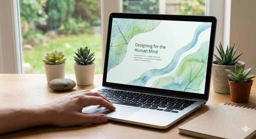
As someone with a background in both biology and web design, I find the intersection of our natural world and our digital tools to be the most exciting frontier in design today. We are going to explore a concept that might sound complex at first but is actually very close to our hearts: eco-psychology in web design.
When we talk about the internet, we usually talk about cables, servers, and code. But we often forget the most important part of the equation: the human being sitting in front of the screen. Our brains were not designed for glowing rectangles and endless scrolling. They were designed for forests, open plains, and the rhythms of the sun.
This is where eco-psychology comes in. It is the study of how our mental health is tied to our connection with nature. In the world of web design, we use this psychology to make websites feel like digital habitats instead of cold, plastic tools. My goal today is to show you how we can bridge the gap between the soul and the syntax of a website to create a better experience for everyone.
Table of Contents
What is eco-psychology in web design?
To understand this, we first have to look at the word itself. Psychology is the study of the mind. Eco refers to our home, which is the earth. So, eco-psychology looks at how being away from nature makes us feel stressed or tired, and how being close to it makes us feel calm and happy.
When we apply this psychology to a website, we are trying to fix a big problem. Most websites are built to grab your attention and never let go. They use bright, flashing lights and loud colors. This is hard on the human brain. It causes what experts call digital fatigue. By using eco-psychology, we design websites that follow the rules of nature. We use colors that you might see in a garden. We use shapes that look like clouds or stones instead of perfect, sharp squares. This makes the user feel more relaxed. It turns a website from a chore into a place where someone actually wants to spend time.
The Biological Root: Why Our Brains Crave Nature Online
We have to remember that humans have lived in nature for millions of years. We have only had the internet for a few decades. Our bodies are still tuned to the wild. This is why we feel better when we see a plant or look out a window. There is a famous idea called the biophilia hypothesis. It says that humans have a built-in need to connect with other living things.
When you are on a website, your brain is still looking for those natural cues. If a website is too messy or “loud,” your brain goes into a state of high alert. This is bad psychology because it makes the user want to leave. But if we use natural patterns, like the way a tree branches out, the brain recognizes it. It feels familiar. This is called restoration. It helps your brain rest even while you are looking at a screen. We use this psychology to reduce the “noise” of the internet.
Core Principles of Eco-Psychological Web Design
As an expert at Silphium Design LLC, I find that the “Core Principles of Eco-Psychological Web Design” are the most vital part of our work. This is where the abstract ideas of psychology meet the practical world of coding and visual layout. To build a digital habitat that feels right to the human brain, we must look at how nature organizes information and mimic those systems.
Below is a detailed breakdown of these principles, explained simply for any reader to understand.
Understanding Affordances: Nature’s Instruction Manual
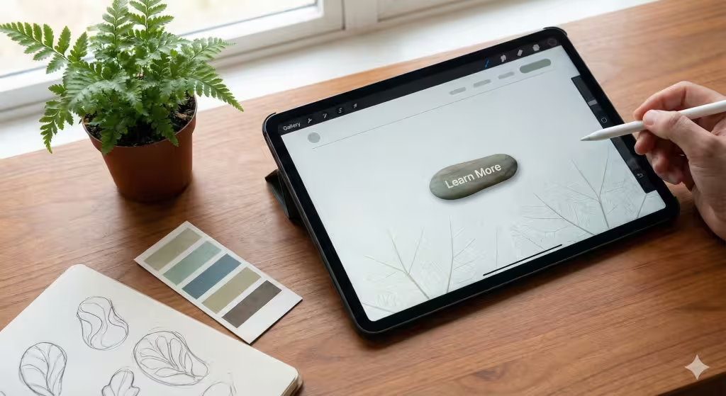
In the world of psychology, an “affordance” is a quality of an object that tells you how to use it. Think about a flat, sturdy rock in the middle of a hiking trail. You don’t need a sign to tell you that you can sit on it. The rock “affords” sitting. In the same way, a hollow in a tree “affords” hiding or storage.
When we design a website, we use this psychology to make things obvious. If a user has to guess where to click, their brain uses up precious energy. This causes stress. We use shadows, depth, and textures that mimic the physical world. A button that looks slightly raised, like a physical pebble, tells the user’s psychology that it can be pushed. When digital elements behave like physical objects, the brain feels a sense of relief because it doesn’t have to learn a new language. It already knows the language of the earth.
The Power of Fractals: Visual Comfort Through Pattern
One of the most fascinating parts of eco-psychology is our love for fractals. A fractal is a pattern that repeats itself at different scales. You can see this in the way a fern leaf is made of smaller leaves that look just like the big one. Or how a coastline looks jagged from space, and just as jagged when you stand on the beach.
Research in psychology shows that looking at these patterns can lower a person’s stress levels by up to 60%. This is because our eyes evolved to process these shapes easily. On a website, we can use fractal-like patterns in the background or in the way we organize images. Instead of a boring, rigid grid that feels like a prison, we use “organic grids.” These allow for a bit of variety while still feeling organized. This creates a visual rhythm that is soothing to the human mind.
Circadian UX: Designing for the Rhythms of Light
Our bodies have an internal clock called the circadian rhythm. This clock is set by the sun. Blue light from the morning sky wakes us up, while the warm, orange light of sunset tells us it is time to rest. Modern psychology tells us that staring at bright blue light late at night ruins our sleep and makes us anxious.
In eco-psychological design, we create “Circadian UX.” This means the website changes based on the user’s local time. During the day, the site might be bright and crisp to help with focus. As evening comes, the psychology of the site shifts. The background might become darker, and the text might turn to a warmer hue. By respecting the natural rhythm of the user’s body, we show that the website is a partner in their health, not an enemy to their sleep.
Biophilic Color Palettes: More Than Just Green
Many people think that “natural design” just means using the color green. While green is a very healthy color for our psychology, reminding us of growth and water, nature has a much larger box of crayons.
We use “earth tones” which are colors you can find in the soil, the sky, and the stones. These colors are easy on the eyes. Unlike “safety orange” or “neon purple,” which are designed to startle the brain, earth tones allow the user to focus on the content. We also use the psychology of “atmospheric perspective.” This is the way distant mountains look blue and hazy. By using this in web design, we can create a sense of deep space on a flat screen. This makes the website feel open and airy instead of cramped and flat.
Organic Motion and Haptic Feedback
In nature, nothing moves in a perfectly straight line at a constant speed. A leaf falls in a curve. A wave builds up slowly and crashes. In web design, most things “pop” or “slide” in a very robotic way. This can be jarring to our psychology.
We use “organic motion” to make the website feel alive. When you scroll, the elements might move at slightly different speeds, like trees in the wind. This is called parallax, but we do it gently. We also use “haptic feedback” or tiny vibrations on mobile phones. If a user “touches” a digital plant or swipes a menu, a tiny vibration can mimic the feel of a physical object. This bridges the gap between the digital and the physical, making the experience feel “real” to our primitive brain.
Complexity and Order: The “Goldilocks” Zone
Nature is very complex, but it is never messy. A forest floor has thousands of leaves, but it still feels like a single, unified place. This is the balance of “complexity and order.”
Psychology tells us that humans hate two things: being bored and being overwhelmed. If a website is too simple (like a blank white page with one word), we get bored. If it is too complex (like a crowded news site), we get overwhelmed. We look for the “Goldilocks” zone—just right. We use layers, textures, and groupings to organize a lot of information in a way that feels as natural as a pile of smooth stones. This allows the user to explore at their own pace without feeling lost.
Spatial Psychology: Prospect and Refuge in UX
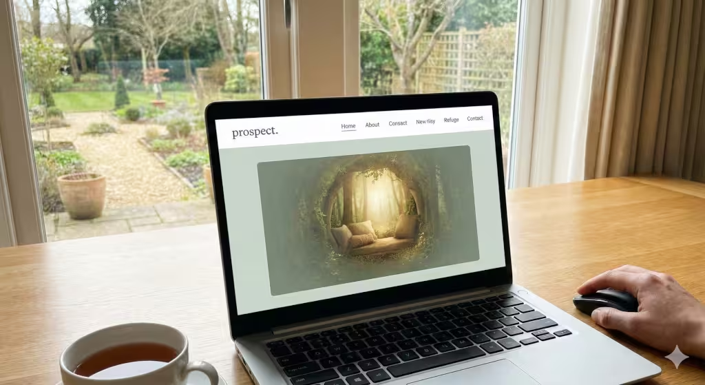
In the wild, animals like to be in places where they can see what is coming but also feel protected. This is called “prospect and refuge.” We use this same psychology in web design.
“Prospect” means having a clear view. On a website, this means having a very clear menu and knowing exactly where you are. The user should never feel lost in a “dark woods” of links. They should feel like they are standing on a hill looking at a map.
“Refuge” means feeling safe. We create refuge by using plenty of whitespace. Think of whitespace like a clearing in a forest. It gives the eyes a place to rest. If a page is covered in text and ads, there is no refuge. By using the psychology of space, we make sure the user feels in control. This leads to a much better experience and makes them want to stay on the site longer.
Technical Synergy: SEO and the Natural Web
You might wonder how this helps a website show up on Google. Well, Google is getting smarter. Its goal is to show people websites that are helpful and easy to use. Google’s latest updates focus on things like speed and how easy it is to click on things. This is exactly what we do with eco-psychology.
When a website is designed with the user’s psychology in mind, people stay on the page longer. They don’t click the “back” button right away. Google sees this and thinks, “This must be a good website.” So, by making a site more natural and calming, you are actually helping your search engine rankings. It is a win-win. We use the psychology of human behavior to satisfy both the person and the computer.
Question: How nature impacts digital behavior?
People often ask if a picture of a tree is enough to make a website “biophilic.” The answer is no. It goes much deeper than just pictures. It is about the flow of the information. When a website flows like a river—meaning one part leads naturally to the next—the user’s psychology is affected in a positive way. They feel a sense of “flow.” This is a state where you are focused but not stressed.
Another common question is whether this makes a website look old-fashioned. Not at all. We can use the most modern technology and still follow these natural rules. In fact, the most advanced websites today are moving toward this “natural” look because they know it is what the human mind wants. The psychology of beauty and function are the same thing when you look at it through the lens of nature.
Question: Is biophilic design the same as eco-psychology?
While they are related, they are not the same. Biophilic design is the “how.” It is the tools we use, like natural light, plants, or organic patterns. Eco-psychology is the “why.” It is the study of the human soul and its need for the earth. When we design for Silphium Design LLC, we use the psychology of the “why” to pick the right tools for the “how.” Understanding the deep psychology of our users helps us build sites that don’t just look good, but actually feel good.
Question: How do you implement eco-psychology on a minimalist website?
Minimalism is actually a great partner for eco-psychology. In nature, everything has a purpose. There is no waste. A minimalist website that uses the right psychology removes everything that isn’t needed. This reduces the mental load on the user. We use simple movements, like a soft fade instead of a sharp pop-up. This mimics the way shadows move or the way the wind blows. It is a very gentle way to use psychology to guide a user without shouting at them.
Related Concepts and Ideas in Digital Nature
To really master this, we look at several different areas. One is fractal geometry. Fractals are patterns that repeat at different sizes. You see them in snowflakes, ferns, and clouds. Our brains love looking at fractals. Using them in the background of a website can make it much more interesting without being distracting. This is a core part of the psychology of visual comfort.
We also look at “neuro-aesthetics.” This is a field that studies how the brain reacts to things that are beautiful. Science shows that when we see things that remind us of nature, our brain releases chemicals that make us feel happy. By using this psychology, we can create a website that actually makes someone’s day a little bit better. That is the true power of good design.
The Power of Sound and Motion in Eco-Psychology
We often focus only on what we see, but the psychology of sound and motion is just as important. Think about how a leaf falls. It doesn’t move in a straight, robotic line. It drifts. When we animate elements on a website, we try to use that same natural motion. This is much more pleasing to the human eye.
If a website uses sound, we avoid harsh “beeps.” Instead, we might use sounds that mimic a soft drop of water or a bird call. The psychology here is simple: we want to keep the user in a state of calm. If we startle them with a loud noise, we have broken that connection. At Silphium Design LLC, we believe every small detail matters because every detail affects the user’s psychology.
Toward a Living Internet
The internet does not have to be a cold, digital desert. It can be a lush, vibrant forest of information. By using the rules of eco-psychology, we can build websites that respect the human mind. We can create spaces that help us feel more connected to the world around us, even when we are looking at a screen.
This approach is the future of design. As we spend more of our lives online, the psychology of our digital environments becomes more important. We must ensure these spaces are healthy, restorative, and beautiful. When we align our technology with our biology, we create a better world for everyone.