If you’ve spent any time looking at a computer screen lately, you probably feel like you’re staring at a digital box. It’s all sharp corners, bright white lights, and flat lines. But here’s the thing: our brains weren’t built for boxes. We evolved in the woods, near the water, and under the sun. That’s where biophilic design comes in. What we’ve found is that when we use visual metaphors of nature in our websites, people just feel better.
In this article, we’re going to talk about how to take those natural vibes and put them into a website. We aren’t just talking about putting a picture of a tree on your home page. We’re talking about “natural analogues,” which is a fancy way of saying we use shapes, colors, and patterns that remind your brain of the outdoors. This helps people stay on your site longer because they don’t feel like they’re doing a chore; they feel like they’re taking a walk in the park. At Silphium Design, we believe that the best websites should breathe. Let’s dive into how we make that happen with visual metaphors of nature.
Table of Contents
What are visual metaphors of nature in web design?

To understand what we are talking about, we have to look at how we represent things. A metaphor is when you use one thing to stand for another. In web design, visual metaphors of nature are design choices that represent the natural world without being literal photos. Think of it like this: if you see a button that is shaped like a smooth river stone, your brain connects it to the feeling of being outside. You don’t need a label that says “this is a rock.” You just feel it.
These visual metaphors of nature show up in three main ways. First, we have biomorphism. This is when we use shapes that look like living things. Think of curves, leaves, or the way a shell spirals. Second, we have natural patterns. Nature isn’t random, but it isn’t a perfect grid either. It has what we call “organized complexity.” Think of the way a tree branches out or how a snowflake looks the same whether you look at the whole thing or just a tiny piece of it. Third, we use materials and textures. Even on a flat screen, we can make something look like it has the grain of wood or the softness of moss.
By using visual metaphors of nature, we are speaking a language that the human brain has known for millions of years. This reduces “cognitive load,” which is just a technical way of saying it makes the website easier to use. When a site feels natural, you don’t have to think as hard to navigate it. You just follow the flow, much like you would follow a path through the woods.
The Three Pillars of Biophilic Metaphors
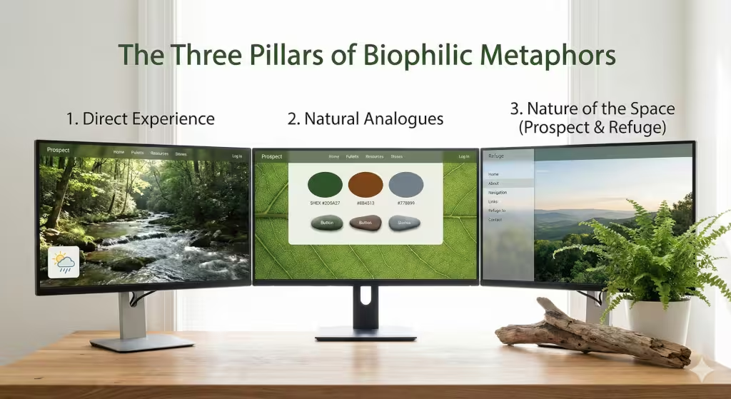
Experts have found fourteen different patterns that make us feel good in a space. We can group these into three big buckets when we build a website.
The first pillar is Direct Experience. This is the most obvious one. It involves things like high-quality videos of a forest or sounds of a running stream. If your website changes its background based on whether it is day or night in the user’s location, that is a direct experience of nature. It connects the digital world to the real world outside the window.
The second pillar is Natural Analogues. This is where visual metaphors of nature really shine. Instead of a real tree, we use the colors of a tree. We might use a deep forest green for the header and a warm wood brown for the footer. We use shapes that are rounded instead of square. These are “analogues” because they are like nature, but they are man-made. They provide a sense of comfort and authenticity. People tend to trust websites that use these natural cues more than they trust sites that look like a cold, gray office.
The third pillar is the Nature of the Space. This is about how the website is laid out. Have you ever felt trapped on a website because you couldn’t find the “back” button? That is the opposite of a good natural space. In nature, we like “Prospect and Refuge.” This means we like to see a long way off (prospect) while feeling safe and tucked in (refuge). In web design, we do this by having a clear, open layout but keeping a steady navigation bar (the “refuge”) so the user always knows where they are.
Implementation: From Biology to Browser
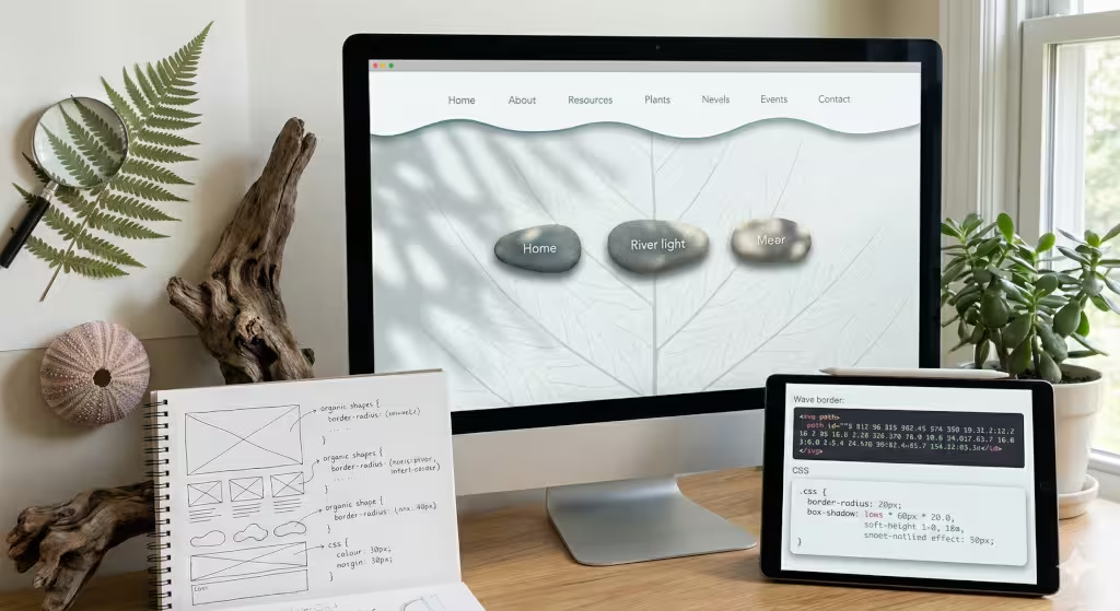
So, how do we actually build this? It starts with getting rid of the rigid grid. Most websites are built on a series of squares. But if you look at a leaf under a microscope, you won’t see many perfect squares. You see organic geometries. We use special code called SVGs to create section dividers that look like waves or hills. This breaks up the page and makes it feel less like a document and more like a landscape.
Another big part is light and shadow. In the woods, light isn’t just “on” or “off.” It filters through trees, creating a dappled effect. We call this Komorebi in Japanese. On a website, we can use soft gradients and shadows to mimic this. It gives the screen depth. Instead of a flat piece of glass, the website looks like it has layers. This makes the visual metaphors of nature feel more real to our eyes.
Then there is motion. Most web animations are very mechanical. A window pops open or slides in at a constant speed. But nothing in nature moves at a constant speed. A leaf falling or a wave crashing starts slow, speeds up, and slows down again. By using “ease-in-out” functions in our code, we make the website move in a way that feels like gravity is real. When a menu slides down like a heavy curtain or bounces slightly like a branch, it reinforces those visual metaphors of nature.
How Does Biophilic Design Affect Website SEO?
You might be wondering what all this “nature stuff” has to do with appearing on the first page of Google. As someone who monitors local SEO trends daily, I can tell you: it matters a lot. Google doesn’t just look at keywords anymore. They look at “user signals.” They want to know if people like your site.
When you use visual metaphors of nature, people stay on your site longer. We call this “dwell time.” If a user clicks on your link and stays for five minutes because the site is beautiful and easy to read, Google thinks, “Wow, this must be a great website.” They then move you higher up in the search results.
Also, biophilic design helps with “bounce rate.” A bounce is when someone clicks your site and immediately leaves because it looks ugly or confusing. By using natural colors and shapes, you create a “soft fascination.” This captures the user’s attention without stressing them out. They feel relaxed, so they stick around and click more pages. All of this tells search engines that your site is a high-quality resource.
Can Biophilic Design Improve User Conversion?
A “conversion” is just a fancy word for getting a user to do what you want, like buying a product or signing up for a newsletter. Does using visual metaphors of nature help with this? Absolutely.
The reason is simple: trust. We are biologically programmed to trust environments that look healthy. A lush green forest feels safer than a dry, brown desert. When your website uses the colors of healthy plants and the patterns of clear water, that feeling of “health” rubs off on your brand. Users feel more comfortable giving you their credit card information or their email address because the environment feels safe.
Also, natural design reduces “decision fatigue.” In a cluttered, boxy website, your brain has to work hard to figure out where to look. This makes you tired and less likely to buy anything. But visual metaphors of nature guide the eye naturally. Using a “path” metaphor, where the layout leads the eye toward a button, makes the choice feel easy. When the choice is easy, the conversion happens.
Examples of Nature-Inspired Color Palettes
If you want to use visual metaphors of nature, you have to get the colors right. You can’t just pick any green. You want to look at “palettes” found in the real world. For example, a “Forest” palette would use deep moss greens, bark browns, and the soft gray of a misty morning. These colors have a low saturation, which means they aren’t “neon” or “loud.” They are calming.
Another option is the “Coastal” palette. This uses sandy beiges, cool ocean blues, and the white of sea foam. This is great for brands that want to feel fresh and open. Then there is the “Desert” palette, with terracotta oranges, sage greens, and pale yellows.
When we pick these colors, we look at the HEX codes, the specific numbers that tell a computer what color to show. But we choose those numbers by looking at real photos of the earth. By grounding the colors in reality, the visual metaphors of nature feel much more powerful. It’s the difference between a cartoon and a painting.
The Importance of Fractal Patterns
Fractals are one of my favorite things to talk about. A fractal is a pattern that repeats itself at different sizes. You see this in ferns, clouds, and even the veins in your hand. Our brains are actually wired to process fractals very quickly. In fact, looking at fractals can lower your heart rate and help you focus.
On a website, we use visual metaphors of nature by building fractal-like structures. This might mean the way a navigation menu breaks down into smaller sub-menus, or how the layout of a blog post mirrors the layout of the whole site. When we use these patterns, we create “organized complexity.” The site has a lot of information, but it doesn’t feel messy. It feels like a tree with many branches. Everything has its place, and the whole thing makes sense.
Prospect and Refuge in Digital Spaces
I mentioned this earlier, but it deserves its own section. Think about how you feel in a cozy booth at a restaurant that looks out over the whole room. You feel safe because your back is covered, but you feel powerful because you can see everything. This is “Prospect and Refuge.”
In web design, we create “Prospect” by using large, hero images and clear headings that tell the user exactly what the site is about. We give them a view of the “whole forest.” We create “Refuge” by using things like sticky headers or clear sidebars. These are elements that stay in the same place no matter where the user scrolls. It’s like a handrail on a staircase. It gives the user a sense of security while they explore the “wide open” parts of your site. Using these visual metaphors of nature makes the digital world feel much more human.
The Role of Local SEO and Ecological Identity
The role of “place” also matters. Every area has its own nature. If you are a business in Vermont, your visual metaphors of nature should probably include things like maple trees, granite rocks, and deep autumn oranges. If you are in Arizona, you should use cactus shapes and red rock textures. This is to say you should tailor your visual metaphors of nature to place you are are located.
This is called “Place-Based Relationships.” It’s about making a website feel like it belongs to a specific spot on the map. This is huge for local SEO. When people in a specific city visit your site and see visual metaphors of nature that look like their own backyard, they feel a local connection. This builds community trust. It tells the user that you aren’t just a big, faceless company; you are a neighbor who understands the local landscape.
Answer Engine Optimization (AEO) and Natural Language
The way we search for things is changing. People don’t just type “nature web design” into a box anymore. They ask their phones, “What are visual metaphors of nature in web design?” This is where Answer Engine Optimization (AEO) comes in. We have to write in a way that helps AI and voice assistants find the answer quickly.
By using clear headings and answering questions directly, we make it easy for these “answer engines” to pick up our content. We use “natural language,” which is just talking like a normal person, to explain complex ideas. When we combine this with visual metaphors of nature, we are creating a site that is smart and beautiful. We are making sure that whether a human is reading or an AI is scanning, the message of biophilia comes through loud and clear.
The Psychology of “Soft Fascination”
Have you ever stared at a flickering fire or watched clouds move? You weren’t really “thinking,” but you were definitely paying attention. This is called “soft fascination.” It is a type of attention that doesn’t tire you out. It actually recharges your brain.
In web design, we want to create soft fascination using visual metaphors of nature. If a website is too busy with flashing ads and bright colors, it uses “hard fascination,” which makes people tired and grumpy. But by using visual metaphors of nature, like a gentle parallax effect where a background image moves slower than the foreground, we create that “cloud-watching” feeling. This allows the user to absorb your information without feeling like they are working. It’s a powerful tool for any business that wants to be seen as a helpful partner rather than a noisy salesperson.
Sustainable Web Design and Biophilia
There is also a “green” side to this that goes beyond just looks. Biophilic design is often linked to sustainability. A website that uses visual metaphors of nature often uses less energy. How? By using simpler layouts, optimized images, and dark modes that save battery life on mobile phones.
When we design with nature in mind, we tend to make things more efficient. We don’t add “bloat,” which is extra code that doesn’t need to be there. Just like in nature, every part of the “organism” (the website) should have a purpose. This makes the site faster. And as we know, a fast site is a site that Google loves. So, by being “green” and using visual metaphors of nature, you are actually helping your SEO and the planet at the same time.
Cognitive Load and Natural Navigation
I talk about cognitive load a lot because it’s the silent killer of good web design. If a user has to stop and think about how to use your menu, you’ve already lost them. Their brain “overheats” and they leave.
Visual metaphors of nature solve this by using “intuitive” paths. In the woods, a path usually follows the easiest route around a hill. On a website, your navigation should follow the easiest route for the user’s eyes. We use “natural flow” to place the most important information where people naturally look first. Instead of forcing the user to learn a new system, we use patterns they already know from the physical world. This makes the experience feel seamless and “frictionless.”
Building the “Living Web”
We are moving away from the “Static Web,” where everything was just a digital flyer, to the “Living Web.” This is a web that reacts, grows, and feels alive. By using visual metaphors of nature, we are leading this change. At Silphium Design LLC, we don’t just see a website as a piece of software. We see it as a digital garden.
It needs to be tended. It needs to have a balance of different elements. It needs to be a place where people want to spend time. When you use visual metaphors of nature, you aren’t just following a trend. You are tapping into a deep human need to be connected to the world around us. Whether it’s through the curve of a button, the color of a background, or the way a page scrolls, these small touches add up to a big impact.
The Future of the Living Web
The internet doesn’t have to be a cold, mechanical place. By using visual metaphors of nature, we can build digital spaces that feel warm, inviting, and healthy. We can use what we know about biology and computer science to create websites that don’t just work—they thrive.
We’ve talked about a lot today: from the shapes of leaves to the way fractals help our brains relax. We’ve seen how natural colors can build trust and how a well-laid-out site can make us feel safe and empowered. This is the heart of biophilic design. It is about bringing the best parts of the outside world into the digital world.
If you’re ready to see how these principles can change your own digital presence, I’m here to help. At Silphium Design, we specialize in making sure your site isn’t just another box on the screen. We want to help you grow something beautiful.