
Table of Contents
Natural elements bring calm and focus to human spaces. In physical buildings, architects use timber, raw stone, natural daylight, and living plants to help people feel grounded. In the software world, digital skeuomorphism serves a similar purpose. Digital skeuomorphism is the practice of designing digital interface elements to look and act like physical objects. When designers apply digital skeuomorphism to natural materials, they bring the grounding qualities of the physical world directly onto the computer screen.
Modern digital skeuomorphism does not just copy old plastic buttons or stitched leather surfaces. Instead, modern digital skeuomorphism focuses on organic textures, soft shadows, light diffusion, and natural physics. This article explains how digital skeuomorphism bridges the gap between biological needs and modern web interfaces. We will explore how to build these interfaces so they look beautiful, load fast, and remain accessible to every user.
Grounding Interface Design in Natural Materiality
Interface design has swung between extremes over the past twenty years. First, early smartphones used heavy bevels and shiny plastic. Next came flat design, which stripped away every shadow, texture, and visual clue. While flat design loaded quickly, it often confused users because interactive buttons looked identical to plain text or static background cards. Today, digital skeuomorphism offers a balanced middle path. By using digital skeuomorphism rooted in natural materials, interfaces become intuitive, tactile, and calming.
┌──────────────────────────────────────────────────────────┐
│              The Evolution of User Interfaces            │
├──────────────────┬───────────────────┬───────────────────┤
│ Early UI         │ Flat Design       │ Modern Organic UI │
│ (Heavy Realism)  │ (Zero Clues)      │ (Biophilic Balance)│
├──────────────────┼───────────────────┼───────────────────┤
│ Stitched leather │ Plain rectangles  │ Wood, stone, pulp │
│ Heavy gloss/bevel│ Zero depth cues   │ Soft directional  │
│ Slow loading     │ Visual confusion  │ Fast code shaders │
└──────────────────┴───────────────────┴───────────────────┘
The Cognitive Architecture of Affordances
An affordance is a clue that tells you how to use an object. A physical door handle has an affordance that suggests grabbing or pulling. A flat push plate suggests pressing your hand forward. In digital systems, digital skeuomorphism creates visual affordances that our brains understand without formal training.
Human brains evolved over millions of years inside natural environments. Our eyes and visual processing systems recognize the depth, texture, and grain of wood or the roughness of stone instantly. When software uses digital skeuomorphism, it takes advantage of this built-in biological knowledge. A button styled with digital skeuomorphism to look like a raised wooden block tells the brain that it can be pressed downward. This reduces mental effort. The user does not have to guess whether an item is interactive. Through digital skeuomorphism, the visual shape, shadow, and texture communicate the function clearly and immediately.
Beyond Industrial Skeuomorphism
Early computer systems used digital skeuomorphism to copy manufactured items from office buildings. Early interfaces were filled with faux leather, shiny metallic dials, fake brass screws, and glossy plastic buttons. That version of digital skeuomorphism focused on man-made tools. It felt cluttered because designers tried to force physical desktop items into a digital screen without understanding why they were doing it.
Modern digital skeuomorphism takes a completely different path. Rather than copying human tools, it copies nature. Natural digital skeuomorphism uses wood grain, limestone, wet clay, plant leaves, and soft paper. These organic materials do not make an interface feel like a cluttered office desk. Instead, natural digital skeuomorphism creates a clean, calm, and breathable space. It provides the visual depth of the real world while keeping layouts structured, simple, and light.
+--------------------------------------------------------------+
|             Comparing Forms of Digital Skeuomorphism         |
+--------------------------------+-----------------------------+
| Industrial Skeuomorphism       | Natural Digital Skeuomorphism|
+--------------------------------+-----------------------------+
| Copied man-made office tools   | Copies earth, plants, light |
| Fake leather, plastic, chrome  | Wood grain, stone, raw paper|
| Heavy drop shadows and bevels  | Soft ambient diffusion      |
| Cluttered visual noise         | Restorative visual calm     |
+--------------------------------+-----------------------------+
Attention Restoration Theory (ART) in UI
Modern screen time causes mental fatigue. When people spend eight hours a day looking at high-contrast flat screens, their directed attention gets tired. Psychologists call this directed attention fatigue. In environmental psychology, Attention Restoration Theory shows that interacting with nature helps our brains recover from fatigue.
Digital skeuomorphism that uses organic textures can bring a small part of that restorative effect to digital devices. When a user looks at an interface styled with natural digital skeuomorphism, their eyes take in soft gradients, organic textures, and gentle lighting. These visual elements trigger what psychologists call soft fascination. Soft fascination holds the attention gently without draining mental energy. By using digital skeuomorphism to reflect natural materials, we help users stay calm, focused, and relaxed while completing their tasks.
Core Typologies: Digitizing Nature’s Material Palette
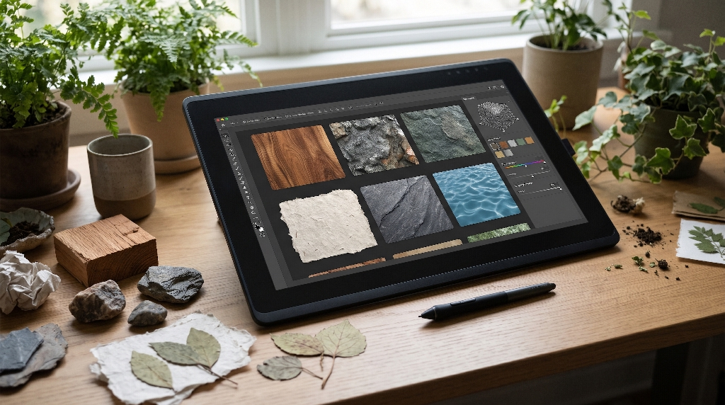
To use digital skeuomorphism effectively, designers must study physical materials closely. You cannot simply paste a photograph of dirt behind a button and call it design. True digital skeuomorphism requires an understanding of how light, surface roughness, and gravity shape physical objects. When we digitize natural materials, we divide them into four core groups.
┌──────────────────────────────────────────────────────────┐
│        Four Core Typologies of Natural Materials         │
├───────────────┬────────────────┬───────────────┬─────────┤
│ Wood & Grain  │ Mineral & Stone│ Paper & Fiber │ Fluids  │
├───────────────┼────────────────┼───────────────┼─────────┤
│ Organic growth│ Stability, mass│ Information,  │ State   │
│ Warmth & life │ Permanent hubs │ Soft touch    │ Dynamic │
└───────────────┴────────────────┴───────────────┴─────────┘
Wood and Grain Morphology
Wood is one of the most comforting materials known to human culture. In natural digital skeuomorphism, wood represents warmth, craftsmanship, and structure. Wood grain has directional lines formed by seasonal tree growth rings. These rings create natural visual paths that the human eye loves to follow.
When applying digital skeuomorphism to wooden surfaces, designers must pay close attention to light reflection. Raw wood does not have sharp white highlights. Instead, wood scatters light in a soft, wide beam. In digital skeuomorphism, we capture this look by using low-contrast highlights and warm ambient shadows. A card container built with wooden digital skeuomorphism feels sturdy and welcoming. It makes users feel safe, which is ideal for educational platforms, home services, and community websites.
Light Source (Sun or Lamp)
         \
          \
           v
   [ Soft Wooden Surface ]  <-- Gentle, wide reflection
      /      |      \
     v       v       v
   Subtle diffused ambient light across organic rings
Mineral, Clay, and Stone Substrates
Stone and rock communicate permanence, strength, and trust. In digital skeuomorphism, mineral surfaces like slate, granite, and sandstone work well for elements that must feel unmovable. If you have a primary checkout button, a security indicator, or a main navigation bar, stone digital skeuomorphism gives that element weight and authority.
To build mineral digital skeuomorphism, you must model surface roughness. Stone has tiny pits, microscopic ridges, and uneven edges. When light hits slate or limestone at an angle, it creates tiny micro-shadows. In digital skeuomorphism, we reproduce these micro-shadows using light bump maps or subtle CSS box-shadow combinations. This gives the surface a tactile quality. Users can almost feel the dry, solid coolness of the stone under their fingertips.
+-------------------------------------------------------------+
|                  Stone Surface Lighting Model               |
+-------------------------------------------------------------+
| Overhead Light (Angle: 45deg)                               |
|       \                                                     |
|        v                                                    |
|    _/\_/\__/\_  <-- Microscopic ridges and pits             |
|   |          |                                              |
|   |  Slate   |  <-- Crisp cast shadows on bottom-right edges|
|   |  Block   |  <-- Soft matte highlights on top-left edges |
|   +----------+                                              |
+-------------------------------------------------------------+
Paper, Fibers, and Botanicals
Paper has been the main container for human thoughts for thousands of years. Traditional paper is made of pressed plant fibers like cotton, linen, hemp, or wood pulp. When you hold raw paper up to the light, you can see these tiny plant fibers woven together.
In digital skeuomorphism, paper and botanical surfaces are perfect for text containers, long-form reading views, and modal dialogs. Flat white computer screens can cause eye strain because they emit harsh, uniform light. Paper digital skeuomorphism replaces that harsh flat glare with warm ivory, soft cream, and subtle fibrous textures. By applying botanical digital skeuomorphism, modal cards can use deckled edges or soft leaf patterns. This makes reading long articles enjoyable, natural, and easy on the eyes.
Hydrological and Atmospheric States
Water is the source of all organic life. In digital skeuomorphism, water, mist, and ice represent change, fluidity, and live feedback. While stone represents things that do not move, water represents things that are currently moving or updating.
Digital skeuomorphism uses water properties for interactive states. For example, when a user clicks a button, a ripple can move across the surface just like a drop falling into a pond. Loading spinners can take the shape of swirling eddies or condensing water drops. Digital skeuomorphism can also use soft frosted glass effects that look like cold morning dew on a windowpane. These fluid touches make software feel alive, responsive, and connected to the natural world.
State A: Rest (Smooth Pond)      State B: Active Tap (Ripple)
+-----------------------+        +-----------------------+
|  [ Submit Order ]     |  --->  |  [ Sub((( O )))rder ] |
+-----------------------+        +-----------------------+
(Zero movement, calm)            (Fluid wave travels out)
Technical Execution: Rendering Natural Textures Without Technical Debt
Designing beautiful concepts is only half the battle. If a website looks incredible but takes ten seconds to load, users will leave immediately. Early digital skeuomorphism suffered from heavy file sizes because designers used massive image cutouts for every knob, switch, and border. Today, modern web standards allow us to create rich digital skeuomorphism entirely through lightweight code.
┌──────────────────────────────────────────────────────────┐
│              Texture Delivery Comparison                 │
├───────────────────────┬──────────────────────────────────┤
│ Heavy Legacy Images   │ Modern Procedural Code           │
├───────────────────────┼──────────────────────────────────┤
│ 2.4 MB PNG files      │ 4 KB SVG Filters or CSS          │
│ High network latency  │ Zero network roundtrips          │
│ Pixelates on zoom     │ Infinite vector scalability      │
│ Blocks page rendering │ Renders smoothly on GPU          │
└───────────────────────┴──────────────────────────────────┘
PBR Shaders and Normal Mapping on the Web
Physically Based Rendering, or PBR, is a way of calculating light that mimics the laws of physics. For years, PBR was used only in big-budget video games and Hollywood films. Today, we can run lightweight PBR shaders directly inside standard web browsers using WebGL and Three.js.
To build realistic digital skeuomorphism for web elements, we use normal mapping. A normal map is a special texture file that tells the computer how light should bounce off an object without adding extra 3D polygons. When the user moves their mouse across a card, the normal map changes the light reflections dynamically.
Through digital skeuomorphism, a wooden button can catch the light differently as the cursor glides across its surface. Because the computer calculates the lighting in real time using the device graphics card, the download size is tiny. Digital skeuomorphism built with PBR gives users rich realism while keeping the website lightweight and fast.
Cursor Position: (X: 120, Y: 45)
          *  <-- Dynamic Light Source
         /
        v
+------------------------------------+
|  Normal Vector N: (0.2, 0.8, 0.5)  |  <-- Shader calculates bounce
|  Texture: Cedar Wood Micro-Grain   |
|  Result: Shifting Specular Glow    |
+------------------------------------+
CSS Procedural Textures vs. Heavy Raster Assets
The biggest mistake web designers make with digital skeuomorphism is using heavy PNG or JPEG images for background textures. Raster images take up huge amounts of bandwidth and slow down mobile phones. Instead of downloading static pictures of natural materials, modern digital skeuomorphism generates textures procedurally using CSS and SVG filters.
An SVG turbulence filter can create organic noise with just a few lines of XML code. When you combine SVG noise with CSS gradients, you can generate authentic stone, paper, and wood patterns instantly. A procedural texture built this way takes up less than two kilobytes of code. This procedural approach to digital skeuomorphism looks crisp on high-resolution screens, scales to any screen size, and requires zero extra network requests.
CSS
/* Procedural paper texture using zero image downloads */
.paper-container {
  background-color: #f7f5f0;
  background-image:
    radial-gradient(at 10% 20%, rgba(220, 210, 195, 0.4) 0px, transparent 50%),
    radial-gradient(at 80% 80%, rgba(200, 190, 175, 0.3) 0px, transparent 50%);
  filter: contrast(105%) brightness(98%);
  box-shadow:
    inset 0 1px 2px rgba(255, 255, 255, 0.8),
    0 4px 12px rgba(60, 50, 40, 0.08);
  border-radius: 4px;
}
+--------------------------------------------------------------+
|                Asset Size & Load Speed Analysis              |
+------------------------------+-------------+-----------------+
| Delivery Method              | File Size   | Render Speed    |
+------------------------------+-------------+-----------------+
| High-Res PNG Texture Cutout  | 1,450 KB    | Slow (Network)  |
| WebP Compressed Image Crop   | 280 KB      | Medium          |
| Procedural SVG/CSS Engine    | 1.8 KB      | Fast (Instant)  |
+------------------------------+-------------+-----------------+
Preserving Core Web Vitals (CWV)
Google uses Core Web Vitals to measure whether a website delivers a good user experience. These metrics look at loading speed, visual stability, and interaction responsiveness. Badly engineered digital skeuomorphism can easily destroy your Core Web Vitals scores if you are not careful.
- Largest Contentful Paint (LCP): LCP measures how fast the main content loads on the screen. If your hero section relies on a heavy photographic texture for digital skeuomorphism, your LCP score will drop. You must load CSS textures first and defer heavy graphical shaders so the main text appears immediately.
- Cumulative Layout Shift (CLS): CLS measures whether elements jump around while the page loads. When creating dynamic bevels or borders with digital skeuomorphism, always declare exact dimensions in your CSS. Never let textured borders pop in late and shift the layout.
- Interaction to Next Paint (INP): INP measures how fast the page responds when a user clicks or taps a button. If your digital skeuomorphism relies on heavy JavaScript calculations every time a button is clicked, the interface will feel laggy. Always run your skeuomorphic animations using CSS transforms and hardware-accelerated properties like opacity and translate.
The Biophilic UX Paradigm: Integrating Nature’s 14 Patterns
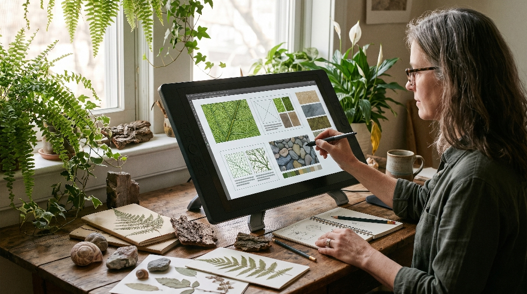
Biophilic design is a concept developed by biologists and architects to help people feel connected to nature in the built environment. In 2014, the environmental consultancy Terrapin Bright Green published the 14 Patterns of Biophilic Design. These patterns explain how specific natural sights, sounds, and forms improve human health and well-being. We can apply these same patterns directly to digital skeuomorphism in web design.
┌──────────────────────────────────────────────────────────┐
│          Biophilic Patterns Applied to Digital UI        │
├────────────────────┬─────────────────────────────────────┤
│ Biophilic Pattern  │ Application in Digital Skeuomorphism│
├────────────────────┼─────────────────────────────────────┤
│ Visual Connection  │ Leaf venation grids, bark patterns  │
│ Material Connection│ Earthy palettes, unpolished stone   │
│ Complexity & Order │ Golden ratios, fractal arrangements │
└────────────────────┴─────────────────────────────────────┘
Visual Connections with Nature
A visual connection with nature means having views of natural systems, plant life, and outdoor scenes. In website design, digital skeuomorphism creates visual connections through graphic structure. Instead of placing text inside rigid, sharp-cornered boxes, digital skeuomorphism can shape containers using the soft curves found in river rocks or tree leaves.
When users see shapes that mimic natural geometry, their nervous system responds with lower stress levels. Digital skeuomorphism uses subtle leaf venation lines to separate sections of content. It can also use gradients that mirror the natural progression of colors seen in a sunrise or forest canopy. These visual touches provide an authentic visual connection to nature without distracting from the words on the page.
Material Connection with Nature
A material connection with nature occurs when we interact with real materials that reflect the local ecology and geology. In interior architecture, this means using local stone or native timber. In web design, digital skeuomorphism provides a material connection by honoring the true properties of natural elements.
If you design a card that looks like unpolished granite, digital skeuomorphism dictates that the card should behave like granite. Granite does not bend like rubber, nor does it bounce like a spring. When clicked, a granite element styled with digital skeuomorphism should feel firm and solid. If you design an interface element that looks like pressed handmade paper, it should have a soft, quiet, and subtle hover transition. By matching visual appearance with physical behavior, digital skeuomorphism creates an honest material connection that users trust intuitively.
Natural Material Appearance  --->  Must Match  --->  Natural Physics
- Granite Stone Card               ================>  Zero bounce, firm click
- Washi Paper Modal                ================>  Gentle drift, soft shadow
- Dewdrop Notification             ================>  Surface tension stretch
Complexity and Order
Nature is never completely uniform, but it is never chaotic either. A tree has thousands of leaves, yet every leaf follows an organized mathematical structure. This balance is known as complexity and order. Humans find this balance deeply satisfying because our brains are built to find order within rich environments.
Flat digital design went too far toward order, stripping away all complexity until interfaces felt sterile and lifeless. Early digital skeuomorphism went too far toward complexity, piling on textures until interfaces felt cluttered. Modern digital skeuomorphism finds the perfect middle ground. It uses mathematical patterns like the golden ratio ($1.618$) and fractal geometry to arrange elements on the screen. Digital skeuomorphism introduces tiny, pleasant variations into textures while keeping navigation grids neat, predictable, and clean.
Common Questions Answered About Digital Skeuomorphism
People often have questions when they first explore how natural materials work in software design. Below are direct answers to the most common questions designers and business owners ask about digital skeuomorphism.
What is digital skeuomorphism in interface design?
Digital skeuomorphism is a design practice where digital objects copy the visual appearance, physical textures, and interactive behaviors of real-world materials. The word comes from two Greek words: skeuos, which means tool or container, and morphe, which means shape.
In early computing, digital skeuomorphism helped people transition from physical desks to virtual screens. Designers created desktop folders that looked like manila office folders and trash cans that looked like metal wastebaskets.
Today, digital skeuomorphism has evolved. Modern digital skeuomorphism uses natural textures, soft ambient shadows, and gentle lighting to make digital environments feel warm, human, and intuitive.
+--------------------------------------------------------------+
|              The History of Digital Skeuomorphism           |
+-------------------+------------------------------------------+
| Era               | Primary Characteristics                  |
+-------------------+------------------------------------------+
| 1980s - 1990s     | Basic desktop metaphors (files, folders) |
| 2000s - 2012      | Heavy glossy plastic, leather stitching  |
| 2013 - 2020       | Flat design rebellion, stripped visuals  |
| 2021 - Present    | Modern organic digital skeuomorphism     |
+-------------------+------------------------------------------+
Why is skeuomorphism returning to modern web design?
Skeuomorphism is returning because users experienced visual fatigue with flat design. When every website consists of flat colored boxes on white backgrounds, every site looks the same. Flat design also created major usability problems. Users could not tell which items were clickable buttons and which items were static labels.
Furthermore, new hardware demands more visual depth. With the rise of virtual reality, augmented reality, and high-resolution displays, flat shapes look out of place. People crave tactile feedback. Digital skeuomorphism brings back physical clues, making software fun, engaging, and easy to navigate once again.
How does natural material skeuomorphism impact web accessibility (WCAG)?
When using digital skeuomorphism, designers must follow the Web Content Accessibility Guidelines (WCAG). Poorly designed digital skeuomorphism can harm readability if background textures interfere with text legibility.
To keep digital skeuomorphism accessible, you must follow strict rules:
- Contrast Ratios: Text must have a contrast ratio of at least 4.5 to 1 against its background for regular text, and 3 to 1 for large text. If you use a wooden or stone texture behind text, make sure the background is smooth and dark or light enough to maintain clear contrast.
- Clear Focus States: Never rely only on subtle shadows to indicate which element has keyboard focus. Always include a distinct, high-contrast outline for users navigating with keyboards.
- Semantic HTML: Digital skeuomorphism is purely visual. Underneath the textures, you must always use standard HTML tags like
<button>,<nav>,<main>, and<article>so screen readers can interpret the page without confusion.
Accessible Contrast Check for Digital Skeuomorphism:
+-----------------------------------------------------+
| [   Background: Textured Stone (#2A2C2E)         ]  |
| [   Foreground: Crisp Bone White (#F5F5F0)       ]  |
| [   Calculated Contrast Ratio: 11.2 : 1          ]  |
| [   WCAG 2.2 Level AAA: PASS                     ]  |
+-----------------------------------------------------+
Does natural skeuomorphic styling degrade mobile performance?
Natural skeuomorphic styling does not degrade mobile performance if it is coded properly. Performance problems happen only when developers rely on heavy image files or inefficient scripts.
When building digital skeuomorphism for mobile devices, follow these rules:
- Use CSS gradients and SVG filters instead of bitmap images.
- Avoid running heavy JavaScript loops during touch scrolls.
- Use CSS hardware acceleration by animating only
transformandopacity. - Use media queries to simplify textures on older, low-power smartphones.
By following these modern techniques, digital skeuomorphism can run smoothly at 60 frames per second on almost any smartphone.
Implementation Architecture: A Component-Level Blueprint
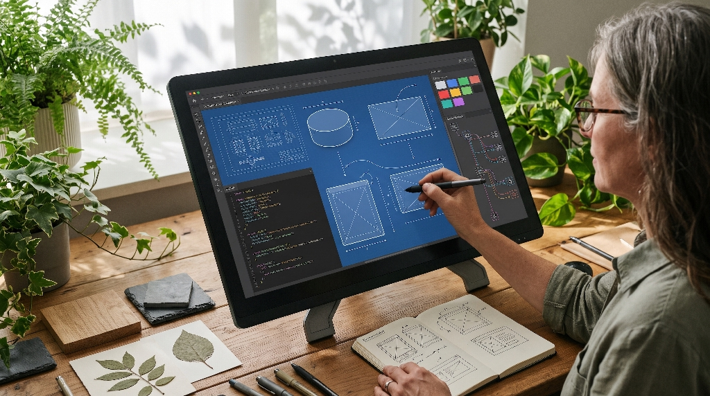
To use digital skeuomorphism across an entire website, you need an organized system. A design system provides clear guidelines and code variables so every button, modal, and card looks unified. Below is the blueprint for creating a component library rooted in natural digital skeuomorphism.
┌──────────────────────────────────────────────────────────┐
│              Design System Architecture                  │
├────────────────────┬─────────────────────────────────────┤
│ Level 1: Tokens    │ Color, roughness, elevation, spread │
├────────────────────┼─────────────────────────────────────┤
│ Level 2: Components│ Buttons, cards, modals, sliders     │
├────────────────────┼─────────────────────────────────────┤
│ Level 3: Feedback  │ Haptics, audio, state transitions   │
└────────────────────┴─────────────────────────────────────┘
System Tokens
Design tokens are the central variables that store design values like colors, spacing, font sizes, and shadow depths. When building a system for digital skeuomorphism, we expand standard tokens to include physical surface properties.
Instead of just defining a flat blue color, our digital skeuomorphism design tokens define surface lighting, roughness, and material elevations.
CSS
:root {
  /* Surface Color Tokens */
  --surface-clay-base: #e6dfd5;
  --surface-clay-highlight: #f5f2ed;
  --surface-clay-shadow: #c4baa9;

  /* Material Depth Tokens for Digital Skeuomorphism */
  --elevation-flat: 0px 0px 0px transparent;
  --elevation-stone-resting:
    inset 0 1px 1px rgba(255, 255, 255, 0.6),
    0 2px 4px rgba(45, 40, 35, 0.12),
    0 6px 12px rgba(45, 40, 35, 0.08);
  --elevation-stone-pressed:
    inset 0 2px 4px rgba(30, 25, 20, 0.25),
    0 1px 2px rgba(45, 40, 35, 0.05);

  /* Animation Timings */
  --transition-tactile: cubic-bezier(0.2, 0.8, 0.2, 1);
}
By organizing digital skeuomorphism into clear tokens, any developer on your team can apply consistent natural textures across hundreds of pages without breaking the design rules.
Micro-Interactions and Spatial Audio/Haptics
Visuals are only one part of how we experience the physical world. When you place a ceramic cup on an oak table, your ears hear a quiet, hollow click. When you press a real stone button, your fingers feel physical resistance before the switch gives way. To make digital skeuomorphism truly believable, we combine visual textures with multi-sensory feedback.
Touch Down (Finger touches screen)
  │
  ├─> Visual: Button sinks 2px down, shadow tightens
  ├─> Audio:  Subtle 20ms low-pitch tap (soft stone click)
  └─> Haptic: Tiny vibration pulse (strength: 15ms)
In mobile applications, digital skeuomorphism pairs with modern haptic motors. When a user drags a slider styled with wooden digital skeuomorphism, the phone can trigger tiny vibrations that feel like the slider is moving across real wooden ridges.
Websites can also use gentle, short audio effects. A quiet paper rustle when opening an article modal completes the illusion. These micro-interactions must always be subtle and respectful. If the user turns off sound or reduces haptic feedback in their system settings, the interface must honor those choices immediately.
+--------------------------------------------------------------+
|                Multi-Sensory Feedback Matrix                 |
+------------------+--------------------+----------------------+
| Material Type    | Audio Frequency    | Haptic Intensity     |
+------------------+--------------------+----------------------+
| Slate / Stone    | Low click (180 Hz) | Firm pulse (25ms)    |
| Hardwood Timber  | Mid pop (320 Hz)   | Double tick (12ms)   |
| Washi Paper      | Soft hiss (800 Hz) | Gentle hum (8ms)     |
| Water Droplet    | High chime (1200Hz)| Sharp drop (5ms)     |
+------------------+--------------------+----------------------+
Degradation and Fallbacks
A professional design system must work well on all devices, from expensive new computers to cheap six-year-old mobile phones. When implementing digital skeuomorphism, you must always provide graceful degradation paths.
Graceful degradation means the website checks what the user device can handle. If a device has a slow graphics chip, the browser automatically switches off complex WebGL shaders. In their place, it renders clean, high-contrast flat backgrounds that load instantly.
We also use the CSS @media (prefers-reduced-motion) query. If a user suffers from motion sensitivity, our digital skeuomorphism system turns off all surface ripples, lighting shifts, and physical bounce animations. The interface remains warm and organic, but it stays completely stationary to protect the user comfort.
CSS
/* Accessible fallback for reduced motion */
@media (prefers-reduced-motion: reduce) {
  .interactive-stone-button {
    transition: none !important;
    transform: none !important;
    box-shadow: var(--elevation-stone-resting) !important;
  }
}
Case Studies and Future Trajectories
Digital skeuomorphism is not a temporary trend. It represents a fundamental shift in how humans interact with technology. As screens evolve into spatial computing headsets, glasses, and ambient displays, the principles of digital skeuomorphism will become more important than ever.
┌──────────────────────────────────────────────────────────┐
│             Future Trajectory of Interfaces              │
├──────────────────────────────────────────────────────────┤
│ 2D Flat Screens  ──> Spatial Headsets ──> Ambient Worlds │
├──────────────────────────────────────────────────────────┤
│ Stiff rectangles ──> Floating 3D Cards──> Organic Matter │
│ Artificial light ──> Real-room lighting──> Living nature │
└──────────────────────────────────────────────────────────┘
Spatial Computing and Apple VisionOS
The launch of spatial computing operating systems like Apple VisionOS marks the beginning of a major era for digital skeuomorphism. In spatial computing, interface windows do not sit inside a fixed plastic frame. Instead, windows float right inside the user physical room.
User Physical Room (Living Room with Wooden Table and Lamp)
  │
  ├─> Physical Lamp casts light to the left
  │
  ▼
[ Floating Digital Skeuomorphic Window ]
  ├─> Window catches real room light on its virtual wooden frame
  ├─> Drops a soft realistic shadow onto the physical oak floor
  └─> Reacts dynamically when user walks closer or steps back
In this environment, flat design looks completely unnatural. A flat white rectangle floating in a living room looks like a broken computer glitch. To look right, digital windows must react to real-world lighting.
If you have a lamp on the left side of your room, the digital window must catch that light on its left edge and cast a soft shadow onto your floor. Digital skeuomorphism provides the exact mathematical framework needed for spatial interfaces.
By using natural digital skeuomorphism, digital objects feel like real pieces of handcrafted furniture sharing your physical living space.
Sustainable Web Design
The internet consumes large amounts of electricity every day. Giant data centers, network routers, and consumer screens require significant energy to keep running. Good design must always consider environmental impact. Fortunately, modern digital skeuomorphism supports sustainable web design when built correctly.
+--------------------------------------------------------------+
|            Environmental Impact of Material Choices          |
+------------------------------+-------------------------------+
| Heavy Media Approach         | Sustainable Procedural Code   |
+------------------------------+-------------------------------+
| Autoplaying 4K video loops   | Lightweight CSS/SVG gradients |
| Continuous network streaming | Generated once on device      |
| High server power consumption| Minimal battery consumption   |
| Fast battery drain           | Long device battery life      |
+------------------------------+-------------------------------+
Many websites try to communicate an organic feel by running massive, auto-playing video backgrounds of forests or ocean waves. These video files are huge, often exceeding thirty megabytes in size. They consume massive amounts of bandwidth and drain smartphone batteries rapidly.
Digital skeuomorphism offers a far cleaner, greener alternative. By using lightweight procedural algorithms, CSS gradients, and small SVG patterns, we can create an organic, nature-inspired feel using a fraction of the electricity.
A page styled with procedural digital skeuomorphism can weigh under two hundred kilobytes while delivering a richer tactile experience than a heavy video loop ever could. Digital skeuomorphism allows us to celebrate the beauty of nature without harming the natural environment through unnecessary electrical waste.
Balancing Humanity and Technology
Technology should serve human needs, not force people to act like machines. For years, digital interfaces felt cold, clinical, and detached from the physical world. Flat design treated human eyes like digital barcode scanners that cared only for abstract data points.
Digital skeuomorphism rooted in natural materials reminds us that we are biological beings who thrive when surrounded by the beauty of nature. By combining the timeless principles of biophilic design with lightweight modern web standards, we can build digital interfaces that are fast, accessible, and deeply calming.
Digital skeuomorphism bridges the gap between the natural world and the digital future. When we respect natural materials and recreate them with precision and care, our digital tools become welcoming spaces that restore our attention and bring genuine delight to our daily work.