The Biophilia of the Digital Flow
When we look at a screen, we often see boxes. We see straight lines and sharp corners. But nature does not work in boxes. As an expert in biophilic design, I believe our digital world should feel as alive as the world outside. The concept of fluid web design is not just a trend. It is a way to bring the calming, restorative power of water into the palm of your hand. When we talk about fluid web design, we are talking about a style that moves and adapts like a river. It flows around obstacles. It fills the space it is given. This is what I call fluid biomorphism. It is the marriage of nature and code.
The goal of this approach is to move beyond static layouts. Most websites feel stuck. They feel heavy. By using fluid web design, we create a sense of transition. We create a sense of life. There is a deep scientific link here as well. Humans have a natural love for water. Scientists call this biophilia. Moving water creates what we call non-rhythmic sensory stimuli. These are patterns that are not perfectly predictable but are not chaotic either.
When a person sees these patterns on a site using fluid web design, their stress levels go down. Their brain feels more at ease. This increases what we call dwell time. It makes people want to stay on your website longer because it feels good to be there. This is why fluid web design is the future of the internet.
Table of Contents
The Physics of Fluidity: Translating Nature to Code

To build a site that feels like water, you must understand how water moves. In the world of science, we talk about two main types of flow. The first is laminar flow. This is when water moves in smooth, parallel paths. It is peaceful and steady. The second is turbulent flow. This is when water swirls and creates eddies. In fluid web design, we use both. We use laminar flow for navigation. We want the user to move smoothly from one page to the next. We use turbulent flow for small details. These small swirls catch the eye and make the site feel real.
Applying these concepts to a digital grid requires math. We do not just guess how things move. We use Sine waves and Perlin noise. A Sine wave is a mathematical curve that describes a smooth, repetitive oscillation. It is the shape of a gentle wave in the ocean. When we use this in fluid web design, we can make headers or backgrounds that bob up and down. Perlin noise is different. It is a type of gradient noise used by computer artists to make things look more natural. It helps us create ripples that do not look like a computer made them.
We also have to think about friction and inertia. In the physical world, things do not stop instantly. If you push a boat, it glides before it stops. Most websites use snap-to scrolling. This feels jerky. It feels fake. In a true fluid web design, we use momentum-based scrolling. We want the page to glide. We want it to feel like it has weight. When a user stops scrolling, the content should settle gently, like a leaf landing on a pond. This attention to physics is what separates a good site from a great one.
Essential Tools for Water-Inspired Motion
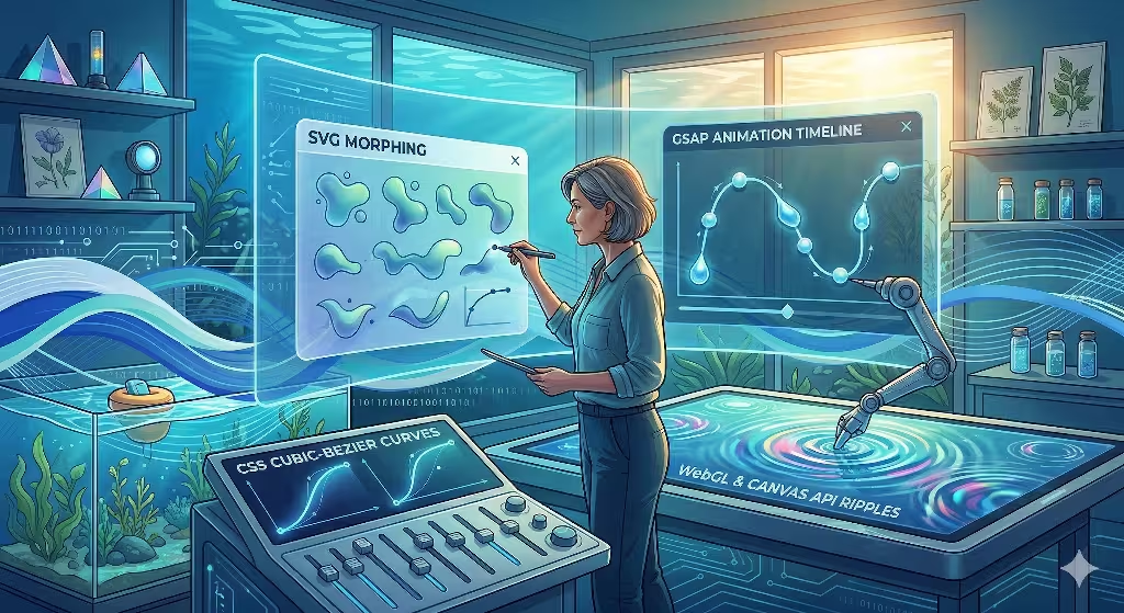
Creating a fluid web design requires the right tools. We cannot rely on old methods. One of the best tools we have is SVG morphing. SVG stands for Scalable Vector Graphics. These are images made of math rather than pixels. This means they can stretch and change shape without getting blurry. By using libraries like GSAP, we can make one shape melt into another. Imagine a button that is a circle, but when you hover over it, it wobbles like a water droplet. This is a key part of fluid web design.
Another powerful tool is the Canvas API and WebGL. WebGL allows us to use the power of a computer’s graphics card to draw complex shapes. This is how we create high-performance ripples. If a user clicks on a background, we want to see a ripple spread out across the screen. We want to see light distorting through that ripple. This is called refraction. In fluid web design, WebGL lets us do this without slowing down the website. If the site is slow, the magic is lost.
We also use CSS Cubic-Bezier curves. These are functions that tell an element how to move over time. Most designers use basic settings like ease-in or ease-out. But water does not move in a basic way. To achieve a high-quality fluid web design, we write custom functions. We create curves that mimic the way a current picks up speed. We want our animations to have a natural rhythm. When you use the right tools, the website stops feeling like a machine and starts feeling like an ecosystem.
Design Principles: Building the Aqueous Interface
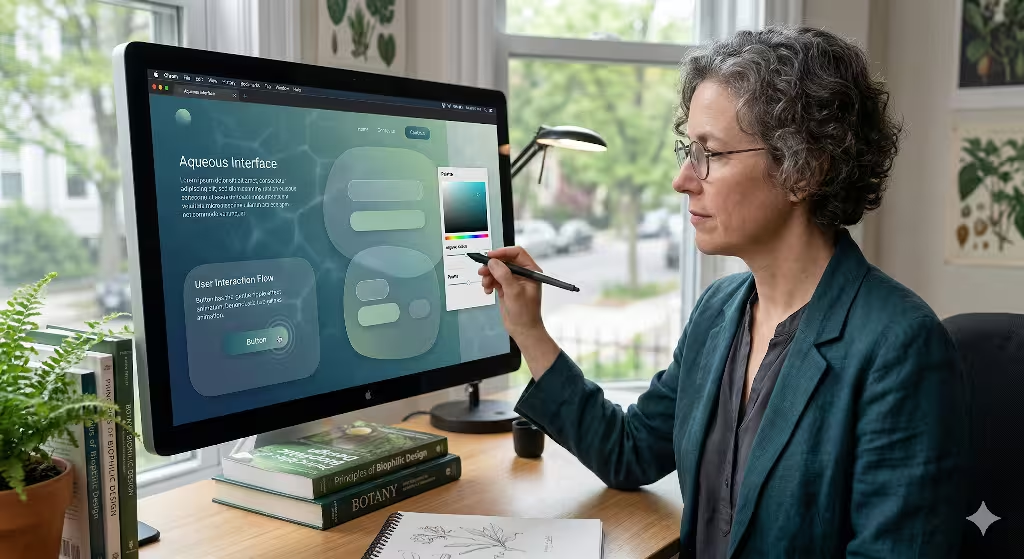
Design is about more than just motion. It is about how the whole site looks and feels. When we build a fluid web design, we start with color theory. We do not use flat colors. We use gradients. Specifically, we use gradients that shift like light moving through deep water. This is a look called caustics. It is the dancing pattern of light you see at the bottom of a swimming pool. By using these patterns, we give the fluid web design a sense of depth.
We also rethink the shape of our containers. Most websites use boxes with sharp 90-degree angles. This is the opposite of nature. In a fluid web design, we use soft, shifting radii. We use shapes that look like pebbles or puddles. These organic containers make the content feel more approachable. They make the user feel like they are exploring a natural space rather than reading a spreadsheet.
Micro-interactions are the small details that make a big difference. When a user moves their mouse, the site should react. In a fluid web design, we want hover states to behave like surface tension. If you touch an element, it should dip slightly. If you move away, it should spring back. These small touches reinforce the idea that the site is made of liquid. It creates a bond between the user and the interface. It makes the fluid web design feel responsive in a way that is deeply human.
Technical Implementation: Step-by-Step
Building a fluid web design is a logical process. The first step is to establish a responsive fluid grid. In the old days, we used fixed pixels. Now, we use Viewport Units and percentages. This means the layout scales perfectly to any screen size. Whether you are on a giant monitor or a small phone, the fluid web design fills the space correctly. It stretches and contracts like a balloon.
The second step is layering. We use something called the parallax effect. This is when different layers of a site move at different speeds. In fluid web design, we use this to create the illusion of depth. We call this the Deep Sea effect. The items in the front move fast. The items in the back move slow. This makes the user feel like they are looking through water. It adds a 3D feel to a 2D screen.
The third step is making certain items sticky. We often have headers or buttons that stay on the screen as you scroll. In a fluid web design, these items should behave like buoyant objects. They should not just sit there. They should have a slight bobbing motion. They should feel like they are floating on the surface of the content. By following these steps, we turn a collection of code into a living environment. This is the core of successful fluid web design implementation.
Frequently Asked Questions about Fluid Web Design
When people search for information on this topic, they often have specific questions. One common question is: What is fluid motion in web design? To answer that simply, it is design that adapts seamlessly to any screen while maintaining a continuous visual flow. It is about making sure nothing feels broken or jagged. It is about harmony. Fluid web design ensures that the user experience is never interrupted by a clunky transition or a rigid layout.
Another question people ask is: How do you make a website feel like water? You do this by focusing on three things. First, use soft edges instead of sharp ones. Second, use transitions that have a natural weight and glide. Third, use transparency. We often use a style called glassmorphism. This makes elements look like frosted glass or clear water. It allows colors from the background to bleed through. This creates a sense of layering that is vital for fluid web design.
Lastly, people often ask: What are the benefits of biophilic web design? There are many. It increases retention, which means people stay on the site longer. It improves brand trust because natural things feel more honest to our brains. It also helps with accessibility. Natural flows are often easier for the human eye to track than sudden flashes or jumps. By using fluid web design, you are making a site that is better for everyone who visits it.
SEO and Performance Optimization
A beautiful website is useless if no one can find it or if it takes too long to load. This is why SEO and performance are so important in fluid web design. We use something called Performance Budgets. This means we set a limit on how much code and how many images we use. We want the fluid web design to be light. If the site is too heavy, the animations will stutter. Stuttering ruins the feeling of water. We want a smooth 60 frames per second at all times.
We also use lazy loading transitions. This is a smart way to save computer power. We only trigger the “water” effects when they are actually on the screen. If a user has not scrolled down to a certain section, we do not run the code for that section yet. This keeps the fluid web design fast and snappy. Google measures these things using Core Web Vitals. If your site is fast and stable, Google will rank it higher in search results.
Semantic HTML is another key part of the puzzle. Just because we have a fancy fluid web design does not mean we can forget the basics. We must use proper tags so that search engines and screen readers can understand the content. The beauty of the biophilic design should never hide the meaning of the words. A well-built fluid web design is both a work of art and a highly functional piece of software. It works for the eyes, the brain, and the search engine robots.
Case Studies: Success in the Wild
Consider a hypotethetical web design firm that has seen the power of fluid web design first hand. This firm recently worked with a high-end architectural firm. The architectural firm wanted a site that felt as solid as a building but as organic as a garden. We used fluid web design to create a navigation system that felt like walking through a series of rooms. Each transition was like a swinging door or a flowing curtain. The result was a massive increase in the time people spent looking at their portfolio.
Fluid design can be used in botanical sites. These sites often use fluid web design to show the growth of plants. By using time-lapse motion and soft, aqueous transitions, they can tell a story that a static site never could. When you mimic the patterns of nature, users feel a sense of peace. They trust the brand more. They feel like the company cares about their well-being.
Our internal projects at Silphium Design LLC often push the boundaries of fluid web design. We experiment with how light reflects off digital surfaces, such as the hero section in the Strawbridge Pools & Spas website. People prefer flow over friction. They prefer the curve over the corner. This is the heart of what we do. We use fluid web design to make the internet a more natural place to spend time.
Common Pitfalls to Avoid
While fluid web design is wonderful, it can be done wrong. One of the biggest risks is motion sickness. Some people are very sensitive to movement on a screen. This is a condition called vestibular disorder. To be inclusive, we always respect the “prefers reduced motion” setting in a user’s browser. If a user has this turned on, our fluid web design will simplify its animations. It will still look beautiful, but it will not move in a way that makes anyone feel sick.
Another pitfall is over-stimulation. It is tempting to put ripples and waves everywhere. But if everything is moving, nothing is important. Too much “splashing” leads to high bounce rates. A bounce is when a person leaves your site almost immediately. In a good fluid web design, motion should be purposeful. It should guide the user’s eye. It should not distract them from the message. Balance is the most important part of biophilic work.
Finally, we must watch out for poor contrast. Sometimes, the soft gradients and water effects can make text hard to read. In fluid web design, readability is still king. We must ensure that there is enough contrast between the text and the background. We use tools to check the color ratios. We want the site to be a dream to look at, but it must be easy to use. A fluid web design that is hard to read is a failure.
The Future of Biophilic UI
The world of technology is changing. For a long time, we were focused on “Mobile First” design. This was about making sure sites worked on phones. Now, we are moving toward “Nature First” design. This is a shift in how we think about the user. We are no longer just designing for a pair of eyes and a thumb. We are designing for a whole human being with a biological history. Fluid web design is the primary tool for this new era.
By embracing the motion of water, we create digital spaces that feel like home. We move away from the cold, robotic feel of early websites. We move toward something that breathes. Computer science and biological principles are converging. We are learning that the most efficient systems are often the ones found in nature. A fluid web design is not just a fancy trick. It is a smarter way to build.
As we look to the future, we see even more possibilities. We see sites that change their “current” based on the time of day. We see interfaces that feel like they are made of light and liquid. At Silphium Design LLC, we are excited to be at the forefront of this movement. We believe that every brand can benefit from the calm and clarity of fluid web design. It is time to let the digital world flow.