At Silphium Design LLC, we look at the internet through a biological lens. My name is Aristaeus, and my background in both biology and computer science has led me to a clear conclusion: the digital world is currently making us tired because it ignores how our bodies work.
In this article, we will look at how to build websites that feel like a walk in the woods rather than a fluorescent-lit office. We are moving toward a concept called biophilic web design beyond green ui. This is about more than just colors. It is about how our brains react to patterns, light, and movement.
Table of Contents
The Biophilia Hypothesis in the Digital Age
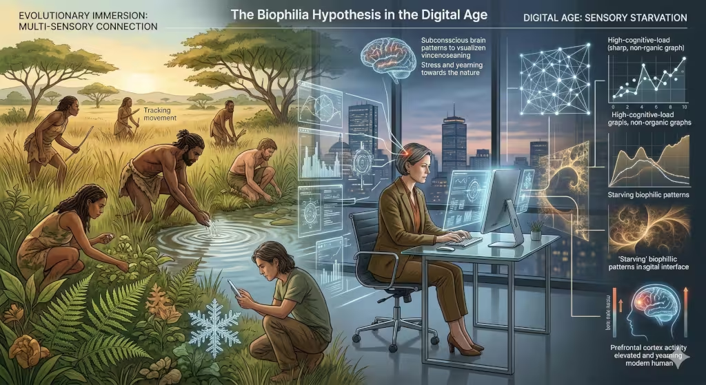
To understand where we are going, we have to look at where we came from. Humans spent thousands of years living in nature. Our eyes are designed to track the movement of leaves. Our ears are tuned to the sound of water. Our brains are built to find patterns in clouds and trees. This is called the biophilia hypothesis. It means that humans have a built-in need to be connected to life and living systems.
When we sit in front of a computer for ten hours a day, we are starving that part of our brain. Most websites today are full of sharp corners, bright white lights, and stiff movements. This creates a hidden kind of stress. We call this digital fatigue. To fix this, we need to go beyond green ui. Simply putting a photo of a tree on a website is not enough. We need to build the “dna” of nature into the code itself.
In 2026, the best designers are those who realize that a user is a biological being first and a consumer second. We are using nature as a blueprint for how information should flow. When a website follows the rules of the natural world, the user feels safe. They stay longer. They trust the brand more. This is the core of what we do at Silphium Design LLC. We create digital ecosystems that breathe.
Neuro-Aesthetics: The Science of Restorative UX
Why do some websites make you feel anxious while others feel calm? The answer lies in neuro-aesthetics. This is the study of how our brains process beauty and art. When you look at a natural object, like a snowflake or a fern, your brain recognizes a pattern called a fractal. Fractals are patterns that repeat at different scales.
Research shows that looking at these patterns actually lowers your heart rate. It reduces the activity in the part of your brain that handles stress. In web design, we can use these patterns in our layouts. Instead of a boring grid of squares, we can use the golden ratio. The golden ratio is a mathematical formula found in seashells and galaxies. It is roughly 1.618.
By using this math, we create a layout that feels “right” to the human eye. This is a key part of moving beyond green ui. It is about the structure, not just the skin. When the math of a website matches the math of a flower, the user’s brain has to work less hard to understand what it is seeing. This is called “soft fascination.” It allows the mind to wander and rest even while it is taking in information.
Beyond the Color Green: The Earth-Driven Palette
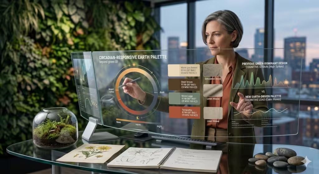
When people hear the word biophilic, they usually think of the color green. While green is a wonderful color, using it too much can be a mistake. High-saturation, neon greens can actually cause eye strain. If you want to go beyond green ui, you have to look at the whole earth.
Think about the colors of a desert at sunset, or the grey-blue of the ocean on a cloudy day. These are earth-toned palettes. They include soft browns, muted blues, warm greys, and terracotta oranges. These colors are easier on the eyes over long periods.
We also think about texture. A flat, plastic-looking button feels “fake” to our subconscious. By adding very subtle shadows or a slight grain, we can make a button look like it is made of stone or wood. This gives the user a tactile feeling. Even though they are touching glass, their brain perceives something natural. This creates a sense of groundedness that you cannot get from standard flat design.
Circadian-Responsive Interfaces
Nature is never static. It changes from morning to night. Our bodies have an internal clock called a circadian rhythm. This clock tells us when to be awake and when to sleep. Most websites ignore this. They blast us with blue light at 11:00 PM, which tells our brains the sun is up.
A truly biophilic website should respond to the time of day. This is a big step beyond green ui. We can use code to change the color temperature of a website based on where the user is located. In the morning, the site might have crisp, cool tones to help the user focus. As evening approaches, the site slowly shifts to warm ambers and oranges.
This doesn’t just look cool; it protects the user’s health. It reduces blue light exposure, which helps them produce melatonin for sleep. When a brand cares enough to protect a user’s sleep cycle through their web design, it creates a deep, unspoken bond of loyalty.
Organic Motion and Liquid Animation
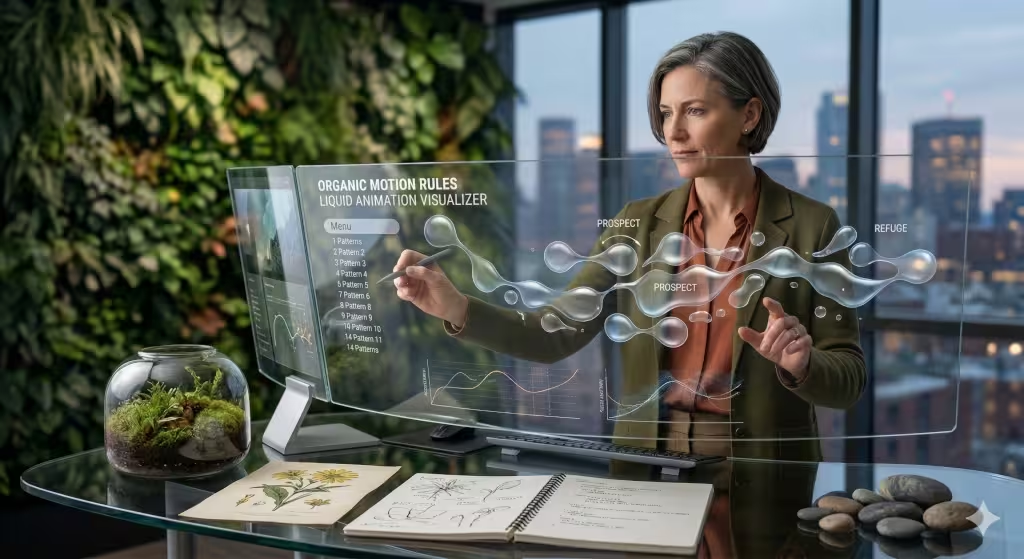
In the real world, nothing moves in a perfectly straight line at a perfectly constant speed. A leaf falls in a dancing path. Water ripples in outward circles. Most web animations are “linear,” meaning they move from point A to point B like a robot. This feels jarring.
To go beyond green ui, we use organic motion. We use animations that have “weight” and “friction.” If a menu slides out, it should accelerate and decelerate like a physical object would. We call this liquid animation. It mimics the way fluids move.
When a user scrolls and the elements on the screen move with a natural flow, it creates a sense of harmony. It feels like the website is alive and responding to their touch. This reduces the “uncanny valley” feeling of digital tools and makes the experience feel more human and less mechanical.
The 14 Patterns of Biophilic Design
There is a famous framework used by architects called the 14 Patterns of Biophilic Design that was developed by Terrapin Bright Green. At Silphium Design LLC, we have worked to adapt these patterns for the web. This is the ultimate guide for going beyond green ui.
One pattern is “Visual Connection with Nature.” This is the obvious one, using high-quality images of plants or landscapes. For an example, you can look at the Patagonia website, which uses abundant imagery of the outdoors. But another pattern is “Non-Visual Connection.” This could be a very quiet, ambient sound of wind or water that plays only when the user interacts with a specific element.
Then there is “Prospect and Refuge.” In nature, humans like to have a clear view of what is ahead (prospect) while feeling safe and protected from behind (refuge). We can do this in web design by using clear navigation menus (prospect) and well-defined content areas or “cards” that feel solid and secure (refuge). By hitting these deep-seated psychological needs, we make the web a place people actually want to spend time.
Technical SEO: The Sustainability-Performance Link
You might wonder how this relates to search engine optimization (SEO). In 2026, search engines like Google care about more than just keywords. They care about user experience and sustainability. A website that goes beyond green ui is often a faster, more efficient website.
If we use lightweight SVG patterns inspired by nature instead of huge, heavy video files, the site loads faster. High speed leads to better rankings. Furthermore, we focus on green hosting. This means the servers running the site are powered by wind or solar energy.
When your site is technically “clean,” it performs better in search results. Google’s algorithms are now smart enough to detect “page experience” signals. If users find your site restorative and stay longer because of your biophilic choices, your bounce rate goes down. This tells the search engine that your site is valuable, which pushes you higher in the results.
Common Questions about Going Beyond Green UI
Many people ask, “Is biophilic design just for wellness brands?” The answer is no. In fact, it is most important for high-stress industries like banking, law, or healthcare. If a person is looking at their bank account, they are likely stressed. A design that goes beyond green ui can help lower that stress, making them feel more in control.
Another common question is about the cost. Does it cost more to build a biophilic site? It requires more thought and a deeper understanding of biology, but the actual coding isn’t necessarily more expensive. It is about making different choices, not just more choices.
Lastly, people ask if this works on mobile. Absolutely. On a small screen, biophilic elements like organic curves and natural spacing are even more important because the space is so limited. It helps the content feel less cramped and more breathable.
Case Study: The Silphium Approach
We recently worked with a pool company. Before the website, they had utilizing mostly Facebook, other social media and traditional promotions. In the website, we incorporated biophilic elements such as rounded corners and images of water, related to the pools.
Specifically, we used rounded corners similar to those of the pools to feature the products. We changed the backgrounds to match the bottoms and sides of the pools, which in turn mimicked the bottoms of rivers and geological features. When visitors enter the site, the sound of somebody jumping into a pool is heard along with the water moving, producing a liquid animation effect.
The results were incredible. Although most visits were seasonal, in the first year there was a lot of activity on the site. Since they did not have a website before, there is no before and after comparison, but initial results have been positive.
The Future: Biophilic AI and 2026 Trends
As we move further into 2026, we are seeing the rise of biophilic AI. This means AI assistants that don’t sound like robots. They use natural pacing in their speech. They understand when a user is frustrated and adjust their tone to be more soothing.
We are also seeing “Generative Biophilia.” This is where a website’s background might change slightly every time you visit, just like a garden grows and changes. It creates a sense of “place” rather than just a digital page.
To stay ahead, you must think about the user as a living creature. Moving beyond green ui is the only way to build a sustainable digital future. We want the internet to be a place that feeds our souls, not just a place that steals our attention.
At Silphium Design LLC, we are constantly monitoring how people search for these terms. We see a huge increase in people looking for “calm tech” and “organic web design.” By embracing these principles now, you are setting your brand up for long-term success.
I hope this exploration of biophilic web design beyond green ui has been eye-opening. It is a field that combines my love for biology with my passion for computer science. When we design for the human spirit, everyone wins.
The digital world does not have to be cold and mechanical. It can be soft, warm, and full of life. It just takes a bit of biological wisdom and a commitment to go beyond green ui.