
Table of Contents
Digital Biophilia and Neuro-Aesthetic Architecture
When you spend hours in front of a computer, your brain gets tired. The modern internet often bombards our senses with bright red notification badges, jumping pop-ups, flashing banners, and stiff layouts. In biology, we study how living organisms respond to constant, unnatural stress. When human beings are subjected to perpetual sensory overload, the nervous system enters a state of mild, chronic alertness. Cortisol levels rise, working memory shrinks, and cognitive fatigue sets in quickly.
To solve this widespread digital problem, we turn to Attention Restoration Theory. Developed by psychologists Rachel and Stephen Kaplan, Attention Restoration Theory explains that exposure to natural patterns allows the human mind to rest its directed attention mechanism. Nature does not demand fierce, forced concentration. Instead, it invites what scientists call soft fascination. Looking at leaves rustling in a gentle breeze or light dappling across a stone path restores our mental reserves.
Digital biophilia is the practice of bringing those exact restorative properties of the physical world into digital interfaces. Digital biophilia is not merely about decorating a layout with stock photos of green leaves or pasting illustrations of vines around a text box. Literal decorations often add more visual clutter rather than removing it. Genuine digital biophilia is an architectural and structural practice. It uses biomimicry, organic proportions, soft mathematical distributions, and natural movement to create environments where people can read, think, work, and interact without feeling drained.
This brings us to the main philosophy of calm web design. Calm web design treats human attention as a precious, finite resource. Rather than competing for attention through jarring contrasts and sudden movements, calm web design creates a serene, predictable, and supportive space for the user. When we combine biophilia with calm web design, we establish an online space that mirrors the restorative balance of the natural world.
Traditional front-end user interface frameworks were built for speed and geometric rigidity. They rely heavily on sharp boxes, rigid 8-pixel grids, and mechanical transitions. While these tools are efficient for basic utility, they fail to deliver calm web design out of the box because nature rarely builds in uniform, sharp boxes. To build peaceful software, we must study the best tools, libraries, and design rules that bring biology, code, and interface engineering together. Essentially most of the components that are often talked about on this blog and biophilic web design.
+-------------------------------------------------------------+
|               The Architecture of Digital Calm              |
+-------------------------------------------------------------+
|  1. Attention Restoration (Soft fascination, low stress)    |
|  2. Structural Biomimicry (Fibonacci scales, organic math)  |
|  3. Sensory Balance (Circadian light, gentle physics)       |
|  4. Low Cognitive Friction (Calm web design workflows)      |
+-------------------------------------------------------------+
The Biological Imperative: Understanding Mental Fatigue on the Web
The human eye and visual cortex evolved over hundreds of thousands of years in outdoor settings filled with fractal patterns, soft lighting, and gradual transitions. Today, the average person spends more than eight hours a day looking at glowing flat glass screens. Most of these digital products are designed to maximize time on site by triggering anxiety. Urgent alert banners, flashing counters, high-contrast neon buttons, and erratic animations keep our eyes constantly jumping across the screen.
When our eyes dart repeatedly between competing visual elements, our visual cortex works overtime. Every sharp color change and sudden pop-up requires a tiny cognitive decision: should I look at this or ignore it? This continuous filtering causes cognitive friction. By mid-afternoon, many users feel a subtle headache, dry eyes, and mental exhaustion. This state of digital burnout directly damages comprehension, patience, and well-being.
By integrating the principles of calm web design, software engineers and product designers can intentionally lower this sensory load. Calm web design does not strip away functionality or make an application boring. Instead, calm web design organizes information with biological clarity. It gives the human mind permission to slow down. When an interface respects the nervous system, users process information faster, retain ideas longer, and leave the experience feeling clear-headed rather than depleted.
Defining Digital Biophilia: Moving Beyond Surface Decoration

Many design teams misunderstand biophilia. When tasked with creating an organic website, they often slap a watercolor leaf into the background header, choose a pale green accent color, and call the job complete. This superficial approach fails because it treats nature as a costume rather than a foundational structural system.
Real nature is defined by how things grow, move, balance, and decay. Digital biophilia applies these underlying principles to the architecture of the code itself. Consider how a tree branches: the main trunk supports heavy limbs, which divide into smaller branches, which then support fine twigs. Each level follows a clear, proportional ratio. A user interface can follow that exact same organizational logic.
In a true biophilic system, page hierarchies, typography scales, card layouts, and navigation menus are linked together using proportional mathematics inspired by natural forms. Digital biophilia also considers how light falls through physical space. Sunlight does not produce harsh, black drop shadows with razor-sharp edges. Sunlight diffuses through atmospheric moisture, creating gentle gradients and layered penumbras. Applying these realistic optical traits inside CSS rules is a fundamental step toward achieving calm web design.
The Mechanics of Calm Web Design: Basic Technical Criteria
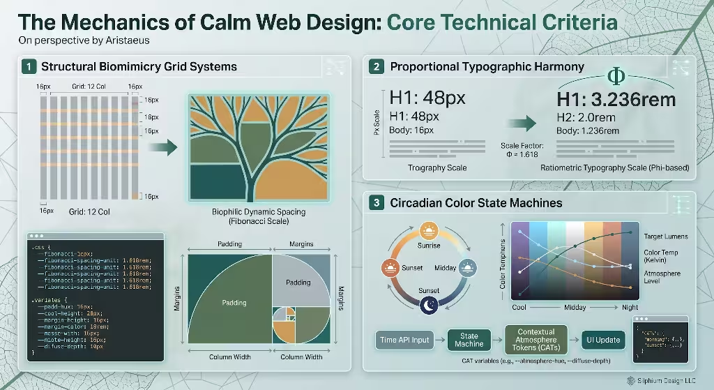
To transition from abstract theory to working software, we must translate biological principles into clear technical rules. Building an interface rooted in calm web design requires four core mechanical pillars: visual rhythm, circadian color theory, physics-based motion, and sensory optimization.
1. Visual Rhythm and Spatial Organization
Most standard web layouts use rigid, uniform grids where every column and gutter is strictly identical. While functional, this uniformity can feel sterile and mechanical. In the physical landscape, visual patterns exhibit dynamic rhythm. Trees in a forest are spaced according to resource availability, sunlight, and terrain, creating a balanced yet varied rhythm.
In calm web design, we achieve this natural balance by replacing rigid, linear spacing with proportional series like the Fibonacci sequence or the golden ratio (1:1.618). When font sizes, margins, line heights, and padding scale according to these proportions, the human eye navigates the page with ease. The visual hierarchy feels inevitable and harmonious. Instead of abrupt shifts in scale, elements relate to one another like the spirals of a nautilus shell or the seed patterns in a sunflower.
2. Colorimetry and Circadian Alignment
Colors on a computer screen are emitted as direct light, not reflected pigment. Staring directly into harsh, blue-weighted light triggers day-time wakefulness signals in the brain, suppressing melatonin and causing ocular strain.
Calm web design relies on balanced color gamuts that mimic ambient daylight and earth-based mineral pigments. We avoid pure, electric primaries such as pure #FF0000 red or harsh #0000FF blue. Instead, we use colors with nuanced spectral depth: deep moss greens, warm slate grays, muted ochres, river-stone neutrals, and soft terracotta tones.
Circadian alignment takes this one step further. Using modern web standards, websites can detect the user’s local time or system preferences to shift color temperature smoothly throughout the day. Morning interfaces can feature crisp, clear daylight tones with high legibility, while evening interfaces gradually transition toward warmer, low-glare palettes that do not disrupt the body’s natural sleep-wake cycle.
Color Temperature Across the Day in Calm Web Design:

  Morning (08:00)       Midday (12:00)        Dusk (18:00)          Night (22:00)
  Soft crisp sunlight   Balanced clear light  Warm amber tones      Low-glare deep slate
  [#F4F6F0]             [#FAFBF9]             [#F5EFEB]             [#1A1D1A]
3. Organic Motion and Physics-Based Micro-Interactions
Standard CSS animations often use linear timing curves (ease-in-out or linear). In the real world, no physical object starts moving instantly at top speed and stops dead in its tracks without deceleration. Objects have mass, inertia, air resistance, and elasticity. When an interface element slides across the screen along a stiff linear path, the brain subconsciously registers it as artificial and abrupt.
To support calm web design, digital movement should mirror Newtonian physics. Modals, drawers, tooltips, and dropdown menus should move with realistic mass and spring tension. Elements should ease smoothly into place, bounce with gentle damping if appropriate, and settle softly. This eliminates visual jarring and makes the entire interface feel tactile, predictable, and calm.
4. Sensory Optimization and Performance
A website cannot feel peaceful if it stutters, freezes, or takes ten seconds to load. Choppy scrolling and erratic visual layout shifts create immediate irritation and physical tension in the user. Therefore, real calm web design requires exceptional performance engineering.
To create calm web design, the underlying codebase must be lightweight, semantic, and efficient. We must achieve instantaneous rendering, zero layout shift (CLS), fast input response times, and smooth 60-frames-per-second rendering. When an interface reacts instantly to human input without hesitation, the mechanical boundary between human and computer fades away, leaving a calm, frictionless experience.
Top Biophilic and Nature-Inspired UI Frameworks and Component Libraries
Now let us examine the concrete technical frameworks and component systems available to front-end developers today for calm web design. Standard libraries like Bootstrap or stock Material UI were never built with biological principles in mind. However, several modern tools, component libraries, and animation engines excel at powering calm web design.
+-------------------+----------------------+---------------------+----------------------+
| Framework / Tool  | Primary Strength     | Biophilic Alignment | Best Used For        |
+-------------------+----------------------+---------------------+----------------------+
| Chakra UI / Radix | Headless Tokens      | High Flexibility    | Design token systems |
| Tailwind CSS      | Utility Composition  | Fractal Scales      | Custom CSS engines   |
| Framer Motion     | Spring Physics       | Natural Kinetics    | Smooth interactions  |
| React Spring      | Force Simulations    | Biological Mass     | Fluid tactile UI     |
| Paper.js          | Canvas Vector Math   | Organic Geometry    | Generative backdrops |
+-------------------+----------------------+---------------------+----------------------+
1. Radix Primitives and Chakra UI: Token-Driven Foundations
When constructing calm web design, starting with unstyled, accessible primitives is vastly superior to wrestling with opinionated, boxy frameworks. Radix Primitives and the headless architecture of modern Chakra UI offer an ideal blank canvas.
These frameworks completely separate functional logic (such as keyboard navigation, screen reader announcements, and focus trapping) from visual presentation. This separation lets developers construct a deep design-token pipeline centered around nature-based variables:
- Fluid Spacing Scales: You can configure token scales based on the golden ratio rather than arbitrary pixel jumps.
- Semantic Elevation Levels: Instead of rigid, elevated drop shadows, tokens can be defined to represent diffused lighting passing through variable atmospheric densities.
- Circadian Theming: The theme engine lets you swap entire palettes based on ambient lighting sensors or time APIs without touching underlying components.
By starting with headless primitives, developers avoid the aggressive visual language of commercial enterprise dashboards, laying down a clean, accessible foundation for calm web design.
2. Tailwind CSS with Custom Biophilic Plugins
Tailwind CSS has become the industry benchmark for utility-driven design. While standard Tailwind configurations lean heavily toward conventional modern enterprise aesthetics, its design engine is extraordinarily adaptable.
By extending the tailwind.config.js file, engineers can implement a rigorous mathematical design system rooted in calm web design. For example, you can write custom plugins that automatically calculate fractal padding scales, multi-layered atmospheric box shadows, and Display P3 color values:
JavaScript
// Example: tailwind.config.js extended for calm web design
module.exports = {
  theme: {
    extend: {
      colors: {
        moss: {
          50: '#f4f6f3',
          100: '#e6ece3',
          500: '#5a7356',
          900: '#233021',
        },
        stone: {
          100: '#f5f4f2',
          300: '#d9d6d0',
          800: '#3d3b37',
        },
        river: {
          400: '#7fa3b0',
          700: '#395361',
        }
      },
      boxShadow: {
        'canopy': '0 4px 20px -2px rgba(45, 55, 40, 0.05), 0 12px 32px -4px rgba(45, 55, 40, 0.08)',
        'dappled': '0 2px 8px 0 rgba(0, 0, 0, 0.04), 0 20px 48px -8px rgba(35, 45, 30, 0.06)',
      },
      transitionTimingFunction: {
        'natural': 'cubic-bezier(0.25, 1, 0.5, 1)',
      }
    }
  }
}
This configuration embeds biophilic concepts directly into standard utility classes. Developers can construct layouts with gentle canopy shadows, earthy moss tones, and natural cubic-bezier curves, ensuring every screen maintains calm web design effortlessly.
3. Framer Motion and React Spring: Natural Biological Kinetics
Static web pages can feel rigid, but poorly animated pages feel chaotic. To bridge this gap, modern physics engines like Framer Motion and React Spring provide the computational foundation for natural kinetics.
Unlike traditional CSS animations that operate on fixed time durations (e.g., transition: all 300ms ease), physics-based libraries operate on mass, tension, and friction. When a user opens a drawer, drags an item, or navigates to a new route, the motion calculations replicate the real-world behavior of physical matter:
- Mass: Gives components realistic visual weight. Larger cards move with deliberate, stable inertia.
- Tension and Damping: Eliminates harsh visual snaps. Components settle gracefully into place without oscillating wildly.
- Velocity Inheritance: If a user flings a card across the screen with their finger, the element carries that kinetic momentum forward, decaying naturally according to simulated air drag.
This physical continuity is central to calm web design. When UI elements behave like gentle physical objects rather than erratic digital pop-ups, the user’s brain does not need to recalibrate expectations on every click.
4. Paper.js and Canvas Engines: Generative Organic Geometries
When a project calls for organic visual backgrounds, static image files often bloat page weight and degrade performance. This is where lightweight canvas vector engines like Paper.js shine.
Instead of heavy video backgrounds or dense photography, Paper.js can programmatically draw delicate, generative natural structures using minimal math. A developer can write a tiny script that creates subtle, slow-moving river ripples, gentle branch-growth patterns, or wind currents that respond softly to mouse position. Because the shapes are generated mathematically in real time via canvas or SVG, the asset payload is nearly zero kilobytes. This combines peak technical performance with the visual tranquility essential to calm web design.
Designing with Biological Patterns
Writing clean code for nature-inspired websites requires understanding how biological patterns function across physical space. Three primary architectural patterns dictate how humans experience natural environments: biomorphic forms, lighting through refuge, and temporal coherence.
Biological Patterns in Web Architecture:
- Biomorphic Forms: Soft curves, fractal geometry, continuous non-Euclidean contours.
- Prospect and Refuge: Clear sightlines (navigability) paired with protected, legible content spaces.
- Temporal Coherence: Interactions that honor natural time, seasonal drift, and calm pacing.
1. Biomorphic Forms and Fractal Geometry
In classical Euclidean geometry, forms are made of straight lines, sharp ninety-degree angles, and perfect circles. But in living nature, forms are almost entirely non-Euclidean. A coastline, a cloud, a fern frond, and a river delta all exhibit self-similar fractal geometry. Research in visual neurobiology demonstrates that human brain waves exhibit a distinct relaxation response when observing fractal patterns with a statistical dimension ($D$) between 1.3 and 1.5.
In web interfaces, we can evoke this calming visual resonance without overwhelming the user:
- Asymmetric Border Radii: Instead of giving every button a uniform
border-radius: 8px, you can use dynamic border radius properties likeborder-radius: 60% 40% 30% 70% / 60% 30% 70% 40%. This produces pebble-like, river-smoothed forms that feel soft and welcoming. - Organic Section Dividers: Replacing harsh horizontal lines with subtle SVG contour lines or gentle rolling curves helps the eye glide downward through content naturally.
- Non-Uniform Padding: Introducing subtle variations in white space breaks up sterile content blocks and creates a comfortable, breathing reading flow.
By introducing these gentle, biomorphic shapes, we eliminate the visual tension inherent in harsh rectangular layouts, advancing the core mission of calm web design.
2. Light, Shadow, and Depth: The Principles of Prospect and Refuge
Environmental psychologists long ago identified the “Prospect and Refuge” theory. Humans feel most at ease in environments where they have clear sightlines to see ahead (prospect), alongside safe, sheltered areas where they feel protected from behind (refuge). Think of sitting comfortably beneath a broad porch roof while looking out over a wide, open meadow.
We can apply this spatial dynamic directly to modern software architecture:
- Prospect in Navigation: Navigation bars and directory structures must be transparent, predictable, and clear. Users should always know exactly where they are, where they came from, and where they can go. Unexpected redirects, mystery meat navigation, and hidden menus cause stress by removing prospect.
- Refuge in Content Cards: Content containers should act as quiet sanctuaries. Soft, diffused ambient drop shadows, warm tinted card backgrounds, and generous internal padding give the text a sheltered feeling.
Furthermore, lighting models within your CSS must mimic diffuse natural light. Avoid harsh black shadows directly beneath an element. Instead, stack two or three subtle shadows with low opacity and high blur radii to simulate the way sunlight filters through a forest canopy. This soft depth establishes visual comfort, which is a hallmark of calm web design.
CSS Code for Canopy Lighting:

/* Harsh, mechanical shadow (Avoid) */
box-shadow: 0 4px 6px #000000;

/* Layered, diffuse canopy shadow (Recommended for calm web design) */
box-shadow:
  0 4px 12px -2px rgba(35, 45, 30, 0.04),
  0 12px 28px -4px rgba(35, 45, 30, 0.07);
3. Temporal Coherence and Micro-Interactions
Nature never rushes. Water does not flash instantly into ice, and a leaf does not snap instantaneously into full size. Growth and movement take time, following an organic cadence.
Many websites break this temporal coherence by flashing error messages instantly, slamming alert modals in front of reading panes, or cycling aggressive promotional carousels every three seconds. These sudden temporal shifts startle the nervous system.
Calm web design respects temporal coherence. Informational messages should fade into view softly, giving the eye time to notice them without alarm. If an error occurs in a form field, avoid aggressive crimson outlines and vibrating inputs. Instead, use clear, calm typography in deep ochre or warm slate, appearing gently below the input field. Micro-interactions should reward curiosity with smooth, fluid feedback. When a user hovers over a link or toggles a switch, the color and surface tension should adjust like water responding to a fingertip.
Frequently Asked Questions about Calm Web Design
To help search engines index this guide accurately and provide readers with immediate answers to common questions, let us address the most frequent queries regarding biophilic interfaces and calm web design.
What is biophilic web design?
Biophilic web design is the deliberate practice of incorporating natural patterns, biological geometry, organic color gamuts, diffuse lighting, and natural physics into digital user interfaces. Its goal is to reduce screen-induced stress, minimize mental fatigue, and align digital interactions with human evolutionary biology. Rather than simply using nature imagery, biophilic web design structures page layouts, typography, spacing, and animations according to the physical principles that govern living ecosystems.
How do you make a website feel calm and natural?
To make a website feel calm and natural, you must apply the principles of calm web design across every layer of the product:
- Expand White Space: Provide generous margins and line heights so content never feels cramped or urgent.
- Eliminate Aggressive Interactivity: Remove intrusive pop-ups, autoplay videos, countdown timers, and sudden modals.
- Use Earth-Aligned Palettes: Replace harsh neons and pure blacks with slate grays, forest greens, warm creams, and river-stone blues.
- Implement Physics-Based Motion: Ensure interactive elements move with realistic weight and damping rather than robotic linear animations.
- Humanize Typography: Choose well-crafted serif or humanist sans-serif typefaces that mirror the organic warmth of human handwriting and classical stonework.
Can biophilic web design improve digital conversion rates?
Yes. Many marketing teams mistakenly believe that high conversions require high-pressure sales tactics like flashing countdown clocks, vibrating checkout buttons, and intrusive banners. While these tactics may generate short-term clicks, they create high cognitive friction and erode brand trust.
Calm web design rooted in biophilia builds deep psychological safety. When users feel relaxed, respected, and clear-headed, their decision-making process improves. They spend more time exploring content, experience less buyer fatigue, and complete checkout flows with greater confidence. Lower bounce rates, higher time on page, and stronger long-term customer retention are consistent benefits of calm web design.
Does biophilic design slow down site performance?
Not when implemented correctly. High performance is a core requirement of calm web design. While amateur implementations might rely on heavy background videos and massive uncompressed photography, an expert biophilic architecture relies on lightweight CSS variables, algorithmic vector math, SVG masks, and native headless components. A properly built biophilic website easily achieves top-tier Google Core Web Vitals scores, loading in less than one second and running at a smooth sixty frames per second.
Implementing an Organic Design Token Pipeline
To bring calm web design into production, front-end engineers need a structured token pipeline. Design tokens serve as the single source of truth for an entire design system, storing values for colors, typography, spacing, and motion.
Below is an example of a complete design token structure written in modern CSS variables, designed specifically to support calm web design across web applications.
CSS
/* =========================================================
   Biophilic Design Tokens for Calm Web Design
   ========================================================= */

:root {
  /* -------------------------------------------------------
     1. Proportional Spacing Scale (Fibonacci Series)
     ------------------------------------------------------- */
  --space-unit: 1rem;
  --space-xs:   calc(var(--space-unit) * 0.5);   /* 8px  */
  --space-sm:   calc(var(--space-unit) * 0.75);  /* 12px */
  --space-md:   calc(var(--space-unit) * 1.0);   /* 16px */
  --space-lg:   calc(var(--space-unit) * 1.618); /* ~26px (Golden Ratio) */
  --space-xl:   calc(var(--space-unit) * 2.618); /* ~42px */
  --space-2xl:  calc(var(--space-unit) * 4.236); /* ~68px */
  --space-3xl:  calc(var(--space-unit) * 6.854); /* ~110px */

  /* -------------------------------------------------------
     2. Circadian Daytime Spectrum (Calm Daylight)
     ------------------------------------------------------- */
  --surface-base:      #fbfaf7; /* Warm unbleached paper */
  --surface-subtle:    #f3f1ec; /* River silt */
  --surface-card:      #ffffff; /* Clean diffuse light */
  --surface-overlay:   #eae6df; /* Soft limestone */

  --text-primary:      #2b2e2a; /* Deep forest slate */
  --text-secondary:    #545952; /* Weathered bark */
  --text-muted:        #798075; /* Dry lichen */

  --brand-growth:      #4a6b47; /* Fern green */
  --brand-water:       #4f7285; /* Mountain pool */
  --brand-earth:       #8c684d; /* Raw clay */
  --brand-accent:      #b87333; /* Autumn copper */

  /* -------------------------------------------------------
     3. Diffuse Canopy Depth & Lighting
     ------------------------------------------------------- */
  --shadow-ambient:
    0 2px 4px 0 rgba(43, 46, 42, 0.02),
    0 6px 16px -2px rgba(43, 46, 42, 0.04);

  --shadow-floating:
    0 4px 12px -2px rgba(43, 46, 42, 0.03),
    0 16px 36px -4px rgba(43, 46, 42, 0.06);

  --shadow-shelter:
    inset 0 2px 6px 0 rgba(43, 46, 42, 0.03);

  /* -------------------------------------------------------
     4. Natural Kinetics & Transitions
     ------------------------------------------------------- */
  --curve-natural: cubic-bezier(0.2, 0.8, 0.2, 1);
  --duration-fluid: 320ms;
  --duration-gentle: 540ms;

  /* -------------------------------------------------------
     5. Biomorphic Surface Contours
     ------------------------------------------------------- */
  --radius-soft:   12px;
  --radius-pebble: 24px 18px 22px 20px;
  --radius-pill:   9999px;
}

/* =========================================================
   Circadian Nighttime Spectrum (Dusk to Dawn)
   ========================================================= */
@media (prefers-color-scheme: dark) {
  :root {
    --surface-base:    #161815; /* Deep mineral night */
    --surface-subtle:  #1d211c; /* Shaded woodland */
    --surface-card:    #242923; /* Wet stone */
    --surface-overlay: #2e362d; /* Overstory canopy */

    --text-primary:    #e8ebe6; /* Pale moonlight */
    --text-secondary:  #b5bcb2; /* Soft fog */
    --text-muted:      #818a7d; /* Shadowed fern */

    --brand-growth:    #6c9368; /* Luminescent moss */
    --brand-water:     #7097ac; /* Night water */
    --brand-earth:     #b08d74; /* Sandstone */
    --brand-accent:    #d98f52; /* Campfire ember */

    --shadow-ambient:
      0 2px 8px 0 rgba(0, 0, 0, 0.25),
      0 8px 24px -2px rgba(0, 0, 0, 0.35);

    --shadow-floating:
      0 6px 16px -2px rgba(0, 0, 0, 0.30),
      0 20px 48px -4px rgba(0, 0, 0, 0.45);
  }
}
This token architecture provides a robust code foundation. Every spacing calculation, surface shade, text color, and elevation level stems from a cohesive biological palette. By keeping these rules organized inside native CSS properties, the entire front-end application remains lightning fast, highly maintainable, and aligned with calm web design.
Practical Implementation: Building a Biophilic Card Component
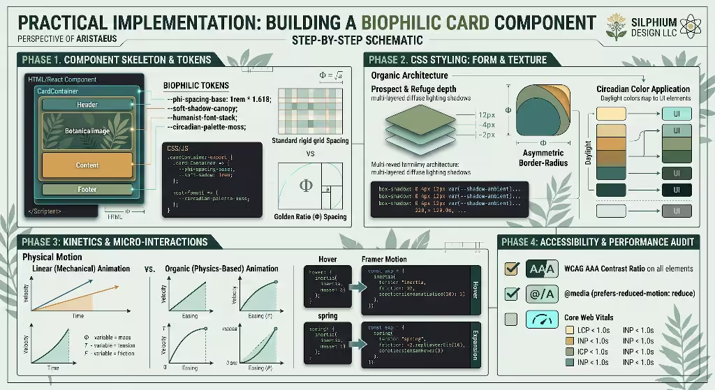
To see these tokens in action, let us review a clean, semantic React and CSS component. This card component displays educational information while embodying every core principle of calm web design:
JavaScript
import React from 'react';
import { motion } from 'framer-motion';

export const BiophilicCard = ({ category, title, description, readTime }) => {
  return (
    <motion.article
      className="biophilic-card"
      initial={{ opacity: 0, y: 12 }}
      animate={{ opacity: 1, y: 0 }}
      transition={{
        duration: 0.5,
        ease: [0.2, 0.8, 0.2, 1]
      }}
      whileHover={{
        y: -4,
        transition: { duration: 0.3, ease: "easeOut" }
      }}
    >
      <div className="biophilic-card-header">
        <span className="biophilic-badge">{category}</span>
        <span className="biophilic-meta">{readTime} min read</span>
      </div>

      <h3 className="biophilic-card-title">{title}</h3>
      <p className="biophilic-card-description">{description}</p>

      <div className="biophilic-card-footer">
        <a href="#explore" className="biophilic-link">
          Explore concept
          <span className="arrow-glyph" aria-hidden="true"> →</span>
        </a>
      </div>
    </motion.article>
  );
};
And the companion CSS rules that style the component:
CSS
.biophilic-card {
  background-color: var(--surface-card);
  border: 1px solid var(--surface-overlay);
  border-radius: var(--radius-pebble);
  padding: var(--space-xl);
  box-shadow: var(--shadow-ambient);
  transition:
    box-shadow var(--duration-fluid) var(--curve-natural),
    border-color var(--duration-fluid) var(--curve-natural);
  display: flex;
  flex-direction: column;
  gap: var(--space-md);
  max-width: 32rem;
}

.biophilic-card:hover {
  box-shadow: var(--shadow-floating);
  border-color: var(--brand-growth);
}

.biophilic-card-header {
  display: flex;
  justify-content: space-between;
  align-items: center;
}

.biophilic-badge {
  font-size: 0.875rem;
  font-weight: 500;
  color: var(--brand-growth);
  background-color: var(--surface-subtle);
  padding: var(--space-xs) var(--space-sm);
  border-radius: var(--radius-pill);
}

.biophilic-meta {
  font-size: 0.875rem;
  color: var(--text-muted);
}

.biophilic-card-title {
  font-size: 1.618rem; /* Scaled via Golden Ratio */
  line-height: 1.3;
  color: var(--text-primary);
  font-weight: 600;
  margin: 0;
}

.biophilic-card-description {
  font-size: 1rem;
  line-height: 1.618;
  color: var(--text-secondary);
  margin: 0;
}

.biophilic-card-footer {
  margin-top: var(--space-sm);
  padding-top: var(--space-md);
  border-top: 1px solid var(--surface-subtle);
}

.biophilic-link {
  color: var(--brand-growth);
  text-decoration: none;
  font-weight: 500;
  display: inline-flex;
  align-items: center;
  gap: var(--space-xs);
  transition: color var(--duration-fluid) var(--curve-natural);
}

.biophilic-link:hover {
  color: var(--brand-water);
}
Notice how this component creates an atmosphere of peace and stability. There are no harsh drop shadows, jarring hover shifts, or high-contrast neon borders. The pebble border radius provides an organic silhouette, while the spring physics transition ensures every user interaction feels gentle. This is the practical execution of calm web design in modern software engineering.
Accessibility, Performance, and Ethical Considerations
A design philosophy cannot claim to be natural if it excludes people or damages the environment. True digital biophilia aligns with universal accessibility, motion safety, and ecological sustainability.
1. WCAG Compliance vs. Soft Earth Tones
A common pitfall when building nature-inspired sites is over-softening colors to the point where text becomes illegible. Low-contrast gray text on a beige background might look stylish in an editorial mock-up, but it fails accessibility guidelines and creates severe eye strain for users with visual impairments.
Calm web design does not sacrifice legibility for aesthetics. We can maintain a soft, grounded mood while strictly adhering to Web Content Accessibility Guidelines (WCAG) Level AA and AAA standards:
- Text Contrast Ratios: Primary body text must always achieve at least a 4.5:1 contrast ratio against its background, and large headings should reach at least 3:1. Level AAA targets a 7:1 ratio for standard text.
- Warm Contrast without Pure Black: Rather than relying on harsh
#000000text on a stark#FFFFFFcanvas, achieve deep contrast using mineral tones, such as rich charcoal#1C201Bresting against unbleached linen#FAF8F5. This delivers a 14:1 contrast ratio, surpassing accessibility requirements while preventing glare and visual fatigue.
+------------------+---------------------+-------------------+------------------+
| Element Type     | Foreground Color    | Background Color  | Contrast Ratio   |
+------------------+---------------------+-------------------+------------------+
| Primary Body     | Mineral Slate (#1C) | Soft Linen (#FA)  | 14.2:1 (AAA)     |
| Secondary Text   | Weathered Bark (#54)| Soft Linen (#FA)  | 6.8:1 (AA)       |
| Primary Button   | Forest Moss (#2330) | Card Canvas (#FF) | 10.5:1 (AAA)     |
| Dark Mode Body   | Pale Fog (#E8)      | Night Slate (#16) | 12.6:1 (AAA)     |
+------------------+---------------------+-------------------+------------------+
2. Motion Sensitivity and Vestibular Safety
While natural physics-based animations can soothe the mind, excessive motion can cause nausea, dizziness, and disorientation for people with vestibular balance disorders.
Calm web design treats animation as an enhancement, never an obligation. Every animated framework must respect the user’s system preferences via the @media (prefers-reduced-motion: reduce) media query:
CSS
@media (prefers-reduced-motion: reduce) {
  *,
  *::before,
  *::after {
    animation-duration: 0.01ms !important;
    animation-iteration-count: 1 !important;
    transition-duration: 0.01ms !important;
    scroll-behavior: auto !important;
  }
}
When reduced motion is enabled, all floating elements, spring movements, and dynamic transitions snap instantly or cross-fade gently without spatial movement. Respecting personal physical boundaries is a core tenet of calm web design.
3. Clean Code as Ecological Sustainability
Every gigabyte of data transferred across the internet requires electrical power to route through server farms, edge nodes, and mobile towers. Heavy, bloated websites that force users to download massive media assets directly increase carbon emissions.
Building for nature means building light:
- Minimal Payloads: Eliminate unnecessary tracking scripts, bloated external icon fonts, and giant third-party libraries.
- Modern Media Formats: Serve images using next-generation formats like AVIF or WebP, and use vector SVGs for iconography and organic shapes.
- Lean DOM Sizes: Keep your HTML document tree shallow and clean to reduce browser memory consumption.
When a digital experience loads instantly with minimal power consumption, it practices true ecological ethics. Lightweight code runs cooler on devices, saves battery life, and supports the quiet harmony of calm web design.
Strategic Implementation Roadmap
Adopting a biophilic approach does not require tearing down your entire application overnight. A deliberate, phased rollout ensures high code quality, accessible design, and steady improvements to the user experience.
The Four-Phase Implementation Roadmap:
[Phase 1: Token Audit]  --> [Phase 2: Headless Refactor]
        |                               |
        v                               v
[Phase 3: Kinetics Layer] --> [Phase 4: Optimization & Audit]
Phase 1: Establish Nature-Derived Design Tokens
Begin by conducting an audit of your current design system:
- Extract all hardcoded pixel measurements, arbitrary margins, and disparate hex codes.
- Build a unified CSS variable dictionary rooted in natural proportions, Fibonacci scales, and circadian color gamuts.
- Replace your existing color variables with spectrally balanced tones that reduce glare while meeting WCAG AAA requirements.
Phase 2: Decouple Logic with Headless Components
Examine your component architecture:
- Replace rigid, opinionated UI components with headless primitives such as Radix UI or Chakra UI headless hooks.
- Wrap these primitives in clean styling layers that utilize your newly established biophilic tokens.
- Reorganize screen layouts around clear prospect-and-refuge structures, offering expansive white space and sheltered content containers.
Phase 3: Introduce Physics-Driven Micro-Interactions
Refine how your application moves:
- Remove harsh linear CSS transitions across your stylesheets.
- Integrate Framer Motion or React Spring to govern drawers, dialog modals, route transitions, and card hovers.
- Configure spring physics with gentle damping and realistic inertia so movement feels smooth, predictable, and calm.
- Ensure comprehensive
@media (prefers-reduced-motion)overrides are fully in place across all interactive components.
Phase 4: Validate Performance and Cognitive Restfulness
Conclude with rigorous testing:
- Audit the application using Google Lighthouse to ensure Core Web Vitals (Largest Contentful Paint, Interaction to Next Paint, Cumulative Layout Shift) achieve top scores.
- Conduct usability testing with real users, observing not just their task completion speed, but also their subjective feelings of mental clarity and visual comfort.
- Iterate continuously to remove unnecessary visual elements, keeping your interface true to the restorative goals of calm web design.
The Future of Interfaces is Restorative
The early decades of the internet focused on raw connection, speed, and capturing human attention at all costs. But as digital spaces have matured, our collective nervous systems have paid a steep price. Sensory overload, visual distraction, and chronic digital fatigue are now recognized as genuine public health and workplace challenges.
The path forward requires building software that acts as a soothing sanctuary rather than a chaotic digital marketplace. By uniting the neurobiology of Attention Restoration Theory with the disciplined engineering of modern component frameworks, front-end developers have an extraordinary opportunity.
When we replace rigid rectangles with biomorphic geometry, exchange harsh neons for circadian palettes, ground animations in natural physical mass, and prioritize low-friction performance, we transform everyday software. Applying these thoughtful methods allows us to build an internet that respects our cognitive well-being. By embracing digital biophilia and mastering the craft of calm web design, we can design online environments that restore our balance, sustain our focus, and support our natural human biology.
The connection between sensory overload, elevated cortisol, and shrinking working memory makes a strong case for calmer interface patterns. I especially appreciate the focus on replacing flashing banners and notification badges with biophilic elements that reduce chronic visual alertness.
Paula, I have never liked the flashing banners both from a personal and an accessibility viewpoint. They are too distracting.