
Table of Contents
The Conservation Sector’s Digital Disconnect
Most environmental non-profit websites operate under a major disadvantage. They attract people who already care about clean water, thriving forests, wildlife corridors, and healthy soil. These visitors arrive with genuine emotional goodwill, ready to support the cause. Yet, across the internet, environmental non-profit websites convert visitors into financial supporters at rates far below commercial websites. The average commercial online store turns two to three percent of visitors into paying customers. Meanwhile, environmental non-profit websites often see conversion rates slip well below one percent.
When giving campaigns underperform, leadership teams usually assume the problem lies with public apathy or donor fatigue. They assume people simply do not care enough to give money. In reality, the issue is almost never the cause itself. People care deeply about living systems and regional biodiversity. The breakdown happens inside the digital experience. Most environmental non-profit websites fail because they are built like static filing cabinets instead of living digital environments. They overwhelm the visitor, hide their donation buttons, slow down browsers, and direct users into confusing dead ends.
To turn casual readers into active financial contributors, we must understand why environmental non-profit websites struggle to convert donors. We have to look closely at digital design, computer science, and human psychology. When environmental non-profit websites align their user experience with natural patterns, human thinking, and streamlined web engineering, conversion rates climb naturally. The following ten criteria break down the exact structural and technical flaws that hold environmental non-profit websites back, along with the precise methods needed to fix them.
Criterion 1: Cognitive Exhaustion and The Eco-Gloom Paralysis
When users arrive on environmental non-profit websites, they are often hit with a wave of overwhelming despair. They see screaming red headlines about vanishing species, barren clear-cuts, dying oceans, and impending disaster. While these ecological crises are real and urgent, bombarding visitors with constant catastrophe causes a psychological reaction known as eco-gloom paralysis.
From a cognitive standpoint, human brains are wired to survive threats, not to dwell in unending panic. When a visitor lands on an environmental non-profit website and absorbs heavy emotional dread, their brain looks for quick relief. If the digital layout does not offer an immediate, empowering action, the user simply closes the tab to escape the bad feeling. In web design, this reaction shows up as high bounce rates and low time-on-page metrics. Many environmental non-profit websites chase their visitors away within ten seconds because the emotional burden is simply too heavy to carry.
To fix this issue, environmental non-profit websites must balance their storytelling. A helpful model is the eighty-twenty rule of ecological communication. Twenty percent of the written content should define the core problem with clear, sober facts. The remaining eighty percent must focus on tangible solutions, active restoration, and the direct role of the supporter.
Environmental non-profit websites need to show how local action makes a real difference. Instead of showing an endless expanse of destroyed forest, show a local team planting native oak saplings in rich soil. When environmental non-profit websites give visitors an immediate feeling of agency, visitors do not run away from the screen. They see a clear path forward and feel motivated to contribute.
Criterion 2: Broken Visual Ecology and The Absence of Biophilic UI
A major reason why environmental non-profit websites fail to connect with their audience is poor visual design. Many environmental non-profit websites use cold, corporate templates designed for software companies or law offices. They feature rigid rectangular blocks, flat gray backgrounds, generic stock photos of business handshakes, and sterile fonts. This creates an awkward mismatch. A visitor comes to an environmental non-profit website to connect with the living world, but the screen feels like a sterile hospital hallway.
Biophilic user interface design solves this problem by bringing the patterns and sensory qualities of nature directly into web design. Nature does not work in sterile boxes or unnatural neon colors. Living systems use organic curves, layered depth, soft edges, and balanced color palettes. Environmental non-profit websites should use color schemes taken from natural habitats. Earthy ochres, deep forest greens, river blues, and warm stone grays create a calm, grounded digital atmosphere.
Fractal geometry is another powerful tool. In nature, patterns repeat at different scales, like the branching patterns of trees, river deltas, and leaf veins. Environmental non-profit websites can use subtle branching lines to divide content sections, guiding the human eye down the page naturally.
Visual authenticity is equally important. Stock photos of smiling models in clean lab coats break user trust. Successful environmental non-profit websites use high-quality, local photos that show true fieldwork. They show boots in the mud, hands examining native seed heads, and real volunteers measuring stream health. When environmental non-profit websites look and feel like the natural environments they protect, visitors stay longer, feel connected, and donate more freely.
Criterion 3: Friction-Heavy Checkout Architectures and Off-Site Redirects
Even when an environmental organization tells an inspiring story, it often fails at the final hurdle: the donation checkout flow. A user clicks a bright donate button, only to be redirected away to a completely different web address owned by a third-party payment processor. This sudden jump breaks trust immediately. The layout changes, the fonts look different, the site logo shrinks, and the browser address bar displays a strange URL.
Redirecting visitors off-site is one of the quickest ways for environmental non-profit websites to lose donations. Everyday web users are constantly warned about phishing scams and identity theft. When environmental non-profit websites bounce users to an unfamiliar payment domain, visitors wonder if the page is safe. Many simply close the browser window rather than take the risk.
Beyond redirects, many environmental non-profit websites make their donation forms far too complicated. They ask for unnecessary details, such as home phone numbers, fax numbers, employer addresses, and long surveys about how the user found the website. Every extra form field adds mental friction and increases abandonment.
To turn this around, environmental non-profit websites must keep the entire donation process on their primary domain using secure, modern forms. The form should be simple and easy to scan. It should ask only for the donor name, email address, and payment information. Furthermore, modern environmental non-profit websites must support one-click digital wallets like Apple Pay and Google Pay. These mobile payment options allow users to complete a donation in seconds using fingerprint or facial recognition, cutting out the hassle of typing sixteen credit card digits on a small screen.
Criterion 4: Vague Impact Metrics (The Black Hole Giving Syndrome)
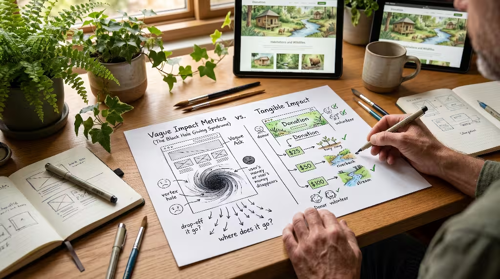
Another common trap for environmental non-profit websites is the vague call to action. Many donation pages feature generic phrases like “Support Our Work,” “Donate to the General Fund,” or “Help Us Protect the Planet.” While these statements sound noble, they leave prospective donors feeling uncertain. When visitors do not know where their money actually goes, they often view the donation page as an endless financial black hole.
People want to know that their hard-earned dollars produce real-world results. If an environmental non-profit website asks for money without explaining the practical outcome, donors hesitate. They wonder if their gift will be swallowed up by administrative overhead, marketing costs, or executive travel.
To fix this problem, environmental non-profit websites must connect specific dollar amounts directly to tangible conservation results. Instead of asking for a generic twenty-five-dollar gift, show what twenty-five dollars accomplishes on the ground. For example, explain that twenty-five dollars buys fifty native milkweed plugs to restore a local monarch butterfly waystation. Explain that seventy-five dollars pays for the water-testing kits needed to monitor five miles of cold-water trout streams for an entire season.
[ $25 ]  --> Plants 50 native milkweed plugs for monarch butterfly habitats
[ $50 ]  --> Restores 10 linear feet of degraded riverbank with native willows
[ $100 ] --> Funds water-quality testing across 5 miles of headwater streams
[ $250 ] --> Protects 1 acre of mature forest through conservation easement monitoring
When environmental non-profit websites provide concrete, transparent numbers, the act of giving changes completely. It stops feeling like an abstract financial expense and starts feeling like an exciting direct investment in living soil, clean water, and healthy wildlife.
Criterion 5: Desktop-Centric Design in a Field-First, Mobile-Driven World
Many non-profit leaders and board members review their organizations’ websites from comfortable office desks using large desktop monitors. Because of this, they approve layouts that look great on a large screen but break completely on a smartphone. In the real world, the majority of visitors visit environmental non-profit websites from mobile devices. People scan QR codes at nature center trailheads, click links on social media while riding the train, and read email newsletters on their phones during lunch breaks.
When a mobile user visits an environmental non-profit website that was built only for desktops, the experience is frustrating. The text is tiny, menus are hard to tap, photos spill off the edges of the screen, and donation buttons require clumsy pinching and zooming. If a user cannot tap a link easily with their thumb, they will leave.
Environmental non-profit websites must be engineered with a mobile-first philosophy. This means designing the smartphone layout first before adding extras for desktop screens.
- Thumb-friendly buttons: All main navigation links and donation buttons must sit within easy reach of the user’s thumb, measuring at least forty-eight pixels in height.
- Streamlined typography: Fonts must stay clear and readable without requiring zooming, using clean type sizes of sixteen pixels or larger.
- Single-column layout: Information should flow smoothly down the screen in a clean, vertical line rather than splitting into cramped horizontal columns.
- Sticky action bars: A discreet, non-intrusive donation button pinned to the bottom of mobile screens lets supporters give the moment they feel inspired.
When environmental non-profit websites work seamlessly on small screens, they turn casual mobile browsing into dependable financial support.
Criterion 6: Information Architecture Designed for Boards, Not Donors

If you explore poorly performing environmental non-profit websites, you will notice that their menu bars are often organized around internal committees. You see menu links like “Director’s Message,” “2023-2027 Strategic Plan,” “Sub-basin Governance Committee,” and “Inter-Agency Resolutions.” This type of navigation structure reflects internal office politics rather than what an outside visitor wants to see.
When environmental non-profit websites organize their content this way, ordinary visitors feel lost and excluded. An everyday person visiting a website does not care about internal committee names or administrative meeting minutes. They want to know what challenges the organization tackles, what progress is being made, how they can get involved, and where their donations go.
Environmental non-profit websites need clear, intuitive information architecture built around user intent. Menus should be short, friendly, and easy to understand. A great site structure uses four or five clear top-level categories:
[ Our Work ]       --> Clear stories covering local habitats and wildlife projects
[ Real Impact ]     --> Concrete facts, data, maps, and field milestones
[ About Us ]        --> Staff, board, transparency ratings, and core mission
[ Get Involved ]    --> Volunteer days, community events, and native seed swaps
[ Donate ]          --> Prominent, high-contrast action button visible on all pages
By removing bureaucratic clutter, environmental non-profit websites make it easy for visitors to find the information they need to make a confident giving decision.
Criterion 7: The Omission of Recurring Stewardship Systems
A major missed opportunity across environmental non-profit websites is the failure to build recurring giving options into the core user experience. Many organizations treat donations as one-time transactions. They ask for a single contribution at the end of the year and never invite the donor to become an ongoing partner. As a result, these environmental non-profit websites are forced to start their fundraising from scratch every January.
Recurring donors are the true lifeblood of any successful non-profit. A donor who gives fifteen dollars a month provides one hundred and eighty dollars over the course of a year, and they often stay active for many years. Furthermore, recurring support gives conservation organizations the predictable cash flow they need to hire field staff, purchase native plants, and maintain ongoing land stewardship projects.
Environmental non-profit websites should make recurring giving the default choice on every checkout page. Instead of using dry, financial terms like “monthly subscription” or “recurring debit,” frame the program around ongoing care and stewardship. Call it the “Watershed Protectors Club,” the “Canopy Stewards Program,” or the “Habitat Defenders Circle.”
Select Your Giving Frequency:
(•) Monthly Stewardship  [Default Selection - Protects habitat year-round]
( ) One-Time Gift        [Supports immediate urgent needs]
When environmental non-profit websites use interactive giving forms where the monthly tab is selected by default, a larger share of donors choose recurring gifts. Environmental non-profit websites should pair this option with short notes explaining how steady monthly support allows field teams to plan long-term restoration projects with confidence.
Criterion 8: Obscured Trust Architecture and Security Indicators
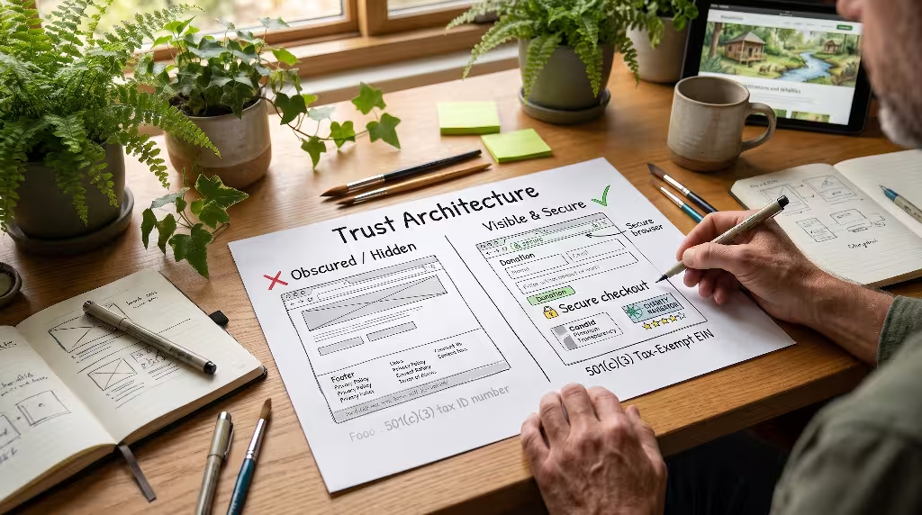
The internet is filled with thousands of charities competing for attention, and donors are naturally careful about where they send their money. Before parting with hard-earned savings, visitors want proof that an organization is trustworthy, financially responsible, and legally sound. When environmental non-profit websites hide their financial documents or leave out third-party trust badges, donors hesitate and abandon the page.
Trust must be earned quickly and clearly. If an environmental non-profit website does not display its official non-profit status, tax identification number, and independent charity ratings, prospective donors may worry that the operation is amateur or fraudulent.
To build strong digital trust, environmental non-profit websites should place key verification badges directly within the footer and beside donation forms:
- Charity ratings: Display badges from respected independent watchdog groups like Charity Navigator, GuideStar (Candid), and the Better Business Bureau Wise Giving Alliance.
- Clear 501(c)(3) details: State the legal name, tax-exempt status, and federal Employer Identification Number (EIN) clearly in the footer of every page.
- Privacy guarantees: Add a short, plain-language note beside the donation button stating that donor information is never sold, rented, or traded.
- Security seals: Use well-known security icons that show the page uses modern SSL encryption to protect private credit card data.
Secure Giving Assured:
[ SSL 256-Bit Encryption ] | [ Candid Platinum Transparency ] | [ 4-Star Charity Navigator ]
"We respect your privacy. Your personal information is never sold, traded, or shared."
When environmental non-profit websites show these trust signals clearly, visitors feel confident that their money will be handled ethically and effectively.
Criterion 9: Slow Digital Page Performance and Carbon-Heavy Codebases
Web performance is not just a technical issue. For conservation groups, it is an ethical one. The internet produces a surprisingly large amount of carbon emissions. Every line of code, uncompressed image, tracking script, and background video uses electricity in massive server farms. When environmental non-profit websites build bloated, heavy web pages, they contradict their own mission by wasting energy.
Beyond carbon emissions, slow websites hurt user conversions directly. Research shows that every extra second a web page takes to load causes conversions to drop significantly. If an environmental non-profit website takes longer than three seconds to appear on a smartphone, over forty percent of visitors will hit the back button and leave.
Page Load Time (Seconds) vs. Donor Drop-Off Rate:
1 Second Load  --> [ 5% Drop-off  ] (Optimal Performance)
2 Second Load  --> [ 12% Drop-off ] (Good)
3 Second Load  --> [ 28% Drop-off ] (Warning Threshold)
4+ Second Load --> [ 50%+ Drop-off] (Severe Abandonment)
Many environmental non-profit websites suffer from code bloat. They load multiple analytical tracking pixels, giant full-screen background video files, and uncompressed photos straight from digital cameras. To build fast, lean, and eco-friendly digital experiences, environmental non-profit websites should follow these best practices:
- Compress all imagery: Convert old PNG and JPEG files into modern WebP or AVIF formats. This shrinks file sizes by seventy percent or more without losing visual sharpness.
- Eliminate autoplaying videos: Replace massive background video loops with clean, still photographs that tell a strong story without hogging bandwidth.
- Clean up third-party scripts: Audit the website codebase regularly and remove old tracking pixels, unused font packages, and unnecessary plugins.
- Use green web hosting: Choose hosting providers that run their server facilities using renewable energy like wind and solar power.
By building lean and clean websites, environmental non-profit websites load almost instantly on any device while reducing their digital carbon footprint.
Criterion 10: Missing Post-Conversion Donor Nurturing and UX Loops
The donor journey does not end when the credit card transaction clears. In fact, that moment marks the beginning of the relationship. Unfortunately, many environmental non-profit websites drop the ball as soon as the payment is processed. The donor is redirected to a cold, generic confirmation page that looks like an invoice: “Payment Received. Order Number 48291. A receipt has been emailed to your address.”
This sudden drop in warmth leaves the donor feeling unappreciated. It turns a meaningful act of conservation stewardship into a cold financial transaction. When environmental non-profit websites treat supporters like customer account numbers, donor retention plummets. Most of those donors will never give again.
Environmental non-profit websites must treat the post-donation confirmation page as a celebration of collective impact. As soon as the transaction finishes, show a warm, human thank-you page. Feature a short, authentic video from a field scientist or volunteer standing in the restored habitat, speaking directly to the donor with genuine gratitude.
[ Instant On-Screen Gratitude ] --> Authentic field video thanking the donor
       ↓
[ Social Proof & Sharing ]    --> One-click buttons to share the campaign with friends
       ↓
[ Immediate Impact Story ]    --> Plain-English breakdown of what happens this week
       ↓
[ Automated Welcome Email ]   --> Field update sent within 48 hours showing real work
The confirmation screen should also offer simple sharing buttons so the donor can post about their contribution to social media. When environmental non-profit websites celebrate the donor’s kindness right away, they build lasting goodwill. That goodwill turns a one-time gift into years of dedicated partnership.
Strategic Synthesis and Conversion Audit Checklist
Fixing these issues does not require magic. It requires viewing digital architecture through the lens of human experience, ethical clarity, and biological balance. When environmental non-profit websites replace heavy despair with inspiring action, replace corporate clutter with biophilic design, and eliminate technical checkout friction, their conversion rates rise.
To help your team review and improve your organization’s digital home, use this straightforward conversion checklist. Walk through these points step by step to ensure your website supports your conservation mission effectively.
The Environmental Non-Profit Website Health Audit
- [ ] Emotional Balance: Does the homepage spend eighty percent of its space on solutions and real-world restoration rather than overwhelming disaster narratives?
- [ ] Biophilic Aesthetics: Does the visual layout use natural color palettes, organic patterns, and authentic local photography rather than corporate stock imagery?
- [ ] On-Site Donation Flow: Does the checkout process stay entirely on your primary website domain without redirecting donors to strange third-party URLs?
- [ ] Mobile Usability: Are all buttons easy to tap with a thumb, text easy to read without zooming, and forms simple to fill out on a smartphone?
- [ ] Digital Wallet Integration: Can mobile users complete their gift using one-click tools like Apple Pay or Google Pay without typing credit card numbers?
- [ ] Concrete Impact Tiers: Does the donation form connect clear dollar amounts directly to specific conservation outcomes?
- [ ] Clear Navigation Menus: Are your menu titles based on simple donor questions rather than internal committee names or administrative files?
- [ ] Recurring Stewardship Default: Is monthly giving selected by default, with friendly wording that invites ongoing partnership?
- [ ] Visible Trust Signals: Are your 501(c)(3) tax identification number, charity evaluation ratings, and privacy assurances clearly visible on every page?
- [ ] Fast Page Load Times: Does your website load in under three seconds on a standard cellular connection, using optimized modern image formats?
- [ ] Warm Confirmation Experience: Does your donation thank-you page celebrate the donor’s generosity with an authentic message from the field?
- [ ] Transparent Reporting: Can a visitor find your annual financial reports and impact updates within two clicks from the homepage?
By working through these twelve practical checkpoints, environmental non-profit websites can turn digital frustration into conservation momentum. In doing so, they build a lasting digital bridge between the people who care about our planet and the vital work needed to protect it.