Table of Contents
For decades, the golden rule of web design was simple: eliminate all drag. Designers and software engineers pushed to make digital experiences as fast, effortless, and slick as possible. We cut down steps, introduced one-click buttons, saved payment credentials, and streamlined every digital pathway. The theory claimed that any barrier between a user and an action caused frustration and killed conversions.
Yet, when interfaces become too slick, systems break down. People make irreversible errors, delete valuable data, buy items by accident, and miss critical privacy details. This reality has forced the design industry to reconsider how users interact with technology. Today, leading design teams rely on intentional friction to bring balance back to digital spaces.
Intentional friction is the deliberate choice to slow a user down. It introduces thoughtful barriers into a user journey to spark mindfulness, verify choices, protect private information, and build mutual trust. Just as natural landscapes use physical resistance to stay stable and strong, digital landscapes need intentional friction to maintain safety, accuracy, and clarity.
The Friction Paradox in Modern User Interfaces
In digital product design, speed is often celebrated as the ultimate measure of success. When an interface has zero resistance, people browse on autopilot. They tap buttons without reading, skim past legal disclosures, and confirm prompts before understanding what those prompts mean.
This creates what we call the friction paradox. Removing all friction from an interface can actually degrade the overall user experience. When tasks are completely frictionless, the risk of human error skyrockets. Users feel anxious when actions happen too quickly without clear confirmation.
Intentional friction solves this problem by reintroducing deliberate moments of pause. By forcing a user to stop and evaluate a choice, intentional friction restores control to the human being behind the screen. It balances convenience with safety. Rather than treating speed as the only goal, smart design uses intentional friction to ensure that critical actions are executed with clear, conscious intent.
The Historical Shift from Accidental to Purposeful Drag

Friction was not always seen as a positive design tool. In the early days of personal computing, friction was almost entirely accidental. Jef Raskin, the computer visionary who initiated the Macintosh project at Apple and authored the book The Humane Interface in 2000, coined the term cognitive friction. Raskin used it to describe how interfaces often work against human logic, demanding unnecessary mental gymnastics just to complete basic tasks.
Accidental friction stemmed from poor layout, hidden menus, confusing icons, and slow servers. Designers spent two decades rooting out these accidental obstacles. However, in the race to strip away every hurdle, systems swung too far in the opposite direction. Designers realized that removing all friction removed all moments for reflection.
Over the past decade, product teams moved from eliminating friction to managing it strategically. The modern era of digital product development views intentional friction not as a technical flaw, but as an essential protective layer. It transforms blind user habits into mindful, confident digital interactions.
What Is Friction in UX and Web Design?
In user experience and web design, friction refers to any resistance a person experiences while navigating an interface. This resistance generally falls into three categories: cognitive, mechanical, and emotional.
Cognitive friction happens when a layout is confusing, text is dense, or a layout requires excessive mental effort to interpret. Mechanical friction occurs when physical actions become cumbersome, such as filling out long forms on a mobile device or tapping tiny, poorly spaced buttons. Emotional friction arises when an interface sparks anxiety, doubt, or frustration, like dealing with vague pricing or unclear privacy policies.
While accidental friction damages usability and drives visitors away, intentional friction is applied with precision. When software teams introduce intentional friction, they do so to solve a specific problem. They create a brief obstacle that demands user attention, ensuring that the person using the tool understands what is happening at every major milestone.
What Is the Difference Between Good Friction and Bad Friction?
Understanding the difference between good friction and bad friction is essential for every web designer and digital architect. Bad friction is accidental, obstructive, or manipulative. It wastes time, causes confusion, and damages the relationship between a user and a brand.
Bad friction appears as broken links, slow loading speeds, confusing forms, and deceptive design tactics known as dark patterns. A classic example of bad friction is a subscription service that lets you sign up in two seconds online, but forces you to call a phone number and wait on hold for an hour to cancel. That friction serves only the business, actively harming the customer.
In sharp contrast, good friction protects, educates, and empowers the user. Good friction is intentional friction designed with the user’s best interest at heart. When a banking website asks you to verify your identity with a one-time passcode before transferring money, that is intentional friction working as a shield. When an e-commerce platform asks you to review your shipping address and order details before running your credit card, that intentional friction prevents expensive shipping blunders. Good intentional friction creates clarity, prevents errors, and builds long-term confidence.
Why Would a Designer Intentionally Add Friction?
A web designer or software engineer adds intentional friction for several critical reasons:
- Preventing Costly Errors: It stops people from accidentally deleting essential files, publishing unfinished work, or sending money to the wrong account.
- Enhancing Security and Privacy: It verifies user identity, protects sensitive personal information, and prevents unauthorized access to private tools.
- Improving Data Accuracy: It ensures that people enter accurate information on registration forms, tax documents, medical portals, and order screens.
- Elevating Value and Trust: It demonstrates that a platform takes user actions seriously. Counterintuitively, people place higher trust in systems that take the time to double-check their choices.
- Complying with Legal Regulations: It ensures that digital tools satisfy legal standards, such as consumer protection mandates, privacy disclosures, and age-verification rules.
By intentionally slowing users down, intentional friction transforms an interface from a slippery slide into a guided, reliable pathway.
The Neurological Mechanisms: Moving Users from System 1 to System 2
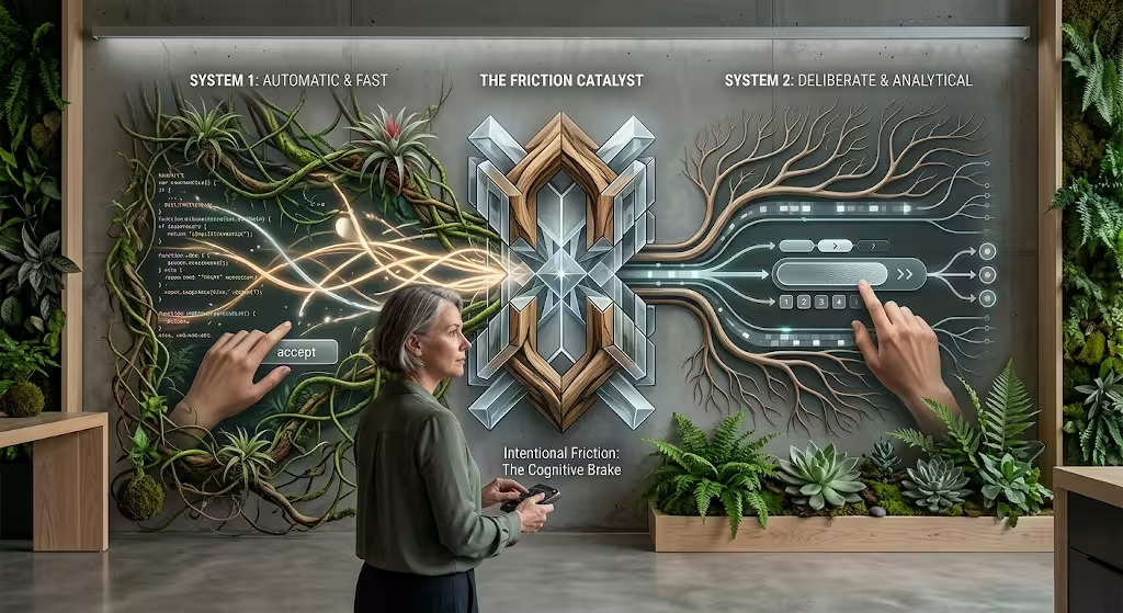
To understand why intentional friction is so effective, we must look at how the human brain processes information. In his groundbreaking research on behavioral economics and cognitive psychology, Daniel Kahneman outlined two primary modes of human thought: System 1 and System 2.
System 1 operates automatically, quickly, and with little or no conscious effort. It handles routine tasks like recognizing a familiar face, swiping on a phone, or driving on an empty highway. System 1 relies heavily on mental shortcuts and instinct. When people browse the modern web, they operate almost entirely in System 1. They click familiar blue buttons, skim headings, and scan pages without deep analytical engagement.
System 2, on the other hand, is slow, deliberate, analytical, and effortful. It engages when you solve a math problem, parallel park in a tight space, or compare two complicated legal contracts. System 2 demands energy and active attention.
When an interface is completely frictionless, it keeps the brain locked in automatic System 1 thinking. If a user encounters a high-stakes decision while operating on autopilot, they are likely to make mistakes. This is where intentional friction acts as a cognitive circuit breaker.
By presenting an unexpected prompt, an intentional delay, or a required confirmation step, intentional friction gently knocks the brain out of automatic System 1 processing and recruits analytical System 2 thinking. The user pauses, reads the prompt, evaluates the risks, and makes an informed choice. Intentional friction is the tool that awakens System 2 when careless decisions carry severe consequences.
The Cognitive Cost of Excessive Digital Speed
Modern high-speed internet connections and rapid interface animations have conditioned users to expect immediate responses. Research in digital psychology reveals that when digital interactions take less than 400 milliseconds, the human brain perceives them as instantaneous.
While instant execution feels impressive during leisure browsing, it carries major risks during serious tasks. Sub-400-millisecond reactions bypass our built-in cognitive risk appraisals. When a user can delete a database, authorize a payment, or broadcast a message in a fraction of a second, they lose the window required to realize they made an error.
Excessive speed often breeds anxiety rather than satisfaction. When a customer taps a button to transfer life savings to an escrow account, an instant screen change can leave them feeling unsettled. Did the funds go through? Was the account number verified?
Introducing intentional friction into high-stakes workflows creates a comforting sense of gravity. A deliberate processing state, an explicit confirmation screen, or a review step reassures the user that the system handled their request with care. Intentional friction matches the operational pace of the interface to the emotional importance of the task.
Preventing Irreversible and Destructive User Errors
One of the most valuable uses of intentional friction is the prevention of catastrophic, irreversible user mistakes. Every day, people manage software, cloud storage, code repositories, and financial portals where a single wrong click can destroy years of hard work.
Standard warning dialogs with simple “OK” and “Cancel” buttons fail to protect users. Because users encounter dozens of generic alert boxes every day, System 1 learns to dismiss them automatically. People click “OK” without reading the text, only to discover they just wiped out a critical project.
To stop this automatic behavior, developers use advanced forms of intentional friction. The development platform GitHub provides an excellent example. When a developer attempts to delete a code repository, GitHub does not show a basic confirmation box. Instead, the interface introduces intentional friction by requiring the developer to manually type out the full name of the repository before the delete button becomes active.
This requirement completely breaks the user’s physical rhythm. You cannot simply hit the enter key or tap a button. You must switch to your keyboard, read the name of the repository, type it character by character, and confirm the action. This intentional friction guarantees that the user is awake, aware, and acting with full intention.
Physical and Temporal Safety Interlocks
Beyond text verification, designers use physical and time-based mechanisms to prevent accidents. These safety interlocks draw direct inspiration from physical engineering, where heavy machinery requires two separate levers or a safety key to turn on.
In touch interfaces, a popular form of intentional friction is the slide-to-confirm control. Instead of offering a single tap target to authorize an irreversible command, like wiping a phone or selling a stock, the interface requires the user to drag a slider continuously across the screen. This sweeping physical gesture cannot happen by an accidental screen brush or pocket tap. It demands conscious motor control.
Another powerful mechanism is the temporal buffer, often referred to as a safety valve. The most famous example is Google Gmail’s “Undo Send” feature. When you click send on an email, the message is not blasted across the internet immediately. Instead, the software introduces a brief window of intentional friction, typically lasting between 5 and 30 seconds.
During this brief holding period, the email sits in a temporary queue while a small bar appears on the screen with an “Undo” button. If you suddenly realize you forgot to attach a document or noticed a typo in the recipient’s name, you can click undo. The software simply cancels the queue, returning you to the composition window. This tiny injection of intentional friction saves millions of professionals from embarrassing mistakes every day.
High-Stakes Validation in Authentication and Security
Digital security is another area where intentional friction plays an indispensable role. In the early days of online security, organizations tried to make logins as frictionless as possible. However, credential stuffing attacks, phishing, and data breaches proved that convenience cannot come at the expense of safety.
Today, modern cybersecurity depends on intentional friction to verify identities. Step-up authentication is an industry standard. When a user logs into their account from their usual laptop at home, the system allows them to browse with minimal resistance. But the moment that user attempts to change their password, view sensitive medical records, or transfer funds to a new recipient, the system triggers intentional friction.
The interface pauses the user journey and demands a secondary verification step. It may require a fingerprint scan, a hardware security key, or a one-time passcode sent via an authenticator app. This intentional friction acts as a targeted security checkpoint. While it adds a few seconds of work, users welcome this intentional friction because it reassures them that their identity and finances are safe.
Password Security and Real-Time Feedback
Creating a new account is another touchpoint where intentional friction shapes long-term safety. Left to their own devices, most human beings will pick simple, easy-to-remember passwords like “password123” or their pet’s name.
To combat this vulnerability, secure registration systems use intentional friction during the onboarding process. Instead of accepting any string of characters, the registration form enforces strict security criteria. It requires a specific length, a combination of numbers and symbols, and checks the password against known breach databases.
Dynamic password strength meters turn this intentional friction into an engaging experience. As the user types, the meter changes color and displays clear feedback, showing exactly what elements are missing. This intentional friction prevents the user from proceeding until their password meets security standards. While it takes longer to complete registration, this intentional friction permanently protects the user’s account against automated brute-force attacks.
Form Integrity and Contextual Validation
Accidental errors on digital forms cause massive headaches for both users and businesses. An incorrect digit in a bank routing number, a missing character in an email address, or a misplaced postal code can delay shipments, derail payments, or cancel reservations.
Smart forms use intentional friction through contextual validation to catch these errors at the source. Rather than allowing a user to fill out a ten-step form and submit it blindly, only to return a wall of red error messages, contextual intentional friction validates data as it is entered.
If an entered phone number does not have enough digits, or if a credit card number fails the checksum formula, the form applies immediate, gentle resistance. It highlights the input field, explains the issue in plain language, and disables the submission button until the entry is corrected. This intentional friction keeps users focused on fixing small mistakes before moving forward, eliminating downstream frustration.
Slowing Down in E-Commerce to Build Trust and Retention
In the world of online shopping, conventional marketing teaches that friction is the ultimate enemy of conversions. Retailers race to introduce single-click buying, saved carts, and instant checkout flows. Yet, cutting all friction from e-commerce checkouts often leads to buyer remorse, accidental orders, and high return rates.
Consider the problems that arose with voice-activated smart speakers and instant one-click purchases. Parents regularly discovered that young children had ordered expensive toys by simply speaking into the room. Shoppers found that an accidental tap on a mobile device ordered products they were only browsing.
To solve these issues, thoughtful e-commerce brands use intentional friction to protect both the shopper and the business. Adding an order review step is a prime example of positive intentional friction. Before charging the customer’s card, the interface displays a clear summary showing the items ordered, the exact shipping address, the delivery speed, and the total cost including taxes. Requiring the user to look over this summary and tap a final confirmation button introduces intentional friction that drastically lowers returns, chargebacks, and shipping errors.
Interactive Quizzes, Onboarding, and the Labor Illusion
Many modern direct-to-consumer companies use intentional friction to make their products feel more personal and valuable. Brands specializing in custom skincare, personalized vitamins, custom clothing, or specialized pet food rarely send visitors straight to a generic product catalog. Instead, they guide potential customers through an in-depth quiz.
These quizzes ask questions about daily habits, lifestyle goals, skin types, and personal preferences. From a purely functional standpoint, this multi-step onboarding adds considerable friction. It demands several minutes of reading, answering, and clicking. Yet, conversion rates on these quiz funnels are often significantly higher than on traditional storefronts.
This success ties directly to a psychological phenomenon known as the labor illusion, which is closely related to the well-known IKEA effect. When people invest their own effort into a process, they value the end result far more.
Furthermore, when a quiz shows an animated loading screen that says “Analyzing your skin profile” or “Formulating your custom blend,” that brief pause of intentional friction signals care and scientific precision. Even if the computer algorithm calculates the result in two milliseconds, the artificial delay of intentional friction convinces the user that real, thoughtful effort went into tailoring their recommendation.
Ethical Offboarding Versus Malicious Friction
How a user leaves a service is just as important as how they join. Unfortunately, many companies abuse friction when customers attempt to cancel subscriptions or delete accounts.
When a company hides its cancellation link, forces users through twenty pages of guilt-tripping text, requires customers to chat with an aggressive retention agent, or demands that they send a physical letter, they are using dark patterns. This is malicious friction. It is designed to trap the customer by exploiting their exhaustion. It destroys brand reputation and invites regulatory penalties.
Ethical offboarding, by contrast, uses intentional friction with total transparency and respect. When a user chooses to cancel a service, a well-designed interface might introduce intentional friction by offering helpful options. It might ask if the user wants to pause their subscription for a month, switch to a cheaper plan, or download their personal data before leaving.
The critical difference is that ethical intentional friction never removes the user’s agency. The button to confirm cancellation remains visible, clearly labeled, and fully functional. The intentional friction exists to provide helpful alternatives, not to hold the customer hostage.
Defining the Boundary Between Ethical Resistance and Dark Patterns
To maintain ethical design standards, teams must learn to distinguish between beneficial intentional friction and predatory digital barriers. The table below illustrates the stark contrast between these two design philosophies.
| Design Dimension | Ethical Intentional Friction | Dark Patterns (Malicious Friction) |
| Primary Beneficiary | Protects user safety, data, and finances | Exploits user fatigue for corporate revenue |
| User Agency | Empowers user to make conscious choices | Strips agency and traps the user in a loop |
| Transparency | Explains clearly why the delay or step exists | Hides options, terms, and exit paths |
| Visual Hierarchy | Critical choices are clearly presented | Confirm buttons are disguised; exits hidden |
| Reversibility | Prevents irreversible and costly mistakes | Makes simple choices difficult to reverse |
Ethical intentional friction is honest. It treats the user as an equal partner, introducing pauses that serve to protect, inform, and support their digital journey.
An Ecological Analogy: Friction as an Adaptational Buffer

To truly understand the value of intentional friction, we can look to the natural world. As someone deeply invested in biophilic design, which studies how natural patterns can improve our built environments and digital tools, I find that nature offers profound lessons on resistance.
In healthy ecosystems, friction is never an accident. It is an essential mechanism for survival, balance, and growth. Consider a natural river system. A pristine river never flows in a straight, perfectly smooth concrete trench. A straight concrete channel creates frictionless water flow. When heavy rains hit, water rushes down that channel with violent speed, causing catastrophic erosion, tearing out plant life, and flooding downstream communities.
A natural river, however, is full of intentional friction. It meanders through curves, loops around sandbars, and tumbles over rocks, fallen logs, and gravel beds. Surrounding wetlands and mangrove forests act like giant sponges, creating hydraulic friction that absorbs the shock of storm surges. This organic resistance slows the water down, filters out silt and pollutants, and allows life to flourish along its banks.
Nature uses friction everywhere. Trees grow thick, coarse bark to resist insects and frost. Seeds have tough outer coats that enforce periods of dormancy, ensuring they do not sprout until seasonal temperatures are safe. Thorns and tough cell walls protect delicate leaves from being eaten before they mature. In nature, resistance is an adaptive buffer that preserves life.
Biophilic Parallels in Digital Web Architecture
When we apply these biological principles to website design and digital architecture, our perspective on friction transforms. A website that treats every visitor journey as a frictionless sprint is like a concrete drainage ditch. It prioritizes sheer throughput over human wellbeing. It rushes visitors through pages, pushes them toward impulse decisions, and leaves them mentally drained.
Biophilic web design uses intentional friction to turn digital platforms into sustainable, grounding environments. Rather than rushing visitors through slick tunnels, a biophilic interface introduces organic rhythms and clear resting points.
Intentional friction can take the form of subtle pauses between sections, allowing readers to digest complex ideas before moving on. It can appear as clear visual boundaries that separate different types of content, preventing cognitive overload.
By designing digital paths that mimic natural systems, we create software that feels stable, calming, and restorative. Intentional friction transforms digital spaces from hectic highways into balanced landscapes where users feel safe, focused, and in control.
A Step-by-Step Framework for Implementing Intentional Friction
Adding intentional friction to a website or software application requires careful planning. If you add friction indiscriminately, users will grow frustrated and abandon your platform. If you add too little, users will make mistakes.
The following four-step decision matrix helps design and engineering teams determine when, where, and how to introduce intentional friction effectively.
1. Assess the Severity of the Action
Before designing any screen or interaction, evaluate the potential consequences of a user error. Ask yourself:
- Is this action permanent and irreversible?
- Does this action carry financial, legal, or privacy consequences?
- Will an error result in lost time, lost data, or severe stress for the user?
If the answer to any of these questions is yes, intentional friction is mandatory. High-consequence tasks must never be frictionless. If the action is harmless and easily undone, keep friction to an absolute minimum.
2. Calibrate Friction to Match the Gravity of the Task
Once you determine that intentional friction is needed, match the weight of the friction to the seriousness of the action. Minor decisions require only light friction, while high-stakes decisions warrant substantial barriers.
- Low-Impact Actions: Use a lightweight temporal buffer, such as an undo notification that stays on screen for a few seconds.
- Moderate-Impact Actions: Use an explicit confirmation dialog or an order review screen that highlights key details.
- Severe-Impact Actions: Use heavy friction, such as requiring manual text verification, multi-factor authentication, or a deliberate physical gesture like a slide-to-confirm control.
3. Deploy Explanatory Micro-Feedback
Never force a user to hit a wall without explaining why that wall is there. If a user encounters intentional friction without context, they will assume your software is broken, buggy, or poorly built.
Every resistance point must be paired with clear, friendly, and concise copy. Tell the user what is happening and why the pause is necessary. For example, instead of disabling a button with no explanation, display a clear message: “Please enter your 10-digit phone number to complete your order.” When users realize that intentional friction exists to protect them, they welcome the pause with open arms.
4. Test and Balance Usability Against Safety
Implementing intentional friction is not a one-time event. Product teams must continuously monitor user behavior to ensure that the friction achieves its safety goals without driving users away.
Run usability tests and analyze data to find the right balance. If users consistently abandon a form at a specific checkpoint, your friction may be too heavy or confusing. If users continue to make errors, your friction is likely too light. Adjust the resistance until error rates drop while task completion rates remain healthy.
Measuring the Success and Value of Intentional Friction
In traditional digital analytics, success is measured by speed, time-on-page, and conversion rates. When you introduce intentional friction, traditional metrics alone cannot tell the full story. You must track specialized data points to measure the real impact of intentional friction.
Reduction in Error Rates and Support Tickets
The clearest sign that intentional friction is doing its job is a dramatic drop in user mistakes. Measure how often users trigger undo actions, request account rollbacks, or submit customer support tickets for accidental purchases. When well-placed intentional friction stops errors before they happen, support desks see fewer tickets, saving companies time, money, and customer goodwill.
Quality of Conversions Over Sheer Volume
Many businesses discover that cutting out all friction fills their pipeline with poor-quality leads. When anyone can fill out a sales form with one click, sales teams waste hours chasing unqualified prospects.
By introducing intentional friction into contact forms, such as asking detailed questions about project timelines, budgets, and specific business needs, the total number of inquiries may decrease, but the quality of those inquiries increases dramatically. The leads that pass through this intentional friction are serious, informed, and far more likely to turn into high-value clients.
User Trust and Confidence Scores
You can measure the emotional impact of intentional friction using post-task surveys and System Usability Scale evaluations. Ask users how confident they felt during critical transactions.
Platforms that use clear, protective intentional friction consistently earn higher trust ratings. Users report feeling in control, secure, and respected by the software. They appreciate that the interface took the time to verify their choices.
The Future of Human-Centered Digital Design
As digital interfaces integrate deeper into our daily lives, the need for intentional friction will only grow. The rise of artificial intelligence, automated workflows, and ambient computing means that technology can now execute complex tasks on our behalf with unprecedented speed.
In an era where software can draft emails, execute stock trades, book travel, and adjust home security systems automatically, intentional friction serves as the ultimate checkpoint for human agency. It ensures that machines do not run ahead of our intentions.
Intentional friction reminds us that humans are not automated machines designed for pure, relentless speed. We are thoughtful, reflective beings who need moments to pause, assess, and choose. By designing interfaces that respect human cognitive limits and value careful intent, intentional friction transforms the web from a chaotic, slippery race into a safe, sustainable, and empowering digital landscape.
Key Takeaways on Intentional Friction
- Intentional friction is the purposeful deceleration of user actions to improve accuracy, security, and mindfulness.
- Eliminating all friction drives users into automatic System 1 thinking, which increases the likelihood of costly human errors.
- Introducing intentional friction awakens analytical System 2 thinking, encouraging users to evaluate critical and high-stakes choices.
- Real-world examples of intentional friction include GitHub’s text-input deletion step, Gmail’s undo-send buffer, and step-up security logins.
- Unlike manipulative dark patterns, ethical intentional friction protects user interests, maintains total transparency, and preserves human agency.
- Biophilic design views intentional friction as a natural stabilizing buffer, echoing how wetlands, tree bark, and meandering rivers protect natural ecosystems.
- High-performing web teams calibrate intentional friction to match the severity of the action, tracking error reduction and user trust alongside standard conversion rates.